Part 3 · The launch plan
Chapter 11 of 14
The website

The question
Does the website sell, and what should replace it?
The answer
Today's product pages score 0–3 out of 10 on pain, proof and offer. The rebuilt page puts all three on the first screen.
Key number
8.15
the rebuilt page in a blind review panel

What we found swipe
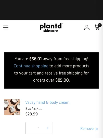
- The home page leads with a two-month-old face line. Product pages open with mood copy; Add to Cart sits below the first screen; the sticky bar shows $14.99 on a $28.99 jar.
- The biggest gaps are pain, proof and offer. The first things a stranger needs.
- Four versions of the new page are built. The latest scores 8.15 for the full phone scroll, ahead of Tatcha (7.25) and Herbivore (7.12). The panel checks craft and clarity, not sales.
What it means for Plantd
Fix the broken details now, then move the ads onto one product page with three pain views. Real traffic, not a score, will decide between the versions.
The evidence
Plantd today Best page we captured chip = points behind
↑ The biggest gaps are the first things a stranger needs: her problem in the headline, proof, and a reason to buy now.
Source: Plantd and 15 competitor product pages captured on a phone, 6 Oct 2026, scored by us. Directional, not a certified score.
Data as a table
| Section | Plantd | Best | Best page |
|---|---|---|---|
| Pain hero, ad-to-page match | 1 | 9 | a supplement brand's pain page |
| Offer | 2 | 8 | Solura |
| Social proof | 3 | 9 | Sol de Janeiro |
| Mechanism | 3 | 9 | a supplement brand's pain page |
| Before/after proof | 0 | 8 | True Botanicals |
| FAQ on the page | 0 | 8 | a hair-serum page |
| Objection handling | 3 | 9 | a supplement brand's pain page |
| Guarantee | 3 | 9 | a hair-serum page |
| Buy box, first screen | 4 | 8 | Nécessaire |
| Speed | 8 | 9 | a supplement brand's pain page |
Do this first
In this chapter
The rebuild
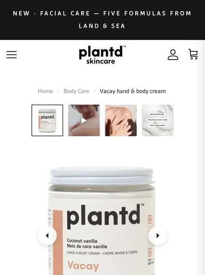
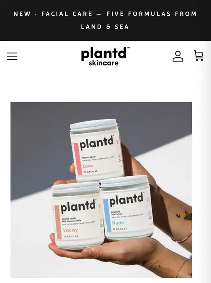
Today's site
How the main pages look on a phone today, with the issues we logged on each.


Four versions, already built
How the versions scored. A blind review panel compared each version with competitor pages. It checks craft and clarity, not sales; real results come from traffic. Full scroll on a phone: B4 8.15, first of the 12 pages scored, ahead of Tatcha (7.25) and Herbivore (7.12). Buy box alone: all our versions 7.8–8.2, against Tatcha 7.30 and Nécessaire 7.12.
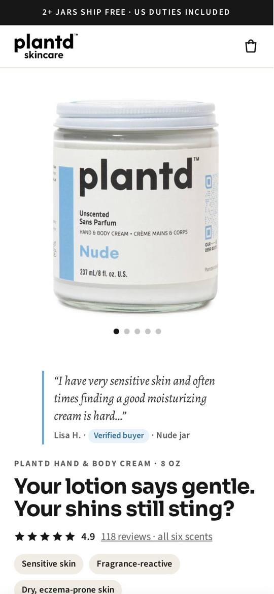
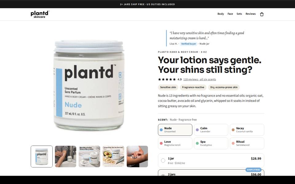
A
The story first
Pain headline, a customer quote and the jar; price and Add to cart sit further down the page.
Open A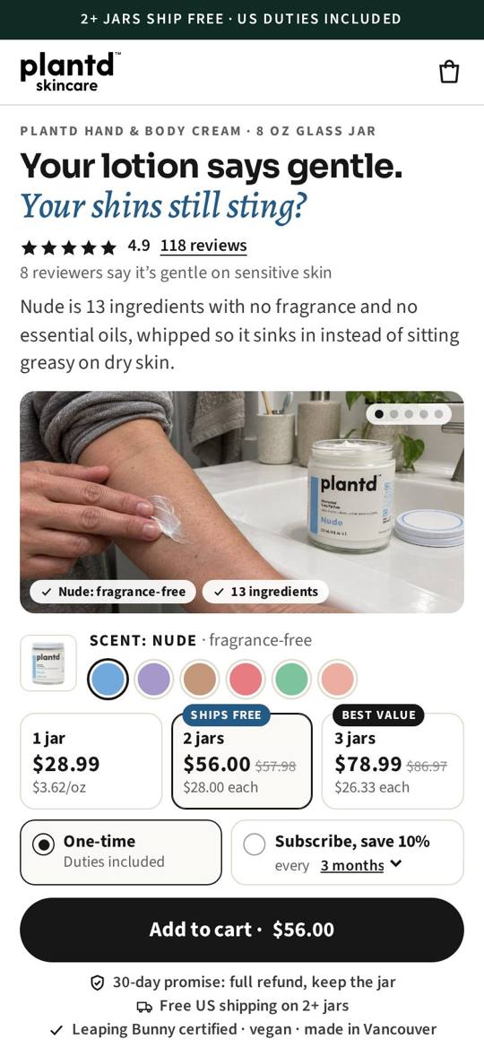
B
Buy on the first screen
Headline, rating, price, bundles and Add to cart all on the first phone screen, with reviews matched to each pain.
Open B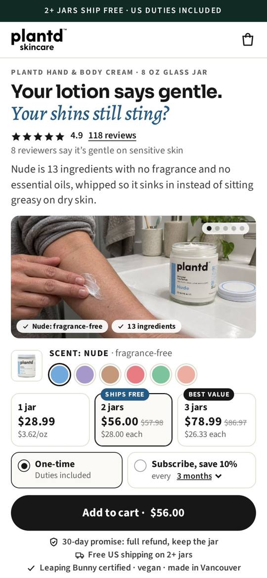
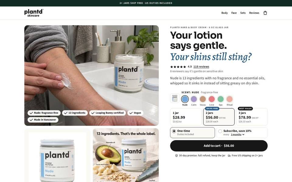
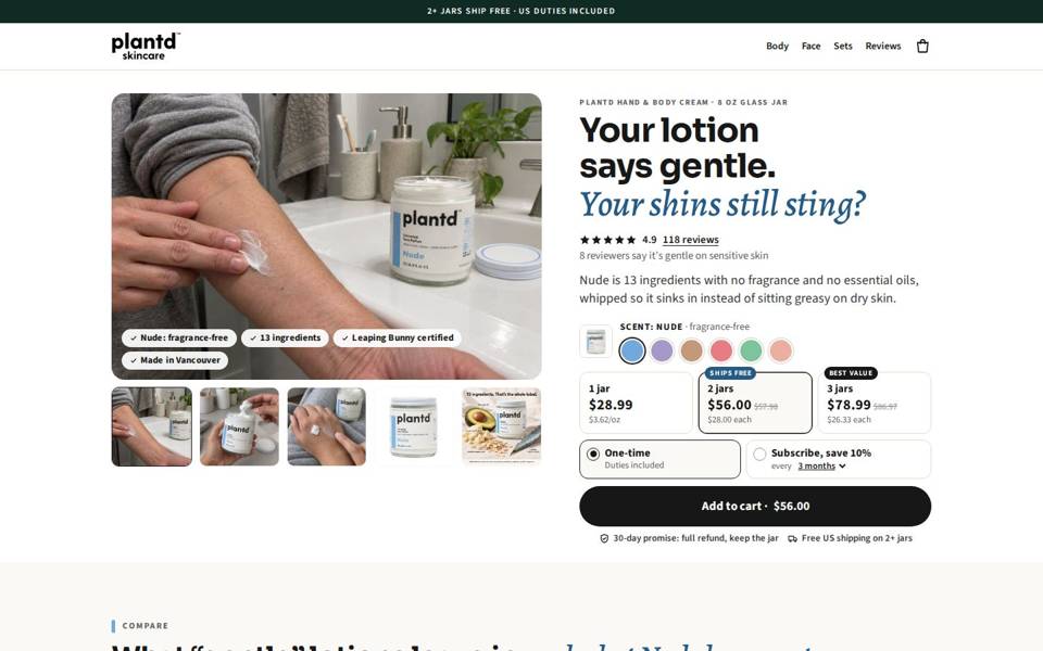
B2
Desktop rebuilt
Same phone page as B. On a laptop: a large photo stack, a buy column that stays on screen, and the comparison told as three short customer stories.
Open B2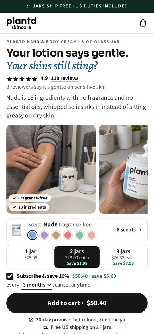
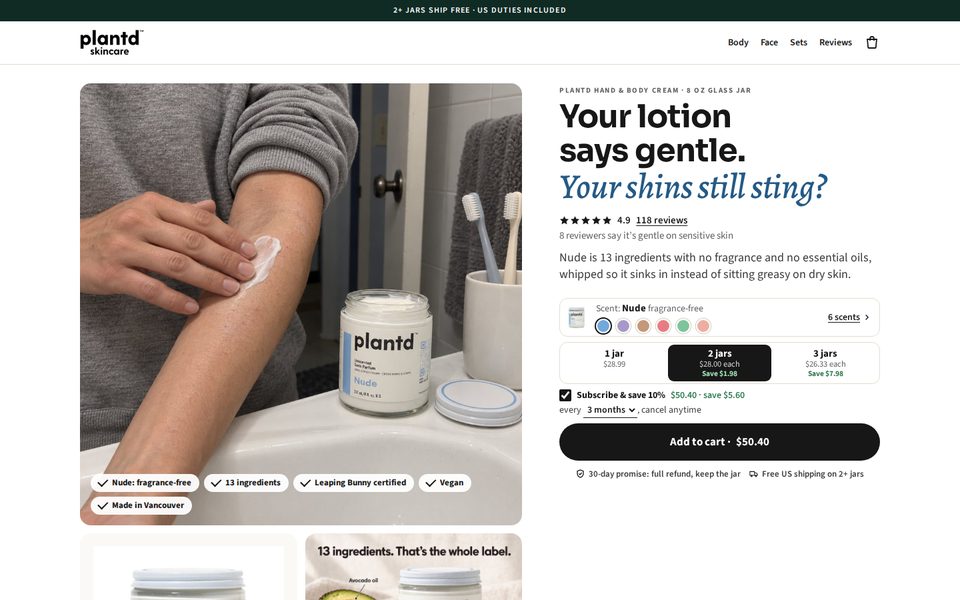
B4
The buy box made plain
Savings shown in dollars ("Save $1.98", "Save $7.98"), the subscribed price spelled out, and the chosen scent named.
Open B4Try the live page
Version B4, the real page. Each button reloads it the way an ad for that pain would land.
Go deeper
Full detail: Website audit, rebuild plan and page blueprints
The operator layer behind this chapter. Inside:
- Every weak point on today's site, ranked by revenue impact
- The rebuild plan for home, navigation and product pages
- Two page blueprints, section by section