
Hand & body cream · product page
Four versions of the page your ads land on
Each version opens with the pain the ad named and sells Nude, the fragrance-free jar. Every link has three views, one per pain: sensitive skin, winter-dry hands, and crepey legs. Prices are today's. Anything marked proposed in the page notes is a recommendation, not live yet.
Scores come from a blind review panel that compared each page with competitor pages. It checks craft and clarity, not sales; real results come from testing with traffic.
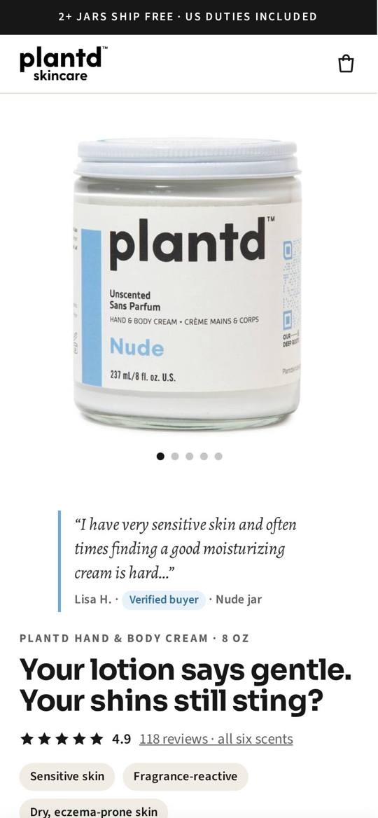
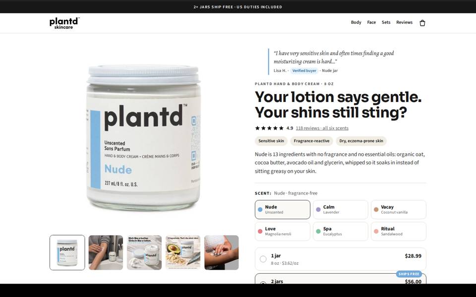
First version: the story first
Pain headline, customer quote and jar, with the buy box further down. Strong at linking the pain to the product. Price and Add to cart weren't on the first screen.
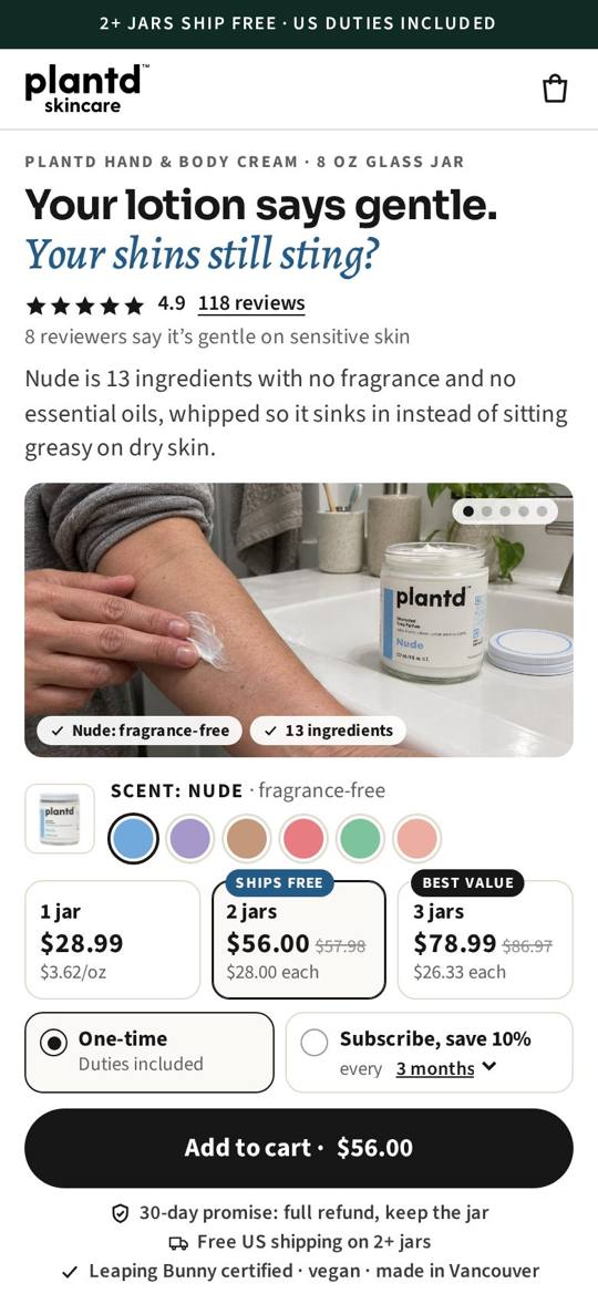
Buy on the first screen
Headline, rating, price, bundles and Add to cart all fit on the first phone screen. Reviews are matched to each pain and filtered by concern. Adds in-use photos, a comparison and how it sinks in.
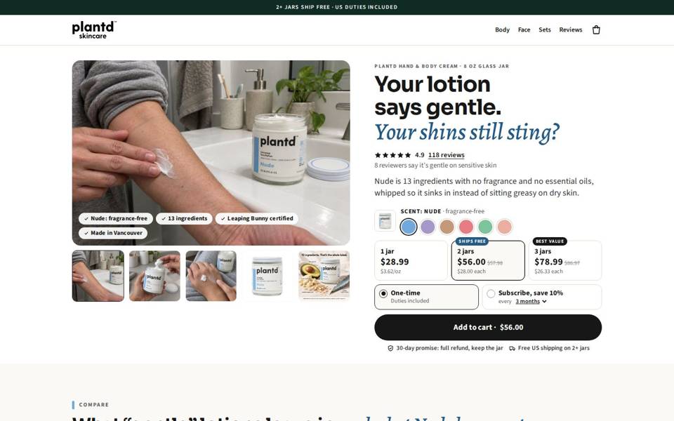
Desktop rebuilt, comparison told in customers' words
Same phone page as B. On desktop: a large photo stack with a buy column that stays on screen, balanced sections, and reviews beside their filters. The comparison becomes three short "what you tried before" stories.
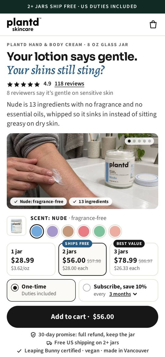
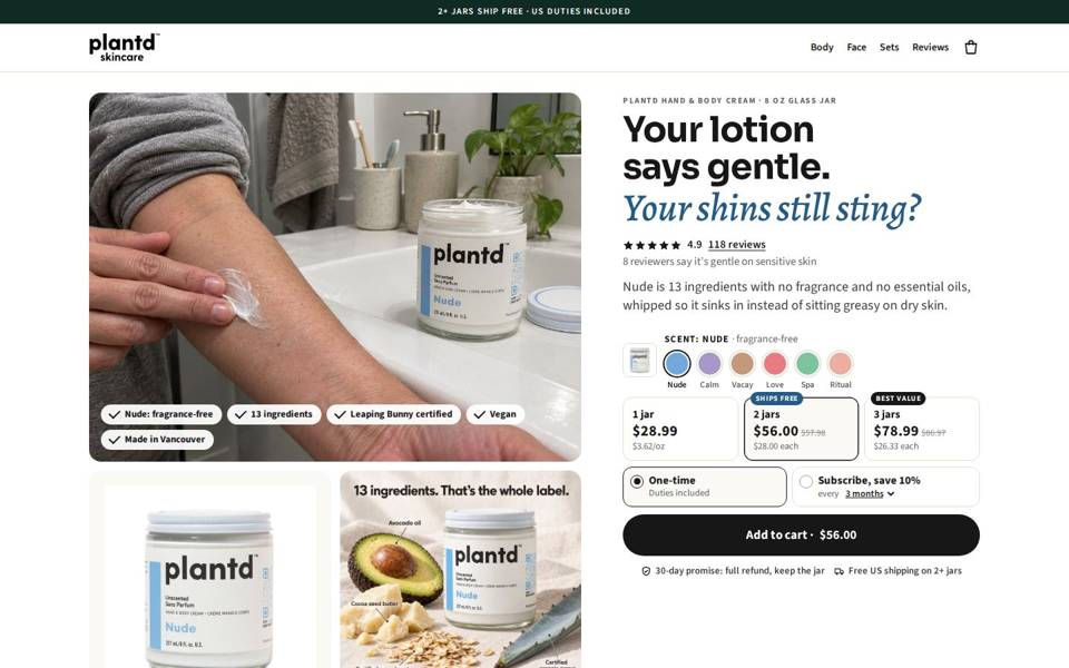
B3 with savings in dollars and named scents
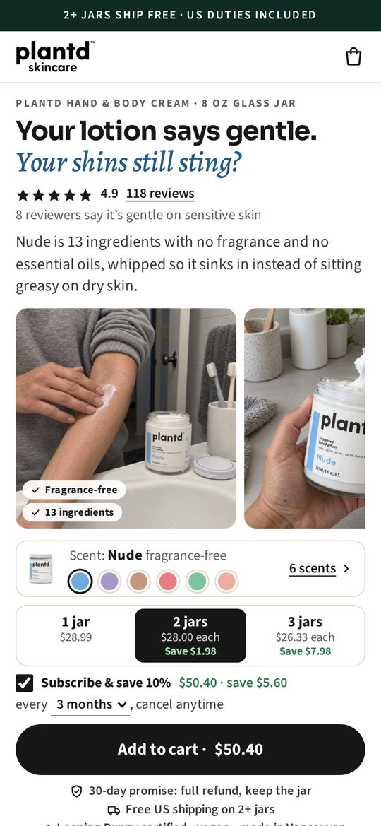
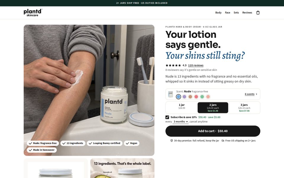
Only the buy box changed: the 2- and 3-jar options show "Save $1.98" and "Save $7.98", and the subscribe line shows the subscribed price and saving ("$50.40 · save $5.60").
Six small scent swatches sit in the scent row with the selected scent named beside them; "6 scents" still opens the full list.
For reference, the same panel on other pages
- plantdskincare.com body cream page today: 5.67 phone scroll, 6.22 desktop scroll
- Herbivore 7.15 · Tatcha 6.95 · True Botanicals 7.03 · OSEA 6.50 · Cocokind 6.38 (phone scroll)
- Buy box alone: Tatcha 7.28 · Nécessaire 7.05 · Cocokind 6.17 · Kopari 5.47