Visual, trust, and commerce audit · 12 September 2026
CHL editorial r1 — rejection audit
A documented diagnosis of why the visual concept missed the brief, what the independent judges actually said, and what broader category evidence changes about the next direction.
Operator rejected
Root synthesis
The visual concept is underbuilt and anonymous for the brief.
Disposition: OPERATOR REJECTED. Earlier internal “ready” and “SHIP” language recorded implementation finish and self-review. It did not establish aesthetic acceptance by the operator.
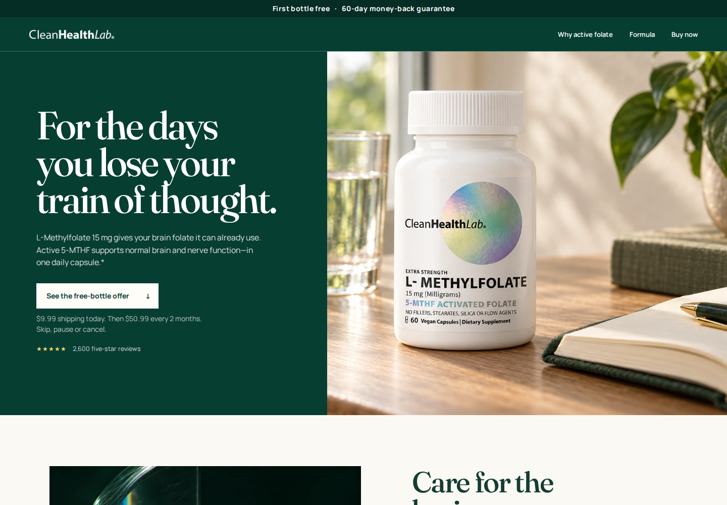
Oversized serif headlines, cream and green bands, staged bottle photographs, and repeated split layouts form a familiar wellness template. They do not build an ownable Clean Health Lab world. The page gives too little visual information specific to this product, repeats the same product-display job in the hero and gallery, isolates people deep in the journey, and promises proof that ends in facts plus an email request instead of an available quality document.
The problem is the composition as a whole: too few distinct visual ideas, too much space assigned to each, and too little brand-specific information carried through them. Green, cream, serif type, and whitespace are not failures by themselves.
Audit only. No numeric score, conversion-lift claim, redesign, Shopify change, or production approval is included.
Three isolated reviews
The independent judges preferred aspects of the candidate. That was not acceptance.
Each judge saw fresh evidence without the other verdicts or the root conclusion. All three expressed favorable aesthetic opinions, so describing this as a unanimous aesthetic rejection would be false. Their comparisons were also too narrow to validate whether the concept met the operator's ownability, humanity, product-specificity, and proof requirements.
Visual identity
Positive: preferred the candidate's coherence, photography, typography, and editorial rhythm to v61.
Limit: called its premium-wellness language interchangeable, its grammar repetitive, and its human scene isolated.
Recorded verdict: strong visual improvement, still insufficiently ownable.
Trust and persuasion
Positive: preferred the readable label, transparent terms, restraint, and high-dose disclosure.
Limit: found company, formulation, and dose authority thin; the 2,600-review count was not independently audited.
Recorded verdict: credible presentation with material trust gaps.
Commerce and mobile
Positive: preferred the aesthetics and learning arc.
Limit: found choices too late, human proof too deep, and the mobile path repetitive before the offer.
Recorded verdict: revise before acceptance.
Ranked diagnosis
Seven reasons the direction failed
The core visual concept is anonymous. Giant serif type, green/cream blocks, staged bottles, and split photo/text modules could move to another premium wellness brand with minor substitutions. The bottle's iridescent circle never becomes a wider CHL visual language.
The image sequence repeats jobs instead of building an argument. A staged bottle hero leads to a separate bottle gallery. Later modules again pair oversized headings with images or rule-based information. Mechanism, ingredient behavior, use, provenance, and human context receive little distinct visual explanation.
Space is allocated to repetition. Formula, proof, routine, and reassurance ideas each receive large display areas while the useful content within them stays thin. The issue is the ratio of space to information, not whitespace alone.
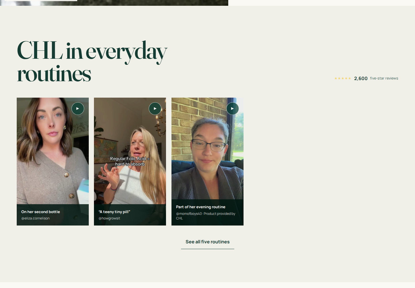
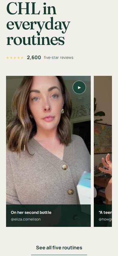
Human evidence is isolated and late. Fresh capture places routines around 5,759 px on desktop and 7,231 px on mobile—about six desktop screens and more than eight mobile screens down at the tested viewports. Three of five cards appear initially; two sit behind a reveal. Capture geometry varies, but the late placement and 3-of-5 state do not.
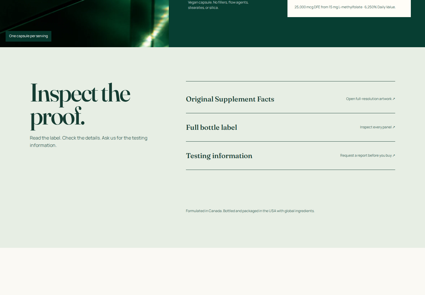
The proof promise exceeds the available proof. “Inspect the proof” offers facts, a readable label, source links, and an email request for testing records, but no inspectable report. The label supports ingredient transparency; it does not establish company authority, formulation rationale, effectiveness, or the review count.
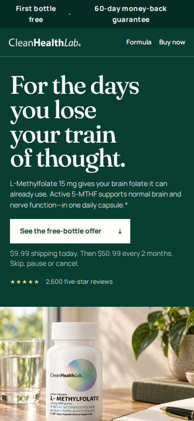
Purchase hierarchy regressed. V61's desktop decision region joined product, dose, a creator cue, and offers. Editorial r1 puts choices below the first 900 px desktop viewport. Mobile shows a hero bottle and another gallery before choices begin; one judge measured the purchase start near 1,507 px. The incomplete v61 mobile hero capture cannot establish an aesthetic comparison.
Large reassurance copy carries too little product meaning. “Care for the brain you count on,” “A daily habit…,” and “Nothing to hide” receive major display hierarchy while product identity and reasons to trust this brand and dose remain small. The pain-led opening starts a useful argument but does not complete it.
Candidate pixels
The failure is visible in sequence, density, and proof placement.
Desktop opening: large premise and staged bottle; purchase choices begin below the tested first viewport.Proof section: readable facts and sources, but no inspectable quality report.Desktop routines: 3 of 5 cards initially, late in the page, with a large unused grid region.Mobile opening: premise first, followed by another product-image sequence before purchase choices.Mobile routines initial state: three visible creator cards.Mobile routines after the visitor asks to see all five.
Evidence boundaries
20 brands were evidence-screened; 13 brands received direct current visual review.
The 20-brand research matrix spans supplements, beauty, food, apparel, home, accessories, and consumer technology. Four user-named anchors—Grüns, IM8, Seed, and Salt & Stone—were handled alongside it. Screening means a source or product path was reviewed; it does not mean every page was visually inspected. The direct screenshot comparison covers 13 brands from the combined set: Grüns, IM8, Seed, Graza, Dr. Squatch, Jones Road, Huel, Aje, Anker, Oura, Ridge, Gymshark, and Murad.
Evidence lane
Examples
What it supports
What it does not support
Vendor-reported commercial outcome
Murad +56% store conversion after migration; Aje +135% after replatform/mobile work; BODi +10 percentage points at checkout launch.
Why a commerce implementation or brand merits study, within the stated vendor context.
A causal claim that a PDP visual pattern produced the result.
Commercial scale or popularity
Huel brand-published FY24 reporting; Oura SEC filing; other documented scale entries in the source matrix.
Why the business is a credible reference candidate.
Page-level conversion or proof that its current design is optimal.
Direct current visual evidence
13 named brands with readable captures in this report.
Composition, information order, image roles, product explanation, human presence, and visible proof architecture.
Sales lift, causal performance, or a “highest converting” rank.
Directional or selection only
Allbirds has no reported percentage; HexClad was challenge blocked; other recognition-only entries lack primary conversion data.
Research selection or a narrowly stated directional outcome.
Quantified comparison or visual judgment from blocked pixels.
Shopify and other vendor case studies combine platform, checkout, merchandising, marketing, and operational changes. Their outcomes are reported with those limits. The complete source links and all 20 entries are in the readable evidence matrix and JSON record.
Direct visual comparison
Useful references change the job of each image and make the product legible.
These are observed pixels, not conversion rankings or designs to copy. The primary structural references are Grüns, IM8, and Seed. Graza and Dr. Squatch show distinctive systems; Jones Road shows human fit; Aje and Oura show product tangibility. Each screenshot opens at full readable size.
Grüns · primary structure
gallery merchandisingproof near decisionownable graphics
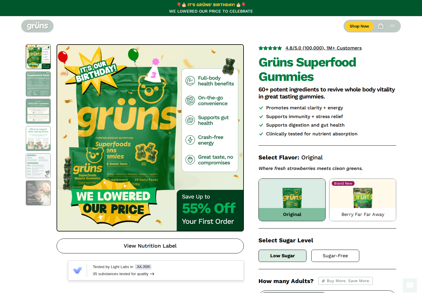
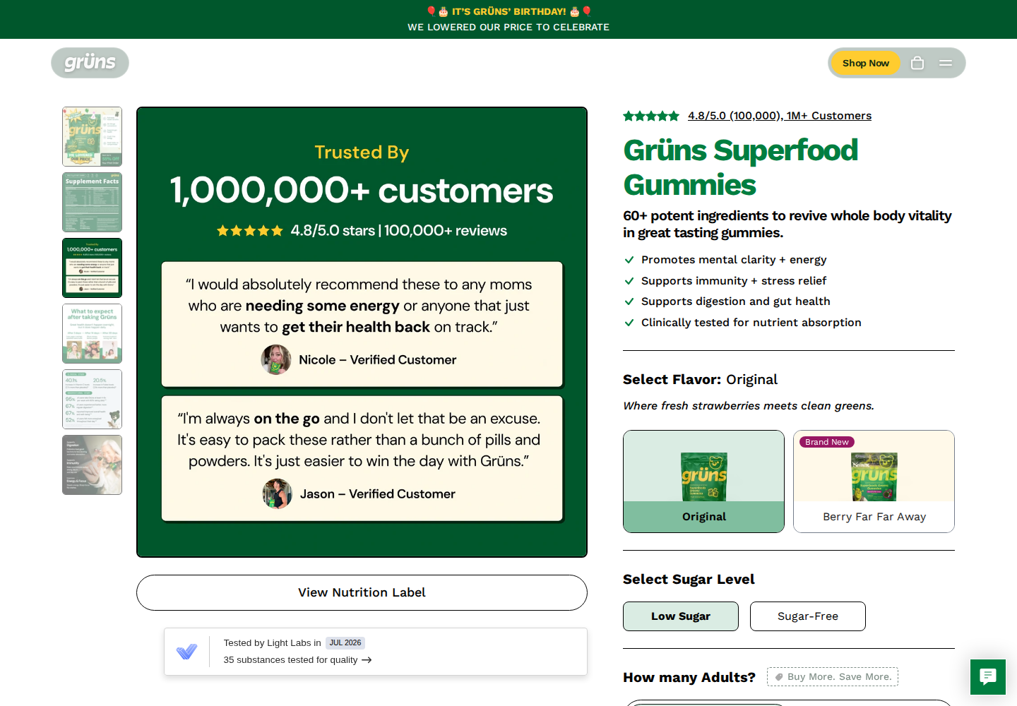
A benefit-annotated packshot, attributed testimonial gallery, and lab-test entry near the buy box give product and proof separate jobs. Mint, yellow, green, a mascot, and strong outlines form a recognizable system. UGC embeds were blocked, so playback was not evaluated. Studied product page.
Benefit-annotated product and buy context.Attributed testimonials in the gallery.Mobile proof and lab-test entry.
IM8 · primary structure and human support
different gallery jobsclinician contextpeople early
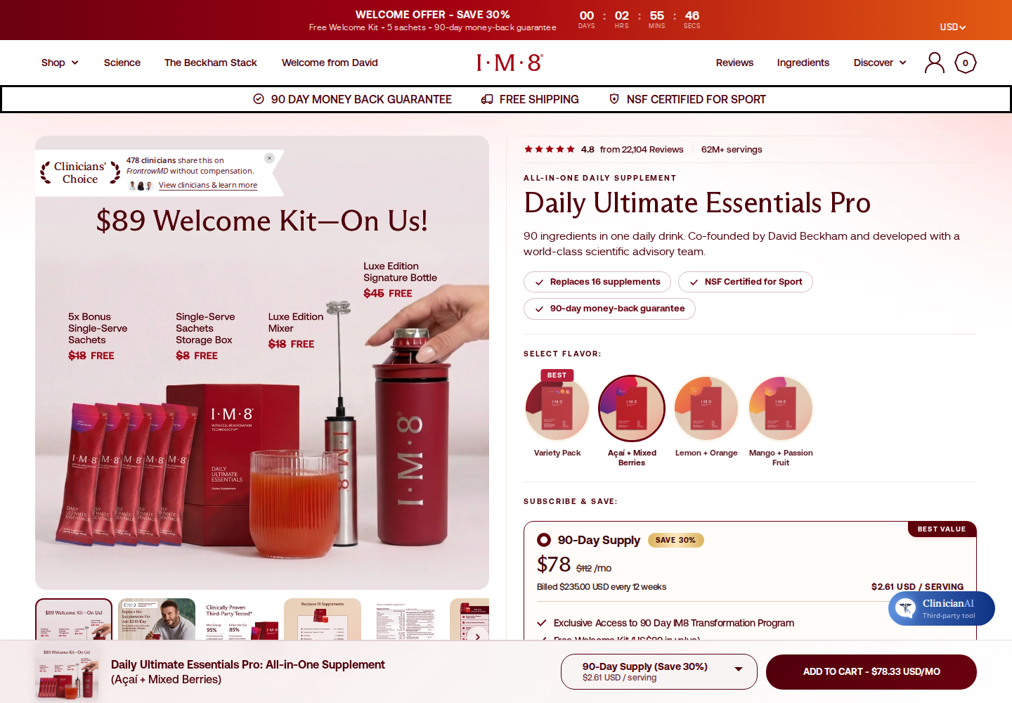
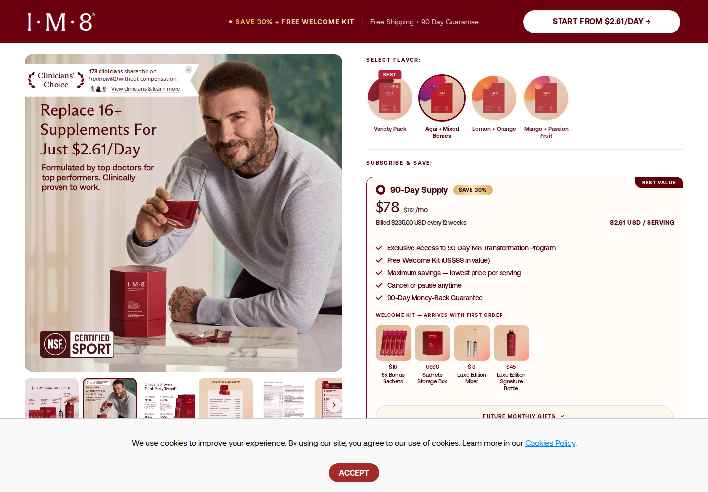
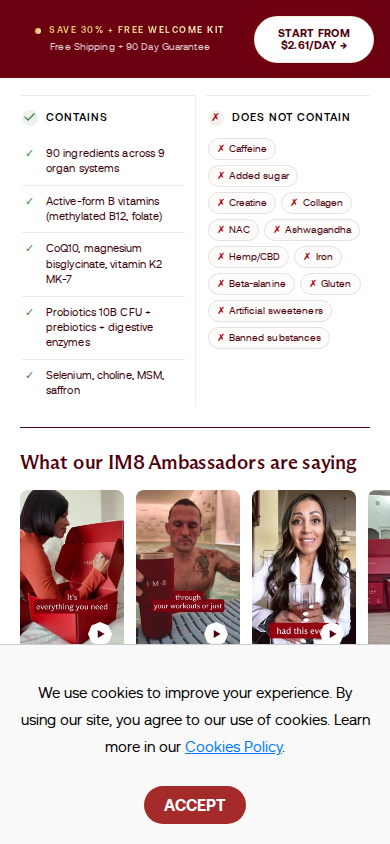
Gallery frames change the argument across kit contents, benefits, and people. Clinician context sits near purchase; saturated burgundy and named-ambassador imagery keep human support from becoming one isolated deep section. The first desktop image is a verified cookie-cleared product opening. Studied product page.
Cookie-cleared desktop product opening.Gallery image changes the information conveyed.“What our IM8 Ambassadors are saying” card row. A cookie panel obscures roughly the lower 200 px, so this does not evidence the full section.
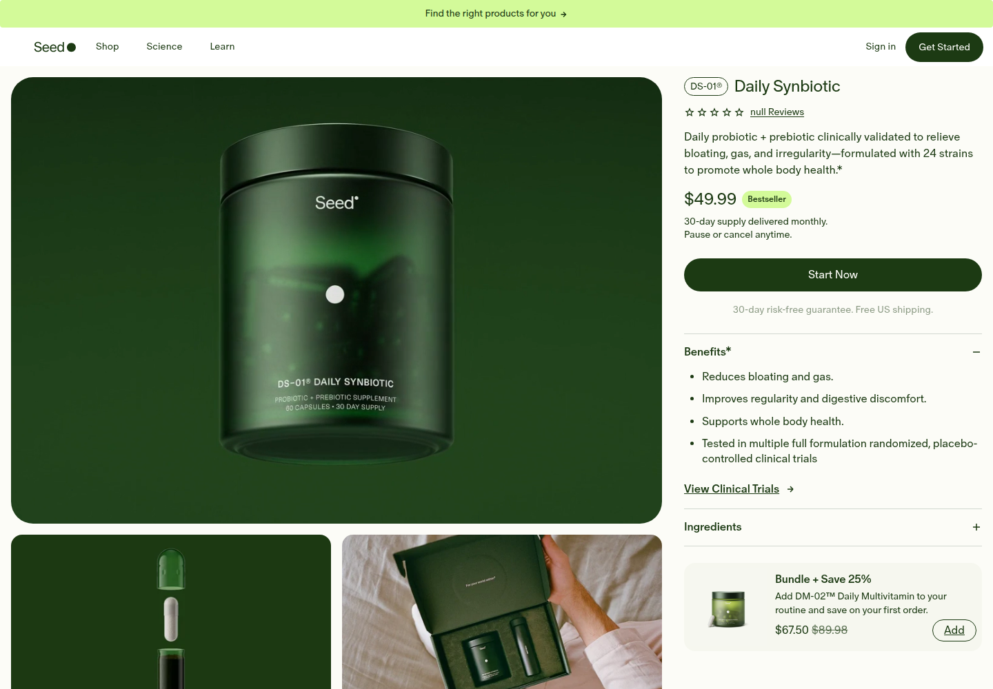
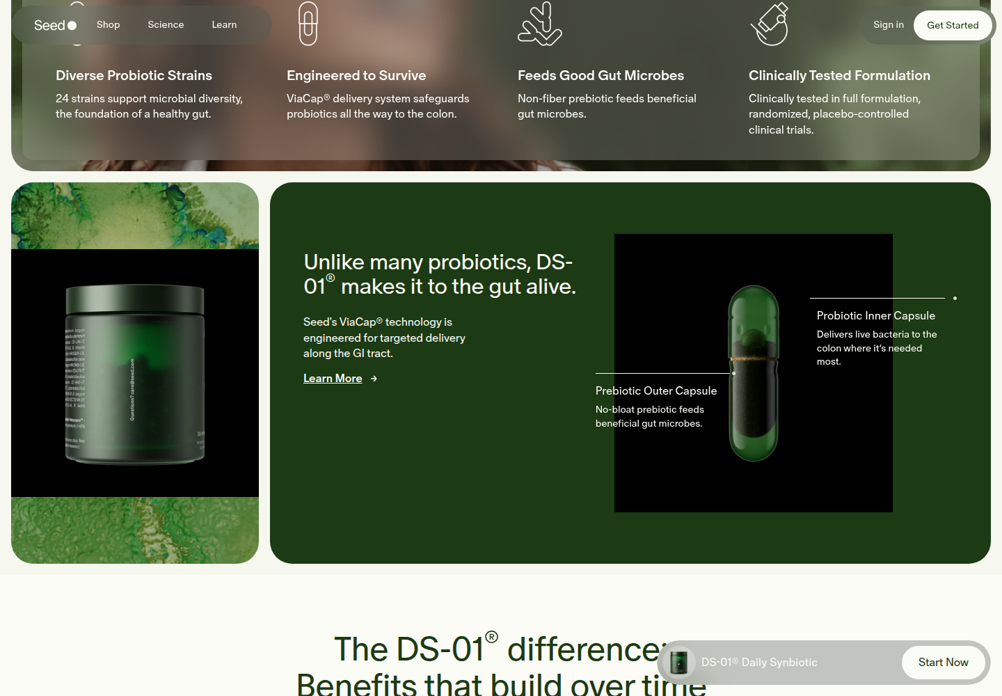
Translucent materials, microscopic textures, and exploded-capsule callouts explain mechanism and vary composition while staying within a green/cream palette. The palette is not the differentiator; the product-specific visual information is. Only two desktop captures were usable; challenge-state captures, including mobile, are excluded. Studied product page.
Usable desktop product view.Usable mechanism and material view; no mobile comparison is claimed.
Graza · primary distinctiveness
packaging languageproduct differenceusage imagery
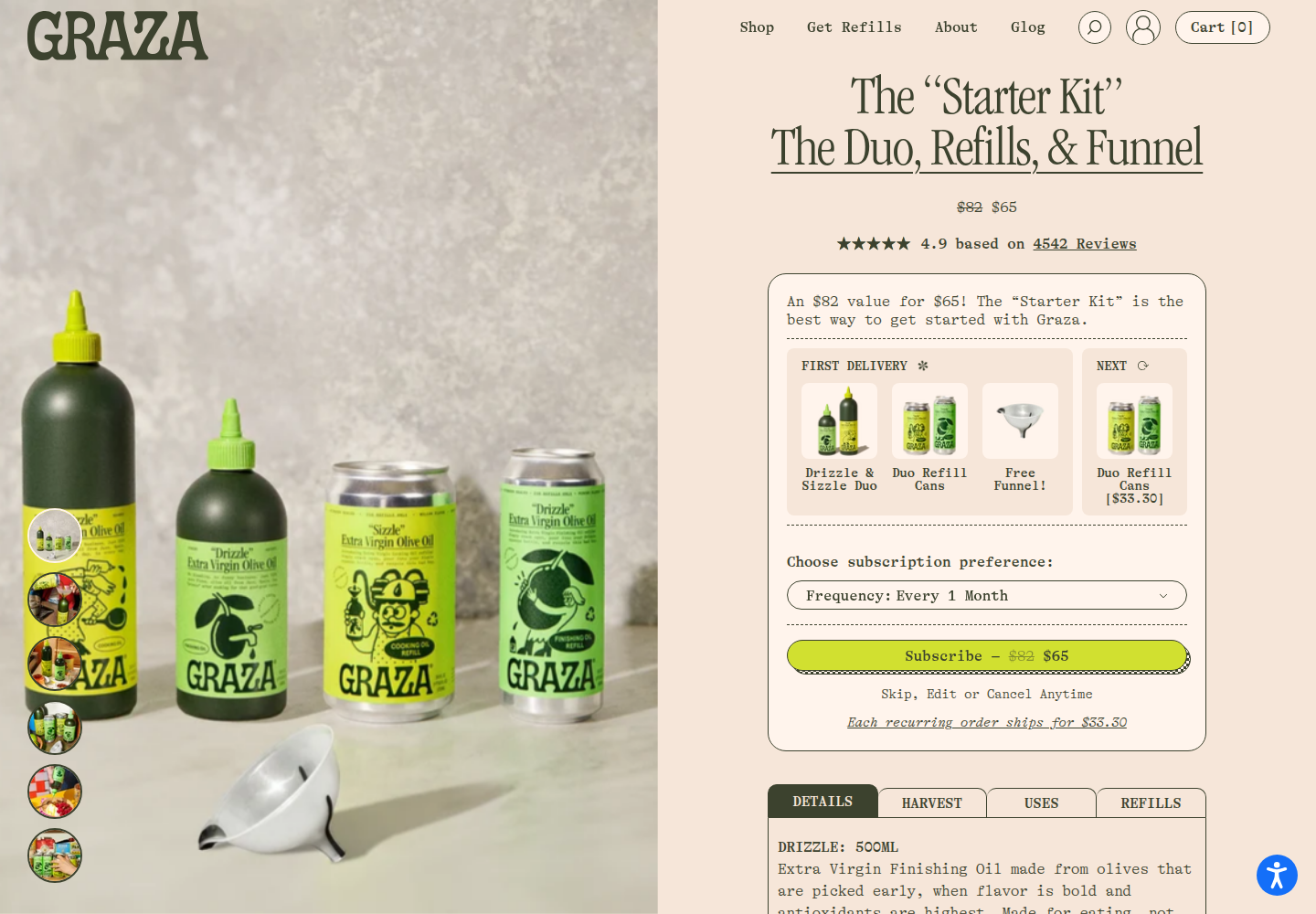
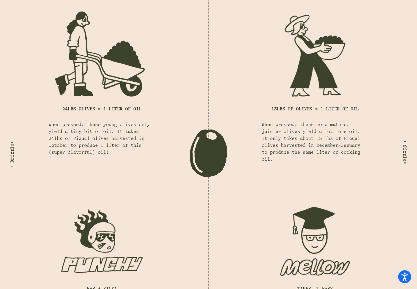
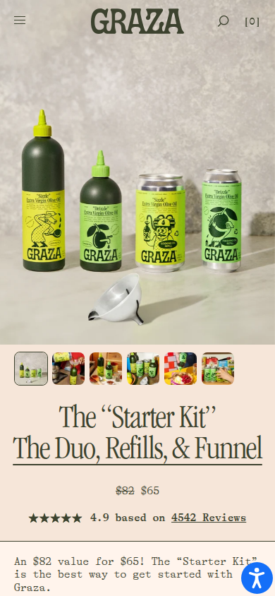
Illustrated packaging continues into color, linework, harvest explanation, food use, and delivery sequence. The 24-pound-versus-13-pound olive comparison and punchy-versus-mellow distinction turn product differences into visual information. Studied product page.
Packaging establishes the visual world.Harvest quantities and flavor roles become visible product explanation.The system remains recognizable on mobile.
Dr. Squatch · primary distinctiveness
physical texturepackaging continuityproduct character
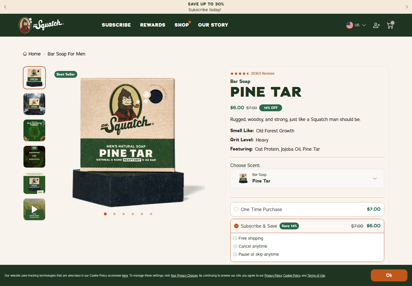
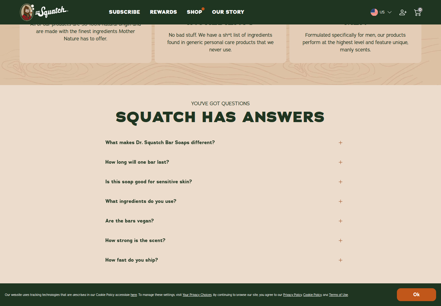
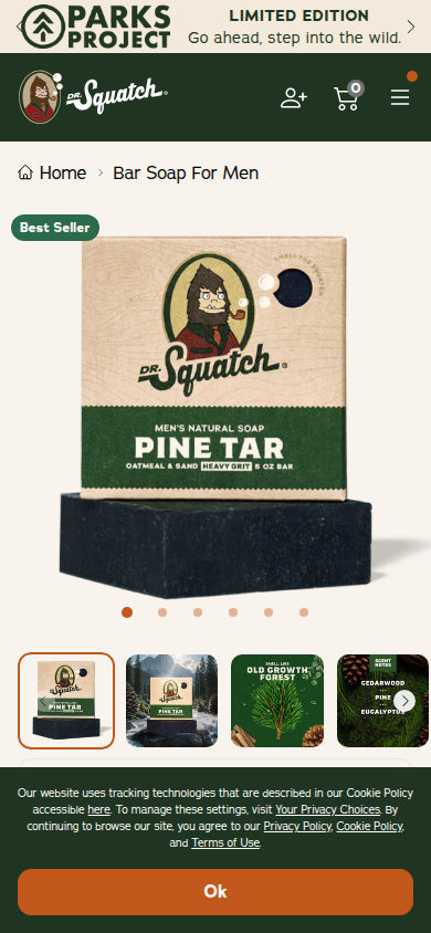
Packaging graphics, wood and soap textures, hard contrast, and ingredient imagery carry product character through the page. This is useful as a continuity model, not as a tone to imitate. Studied product page.
Packaging and physical product texture share the opening.Material and ingredient imagery continue the product identity.Mobile retains the same physical character.
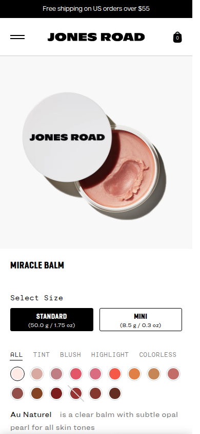
Jones Road · primary human fit
real peopleuse and tonecapture limit
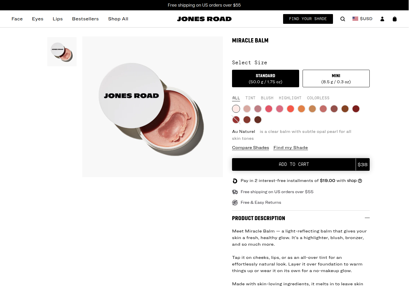
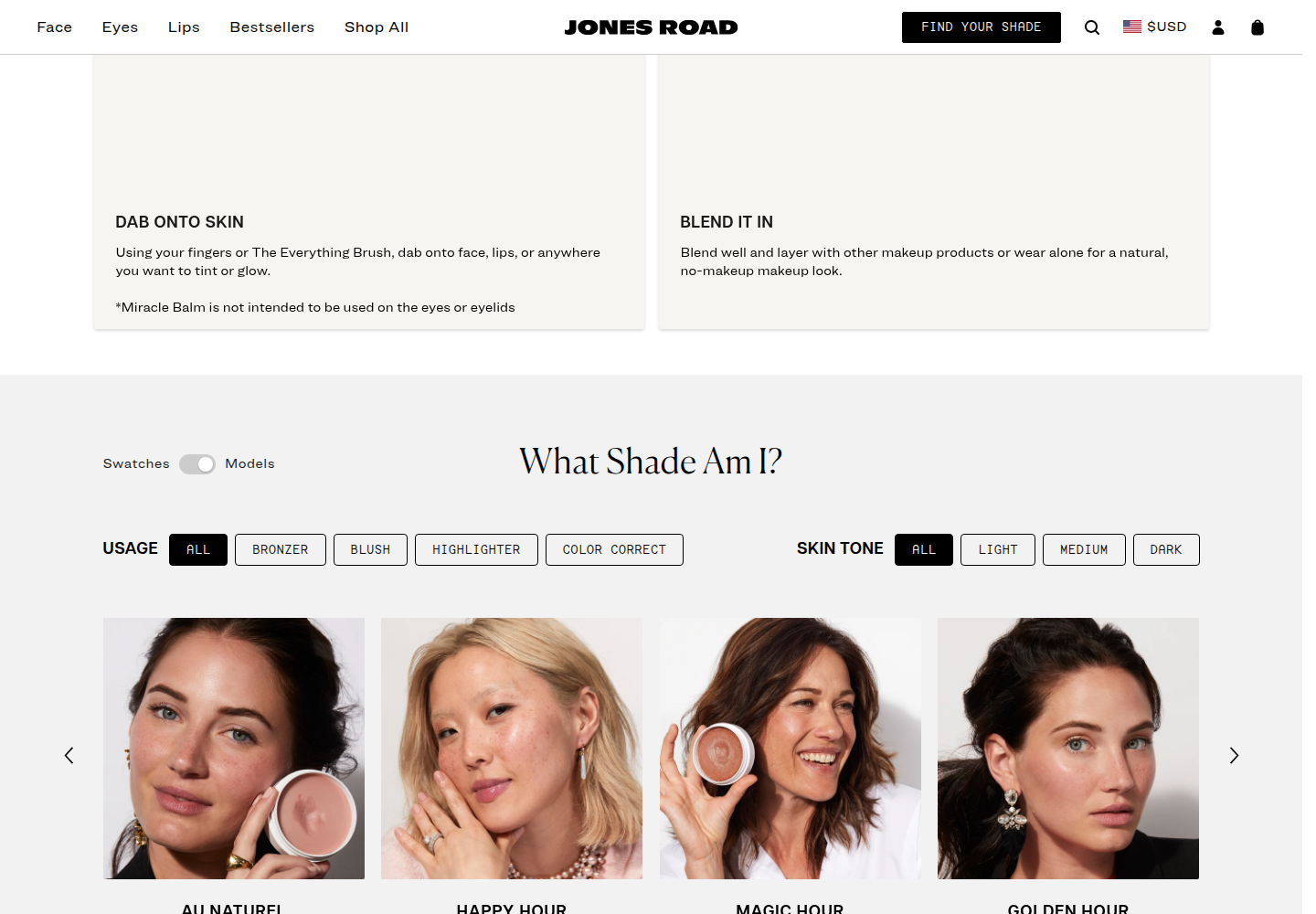
Four women, usage imagery, and skin-tone filters make fit and use visible. Upper how-to-use video panes were blank in the capture, so those panes are not treated as evidence. Studied product page.
Final usable desktop product-and-person state.Real people and fit filters; blank video panes are excluded from the finding.Final usable mobile product-and-person state.
Aje · primary product tangibility
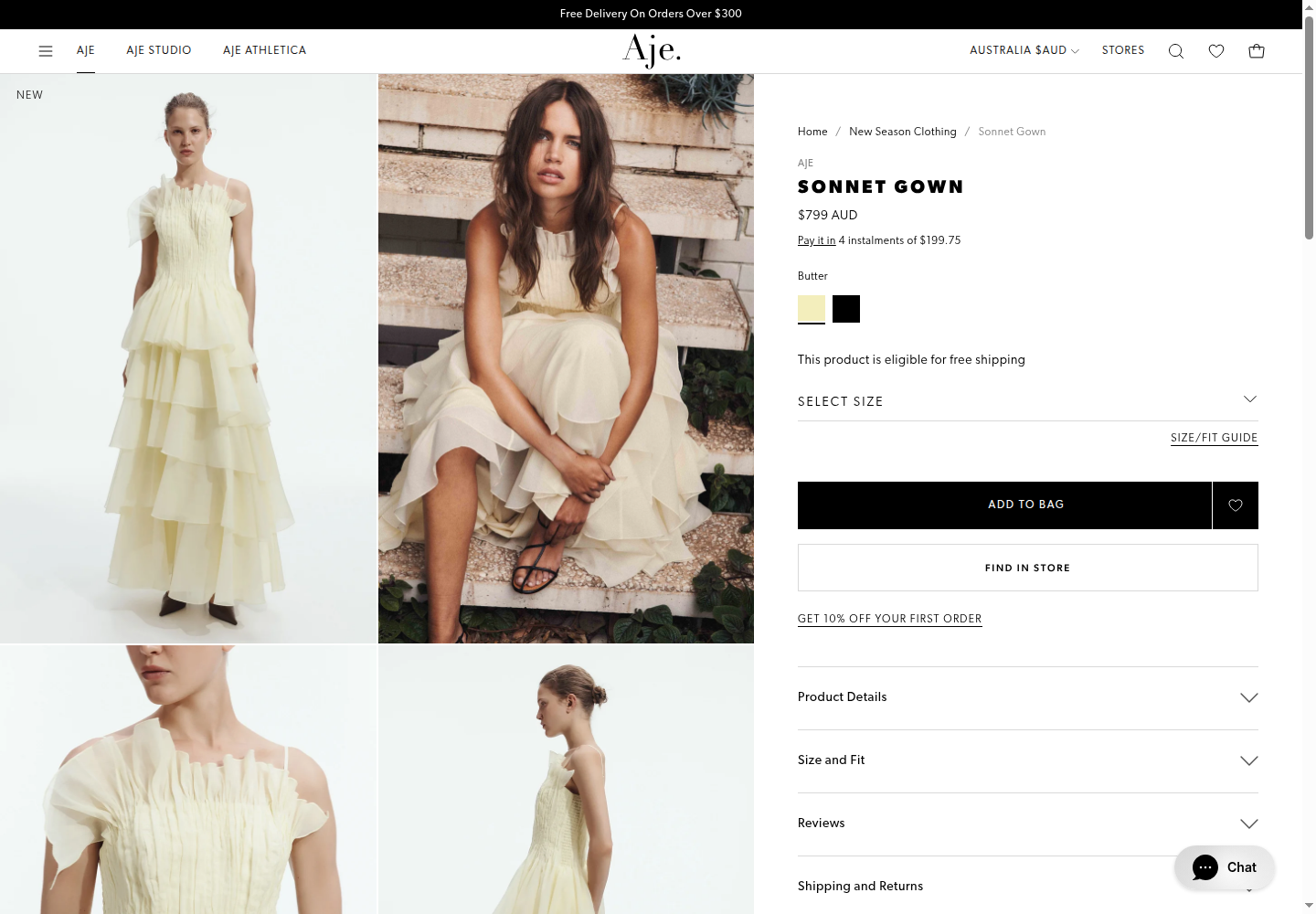
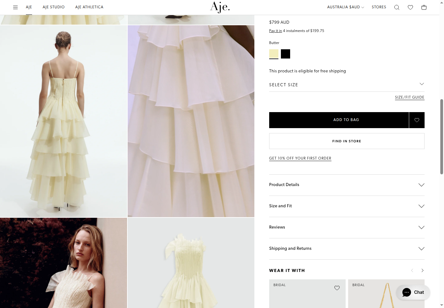
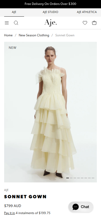
different image jobssticky decisionvendor outcome qualified
Full-body, close-up, and editorial photographs answer different product questions while the purchase panel stays stable at the right. Aje's vendor-reported 135% post-migration conversion increase establishes study relevance, not causation by this layout. Studied product page.
Full-body and product views with a stable purchase panel.Close-up and editorial images do different work.Mobile product and purchase state.
Oura · primary product tangibility
materialssensor close-upsproduct overview
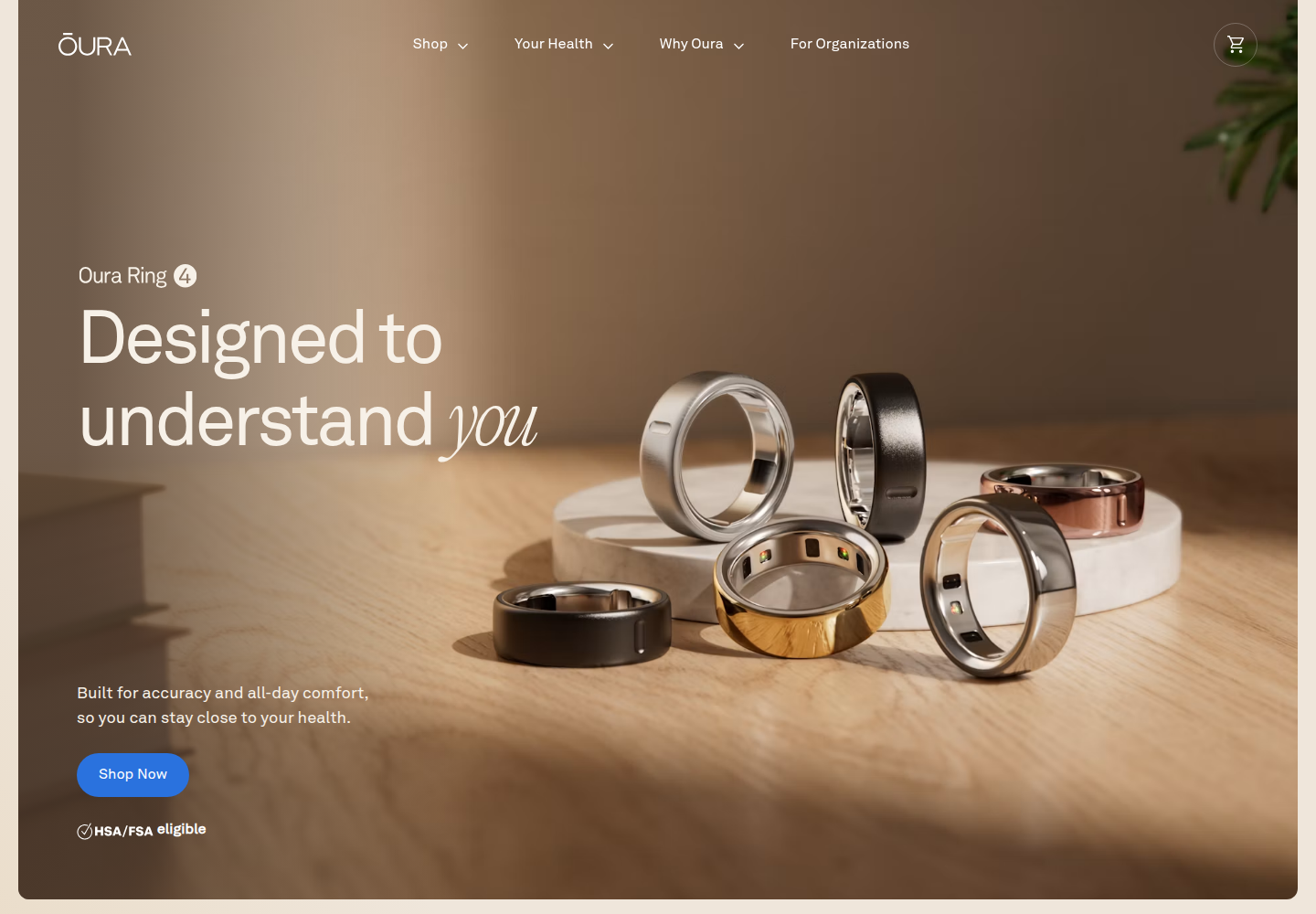
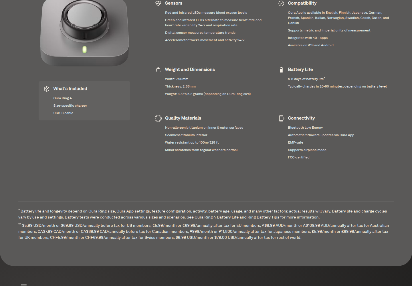
The product-overview page uses tactile wood and metal, controlled shadows, sensor close-ups, and a technical specifications table with footnotes to make a small device physically credible. It is not a buy PDP, and its long hero is not a model for CHL purchase architecture. Studied product overview.
Product-overview atmosphere and material finish.Despite its filename, this is a specifications table: materials, dimensions, battery, compatibility, and footnotes.Tactile product overview at mobile width.
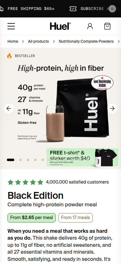
Huel · product explanation
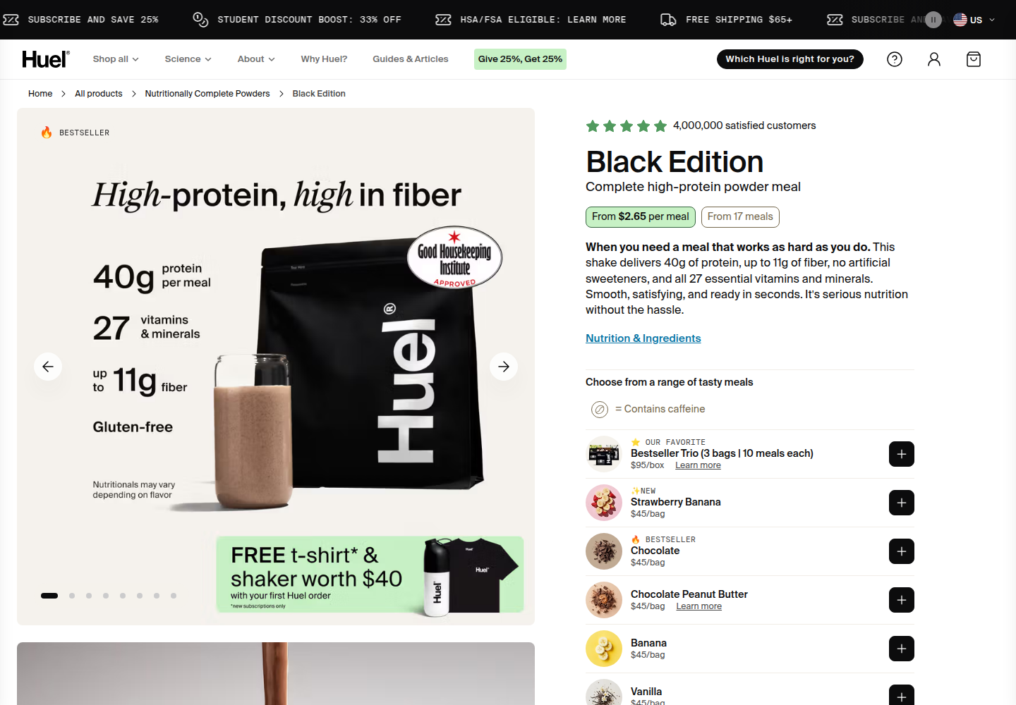
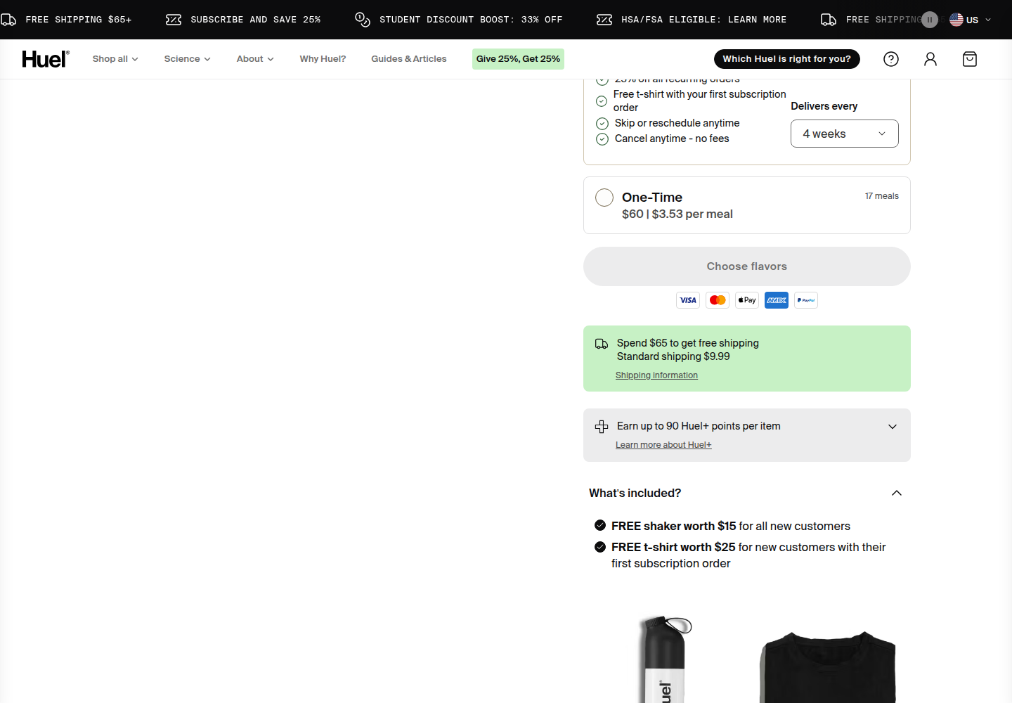
Annotated nutrition, real flavor texture, and a concrete use case give the gallery useful information jobs. The verified later desktop frame contains purchase options, shipping, and what's included; it is not a story section. Studied product page.
Annotated nutrition, flavor texture, and use case.Purchase options, shipping, and what's included; filename does not define the content.Verified mobile product state.
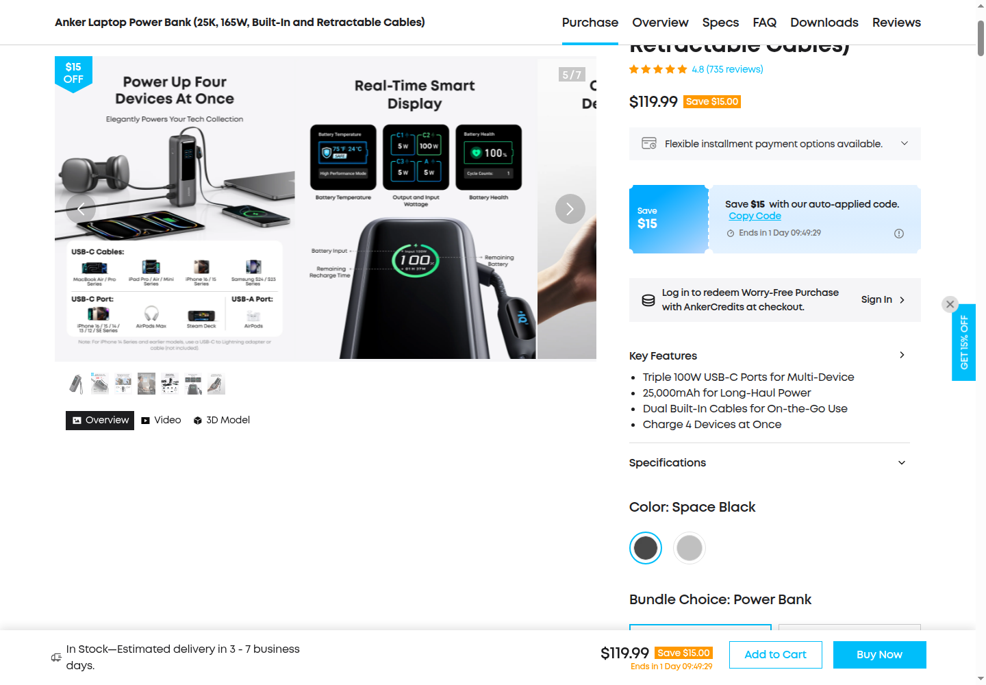
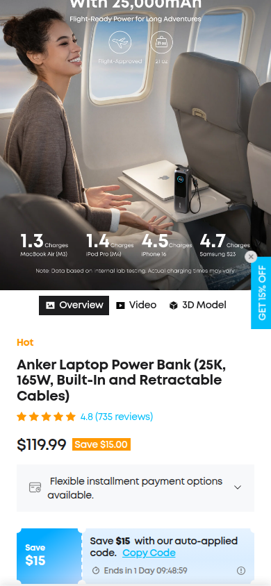
Anker · specification and choice clarity
Illustrated specifications, hand scale, dimensions, and choice summaries reduce ambiguity. Its promotional and upsell density is unsuitable for CHL. These captures are gallery/purchase states; their filenames do not prove page scroll position. Studied product page.
Desktop gallery frame with hand scale and specifications.Travel use, device-specific estimates, rating, price, and product.
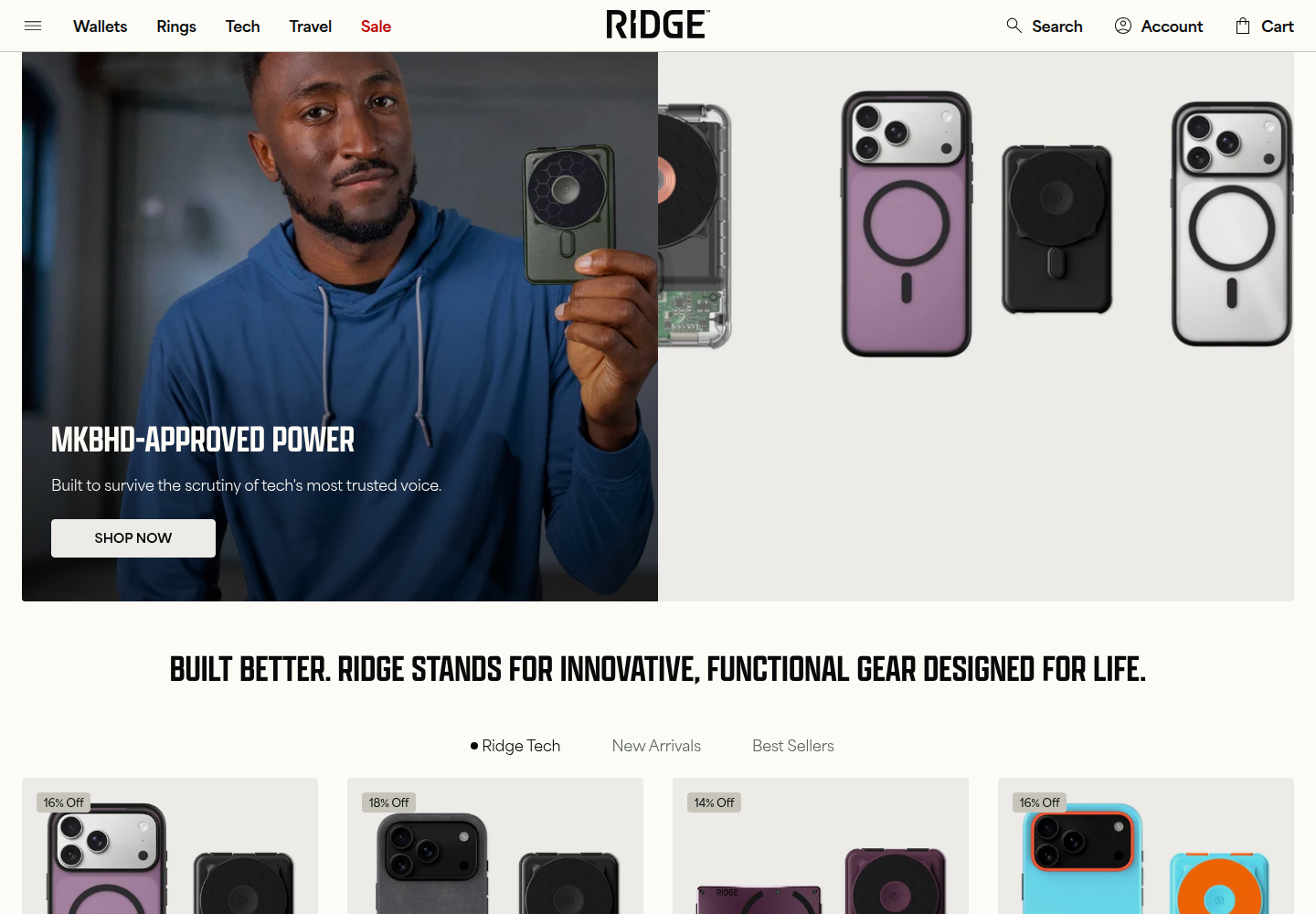
Ridge · homepage identity only
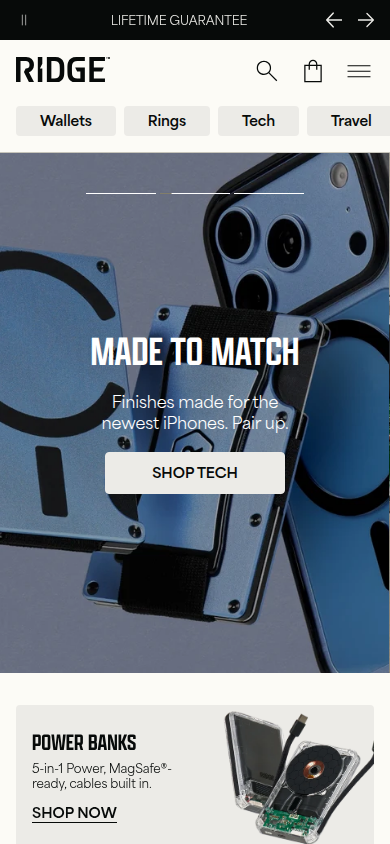
The available screenshots are homepage evidence, not a wallet PDP. Material-finish close-ups and a named expert endorsement support an identity observation only. Studied homepage.
Desktop homepage material finish and named endorsement.Mobile homepage evidence. No wallet-PDP claim is made.
Gymshark · trust through fit and limitation
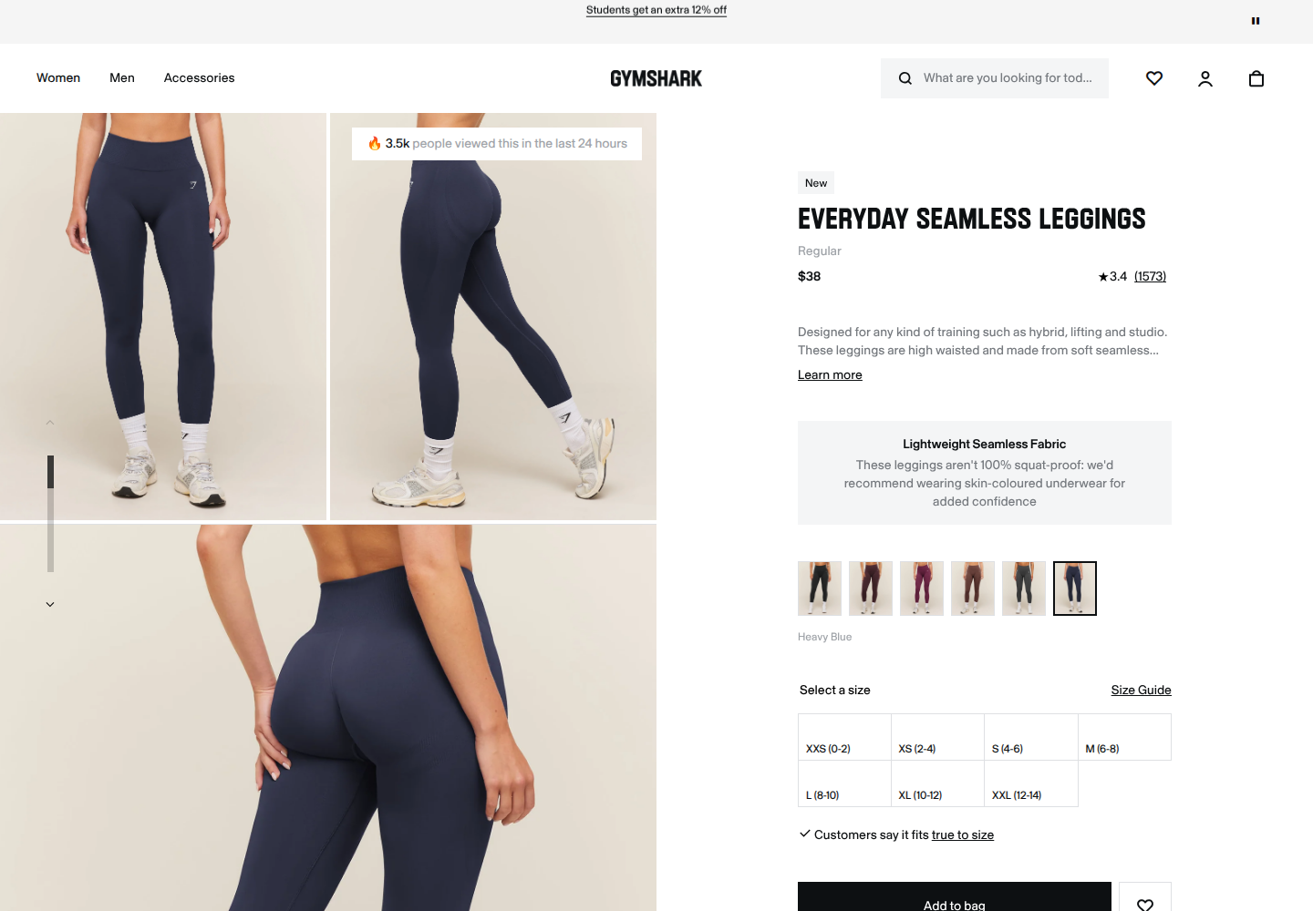
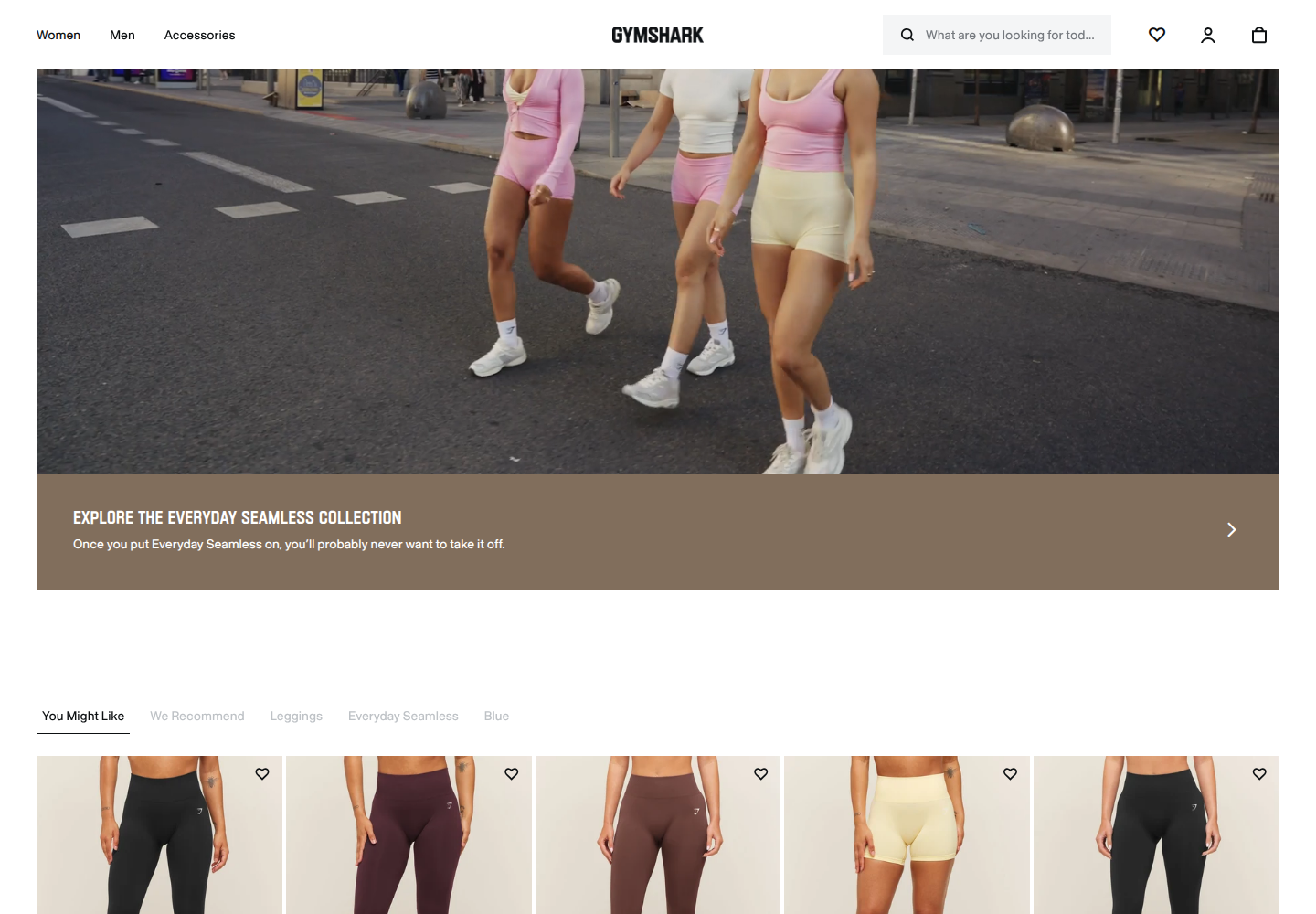
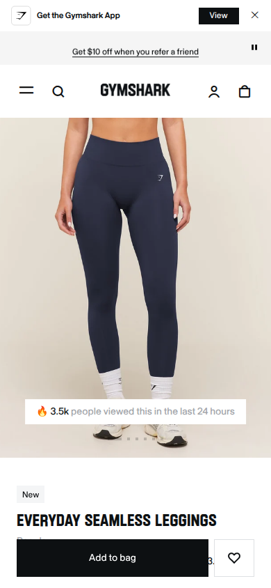
A visible 3.4 rating, a frank “not 100% squat proof” limitation, fit guidance beside sizes, and model images from different angles answer risk at the decision. The later collection lifestyle and recommendation row is not treated as a product-story section. Studied product page.
Clean desktop decision state with fit guidance and frank product limitation.Collection lifestyle and recommendations, accurately labeled.Clean mobile product decision.
Murad · use sequence and decision detail
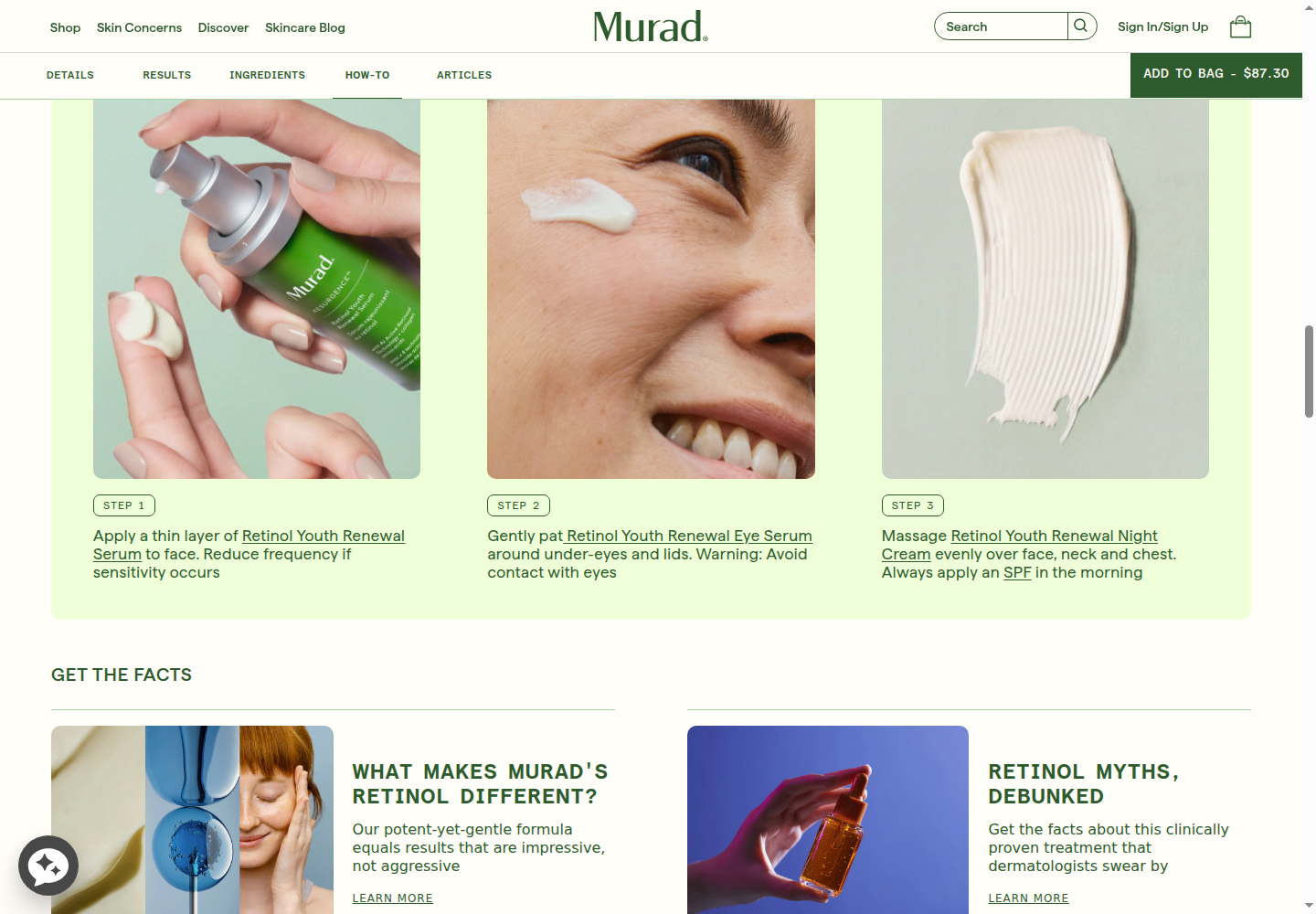
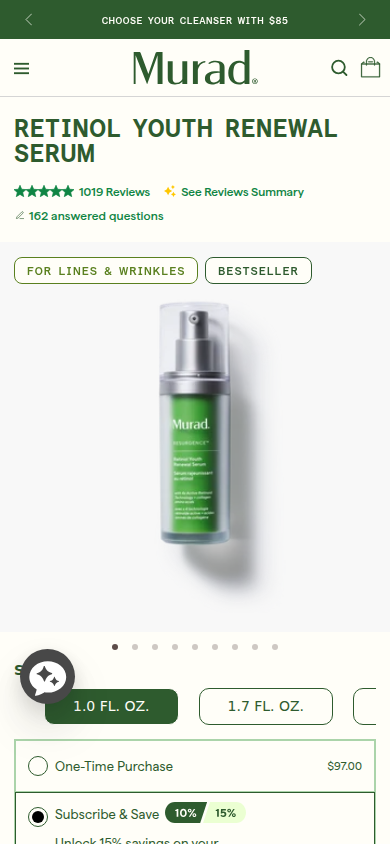
Large frames show dispensing, application on a real person, and cream texture; numbered steps and educational articles extend the explanation. The mobile decision state joins name, reviews/questions, benefit tags, product image, size, and subscription. Murad's vendor-reported 56% post-migration conversion increase is a whole-store outcome, not proof of this composition. The modal-blocked desktop opening is excluded. Studied product page.
Usable desktop body: dispensing, real-person application, texture, steps, and education.Usable mobile decision state: product, questions, benefits, size, and subscription.
Research and process correction
The first audit process rewarded finish and missed the governing question.
The initial archive included 14 references: seven with usable visual evidence, two blocked captures, and five text/indexed-only references. IM8 was text-only and Grüns was absent, so key user-named benchmarks were not visually studied. Its 34 screenshots included failed captures; screenshot count did not equal deep comparison.
The final review checked five implementation details—kickers, text floors, tracking, insets, and overlay—and then recorded “SHIP.” An earlier round called the concept approved and its creative ceiling reached. Those were internal assessments, not operator acceptance. Fifty-five browser checks established function, not commercial or aesthetic success.
The detector produced 12 findings: three warnings and nine advisories. Its cream-palette and overused-font signals are secondary familiarity evidence. Palette alone, hidden modal borders, and color advisories do not explain the rejection. No Impeccable snapshot was stored because that schema requires a numeric score and this scoped audit did not run a fresh full heuristic test.
Preserve and replace
Keep factual clarity. Replace the visual and evidence system.
Preserve the readable Supplement Facts, honest first-payment and renewal terms, cancellation and one-time choices, guarantee, high-dose disclosure, real CHL imagery, and the valid pain-led opening.
Create one distinct product-and-purchase opening.
Give gallery frames separate jobs: identity, readable label and dose, capsule scale, use, and verified quality.
Make all five verified creators visible or browsable early, without an empty grid.
Place attributed real reviews near the objections they answer; invent no quotations.
Show company provenance and an accessible real quality document, if available.
Build product-specific art direction from the existing packaging palette, iridescent circle, and real photographs.
Use varied, purposeful image scale and customer-problem language constrained to verified claims.
Avoid giant numbers, empty carousels, and aspirational copy presented as evidence. Compare desktop and mobile acceptance frames side by side before another full build. Preserve the rejected immutable PDP; any next revision must be a new fork.
Readable source archive
Independent verdicts, measurements, and research records
Method: three isolated fresh visual judges; independent candidate capture and state measurement; exact hosted HTML/CSS/JS byte comparison; an expanded, scope-labeled evidence screen; direct current screenshot review of 13 brands; and a separate root synthesis. Candidate index SHA-256: 398711f96eacaadf584bbcc6758d42f646c1fcf1ea45b005618e4bb2f8be853c. The v61 mobile hero capture is incomplete and was not used to claim mobile appearance superiority.