CHL Research

Cross-industry ecommerce identity research · 13 September 2026

A CHL page people want to explore.

How recognizable ecommerce brands connect identity, product explanation, proof, and buying—without asking shoppers to relearn how a product page works.

Research findings and proposed CHL direction.

01 · Answer

Make the real product understandable and the daily experience tangible.

CHL needs a more deliberate visual journey. Its useful assets and genuine customer evidence currently arrive as repeated headings, pale surfaces, paragraphs, and panels. A shopper has to read to learn why the next section matters; mobile stacking makes that repetition more pronounced.

Keep the existing green palette, photography, product information, and genuine reviews. Change the relationships between them: show a relevant human moment, let the product answer it, reveal the supporting evidence, and make the purchase choice easy to understand. The distinctive identity must continue through explanation, proof, and buying instead of ending with the hero image.

Human momentProduct answer Supporting evidence Clear choice

This conclusion combines four different forms of evidence: community discovery, original design case studies, publisher-reported commercial results, and fresh browser captures. They answer different questions. An identity case can teach visual coherence without proving conversion. A successful experiment can teach usability without making the store an aesthetic model. There is no defensible public league table establishing which store here has the highest conversion rate.

02 · Evidence

What the community actually recommends

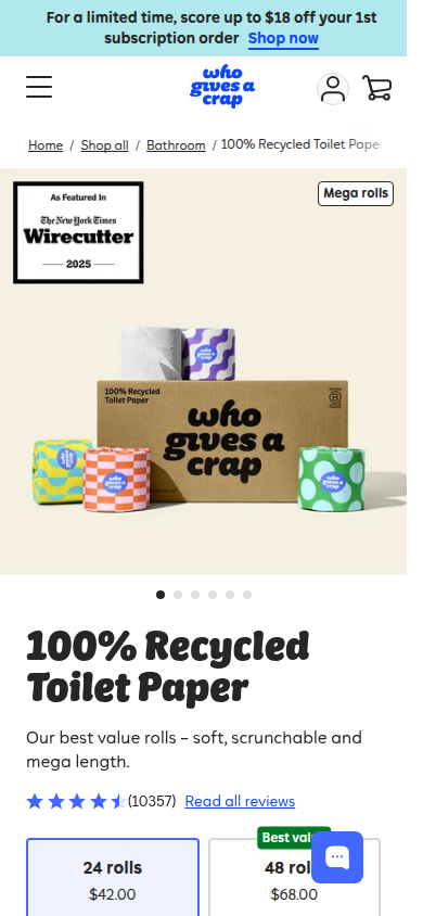
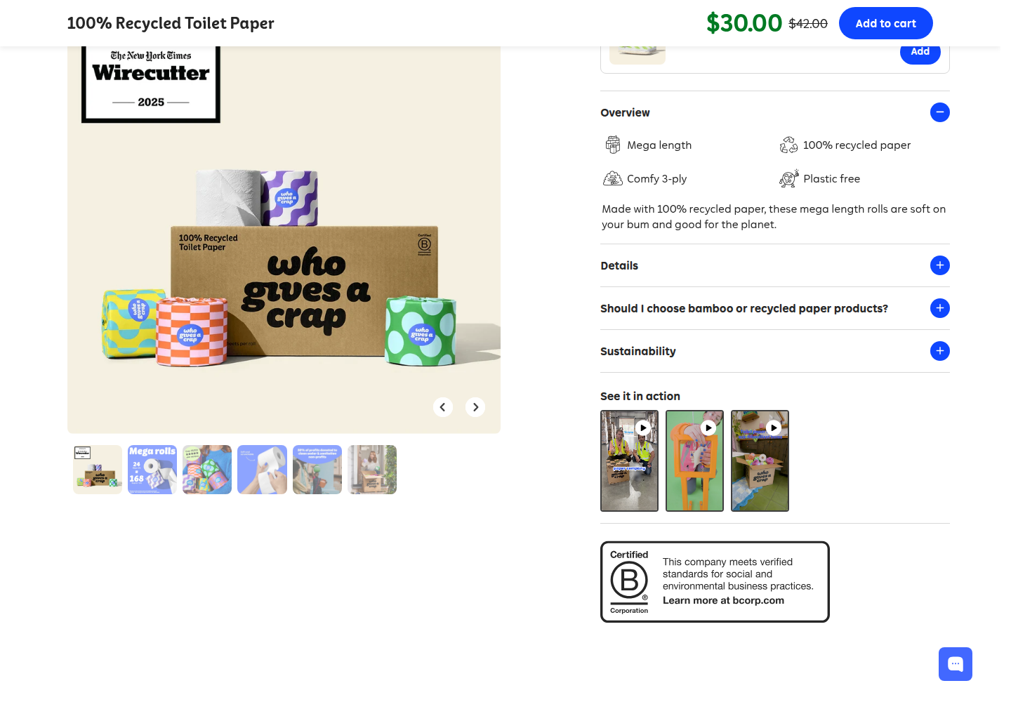
A September 2025 ecommerce discussion named Rains and Snow. A June 2025 Shopify discussion recommended frank body, Thankyou, and Who Gives A Crap. The useful accompanying advice was to surface essential information first and leave deeper information available for people who need it. These are individual recommendations, not measured results or community consensus. Read the ecommerce inspiration discussion; read the product-page discussion.

A July 2026 design thread named SSENSE, Cuscadecaine, Plantbee, Meridian, and Outlier. It also recorded a useful disagreement: expressive design can support browsing and brand perception, while familiar interaction patterns help people complete a purchase. CHL can develop a recognizable aesthetic while keeping price, variants, subscriptions, and purchase controls immediately intelligible. Read the discussion.

A founder's candle homepage drew criticism for moving too slowly toward the product. This applies to CHL's earlier attempts: an elaborate introduction can become another obstacle. A visitor who already wants the product needs a direct buying route; someone who needs reassurance needs a rewarding path to it. Read the critique.

03 · Commercial

Where commercial evidence is useful

Every result below is publisher-reported. Relative lifts are not percentage-point changes, and current pages have not been established as identical to the historical tested versions.

SourceReported resultChangeUseful lesson and limit
Zalora / VWO12% relative checkout-rate liftDelivery and return benefits made more visible on PDPsPut reassurance at the decision. No public sample, runtime, base rate, or confidence interval.
Andaaz Fashion / VWO109.38% PDP-conversion and 125.95% purchase lifts in one mobile information testProduct, delivery, and support information organized into mobile tabsInformation structure can matter. The vendor supplies no sample, base rate, runtime, or statistical detail.
GoodwillFinds / VWO5.16% relative increase in Add-To-Bag clicks over eight daysShorter mobile content and CTA after imagesRelevant to reading burden and purchase access. Clicks are a proxy; completed purchases were not reported.
GLTC / Shopify6% conversion improvement over three monthsMigration, UX, navigation, search, PDP, checkout, and operationsA broad before/after result. It cannot isolate the visual redesign.
The Conran Shop / Shopify54% conversion-rate increaseReplatform, unified commerce, rebrand, and agency workA commerce-program result, not an aesthetic A/B test.
Incu / Shopify15% first-week conversion improvement; later additional change reportedPlatform, theme, filtering, automation, and promotionsMultiple confounders; reported percentages cannot be added or assigned to a section.
Peepers / Shopify30% conversions and 20% AOV increasesImagery/site redesign, checkout, and shipping motivatorMultiple changes and a contemporaneous Oprah feature prevent clean attribution.

The practical implication is to reduce uncertainty and effort when each arises. This does not require a minimal page. Visual richness should help identify the product, understand its use, assess evidence, or choose an offer. Baymard's research supports evaluating actual shopping behavior rather than accepting a site's visual reputation as proof. Read Baymard's product-page research.

05 · Identity

Identity is larger than a nice-looking webpage

Graza

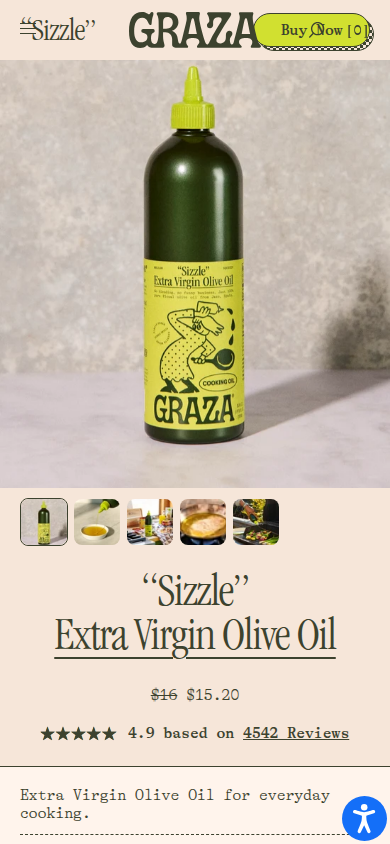
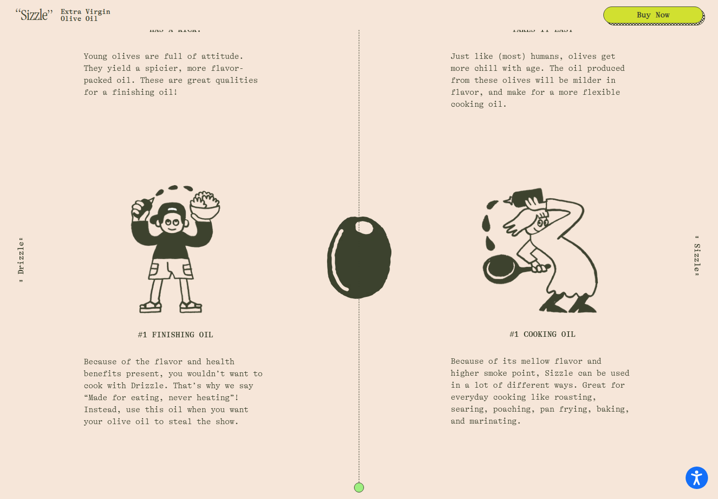
The distinctive squeeze bottle supplies the underlying idea. Packaging, playful identity, product education, story, and recipe content all extend an everyday-use premise. D&AD recognition concerns packaging; it does not measure site conversion.

D&AD record · Baggy project

Great Jones

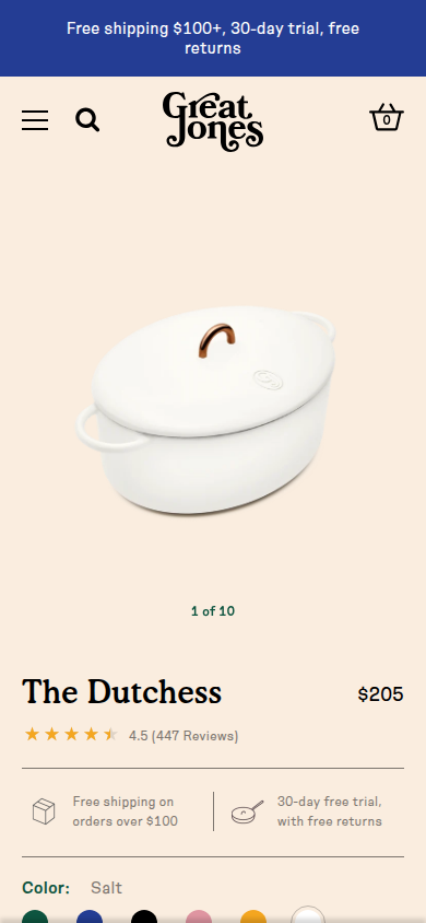
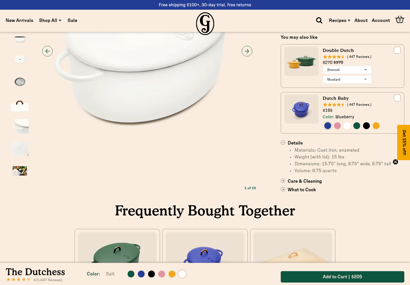
The system addresses uncertainty around choosing cookware and the pleasure of cooking at home. Naming, product color, packaging, practical illustration, photography, and the digital shop share an underlying human activity.

Pentagram case

Plenaire, Dally, and Evernow

These skincare, hand-wash, and health-service cases extend identity through physical or service touchpoints. They demonstrate coherence, but their agency presentations are neither current mobile audits nor automatic PDP exemplars.

Plenaire · Dally · Evernow

Award directories also surfaced SPYLT, Telepathic Instruments, Partake Foods, and Opal. A listing supplies a reason to inspect craft, not a conversion guarantee. An exciting screenshot may coexist with weak mobile usability or a slow buying path.

06 · Direction

A warm, close-up view of CHL, with evidence within reach

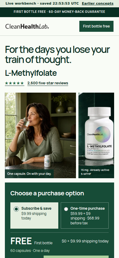
This is an internal art-direction description, not new customer-facing copy. The customer tension already present in the source is practical: uncertainty about what is in a supplement, difficulty understanding the choices, and wanting a routine that does not become another chore.

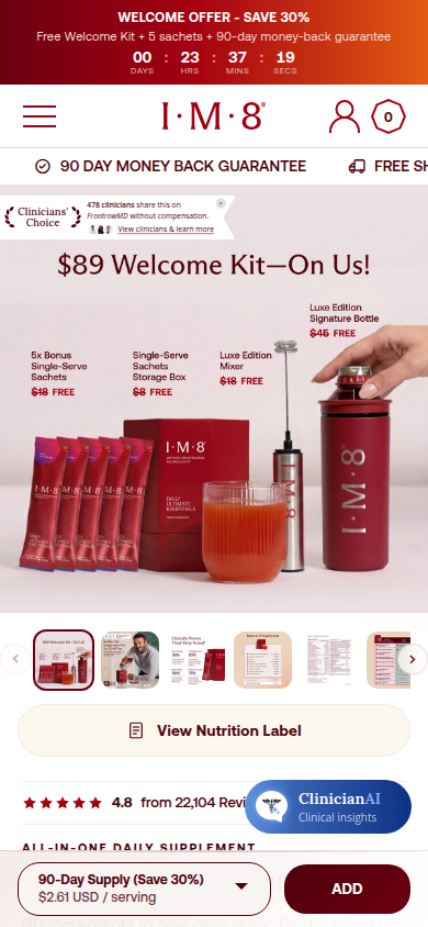
The page should feel as if someone has carefully placed the actual bottle, capsule, label, and customer experience in front of the shopper. Product photography supplies scale and texture. Human photography supplies context. Restrained green annotation connects what shoppers see to what they need to understand. Familiar purchase controls remain easy to reach.

01

The same object carries the story.

The bottle appears in a real routine; a close-up reveals the capsule; formula detail leads to the actual label. Existing photographs and truthful details create continuity instead of a procession of unrelated card-bound images.

02

Proof appears beside the question it answers.

A genuine review about the short ingredient list belongs near the formula. Routine footage belongs beside the use explanation. Attribution, source access, and relevant disclosures remain readable.

03

Visual scale changes with the question.

A human scene can fill the width, a capsule can appear at hand scale, and a formula explanation can become one annotated composition. Detailed evidence can open on demand. Typography and spacing hold those deliberate shifts together.

The first mobile journey to design

Shopper questionVisual treatmentAlways available
What is this, and does it belong in my day?A strong existing routine/product photograph with clear product identityName, source-supported premise, genuine review count, price and purchase access
What would taking it involve?Capsule-in-hand photograph and one relevant creator clip as one use storyActual capsule count, label-directed routine, and creator disclosure
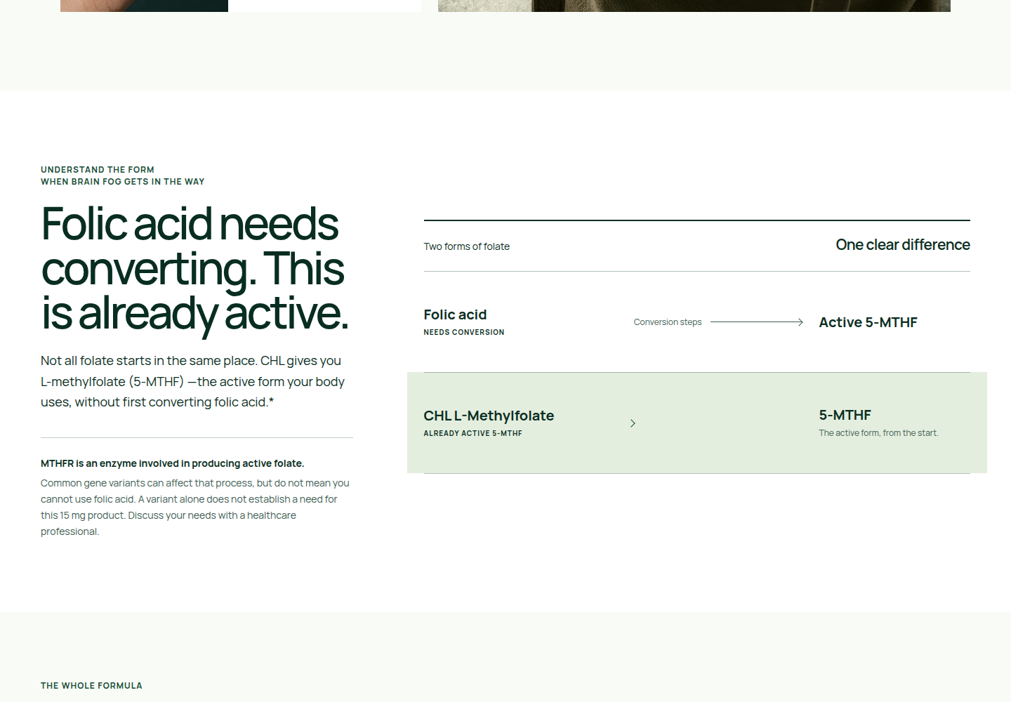
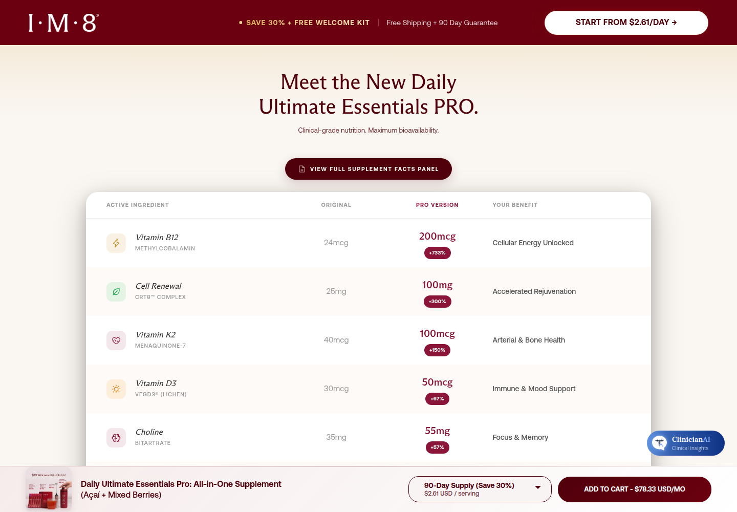
What am I putting in my body?Close-up product/label composition with short legible ingredient annotationsExact formula, readable full-label control, and suitability information
Why should I trust this brand?Relevant genuine customer evidence paired with its subject and access to supporting documentsAttribution and evidence limits; no invented certification imagery
Which purchase option suits me?Compact familiar selection controls with a clear selected stateAuthorized price, shipping, recurring terms, quantity, and what happens next

This is a sequence of questions, not five obligatory full-screen sections. The earlier routine quote, creator routines, and daily-habit material should stop repeating the same reassurance across three chapters. Their strongest parts can become one coherent moment.

07 · Build

Design the journey before expanding the page

Start with a 390-pixel composition and its first several scrolls. Choose the strongest existing assets and crop them deliberately. Sketch the sequence as pictures with short captions, then add the minimum copy required to make each scene clear. Give later formula and proof areas distinct visual jobs.

Desktop can use relationships a phone cannot: product beside explanation, a wider routine scene, or a compact comparison. Mobile needs its own composition and evidence order instead of a mechanical stack of desktop columns. Motion should clarify a state, reveal a detail, or connect related views; the static page must remain complete with motion disabled and videos paused.

08 · Evaluation

Test recognition, understanding, and effort

Ask people what the product is, what they remember, what they would inspect before buying, and where the page begins to feel repetitive. Show the middle without its header and ask what makes it recognizable. Have participants find the formula, relevant review evidence, total price, and recurring terms. Observe whether they explore or merely scroll past text.

Independent reviewers should compare mobile and desktop screenshots without being told which direction the builder prefers, and disagreements should remain visible. Neither an AI score nor a design award establishes buyer trust.

Only after a separate release authorization could a commerce experiment measure completed purchases and revenue per visitor, segmented by device and traffic source with downstream guardrails. Scroll depth, video plays, and Add-To-Cart clicks can diagnose behavior but do not substitute for purchase outcomes. This research launched no such experiment.

09 · Boundary

What this report does not infer

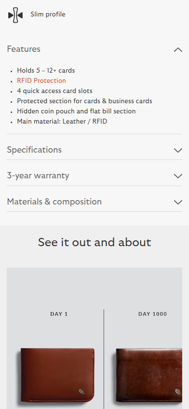
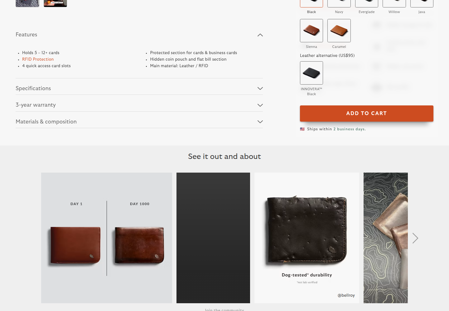
The discovery pool spans supplements, food, cookware, skincare, apparel, bags, home goods, eyewear, electronics, and household consumables. Brands were screened for different purposes. Mention does not mean a current page received a visual audit. The visual companion names exactly which pages have readable captures, their source URLs, viewports, and limits.

The existing CHL reviews remain genuine source material. The authorized statement is 2,600 five-star reviews. This research creates no average rating, star distribution, verification badge, laboratory certification, or health outcome. The current CHL candidate remains rejected. This report introduces no storefront design or conversion claim.

10 · Sources

Detailed source records

The readable findings explain the evidence. The JSON ledgers retain URLs, dates, access limits, promotion flags, reported metrics, and caveats for audit.

Community

Reddit discussion record and X discovery constraints

Nine readable Reddit discussions and six X search-indexed leads. Self-reports remain labeled; inaccessible posts do not become verified findings.

Commercial

Experiments, broad change cases, and identity references

Evidence types remain separated so design rationale, measured behavior, and broad before/after claims are not treated as interchangeable.

Root synthesis · Rendered-page visual analysis