Foreplay · fresh pull · September 10, 2026
Specific references for the layout work.
32 image ads were retrieved with the connector’s longest-running ordering. The full contact sheets were visually reviewed; unrelated material was excluded from the selections below. These examples inform layout and hierarchy, not Wonder efficacy claims. Recorded run duration is a research signal, not proof of sales or ROAS.
 F02 · Nutrafol
One strong typographic emphasis; information forms a compact group beside the bottle.
Foreplay source ↗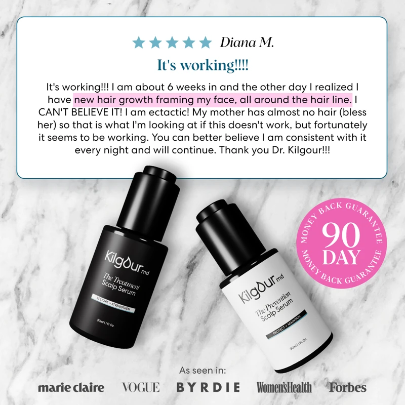 F03 · James Kilgour, MD
Review content kept together in one card, with product still prominent.
Foreplay source ↗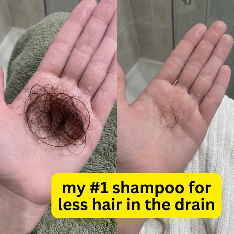 F09 · James Kilgour, MD
A short highlighted hook sits directly on the visual evidence.
Foreplay source ↗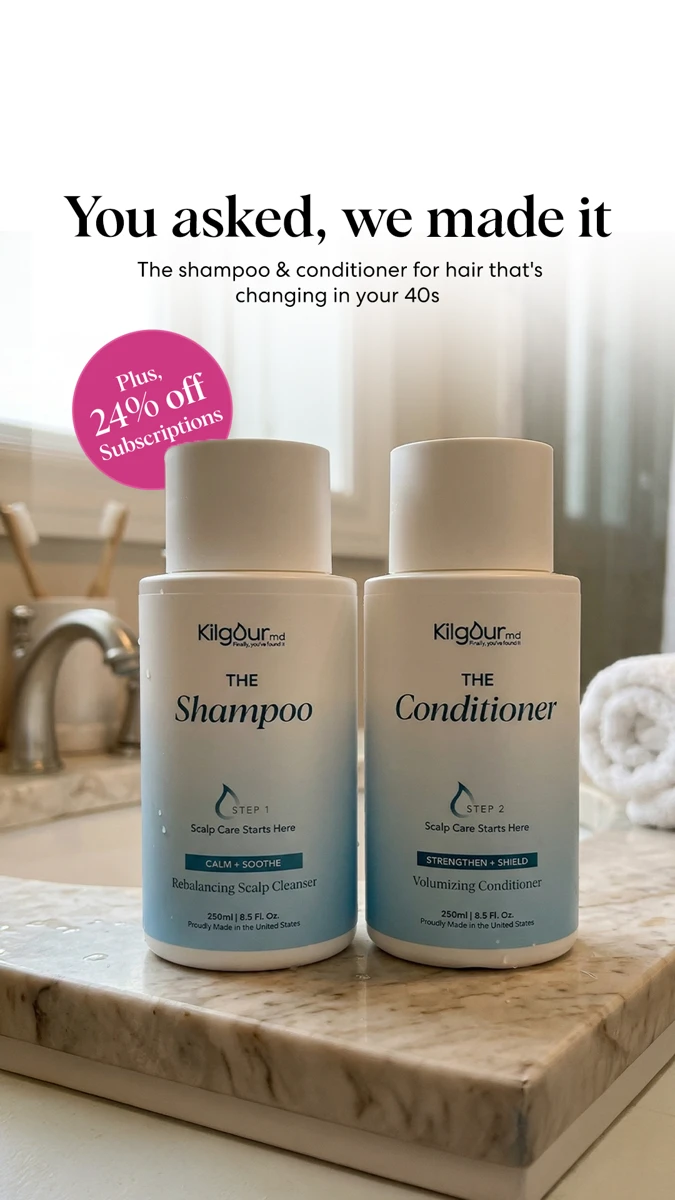 F17 · James Kilgour, MD
A centered serif headline forms one unit above the product.
Foreplay source ↗ F19 · Nutrafol
Paper strips sit tightly behind the words; the headline stays compact.
Foreplay source ↗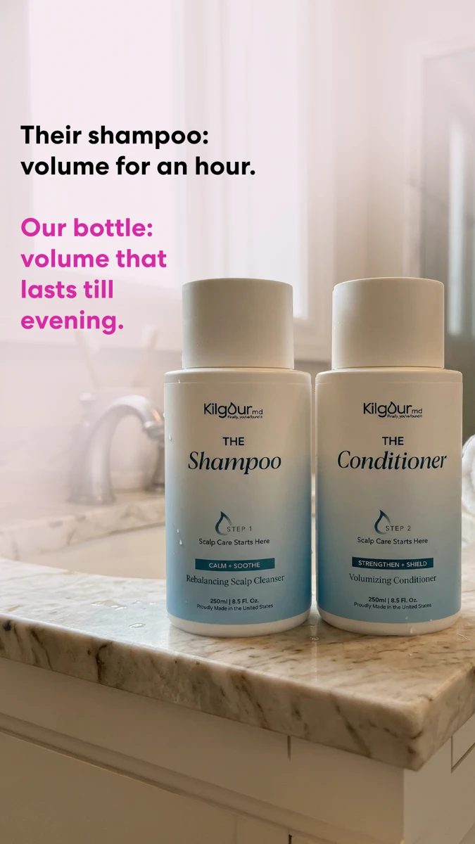 F21 · James Kilgour, MD
Two short, related text groups use color to create contrast.
Foreplay source ↗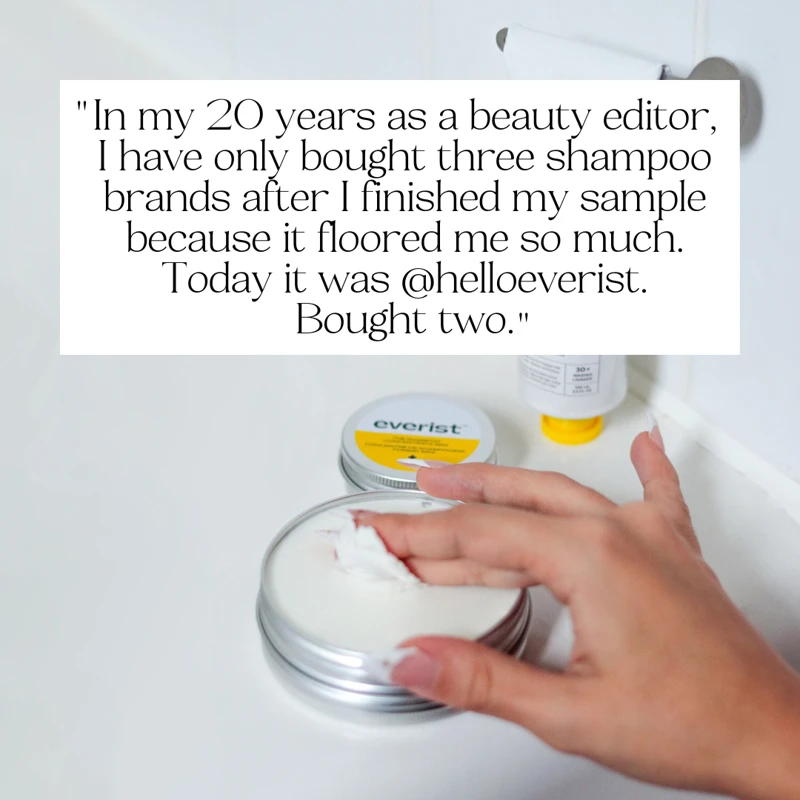 F24 · Everist
Editorial serif copy is intentionally contained as one paper card.
Foreplay source ↗ F31 · James Kilgour, MD
A clear headline and support hierarchy, with consistent horizontal alignment.
Foreplay source ↗The broader prior 166-ad research archive remains available on the board. The originals page contains the exact earlier Wonder work; this reference page identifies the concrete design approaches reused in the revision.