Theirs vs ours
For each concept: the printing competitor ad we copied the structure from, next to the version you picked (2026-09-25). The yellow line is my honest read of the gap.
WS1 Wonder
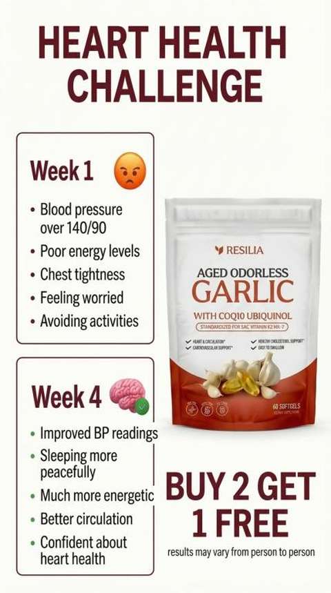
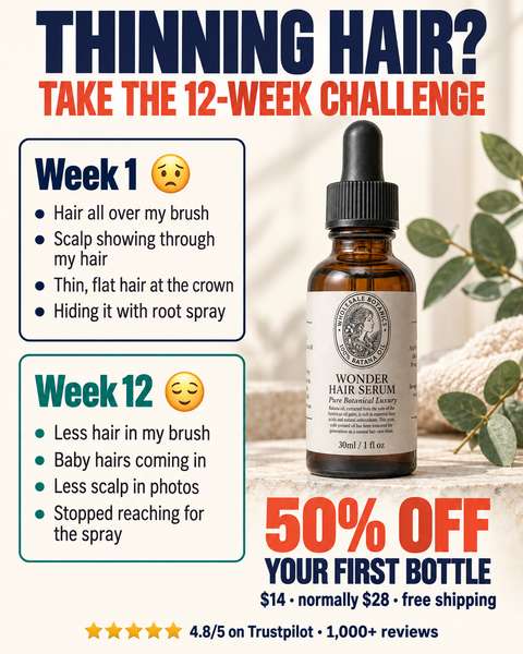
Close. Same challenge-card structure; theirs is plainer and cruder, ours is more polished. You disliked our photo fading into white.
WS2 Wonder
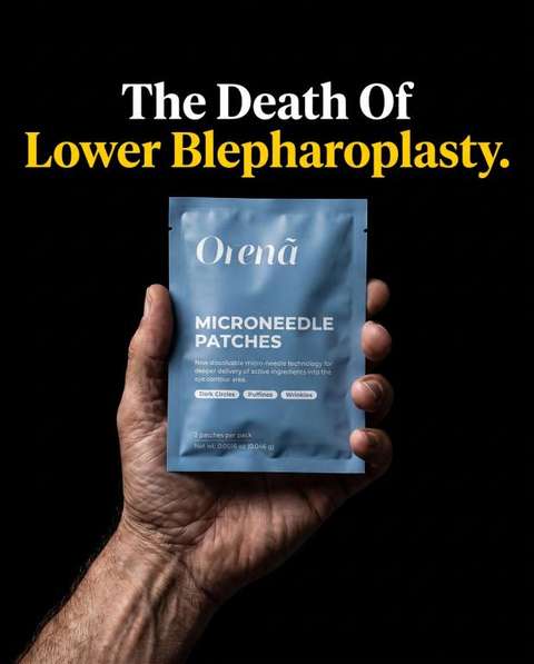
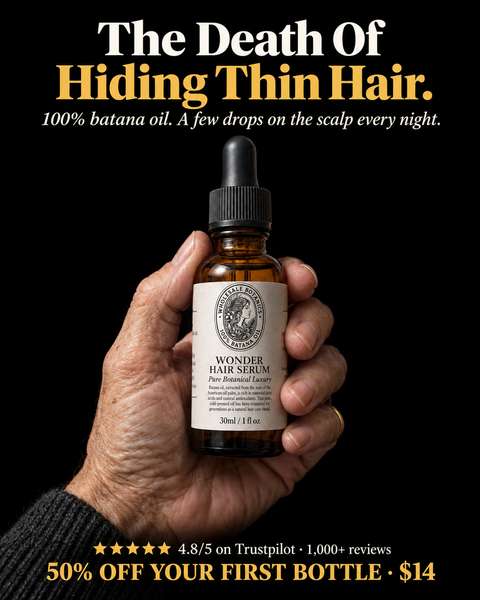
Very close. Theirs is starker: one line, one hand, nothing else. Ours adds three lines of pitch (the new rule).
WS3 Wonder
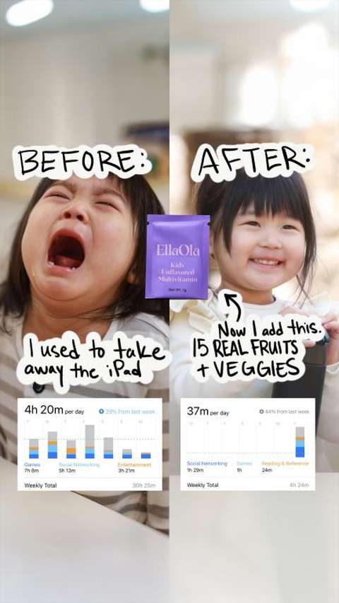
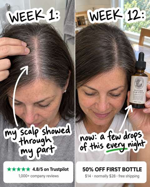
Furthest off. Theirs is real phone photos: a screaming kid vs a smiling kid, a huge change anyone gets instantly, plus real app screenshots. Ours is generated, and the change is subtle.
CS1 CHL
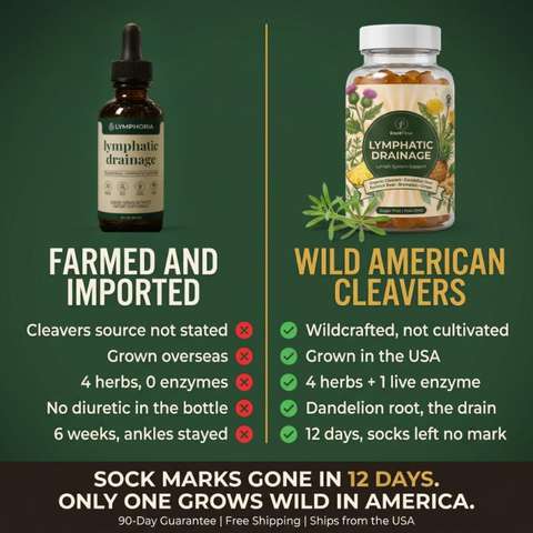
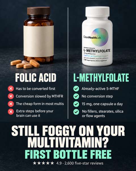
Close. Same two-column ✗/✓ table; palette differs.
CS2 CHL
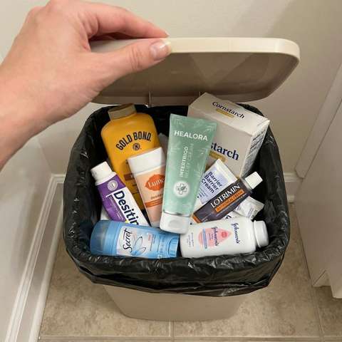
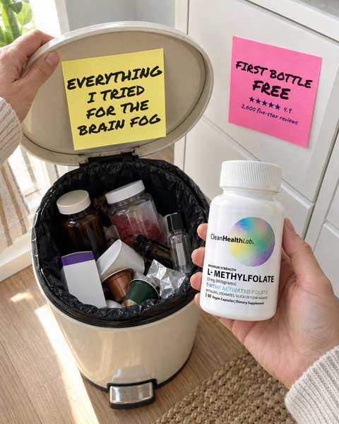
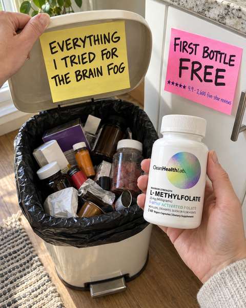
Far off. Theirs is one raw iPhone photo of real, recognisable products (Gold Bond, Secret, Desitin), with no text at all. Ours is generated, unbranded and staged. No pick: you rated both okay.
CS3 CHL
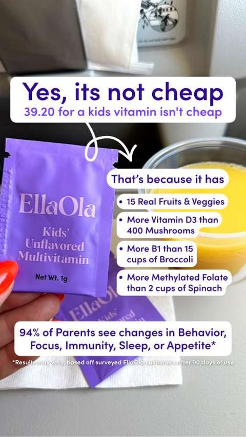
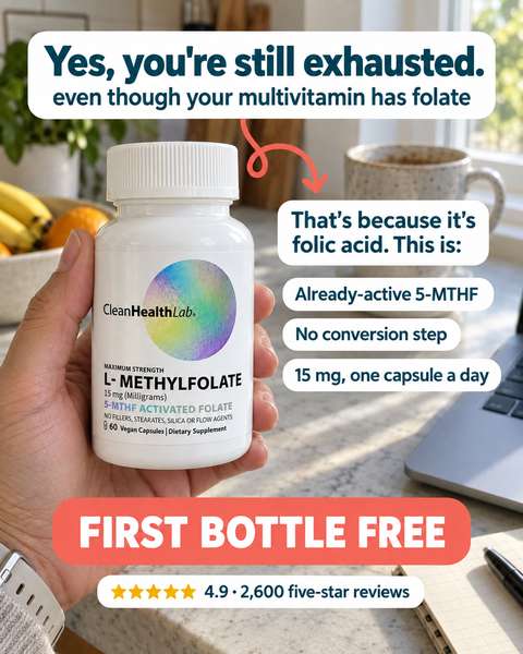
Close. Same bubbles-over-a-held-product structure; theirs is a real phone photo.
RS2 RAW
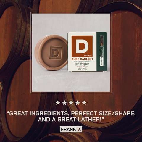
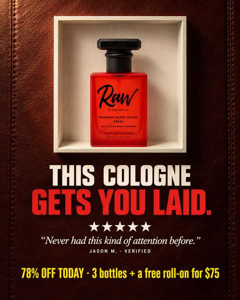
Close. Same framed still life plus review; ours has a much bolder headline.
RS3 RAW

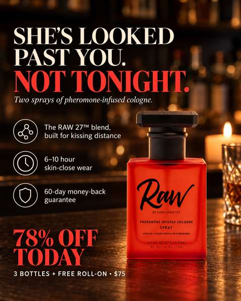
Close. Same serif headline, icon callouts, big product, sale block.
RS4 RAW
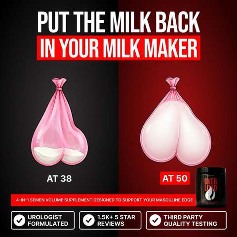
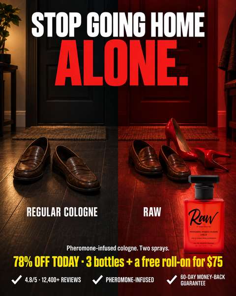
Close. Same split, two objects, labels and trust row; theirs is a crude cartoon, ours is photographic.