Wonder v44 — three new concepts, new plates, 4:5
Internal design review. Not cleared for placement. No Meta object created, edited, published or budgeted.
Why the last set was dark, measured
The twelve Obvi ads on disk were measured rather than described. Obvi's grounds are either a
deep saturated brand colour — electric cobalt #0040c0 at relative
luminance 0.08, hot magenta #f04090 at 0.24 — or a pale neutral bone at
0.87. Between 41% and 79% of a cobalt frame is strongly saturated.
Every plate I had been using was a saturated pastel at luminance 0.60–0.87: too light to carry white type, too coloured for dark type to look clean, and never a brand-colour field. On a pastel the only legible ink is a dark one, which is exactly what came out.
The second error was mine in writing. I set a hard contrast ≥ 3.0 rule and gated
on it. Obvi's own signature move — magenta on cobalt — measures 2.3:1. That rule
would have banned the reference. The gate now scales its floor to type size: 2.0 for display type
at 90px and above, 3.0 in the middle, 4.5 for captions.
So these three plates were generated for this build with deep cobalt, hot magenta and pale bone grounds. On cobalt, white now measures 9.2:1 and lemon 7.2:1 — bright colour became the legible choice rather than the banned one.
Three type systems, not three fonts
- C1 — flush-justified block. One face, Anton. Both headline lines are set at whatever size makes their natural width exactly the 920px measure, so the block is flush on both margins; the offer is that same measure again, tracked out rather than scaled. Nothing is horizontally stretched anywhere in this build — stretching a typeface is distortion, not typography, so justification is solved by size and by tracking.
- C2 — didone against mono. Playfair caps over Instrument Serif italic across the only full-width clear band, then every fact in a Space Mono column tucked down the left beside the hand. Asymmetric, because the plate is.
- C3 — weight clash. Poppins 600 lowercase into Archivo 900 caps, 120px into 186px, near-black into hot magenta: four changes across two words. The type is the brightest object in the frame, which is the point of shooting this plate quiet.
Open
- Free shipping is on all three on your instruction. It contradicts
brief/BUILD-CONTRACT.md, which forbids promising it, and no amount was ever read back from Shopify. Flagging once, not re-arguing. - The $14 is the first subscription bottle; C2 carries "skip or cancel anytime" for that reason, C1 and C3 do not have room at the measure.
- Gate: PASS, 12 elements on 3 frames — nothing on the product, nothing outside the safe margins, nothing under its size's contrast floor, nothing shrunk to fit.

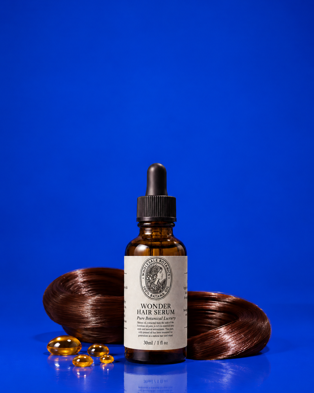
The plate. Electric cobalt seamless, measured relative luminance 0.064 in the type field — the deepest ground in the set. The bottle sits low and dead centre with a chestnut hair coil and gold beads; 560px of the 1350 (41%) is unbroken cobalt. On a ground this dark every bright ink is legal: white 9.2:1, lemon 7.2:1. That is the whole reason this plate exists.
The type system. Anton, one face, no mixing — the design is carried by STRUCTURE, not by a second typeface. Both headline lines are set at whatever size makes their natural width exactly the 920px measure, so the block is flush on both margins and the size difference between the lines is a consequence of the words, not a decoration. Under it, the offer is the same 920px measure again, held at 30px and tracked out until it fills — a caps rule-line locking the bottom of the block. Poster typography: one face, one measure, three weights of presence.
| head | HAIR IN THE / DRAIN AGAIN? Anton · Flush both margins on a 920 measure. The pain is the whole hook and it is a question, so the lemon line is the one that lands; lemon measures 7.2:1 on this cobalt, which is why the loudest colour can carry the loudest words instead of being demoted to a badge. |
|---|---|
| offer | 50% OFF · FIRST BOTTLE $14 · FREE SHIPPING Poppins · Same 920 measure, tracked rather than scaled, so it reads as a rule under the block instead of a caption floating beneath it. White at 9.2:1. |
| roundel | 4.8 / OUT OF 5 / 1,121 REVIEWS Anton, Poppins · The only circular form in the set, and it is lemon-on-cobalt so the proof is the second brightest thing in the frame. It sits high on the right shoulder: the first measured pass put it at y=840 where 24.9% of the disc lay on the hair coil, so it moved up to the last fully clear cobalt. |
Risk. Both headline sizes are solved by the renderer, so the declared 200 is a starting point, not the rendered size — the receipt records what it landed on.
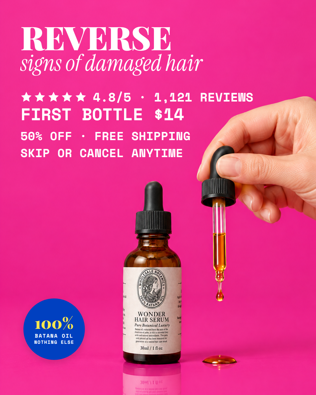
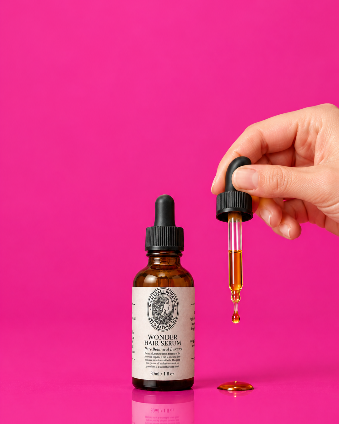
The plate. Hot magenta seamless, type-field luminance 0.219. A hand enters top right actively squeezing the pipette with one amber droplet mid-fall, so the oil has a visible physical source. That hand occupies the right side from y=315 down, which leaves a full-width band across the top 315px and then a tall clear column on the left. The composition is asymmetric, so the typography should be too.
The type system. Playfair Display against Instrument Serif Italic, with Space Mono for the facts — a roman/italic serif clash, the opposite register to C1's single-face grotesque block. Nothing is justified here. The headline is a wide two-line serif across the top band, then everything factual drops into a narrow mono column tucked down the left beside the hand. A didone on shocking pink is the expensive-and-loud pairing; the mono keeps the numbers from pretending to be part of the headline. The whole left column stays white and display-sized rather than dropping to a dark caption: on this magenta white fails a caption floor and passes a display one, so the fix was size, not colour.
| head | REVERSE / signs of damaged hair InstrumentSerif-Italic, PlayfairDisplay · The top 315px is the only full-width clear band, so the headline lives entirely inside it. Caps roman over lowercase italic gives the two-tone without a second colour, which matters because white is 3.9:1 here and lemon only 3.05 — on this ground the type stays white and the contrast comes from form. |
|---|---|
| stars | 4.8/5 · 1,121 REVIEWS SpaceMono · Left column under the headline, in mono so it reads as data. White at 40px rather than near-black at 26px: the dark caption measured fine at 4.92:1 but read muddy against this magenta, and white holds at 3.69:1 once the line is display-sized. Size buys the brightness. |
| offer | FIRST BOTTLE $14 SpaceMono · The number is the loudest fact in this category, so it gets its own line at mono display size rather than being folded into a sentence. |
| proof | 50% OFF · FREE SHIPPING SpaceMono · Broken by hand into two deliberate lines rather than left to wrap: letting it wrap put the break mid-phrase at 'FREE / SHIPPING · SKIP / ANYTIME', which reads as an accident. Each line is one complete thought and each stays clear of the hand, which comes no further left than x=694 on these rows. |
| proof | SKIP OR CANCEL ANYTIME SpaceMono · The subscription qualifier on its own line, because the $14 is the first subscription bottle and the price line above would otherwise overstate it. |
| roundel | 100% / BATANA OIL / NOTHING ELSE PlayfairDisplay, SpaceMono · A cobalt disc on magenta is the third hue in the frame and the only place cobalt appears — it carries its own ground, so its 2.16:1 against the plate never applies to type. |
Risk. The hand's silhouette is the binding constraint on the whole right side; every box here is left of x=494. Free shipping is stated on the operator's explicit instruction and contradicts brief/BUILD-CONTRACT.md, which forbids promising it.
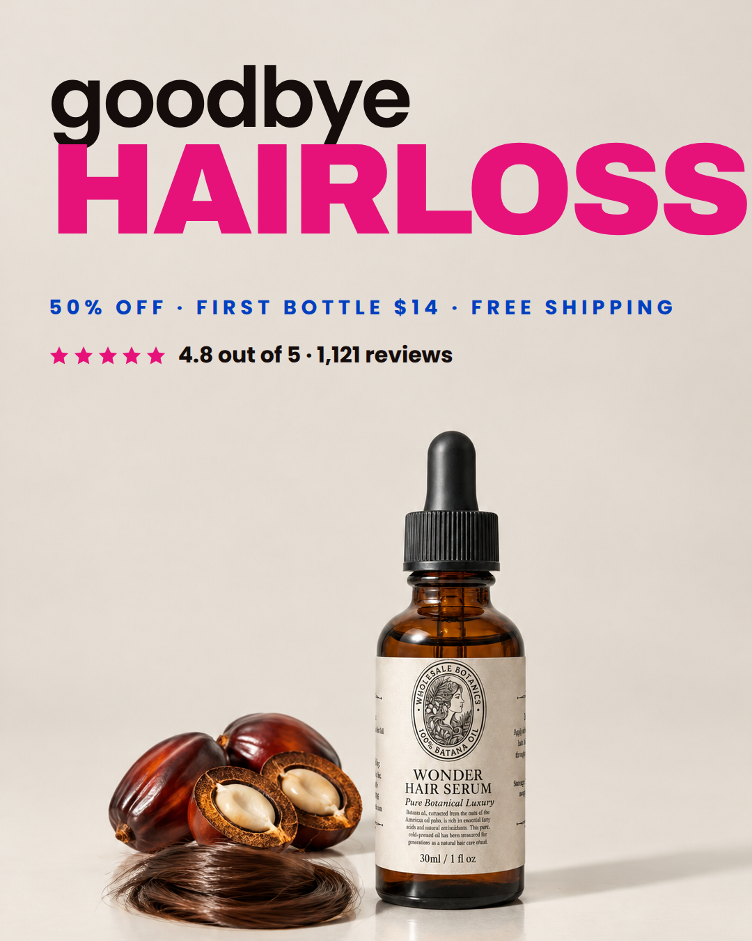
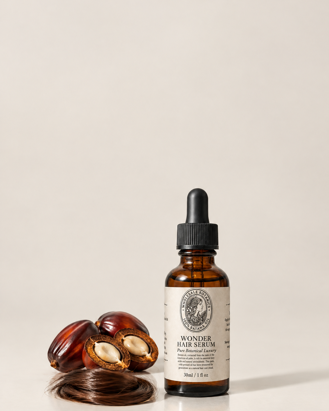
The plate. Pale bone seamless, type-field luminance 0.716 — deliberately the quiet plate, so the colour comes entirely from the typography. 618px of 1350 (46%) is clear, the most space in the set, and the bottle sits small and right of centre with nuts and a hair coil tucked left. On bone, near-black is 14:1 and cobalt 6.1:1, while magenta is 2.6:1 — usable only at display size, which is exactly how it is used.
The type system. A weight and case clash: Poppins 600 lowercase against Archivo at 900 in caps, the second word roughly twice the first and in hot magenta. This is the register Obvi uses on its pale grounds — a soft lowercase word setting up an enormous heavy one — and it is the only concept here where the type is the brightest object in the frame. Cobalt carries the offer line so a third hue appears without touching the headline.
| head | goodbye / HAIRLOSS Archivo, Poppins · Lowercase to caps, 600 to 900, 120 to 186, near-black to magenta — four changes at once across two words, which is what makes a two-word headline feel designed. Magenta at 186px on bone is 2.6:1, below any body-text floor and correct here: it is the largest object in the picture. |
|---|---|
| offer | 50% OFF · FIRST BOTTLE $14 · FREE SHIPPING Poppins · Tracked to the headline's own 940 measure so it underlines the block. Cobalt at 6.1:1 is fully legible at 29px and puts a third colour in the frame without weakening the magenta. |
| stars | 4.8 out of 5 · 1,121 reviews Poppins · Magenta stars tie the proof to the headline's colour; the words stay near-black at 14:1 because they are small. |
Risk. Magenta on bone is the deliberate low-contrast choice and only holds because of size — if the headline ever shrinks below about 120px it should change colour. Free shipping as per C2.