Wonder v43 — five ads, each designed from its own photograph
Internal design review. Not cleared for placement. No Meta object was created, edited, published or budgeted.
What changed and why
v42a put type across the bottle on 14 elements out of 10 frames, measured. The cause was structural: a schedule assigned each ad a set of devices, and the renderer dropped them into computed bands. The layout was never argued from the photograph.
So the renderer lost its authority. Every position, size, typeface, case, colour and device on this page comes from a per-plate spec written by a designer that saw one photograph and nothing else — no template, no schedule, no sight of the other four ads, no access to the previous layout code. The renderer is now a pure interpreter: if a spec does not name an element, the ad does not have one.
A new blocking gate asks the question the old five did not: does this element touch the photograph's subject? It measures every rendered box against the vetted silhouette of bottle, hair, hands and person, with a 24 px cordon. Run against v42a it reproduces all 14 failures. On this set it reports zero.
What the plates forced, and what is still wrong
- Four of five designers centred the headline in the empty top field. They could not see each other, so that is not a template — it is what these plates are. Every one is a symmetrical centre-composed studio still with a flat empty top and the product low. The plates, not the layouts, are the reason these read as a family.
- A second hue is unavailable on every single plate. Five independent measurements, five
identical conclusions: on hot pink, magenta, cyan, lilac and marigold, white, house pink, hot pink,
yellow and green all measure below 3.0:1. Colour therefore comes from solid discs, not from type.
W04's designer mixed its own
#a8004fat 4.08:1 to get a second ink at all. - W05's oil has no physical source. Asked to look, that designer measured it: the ribbon ends in mid-air, the background above the tip is unbroken, and the taper flares wider at the top and necks down as it falls — the inverse of a falling stream. It reads as a glass stem. This is the plate you rejected in v37r2 for the same reason; it needs reshooting, not relayout.
- Free shipping is not on these ads. The build contract forbids promising it and no amount was ever read back from Shopify. Every price line says first bottle $14 with skip-or-cancel, which is the subscription mechanic and is true. Say the word and it goes on.
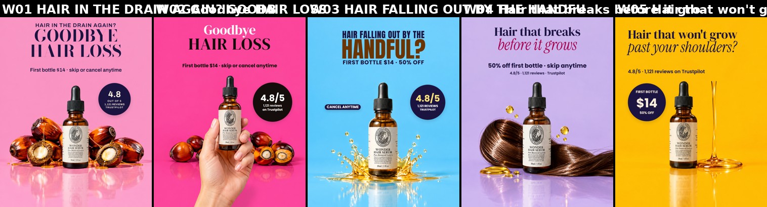
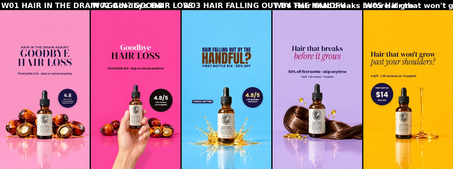
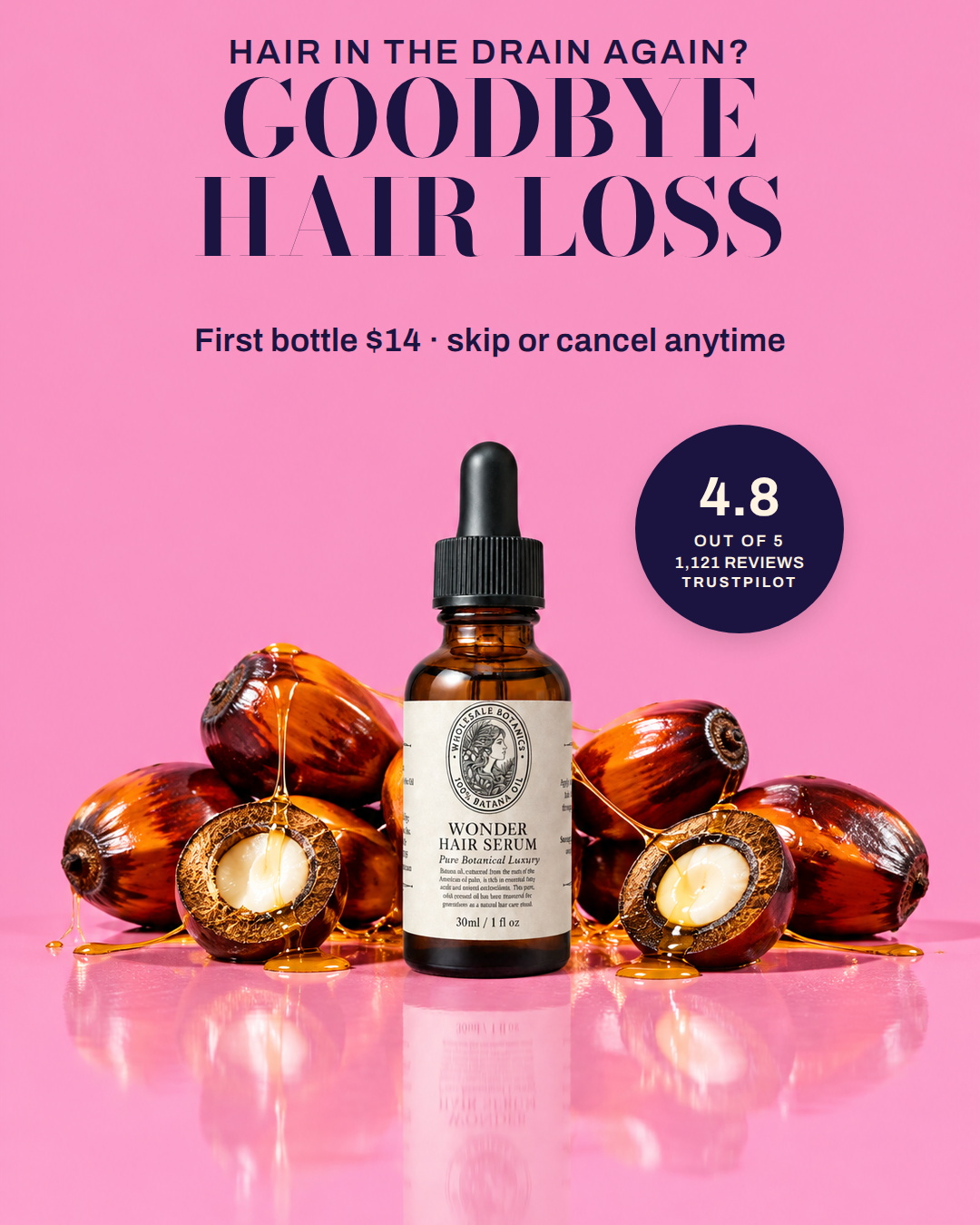
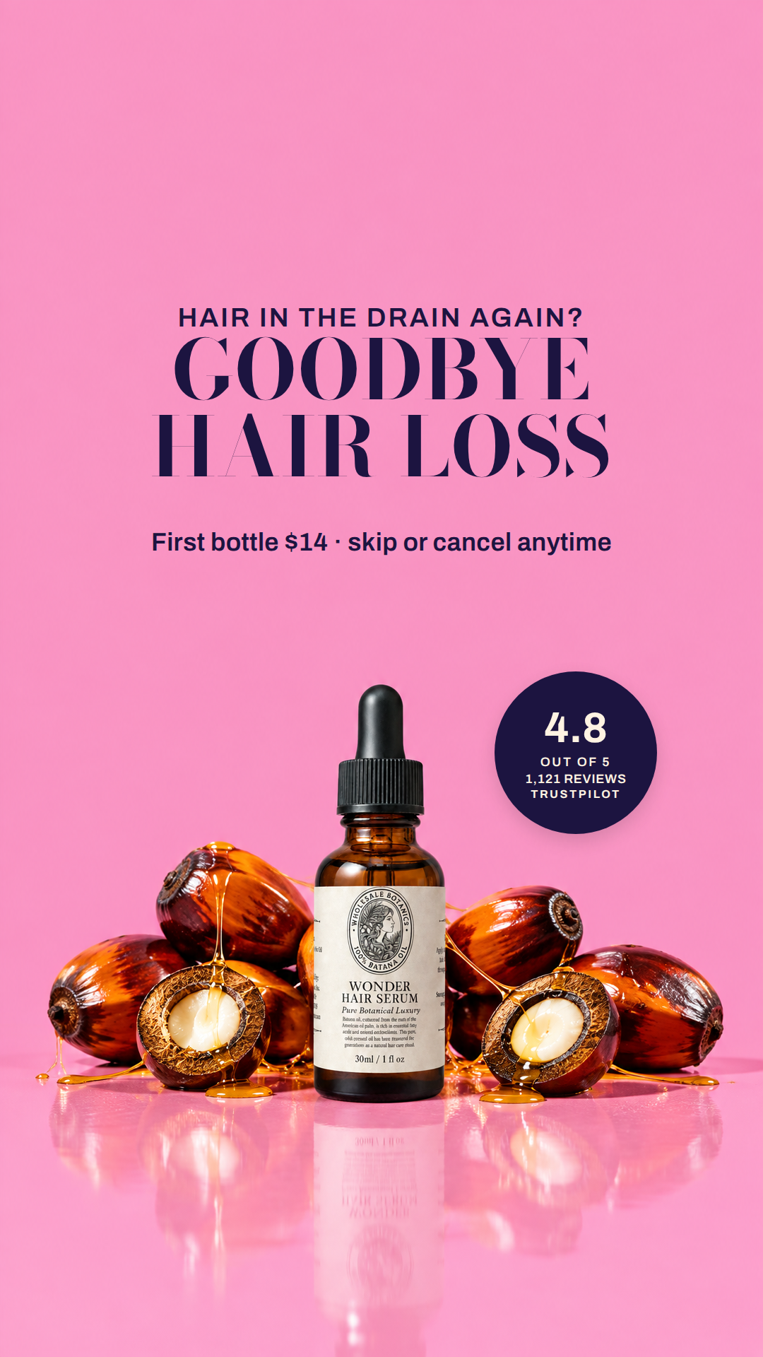
Read of the photograph. A glossy studio still on a seamless hot-pink sweep (measured #f994c2, dead flat: local std under 1 across the whole upper half) with a mirror-gloss floor. Dead centre stands the amber glass dropper bottle with its black cap and cream apothecary label, nested in a pile of five split batana palm nuts - dark red lacquered husks, pale kernels, amber oil drizzled over them and pooling on the floor. The scene is bilaterally symmetrical and bottom-weighted: every object sits below y=485 in the 4:5 and below y=967 in the 9:16, leaving one enormous empty pink field above it (900x450 in 4:5, 900x675 in 9:16) plus two clear pink shoulders either side of the dropper neck. The picture wants a centred column of type dropped into that empty pink sky, sitting on the bottle's own axis, and one small object on the right shoulder where the pink is emptiest - nothing anywhere near the product.
Type. Bodoni (weight 700, caps) for the two hook lines, Archivo (600) for the small factual lines. The bottle's own label is an engraved didone with small caps and an italic subline; Bodoni is the same voice enlarged, so the headline reads as the product's typography rather than an ad pasted on top, and its fat-stem/hairline contrast stays crisp as solid navy shapes on a flat pastel. Archivo's neutral grotesque carries the pain eyebrow and the price line without competing with the didone. Nothing soft, rounded or handwritten: this plate is lacquered and high-gloss, not warm and homespun.
| head | HAIR IN THE DRAIN AGAIN? / GOODBYE / HAIR LOSS Archivo, Bodoni · The photograph is symmetrical about x=540 (the bottle's axis), so the type column is centred on that same axis and drops into the one truly empty area: the flat pink sky above everything. Measured: every cell inside this box has occ=0.00 and std under 1.0, luminance 182-184, so navy scores 8.4:1 the |
|---|---|
| offer | First bottle $14 · skip or cancel anytime Archivo · Batana buyers in this category decide on price, so the number has to be on the image - but it is supporting material, so it sits as one quiet grotesque line hung off the bottom of the headline column, same centre axis, a third of the headline's size. Sentence case rather than caps keeps it as a capt |
| roundel | 4.8 / OUT OF 5 / 1,121 REVIEWS / TRUSTPILOT Archivo · The right shoulder beside the dropper neck is the emptiest pink in the frame and it is wider and taller than the left shoulder (clear_rects gives 360x315 right against 360x225 left, because the left nut pile and its hanging oil drip stand higher). A filled navy disc there is the only saturated shape |
Risk. Checked, with the venv python against read-W01-45.json and read-W01-916.json: every element box in both ratios contains only cells with occ=0.00 and std below 1.0; the smallest distance from any box edge to any cell with occ>0.02 is 44 px in 4:5 (offer) and 35 px in 9:16 (roundel), both above the 24 px minimum; silhouette_box tops are 485 (4:5) and 967 (9:16) and no box reaches either; all boxes sit inside x 65-1015 and inside y 270-1248 in 9:16. Open risks: (1) The box heights above are my estimates of rendered line stacks (38/116/116 with normal leading = about 304 px). If the renderer's line-height is looser than 1.1 the 4:5 headline column could grow downward and eat into the 44 px margin under the offer line - if the rendered 4:5 stack measures taller than 316 px, drop the two Bodoni lines to 108 rather than moving anything down. (2) Two-tone was rejected on measurement, not taste: this ground is a bright saturated pink (luminance 183), so the only inks that clear 3.0:1 are dark ones, and a second dark hue next to navy reads as an accident. The colour interest therefore comes from the solid navy roundel against pink. (3) 'Goodbye hair loss' is the strongest line on the approved list but it is the one closest to the claim boundary - it is about shedding, not regrowth, and no timeframe or guarantee is stated, but if a reviewer wants it softer, 'IMPROVE / HAIR THINNING' drops in at the same two-line size with no layout change. (4) I have not seen the renderer's Bodoni metrics; 'HAIR LOSS' at 116 px should measure about 610 px against w=860, so there is room, but if Bodoni is wider than expected the renderer will shrink the line rather than overflow.
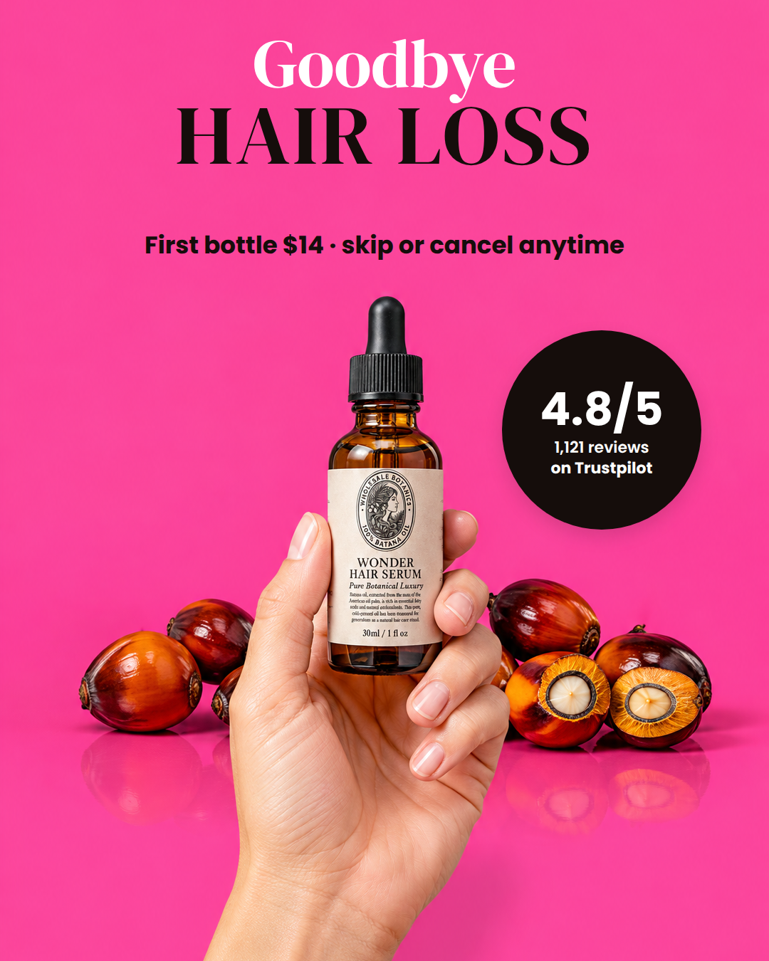
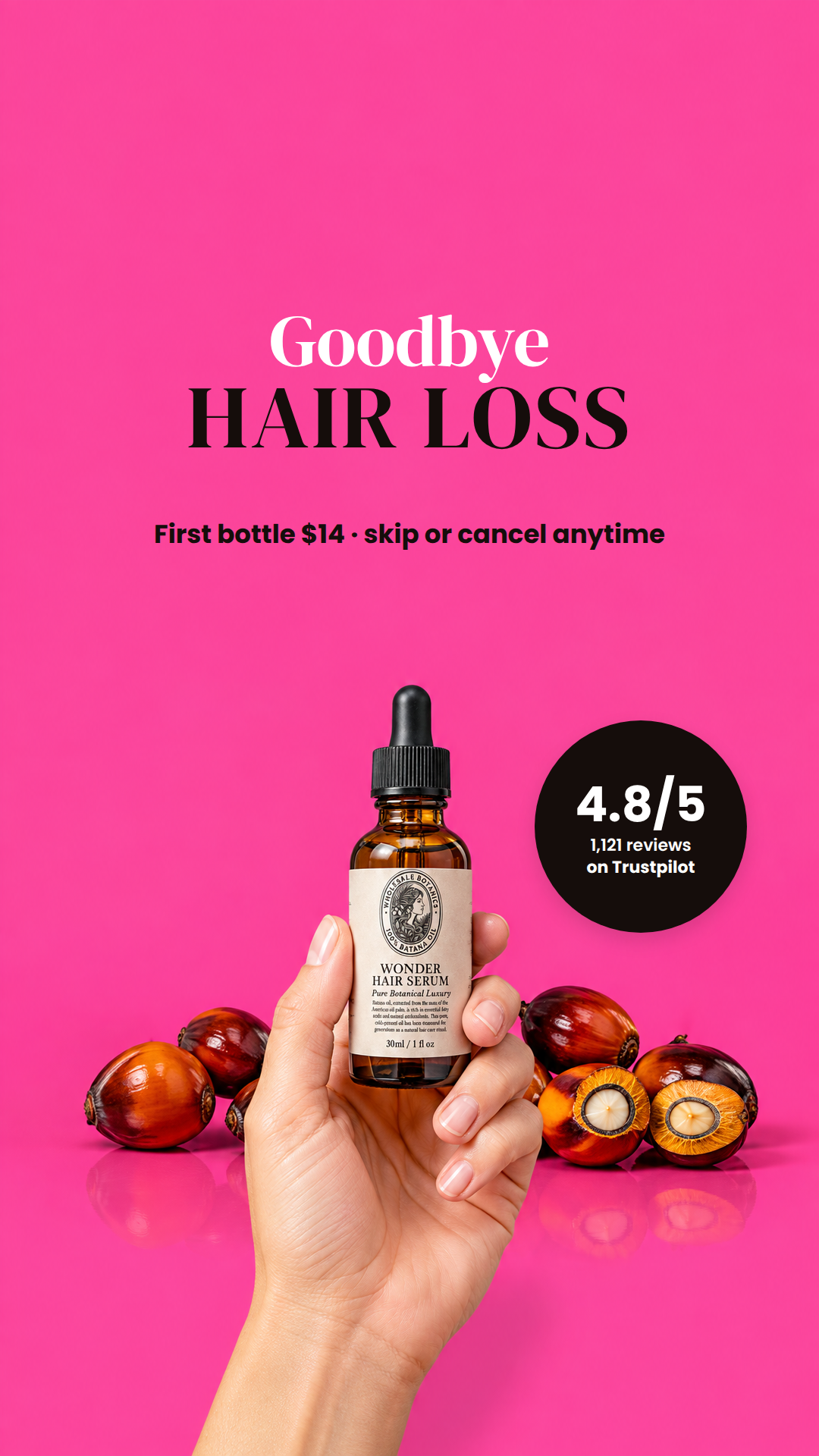
Read of the photograph. A hard-lit seamless studio shot on one flat hot-magenta ground (measured #FB459B, local std 0.5-1.0 everywhere above the props) with a glossy reflective floor. A single hand rises in from the bottom of the frame, palm to camera, holding up the 30ml amber dropper bottle with its black ribbed cap and cream apothecary label (engraved crest, letterspaced serif caps 'WONDER HAIR SERUM', an italic sub-line). Behind and below the hand sits a cluster of five batana palm nuts, deep red-brown glossy shells, two of them halved to show the ochre kernel. The composition is dead-centre and symmetrical, and the photograph's space is all at the TOP: in 4:5 the whole band y=0..405 is empty across the full width, in 9:16 it is y=270..900, a 900x630 void. The only other real pocket is the column to the right of the bottle's neck and shoulder, clear from x=699 out to the frame edge and down to y=808 (4:5) / y=1294 (9:16). That is a picture that wants one big headline overhead and one small mark beside the bottle, and nothing at all over the lower two thirds.
Type. DMSerif for the headline. The only typography inside this photograph is the label's own high-contrast serif with letterspaced caps and an italic line beneath; a single serif voice overhead makes the ad read as an extension of that packaging rather than a promo sticker stuck on top of it, which is the brand's actual edge in a price-led category. DMSerif's stems are heavy enough to hold on a saturated magenta at feed size where a Bodoni or Playfair hairline would break up, and I letterspace the caps line +0.03em to echo the label's own spacing. Poppins carries the commercial facts (offer line, proof roundel) in a deliberately quieter, neutral second voice so the numbers do not compete with the headline.
| head | Goodbye / HAIR LOSS DMSerif · Centred, because the picture is symmetrical about x=540 (bottle, hand and nut cluster all centre on it) and a left-ragged headline would fight that axis. It sits in the one large void the photograph actually has: the flat empty magenta above the bottle, measured std 0.5-0.9 and lum 133 across the fu |
|---|---|
| offer | First bottle $14 · skip or cancel anytime Poppins · One quiet line directly under the headline, still in the flat void and still well clear of the black cap (4:5 bottom is y=367 against a silhouette top of y=417, 50px of air). It goes here rather than beside the product because the only side pockets in this photograph are ~300px wide, which cannot ho |
| roundel | 4.8/5 / 1,121 reviews / on Trustpilot Poppins · The bottle's neck and shoulder cut a tall empty notch in the right of the frame: from x=699 out to the edge the magenta is unbroken down to y=808 (4:5) / y=1294 (9:16), and I measured the true object edge pixel by pixel to confirm it, so the disc has 30px of air to the glass on its left and about 50 |
Risk. I checked every box, dilated by the required 24px of air, against the cells[][] occupancy grid and the safe_zone in both read JSONs: all three elements return maxocc = 0.00 and sit inside the safe zone (4:5 x 90..990 / y 44..744; 9:16 x 90..990 / y 404..1230, inside the y=270..1248 band). Measured contrast against the local ground sampled under each box: #150D0B on #FB459B = 5.90, #FFFFFF on #FB459B = 3.25, #FFFFFF on the #150D0B roundel fill = 19.2. Three things I am not sure of. (1) THE TWO OVERLAY JPEGs FOR W02 ARE STALE - overlay-W02-45.jpg and overlay-W02-916.jpg both show a completely different photograph (a coil of blonde hair, loose capsules and oil droplets on a pale lilac ground) with clear_rects that do not match read-W02-45.json either. The read JSONs and the v42a clean plates agree with each other exactly (silhouette top y=417 = the black cap, x 111..998 = the nut cluster), so I designed from those and ignored the overlays; someone should regenerate them before QA reads them as authority. (2) Cream fails rule 5 on this ground - the label cream #F7EEDD measures only 2.82 against #FB459B and the sampled label colour 1.84, as do the house yellow (2.54), green (1.36) and deep pink (1.36), so cream/yellow type is not available on this plate at all and I have used none. White at 3.25 passes but only just, which is why it carries a 96px serif word and nothing small. (3) The 4:5 top field is only 405px tall and I do not know the renderer's line-height, so I sized the head conservatively (96/118) to leave 50px between the offer baseline and the cap; if the renderer stacks tighter than 1.2em there is headroom to go up to about 104/128, and if it stacks looser than 1.35em the offer line will need to move up ~20px. I would want to see one rendered 4:5 to settle that. On copy: 'Free shipping' is in the permitted offer facts but I left it out, because the only claim I can actually pin to a source here is the price, and the line reads honestly without it.
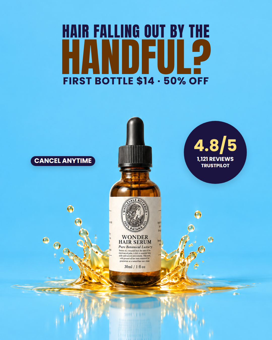
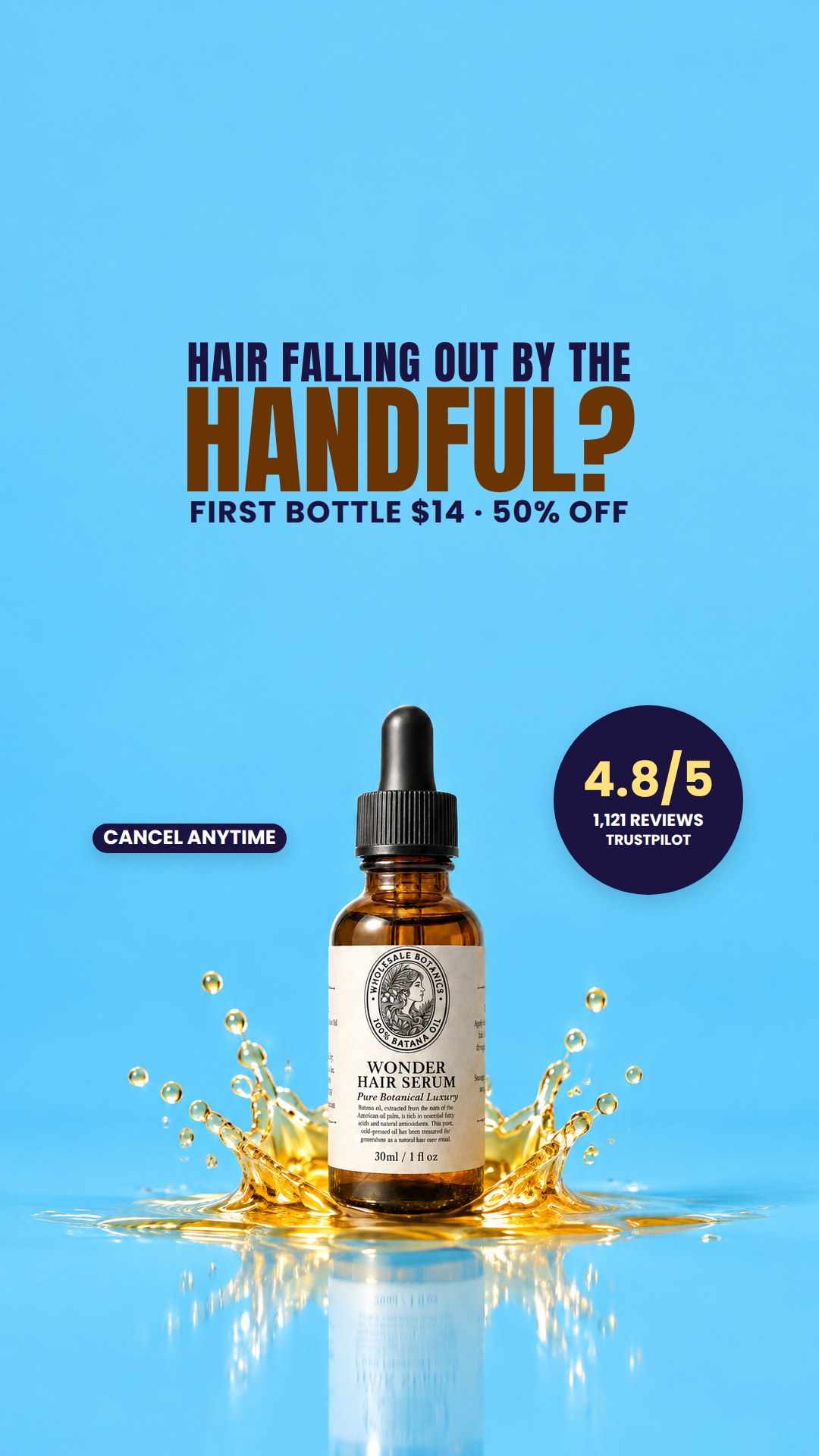
Read of the photograph. A hard-lit studio shot on flat electric cyan: the amber dropper bottle stands dead centre (silhouette x432-646) inside a golden oil splash crown, with its own reflection in a glossy floor below. The photograph is bilaterally symmetric and has exactly two kinds of area - the saturated cyan void and the amber subject - with no texture anywhere in the void: every 45px cell in the top of frame measures std <= 1.1 and lum 176-187. That void is enormous: 900x450 of dead-flat cyan above the bottle cap in 4:5, and 900x630 (y270-900) in 9:16. Because the bottle is only 214px wide, the cyan also stays open either side of its neck and shoulder, giving two quiet pockets at the same height. This is a poster, not an editorial page: it wants a small number of very large words in the sky above the product, and small hard furniture flanking the shoulder. It does not want anything near the splash, which is the only busy region.
Type. Anton for the hook, Poppins ExtraBold/Bold for the small lines. The background is a single saturated hue with zero grain and the subject is a hard-edged glass cylinder in a frozen splash - the picture's own language is high-contrast, graphic and loud. Anton's heavy condensed caps put a block of ink into that void with the same density the amber bottle has, and the condensation is what lets a 142px line still fit inside 900px. The high-contrast serifs (DMSerif, Bodoni, Fraunces, Playfair) would read genteel and thin-stemmed against this electric cyan and would lose the shout contest with the splash; Inter/Archivo at this size read like UI. Poppins carries the offer and the badge lines because a geometric grotesque keeps open counters at 19-38px where Anton's tight apertures would close up at feed size.
| head | HAIR FALLING OUT BY THE / HANDFUL? / FIRST BOTTLE $14 · 50% OFF Anton, Poppins · The bottle is centred and the splash is symmetric about it, so the type has to be centred too - anything ragged left would fight the picture's own axis. It goes in the sky because that is the only part of this photograph with no information in it at all: measured max cell std 0.9 and lum 176-187 acr |
|---|---|
| roundel | 4.8/5 / 1,121 REVIEWS / TRUSTPILOT Poppins · There is a clean cyan pocket to the right of the bottle's neck and shoulder - the glass narrows to the dropper collar there, so the frame is empty from x660 out to the edge and the splash has not started yet. A 250px navy disc lands in it with 100px of clearance to the silhouette in both ratios and |
| chip | CANCEL ANYTIME Poppins · The mirror pocket on the left of the bottle is the same dead-flat cyan (max cell std 0.8, 70px clear of the silhouette in both ratios) and the photograph's symmetry makes the composition feel lopsided with a disc on one side and nothing on the other. One word-sized navy pill balances it and does the |
Risk. Checked, with the pixels rather than by eye: every declared box was sampled against the rembg silhouette mask and the plate luminance. Results - head 4:5 (90,48)-(990,440): occ 0.000, min distance to silhouette 25px, max cell std 1.0; head 9:16 (90,420)-(990,820): occ 0.000, dist 111px; roundel 4:5 (730,480)-(980,730): occ 0.000, dist 100px; roundel 9:16 (730,930)-(980,1180): occ 0.000, dist 105px; chip 4:5 (100,620)-(400,676): occ 0.000, dist 70px; chip 9:16 (100,1086)-(400,1142): occ 0.000, dist 70px. All six are inside the safe zones (4:5 65..1015 x 0..1350; 9:16 65..1015 x 270..1248) - the lowest element in 9:16 ends at y1180, 68px above the 1248 line. Nothing crosses the red outline and no element is closer than 25px to it. Rule 5 was measured, not assumed, and it changed the design: on this cyan (relative luminance 0.534) WHITE is 1.68:1 and deep pink #e6127a is 2.38:1, so both FAIL - as would yellow (1.44) and green (1.32). Only dark ink works on this plate, which is why the whole ad is navy plus one burnt amber (#6b3403, sampled from the bottle glass, 5.32:1) and why the yellow only ever appears inside the navy disc. Remaining risks, in order. (1) The 4:5 headline is the tight one: I budgeted the three-line stack to finish by y~400 assuming a line advance up to 1.4x the type size, which leaves 64px to the dropper tip; if the renderer uses looser leading than that the third line will creep toward y464 and line 1 and line 2 should come down to 88 and 130 rather than moving the block up, since the top margin is already only 48px. Please look at the rendered 4:5, not the numbers. (2) 'FIRST BOTTLE $14 - 50% OFF' rests on offer facts I could not read back from the store; I deliberately used only the two that are self-consistent ($14 as the first bottle, 50% off $28) and avoided free shipping, and I answered the subscription implication with the CANCEL ANYTIME pill - but if the $14 is not in fact the first subscription bottle, both the price line and the pill need rewording together. (3) 'Hair falling out in handfuls?' names the pain and makes no efficacy claim at all, which keeps it inside the claim boundary, but it is a harder read than 'Goodbye hair loss'; the bridge to the product is carried by the bottle itself and the price line rather than by a promise, which is the trade I chose on purpose.
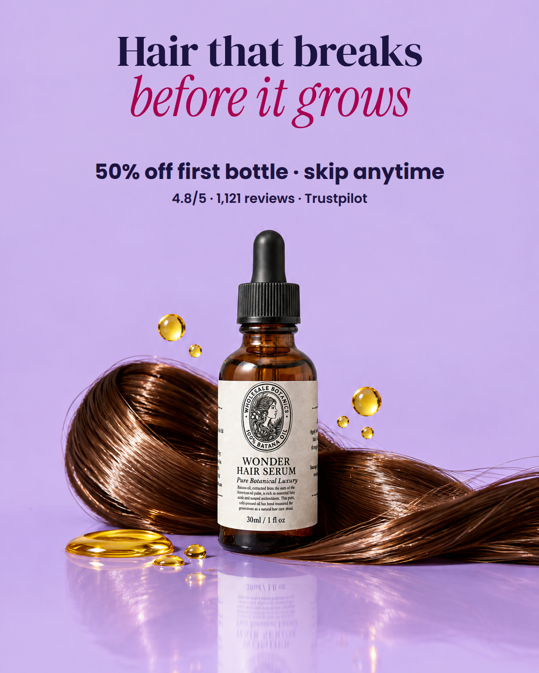
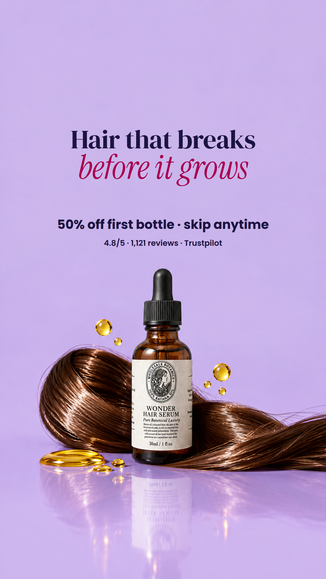
Read of the photograph. A cool lilac studio still: one amber glass dropper bottle with a black pipette cap and a cream engraved apothecary label, stood dead centre on a glossy lilac sweep that mirrors it, with a thick glossy chestnut coil of hair laid horizontally behind and around its base and small gold oil beads floating beside it plus a poured pool of gold oil on the floor to the left. Everything of interest is in the lower half of both ratios: in 4:5 the bottle cap starts at y=460 and the top 450 px is one unbroken field of flat lilac (measured luminance 206, block std under 1), and in 9:16 that empty field is 585 px deep between y=270 and y=855 with the cap at y=889. The picture is symmetric about the bottle, so it wants a centred column of type hanging in that empty upper field, not type pushed to a corner. The only thing in the photograph the hair coil is selling is length that survived, so the copy should name the length that does not.
Type. DMSerif for the first line and InstrumentSerif-Italic for the second, because the bottle's own label does exactly that pairing — engraved high-contrast roman caps for WONDER HAIR SERUM over a light italic serif for 'Pure Botanical Luxury'. Echoing the label's voice makes the type look like it belongs to this bottle rather than being stuck on top of it, and the lilac/glass/gold palette is cool and expensive, which a condensed grotesque like Anton would flatten. The small factual lines are Poppins 800/600 instead: at 26-44 px a high-contrast serif loses its hairlines in-feed, and a deliberate register break keeps the price from competing with the headline.
| head | Hair that breaks / before it grows DMSerif, InstrumentSerif-Italic · The whole upper field of this photograph is empty flat lilac and the bottle is centred, so a centred two-line column hangs there with nothing behind it (measured block std 0.7, luminance 206). The pain is chosen from the photograph: the hair in shot is one long intact glossy rope, which is precisely |
|---|---|
| offer | 50% off first bottle · skip anytime Poppins · This is a price-led category, so the discount is the second thing read, not a footnote. It sits directly under the headline inside the same dead-flat lilac field (std 0.85) rather than down on the mirrored floor, where the hair reflection pushes local std to 15-17 and would eat 42 px type. 'skip any |
| proof | 4.8/5 · 1,121 reviews · Trustpilot Poppins · One quiet line closing the centred column, sized so it reads as a caption to the price and never argues with the headline. It stays in the upper lilac field for the same reason as the offer — the bottom of the 4:5 is the glossy reflection and the only genuinely quiet patch down there is 315x90 px in |
Risk. Checked, with the venv python and PIL/numpy, every box I am shipping against silhouette_box and the safe zone. 4:5 silhouette is [434,460,638,1085]; my lowest element bottoms at y=418, giving 42 px of air to the cap, and the head and offer clear it by 168 and 86 px. 9:16 silhouette is [130,889,637,1534]; my lowest element bottoms at y=830, giving 59 px of air, and everything sits between y=420 and y=830, inside the 270-1248 safe band. All boxes are x=90..990, inside the 65..1015 side limits. Measured contrast in each actual box: local background luminance 205.9-206.4 with block std 0.63-0.85 (flat, unbusy), navy #1c1440 at 9.2:1, accent #a8004f at 4.05:1 — both over 3.0. The accent is NOT house deep pink: I measured #e6127a on this ground at 2.39:1, #ff2d92 at 1.87:1 and #FFFFFF at 1.86:1, all failing rule 5 on a light lilac this bright, so I deepened the house pink to #a8004f, which stays unmistakably pink at a glance and sits in the same violet-red family as the backdrop. Real uncertainties: (1) my line widths are estimates from average character advance, so if the renderer's real metrics for DMSerif or InstrumentSerif-Italic are wider than ~0.52em and ~0.42em it will shrink the head slightly — the honest fix would be a measured text-width pass with the actual font files before render, and the 9:16 head at 100 is the nearest to its w=900 limit. (2) The two ratios are framed differently, so the 9:16 head is set larger (100/132 vs 88/112) to hold the deeper empty field; if that makes the pair look like two different ads rather than two crops, drop the 9:16 to 92/120. (3) '4.8/5 · 1,121 reviews · Trustpilot' lists three supplied facts side by side; if the rating and count are not in fact Trustpilot's, the last token must come off. (4) 50% off is derived from the supplied $14 first subscription bottle against $28 one-time — if the one-time price is not $28 the percentage has to go and the line becomes 'First bottle $14 · skip anytime'.
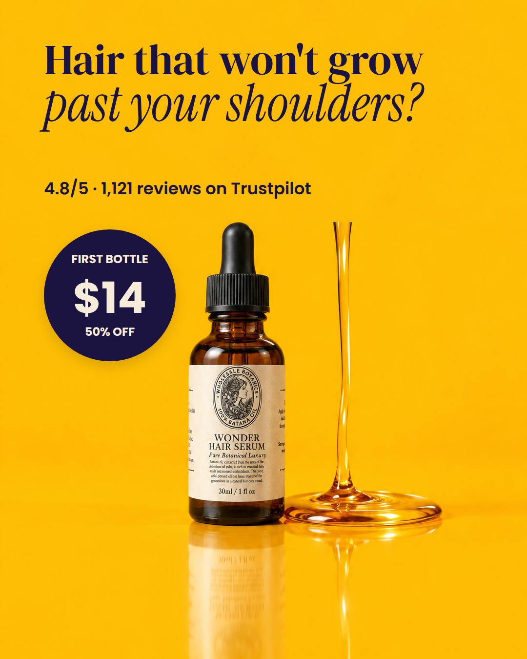
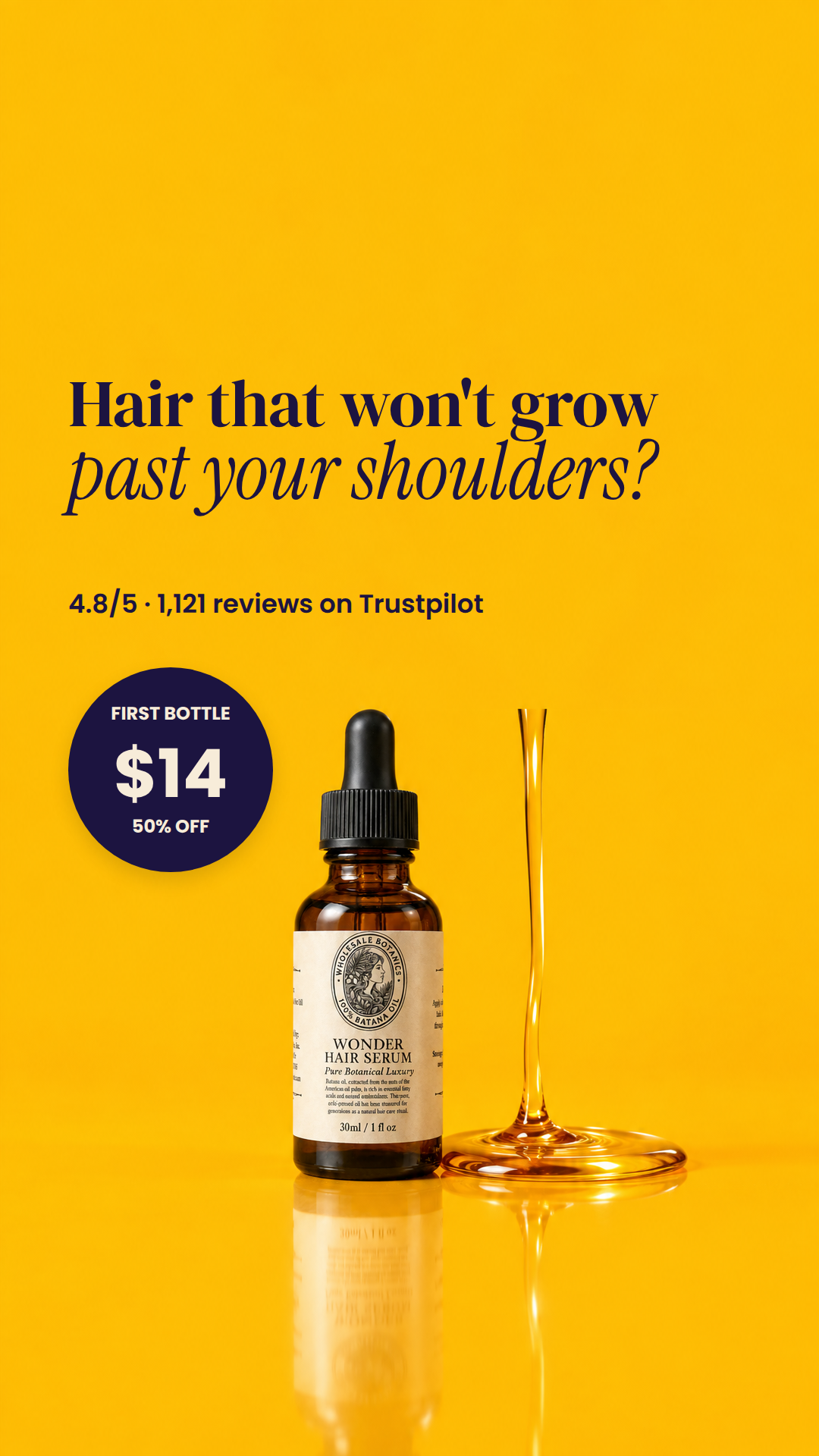
Read of the photograph. A hard-light studio still on a seamless, dead-flat marigold sweep (measured #fdbc05, local std 0.6 across the whole upper field) with a glossy reflective floor. The amber glass dropper bottle stands left of centre with its black ribbed cap and cream apothecary label (Didone-ish caps 'WONDER HAIR SERUM' over an italic 'Pure Botanical Luxury'), and to its right a tall, thin ribbon of honey oil drops into a wide glossy puddle with concentric ripples. The whole top 450 px of the 4:5 (top 930 px of the 9:16) is empty, unbroken colour 900 px wide, and the column left of the bottle (x 65 to 362) is empty full height in both ratios. The photograph is one object and an enormous silence: it wants very little type, placed high and left, and a hard graphic accent low-left to balance the amber mass on the right. There is nowhere else to put type without crossing the bottle, the ribbon, the pool, or their reflections.
Type. DM Serif Display for the first headline line and InstrumentSerif-Italic for the second, both in navy. The label in the photograph is itself set as a high-contrast serif cap line over a light italic serif line, so the ad repeats the product's own typographic pairing rather than importing an unrelated voice; and this is a warm, glossy, saturated-amber shot in the luxury-apothecary register, which a condensed grotesque like Anton would flatten into a discount ad. The italic on 'past your shoulders?' also puts the voice change exactly on the emotional half of the pain. Poppins is used only for the small proof line and the price roundel, where a geometric sans stays legible at 24 to 34 px and deliberately reads as commercial furniture against the serif.
| head | Hair that won't grow / past your shoulders? DMSerif, InstrumentSerif-Italic · The only place in this photograph with room for display type is the empty marigold field above the dropper cap, and it is completely empty: every 45 px cell under this box measures occ 0.0 and std <= 0.9 in both ratios. Left-aligned at x=90 because the photographic mass (bottle at x 386-903, ribbon |
|---|---|
| proof | 4.8/5 · 1,121 reviews on Trustpilot Poppins · Sits on the same left margin as the headline, in the last clear band of the top field before the dropper cap begins. Measured width 548 px against w=600, so no shrink. In 4:5 its bottom lands at y=416, which is 39 px above the silhouette's top edge at y=455; in 9:16 its bottom is y=826, 108 px above |
| roundel | FIRST BOTTLE / $14 / 50% OFF Poppins · The empty column left of the bottle is the one region outside the silhouette box in both ratios, and it is 272 px of usable width, too narrow for a line of type but exactly right for a disc. Putting the price here hangs it beside the bottle at label height, the way a price tag hangs off a product, a |
Risk. OIL SOURCE, honest read: no, this photograph has no plausible physical source for the oil, and it is worse than a missing vessel. The ribbon terminates in mid-air at y~450 in the 4:5 (y~930 in the 9:16), well inside the frame, and I zoomed that region to check: above the tip is unbroken flat marigold, with no bottle, dropper, spoon, hand or frame edge it could be falling from. The taper also runs the wrong way for a falling stream, flaring WIDER at the top and necking down as it descends, whereas a real stream necks down away from its source and widens on impact. The dropper bottle beside it is capped and upright, so it is not the source either. The pool's concentric ripples are convincing, but the column itself reads as a static glass stem or a trumpet mouth, not poured oil. I would treat it as a generation artefact; the only clean fixes are to regenerate the plate with an actual pouring source in frame, or to crop above the tip, which this composition cannot afford. My layout does not depend on the ribbon reading as oil, so the ad still works if the operator accepts it, but a viewer who looks for two seconds will see that nothing is pouring. Second risk, offer wording: the roundel says FIRST BOTTLE $14 / 50% OFF, which is literally accurate but does not disclose that $14 is the first SUBSCRIPTION bottle against a $28 one-time price; a fourth line 'SKIP ANYTIME' does not fit the 270 px circle, so that qualifier must carry in the ad's primary text. I also deliberately left 'free shipping' out. Third, colour: I tested every house accent against the sampled ground and navy #1c1440 is the only one that passes rule 5 at 10.11:1 - white is 1.69, deep pink #e6127a is 2.62, hot pink 2.06, green 1.41 - so this ad is single-ink navy on purpose and no second hue is available on this plate. Fourth, line height: my vertical budget assumed the worst case where the renderer uses full font ascent+descent (122 px at size 88, 138 px at 106); if it uses a tighter leading the block simply sits higher with more air, never lower. CHECKED: I verified every box against silhouette_box and the safe zone in both ratios. 4:5 silhouette_box is [386,455,903,1079] and safe x 65-1015; head bottom worst case y=340 and proof bottom y=416, both above y=431 which is 24 px clear of the silhouette top, and the roundel spans x 90-360, which is 26 px clear of the silhouette's left edge at x=386. 9:16 silhouette_box is [386,934,904,1591] with safe zone y 270-1248; head spans y 490-750, proof y 778-826, both above y=910 which is 24 px clear of y=934, and the roundel spans y 880-1150 inside the safe zone at x 90-360, again 26 px clear of x=386. Every element's x range sits inside 65-1015. Nothing touches.