← Review creativesWhy the earlier version looked too polished
Two existing Foreplay references re-opened at full size for this revision. No fresh search or performance claim.
Our v5 used flattering light, sculpted waves, a styled product display and many levels of typography. W61 uses ordinary phone-photo texture, simpler clothing and a much shorter text hierarchy.
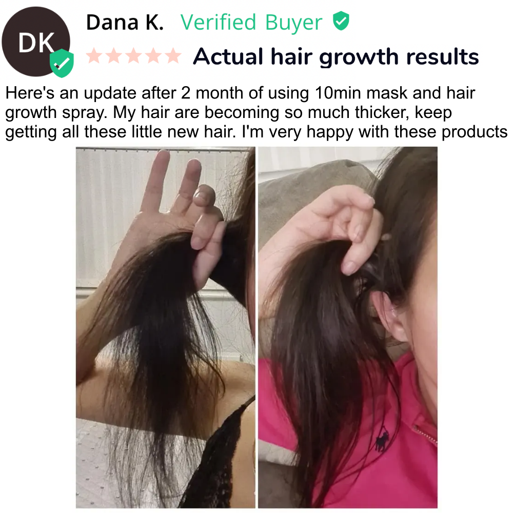
Dana K — ordinary customer framing
Different clothes and hand positions, awkward partial-face crops, plain indoor light, and fine separated strands. The source has a long review header; its perceived photographic authenticity does not come from sophisticated font choices. We apply the casual image formation without copying the customer or review.
Open exact Foreplay record ↗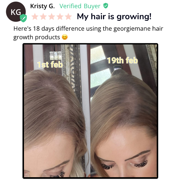
Kristy G — a functional inspection photo
A downward scalp crop, everyday surroundings, slightly different perspective, and simple yellow labels. It is composed to show the hair area, not to flatter a model. We apply ordinary camera texture and let the photograph dominate, without transferring dates or outcome claims.
Open exact Foreplay record ↗These are advertiser-supplied images and assertions, not verified efficacy or performance evidence. W61 is visibly labeled AI-illustrated, not product results.
Compare previous v5 · Earlier multi-brand research