← Creative reviewWhat the competitors actually do
You were right about v3’s sameness. It used essentially the same dark text / pale photograph / left-aligned hierarchy across the whole batch, even though the research already showed other approaches. A consistent brand does not require every concept to use the same composition. This revision keeps the liked photographs and hooks and changes the visual systems.
Method: three fresh Foreplay connector searches on 2026-09-10: “batana hair before after”, “hair growth serum”, and “hair breakage”; image format, most-relevant ordering, 16 results per query. All 48 returned records have distinct IDs within this pull and all 48 images were downloaded and viewed on two contact sheets. Eight selected images were opened at full size for the layout analysis below. Some records repeat advertisers and visually near-identical ads. The first query returned substantial off-target content, including supplements and medical-context ads; it is not presented as 16 direct batana competitors. Some references also appeared in the previous research. This is a targeted design investigation, not an exhaustive market census.
The source images demonstrate visual practice, not conversion performance. No CTR, spend, CPA, ROAS or verified winning status was supplied by this research. Direct serum/hair-care examples and adjacent accessory examples are identified individually.
Finding: color is useful when it creates hierarchy. Arata’s cyan accent isolates an outcome word, Nurel’s blue scene makes white mixed typography distinct, Maria’s yellow makes the pain legible, and Blissy’s arrows turn supporting claims into a visual path. Merely cycling font families on the same layout would miss most of those differences.
Before/after finding: Nurel, Ranavat and Arata visibly use comparisons. The useful design mechanics are matched framing, immediately legible labels, comparable light, enough room to inspect hair, and a clear link between the comparison and its stated meaning. Generated short-to-long portraits cannot supply actual product evidence. W45 therefore presents an AI-illustrated length comparison with “shorter look” and “longer look” labels and “not product results” visible in both final masters. It has no treatment timeline or fabricated testimonial.
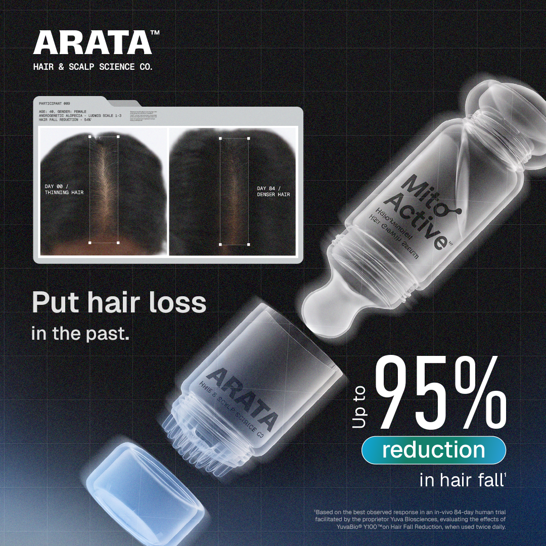
P017 · Arata — contrast and evidence hierarchy
Direct topical hair/scalp product. Charcoal, silver and cyan create an entirely different feed signature from beige bathroom photography. A tilted bottle crosses the central frame; a small comparison module sits upper left; a very large percentage dominates lower right. The image uses three scales of type and a cyan capsule to isolate one word. Its hierarchy is product / comparison / statistic, not headline / paragraph / CTA. Transfer the selective accent and scale separation. Do not transfer the numeric efficacy claim or treat its pictures as Wonder evidence. Our W45 uses the comparison structure, with its fictional status stated on-image.
Open exact Foreplay record ↗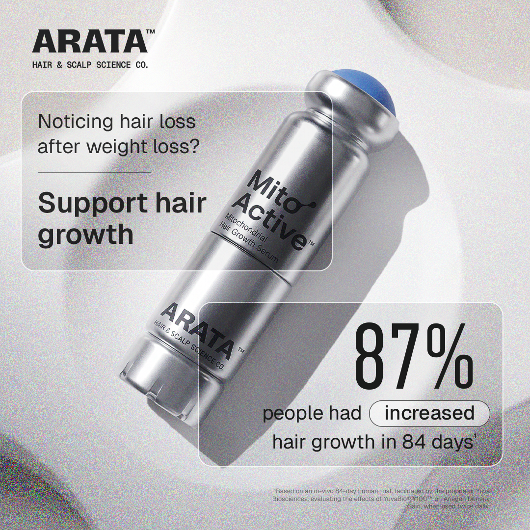
P020 · Arata — annotations without a heavy banner
Direct hair growth serum. The light version keeps the same futuristic bottle, but introduces thin rounded white outlines over a silver photograph. Within the upper module, ordinary-weight pain recognition changes to bold solution text. Another module holds the statistic. This is a useful counterexample to banning all panels: an outline can organize information while preserving the product underneath. W43 uses a teal ingredient annotation and one pale green fact capsule; it points toward the real bottle. Its 100% refers to the supplied ingredient label, not a measured hair result.
Open exact Foreplay record ↗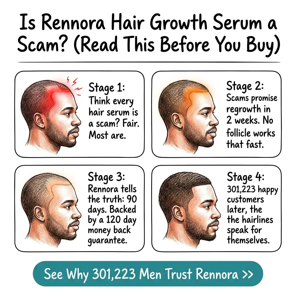
P030 · Rennora — illustrated objection handling
Direct serum category, male-focused positioning. A handwritten headline spans the top; four black-outlined story panels use red anatomical emphasis; a teal rounded CTA anchors the bottom. The sequence answers skepticism before asking for action. The design is not a realistic customer testimonial photograph, although it makes commercial claims that were not independently verified here. W43 borrows the objection-first premise and a drawn pointer, not the four-panel story or asserted customer count. A future Wonder storyboard would require an actual supported mechanism; cosmetic nourishment alone does not justify a follicle diagram promising regrowth.
Open exact Foreplay record ↗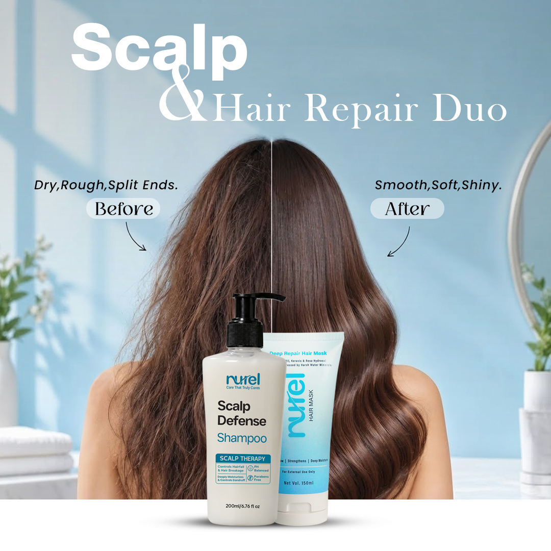
P033 · Nurel — the requested comparison language
Direct scalp and hair-care products. Blue bathroom background, oversized white sans-serif “Scalp,” a contrasting serif line, and a split down one woman’s hair. Small curved arrows associate the short labels with the visible halves. Bottles overlap the center foreground. Most of the frame remains hair rather than explanation. W45 directly adapts the side-by-side comparison and blue field, but uses two matching portraits so the short-versus-long difference is easy to read. The image is an AI hairstyle visualization, explicitly labeled, without dates or an asserted Wonder treatment effect. W44 borrows the sans/serif contrast for the identity hook.
Open exact Foreplay record ↗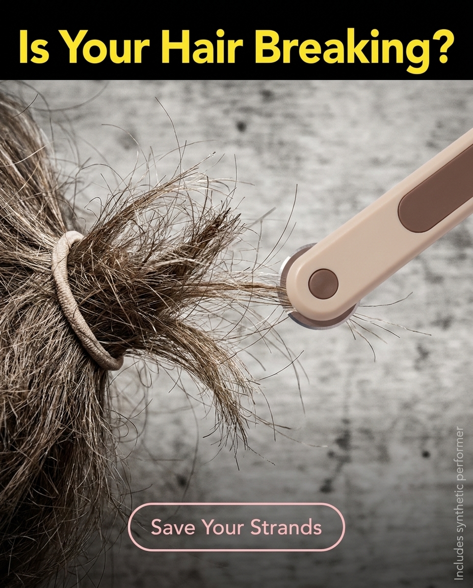
P036 · Maria’s Finds — selective yellow with an immediate problem
Adjacent hair accessory, not a serum benchmark. A close view of frayed strands and a cutting tool fills most of the ad. Bright yellow type on a black top strip states the breakage problem; the outlined pink CTA is much quieter. The strip is roughly one seventh of the frame, so this is real evidence that competitors sometimes use banners. The issue is repeating that treatment indiscriminately. W41 borrows selective yellow emphasis behind only “Dread day.” W42 borrows the close hair pain and urgency, replacing the strip with condensed red typography placed in existing empty wall space.
Open exact Foreplay record ↗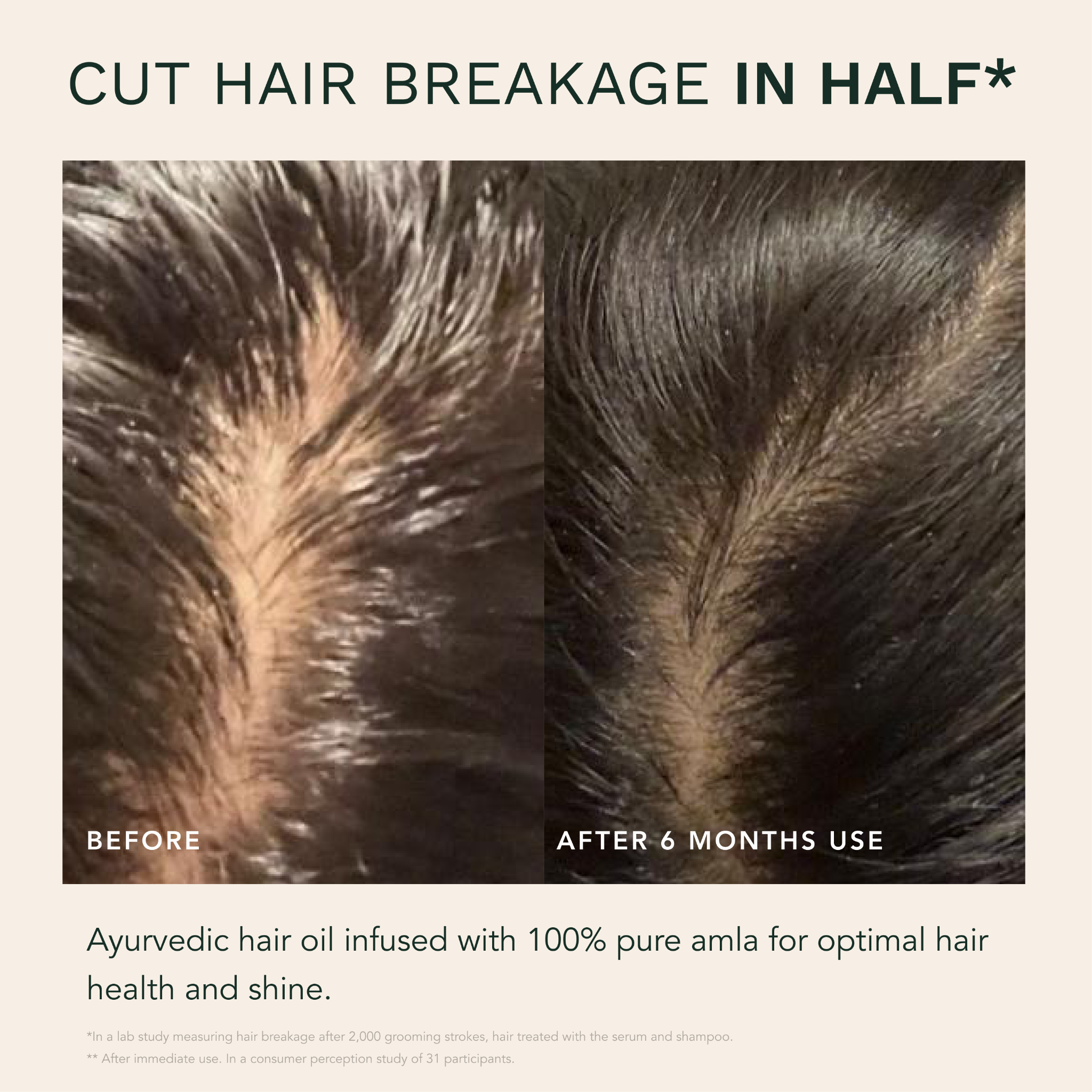
P041 · Ranavat — comparison takes priority
Hair oil category. Deep green typography on cream, an uppercase benefit claim with one bold word, then two large scalp crops of approximately equal size. Labels sit within the photographs; product explanation sits underneath. The comparison itself occupies the majority of the canvas and requires little reading. The visible ad includes a six-month label and a qualification below its claim. Those are that advertiser’s assertions; this research does not establish their truth or provide equivalent Wonder proof. W45 borrows equal framing and obvious side labels. It deliberately compares hairstyles, not fabricated treatment outcomes.
Open exact Foreplay record ↗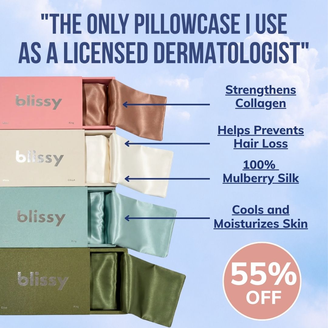
P042 · Blissy — condensed type, color and pointing lines
Adjacent silk pillowcase. Navy condensed capitals dominate a pale blue background; four differently colored boxes form a vertical stack; arrows connect each box to short underlined benefit statements. A circular pink promotion badge creates another shape and reading stop. Its visual lesson is the combination of a narrow headline font, line annotations, and selective color, not the copied endorsement or benefit claims. W42 uses a condensed font with a much larger final pain word. W41 uses a different broad sans-serif and an accent strip. These are materially different treatments, not a regular/bold switch.
Open exact Foreplay record ↗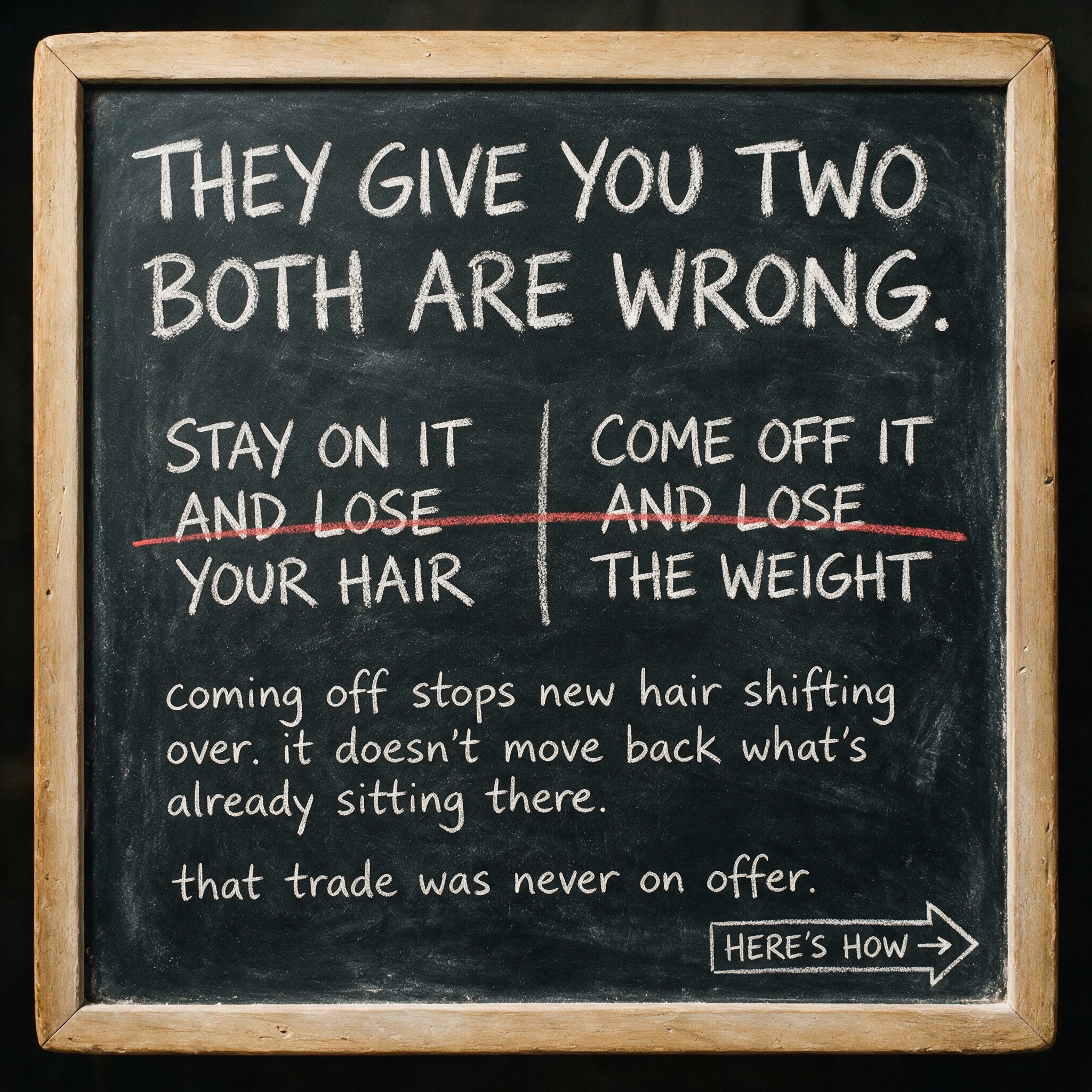
P004 · James Kilgour — a photographed writing surface
Direct scalp/hair advertiser. White chalk on a framed blackboard, a two-column dilemma, a red strike across the unwanted alternatives, and a sketched arrow CTA. The text appears part of the photographed object, producing a different texture from a polished overlay. Its medical/weight-loss subject is outside the Wonder product facts. The transferable lesson is that drawing, underlining and surface-native writing are legitimate visual systems in this market. This v4 keeps the operator-liked photos, so it borrows a restrained drawn underline and pointer rather than replacing them with a chalkboard.
Open exact Foreplay record ↗