9:16 benchmark — how the category actually builds them
AG1 and Seed added from the Meta Ad Library after the Foreplay credit pool ran out. 49 real 1080×1920 ads pulled from Foreplay, measured not assumed. Grouped by structure.
The rule I kept breaking
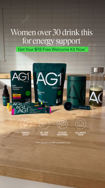
The image is always complete. Every ad in this set is a whole, full-canvas composition — a full-bleed photograph, or a hero object on a colour field that runs edge to edge. Copy and CTA hug the safe middle. Fine print is pinned to the very bottom edge. Some of the image gets covered by platform UI and that is accepted.
What I shipped was a sandwich: a flat dead band, a bar, a masthead, a strip of photograph, another flat dead band. That is not an image with something placed on it — it is an image that has no top and no bottom.
What this set says, against what I built
They do not use one template. There are at least eleven distinct structures here. I built a single bar + masthead + photo sandwich and kept patching it for four rounds.
Most have no CTA button at all. Of the 24 I studied closely, roughly four carry a button, and those are small bars or pills low in the frame. My centred purple lozenge resembles nothing in this set.
Nobody leaves a blank safe-zone band. Content runs edge to edge, top and bottom. Fine print sits at the very bottom of the canvas. They accept that platform UI overlays the reserved zones — which is what those zones actually mean.
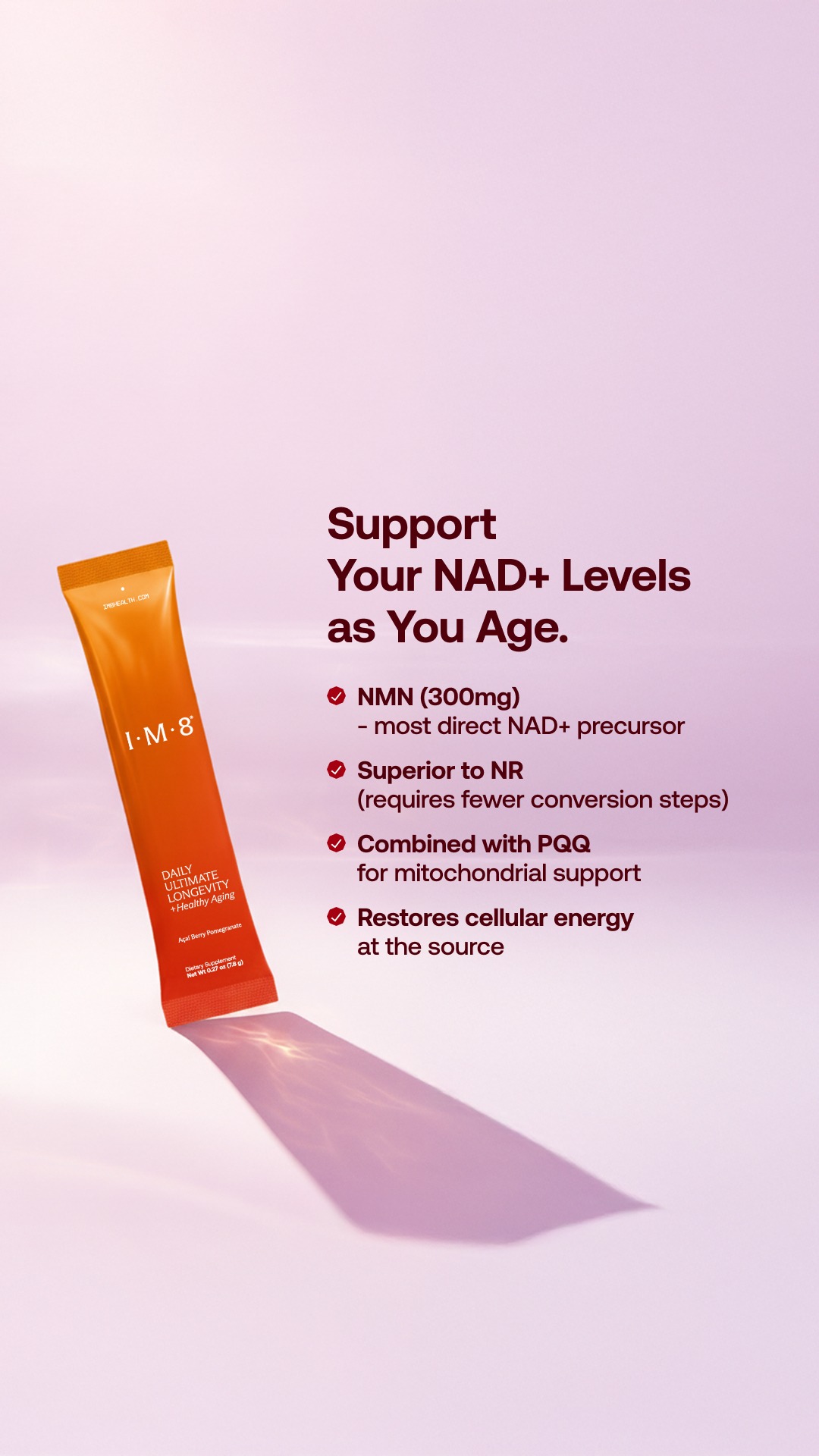
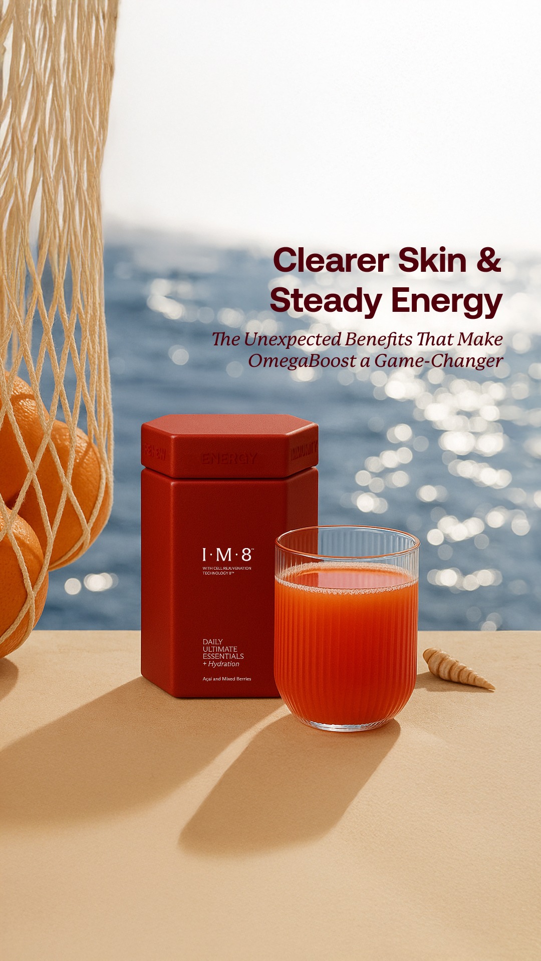
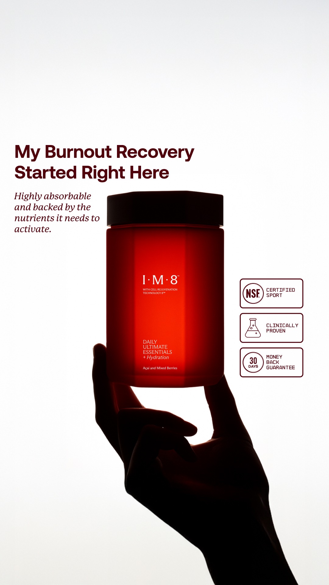
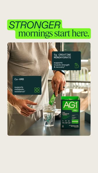
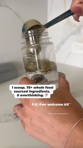
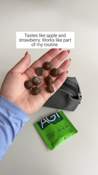
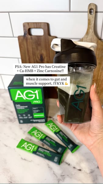
Product is handled, poured, cropped or occluded — held in a hand, pouring into a glass, standing behind fruit that overlaps its base, or deliberately cut by the frame edge. Never standing untouched in a corner.
Typography mixes within a single headline — roman against italic serif, logo set inline inside a sentence, small-caps attribution, fine-print substantiation beneath a big number.
modular grid 4
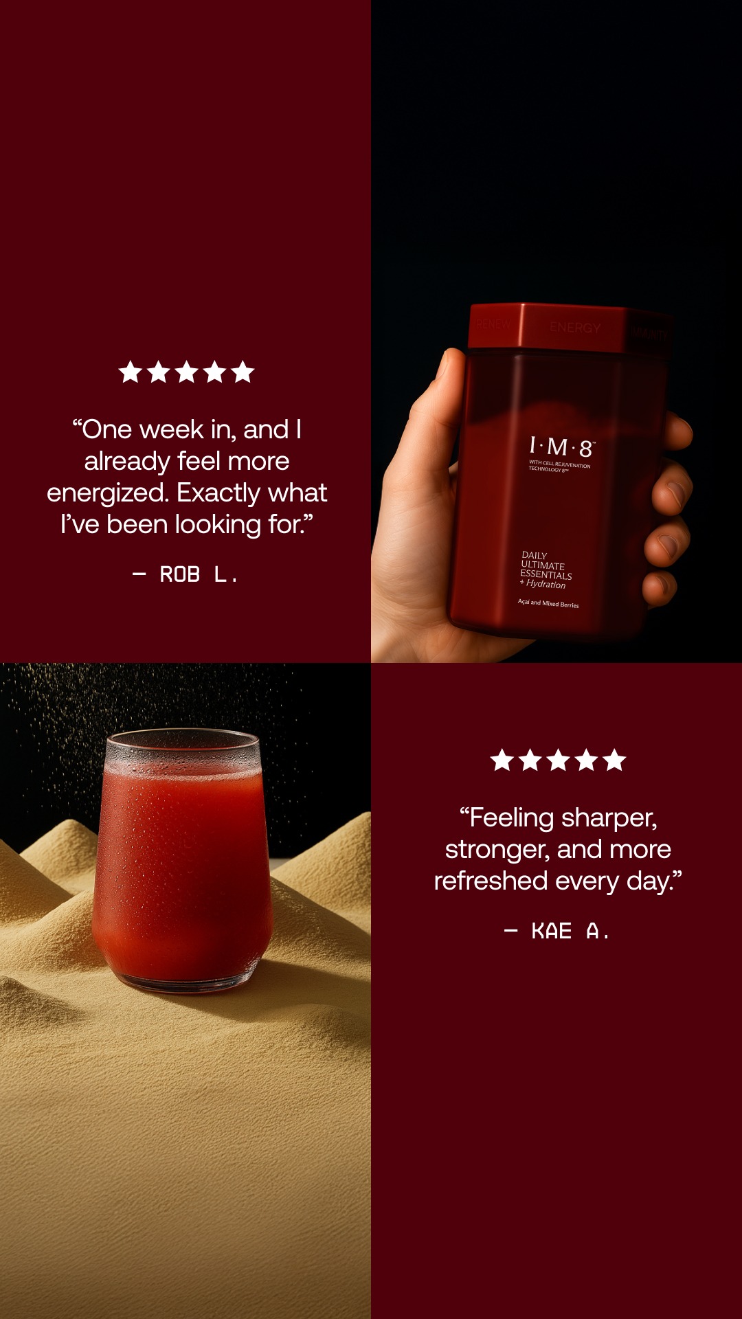
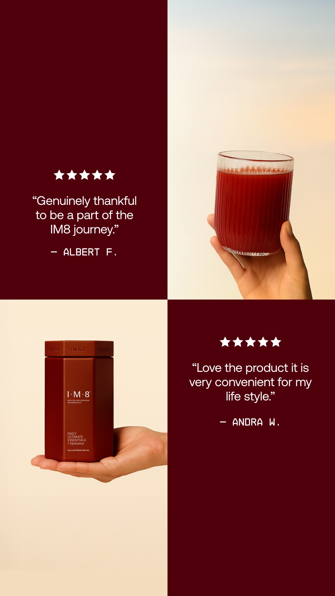
2x2 or asymmetric panels mixing photograph, flat colour, copy and product. The single most common structure in this set — and one I have never once used.
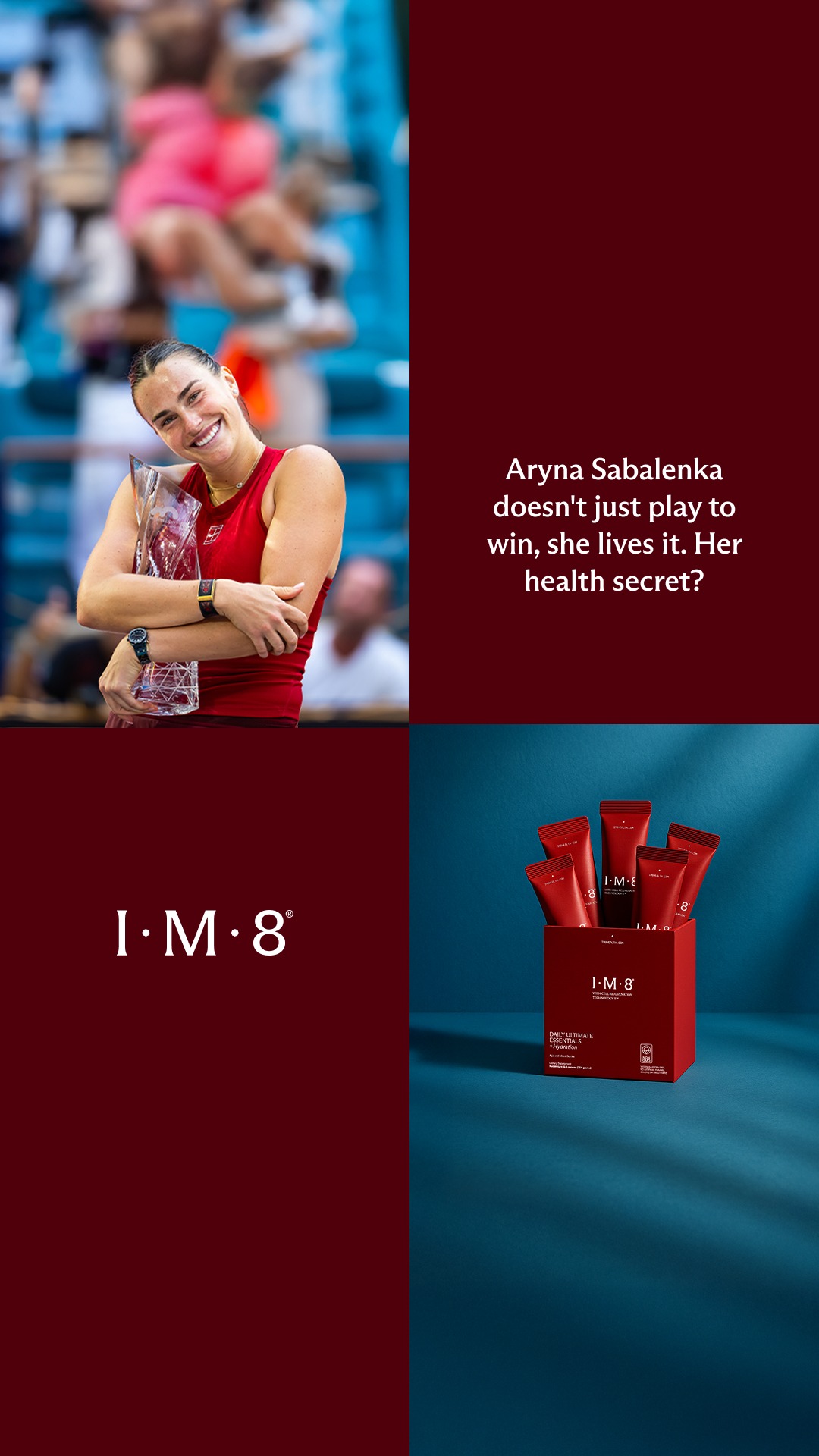
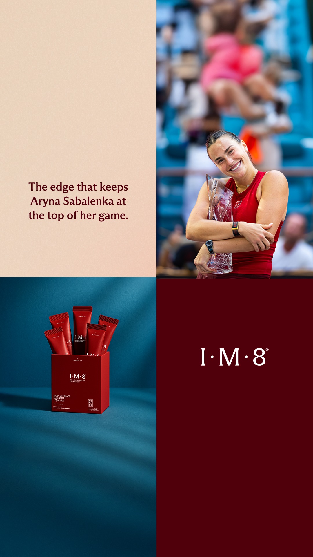
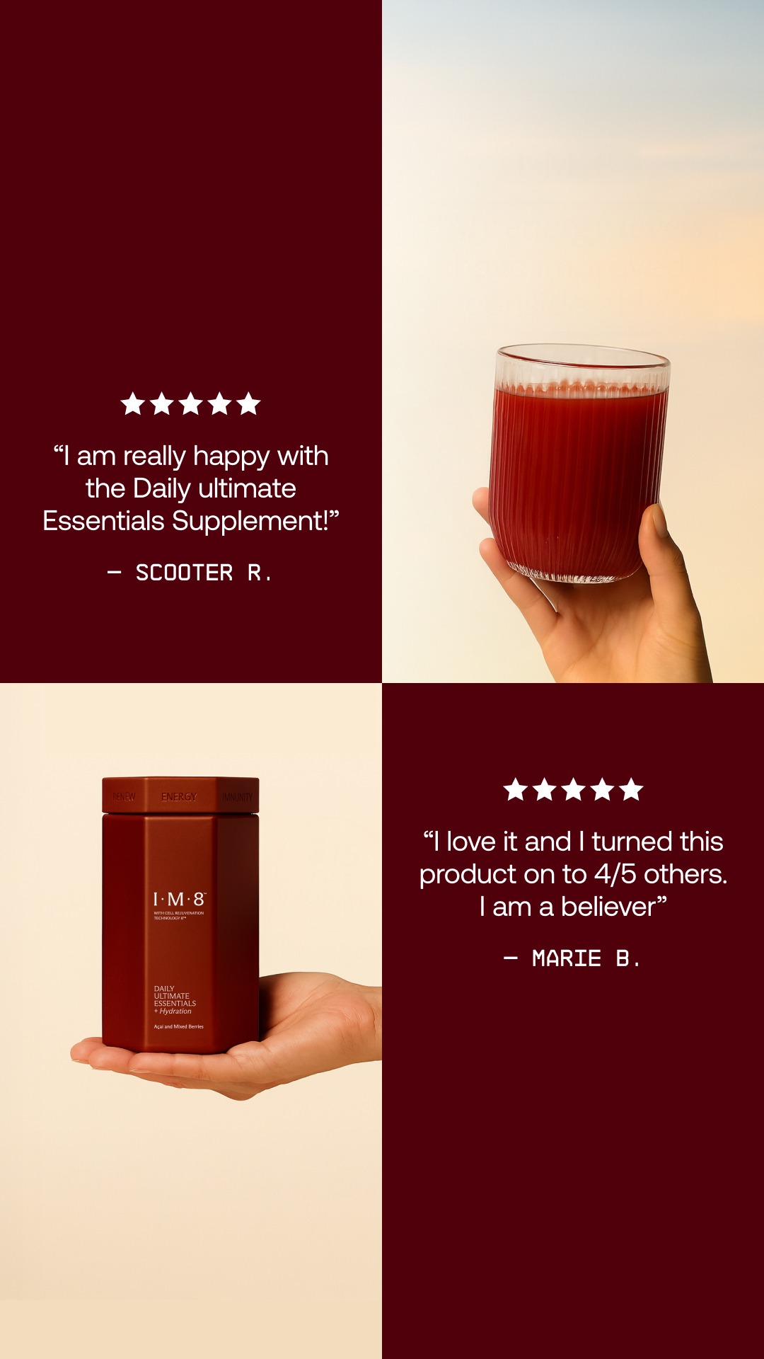
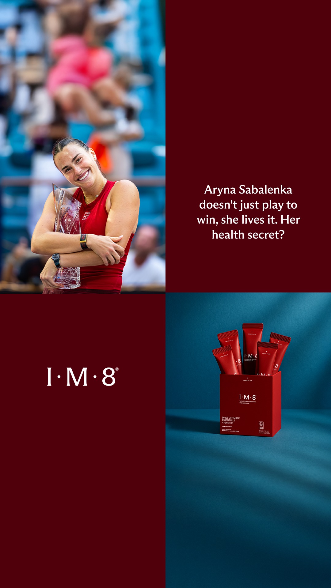
photo scene 2
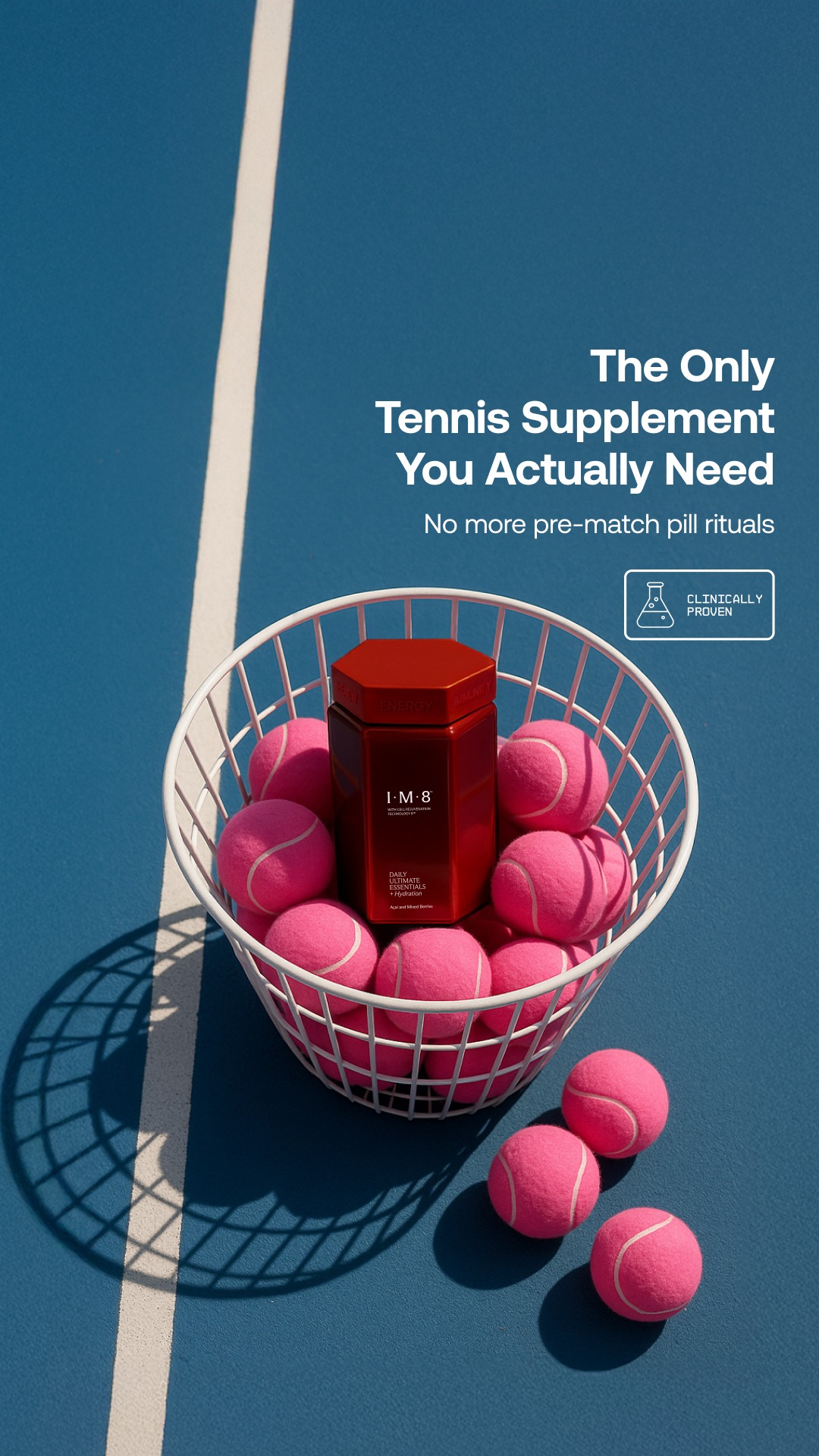
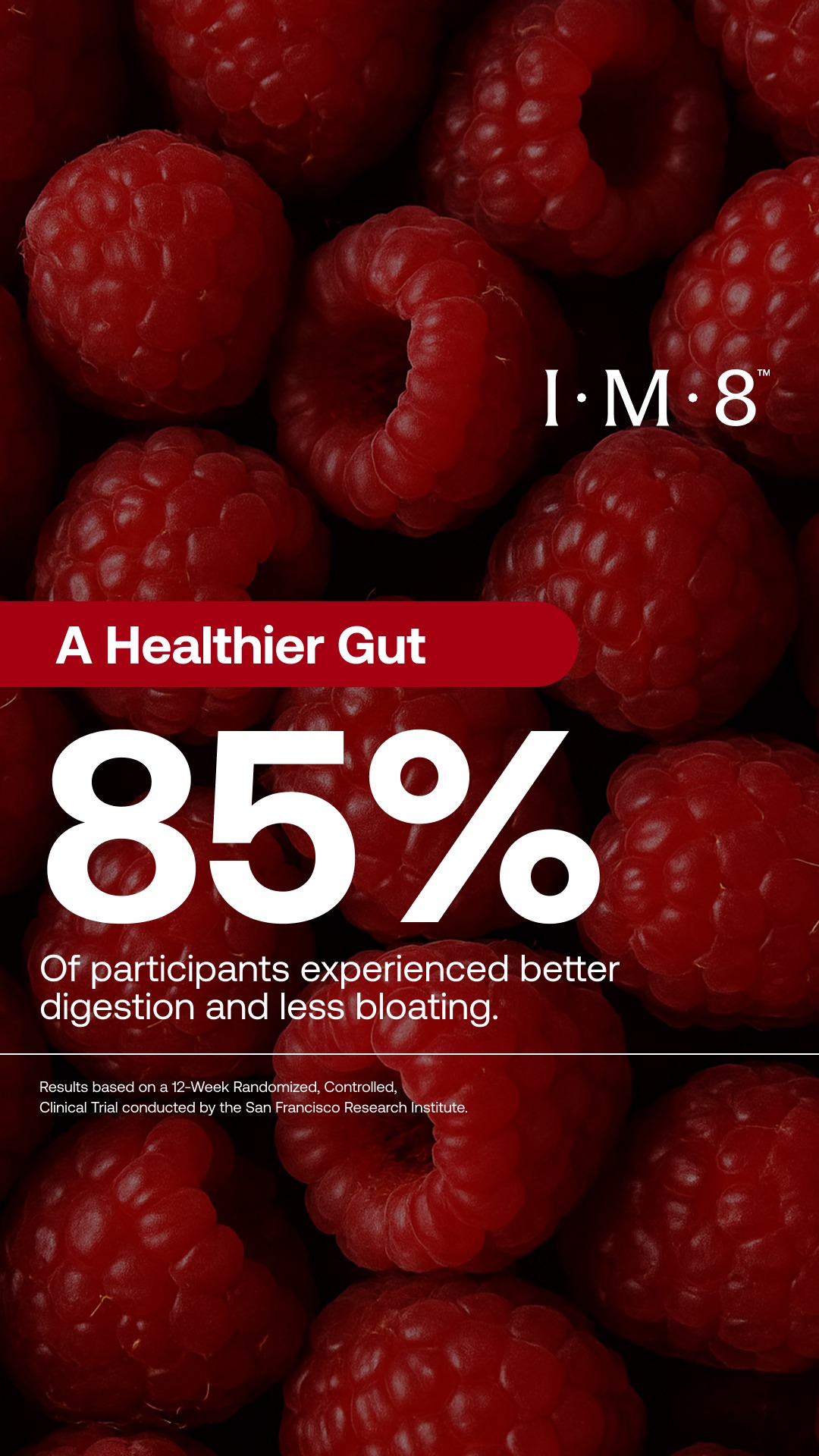
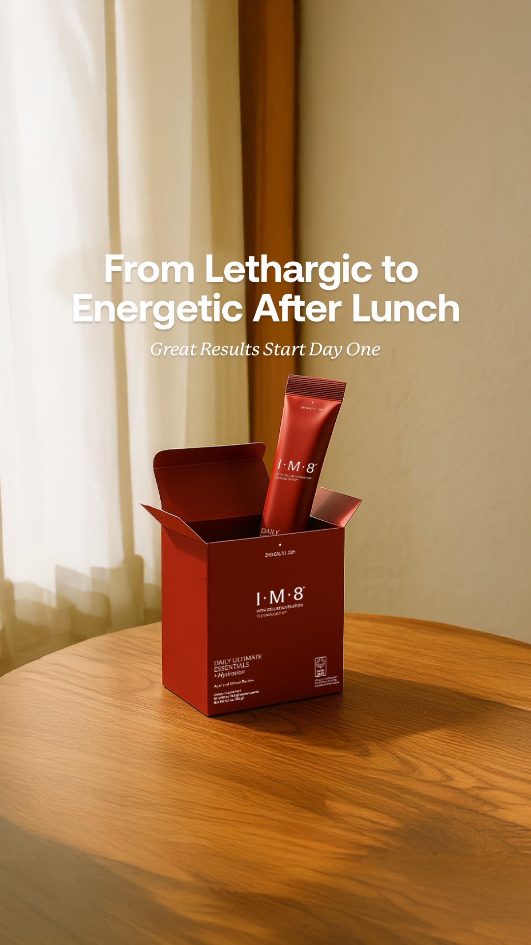
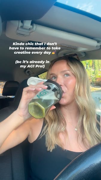
Full-bleed photograph, type set directly on it. Contrast comes from the photograph’s own tonality, not a scrim.
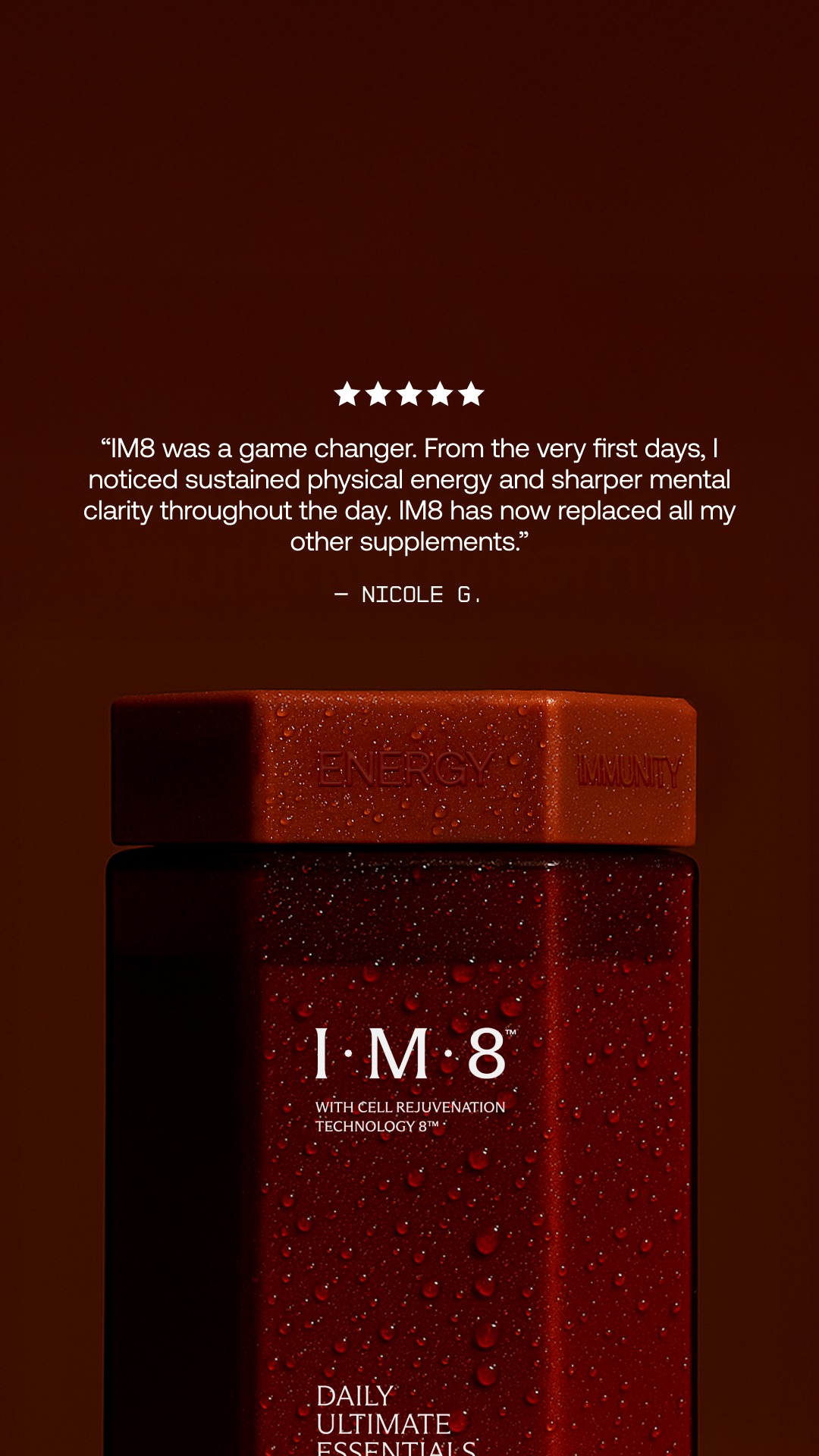
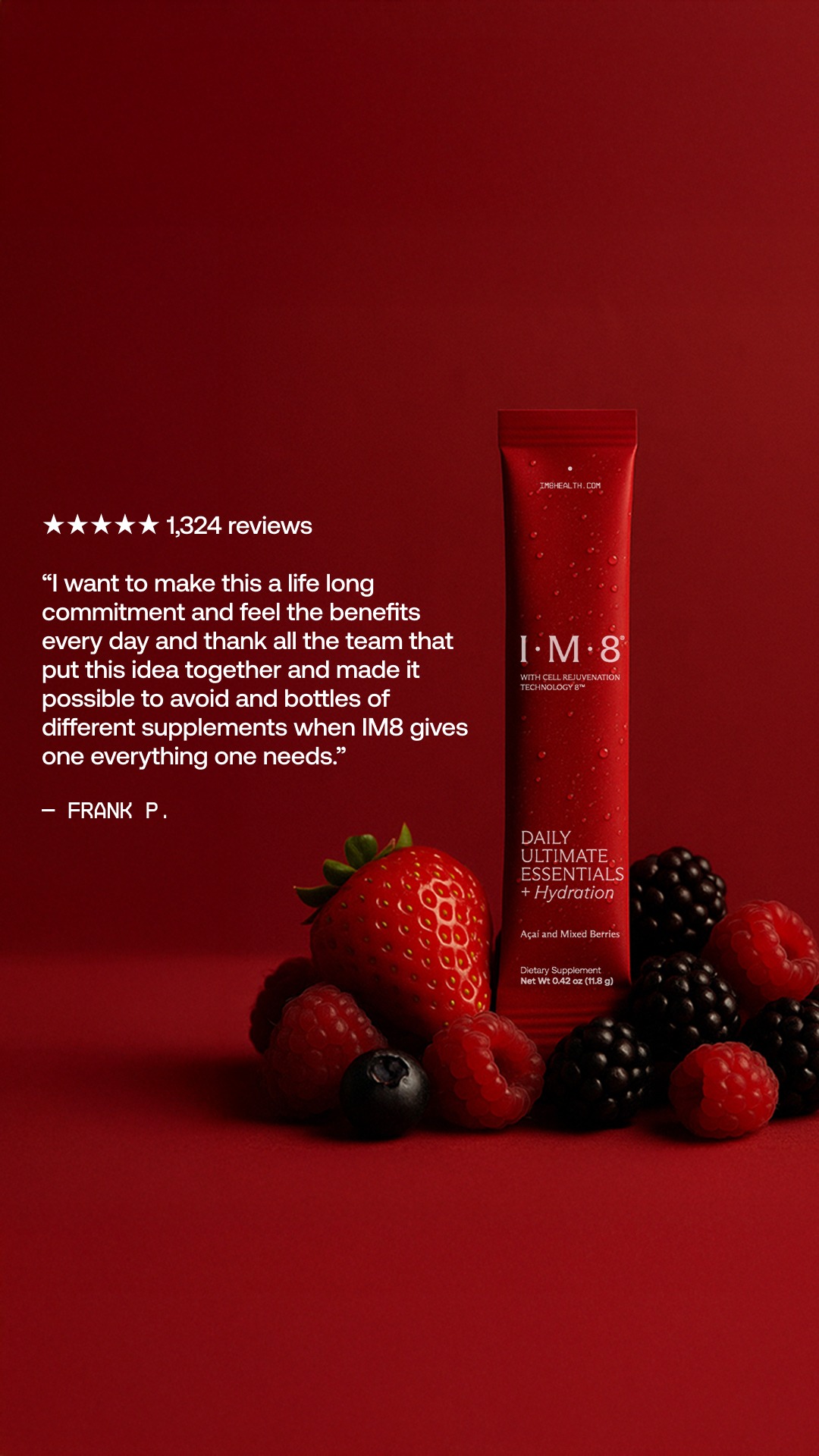
testimonial led 3
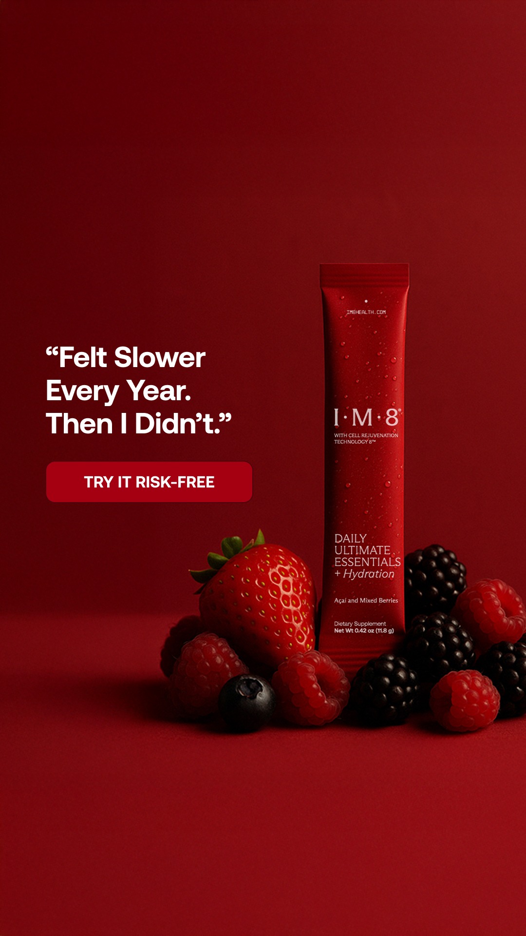
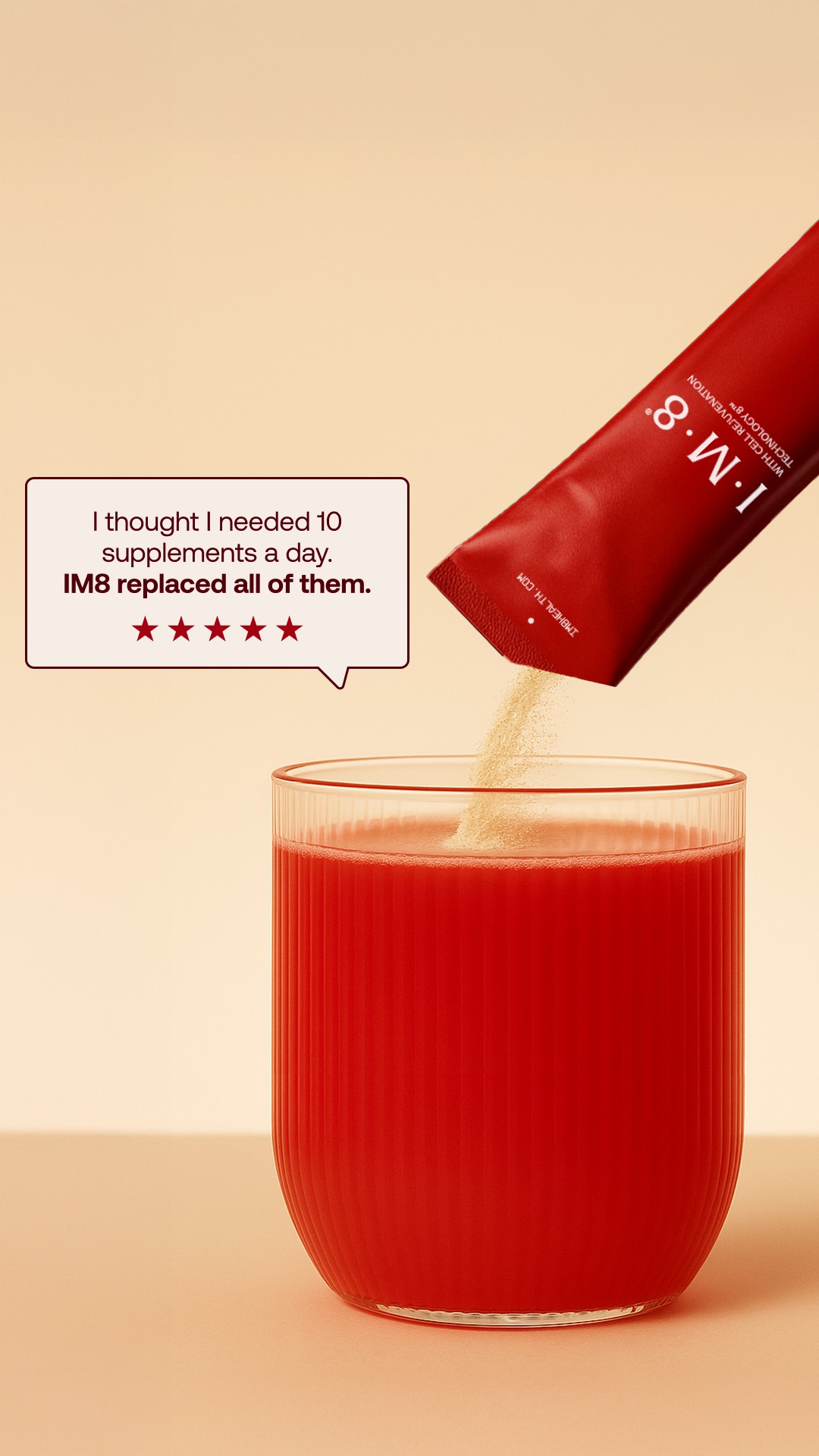
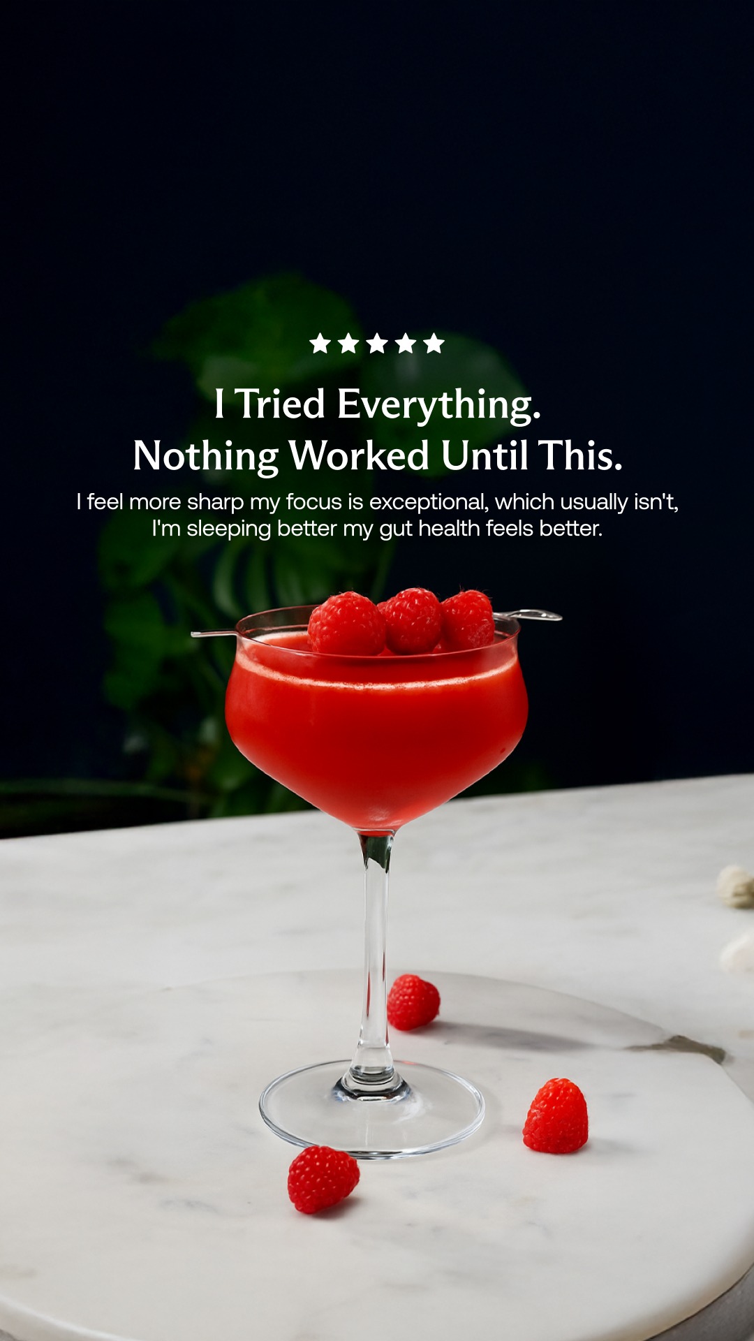
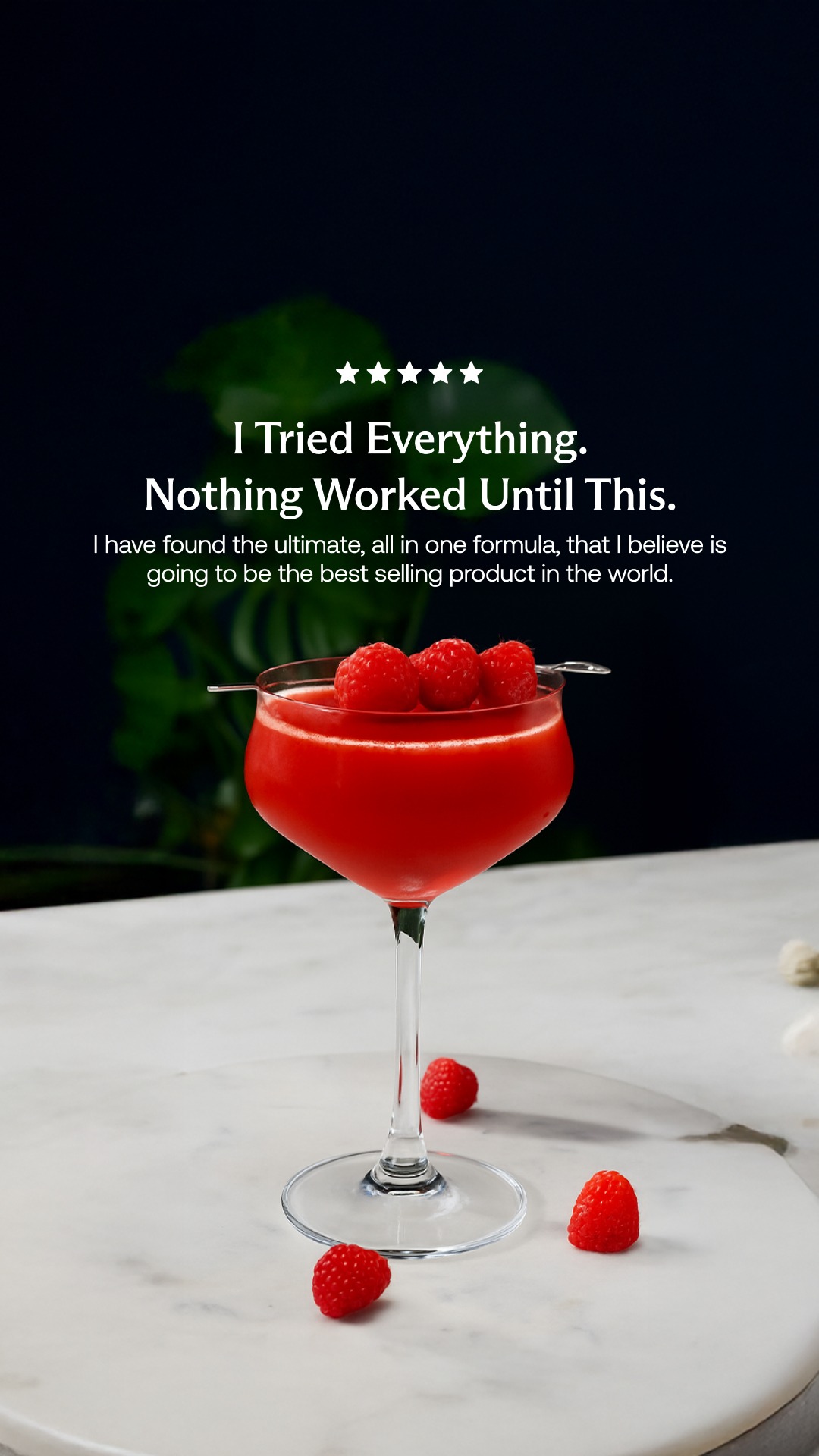
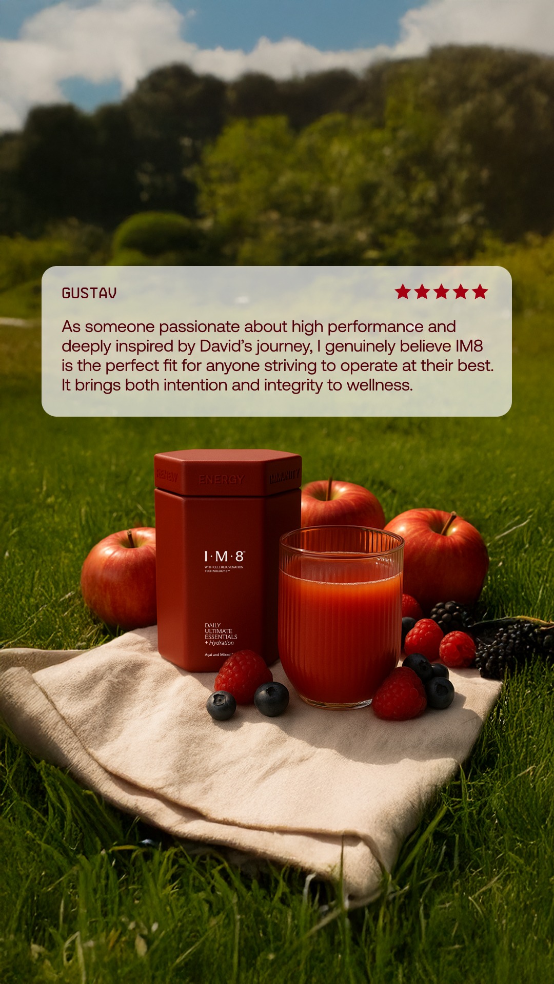
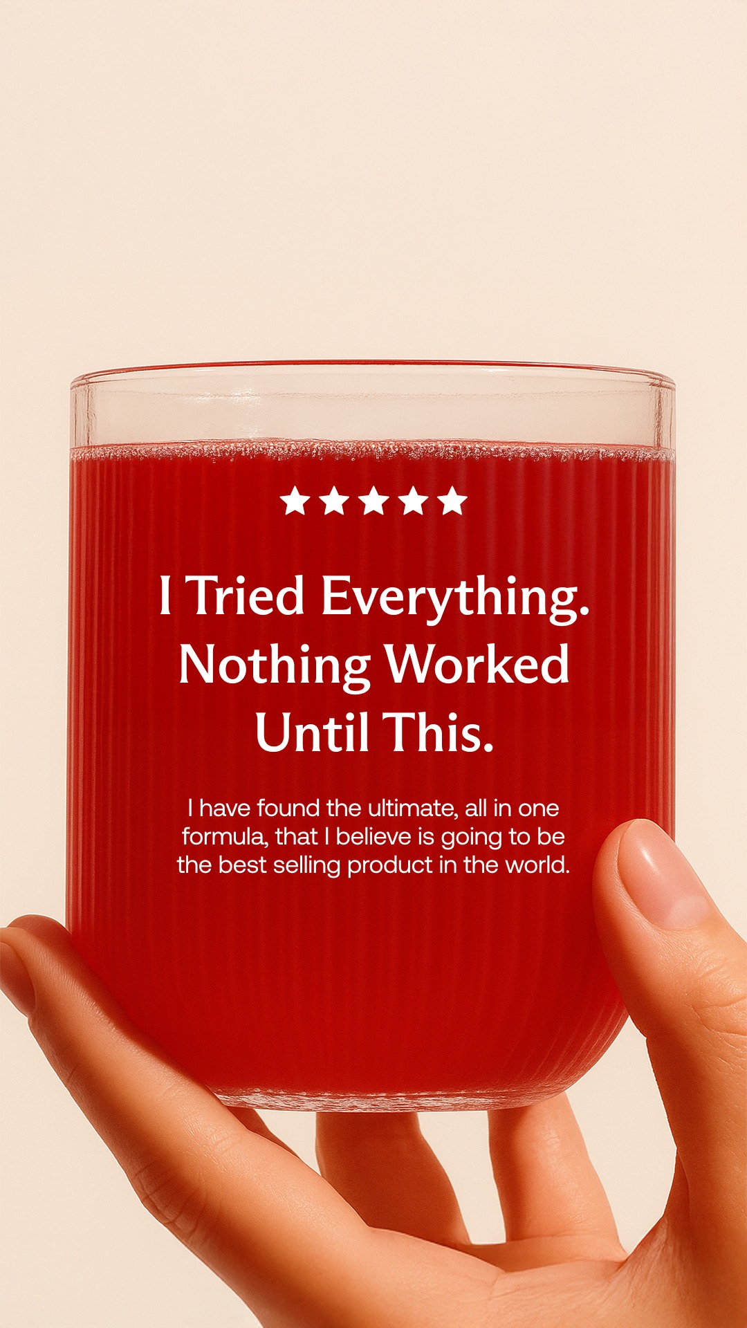
The quote is the hero. Product is secondary, often partly occluded by foreground ingredients.
format mimicry 3
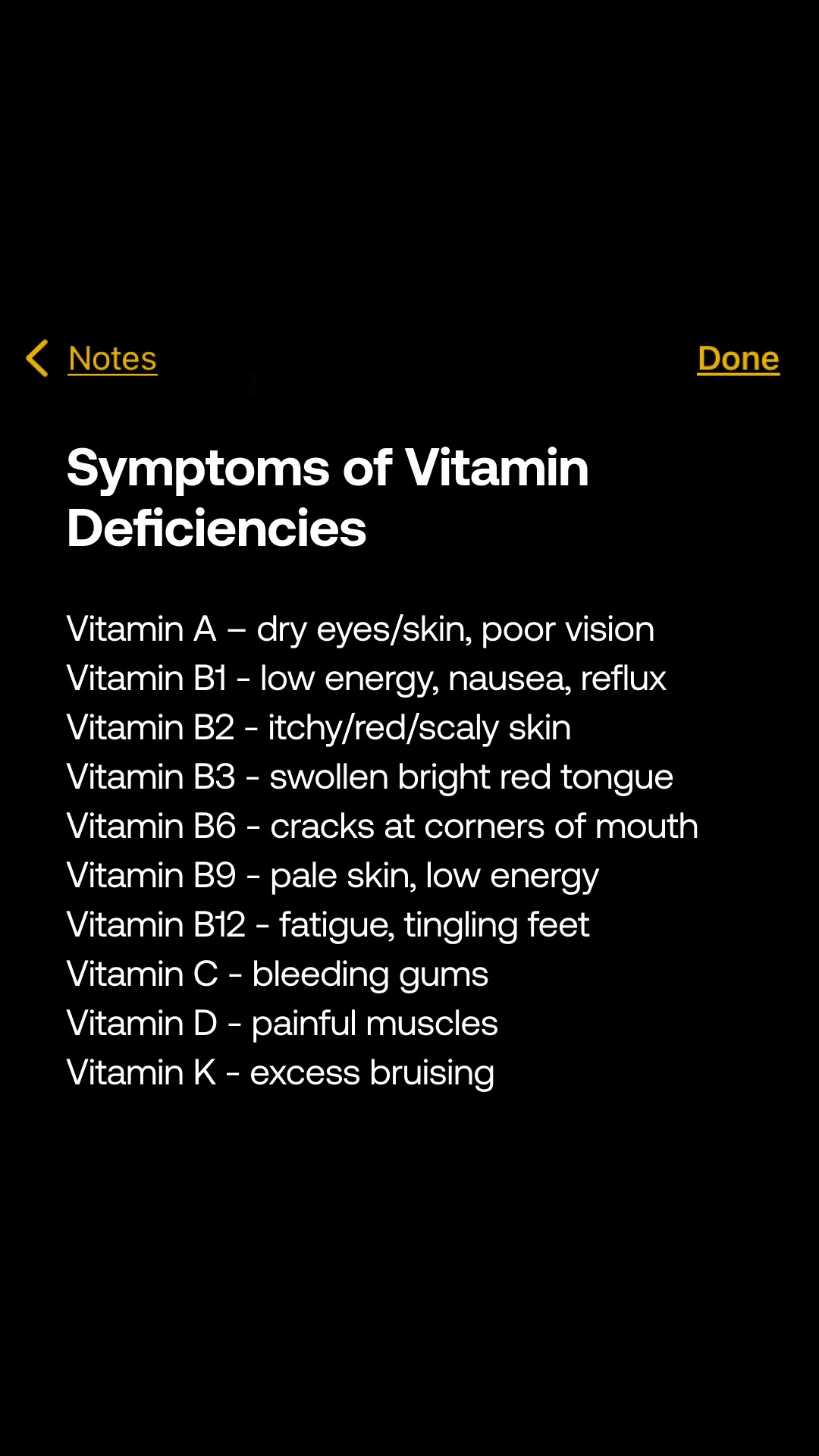
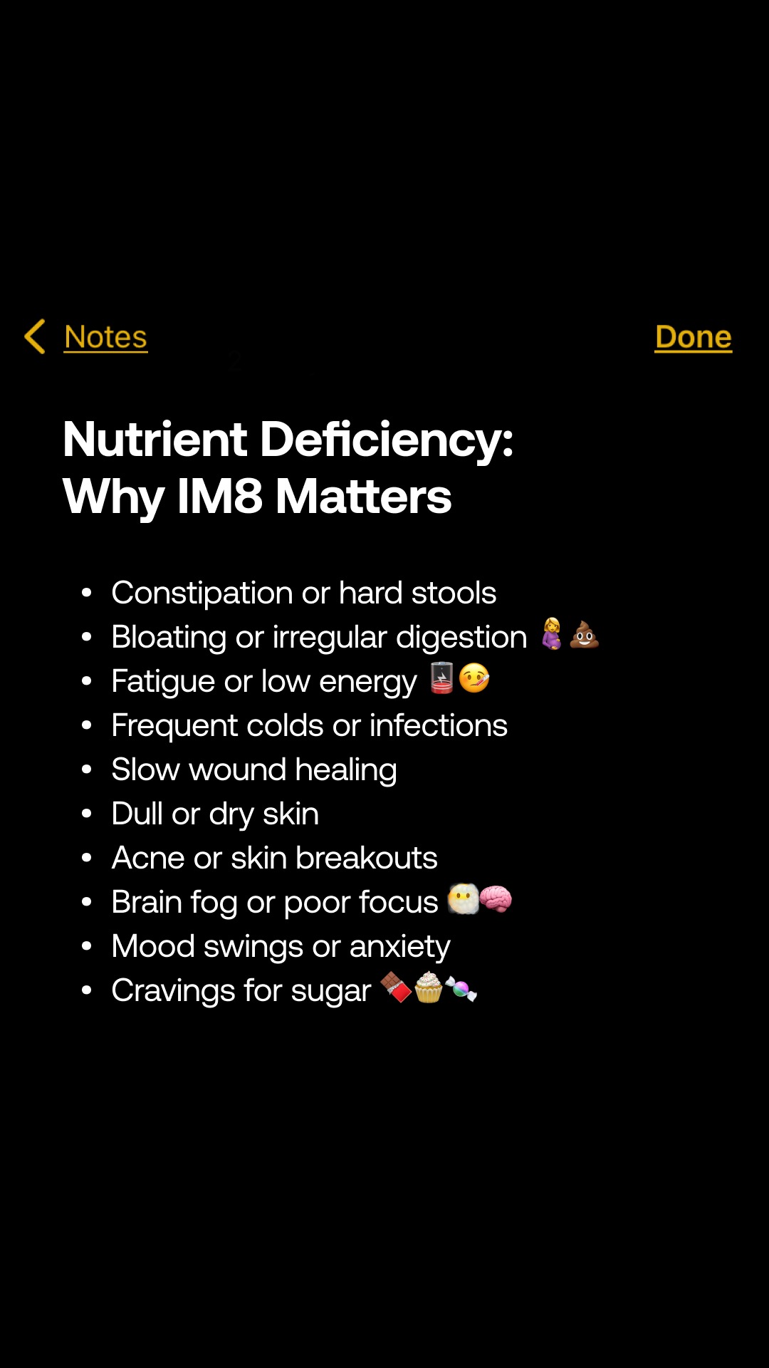
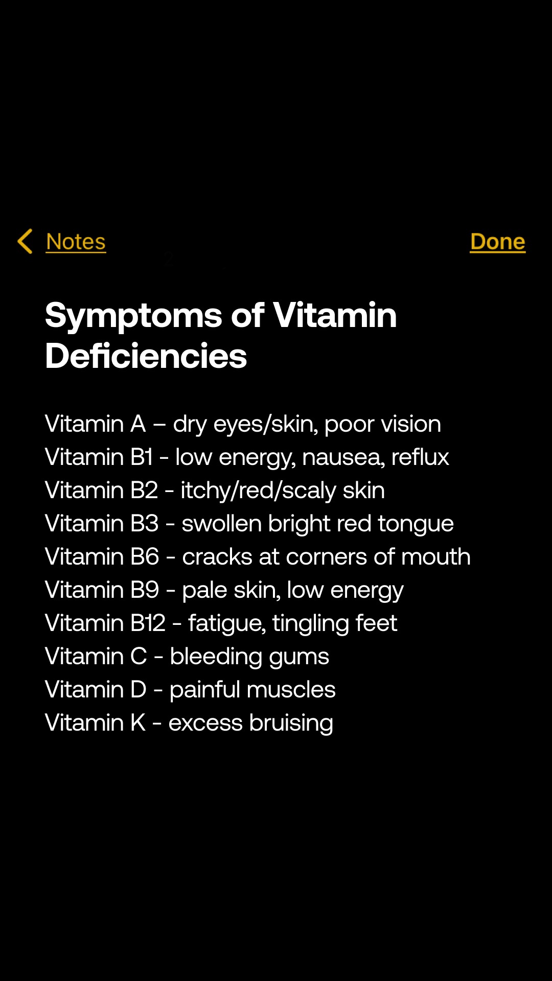
A literal iPhone Notes screenshot. No branding, no CTA, no furniture at all.
product hero 3
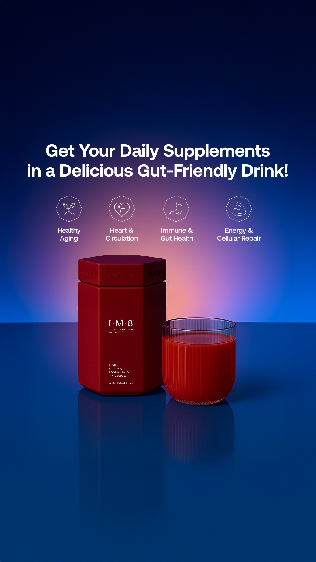
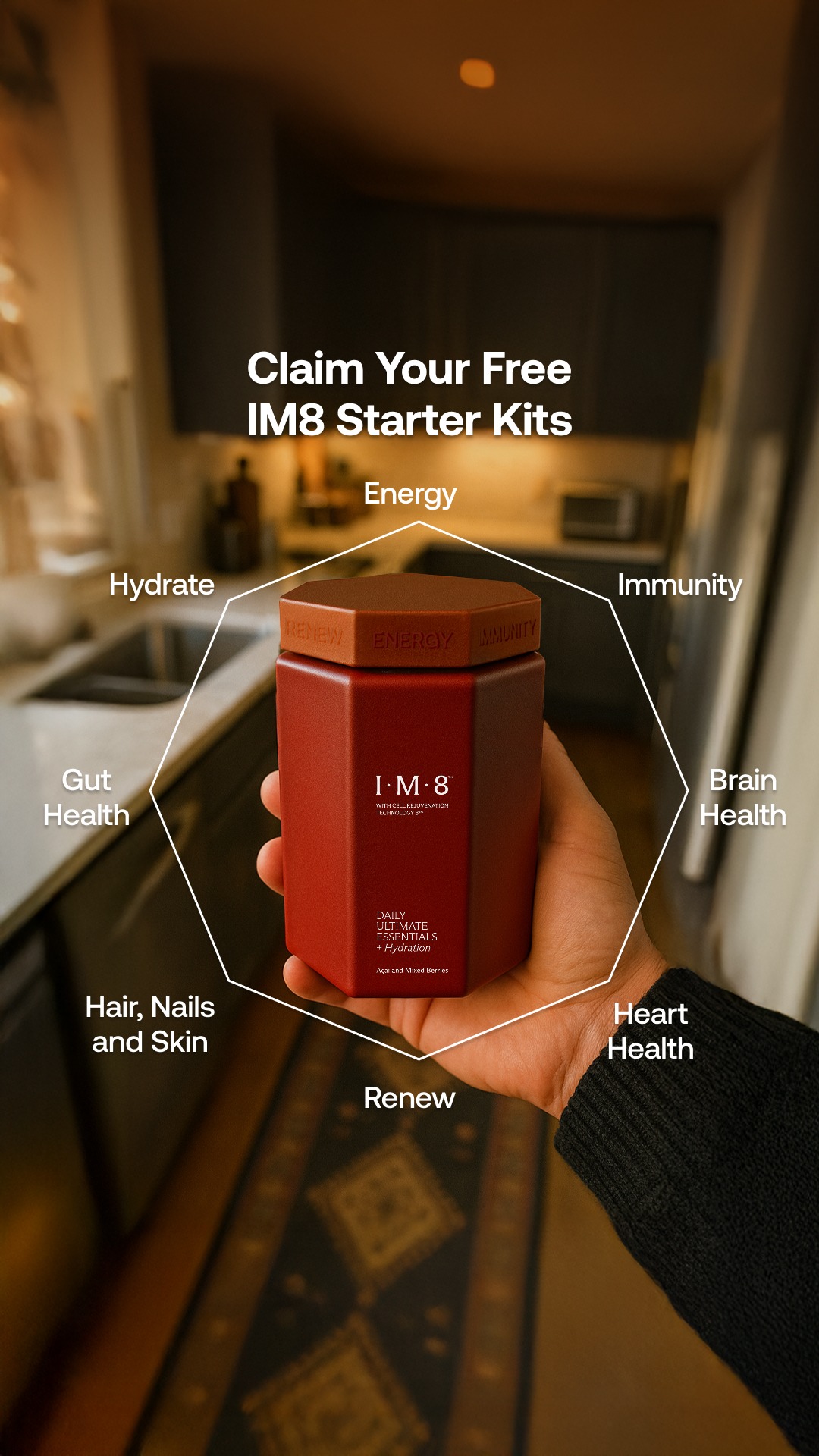
Product centred on flat or gradient ground, benefit labels radiating around it.
split editorial 2
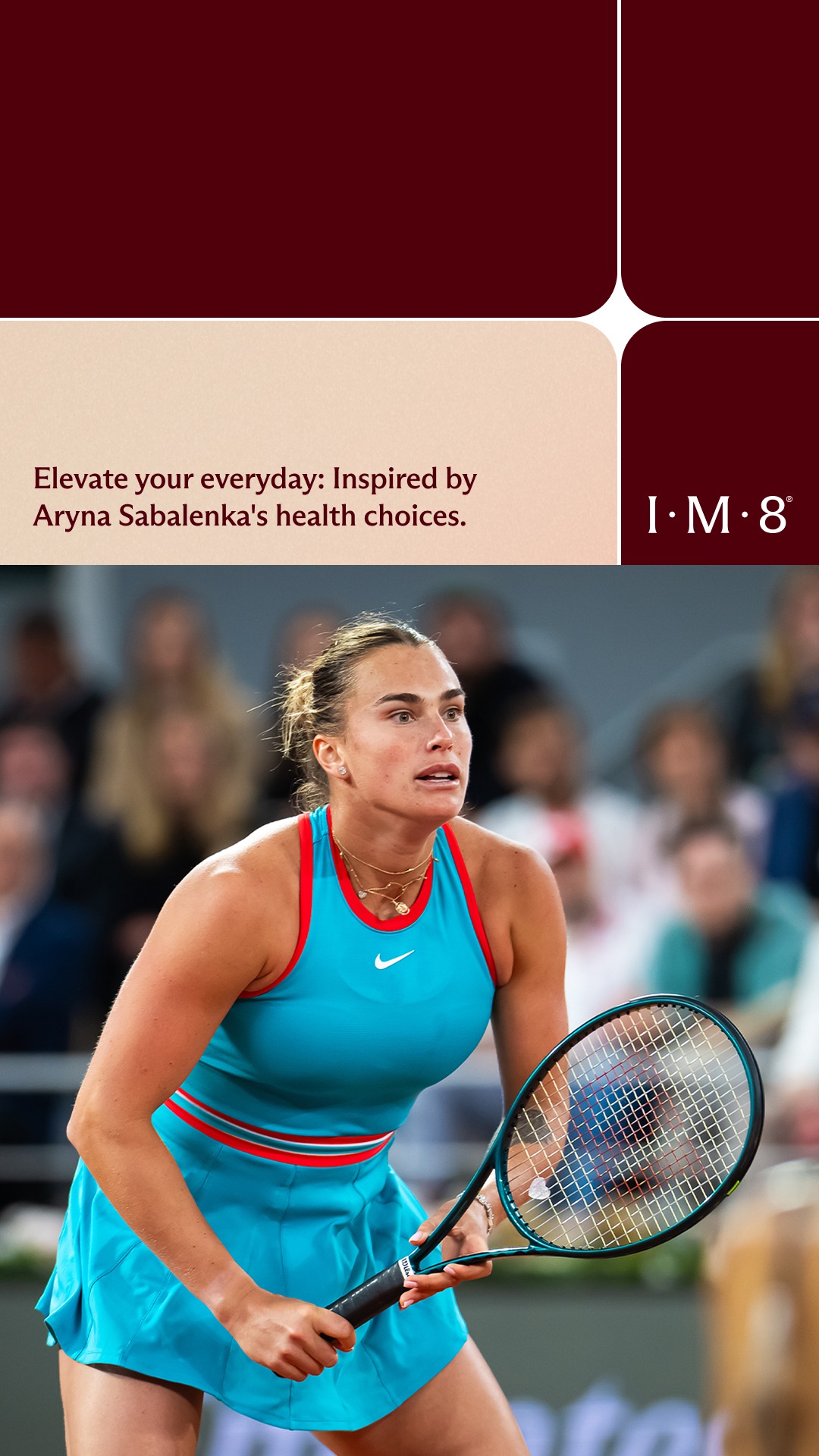
Asymmetric split: editorial copy panel against a photograph bleeding to the edge.
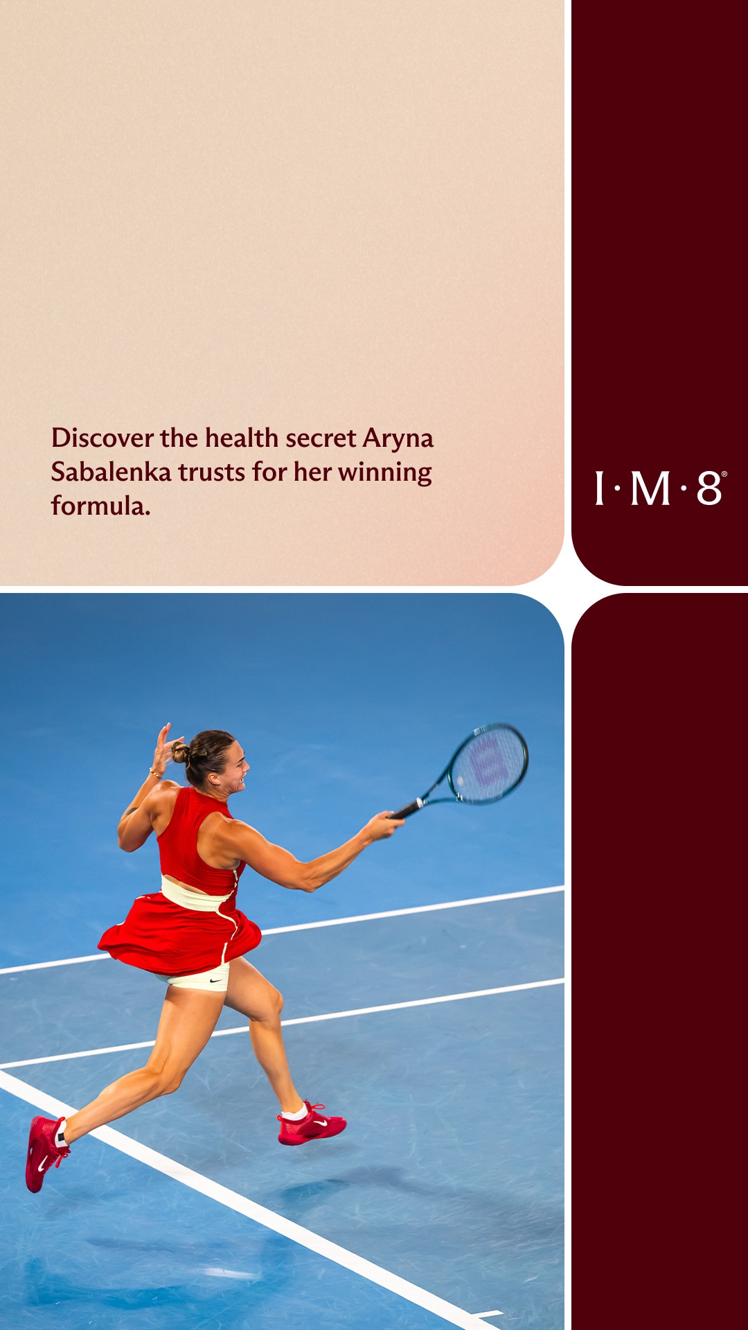
claim with substantiation 1
Big claim, then fine-print trial substantiation set small directly beneath.
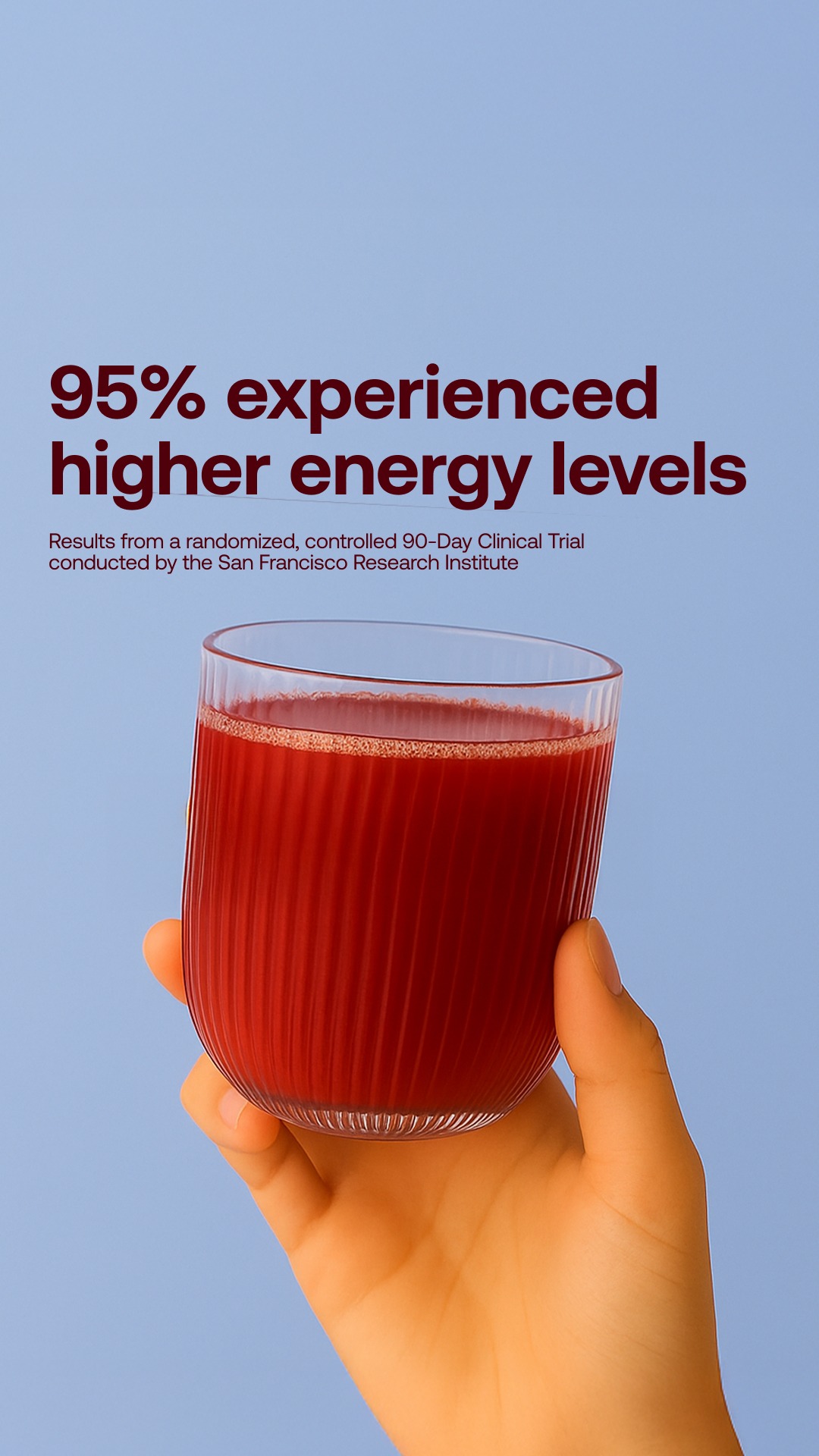
ingredient breakdown 1
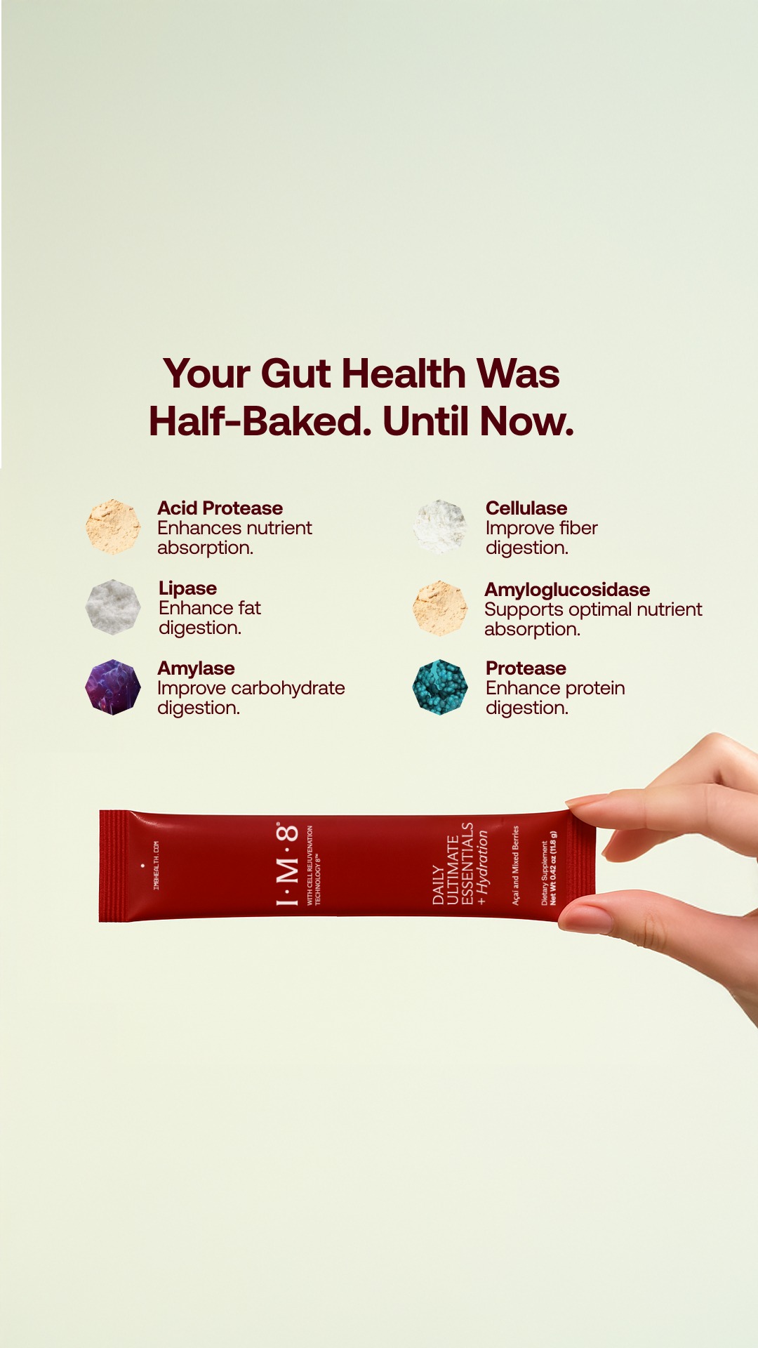
Named ingredients with one-line functions, then a small CTA bar.
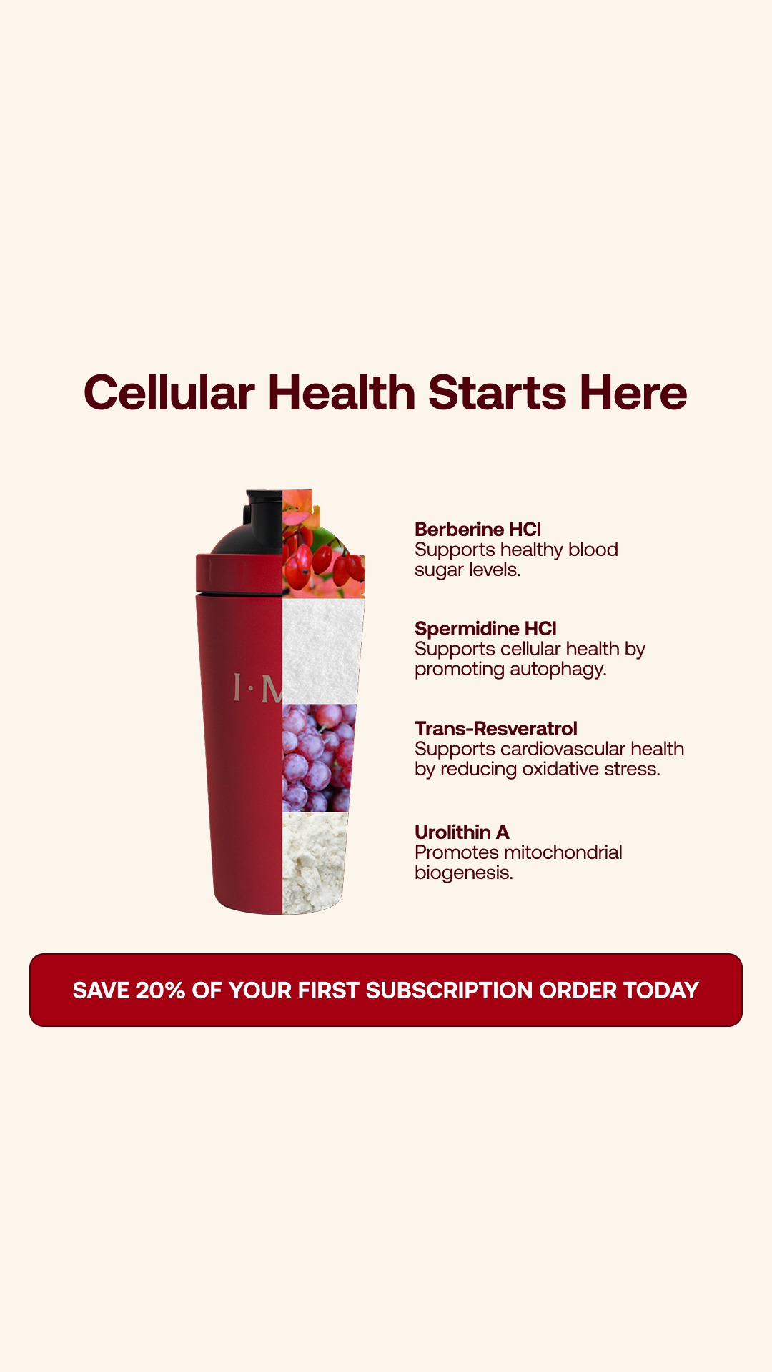
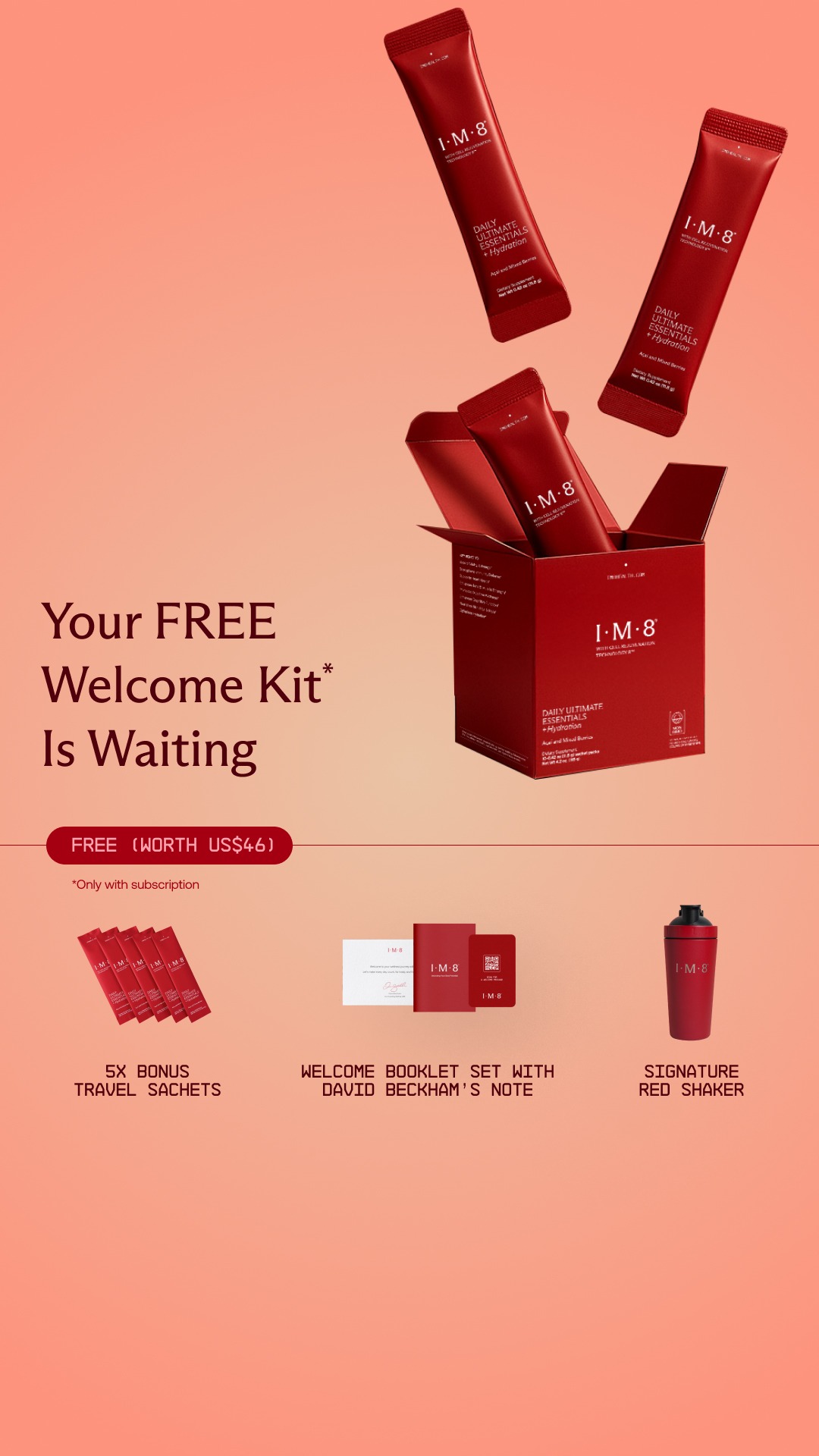
offer hero 2
The offer is the whole ad. Logo set inline inside the headline sentence.
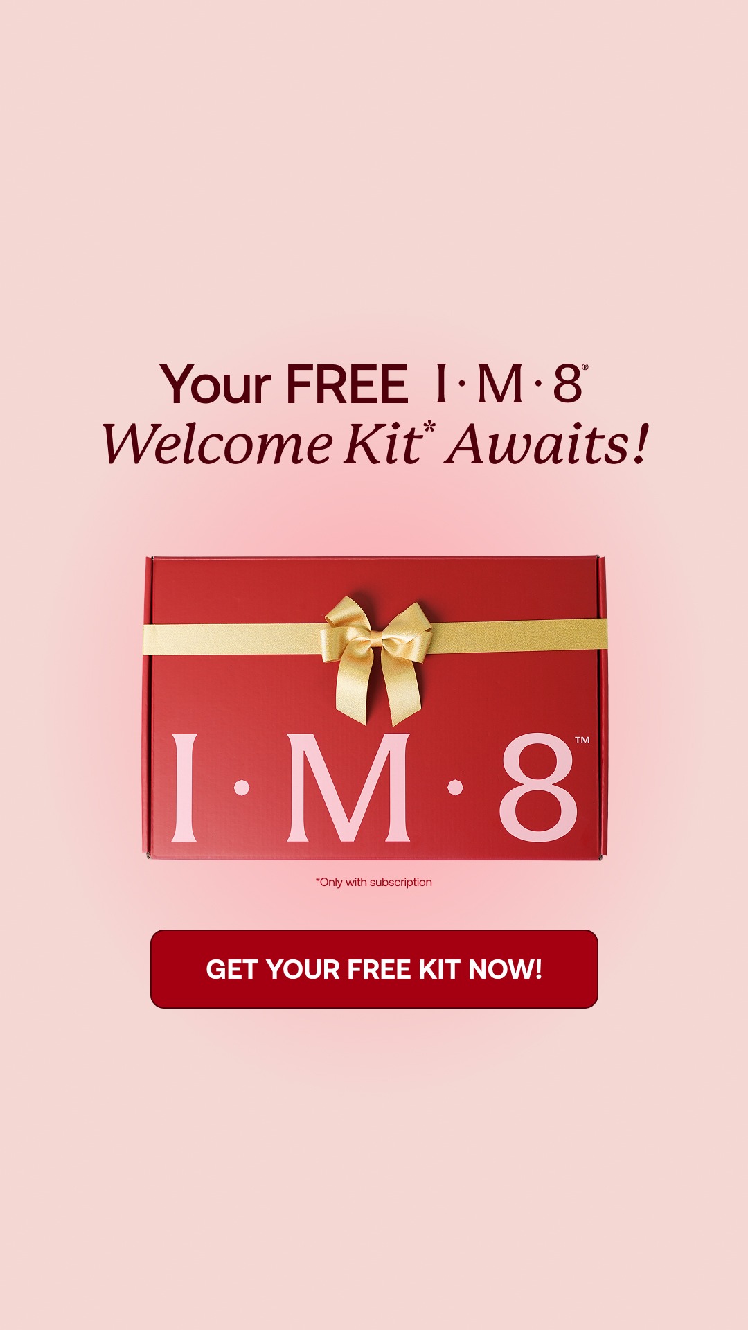
lifestyle diagram 1
Lifestyle photo with a diagram overlaid, labels radiating from the product.
testimonial bubble 1
Quote in a speech-bubble device with stars, product in use beside it.
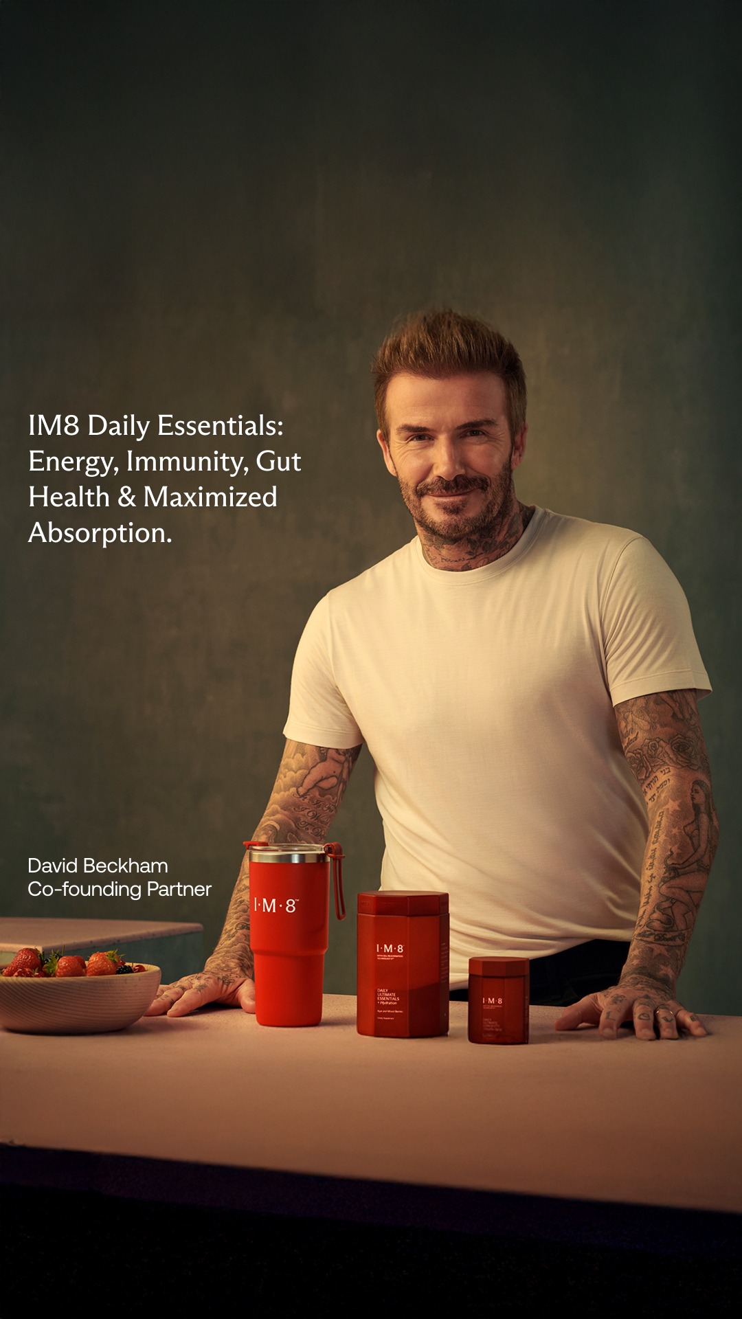
founder lifestyle 1
Founder portrait, product staged on the surface in front.
unclassified 25
Remaining ads in the pull.
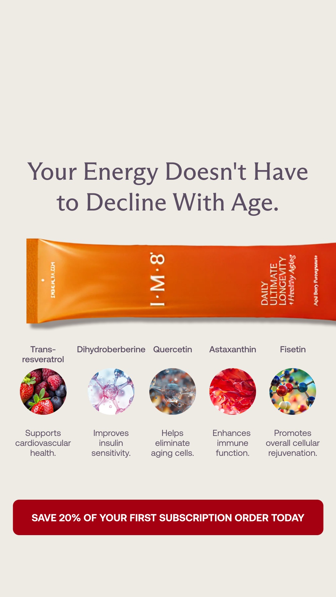
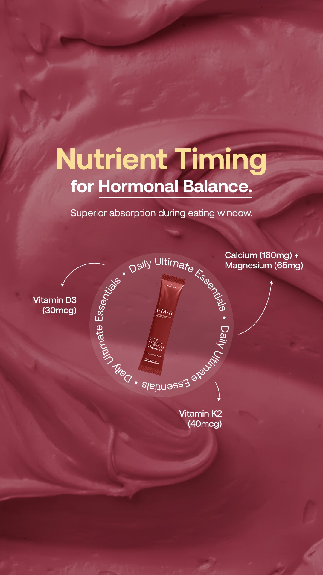
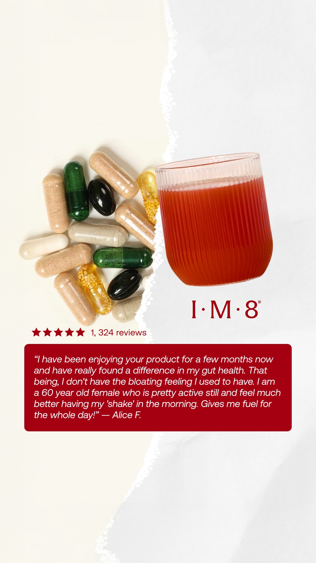
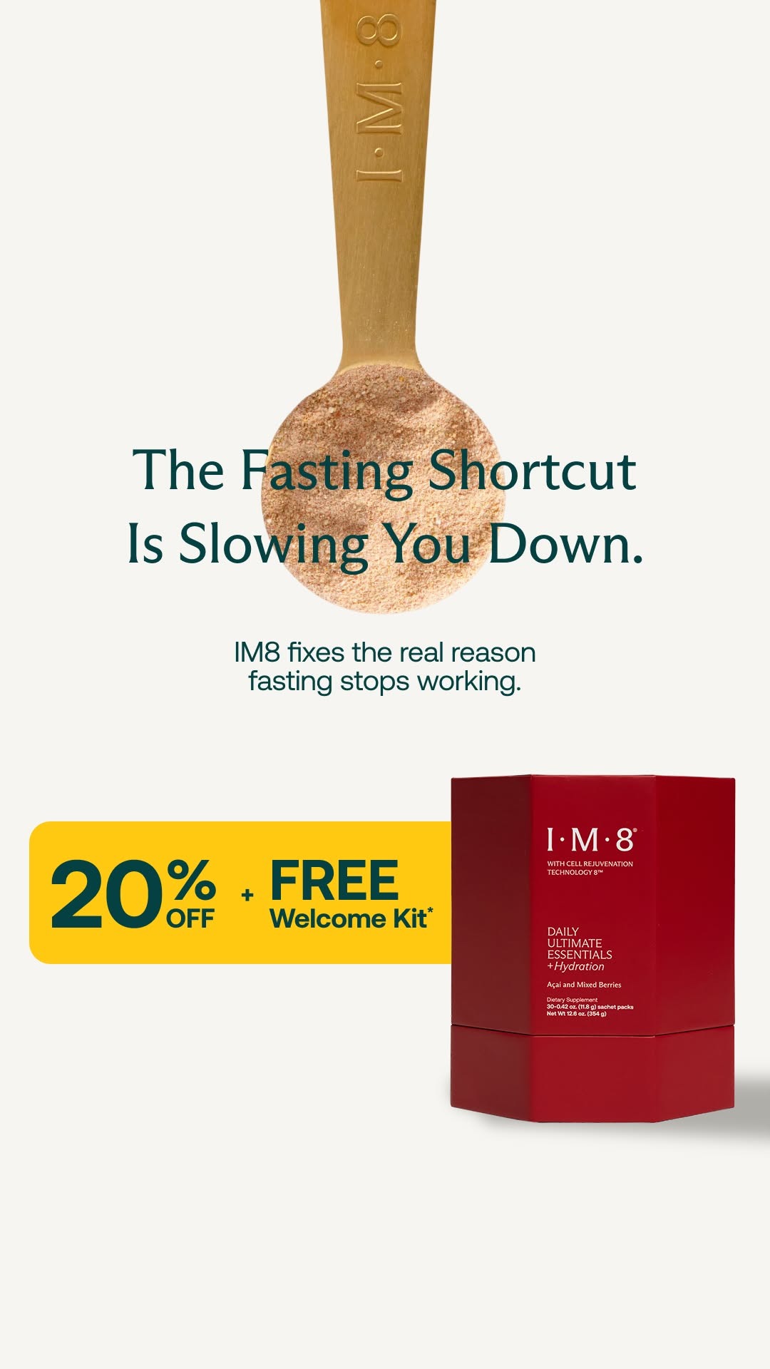
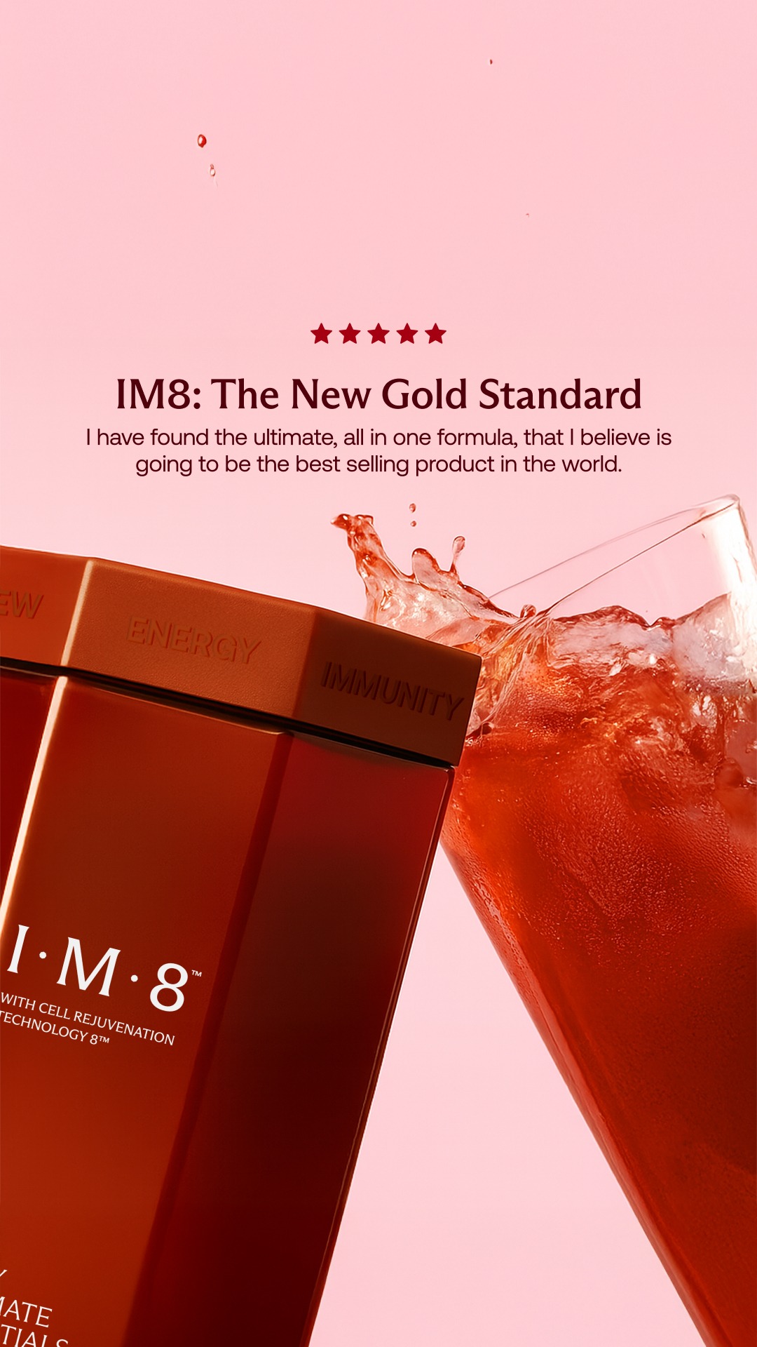
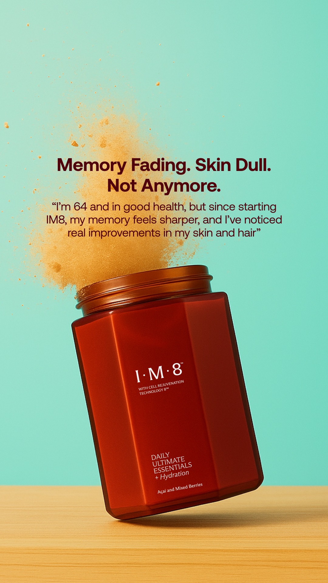
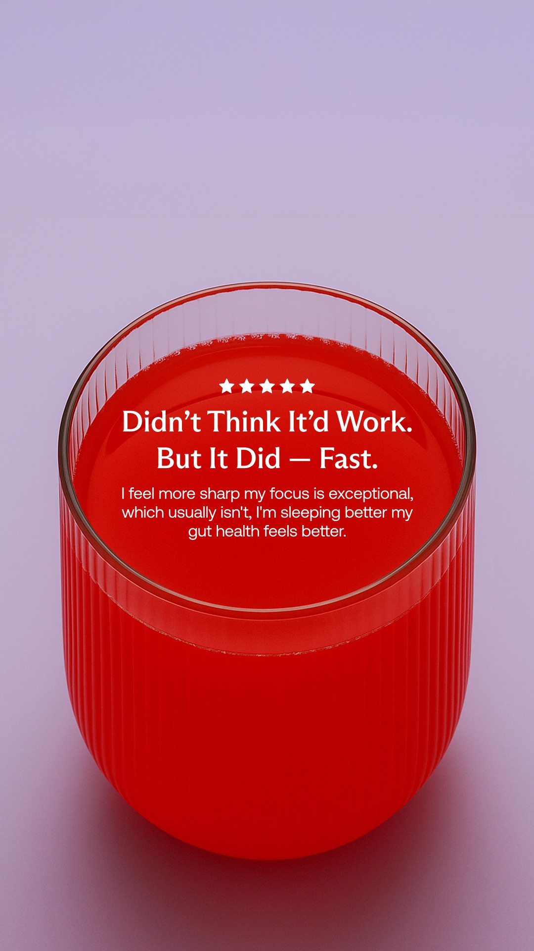
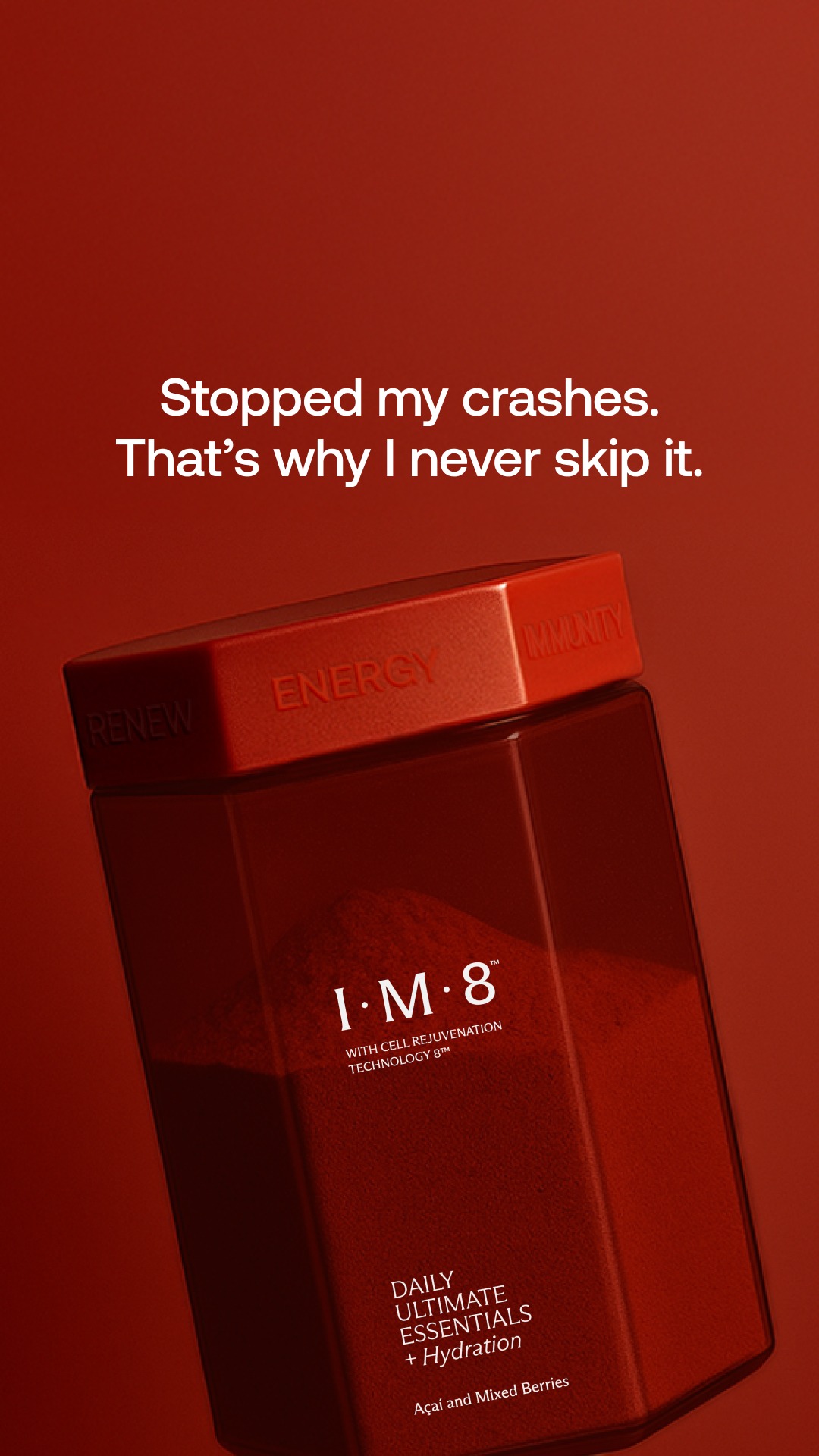
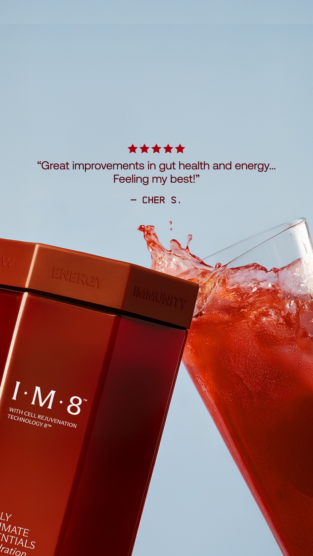
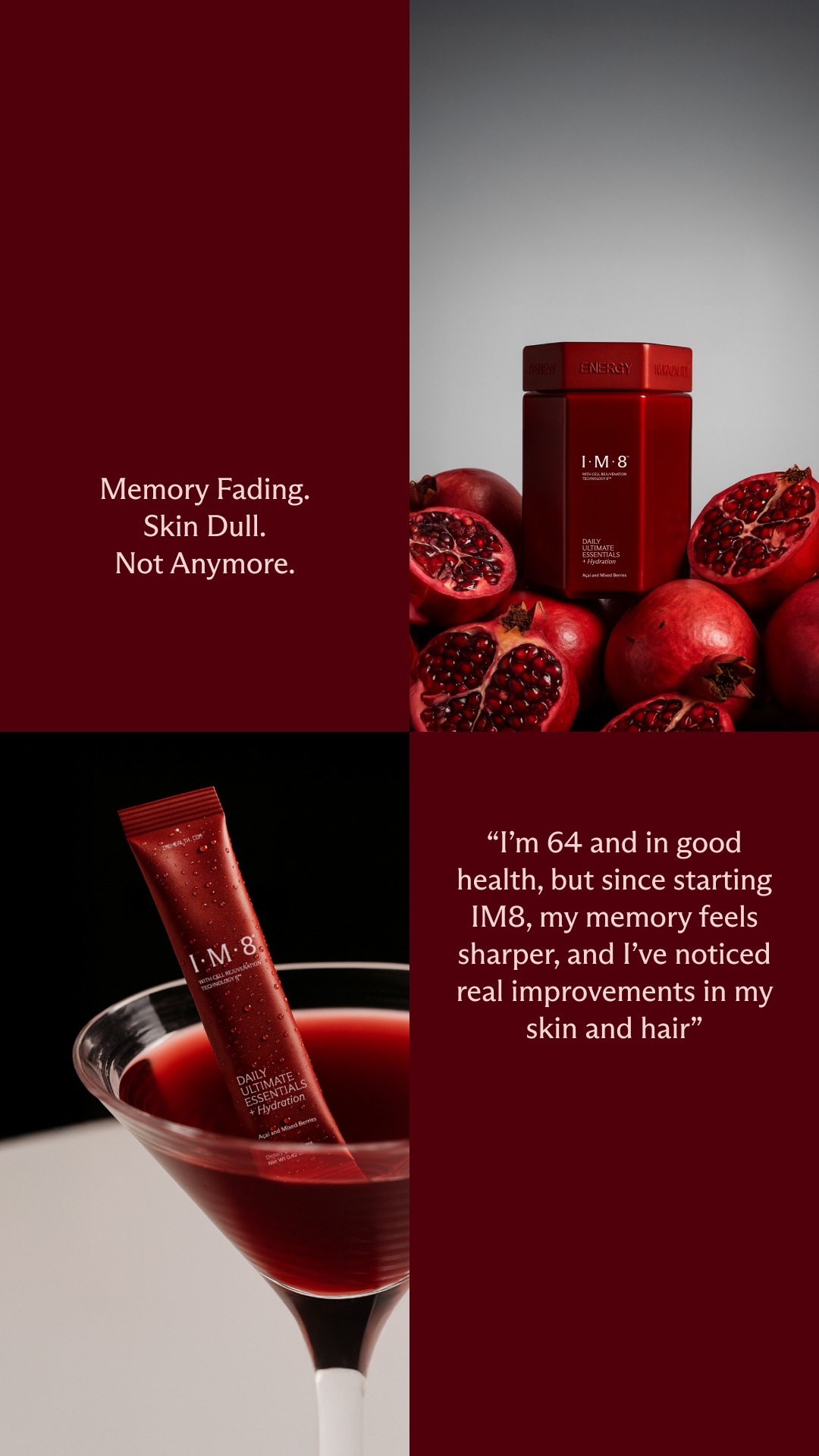
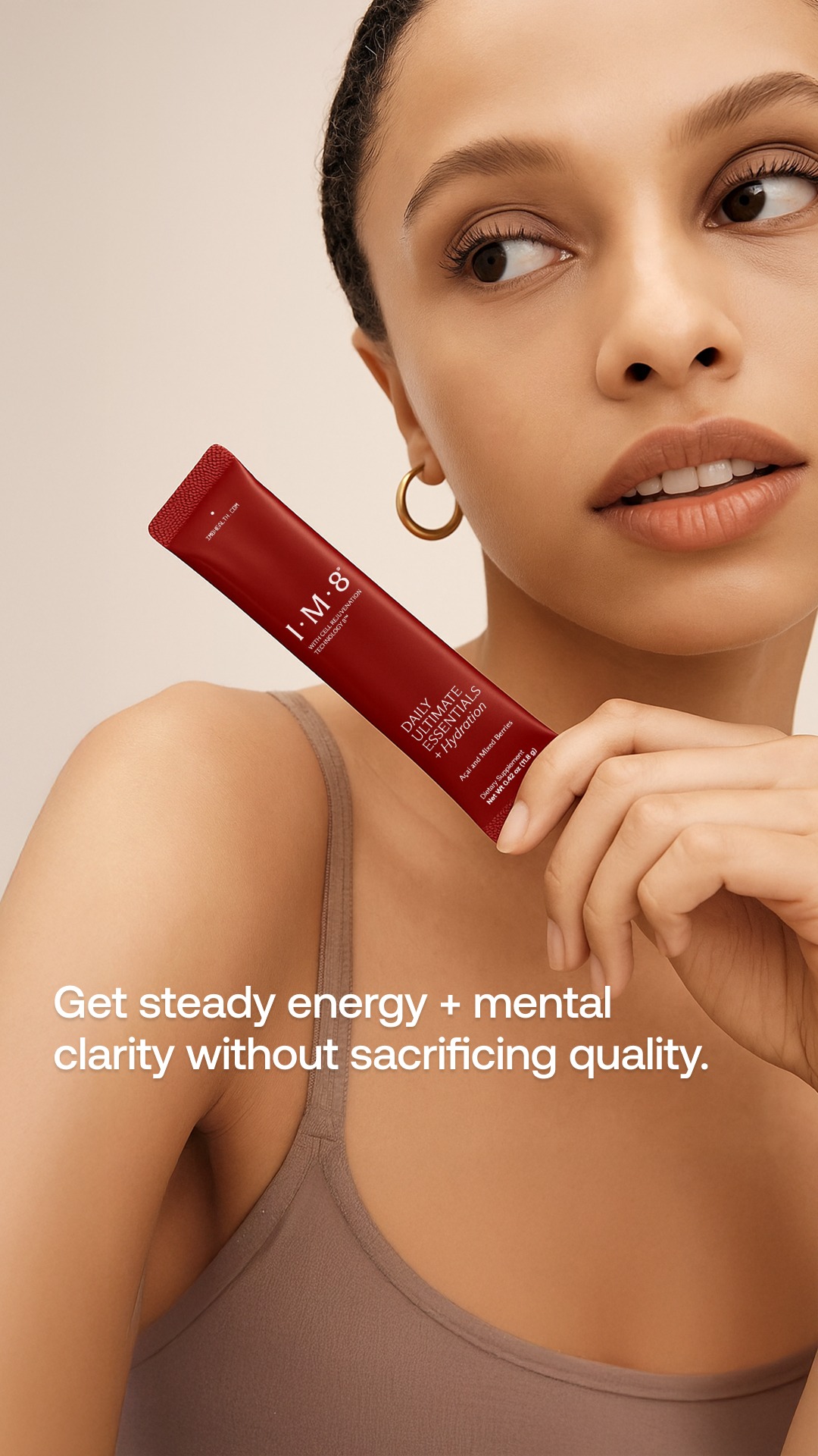
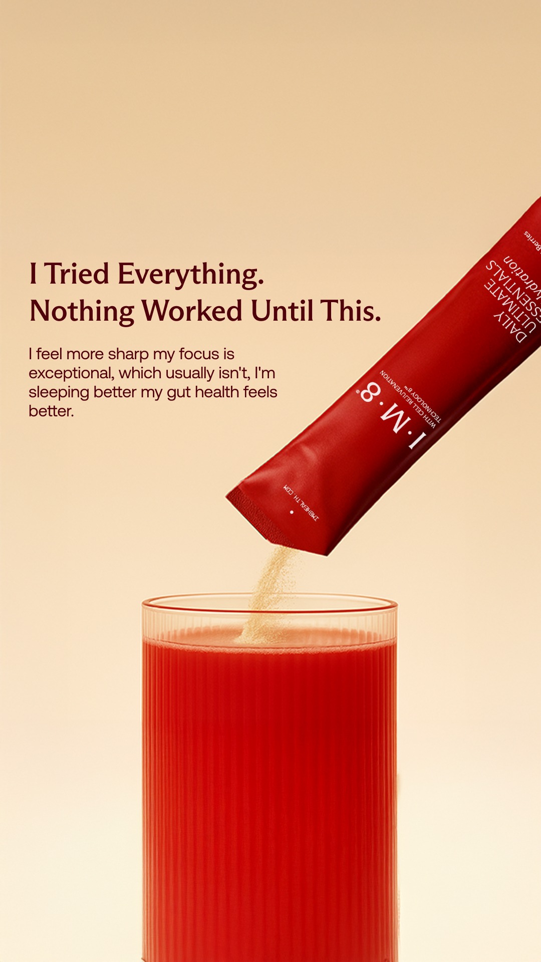
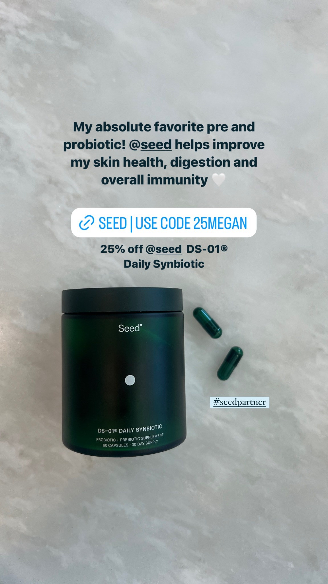
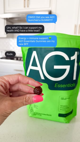
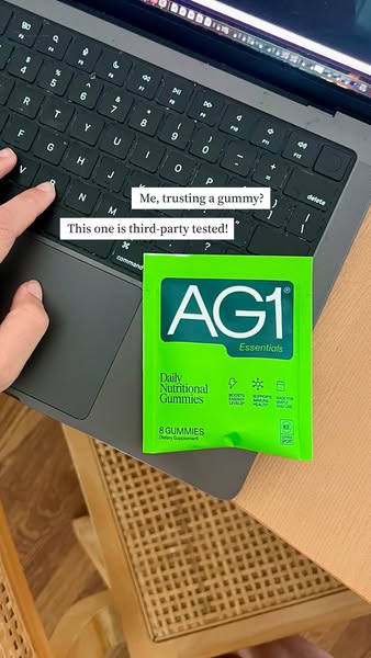
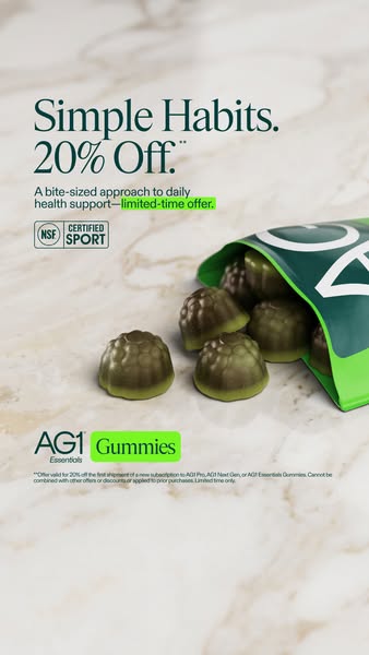
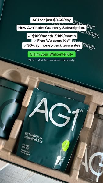
AG1 24 · 9:16
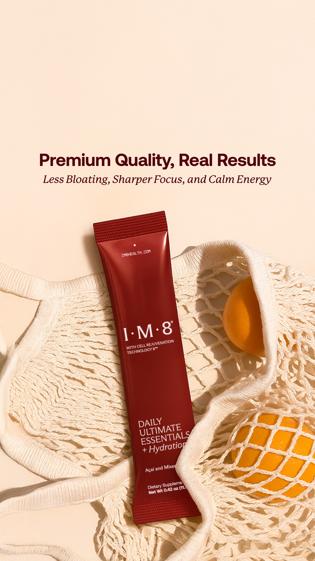
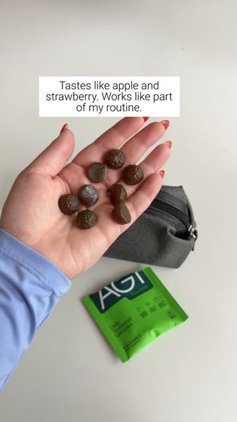
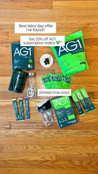
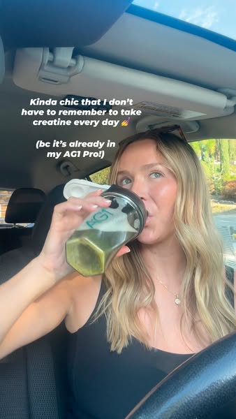
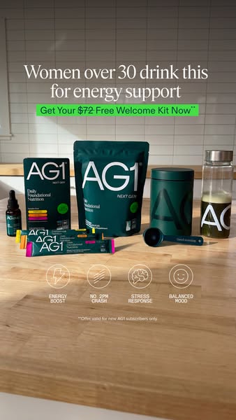
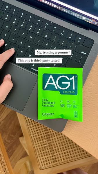
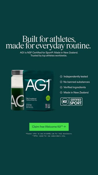
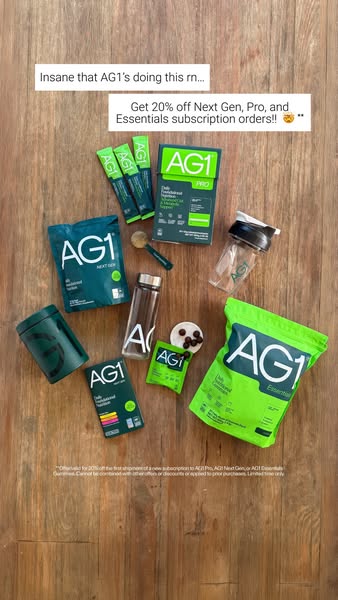
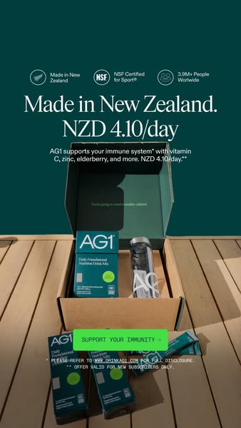
Full-bleed lifestyle photography or a complete designed flat-lay. Copy overlaid low-middle in italic serif, or in a small white caption card styled like an Instagram text sticker. Green highlighter marker used as a real emphasis device. CTA pills are tiny and often absent.
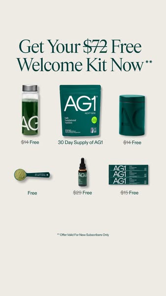

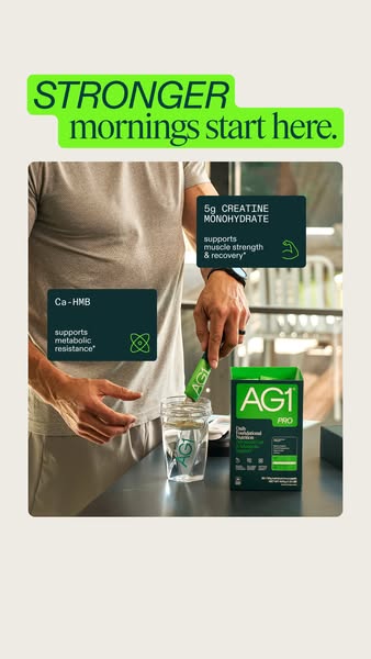
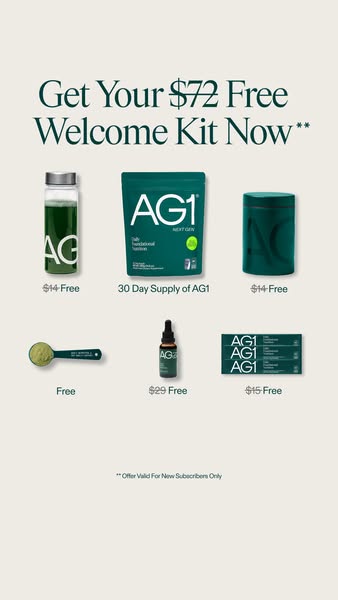

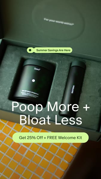
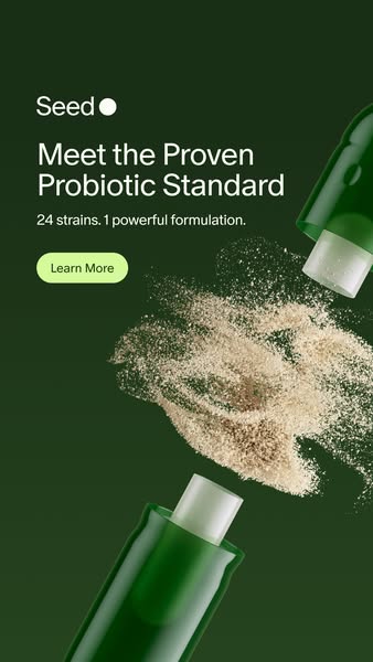
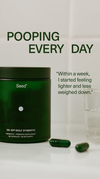
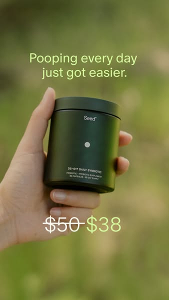
Seed 24 · 9:16
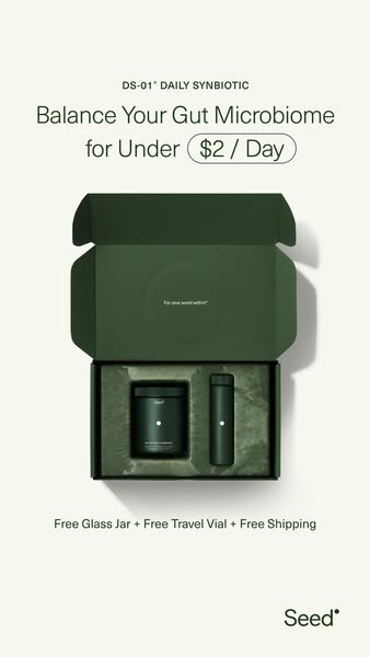
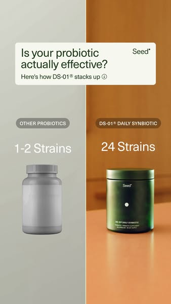
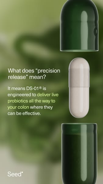
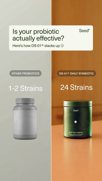
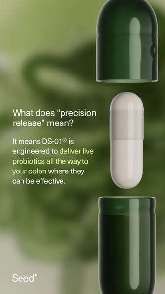
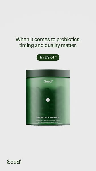
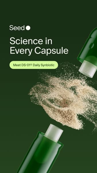
Complete edge-to-edge compositions. Small-caps eyebrow, headline top, product centred, fine print pinned to the very bottom edge, logo small in a corner. Split-screen comparisons. Price strikethrough as a design element. CTA pills small and rare.