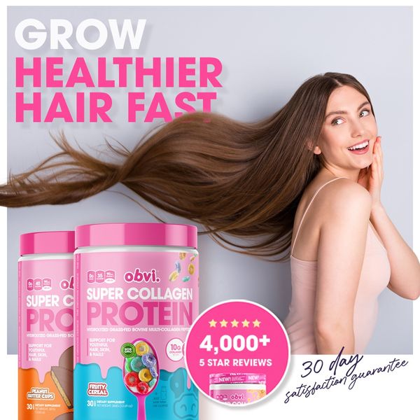
O31 · Hair / hair hybrid
Flowing hair sweeps from model on right through center-left. Two-color headline upper-left, tubs lower-left, circular review proof and script guarantee lower-right. Strongest hair-as-composition reference.
Foreplay source ↗How Obvi combines bold promises, unmistakable products and deliberate placement. Actual reference images, with specific notes on what each composition does.
Start with the 12 featured examples. Open any image at full size. Switch to hair or the full archive to compare repeated layouts and broader product categories.
Flowing hair sweeps from model on right through center-left. Two-color headline upper-left, tubs lower-left, circular review proof and script guarantee lower-right. Strongest hair-as-composition reference.
Foreplay source ↗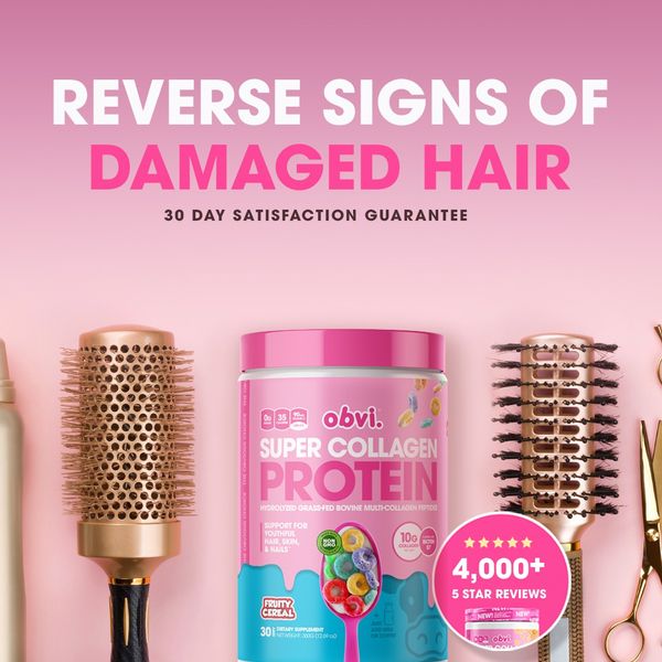
Pink gradient with a damage-focused two-line headline and small guarantee. Tub flanked by brushes/scissors; review circle anchored to lower-right. Particularly relevant to Wonder brush-and-bottle placement.
Foreplay source ↗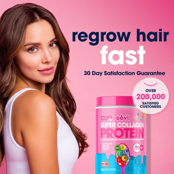
Model left; two-scale headline right; product below the text. White emphasis word contrasts the dark first line. Customer-count circle overlaps the product instead of floating in unused space.
Foreplay source ↗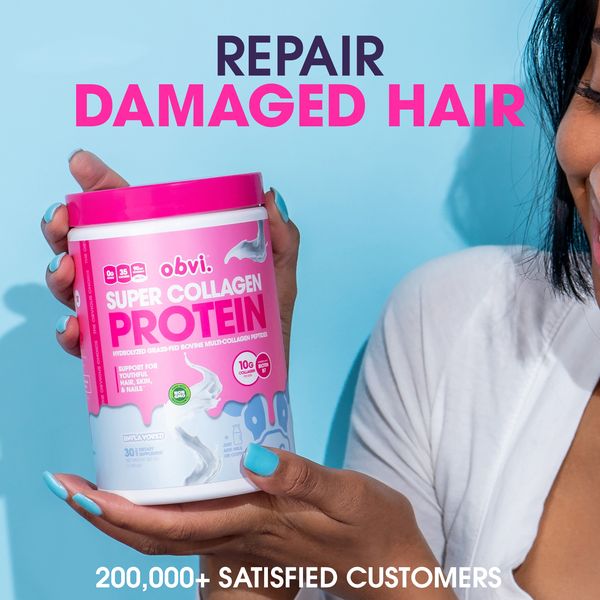
Cyan background and tight crop of a person holding the tub. Two-tone headline above the product, customer-count line at bottom. Hands, skin texture and matching nails bring human scale.
Foreplay source ↗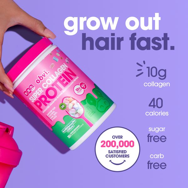
Lavender field with diagonal tub held from top-left. Headline upper-right, aligned nutrition list down right and proof circle near bottom. The product angle creates motion; text remains orderly.
Foreplay source ↗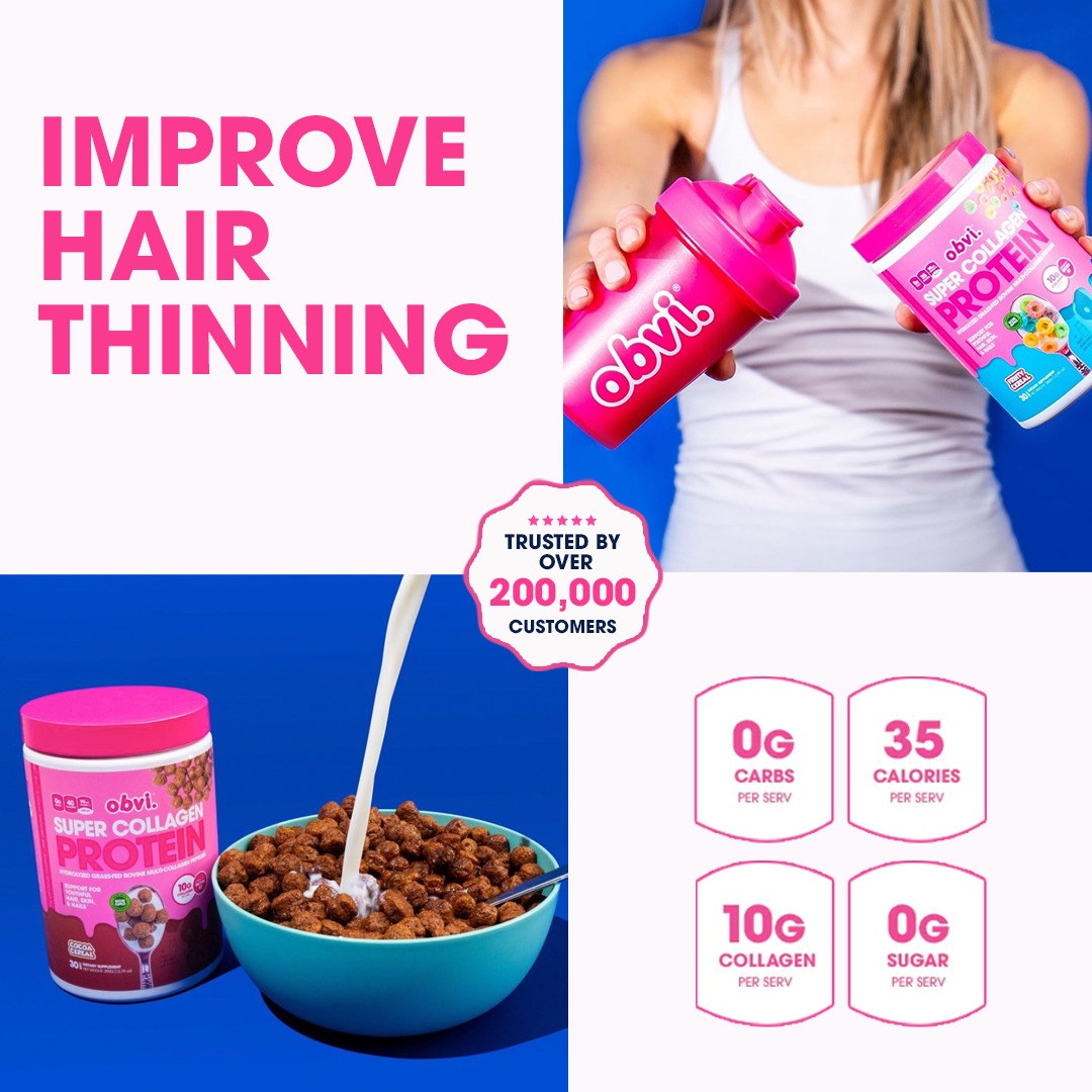
Same four-quadrant system as H16, but with a thinning-focused headline. Each panel has one job; central proof connects them. Better reference for composition than for verified efficacy.
Foreplay source ↗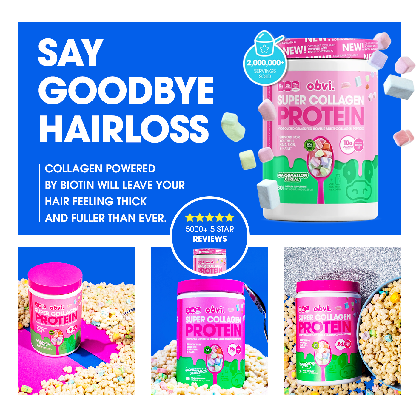
White-gutter collage: big blue upper panel with headline left/product right, then three product photos below. Proof circle bridges panels. Strong reference for organized information density.
Foreplay source ↗
Products upper-left, model holding her hair upper-right inside a contoured dashed border. Highlighted lead word, enormous lower headline, yellow review strip and split guarantee footer. Exact-byte duplicate of H10.
Foreplay source ↗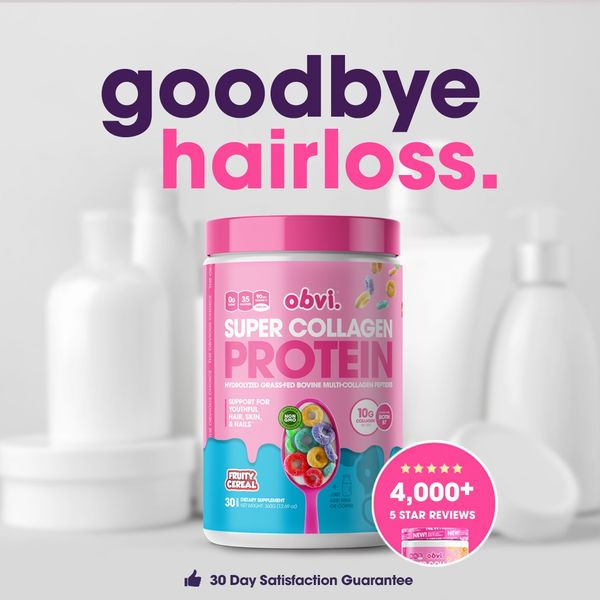
Desaturated blurred packages make one colored tub the hero. Two-tone lowercase headline owns the top; review circle overlaps the tub; tiny guarantee below. Color isolation creates focus.
Foreplay source ↗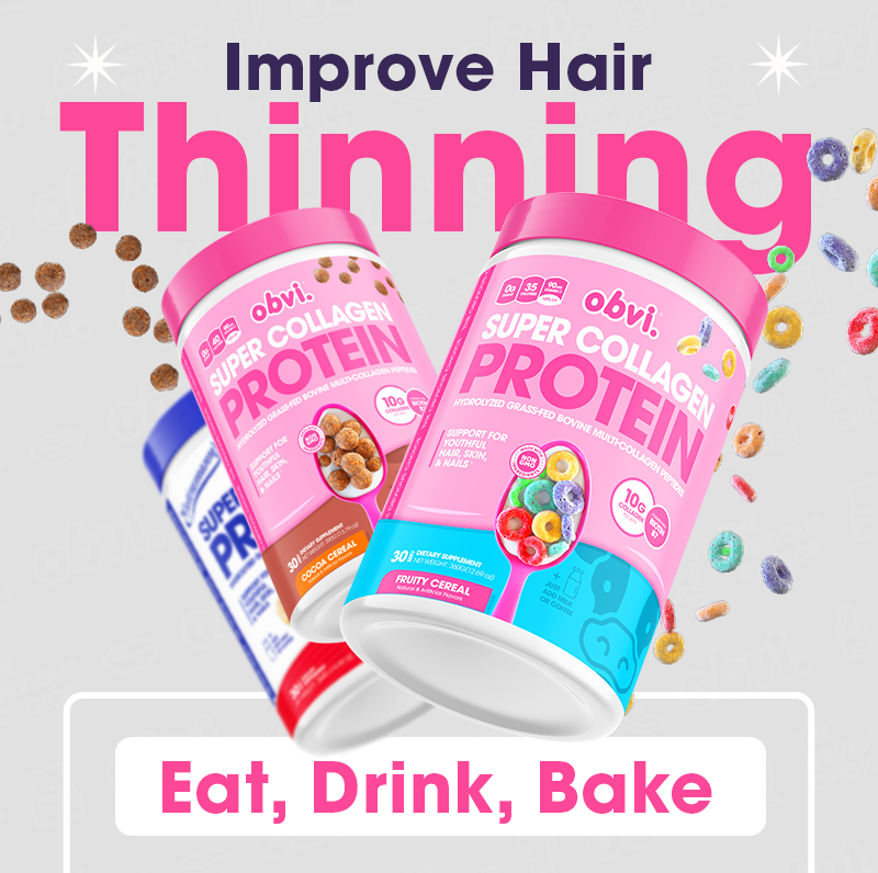
Giant pink emphasis word behind tilted foreground tubs, scattered cereal at edges and rounded usage panel below. Strong depth through product/type overlap; the bottom panel is not a shopping button.
Foreplay source ↗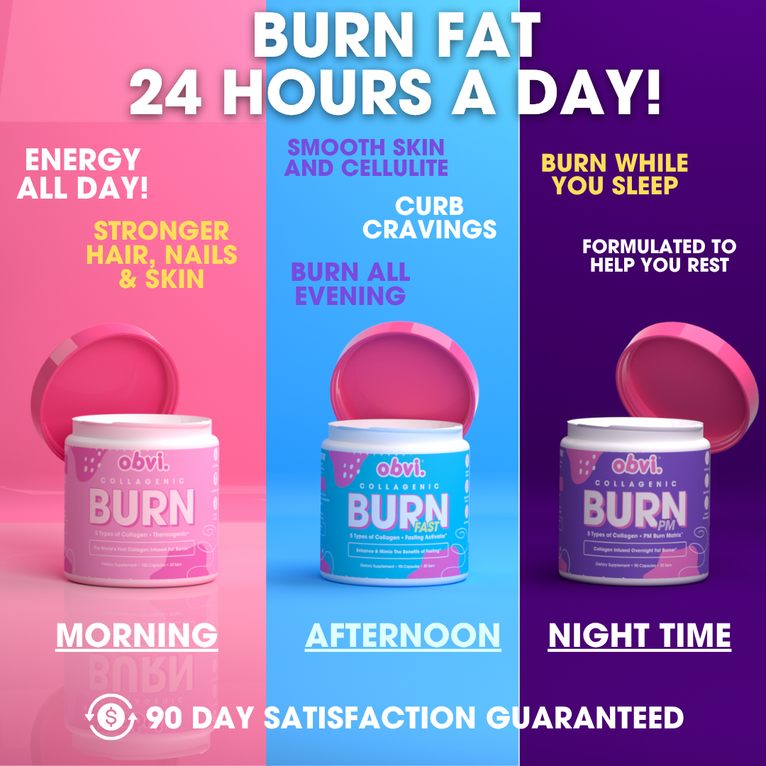
Three full-height color columns map three tubs to dayparts. White headline unifies the system; tiny reassurance closes the bottom. The column structure communicates use before the copy is read.
Foreplay source ↗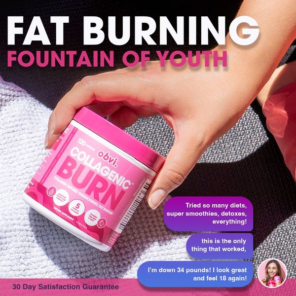
Close hand holding tub on a towel. Two-line white/pink headline uses dark space above; chat bubbles stack lower-right with an avatar. Detail and interaction carry the photograph.
Foreplay source ↗
Autumn photo scene and foreground tubs, with a yellow highlighted phrase inside a white headline. Purple discount seal sits left; stars, payment and guarantee occupy separate supporting rows. Busy but strongly organized.
Foreplay source ↗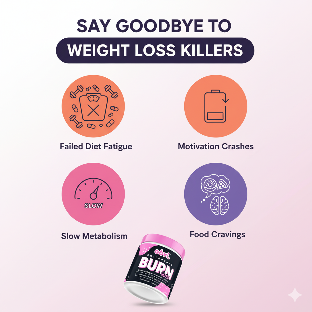
Pale background with dark headline and a pill-shaped emphasis band. Four obstacle icons form a two-by-two grid above a tilted product. The layout explains several causes of frustration.
Foreplay source ↗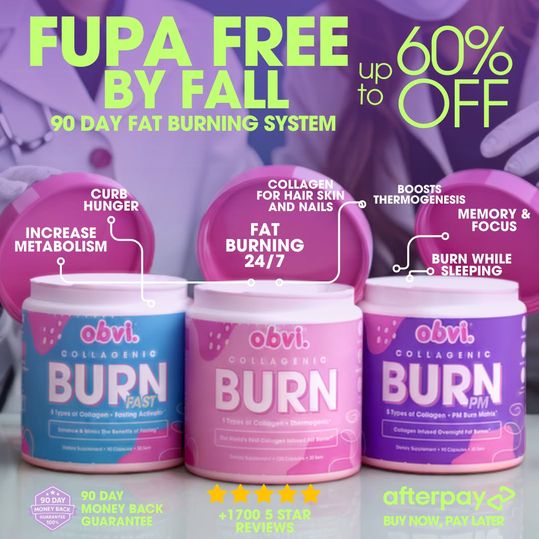
Purple three-product scene, lime headline upper-left and oversized discount upper-right. Rounded benefit labels point to specific tubs. The lines have actual endpoints and explanatory jobs.
Foreplay source ↗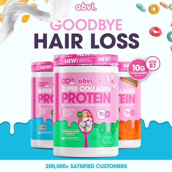
Cyan milk-and-cereal edges surround three foreground tubs. Pink and plum headline sits above the package family; compact proof closes the lower edge. Hair promise carried without a model.
Foreplay source ↗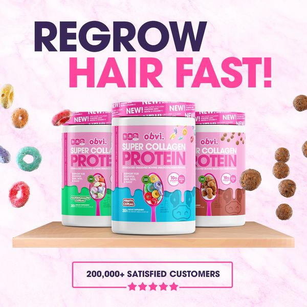
Pink textured field, dark/pink two-line headline and three tubs on a low platform. Floating cereal gives category texture; framed customer proof anchors the bottom. Straight vertical reading order.
Foreplay source ↗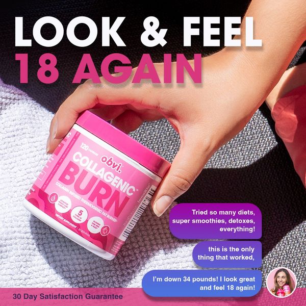
Product held in a workout scene, white/pink headline above. Chat-style testimonial bubbles occupy the lower-right and end in a small avatar. Uses social-message language within a photo.
Foreplay source ↗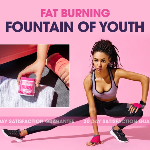
Pink field, outcome headline at top, product photo inset left and stretching model on the right. A repeated guarantee ribbon crosses the bottom. A composited fitness aspiration layout.
Foreplay source ↗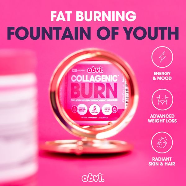
Saturated pink with centered tub shown through a circular mirror. Right-side icon column and top two-color headline. The circle is a physical scene object, not an unexplained graphic.
Foreplay source ↗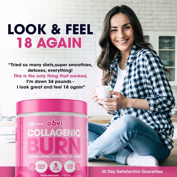
Woman in a domestic kitchen on the right; headline and quote on the left; oversized tub lower-left. A highlighted quote fragment creates a second reading level. Not a dated transformation pair.
Foreplay source ↗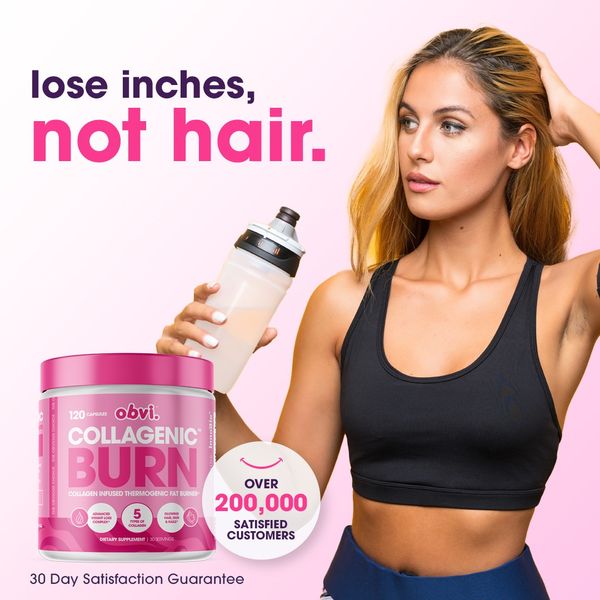
Two-line hair/weight tradeoff upper-left, gym model right and large tub lower-left. Customer circle sits beside the tub. The model balances the text and package mass.
Foreplay source ↗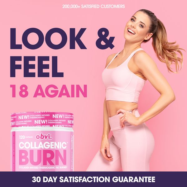
Model right, oversized stacked type left, product lower-left and dark guarantee footer. Pink scene and dark headline contrast strongly. Clear separation of message, person and product.
Foreplay source ↗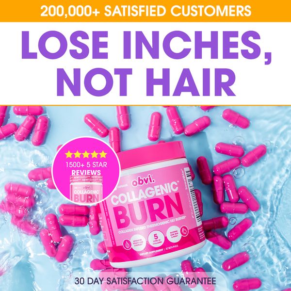
Large purple hair/weight tradeoff above a turquoise pill-and-product scene. Review circle overlaps the tub; narrow customer strip top. More segmented and banner-heavy than O13.
Foreplay source ↗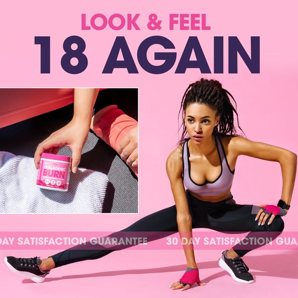
Big type upper-left, small product-in-hand inset below and stretching model breaking across panels. Thin repeated guarantee ribbon near the bottom. Layered collage with one main person.
Foreplay source ↗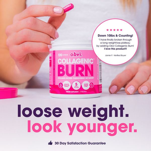
Capsule-in-hand above product, short two-color headline below and circular quote to the right. The action makes the product understandable; quote occupies a quiet patch of background.
Foreplay source ↗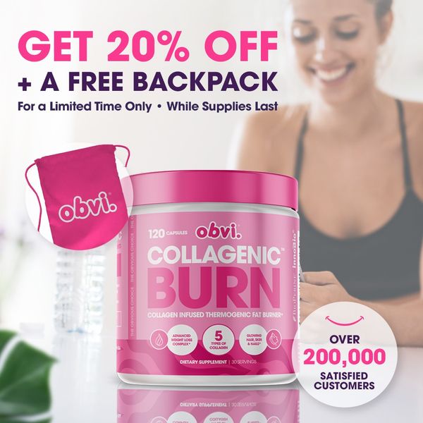
Offer upper-left, tangible gift bag beside an oversized tub, softly blurred person behind. Customer circle lower-right. The free item is pictured rather than buried in caption copy.
Foreplay source ↗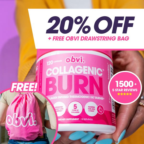
Product-in-hand closeup with slanted white offer panel at top. Gift bag inset lower-left and pink review circle right. Product remains the largest recognizable object despite large discount type.
Foreplay source ↗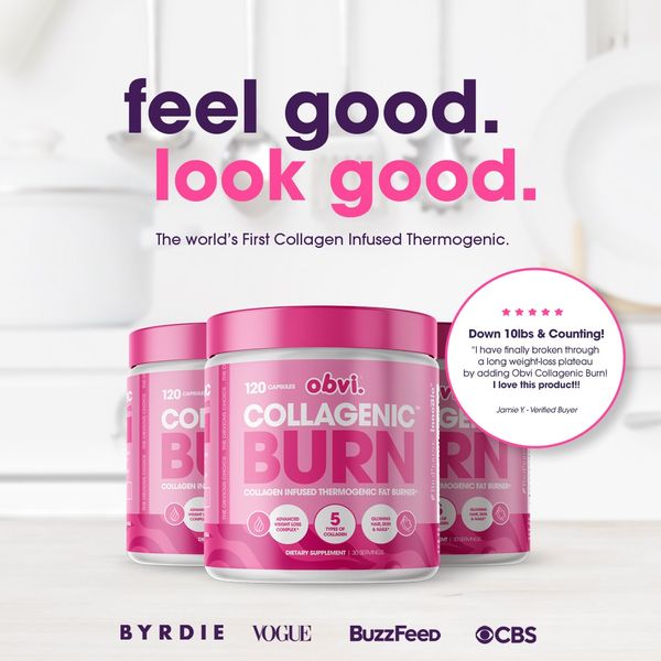
Soft domestic background, lowercase two-color headline and three tubs. Small testimonial circle right; publication-logo strip below. Product, claim and borrowed authority form a tidy stack.
Foreplay source ↗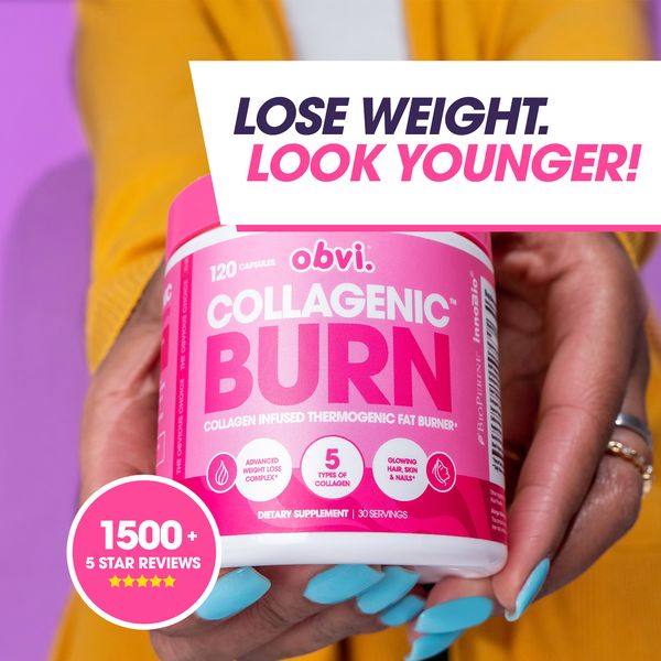
Same hand-held product family as O20, now outcome-led in a slanted white top panel. Review circle lower-left. A concrete example of changing message while preserving a scene.
Foreplay source ↗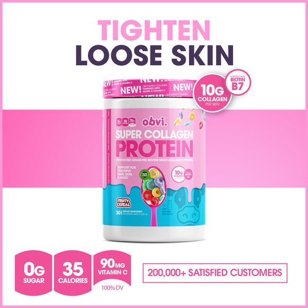
White/pink horizontal bands; large problem headline above a single tub crossing the middle band. Nutrition icons and customer count form a compact footer. Bands establish actual information zones.
Foreplay source ↗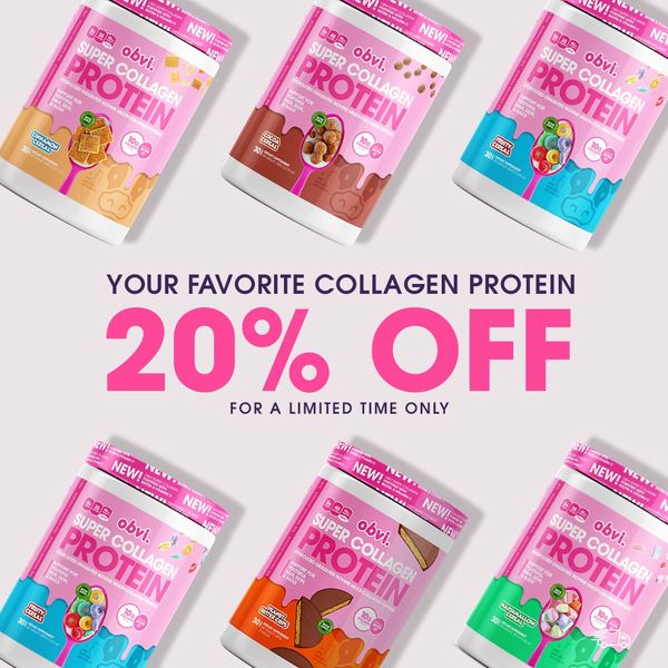
Six tilted tubs frame a central percentage offer. Small descriptor above and limited-time line below. A product-assortment promotion with radial energy, not a hair result demonstration.
Foreplay source ↗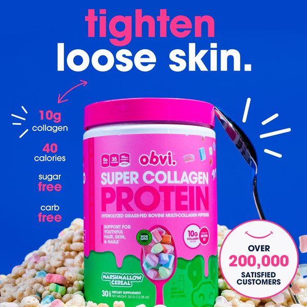
Blue field with pink/white headline, big angled tub and scattered cereal. Ingredient list down left; customer circle lower-right. Small rays frame the product without competing with the headline.
Foreplay source ↗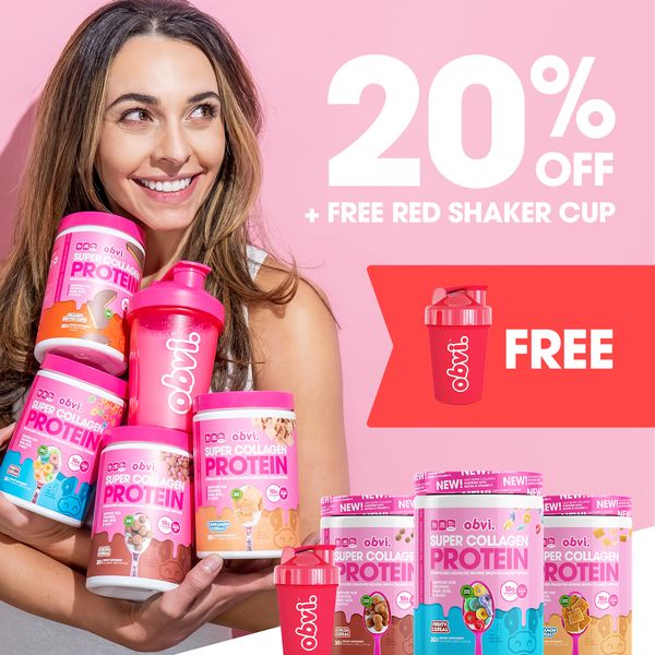
Woman holding several tubs left, large discount upper-right, gift shaker callout mid-right and assortment bottom-right. The offer is visibly bundled. Dense but grouped around two main columns.
Foreplay source ↗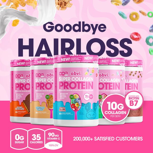
Large hair-loss headline above a five-tub lineup; cereal and milk frame the edges. Ingredient/biotin circles overlap the product; nutrition/proof closes the pink footer. Product variety supports the promise.
Foreplay source ↗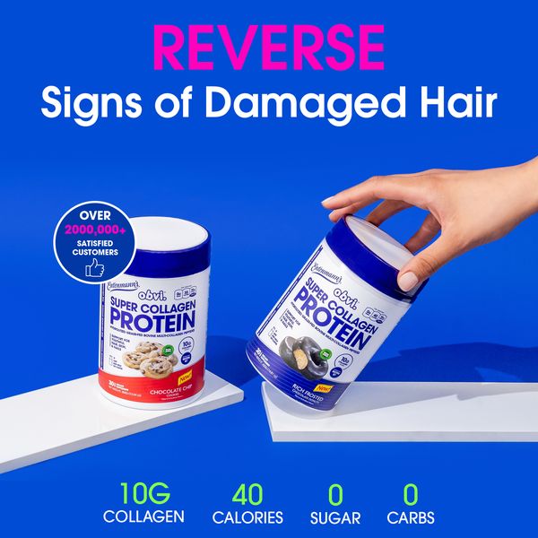
Royal blue field, pink first word and white second line. Two blue-lid tubs on white geometric shelves, one tilted by a hand; green nutrition row below. Product handling adds movement.
Foreplay source ↗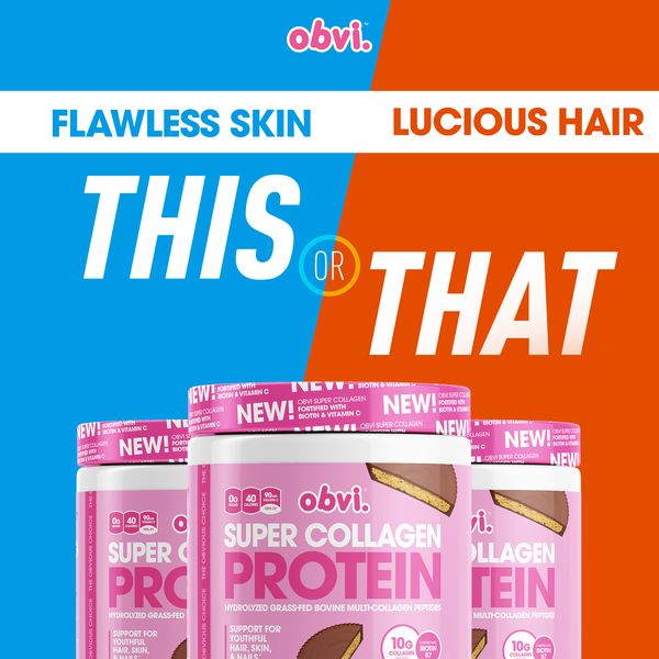
Diagonal cyan/orange split carries two desired outcomes with italic comparison words. Tubs occupy the lower half. Benefit-choice framing rather than testimonial or before-and-after evidence.
Foreplay source ↗
Soft bright room, large two-scale headline, three tubs and a tiny top proof pill. Guarantee bottom. Part of a heavily reused scene family with changed headline benefits.
Foreplay source ↗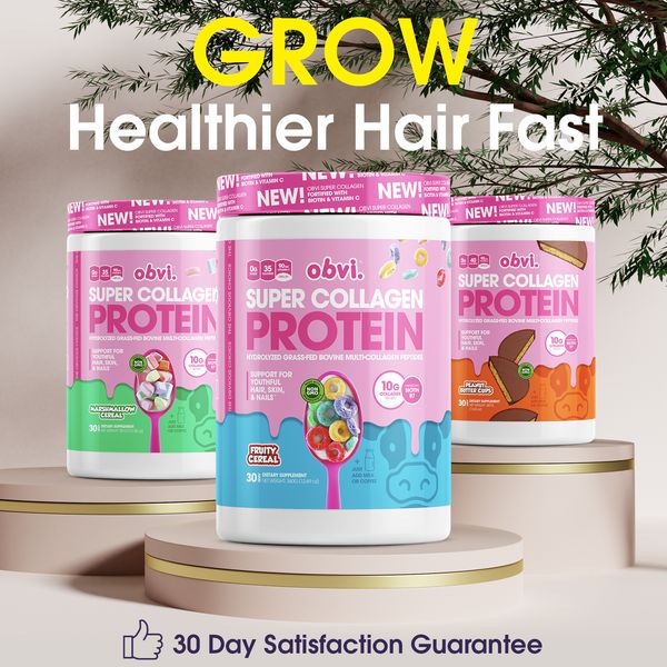
Three tubs on round cream podiums with foliage above. Yellow emphasis word at top, white supporting line, guarantee footer. Polished product-only hair outcome composition.
Foreplay source ↗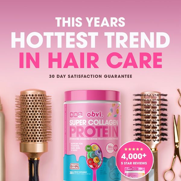
Pink gradient, centered headline, tub between hair brushes and scissors. Circular review badge overlaps the lower-right product area. Props establish hair-care relevance immediately.
Foreplay source ↗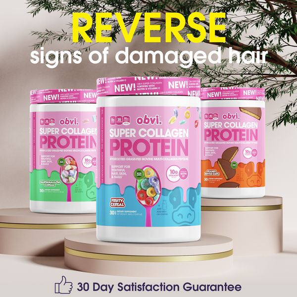
Same podium-and-foliage system as O32 with a damaged-hair promise. Yellow emphasis word sits above white explanation. Reused image system tests a different benefit framing.
Foreplay source ↗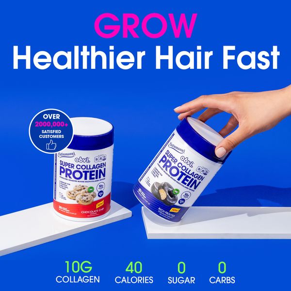
Same blue shelves and hand-held tub as O28 with a growth-focused headline. Pink emphasis/white support, lime facts below. Message variation rather than a new visual concept.
Foreplay source ↗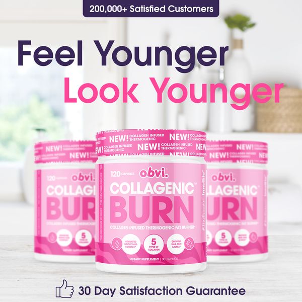
Bright-room three-tub template with youthful-feeling headline split between plum and pink. Tiny proof pill top and guarantee bottom. Same geometry as O30.
Foreplay source ↗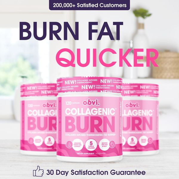
Bright-room product trio with a speed-focused benefit headline. The second word is much larger and pink. Same product scale and proof placement as O30/O36.
Foreplay source ↗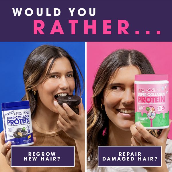
Split portraits on blue/pink fields beneath a dark question header. Each half has a product and benefit caption. This compares benefits; it is not a before-and-after pair.
Foreplay source ↗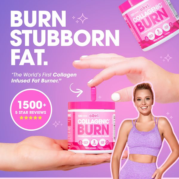
Lavender background with a hand taking a capsule above a tub resting on another palm. White stacked headline left; review circle left-center; fitness-model cutout lower-right. Several distinct focal elements.
Foreplay source ↗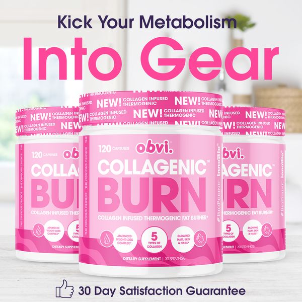
Bright-room product trio and an oversized pink second line below a smaller dark line. Top customer-count pill, bottom guarantee. Shows typographic emphasis within a repeated base scene.
Foreplay source ↗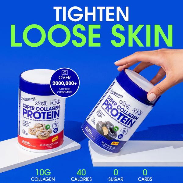
Blue geometric-shelf template repurposed for a skin benefit. White/lime headline above, ingredient row below. Same photographic approach as O28/O35, demonstrating cross-benefit reuse.
Foreplay source ↗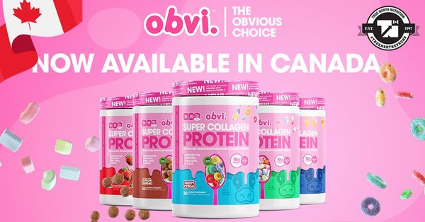
Landscape pink assortment announcement with logo, Canadian flag and availability message. Cereal elements fill edges. Geographic launch creative, not a hair-led pain concept.
Foreplay source ↗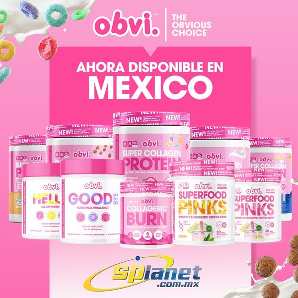
Pink Mexico availability announcement, large logo, full product assortment and retailer mark. Product range includes categories beyond collagen protein. Broad brand-distribution message.
Foreplay source ↗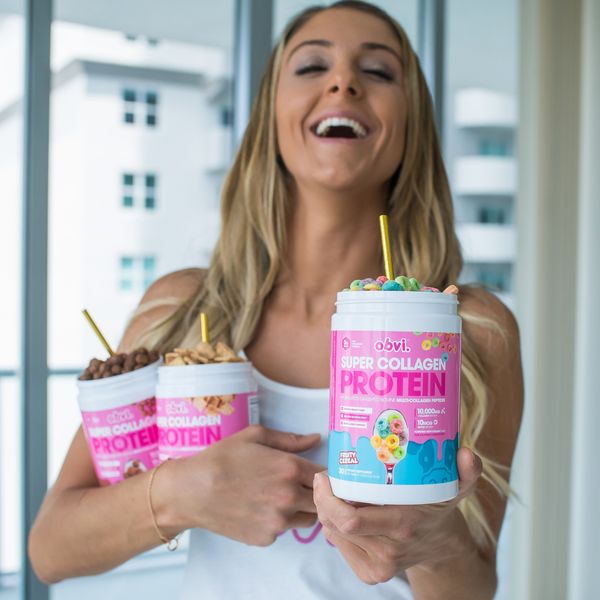
Smiling woman in a kitchen holding two open tubs, with cereal visible at the rims. Almost entirely photography. Product interaction and expression do the work without an added headline block.
Foreplay source ↗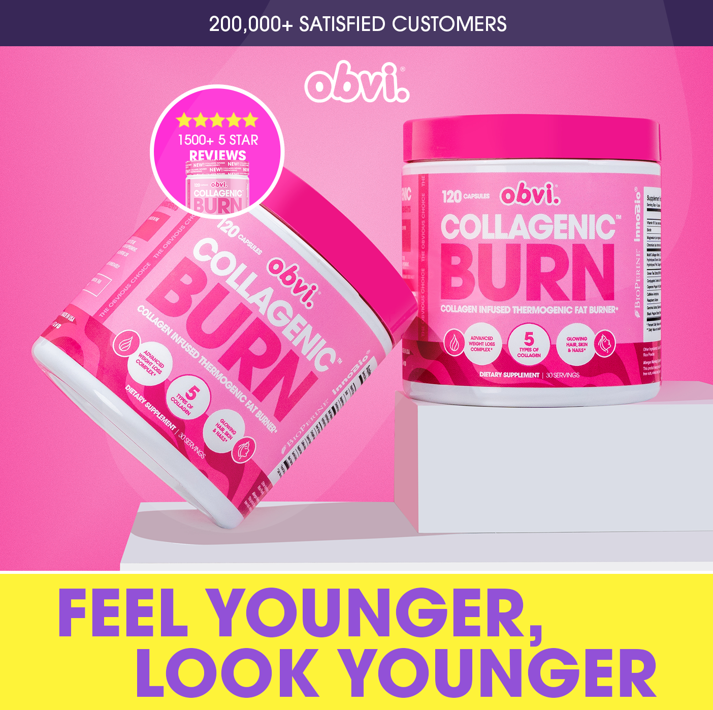
Pink product pedestal with two tilted/standing tubs, circular review badge and dark customer strip. Bright yellow lower outcome banner. Contrast is intentionally loud and sale-like.
Foreplay source ↗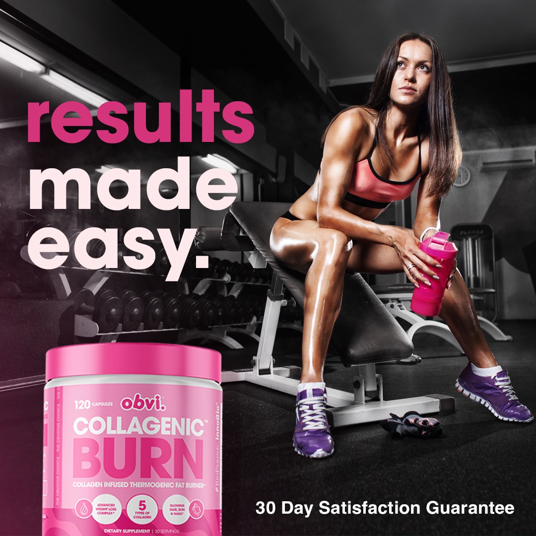
Dark gym photograph with model right, oversized tub lower-left and large pink/white lowercase headline left. Dim scene makes the vivid package pop. Different mood from the pastel hair executions.
Foreplay source ↗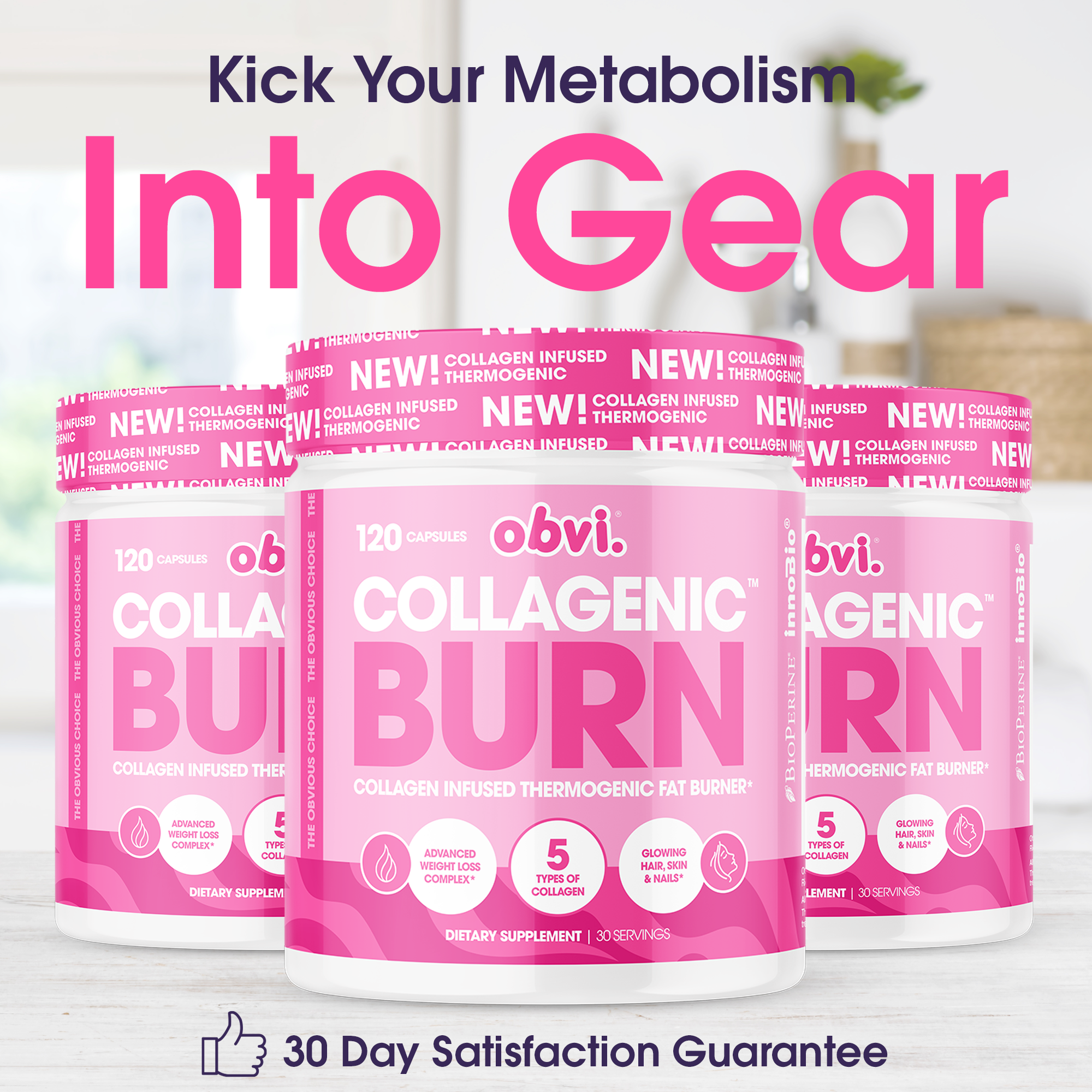
Near-repeat of O41: same domestic product trio, headline hierarchy, proof pill and guarantee. Separate archive record, not a distinct creative concept.
Foreplay source ↗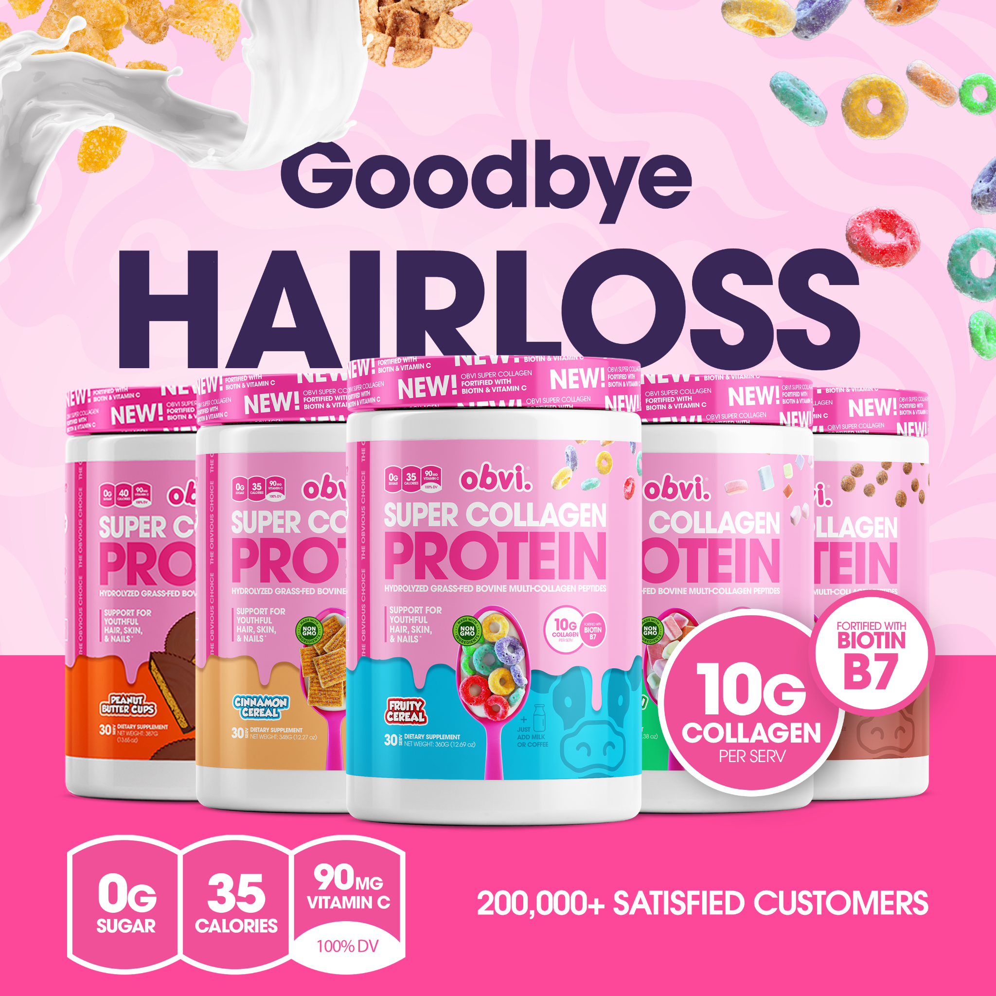
Pink cereal-and-milk product lineup with dark hair-loss headline. Essentially the O27 design family; exact-byte duplicate of H09.
Foreplay source ↗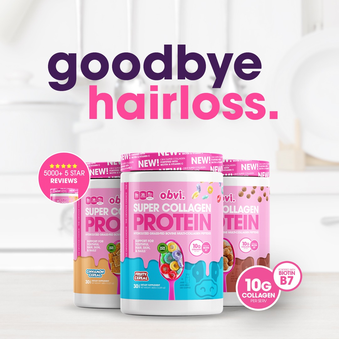
Bright domestic product trio with lowercase two-color headline. Review circle left and ingredient circle lower-right; exact-byte duplicate of H13.
Foreplay source ↗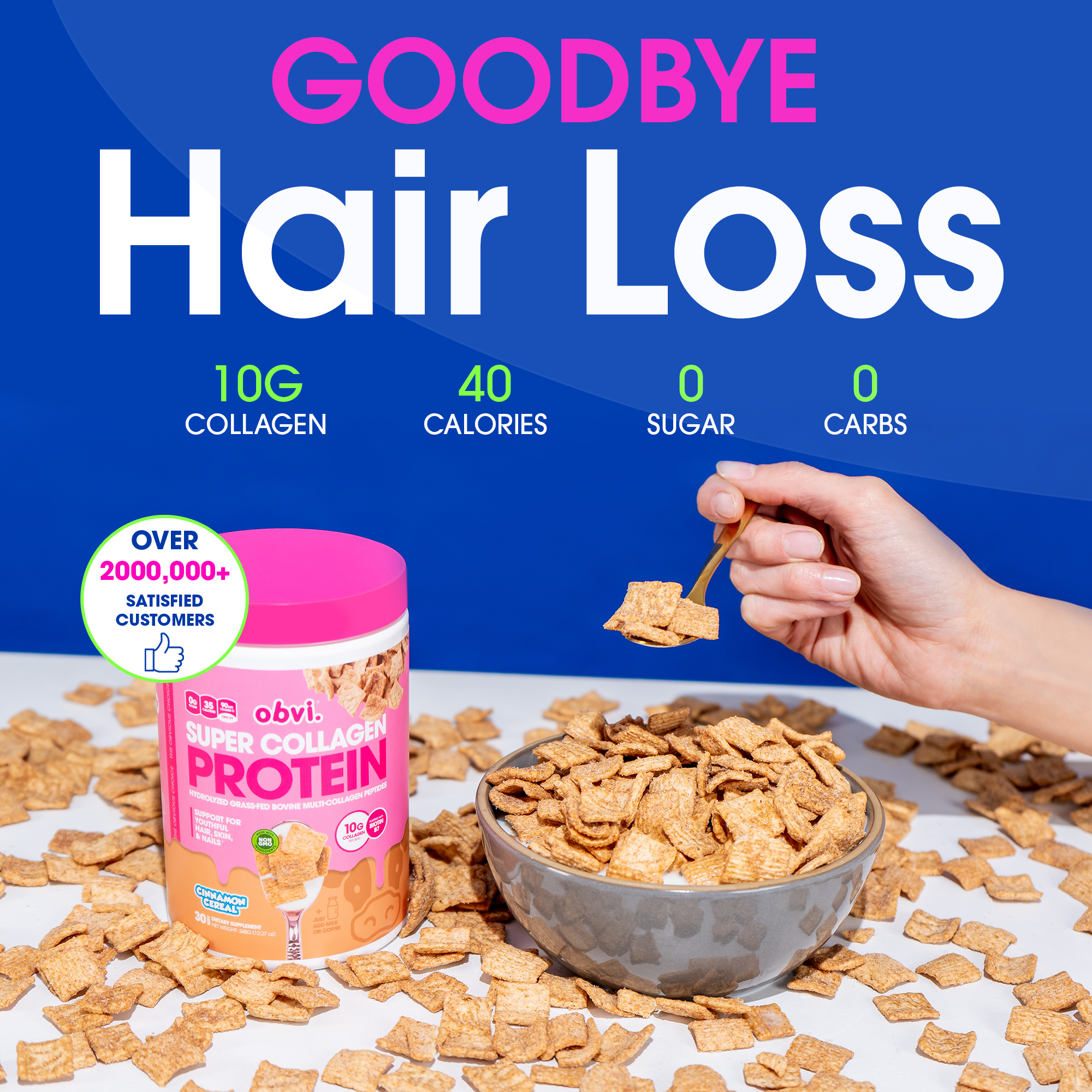
Royal blue field, very large problem headline and green ingredient row above a cereal bowl and spoon-in-hand. Product and actual use share the lower half; exact-byte duplicate of H14.
Foreplay source ↗
Another domestic product-trio hair-loss execution. Same general architecture as H02, with composition/scale differences; exact-byte duplicate of H08.
Foreplay source ↗
Near-repeat of the H04 cutout portrait and large lower headline. Contour follows the model, while bottom strips have separate proof jobs. Similar design, different file.
Foreplay source ↗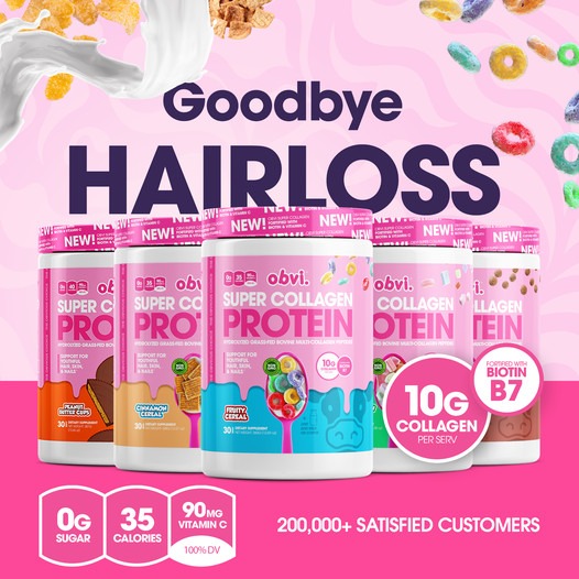
Near-repeat of the pink cereal-and-milk lineup. The headline, package family and bottom facts stay in fixed zones. Not a new concept simply because the ad ID differs.
Foreplay source ↗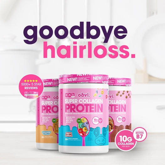
Exact-byte repeat of H05. Preserve record for source traceability; do not count it as another distinct image.
Foreplay source ↗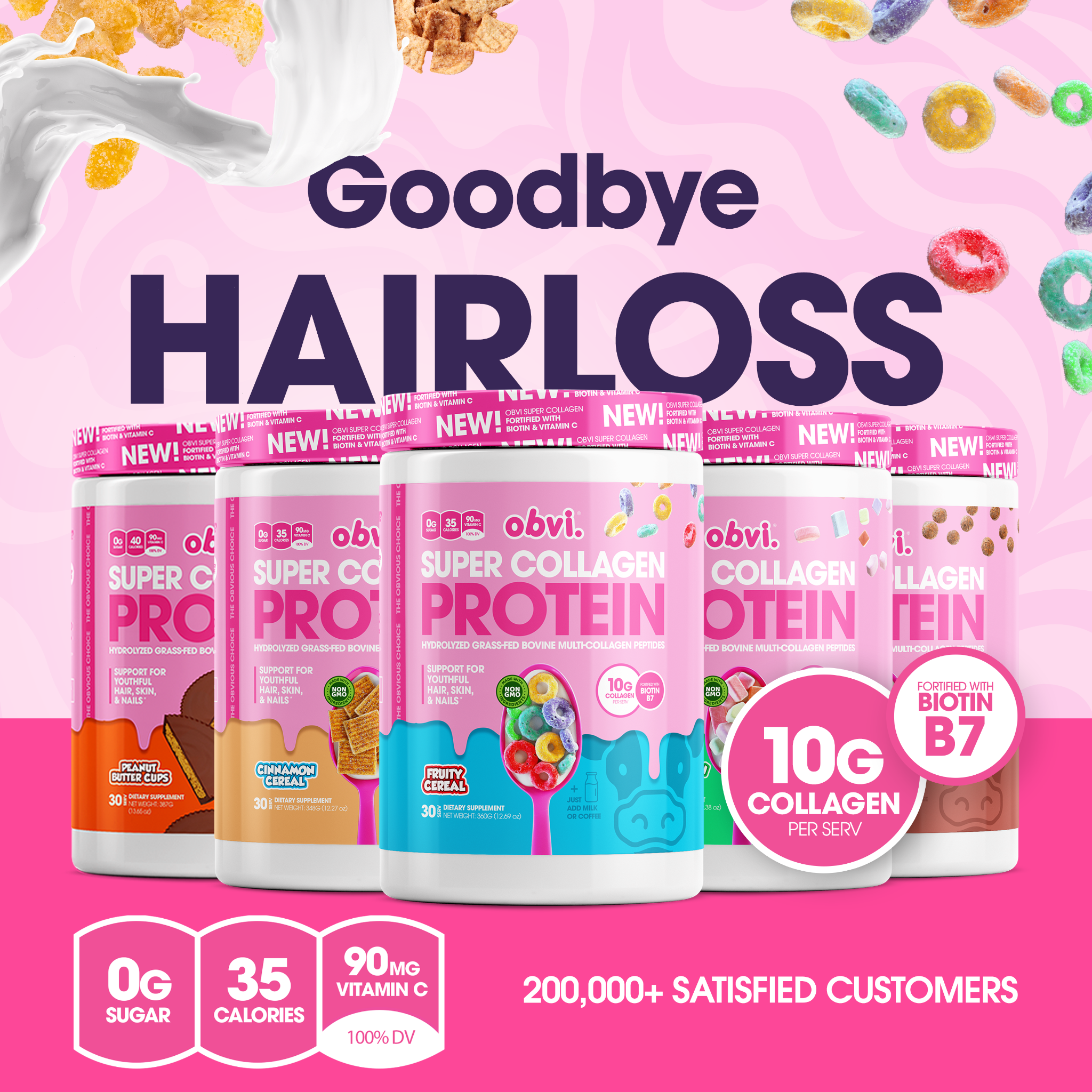
Exact-byte repeat of H01. Same photographed/composited design under another ad record.
Foreplay source ↗
Exact-byte repeat of H04. Repeated run is visible; the data does not explain campaign structure or comparative results.
Foreplay source ↗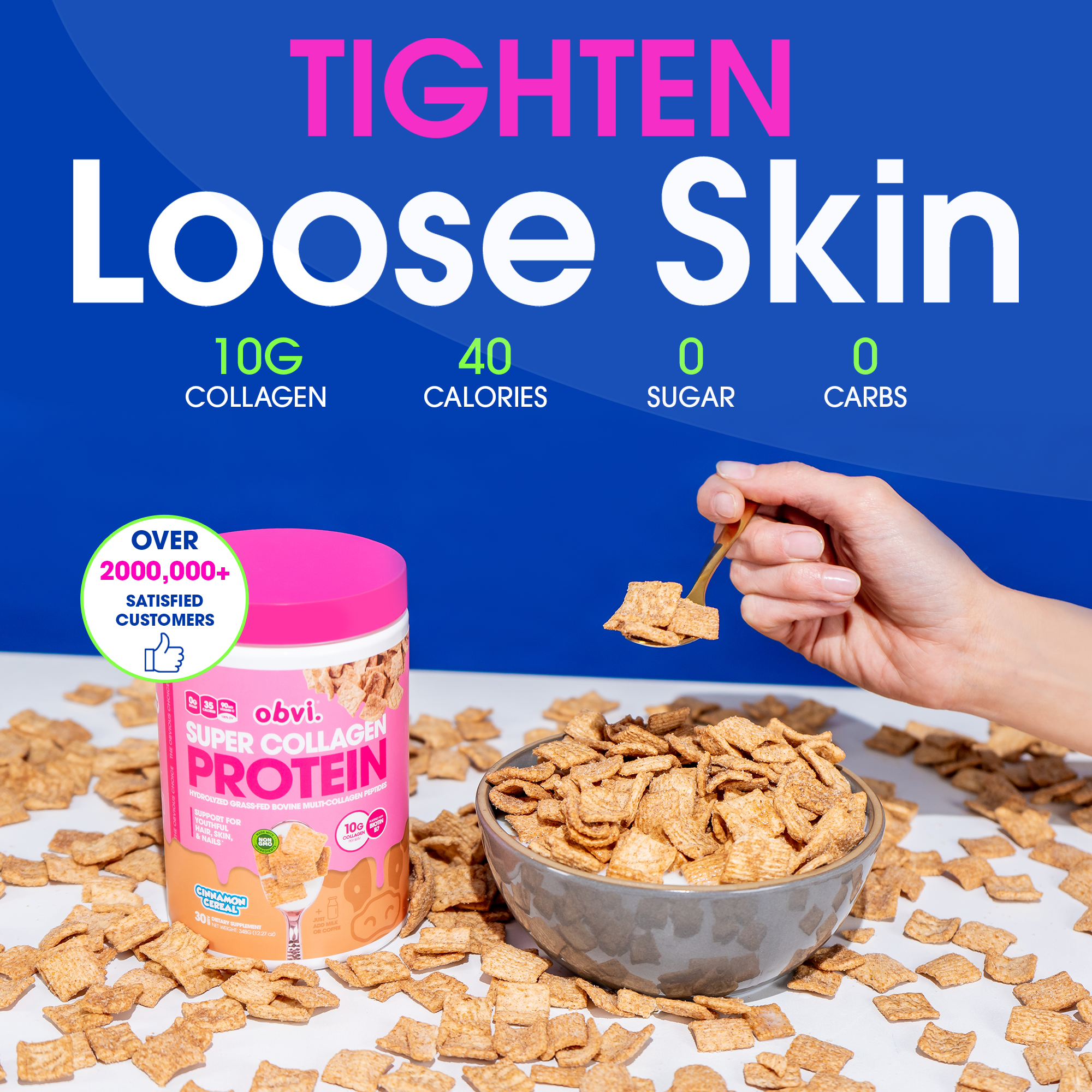
Blue cereal-and-spoon template carrying a skin message rather than a hair headline. Included by the search because of surrounding metadata, not the visible main promise. Exact-byte duplicate of H17.
Foreplay source ↗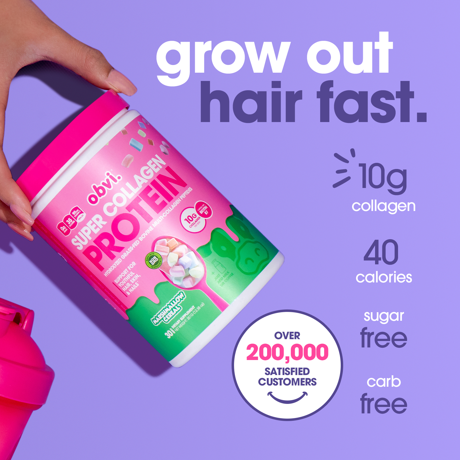
Lavender diagonal hand-held tub, upper-right headline, aligned facts and lower customer circle. Same concept family as O42; fresh search record does not establish a recent launch.
Foreplay source ↗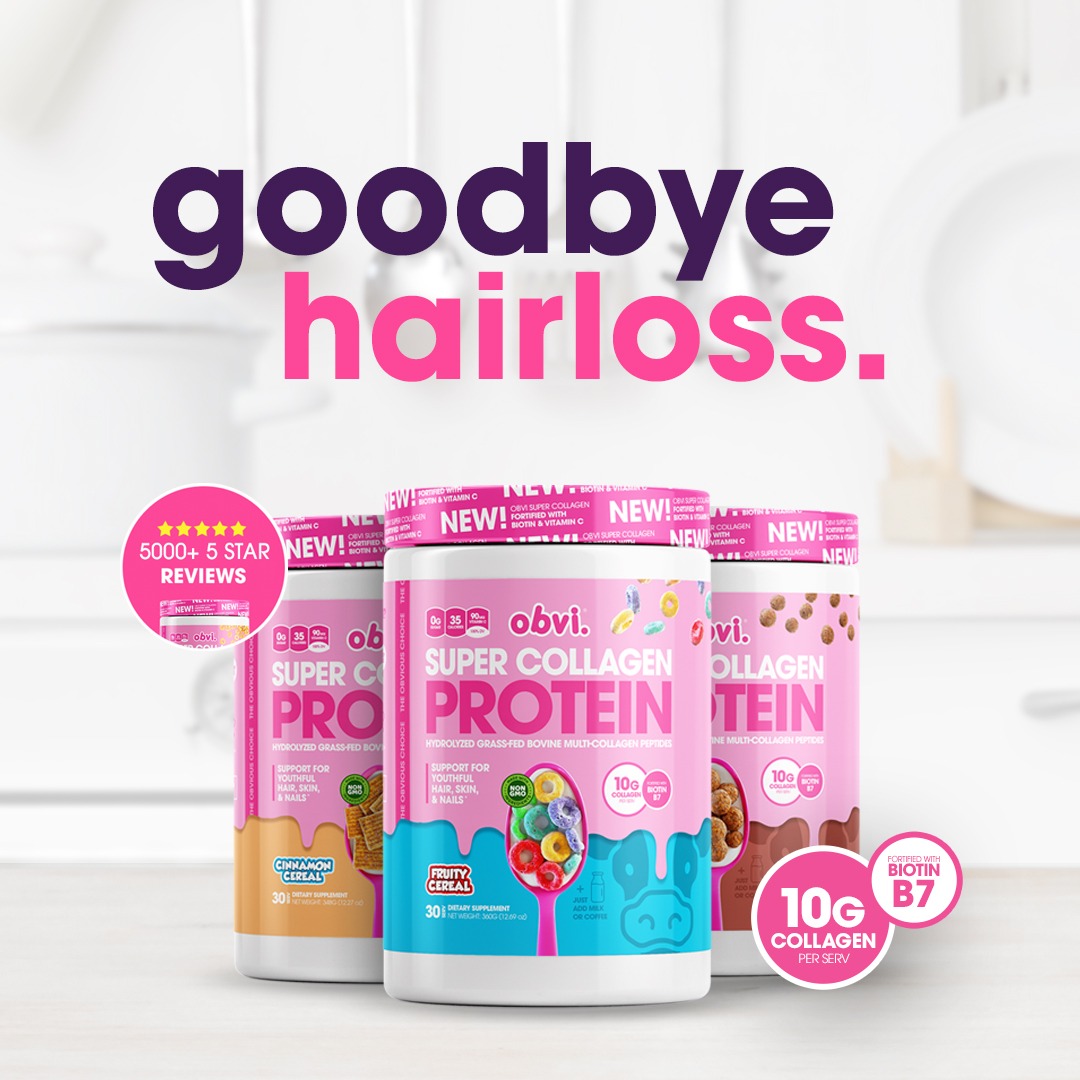
Exact-byte repeat of H02. Bright-room trio and hair-loss headline, not another unique concept.
Foreplay source ↗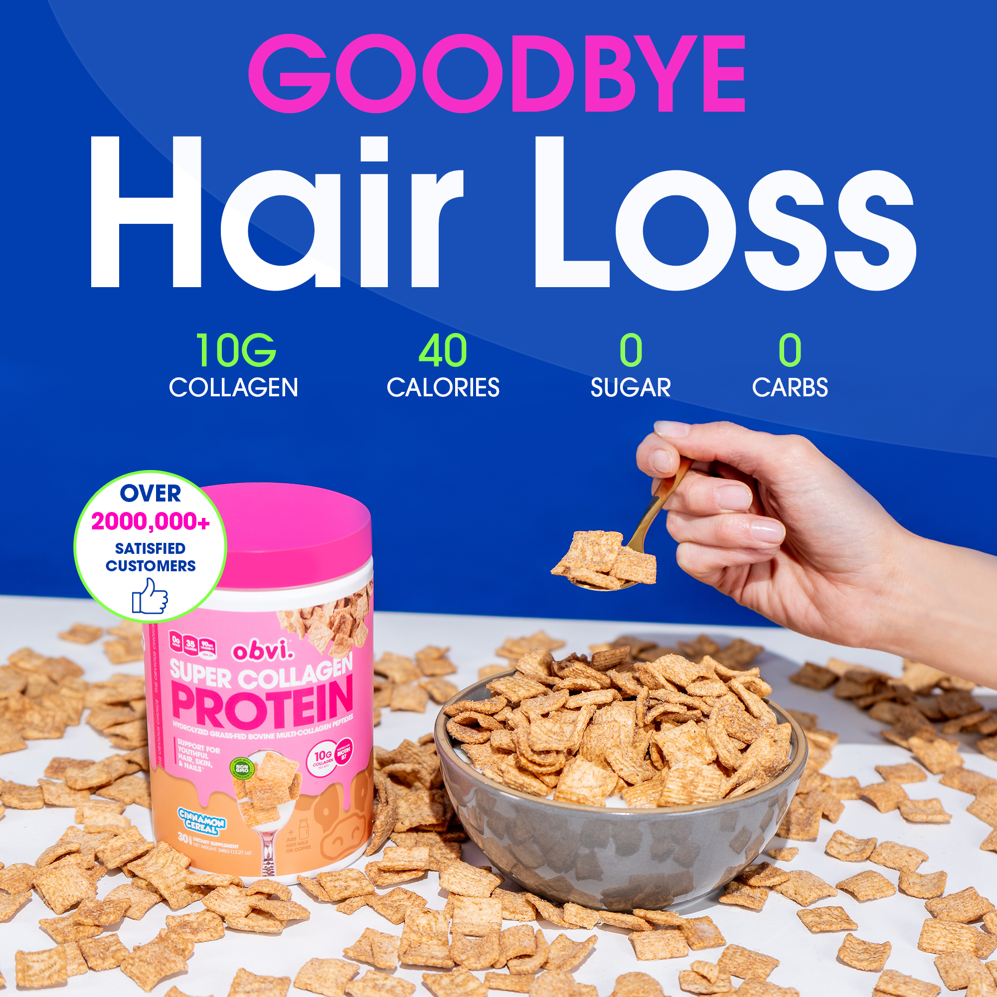
Exact-byte repeat of H03. Blue usage scene with spoon and cereal bowl.
Foreplay source ↗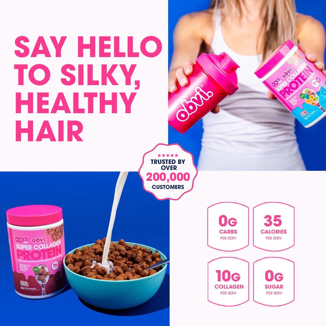
Four quadrants: pink headline on pale upper-left, person holding product upper-right, cereal usage lower-left, nutrition facts lower-right. Customer seal bridges the center. Exact-byte duplicate of H20.
Foreplay source ↗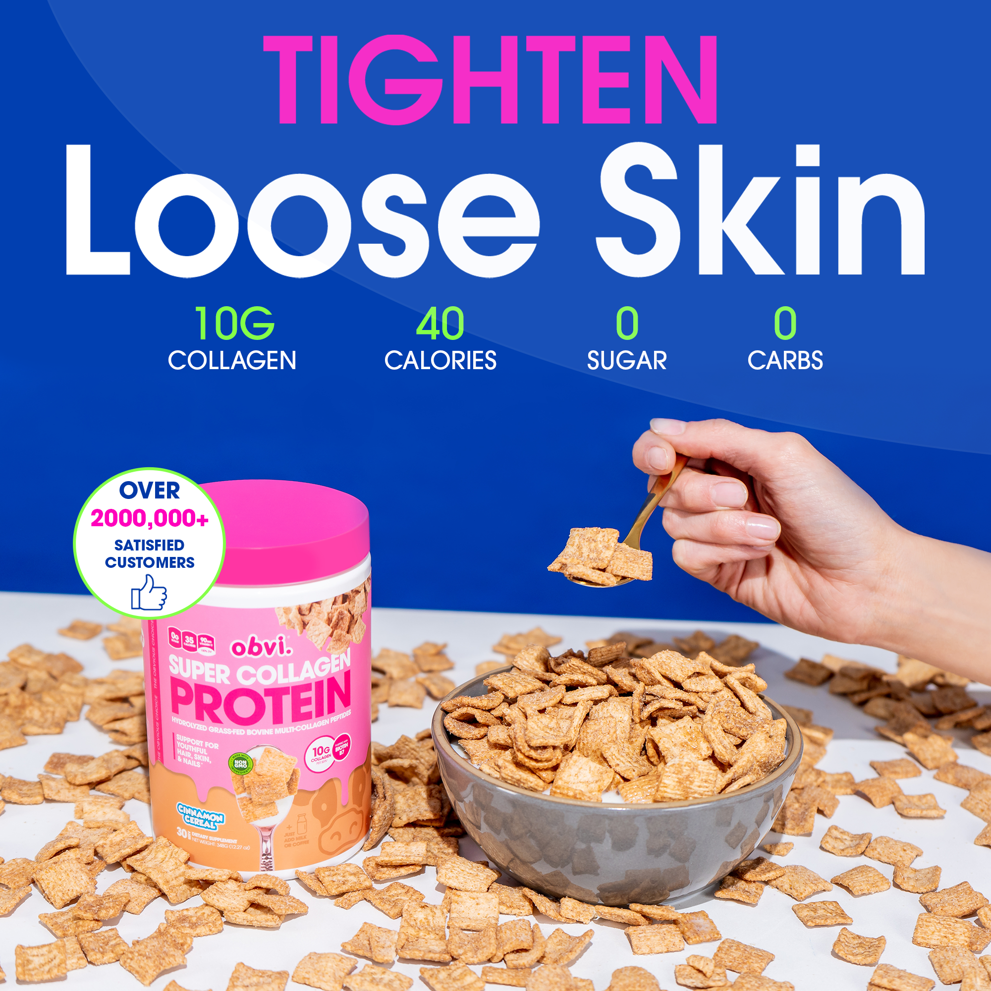
Exact-byte repeat of H11. Skin-focused visible message, despite appearing in the hair search.
Foreplay source ↗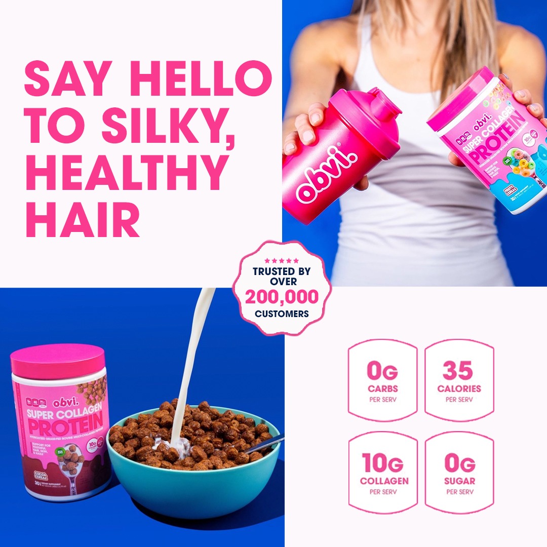
Exact-byte repeat of H16. Same outcome-led four-panel collage.
Foreplay source ↗Research date: 16 September 2026. Prepared for Wonder Hair Serum. This is a visual research study, not a new Wonder creative batch.
I visually inspected 70 Obvi static-ad records: the 50 images already collected on 15 September and 20 additional image records from a fresh Foreplay hair search. These contain 63 byte-distinct files, with additional near-identical layouts and repeated concepts. There are 36 hair-led or hair-hybrid records, corresponding to 30 byte-distinct files. This is not 70 unique concepts.
The original 50 were selected using Foreplay's longest-running ordering. Their stored durations range from 230 to 440 days at the 15 September capture. Many are historical 2022 creatives. Fresh connector requests fetched 100 broad longevity records, 100 Meta static longevity records and 100 hair-search records; these overlapping API results were discovery material, not 300 visually audited images. This report's visual sample is explicitly the 70 records shown in the gallery.
Advertiser: Obvi / myobvi.com; Facebook page 2431731276838642; Foreplay brand BkcnbO1jPIB7zLYPdgvd. Obvi was not on the available Spyder watchlist; its top-overview endpoint returned 403. No spend, purchases, CPA or ROAS was available. Consequently, “top” here can only mean long-running historical references and the most useful design references selected by judgment, never verified best sellers.
A live Meta Ad Library check on 16 September showed the selected Obvi page and active/image filters but returned “No ads match your search criteria.” The body text was saved; screenshot capture timed out. Yesterday's research recorded 17 active ads. This inconsistent capture does not establish that Obvi currently has zero ads, and no current-active ranking is asserted here. Foreplay's live flags are not used as current-status verification.
Obvi makes the promise visually obvious, makes the package hard to miss, and gives the supporting evidence a deliberate home. Most of the variety comes from composition, scale, color, photography and line breaks. Their library does not rely on a different decorative font in every ad.
That directly addresses the earlier Wonder problem. A good image with a uniformly styled sentence dropped into whatever space remains does not reproduce these ads. Obvi often designs the scene, headline and product as one composition. The text is a major shape in the image, not a caption pasted on after the fact.
The woman is placed on the right, turning back toward the viewer. Her hair sweeps left across the middle. Large white and pink uppercase typography sits in the upper-left area. Two oversized product tubs occupy the lower-left. A circular review badge overlaps the product area; handwritten guarantee copy sits in the lower-right white wedge.
The eye has a clear route: headline → sweep of hair → product → reassurance. Hair, type and product each get their own space, but the sweep connects them. This is polished studio imagery, not evidence of an unedited customer photograph. The small script accent works because it is confined to secondary reassurance. For Wonder, the transferable idea is the open corner, hair movement and anchored product—not a duplicate of the model or Obvi's efficacy claim.
A pink gradient provides a quiet upper area for a centered two-line headline. Below it, a large collagen tub is flanked by round brushes and scissors. The objects form a simple row with similar vertical scale. A pink circular rating badge overlaps the lower-right product/tool area. The guarantee is small and immediately beneath the headline.
This is the closest Obvi reference for Wonder's successful brush-and-bottle direction. A brush is useful because it is instantly recognizable in the hair-care context. Our shed hair creates a more explicit painful moment than Obvi's clean salon tools. Preserve that stronger pain cue. The takeaway is to give the existing brush, hair and Wonder bottle a coherent arrangement, with one dominant headline and a compact closing element. No invented leader lines are needed.
The model occupies the left half; the headline and bottle occupy the right. A short dark-plum first line leads into a much larger white emphasis word. The guarantee follows below, and the customer-count circle overlaps the bottle's upper-right edge. The product is large enough to identify immediately.
This is restrained variety: one heavy sans-serif appearance, multiple scales, two text colors and meaningful line breaks. It supports the user's request for expressive typography without turning the layout into unrelated font samples. The proof circle has an obvious attachment point, unlike a floating ornamental circle.
O42 uses a lavender background, a hand entering from the upper-left, and a diagonally held product. The headline sits upper-right; a short ingredient/nutrition column aligns down the right. O43 uses a cyan wall and a tight crop of hands holding a tub. Its short two-color headline sits above the product. H03 shows a spoon, cereal bowl and scattered cereal below a large problem statement.
These photographs contain gestures and material details rather than an interchangeable bathroom backdrop. They remain art-directed commercial images; “UGC-like” does not establish customer provenance. For Wonder, hands dispensing serum or holding the bottle can provide the same human scale. The hand must do something specific, and the copy must have reserved space outside the fingers, label and oil stream.
The package is often the largest object, sometimes repeated in a small family. O08 desaturates and blurs the background packages so one full-color tub stands out. O27 uses cereal and milk around the edges, a headline at the top, tubs in the center, and compact nutrition/proof along the bottom. H19 uses large tilted tubs crossing in front of an oversized pink word; the lower rounded panel communicates ways to consume the product.
The image can be product-led and still carry a problem-led premise. This is relevant to the user's concern that some Wonder ads lost the bottle: Obvi repeatedly keeps the product prominent even when the message addresses an emotional problem. Product visibility is not restricted to warm-audience creative.
H15 has a large blue upper panel containing headline, explanation and product, above three small product photographs. A review circle bridges the row boundary. H18 uses a four-part grid: problem headline upper-left, product-in-hand upper-right, usage lower-left, four nutrition facts lower-right. A scalloped customer-count badge bridges the center intersection.
These are more information-dense than the other hair ads, but the divisions are functional. Each panel answers a different question. This suggests a useful way to combine an authentic customer result, product usage and product identification, if those materials are available. It does not justify filling every panel with another headline or fabricating a review.
A model pulling up her hair occupies the upper-right; product tubs occupy upper-left. The portrait has a shaped white cutout border traced by a pink dashed contour. A pink highlight box leads into very large dark type in the lower-left; bright review and guarantee strips close the bottom.
The contour follows a real silhouette. It is not a free-floating squiggle. These ads are loud and deliberately crowded; the bottom has several competing proof elements. The useful lesson is a highlight attached to a meaningful word and type composed around a subject. The precise time-to-result assertion is Obvi's claim, not verified Wonder evidence.
A product system made visible (O01): three background colors create three vertical columns, one product and daypart per column. The spatial structure explains the usage system before the details are read. A headline unifies the three columns. This is stronger than adding a list of routine benefits to an unrelated photograph.
Seasonal context (O02 / O04): pumpkins, fall language and warmer or purple fields turn a generic weight-management message into a calendar-specific reason to look. Discount, rating, payment and guarantee elements are subordinate but conspicuous. This is an observed execution strategy, not proof that seasonal ads outperformed evergreen ones.
A named obstacle (O03): a headline leads into four illustrated obstacles in a compact two-by-two arrangement, with product beneath. The structure explains why a customer might be stuck. For Wonder, one concrete frustration should lead; multiple objections can live in a separate explanatory execution.
Testimonial embedded in the scene (O09 / O12 / O14 / O18): they use chat bubbles, a short quote beside a woman, or a circular testimonial beside a hand holding a capsule. The text is placed where the scene has room, not uniformly across every face and product. These are testimonial graphics; this research does not verify the underlying customer stories.
Offer made tangible (O19 / O20 / O24 / O26): the free bag or shaker is pictured beside the purchasable product. Percentage-off type is often the largest text. The viewer can see what is included. The captions frequently carry the harder offer even when the image leads on a problem; image and ad-unit copy have different jobs.
Embodied aspiration (O10 / O15 / O17 / O49): active women and gym scenes provide the broader identity outcome. Headline scale, person position and package placement change substantially across executions. These are generally more polished than phone-camera UGC.
Choice and contrast (O29 / O39): split color fields or paired portraits produce an immediate comparison. O39 compares desired benefits, not a dated before-and-after result. Do not mislabel it as transformation proof.
Availability and market expansion (O45 / O46): logo, country message and broad product assortment dominate. These are announcement creatives rather than hair-pain concepts. Their inclusion illustrates why keyword-matching captions alone would misclassify this library.
1. Palette: hot pink and dark plum recur most; white and pale pink provide breathing room. Royal blue, cyan, lavender, orange and occasional neon yellow/green make whole executions feel different. Color is often carried by both the scene and typography.
2. Fonts: most headlines have bold geometric or rounded sans-serif characteristics. Exact font files are unknown. They alternate uppercase stacks, softer lowercase, italic condensed emphasis, very large numbers, and occasional script reassurance. Font variety is controlled by role.
3. Line breaks: key problem or outcome words often get a separate line, color or size. A phrase is arranged for visual emphasis rather than wrapped automatically into a rectangular text box.
4. Alignment: a centered product stack usually gets centered type. A person or hand pushed to one side gets a corresponding text column. Asymmetry is balanced by the product, not by decorative marks.
5. Product scale: large enough to read as a recognizable package at phone size. Often cropped by the bottom edge. Multiple packages create depth with a larger foreground item and smaller background items.
6. Proof placement: circles overlap a product corner, sit beside a usage gesture, or bridge a panel boundary. Their position connects reassurance to the thing being sold.
7. Badge meaning: circles typically contain review counts, customer totals, an offer or a quote. A circle without useful information would lose the function that makes the reference effective.
8. Guarantees: often a thin bottom line, small footer, or secondary line below the headline. Occasionally a script treatment makes reassurance feel like a separate voice.
9. Banners: Obvi does use banners—offer strips, review tickers and footers are visible. The problem is not the existence of a banner. It is whether it has a distinct job, fits the composition and leaves the main story clear.
10. Lines and contours: when present, a line points to a product, follows a cutout or separates actual information groups. Decorative line work is not the central organizing principle.
11. Photography: the library mixes studio models, bright tabletop setups, close product handling, domestic backgrounds, fitness scenes and composited pack shots. It is not consistently candid UGC.
12. Texture: cereal, milk, pills, hair and brushes give material detail. The props generally explain flavor, use or category, rather than existing only as visual clutter.
13. Depth: overlaps, shadows, tilted tubs and foreground/background scale make otherwise simple pack-shot ads feel composed. H19 is a clear example of product/type overlap.
14. Closing action: most sampled images do not need a large in-image button. Their closure is often the product plus proof or guarantee, with offer/CTA handled in the surrounding ad unit. Wonder's oval Discover Wonder CTA remains a valid established preference; this sample does not prove Obvi's circles are CTA buttons.
15. Testing behavior visible in the archive: O32/O34, O28/O35/O44 and O30/O36/O38/O41/O50 reuse scenes with changed benefits. This suggests modular creative testing, but there is no result data to identify a winning variant.
16. Format: the original 50 include 48 square assets, one near-square and one landscape. These are not evidence of native 4:5 or 9:16 composition. Wonder must recompose around its actual placement dimensions rather than stretch or crop these structures blindly.
Keep the successful brush-and-bottle and growing-it-out compositions as anchors. The existing pain cues are often more concrete than Obvi's clean studio scenes. Borrow their clarity of hierarchy and variation of layout, not every slogan or pink background.
For a five-concept, three-variation structure, vary the visual approach deliberately: (1) brush and shed hair; (2) fragile ends/length retention; (3) documented customer diary; (4) product application in hand; (5) direct product-and-problem composition. Within a concept, vary headline treatment, framing and proof placement in controlled ways. Do not reuse one text box template across all fifteen.
For the brush concept, preserve the bottle and hair, reserve a real headline area, and anchor the oval CTA beneath the supporting line. For the split-ends concept, let the hair occupy the visual center and give one word or line distinct emphasis. For diary work, use the actual evidence and a genuine review structure; this Obvi sample supplies collage organization, not proof that a particular week-by-week transformation happened. For application work, show the product performing an action rather than merely sitting in another bathroom.
These are design recommendations only. No new Wonder images were generated, no existing approved image was replaced, and no Meta ad, budget or draft was changed by this research.
Every gallery card has the original image, exact Foreplay link, stored duration, study ID and specific visual note. O01–O50 refer to the existing 15 September collection. H01–H20 refer to the additional 16 September hair-search selection. Byte duplicates are labeled. Selection as a featured reference means creative relevance to Wonder, not financial performance.
No dated before-and-after pairs were identified in these 70 static records. That finding is bounded to this sample and does not mean Obvi has never used them. Video, landing pages, email, organic content and every product under related Obvi advertiser pages were not exhaustively audited.