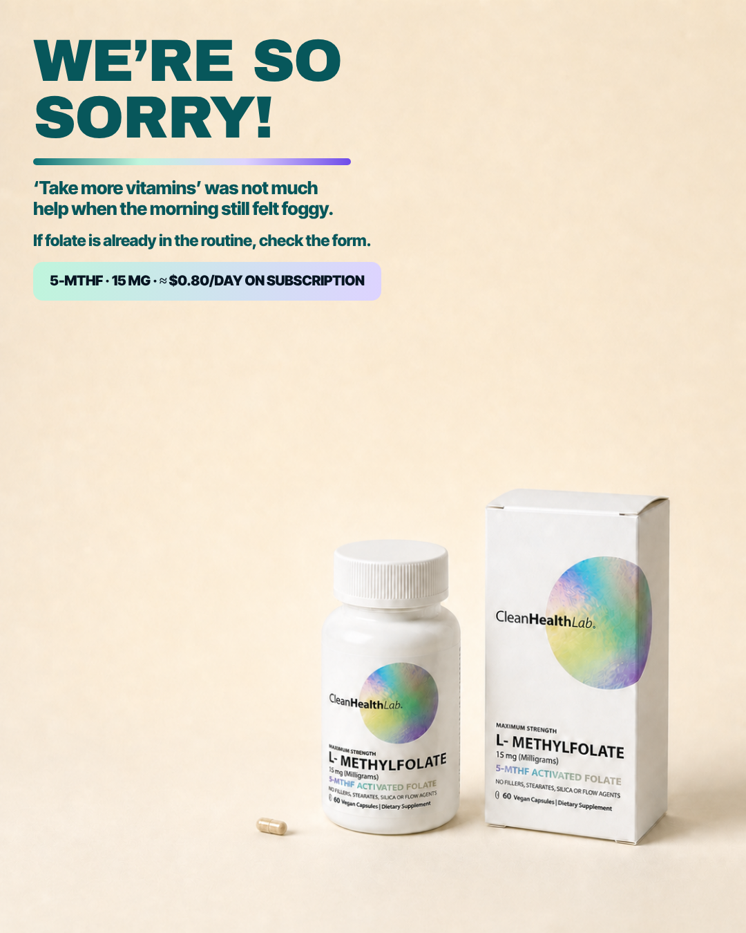
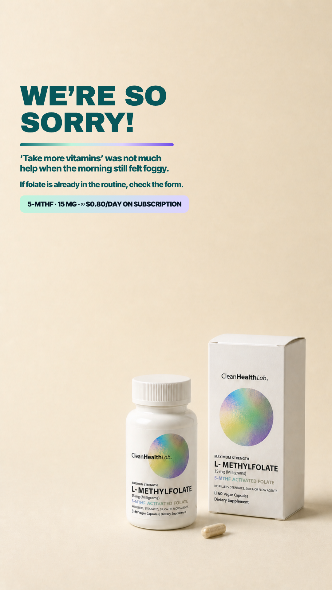
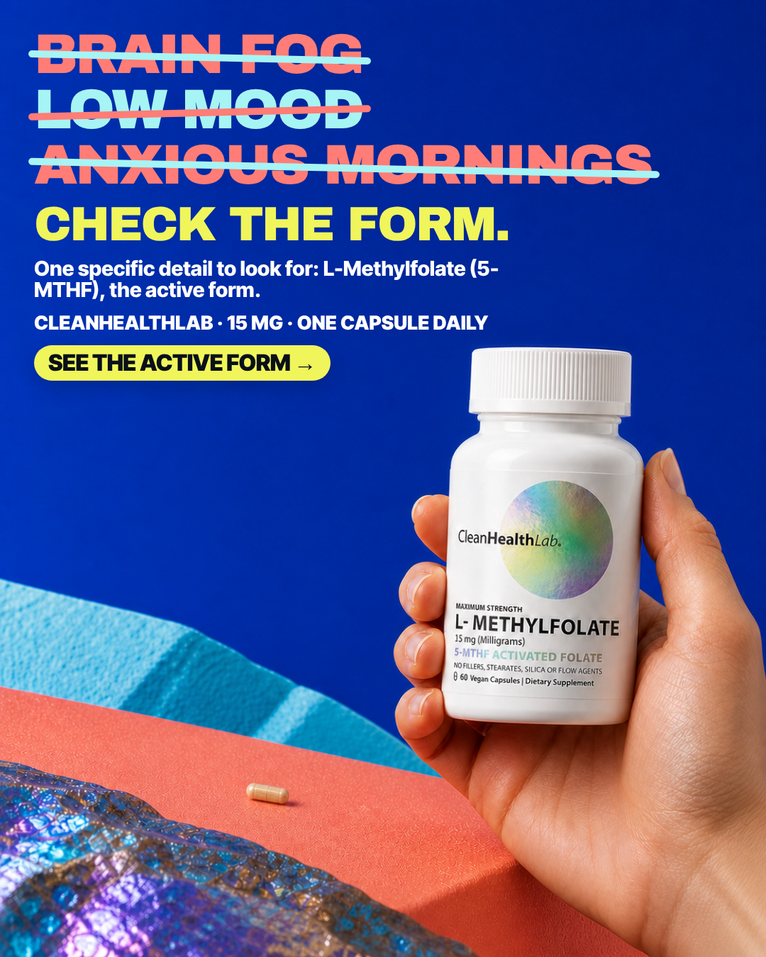
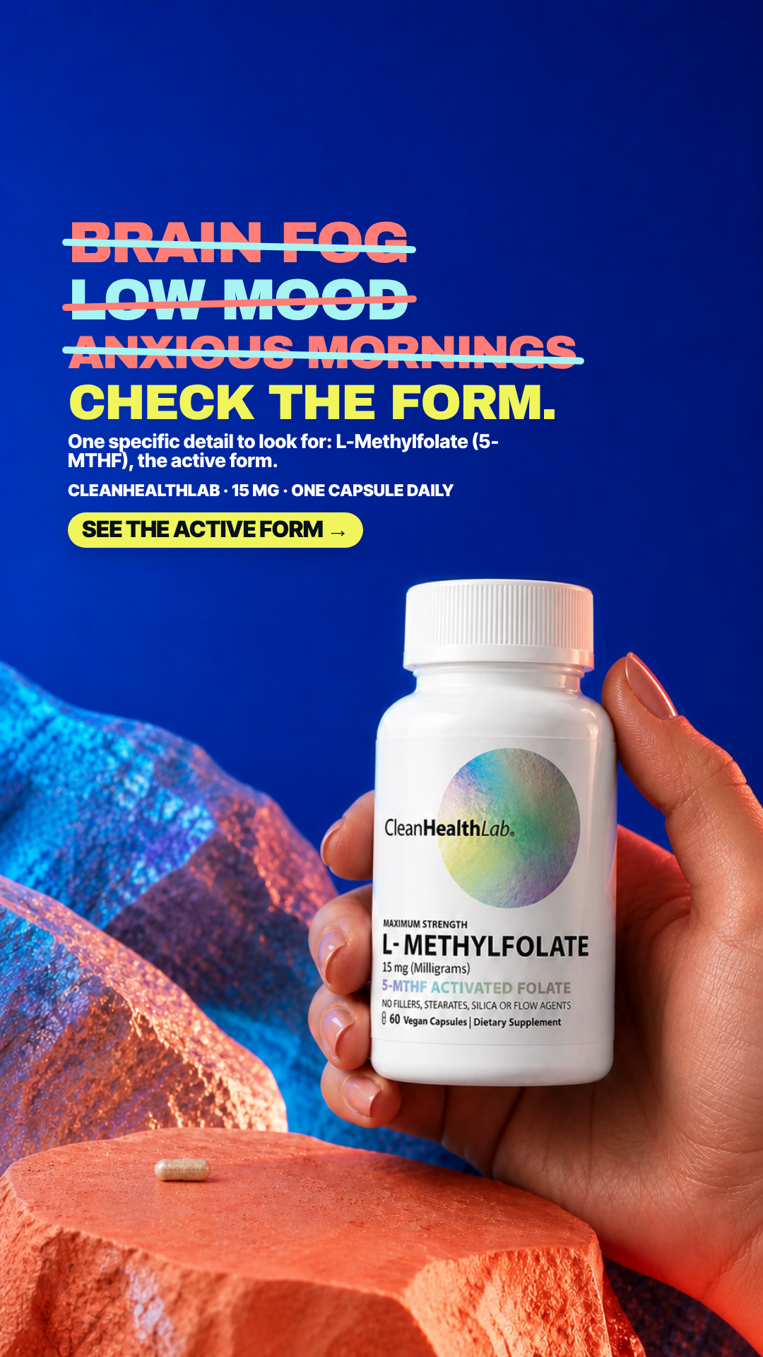
Every concept in the deck, in both native placements, ordered by four
independent judges who saw shuffled code-named plates only — no IDs, no lanes, no copy deck,
no prior scores, and no knowledge of which ten had already been built. Masters are the exact
shipped pixel sets, copied, never re-rendered or re-typeset.
33concepts
66native masters
4blind judges
6.04panel average
11flagged fatal
7built & paused
How the ranking was produced
All 33 4:5 masters were copied to shuffled code names and the key was moved out of the
judged directory. Four fresh judges each scored the whole set from the pixels alone and wrote
their verdicts independently; nobody saw anyone else's. Rank is the mean of their four overall
scores. The 9:16 masters were not separately judged — where a card shows
both placements, the score belongs to the 4:5. These are pre-spend creative judgments: no ad
in this set has spent anything.
Art directorThe set splits cleanly into disciplined studio/plinth plates and looser lifestyle or collage plates, and craft tracks that split almost perfectly. Where the pack is lit flat and shot straight (V10-R01, V10-R02, V10-T05, V10-T05-VALUE, V11-CYM-01, V11-IM8-02) the label survives to thumbnail size and the type has a real hierarchy; where the pack is dropped into a scene or a generative environment the label is the first casualty - cropped by the frame in V10-N03, crushed to grey mush in V10-N06, hallucinated outright in V11-GRUNS-02, and stripped of its brand mark in V11-ARMRA-01. The dominant typographic failure is auto-layout rather than bad taste: orphaned dose-line fragments ('MG' in V10-R04, 'DAILY' in V10-B02, 'FORM.' in V10-T01, 'verify.' in V10-N05), a mid-token break in V10-B01, badge overflow in V10-T06, and equal-width list bars that leave dead space. The second recurring fault is a large unresolved gap between the copy block and the product (V11-SEED-01, V11-GRUNS-03, V10-T02, V10-R05, V10-T04, V11-ARMRA-03), which reads as a template's fixed top stack rather than a composed frame, and in two plates (V10-N07, V10-N02) the layout closes that gap the wrong way and lets a CTA or list bar collide with the pack.
Cold buyerThe winners all named a lived, undesirable moment before they named the molecule: the crossed-off anxious-morning checklist, "you're not lazy, you're running on empty," the exhausted man at the night laptop, and "ADHD routines are complicated enough" each gave me a self-recognition hit inside 1.5 seconds, and only then asked me to check a label. The middle of the set had a real premise — "still foggy after more vitamins" or "five supplements, still foggy" — but spent it on a white-seamless packshot with no human being in frame, so the pain evaporated before the CTA. The bottom of the set failed on premise, not craft: aspiration stacks like "Focus. Finish. Show up.", the "WE'RE SO SORRY!" service-email headline, launch-news framing, label lectures with no person in them, and offer-led cards where SAVE 20% and ≈$0.80/day did the selling. Two are unusable as shipped — the painted-on "scratch to reveal" panel is a fake interaction that made me distrust the brand outright, and the cartoon-fog creative renders the bottle label into unreadable mush.
DR strategistThe batch splits cleanly on one question: does the ad make the folate-form argument, or does it just gesture at fog? The winners pair a named lived moment with a checkable label claim — V10-N06's 'a folate label can name the nutrient without making the form obvious', V10-R05's folic-acid-conversion line, V10-T03 and V10-T07's 'you already paid for good vitamins' attack, and V10-N01's 'you're not lazy, you're running on empty' identity reframe. The collapses come in two flavours: aspirational verb stacks and lifestyle plates that name no pain at all (V10-T05, V10-T05-VALUE, V10-T04, V11-ARMRA-02, V10-R01), and otherwise-decent hooks that end on an offer or spec chip with no instruction to click (V11-SEED-01, V11-GRUNS-02, V11-ARMRA-01, V11-ARMRA-03). Two must not run: V10-B01 crosses out low mood and anxious mornings as if the capsule erased them, and V10-N04 addresses an ADHD diagnosis; V11-SEED-03 is separately disqualified for a fake scratch-off panel painted onto a static image.
SkepticFour failure modes recur. First, health-condition overreach: the set repeatedly borrows clinical or mental-health language it cannot support — ADHD named outright in V10-N04, anxiety and low mood struck through as if resolved in V10-B01 and V10-B02, and stacked unqualified outcome promises in V10-T05/V10-T05-VALUE — with no qualifying language anywhere in any frame. Second, fake interactivity and UI mimicry: a scratch-off panel in V11-SEED-03, an unchecked checkbox in V10-B02, and numbered chip rows in V10-T01/V10-N07/V10-N02 that read as tappable controls in a still image. Third, product-fidelity breakdown at the exact place a buyer looks: the pack is sliced mid-label by the frame in V10-N03, generatively smeared into illegibility in V11-GRUNS-02, and missing the CleanHealthLab wordmark entirely in V11-ARMRA-01, while V11-AG1-01 shows a detached label with no container. Fourth, and most pervasive, structural weakness in the ask — V11-SEED-01, V11-GRUNS-03, V11-GRUNS-02, V11-ARMRA-01 and V11-ARMRA-03 end on an offer or spec chip with no call to action at all, several of them stranded above 300–600px of empty background, and V11-AG1-01/V11-CYM-02/V10-N02 assert a 'five supplement/bottle' count that no frame in the set actually depicts.
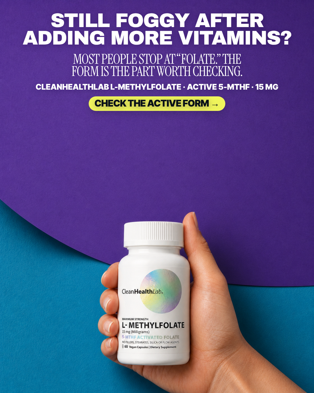
#1 of 33V10 · v10r10TBuilt & paused in the ad setV10-T03
Failed-vitamin reframe
STILL FOGGY AFTER ADDING MORE VITAMINS?
Pain The customer has taken vitamins but still feels foggy or emotionally off and doubts that another ingredient list will help.
7.50panel mean
Art director7.2
Cold buyer7.2
DR strategist8.2
Skeptic7.4
spread 1.0
What each judge said
Art directorLabel in the hand is pristine and fully readable, but a condensed serif sub-line is dropped between a grotesk headline and a grotesk dose line, and roughly 300px of flat purple sits dead between the CTA and the bottle cap.
Cold buyer"Still foggy after adding more vitamins?" names the failed alternative I actually lived, and the hand-held bottle is big enough that I can read 5-MTHF ACTIVATED FOLATE off the label, but the whole middle third is empty purple.
DR strategist'Still foggy after adding more vitamins' names the failed alternative and 'most people stop at folate' converts it into a checkable label instruction rather than a promise.
SkepticNo product or claim defect I can point to; the only faults are a ~300px empty band through the middle third and a serif subhead that belongs to no other typeface in the layout.
4:51080×1350
9:161080×1920not judged
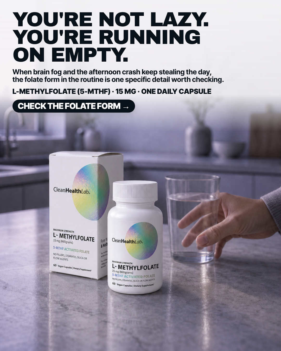
#2 of 33V10 · v10r10NNot builtV10-N01
Depleted, not lazy
YOU'RE NOT LAZY. YOU'RE RUNNING ON EMPTY.
Pain Stress and daily life have left the customer depleted, exhausted, and unlike themself.
7.47panel mean
Art director7.2
Cold buyer8.3
DR strategist8.8
Skeptic5.6
spread 3.2
What each judge said
Art directorStrong headline and a real kitchen moment, but the countertop directly below the bottle carries a smeared mirrored ghost of '60 Vegan Capsules | Dietary Supplement' baked into the stone, and the reaching hand is clipped by the right edge.
Cold buyer"You're not lazy. You're running on empty." is the only line here that names the thing I privately call myself, and the kitchen counter with a hand reaching for the water glass is the exact moment the capsule gets taken.
DR strategist'You're not lazy, you're running on empty' resolves an identity accusation the buyer already makes about themselves, then hands them one specific label detail to go check.
Skeptic'YOU'RE NOT LAZY. YOU'RE RUNNING ON EMPTY.' asserts the viewer's own state in the second person at the top of the frame, and the carton's left side panel behind the bottle dissolves into unreadable generative micro-text.
4:51080×1350
9:161080×1920not judged
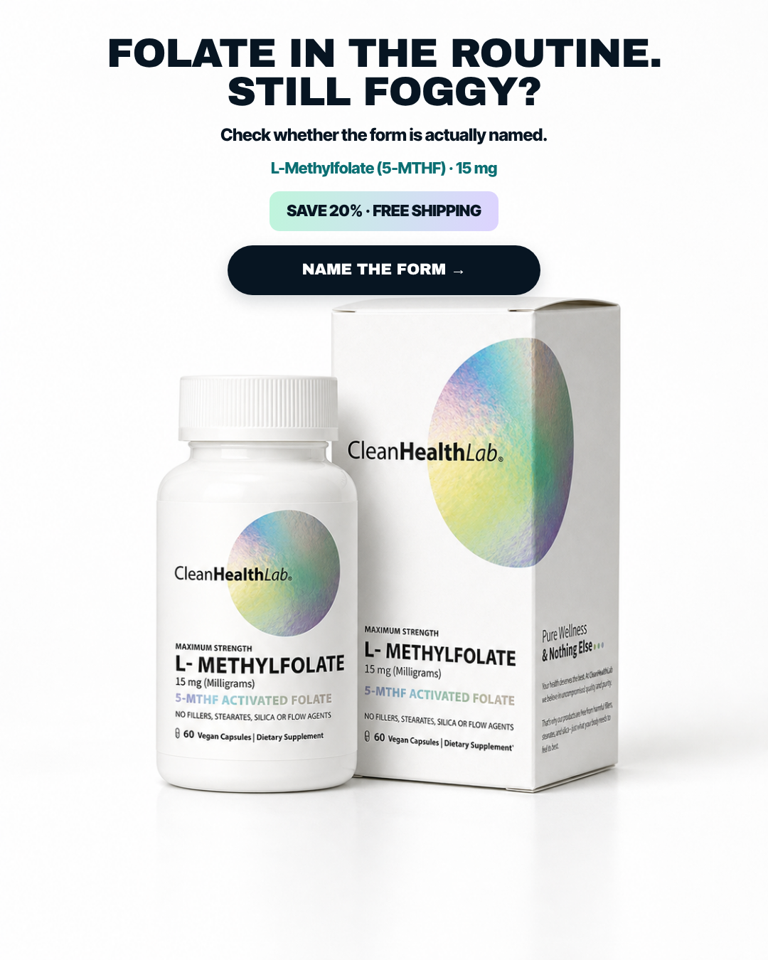
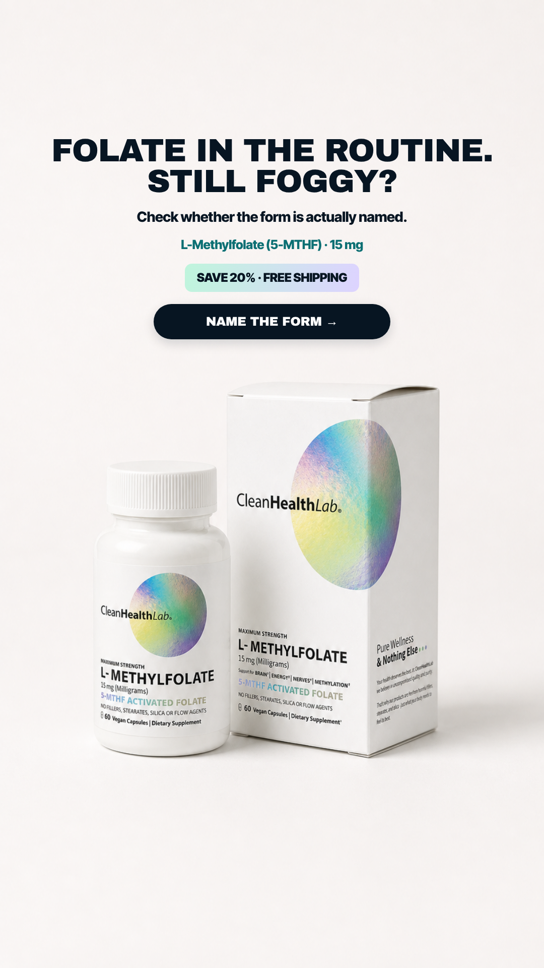
#3 of 33V11 · v11.3CYMNot builtV11-CYM-01
Name The Form
FOLATE IN THE ROUTINE. STILL FOGGY?
Pain Still feeling foggy despite having folate in the routine.
7.33panel mean
Art director8.0
Cold buyer5.9
DR strategist7.6
Skeptic7.8
spread 2.1
What each judge said
Art directorCleanest pack rendering in the set - bottle and carton labels are crisp down to 'NO FILLERS, STEARATES, SILICA OR FLOW AGENTS' - though the six centred stacked elements read as a default ladder rather than a designed hierarchy.
Cold buyer"Folate in the routine. Still foggy?" is a fair question but it is stacked on top of SAVE 20% and a white-seamless bottle-and-box shot that is indistinguishable from every Amazon listing.
DR strategist'Folate in the routine. Still foggy?' plus 'check whether the form is actually named' is the cleanest short path from frustration to a verifiable action in the batch.
SkepticPack and carton are intact and fully legible and the claim is confined to label disclosure; the only quibble is the CTA verb 'NAME THE FORM', which asks the viewer to do something a click cannot do.
4:51080×1350
9:161080×1920not judged
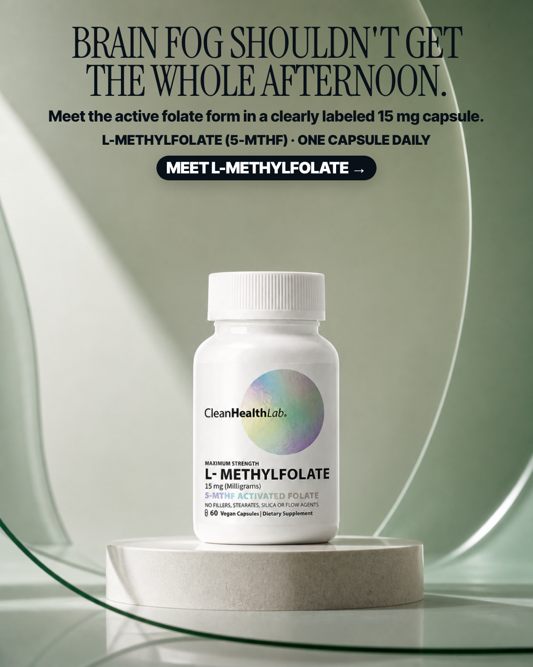
#4 of 33V10 · v10r10RBuilt & paused in the ad setV10-R02
The afternoon lost to fog
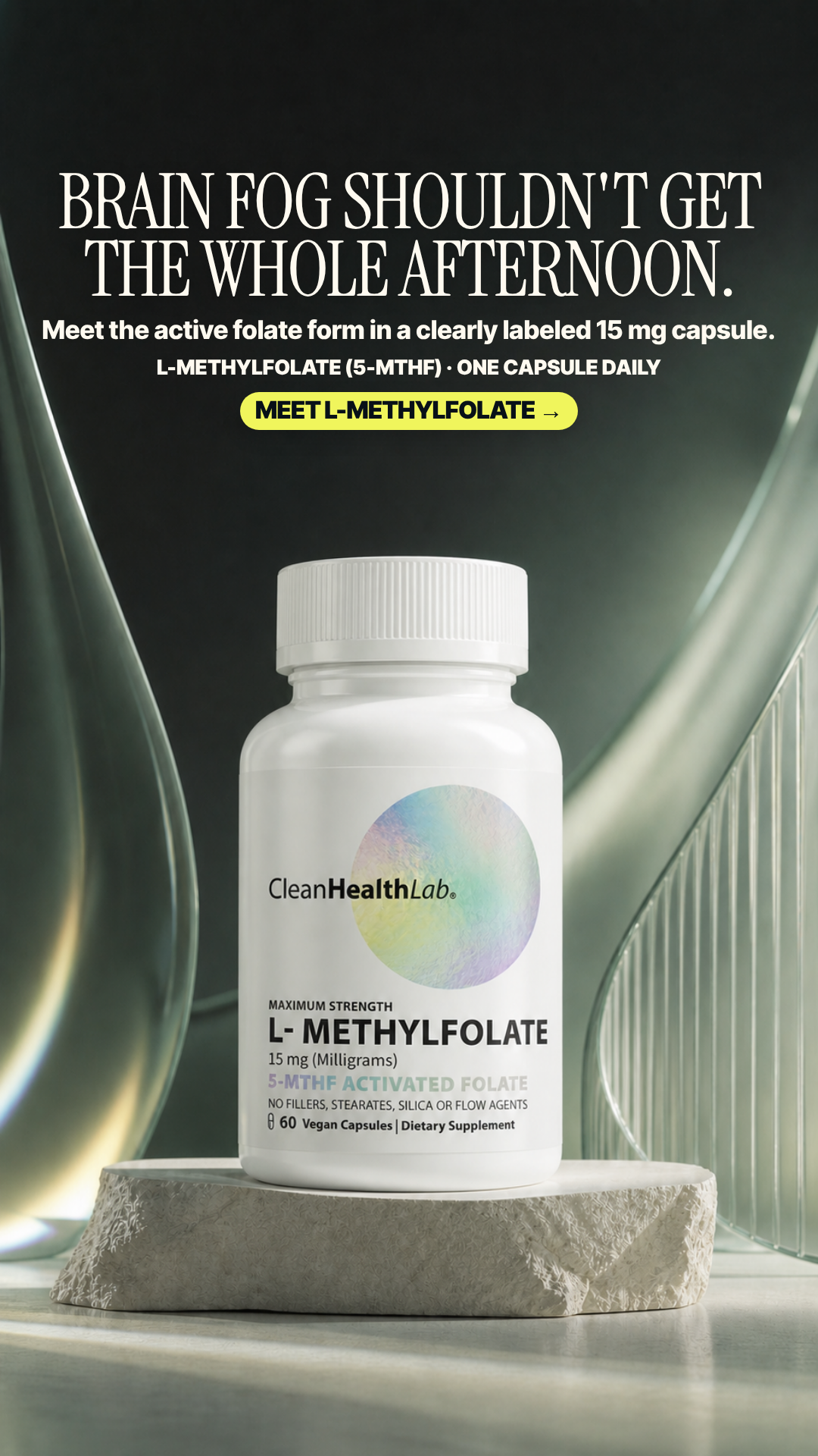
BRAIN FOG SHOULDN'T GET THE WHOLE AFTERNOON.
Pain No explicit lived problem; it assumes category desire and product-launch curiosity.
7.28panel mean
Art director8.5
Cold buyer6.0
DR strategist6.1
Skeptic8.5
spread 2.5
What each judge said
Art directorCalm sage set with a centred plinth, a well-ragged two-line serif headline and a label crisp enough to read '15 mg (Milligrams)' at thumbnail size; only a modest gap between CTA and cap keeps it from perfect.
Cold buyer"Brain fog shouldn't get the whole afternoon" is nicely specific, but the sage-green spa pedestal is so calm and pretty that nothing about the image says anything is wrong.
DR strategist'Shouldn't get the whole afternoon' localises the pain nicely, but 'Meet L-Methylfolate' is an introduction rather than an instruction and asks the reader to do nothing.
SkepticI found no defect I can point to — pack intact and fully legible, one unambiguous CTA, no count, comparison or outcome claim beyond a soft 'shouldn't get the whole afternoon'.
4:51080×1350
9:161080×1920not judged
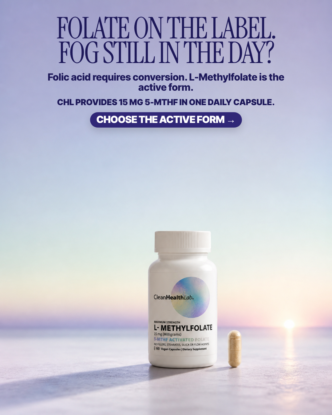
#5 of 33V10 · v10r10RNot builtV10-R05
Folate on label, fog in day
FOLATE ON THE LABEL. FOG STILL IN THE DAY?
Pain The customer may be taking folic acid yet still not getting the expected support—an invisible conversion problem.
7.18panel mean
Art director6.5
Cold buyer7.1
DR strategist8.5
Skeptic6.6
spread 2.0
What each judge said
Art directorElegant sunset gradient, but ~320px of empty haze sits between the CTA and the bottle and the pack is small and low enough that '5-MTHF ACTIVATED FOLATE' softens into the horizon.
Cold buyer"Folic acid requires conversion. L-Methylfolate is the active form." is the one mechanism sentence I could go verify, but the pastel sunset and the 600px of empty sky drain all urgency out of it.
DR strategistThe only plate that states the actual biochemistry — folic acid requires conversion, L-Methylfolate is the active form — which is what makes 'choose the active form' a real instruction rather than a slogan.
SkepticThe sunset horizon is borrowed scenery with no product logic and the middle third of the frame is empty; the 'folic acid requires conversion' line is stated as flat fact with nothing on-frame supporting it.
4:51080×1350
9:161080×1920not judged
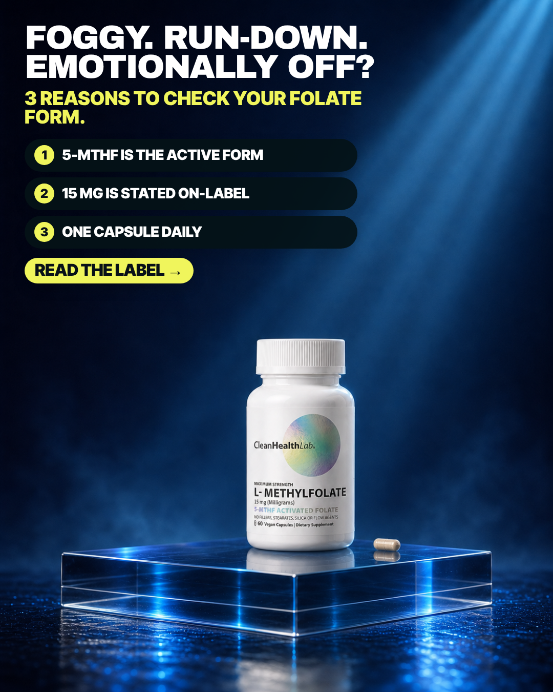
#6 of 33V10 · v10r10TBuilt & paused in the ad setV10-T01
Three reasons to check the form
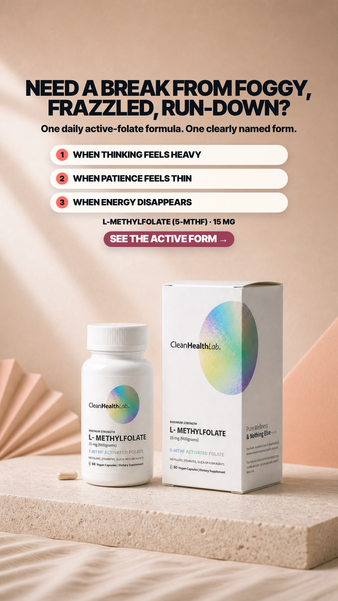
FOGGY. RUN-DOWN. EMOTIONALLY OFF?
Pain Brain fog, mood instability, low energy, and the suspicion that ordinary folic acid is not working.
7.08panel mean
Art director6.8
Cold buyer7.0
DR strategist7.3
Skeptic7.2
spread 0.5
What each judge said
Art directorThe yellow sub-head leaves 'FORM.' as a one-word widow, and all three numbered bars are forced to the same width so bars 1 and 3 carry 200px of empty trailing black.
Cold buyer"Foggy. Run-down. Emotionally off?" names three states I recognise, then immediately spends all three numbered slots on spec trivia (active form, 15 mg on-label, one capsule) instead of anything I'd feel.
DR strategistNames three concrete bad states up front, but the '3 reasons' are three product specs, so the promised reasoning never actually arrives.
SkepticThe three numbered reasons are all verifiable label facts rather than efficacy claims; the only pointable faults are the orphaned word 'FORM.' on its own subhead line and the 'EMOTIONALLY OFF?' mood cue in the headline.
4:51080×1350
9:161080×1920not judged
#7 of 33V11 · v11.3CYMNot builtV11-CYM-02
One Form One Bottle
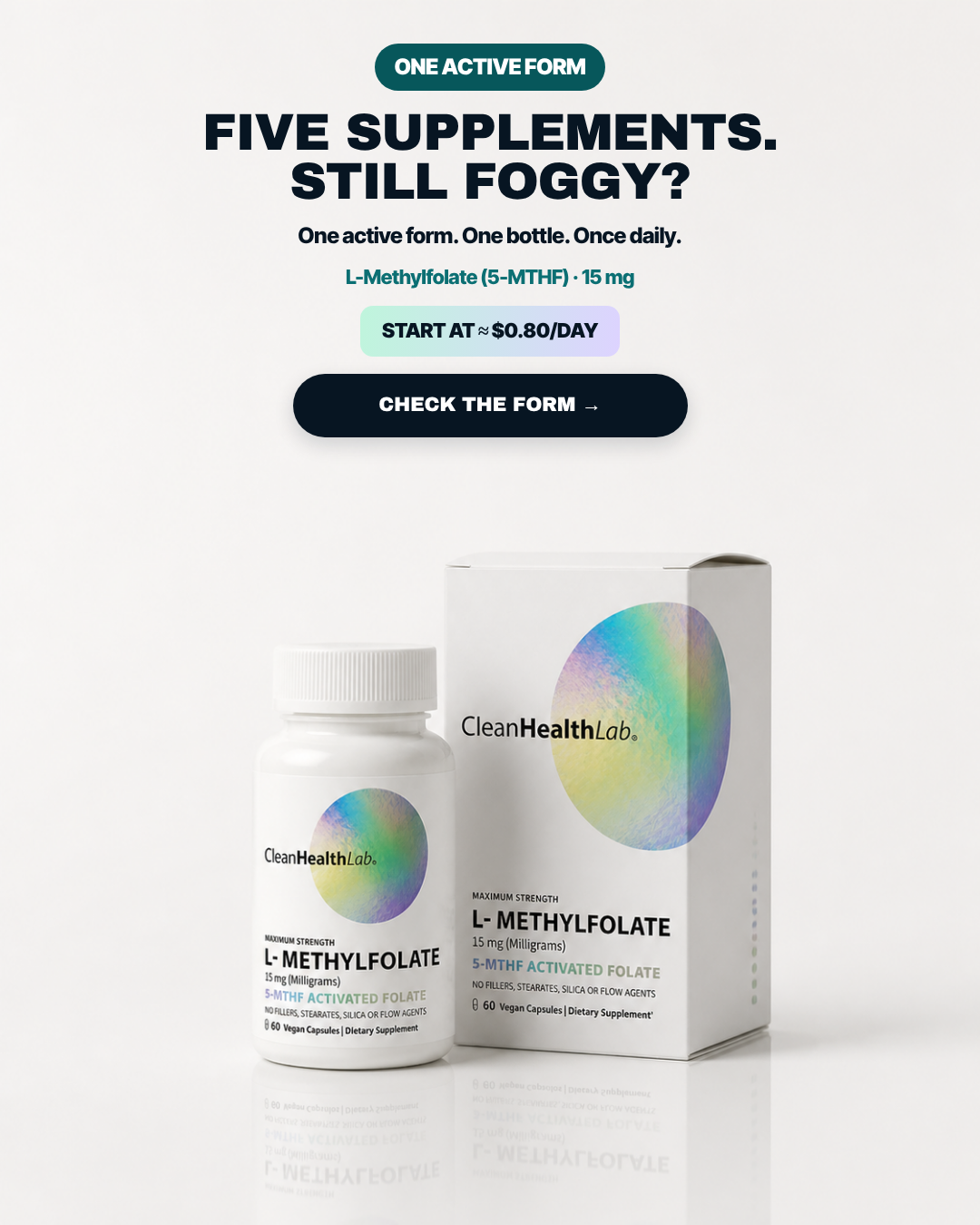
FIVE SUPPLEMENTS. STILL FOGGY?
Pain A complicated supplement stack that still has not resolved the foggy routine.
7.00panel mean
Art director7.9
Cold buyer6.9
DR strategist7.2
Skeptic6.0
spread 1.9
What each judge said
Art directorCrisp packs and a legible centred stack, but badge + headline + sub + dose + price chip + CTA is six stacked elements and the mirrored label reflection along the bottom edge reads as duplicated type at a glance.
Cold buyer"Five supplements. Still foggy?" is the tightest stack-fatigue line here and it reads instantly, but everything under it is a white-background packshot and a price chip with zero human presence.
DR strategist'Five supplements. Still foggy?' is a sharp failed-alternative hook, but the answer is a simplification pitch rather than the form-disclosure argument that would make it checkable.
SkepticThe headline states 'FIVE SUPPLEMENTS' over a still that contains exactly one bottle and one carton, so the only count in the frame contradicts the only count in the copy.
4:51080×1350
9:161080×1920not judged
#8 of 33V10 · v10r10TNot builtV10-T02
Label-guide authority card
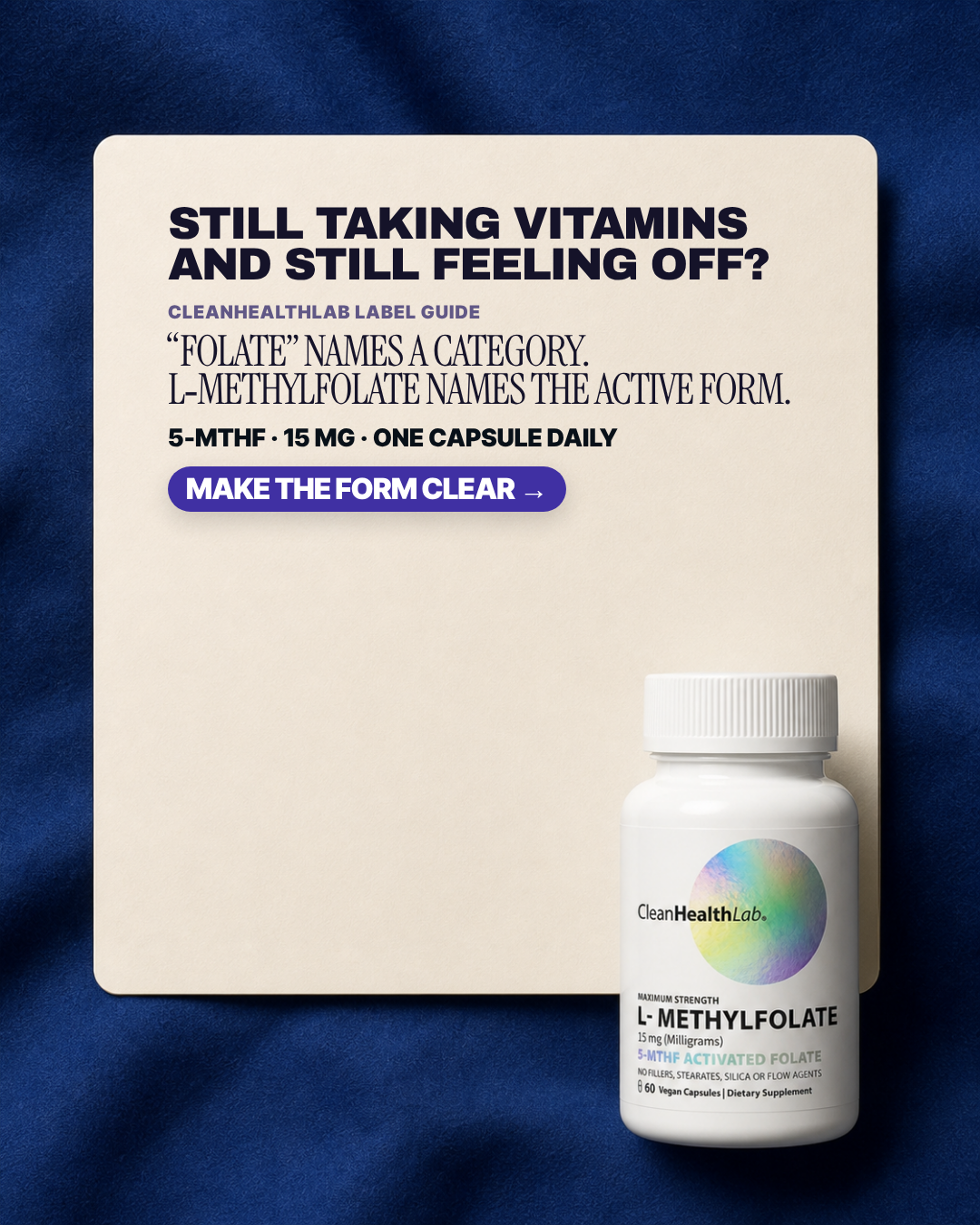
STILL TAKING VITAMINS AND STILL FEELING OFF?
Pain Overstimulation, mental chaos, fog, mood swings, and trying supplements without feeling right.
6.93panel mean
Art director6.0
Cold buyer7.6
DR strategist7.7
Skeptic6.4
spread 1.7
What each judge said
Art directorAll the copy is crammed into the top third of the cream card, leaving roughly 600px of blank card doing nothing, and the bottle is pushed so far into the lower-right corner it barely clears the card edge.
Cold buyer"'Folate' names a category. L-Methylfolate names the active form." is the clearest one-sentence explanation of why I should care, though the cream card wastes half its height on emptiness.
DR strategist'Folate names a category, L-Methylfolate names the active form' is the single most persuasive sentence in the set, wasted on an enormous empty card and a fuzzy 'make the form clear' CTA.
SkepticThe lower half of the cream card, roughly 500px tall, is entirely empty and the bottle merely overlaps its corner instead of being composed into it; the copy itself claims nothing it cannot support.
4:51080×1350
9:161080×1920not judged
#9 of 33V10 · v10r10TNot builtV10-T04
Category name versus actual form
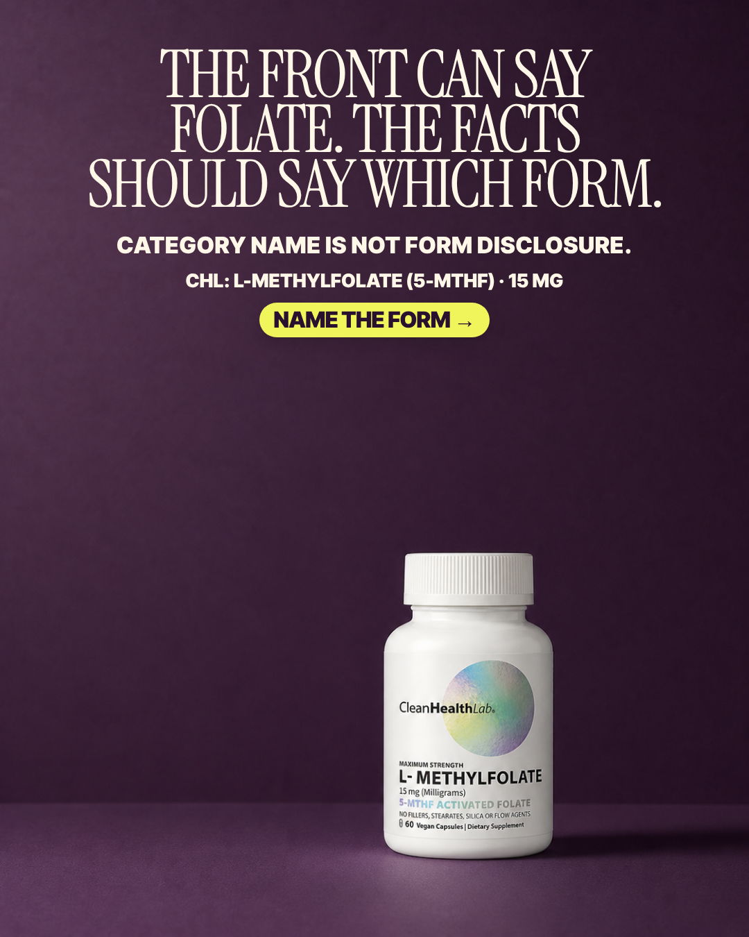
THE FRONT CAN SAY FOLATE. THE FACTS SHOULD SAY WHICH FORM.
Pain The body feels as if it is not responding despite taking vitamins—the ‘wrong form’ frustration.
6.92panel mean
Art director7.2
Cold buyer6.0
DR strategist6.3
Skeptic8.2
spread 2.2
What each judge said
Art directorGenuinely handsome serif headline on aubergine, undercut by ~280px of empty wall between the CTA and the bottle cap and a pack scaled too small for a claim built entirely on reading the label.
Cold buyer"The front can say folate. The facts should say which form." is a label lecture with no person and no bad day in it — it argues a category point at me before giving me any reason to care.
DR strategistA rigorous category indictment with no human being in it — 'category name is not form disclosure' will convert the already-suspicious and stop nobody scrolling cold.
SkepticCategory-disclosure argument only, no efficacy claim, pack intact and fully legible — the only faults are a ~280px empty band under the CTA and the un-actionable CTA verb 'NAME THE FORM'.
4:51080×1350
9:161080×1920not judged
#10 of 33V10 · v10r10RNot builtV10-R01
New for brain-offline days
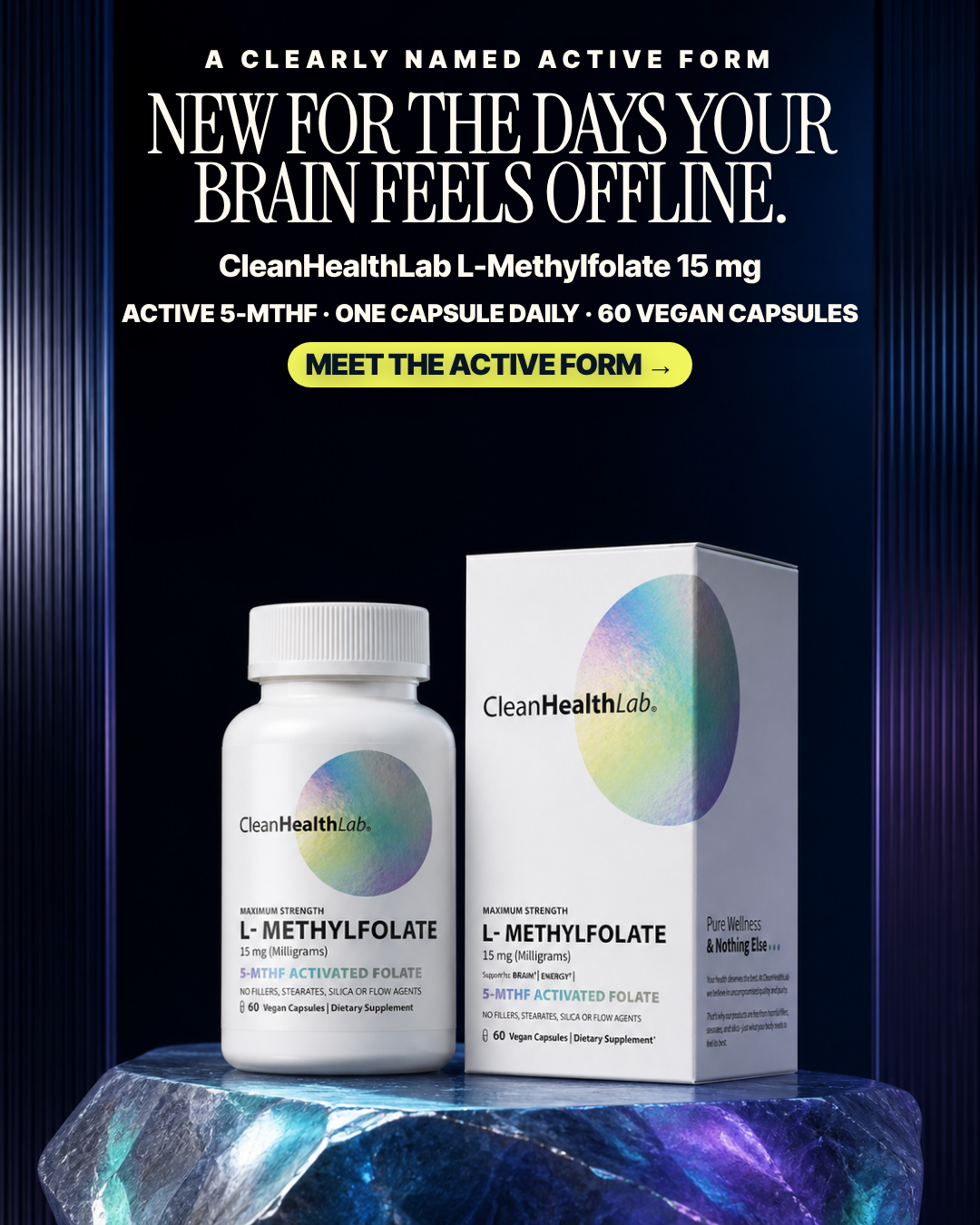
NEW FOR THE DAYS YOUR BRAIN FEELS OFFLINE.
Pain No felt pain is named; the appeal is novelty and a desire for an easier, immediately usable format.
6.70panel mean
Art director8.8
Cold buyer5.5
DR strategist4.7
Skeptic7.8
spread 4.1
What each judge said
Art directorThe only plate where eyebrow, serif headline, product name, spec line and CTA read as a deliberate hierarchy, and both bottle and carton labels survive intact on the crystal plinth.
Cold buyer"NEW for the days your brain feels offline" leads with a product launch announcement — I do not know this brand, so "new" is worth nothing to me, and the rest is a luxury packshot.
DR strategistLeads with 'NEW' — a product announcement, not a reason to want it — and 'the days your brain feels offline' is too soft to carry a cold-traffic click.
Skeptic'NEW' in the headline is an unsupported novelty claim with nothing on-frame dating the product; the pack, carton, side panel and CTA are otherwise all intact and legible.
4:51080×1350
9:161080×1920not judged
#11 of 33V10 · v10r10TNot builtV10-T06
Premium-vitamin skepticism
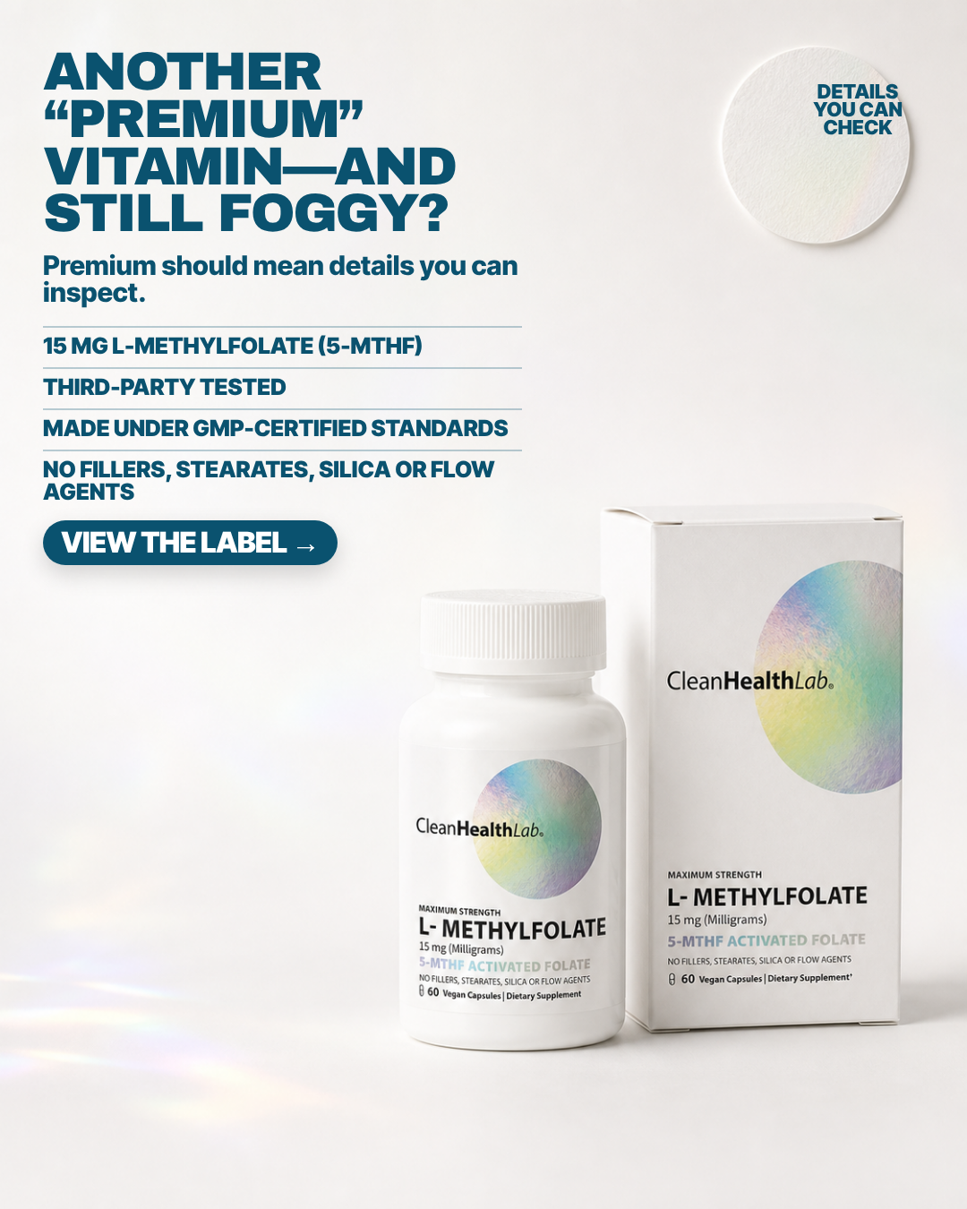
ANOTHER “PREMIUM” VITAMIN—AND STILL FOGGY?
Pain The buyer has tried vitamins and still feels wrong; another generic bottle does not feel credible.
6.63panel mean
Art director6.0
Cold buyer7.3
DR strategist8.0
Skeptic5.2
spread 2.8
What each judge said
Art directorThe 'DETAILS YOU CAN CHECK' badge overflows its disc - the final S and N sit outside the circle on bare background - and the last rule line leaves 'AGENTS' widowed on its own line.
Cold buyer"Another 'premium' vitamin — and still foggy?" earns the four ruled lines beneath it: 15 mg 5-MTHF, third-party tested, GMP, no fillers is the only genuinely checkable stack in the set.
DR strategistTurns the word 'premium' against the category and then lists four things a buyer can actually inspect — the most substantiable stack here, if slightly spec-sheet cold.
SkepticThe white disc at top-right is a blank textured seal with 'DETAILS YOU CAN CHECK' shoved against its right rim so it reads as a broken certification badge, and 'THIRD-PARTY TESTED' / 'GMP-CERTIFIED' are substantiation claims with no certifier, mark or lot anywhere in frame.
4:51080×1350
9:161080×1920not judged
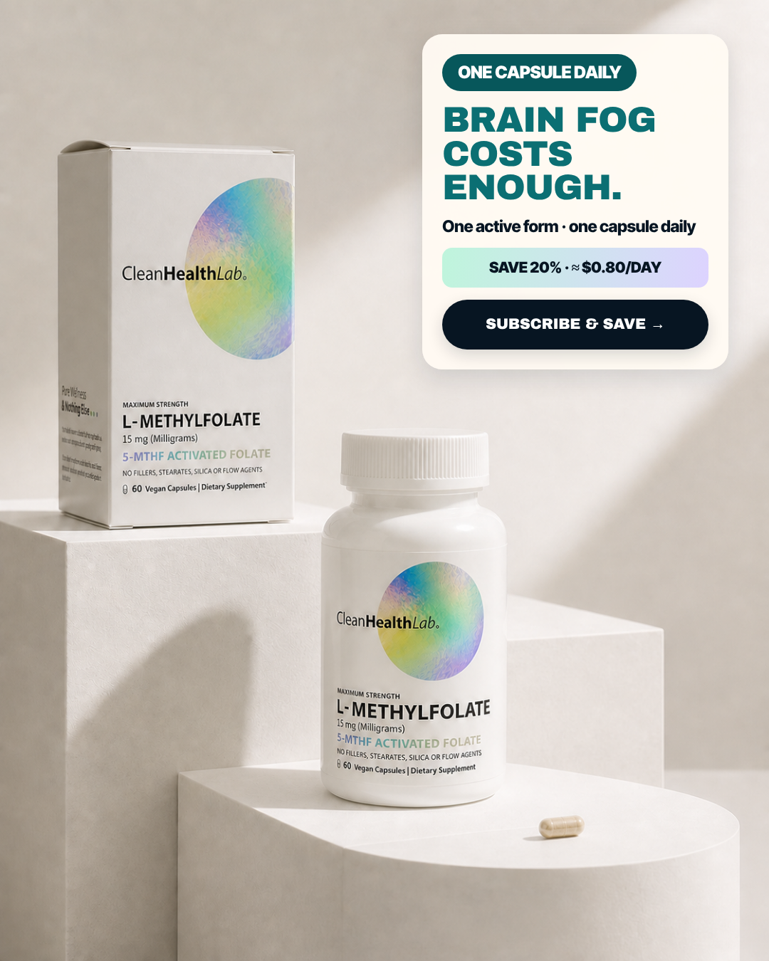
#12 of 33V11 · v11.3IM8Built & paused in the ad setV11-IM8-02
Savings Pedestal
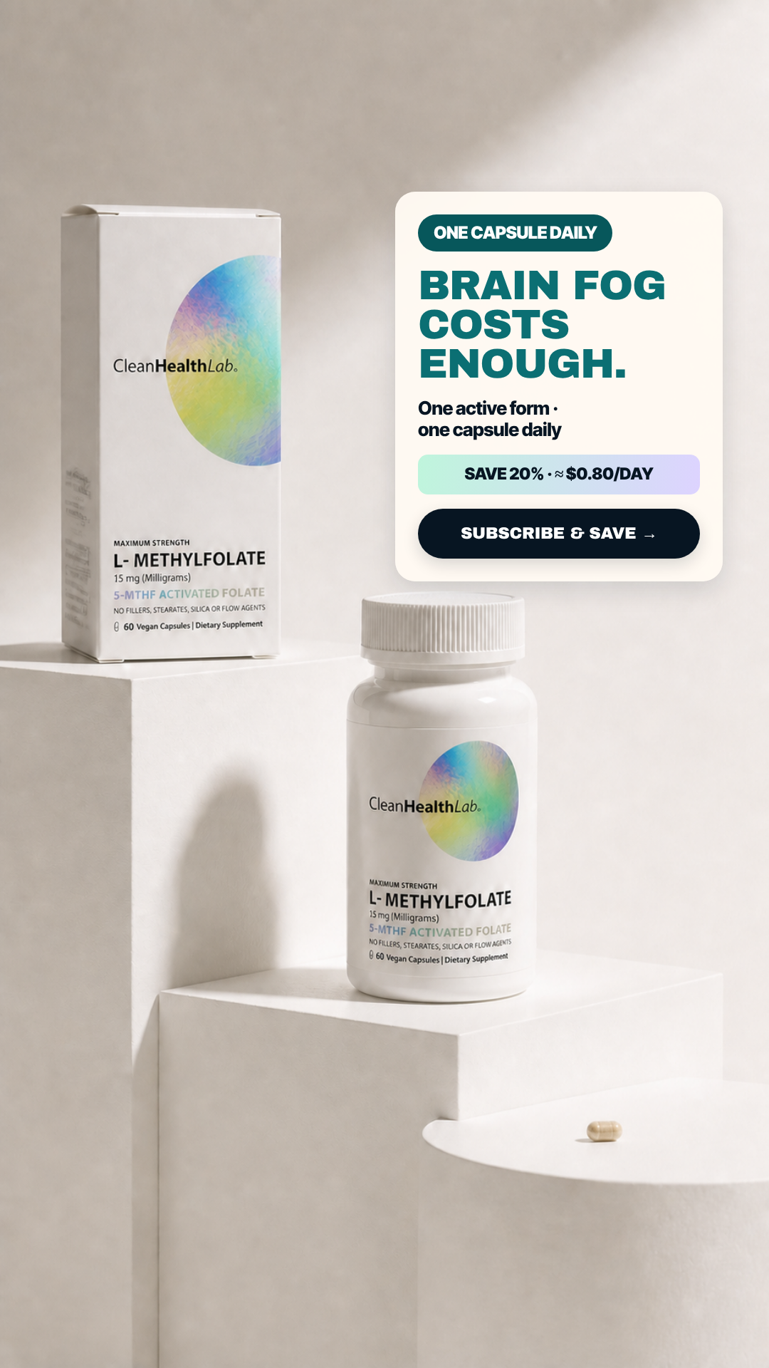
BRAIN FOG COSTS ENOUGH.
Pain Brain fog already costs attention and time; an unclear supplement should not add friction.
6.55panel mean
Art director8.2
Cold buyer5.8
DR strategist5.3
Skeptic6.9
spread 2.9
What each judge said
Art directorConfident plinth staging with a well-built top-right copy card, but the carton's left side panel has its 'Pure Wellness & Nothing Else' block warped and smeared into unreadable grey ticks.
Cold buyer"Brain fog costs enough" turns a symptom into a pun about money within three words, then hands the rest of the card to SAVE 20%, ≈$0.80/DAY and SUBSCRIBE & SAVE — that is an offer ad wearing a pain headline.
DR strategist'Brain fog costs enough' is a pun that pivots straight into SAVE 20% and SUBSCRIBE & SAVE, so the discount is the premise and 'one active form' is decoration.
Skeptic'BRAIN FOG COSTS ENOUGH' welds a symptom to a price argument that does not follow, and the carton's side panel at left is illegible micro-text; otherwise the pack is intact and the CTA is a real action.
4:51080×1350
9:161080×1920not judged
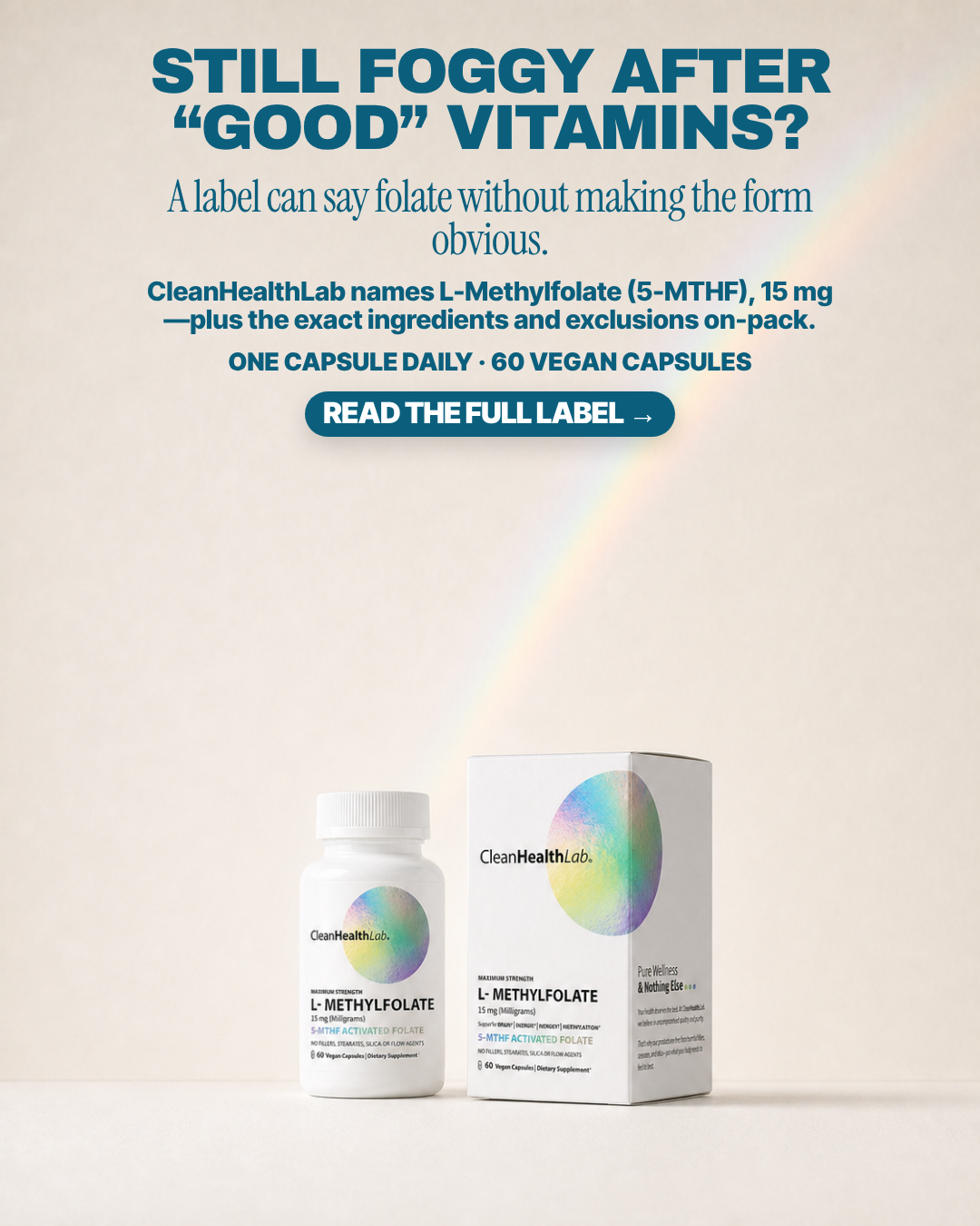
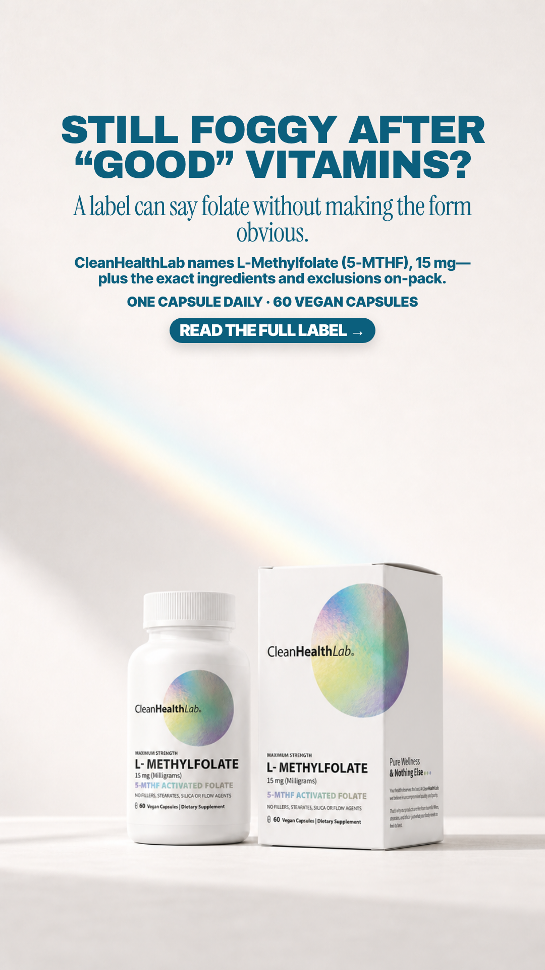
#13 of 33V10 · v10r10TNot builtV10-T07
Good-vitamins disappointment
STILL FOGGY AFTER “GOOD” VITAMINS?
Pain Persistent fog, mood swings, and exhaustion after trying products that the body may not be using effectively.
6.55panel mean
Art director5.4
Cold buyer6.4
DR strategist8.0
Skeptic6.4
spread 2.6
What each judge said
Art directorFive centred lines alternating serif and sans, with a line beginning on an em-dash ('—plus the exact ingredients'), and the pack is so small at the bottom that the on-label '15 mg (Milligrams)' is unreadable at phone size despite the ad demanding you read the label.
Cold buyer"Still foggy after 'good' vitamins?" is a good scare-quote jab, but it is followed by three separate paragraphs of explanation and a product shot shrunk into the bottom quarter behind a decorative rainbow.
DR strategistAttacks the 'good vitamins' the buyer already paid for and backs it with the label-opacity mechanism plus exclusions, earning the 'read the full label' click.
SkepticThe product is rendered small and pushed into the bottom-left while a decorative rainbow beam owns the centre of the frame, leaving a ~350px empty band between CTA and pack.
4:51080×1350
9:161080×1920not judged
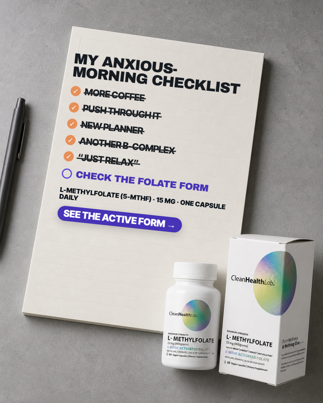
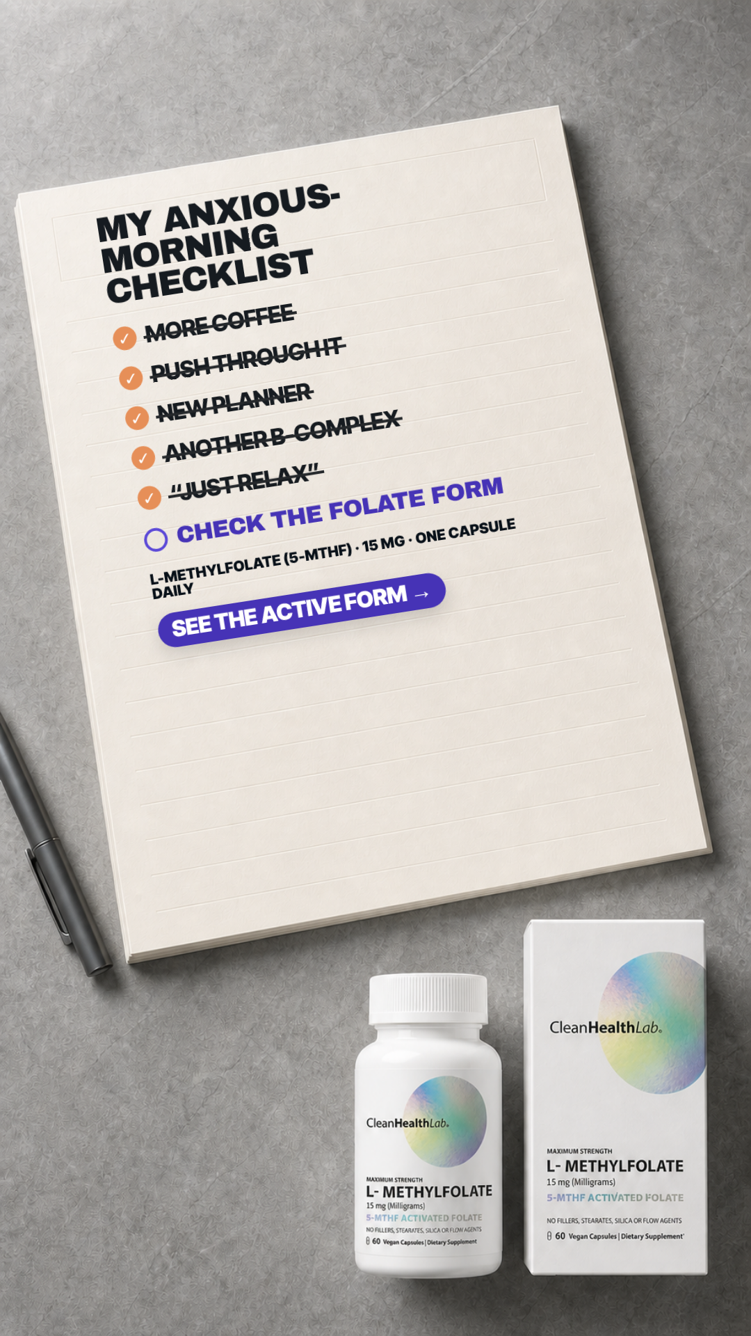
#14 of 33V10 · v10r10BNot built⚠ 1 of 4 would not run itV10-B02
The anxious-morning checklist
MY ANXIOUS-MORNING CHECKLIST
Pain The buyer has cycled through positivity, journaling, breathing apps, diet changes, supplements, medication, and therapy and still feels anxious and foggy.
6.53panel mean
Art director7.2
Cold buyer8.4
DR strategist8.1
Skeptic2.4
spread 6.0
What each judge said
Art directorStrong checklist device and clean packs bottom-right, but the dose line wraps to strand 'DAILY' alone on a second line and the headline hyphen-breaks 'ANXIOUS-/MORNING'.
Cold buyerA notepad with more coffee, push through it, new planner, another B-complex and "just relax" all crossed off is every thing I have already tried, and the one unchecked box being the folate form is the sharpest argument in the entire set.
DR strategistThe crossed-off checklist of everything that already failed is the strongest failed-alternative device here, though anchoring it to 'anxious mornings' walks close to a mood claim I would rather qualify.
SkepticThe empty circle beside 'CHECK THE FOLATE FORM' imitates a tappable checkbox in a static image, the struck-out 'ANOTHER B-COMPLEX' disparages a competing category, and the whole checklist is set axis-aligned on a notepad photographed in perspective.
4:51080×1350
9:161080×1920not judged
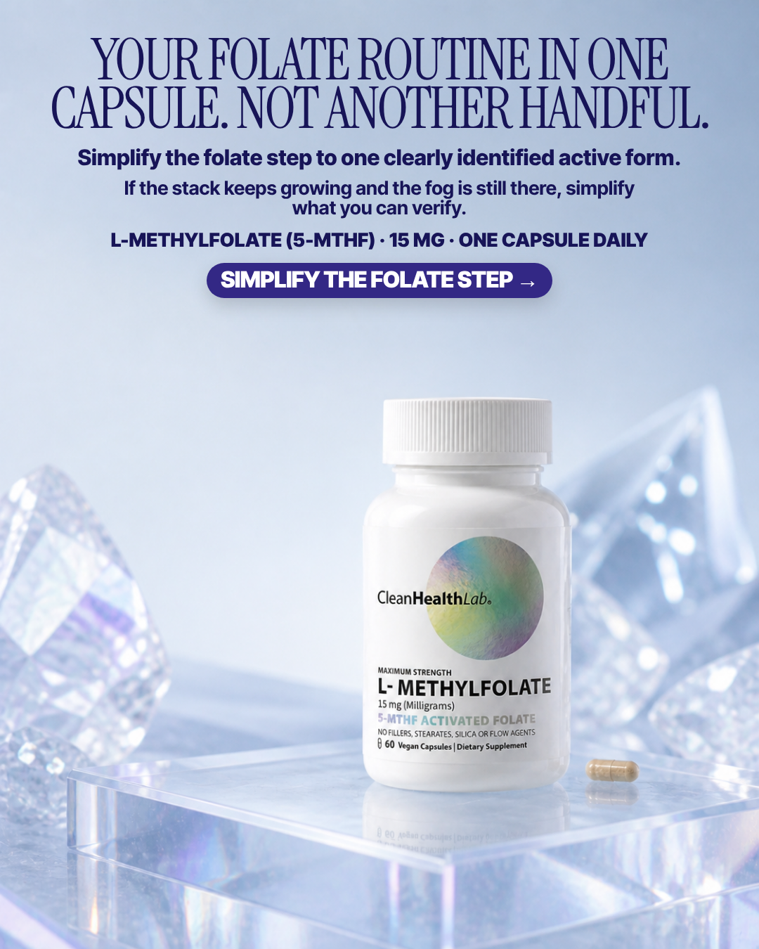
#15 of 33V10 · v10r10RNot builtV10-R03
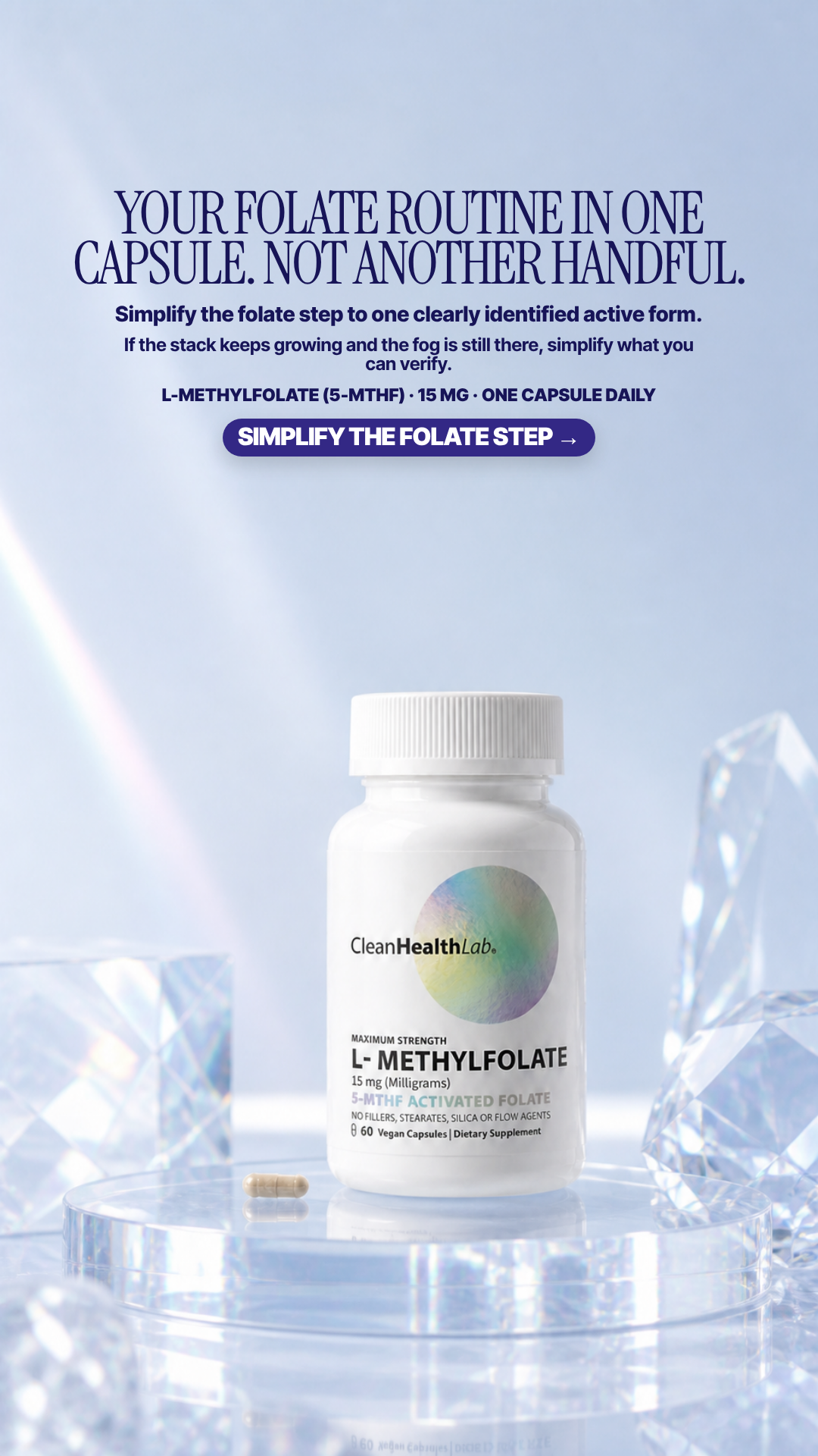
One capsule, not another handful
YOUR FOLATE ROUTINE IN ONE CAPSULE. NOT ANOTHER HANDFUL.
Pain Daily pill burden, clutter, and the annoyance of managing a complicated supplement routine.
6.52panel mean
Art director7.4
Cold buyer5.6
DR strategist5.9
Skeptic7.2
spread 1.8
What each judge said
Art directorThe serif headline runs nearly edge-to-edge with only ~70px side margins, and three consecutive centred copy lines each set at a different measure make the top block look auto-flowed rather than typeset.
Cold buyerTwo full serif lines plus three more copy tiers before the CTA — "simplify" is the promise and the layout is the opposite, and the ice-crystal set has nothing to do with a foggy morning.
DR strategistSells pill-burden simplification rather than a felt problem; the fog appears only in the third line of small type, well after the argument has already been made.
SkepticTwo subheads directly under the headline say the same thing twice on different centre axes, and the ice-crystal props flanking the plinth are decoration; the pack itself is clean and the CTA is real.
4:51080×1350
9:161080×1920not judged
#16 of 33V10 · v10r10NNot builtV10-N05
Impatient brain fog
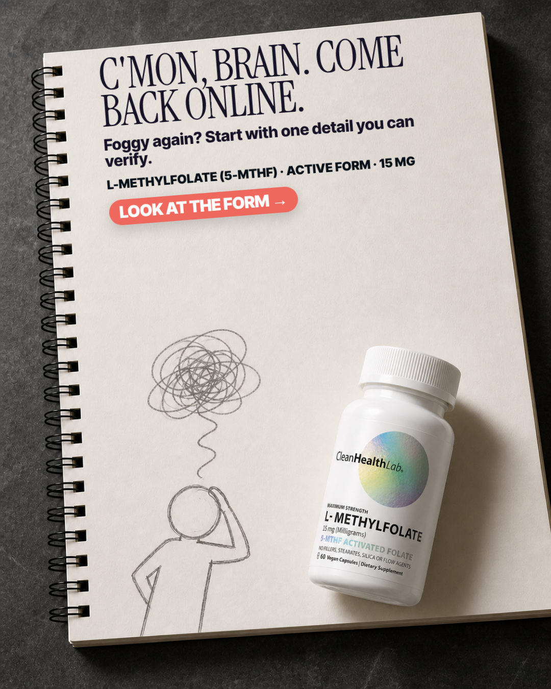
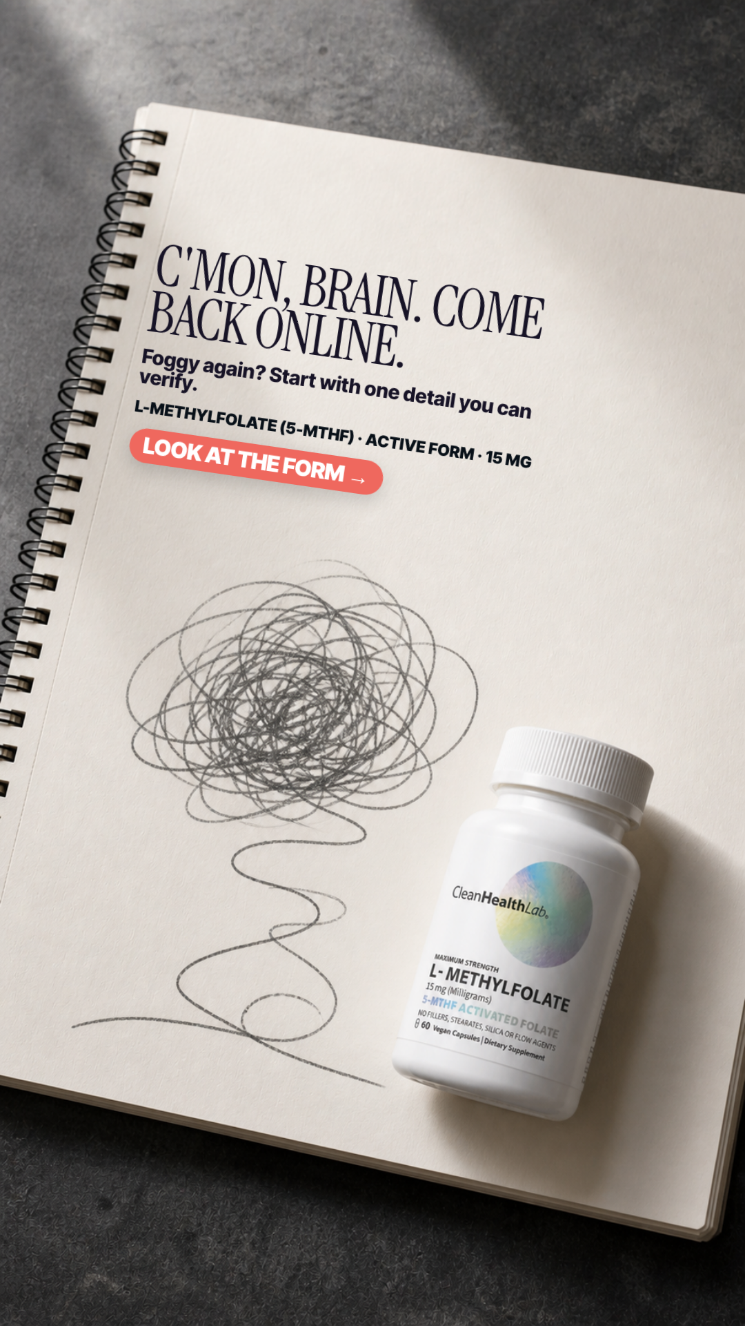
C'MON, BRAIN. COME BACK ONLINE.
Pain Blunt frustration with feeling emotionally off and wanting relief now.
6.35panel mean
Art director6.4
Cold buyer7.4
DR strategist5.6
Skeptic6.0
spread 1.8
What each judge said
Art directorThe sub-line leaves 'verify.' widowed on its own line, and a 400px stretch of blank notebook page separates the CTA from the doodle and product.
Cold buyerThe pencil scribble-cloud over a stick figure on a real spiral notebook is the most native, least ad-looking image here and "C'mon, brain. Come back online." is how I'd actually say it, though the body line orphans "verify." onto its own row.
DR strategistThe doodle makes the fog charming instead of urgent, and 'one detail you can verify' promises specificity the plate never delivers.
SkepticThe headline, subhead and CTA are set flat and axis-aligned on a notebook page photographed in perspective, so the type visibly floats above the paper instead of sitting on it, and 'verify.' orphans onto its own line.
4:51080×1350
9:161080×1920not judged
#17 of 33V10 · v10r10NNot built⚠ 1 of 4 would not run itV10-N06
Tried everything, still foggy
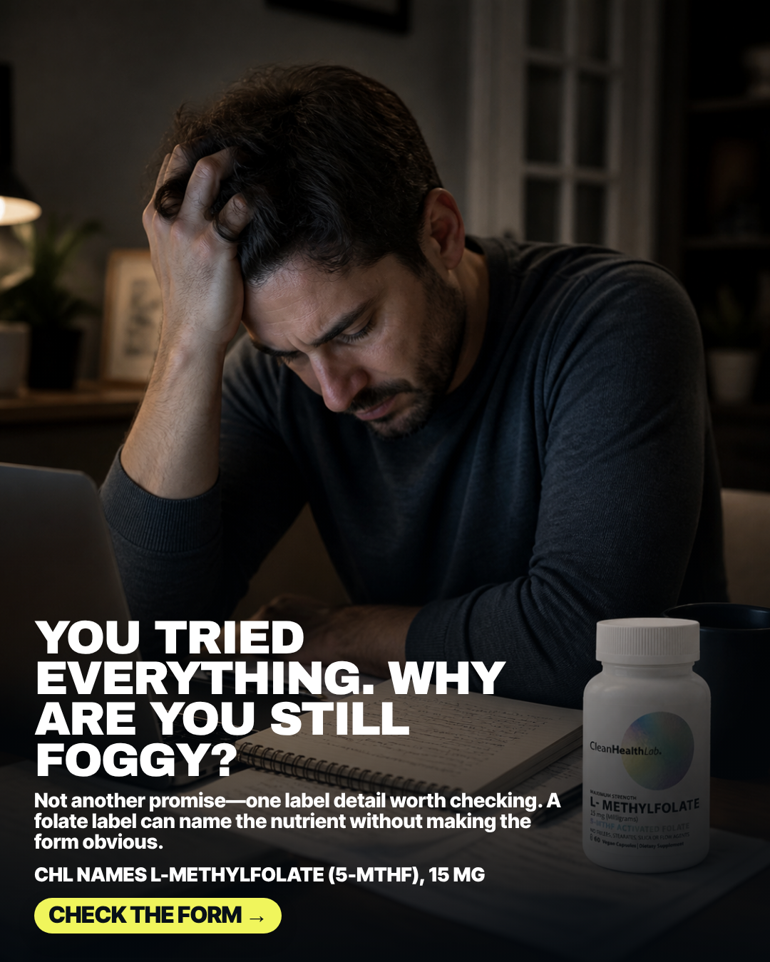
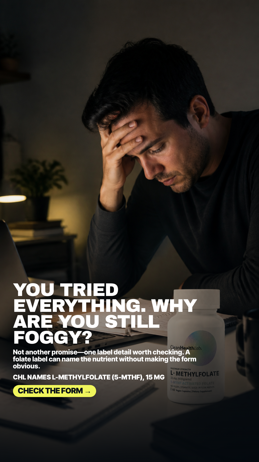
YOU TRIED EVERYTHING. WHY ARE YOU STILL FOGGY?
Pain A person has tried antidepressant treatment yet still feels depressed, foggy, exhausted, and unlike themself.
6.25panel mean
Art director3.4
Cold buyer8.0
DR strategist9.0
Skeptic4.6
spread 5.6
What each judge said
Art directorThe bottle at lower-right is crushed into shadow - 'MAXIMUM STRENGTH', '15 mg (Milligrams)' and '5-MTHF ACTIVATED FOLATE' all degrade to grey mush, so the pack reads as an unbranded white cylinder at phone size.
Cold buyer"You tried everything. Why are you still foggy?" over a genuinely defeated man at a laptop at night is the strongest failed-alternative moment in the set, though the bottle sits in near-darkness and its label is only just legible.
DR strategistOnly plate that pairs an exhausted-at-the-desk moment with the actual mechanism — a label can name the nutrient without making the form obvious — and explicitly refuses to make another promise.
SkepticThe bottle at bottom-right is thrown so far into shadow that the whole lower label block sits at a fraction of the frame's contrast, and pairing a visibly despairing man with 'YOU TRIED EVERYTHING' implies this succeeds where everything else failed.
4:51080×1350
9:161080×1920not judged
#18 of 33V10 · v10r10TBuilt & paused in the ad setV10-T05
Return-of-function checklist
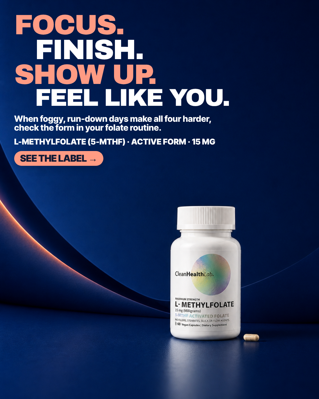
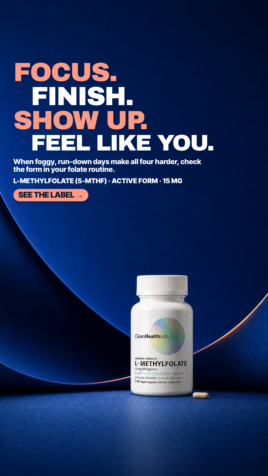
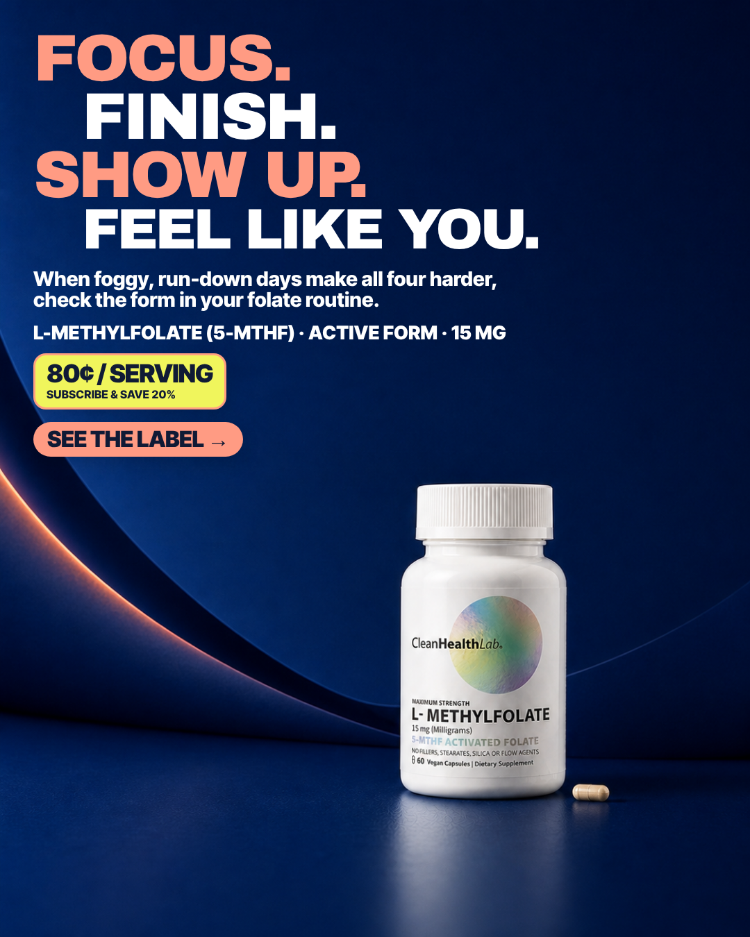
FOCUS. FINISH. SHOW UP. FEEL LIKE YOU.
Pain Low energy and the feeling that core body systems are not functioning at their best.
6.13panel mean
Art director8.5
Cold buyer5.2
DR strategist4.5
Skeptic6.3
spread 4.0
What each judge said
Art directorThe coral/white staircase headline is genuinely composed rather than auto-stacked, and the bottle sits cleanly in the lower-right light fall with the dose line and '5-MTHF ACTIVATED FOLATE' both holding at thumbnail size.
Cold buyer"Focus. Finish. Show up. Feel like you." is four aspiration words with no undesirable moment in them; the pain only appears in 14pt subcopy I would never reach at scroll speed.
DR strategistFour aspirational verbs stacked into a mood board; nothing undesirable is ever named, so there is no reason to read the mechanism line underneath.
SkepticThe four-line headline 'FOCUS. FINISH. SHOW UP. FEEL LIKE YOU.' stacks four unqualified outcome promises at the top of the frame with nothing on-frame qualifying them.
4:51080×1350
9:161080×1920not judged
#19 of 33V11 · v11.3SEEDNot builtV11-SEED-01
Under A Dollar
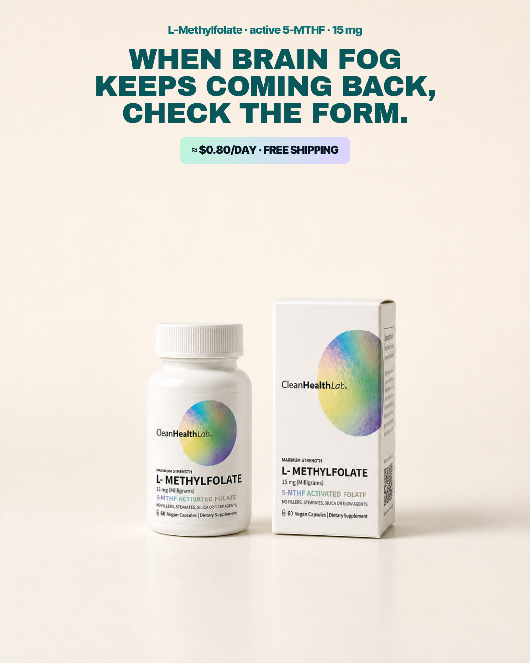
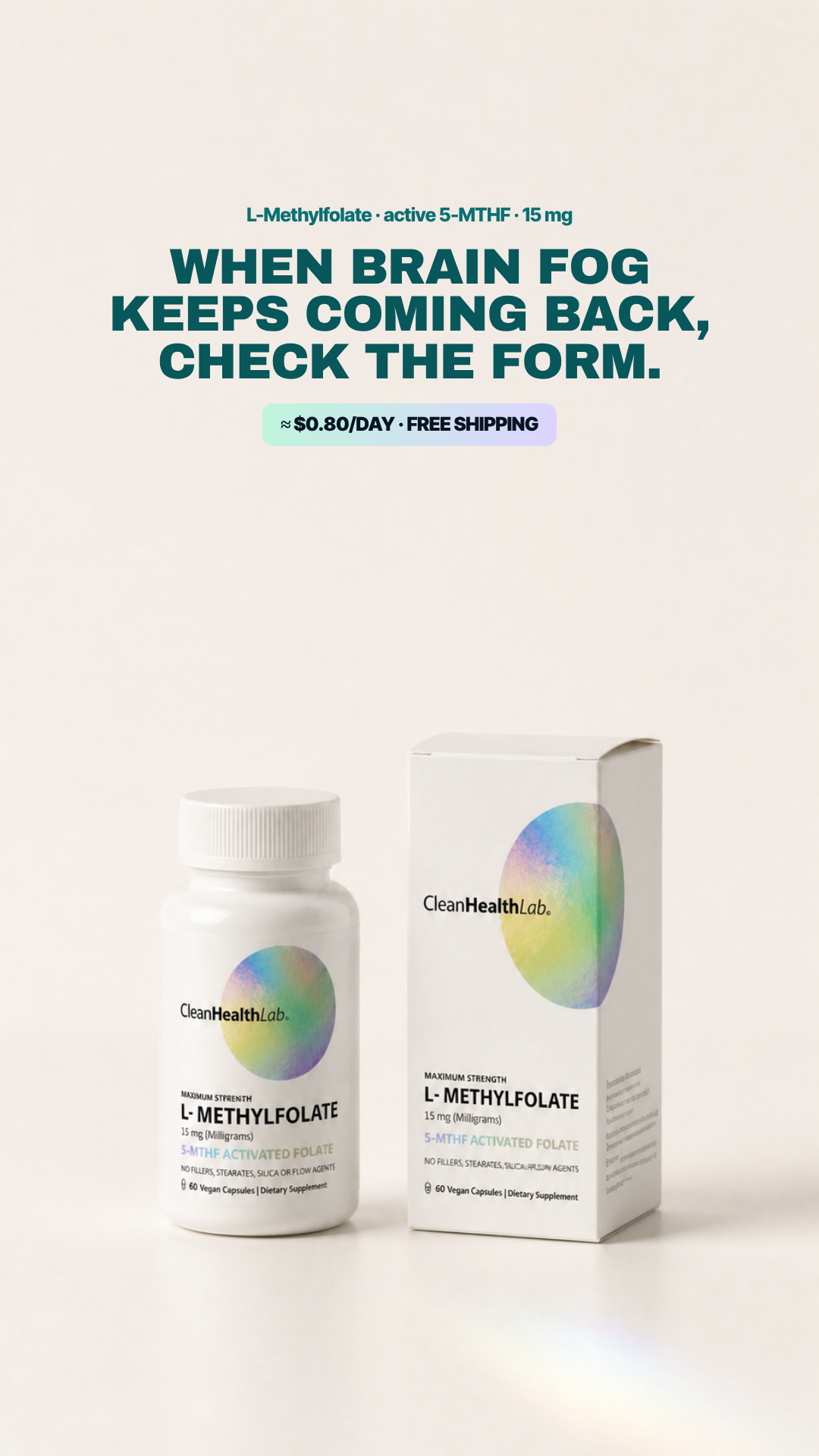
WHEN BRAIN FOG KEEPS COMING BACK, CHECK THE FORM.
Pain Brain fog that keeps coming back despite the routine.
6.08panel mean
Art director7.3
Cold buyer6.2
DR strategist5.0
Skeptic5.8
spread 2.3
What each judge said
Art directorBeautifully set eyebrow/headline/price-chip block and a flawless bottle-and-carton pack shot, but there is no CTA button at all and a ~280px band of empty cream between the chip and the products.
Cold buyer"When brain fog keeps coming back" is the right premise but it sits above a beige void with the packshot pushed to the bottom sixth, so the whole thing reads as a catalogue page.
DR strategist'When brain fog keeps coming back' is a decent recurrence hook, then the ad stops dead — a $0.80/day chip is standing in for an instruction and there is no CTA at all.
SkepticThere is no call to action anywhere in the frame — the '$0.80/DAY · FREE SHIPPING' chip below the headline is the last element before a ~250px empty band, so an offer chip is standing in for the next step.
4:51080×1350
9:161080×1920not judged
#20 of 33V10 · v10r10TNot builtV10-T05-VALUE
Return-of-function plus value support
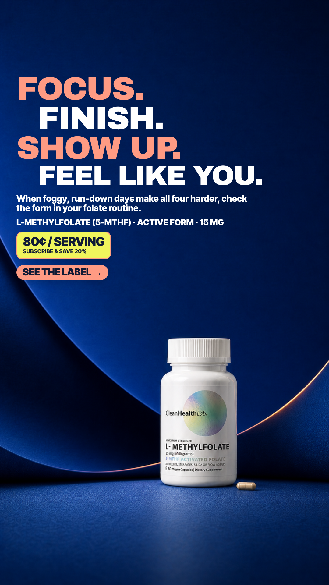
FOCUS. FINISH. SHOW UP. FEEL LIKE YOU.
Pain Low energy and the feeling that core body systems are not functioning at their best.
6.08panel mean
Art director8.2
Cold buyer5.3
DR strategist4.8
Skeptic6.0
spread 3.4
What each judge said
Art directorSame well-built navy staircase headline as its sibling, but the two-line '80¢ / SERVING' chip stacked directly above the CTA makes the lower-left cluster feel crowded against the light streak.
Cold buyerSame four aspiration verbs as its sibling with an 80¢/serving chip bolted on, so it now leads with mood language and closes with price — no lived problem anywhere above the fold.
DR strategistSame aspirational verb stack as its twin with an 80¢/serving badge bolted on, so the discount is doing the persuading that the headline refused to do.
SkepticSame four unqualified outcome promises as its sibling, now with a yellow '80¢ / SERVING' chip stacked directly on top of the CTA so two competing pill shapes sit in the same left column.
4:51080×1350
9:161080×1920not judged
#21 of 33V10 · v10r10NNot built⚠ 1 of 4 would not run itV10-N07
Foggy / frazzled / run-down cycle
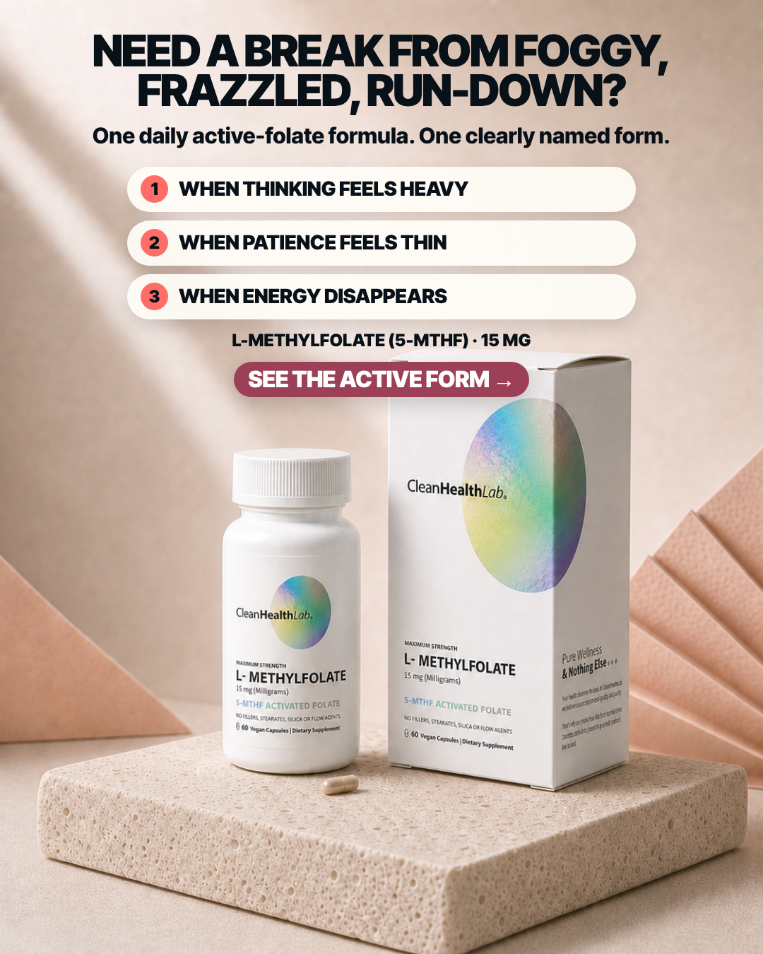
NEED A BREAK FROM FOGGY, FRAZZLED, RUN-DOWN?
Pain Cravings, relapse fear, unstable mood, and the feeling that recovery has stalled.
5.98panel mean
Art director5.7
Cold buyer7.4
DR strategist6.0
Skeptic4.8
spread 2.6
What each judge said
Art directorThe maroon 'SEE THE ACTIVE FORM' CTA pill overlaps the carton's top-left corner and sits on the box's top face, and the dose line above it is centred while the three numbered pills above are left-aligned.
Cold buyer"When thinking feels heavy / when patience feels thin / when energy disappears" are felt states rather than specs, which makes this the rare list ad that describes me instead of the bottle.
DR strategistNames three bad moments and then uses its three numbered bullets to restate those same moments, so the list occupies the space where the reason should be.
SkepticThe three numbered white rows read as tappable list items rather than copy, and the 'SEE THE ACTIVE FORM' pill collides with and overlaps the carton's top-left corner below it.
4:51080×1350
9:161080×1920not judged
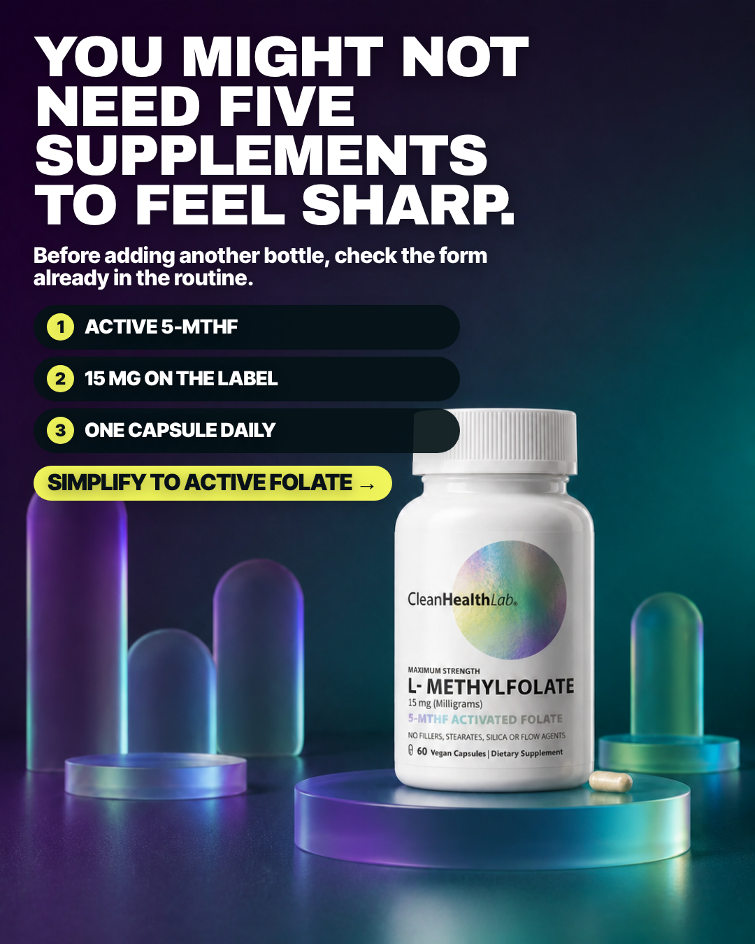
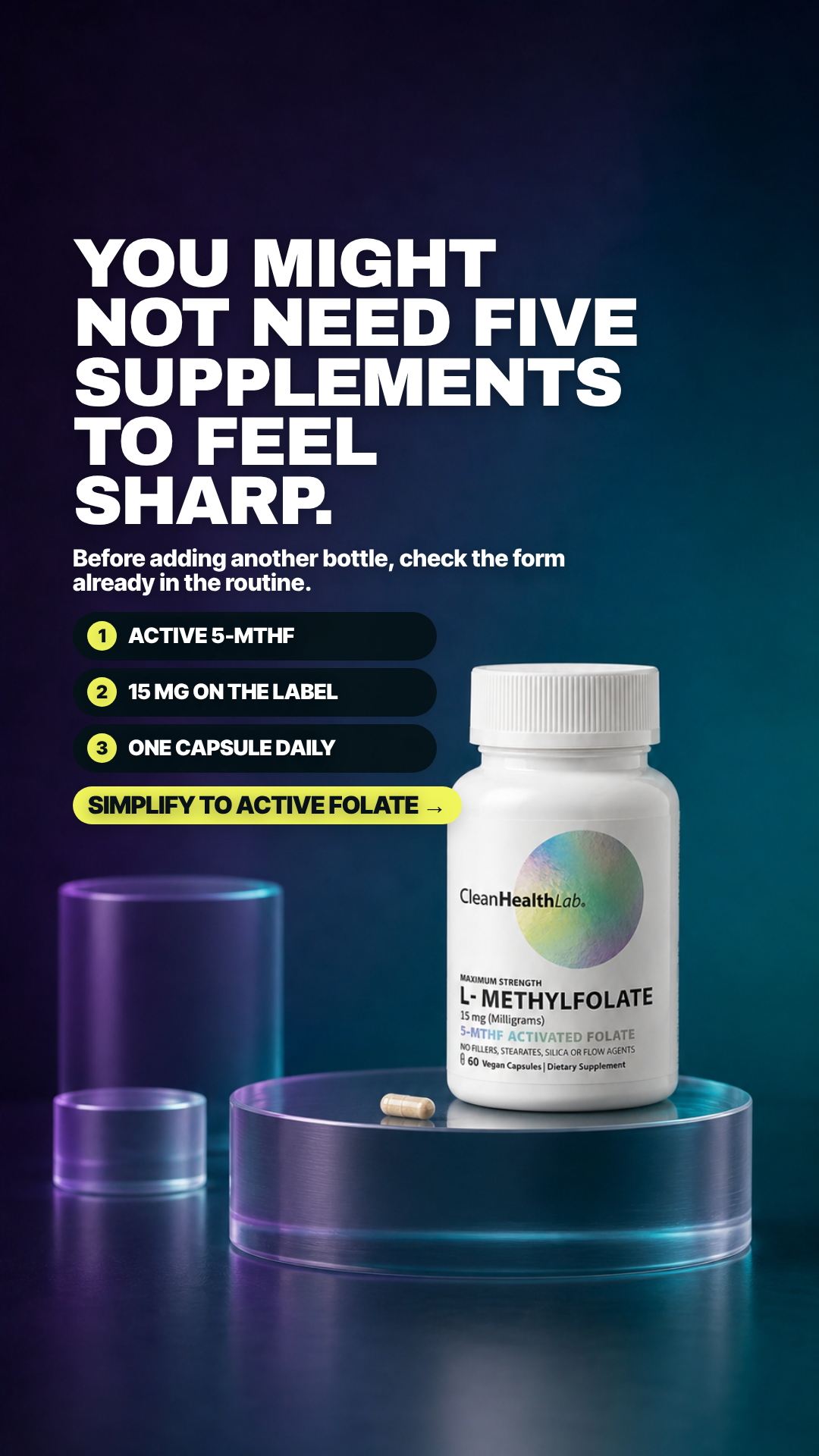
#22 of 33V10 · v10r10NNot built⚠ 1 of 4 would not run itV10-N02
Five supplements may be too many
YOU MIGHT NOT NEED FIVE SUPPLEMENTS TO FEEL SHARP.
Pain Mental dullness plus frustration with a crowded supplement routine that still has not delivered clarity.
5.90panel mean
Art director5.6
Cold buyer7.0
DR strategist6.6
Skeptic4.4
spread 2.6
What each judge said
Art directorThe third numbered bar ('ONE CAPSULE DAILY') runs straight into the bottle and its rounded end is clipped by the white cap, and the yellow CTA below crowds the bottle shoulder.
Cold buyer"You might not need five supplements to feel sharp" is a strong permission-to-simplify hook and the neon capsule set is striking, but the bottle cap physically covers the end of the third numbered chip.
DR strategistDecent 'before adding another bottle' reframe, but 'to feel sharp' is an unearned outcome promise and the CTA pill collides with the bottle cap.
SkepticChip 3 'ONE CAPSULE DAILY' is clipped by the bottle cap — its rounded right end is sliced off at the cap edge around mid-frame — and 'FIVE SUPPLEMENTS' again names a count the frame never shows.
4:51080×1350
9:161080×1920not judged
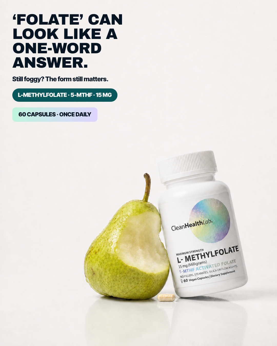
#23 of 33V11 · v11.3ARMRANot builtV11-ARMRA-03
One Word Answer
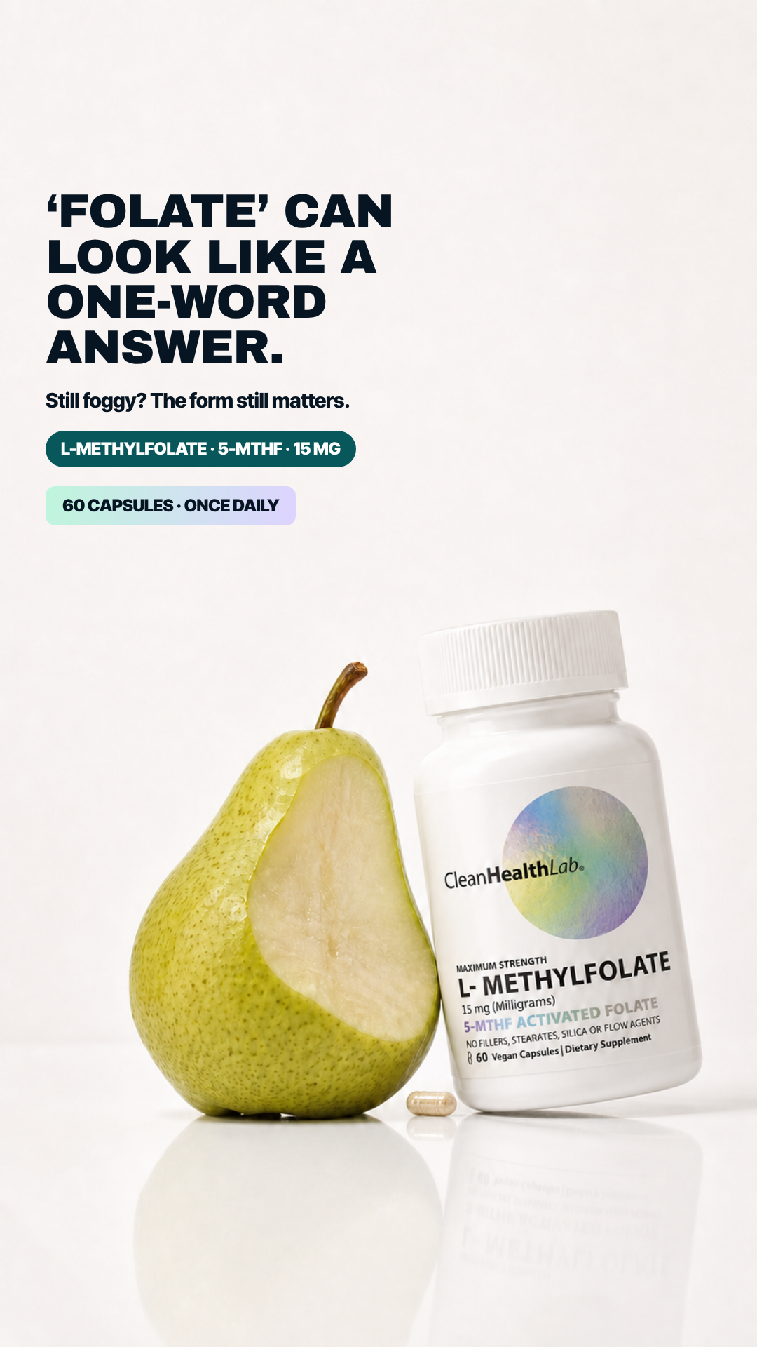
‘FOLATE’ CAN LOOK LIKE A ONE-WORD ANSWER.
Pain Still feeling foggy while the label gives only the vague category word ‘folate.’
5.85panel mean
Art director7.0
Cold buyer5.4
DR strategist5.4
Skeptic5.6
spread 1.6
What each judge said
Art directorThe four-line headline rags awkwardly to 'ONE-WORD / ANSWER.' and two stacked chips replace a real CTA, leaving a large empty band above the pear-and-bottle group.
Cold buyer"'Folate' can look like a one-word answer" is a riddle I have to decode, and the bitten pear next to a pill bottle is an unappetising pairing that adds nothing.
DR strategist'Folate can look like a one-word answer' is a genuinely good category line, immediately killed by two inert spec chips where the call to action should be.
SkepticThere is no CTA at all — the layout stops at two spec chips in the upper left — and the bitten pear beside the bottle is decoration that argues nothing about which folate form is on the label.
4:51080×1350
9:161080×1920not judged
#24 of 33V10 · v10r10RNot builtV10-R04
Energy is a team effort
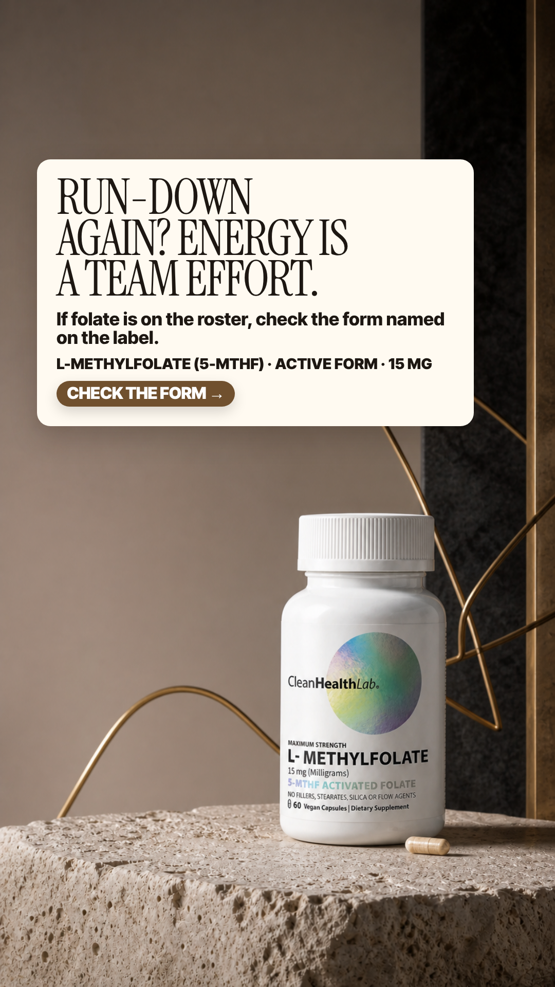
RUN-DOWN AGAIN? ENERGY IS A TEAM EFFORT.
Pain Low energy that does not feel solvable by one isolated nutrient or another quick fix.
5.63panel mean
Art director5.8
Cold buyer5.0
DR strategist5.2
Skeptic6.5
spread 1.5
What each judge said
Art directorThe dose line wraps to leave 'MG' orphaned on its own line under 'ACTIVE FORM · 15', and the serif headline rags badly across 'RUN-DOWN / AGAIN? ENERGY IS / A TEAM EFFORT.'
Cold buyer"Energy is a team effort" and "if folate is on the roster" is a sports metaphor nobody asked for, and the copy card overflows so badly it orphans "MG" onto its own line.
DR strategist'Energy is a team effort' is a metaphor doing the job of a pain; 'run-down again' is asserted and then abandoned for a roster joke.
SkepticThe spec line breaks badly and drops an orphan 'MG' onto its own line inside the cream card, and the brass wire loop behind the bottle is pure decoration that argues nothing about folate form.
4:51080×1350
9:161080×1920not judged
#25 of 33V11 · v11.3ARMRANot builtV11-ARMRA-02
Skip Guesswork
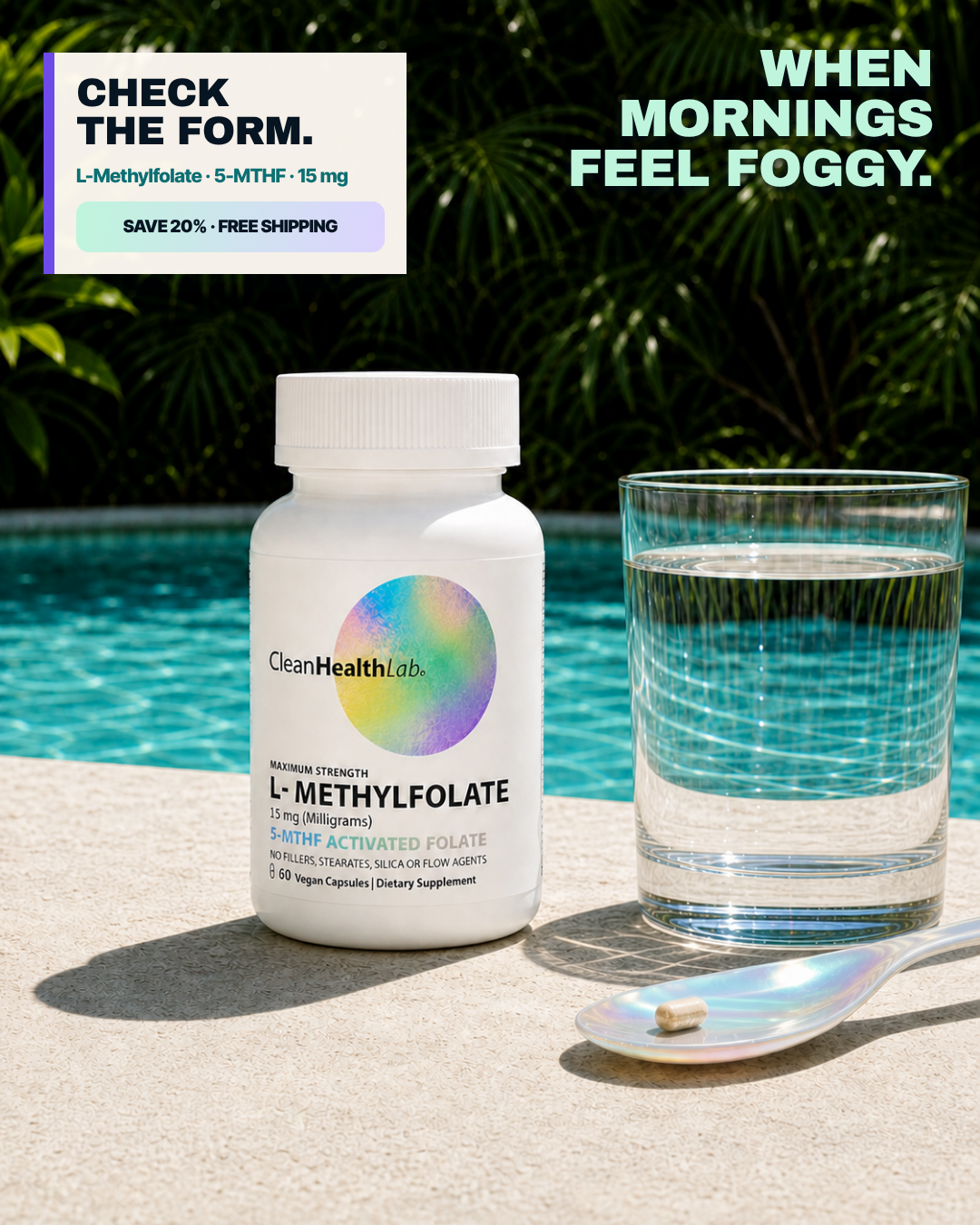
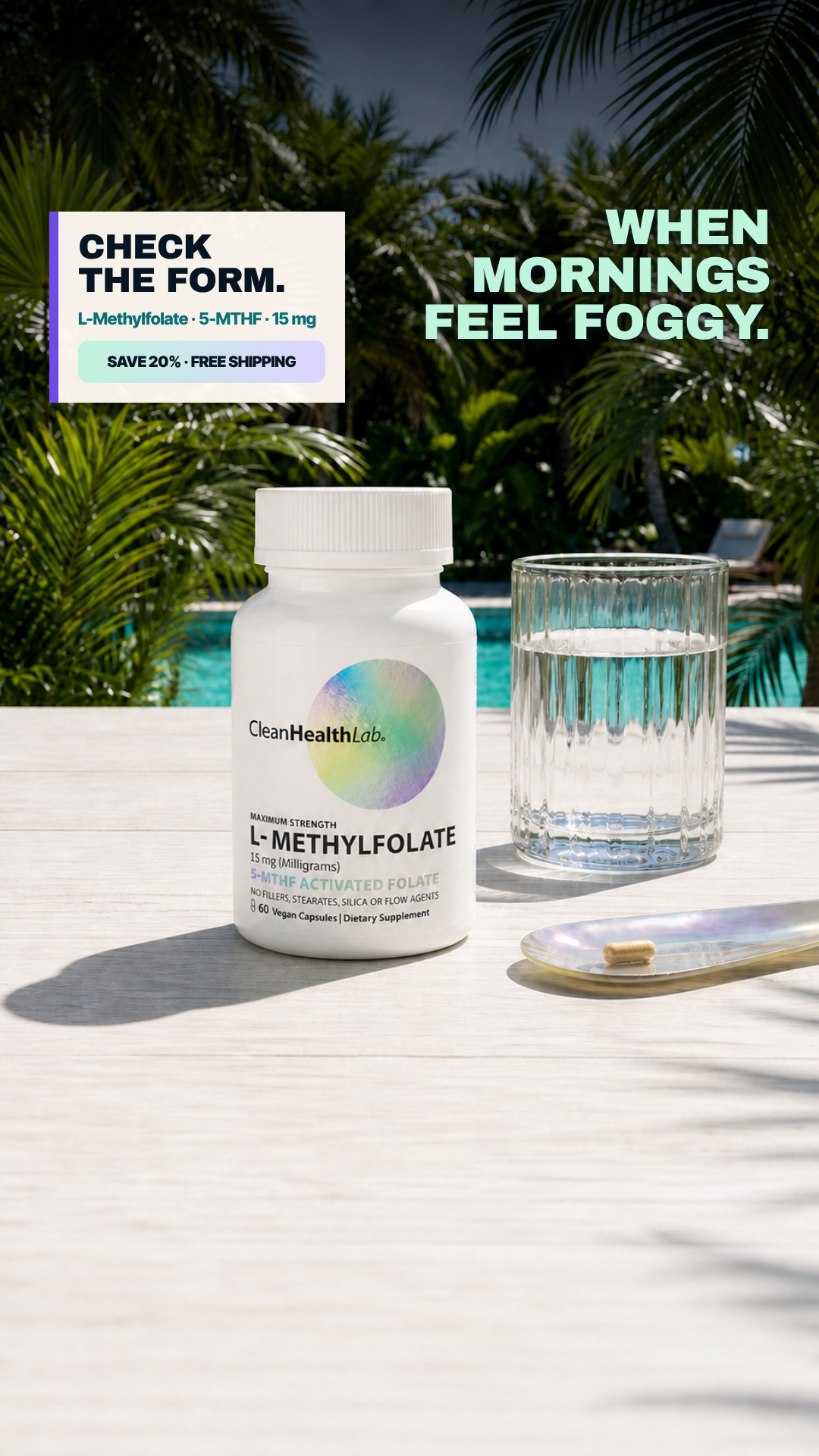
WHEN MORNINGS FEEL FOGGY, CHECK THE FORM.
Pain Foggy mornings and an unclear folate label.
5.63panel mean
Art director7.4
Cold buyer4.9
DR strategist4.4
Skeptic5.8
spread 3.0
What each judge said
Art directorThe most readable pack in the set with the label filling the left third, but the copy is split into two competing corners - a cream card top-left and a mint headline top-right - with no single entry point and no CTA.
Cold buyerThe headline sits in the top-right corner while a separate offer card sits in the top-left, so my eye has nowhere to start, and "when mornings feel foggy" over a palm-fringed resort pool is the opposite of the moment described.
DR strategistFoggy mornings claimed in one corner, poolside holiday shot in the middle, an offer chip in the other corner — three arguments competing and no CTA to resolve them.
SkepticTwo text blocks fight from opposite top corners, and the left card ends in a 'SAVE 20% · FREE SHIPPING' chip standing in for a CTA over a poolside palm scene that argues nothing about folate form.
4:51080×1350
9:161080×1920not judged
#26 of 33V10 · v10r10NNot built⚠ 2 of 4 would not run itV10-N03
Brain not clocking in
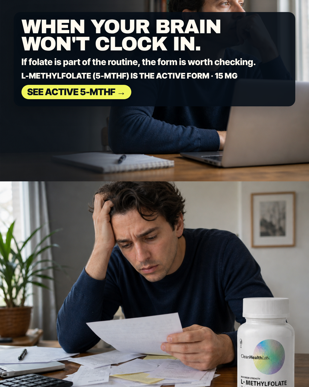
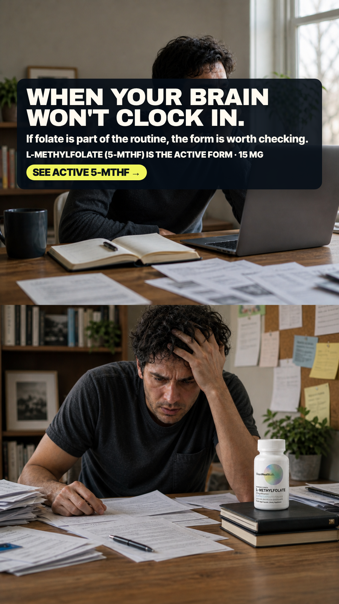
WHEN YOUR BRAIN WON'T CLOCK IN.
Pain Fear that focus, mood, and cognition are slipping—the brain is not showing up when life demands it.
5.40panel mean
Art director4.2
Cold buyer6.4
DR strategist7.4
Skeptic3.6
spread 3.8
What each judge said
Art directorThe bottle at bottom-right is sliced by the frame edge - the label stops mid-lockup after 'L- METHYLFOLATE' so the 15 mg dose line is cut away entirely, and the top panel repeats the same man as the bottom photo.
Cold buyerThe photo shows a man buried in receipts and a calculator, which reads as money panic rather than the "brain won't clock in" headline, and the bottle is sliced off by the bottom edge.
DR strategistGenuinely painful photograph, but the man is drowning in bills and receipts while the headline argues cognition, so the picture sells money stress and the copy sells brain fog.
SkepticThe bottle at bottom-right is sliced by the frame edge mid-label — '15 mg (Milligrams)' is cut through the glyphs — and the top panel additionally crops the man's head off at the top edge across a hard photo seam.
4:51080×1350
9:161080×1920not judged
#27 of 33V11 · v11.3AG1Not built⚠ 1 of 4 would not run itV11-AG1-01
Form Kit
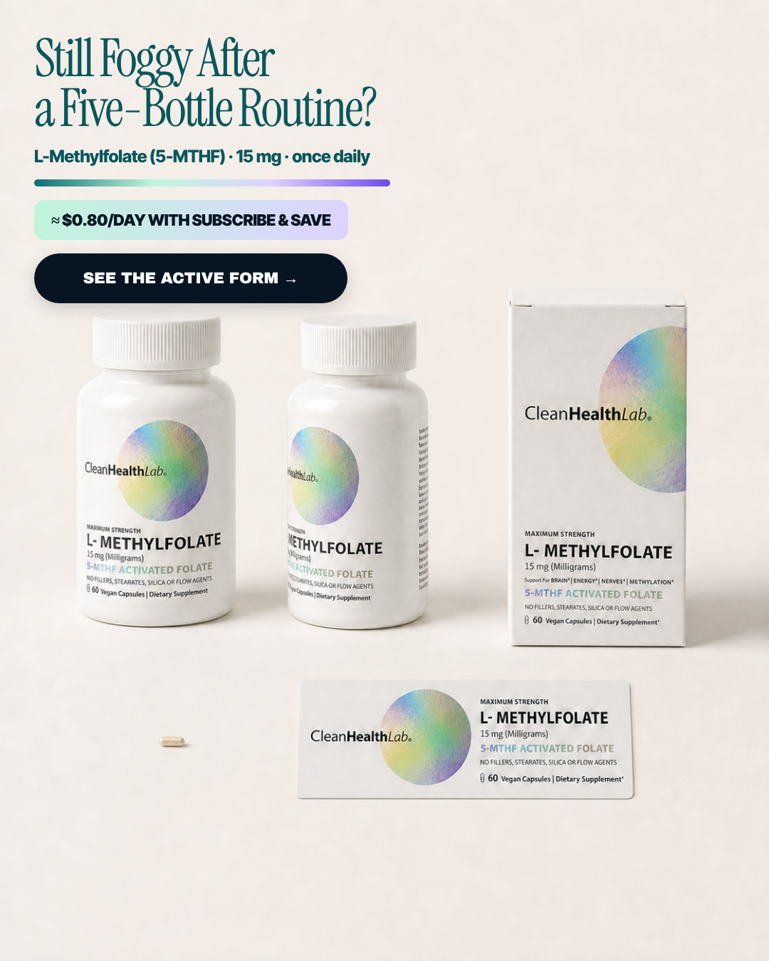
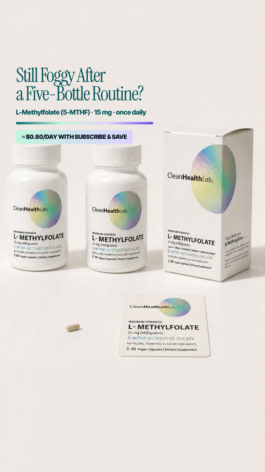
STILL FOGGY AFTER A FIVE-BOTTLE ROUTINE?
Pain A crowded five-bottle routine that still leaves the customer foggy.
4.97panel mean
Art director5.6
Cold buyer5.4
DR strategist6.0
Skeptic2.9
spread 3.1
What each judge said
Art directorFour near-duplicate label lockups in one frame - the middle bottle's label is chopped by the front bottle so it reads '...METHYLFOLATE / (...illigrams)', and the flat label card lying at the bottom looks like a stray production asset.
Cold buyerThe "five-bottle routine" line is a real frustration, but the picture is a duplicated bottle overlapping itself plus a flat label card lying on the floor, which looks like a layout accident rather than a product.
DR strategistThe five-bottle routine is a real frustration, but the ad answers it with a cost-per-day chip placed above the CTA and never explains why naming the form fixes anything.
SkepticThe headline states a 'Five-Bottle Routine' while the frame shows two bottles, one carton and a detached flat label lying on the surface — a stated count the picture contradicts, plus a label with no container is a non-retail artefact.
4:51080×1350
9:161080×1920not judged
#28 of 33V11 · v11.3GRUNSNot builtV11-GRUNS-03
Apology
WE’RE SO SORRY!
Pain Generic advice to take more vitamins did not answer the foggy morning.
4.85panel mean
Art director6.0
Cold buyer4.0
DR strategist4.2
Skeptic5.2
spread 2.0
What each judge said
Art directorRoughly 450px of blank cream separates the price chip from the pack, there is no CTA button, and the bottle and carton are shoved into the bottom-right corner leaving the left half of the frame empty.
Cold buyer"WE'RE SO SORRY!" in 90pt reads as a shipping-delay apology email, and by the time the actual foggy-morning line appears in small type I have already scrolled past.
DR strategistA giant 'WE'RE SO SORRY!' apologises for a relationship cold traffic does not have, and the ad closes on a price chip with no instruction to click anything.
Skeptic'WE'RE SO SORRY!' is an apology from the brand for advice the brand never gave, and the creative ends on a spec/price chip with no CTA above roughly 600px of empty background.
4:51080×1350
9:161080×1920not judged
#29 of 33V10 · v10r10BBuilt & paused in the ad set⚠ 2 of 4 would not run itV10-B01
Three lived pains, one label check
BRAIN FOG / LOW MOOD / ANXIOUS MORNINGS
Pain Foggy thinking, low mood, and waking anxious—the customer’s bad morning is named in three fast phrases.
4.60panel mean
Art director5.8
Cold buyer7.5
DR strategist2.5
Skeptic2.6
spread 5.0
What each judge said
Art directorThe sub-line breaks mid-token as 'L-Methylfolate (5-' / 'MTHF)', the strikethrough headline runs almost full-bleed to the right margin, and the foil/coral/blue paper collage in the lower third fights the pack.
Cold buyerThree struck-through symptoms — brain fog, low mood, anxious mornings — land in under a second and the strikethroughs promise removal, though "(5-\nMTHF)" breaking across a line is sloppy and the crossing-out implies more cure than the label supports.
DR strategistStriking through LOW MOOD and ANXIOUS MORNINGS depicts the product eliminating mood and anxiety states — an implied mental-health treatment claim I could not substantiate for a folate supplement.
SkepticThe top-of-frame strikethrough list crosses out 'LOW MOOD' and 'ANXIOUS MORNINGS', which reads as a claim to eliminate mood and anxiety states — implied treatment of a mental-health condition by a dietary supplement.
4:51080×1350
9:161080×1920not judged
#30 of 33V10 · v10r10NNot built⚠ 2 of 4 would not run itV10-N04
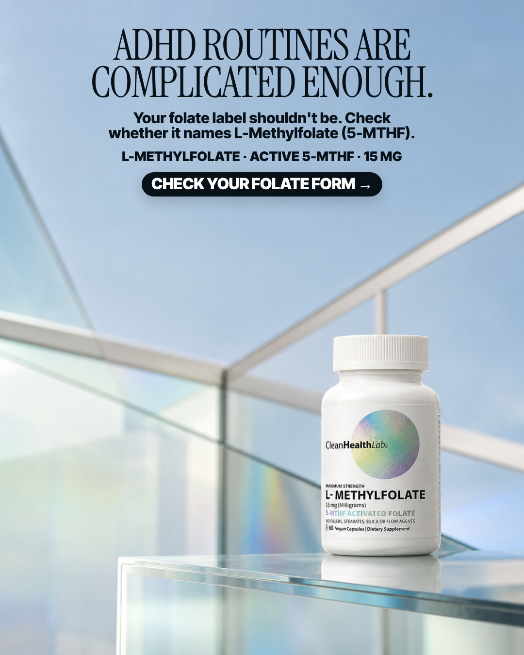
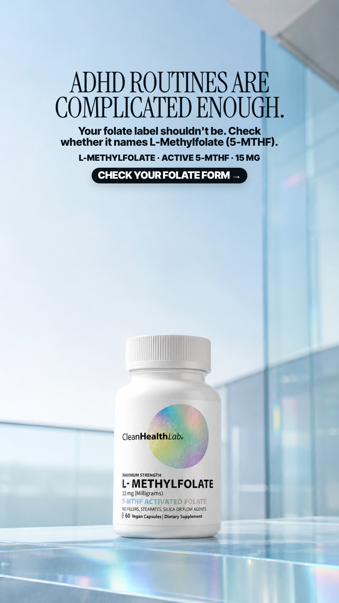
ADHD routines are complicated enough
ADHD ROUTINES ARE COMPLICATED ENOUGH.
Pain People identifying with ADHD-related focus, memory, and sustained-energy struggles want something made for their lived experience.
4.55panel mean
Art director7.9
Cold buyer7.5
DR strategist2.0
Skeptic0.8
spread 7.1
What each judge said
Art directorClean serif headline over sky with a tidy sub/dose/CTA ladder and a crisp label on the glass ledge; the left half below the CTA is largely empty and the pack could carry more scale.
Cold buyer"ADHD routines are complicated enough" names a specific identity and its daily friction in six words, and the copy stays honest by only asking me to check whether my label names 5-MTHF.
DR strategistAddressing people by their ADHD diagnosis implies the supplement is relevant to treating that condition and drags the ad into health-condition targeting I could not substantiate or run.
SkepticThe headline names ADHD, a clinical diagnosis, in the first line of a dietary-supplement ad, which both implies knowledge of the viewer's medical condition and positions the capsule against it.
4:51080×1350
9:161080×1920not judged
#31 of 33V11 · v11.3ARMRANot built⚠ 2 of 4 would not run itV11-ARMRA-01
One Capsule
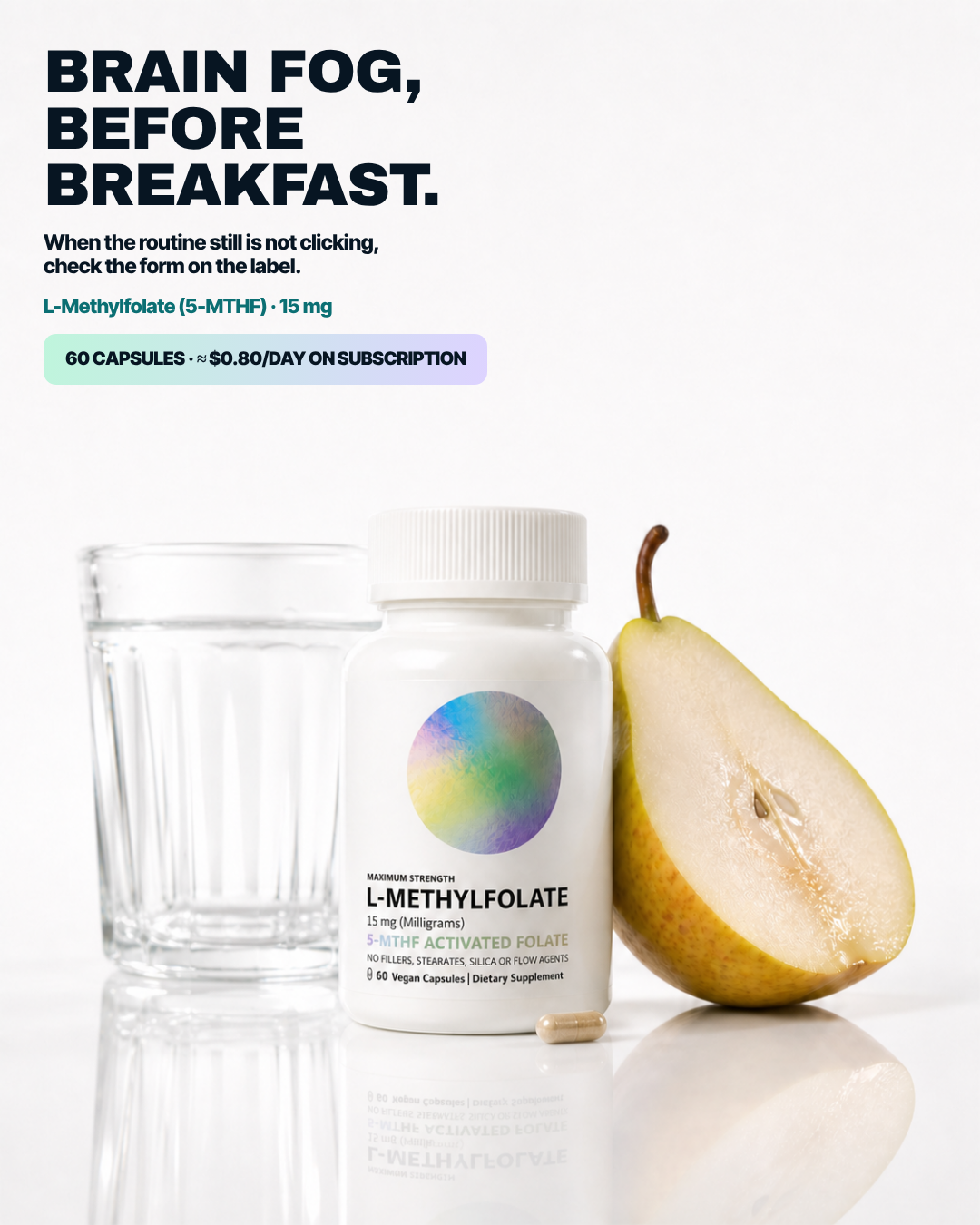
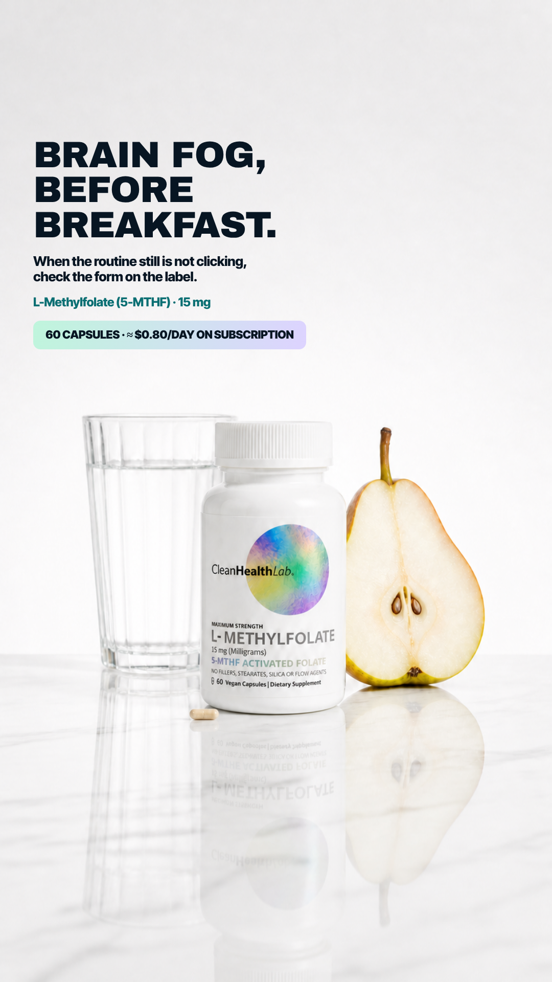
BRAIN FOG, BEFORE BREAKFAST.
Pain Brain fog showing up before the day has properly started.
4.25panel mean
Art director4.5
Cold buyer6.1
DR strategist4.6
Skeptic1.8
spread 4.3
What each judge said
Art directorThe bottle label has lost the CleanHealthLab brand mark entirely - the disc sits bare above 'MAXIMUM STRENGTH' - and the disc itself is a different blotchy generative fill with the name reset as 'L-METHYLFOLATE' instead of the 'L- METHYLFOLATE' lockup used on every other plate.
Cold buyer"Brain fog, before breakfast" is a real time-stamped moment, but a halved pear and a water glass on white seamless is a grocery still life with no tension in it.
DR strategist'Brain fog, before breakfast' is a usable moment, then the ad ends on a spec chip with no CTA — and this bottle's label art does not match the packaging shown on every other plate.
SkepticThe bottle's roundel is missing the 'CleanHealthLab' wordmark that appears on every other pack in this set, so the pack shown is not the pack sold; there is also no CTA, only a price chip, and the halved pear is decoration.
4:51080×1350
9:161080×1920not judged
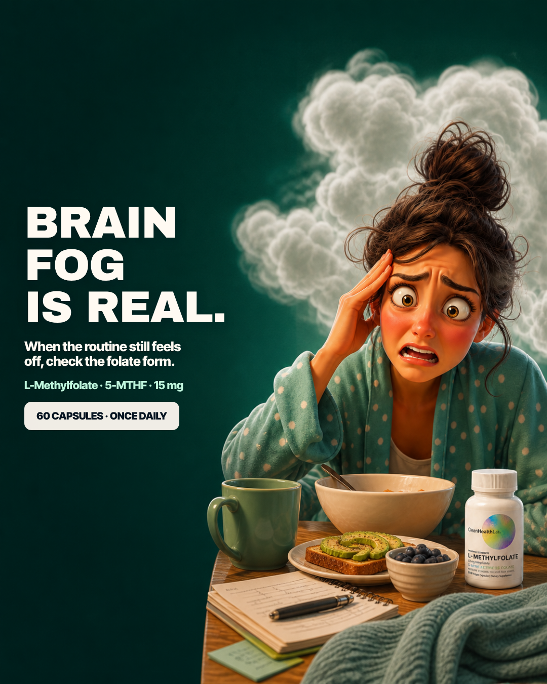
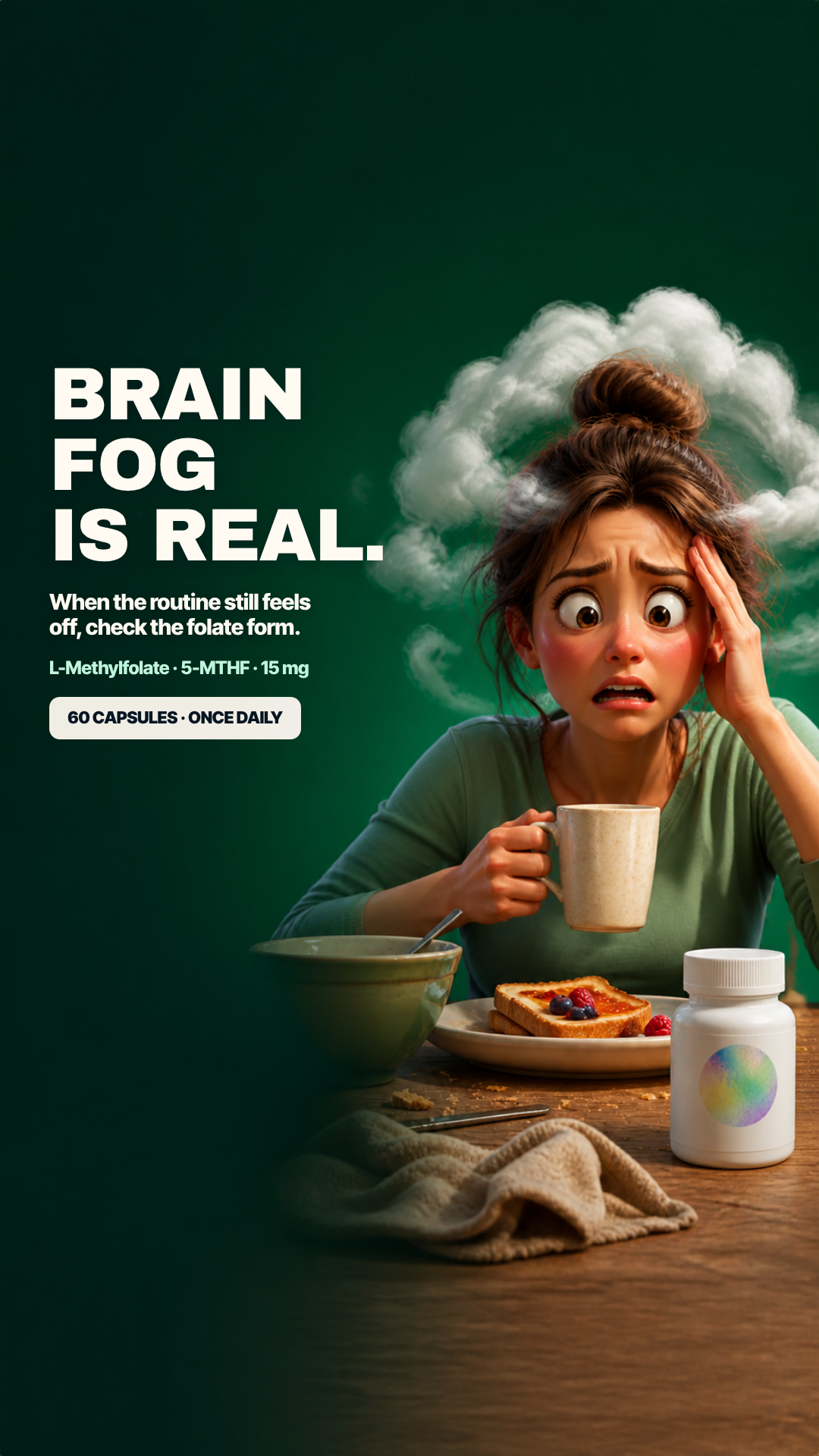
#32 of 33V11 · v11.3GRUNSBuilt & paused in the ad set⚠ 3 of 4 would not run itV11-GRUNS-02
Confusion Is Real
BRAIN FOG IS REAL.
Pain The literal feeling of brain fog and overwhelm.
3.55panel mean
Art director3.0
Cold buyer4.9
DR strategist4.3
Skeptic2.0
spread 2.9
What each judge said
Art directorThe bottle at bottom-right is a hallucinated pack - wrong soft-shouldered geometry, blurred brand mark, warped 'L-METHYLFOLATE' and sub-lines dissolved into unreadable coloured noise - and a 3D-cartoon character clashes with a photoreal product.
Cold buyerThe 3D cartoon woman with a literal storm cloud does stop the thumb, but the bottle beside her is a smeared render whose label text is unreadable — I cannot tell what I would be buying.
DR strategist'Brain fog is real' validates the reader and argues nothing, the cartoon undercuts the seriousness, and the only chip is a spec line with no call to action.
SkepticThe bottle at bottom-right is generatively smeared — 'MAXIMUM STRENGTH', '15 mg (Milligrams)', the 5-MTHF line and the no-fillers line are all illegible mush — and the 3D-cartoon character clashes with a photoreal pack while no CTA appears anywhere.
4:51080×1350
9:161080×1920not judged
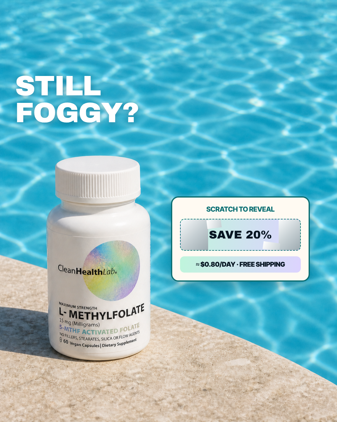
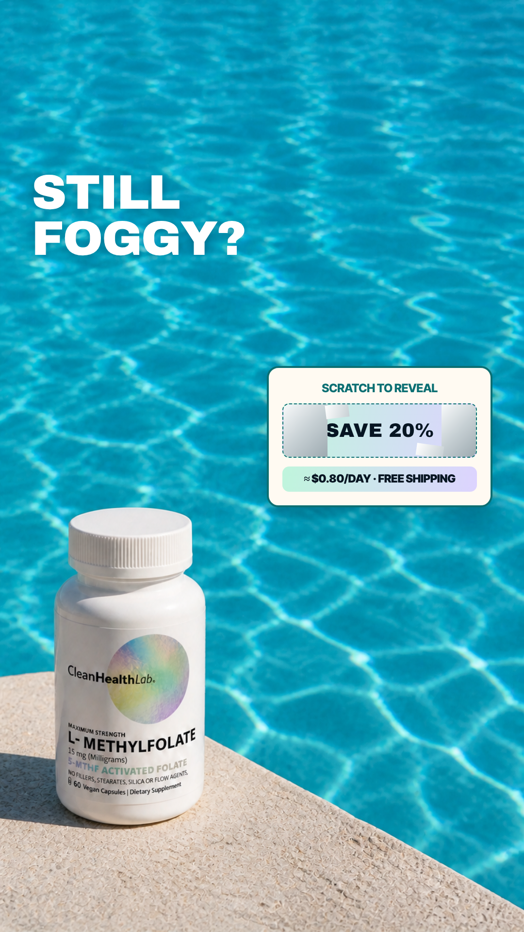
#33 of 33V11 · v11.3SEEDNot built⚠ 3 of 4 would not run itV11-SEED-03
Price Relief
STILL FOGGY?
Pain A foggy routine that needs a clearer next action than another vague bottle.
3.00panel mean
Art director5.9
Cold buyer3.2
DR strategist1.5
Skeptic1.4
spread 4.5
What each judge said
Art directorThe faux scratch-off panel physically covers part of 'SAVE 20%', 'STILL FOGGY?' is stranded top-left over rippling water with no supporting copy, and there is no CTA button.
Cold buyerA fake "SCRATCH TO REVEAL" panel with painted-on scratch flecks in a static image is a bait mechanic I cannot actually scratch, and "Still foggy?" beside a sunlit swimming pool makes no sense.
DR strategistA fake 'SCRATCH TO REVEAL' panel drawn mid-scratch on a static image is a fabricated interactive element, and the poolside bottle argues nothing about fog at all.
SkepticThe 'SCRATCH TO REVEAL' panel at mid-right, with its dashed border and painted scratch flecks over 'SAVE 20%', is a fake interactive affordance inside a static image, sitting on a poolside scene that has no product logic and no CTA.