Blind visual review
Three fresh, isolated GPT-6 Astra judges at high reasoning reviewed the same 45 opaque screenshots through craft, journey and trust lenses. Each saw all five gallery slides at readable main-image size at 390 and 1440 pixels. They received the locked rubric, neutral attachment index and output schema only—no conversation, prior results, user feedback, change summaries, source provenance, build notes, known concerns, score target, page history, separate report pages or product-reference attachments.
| Overall (weighted) | 8.19 |
|---|---|
| Visual craft | 8.67 |
| Brand distinctiveness | 8.23 |
| Journey | 8.07 |
| Trust/proof | 7.80 |
| Offer clarity | 7.80 |
| Mobile usability | 8.10 |
Independent findings
Against R21.28, the weighted score is effectively flat at 8.19 versus 8.20. Visual craft rises 0.04 to 8.67, brand distinctiveness rises 0.03 to 8.23, journey rises 0.14 to 8.07, and mobile usability rises 0.10 to 8.10. Trust/proof falls 0.10 to 7.80 and offer clarity falls 0.53 to 7.80. Across the fresh R21.32 verdicts, all three lenses flag prominent free-bottle messages that omit the shipping and subscription conditions visible in the purchase selector, and all three request more inspectable aggregate and source context for the 2,600-review presentation. Craft and journey also cite the floating purchase strip covering visible reading content at captured positions. The trust lens alone additionally calls the two-ingredient formula headline broader than the label because the capsule is separately listed under other ingredients. These are independent screenshot-based visual judgments, not performance or conversion measurements; the small aggregate difference does not demonstrate a commercial regression.
Exact judge results
Craft lens — scores, evidence and exact blockers
Visual craft — 8.7
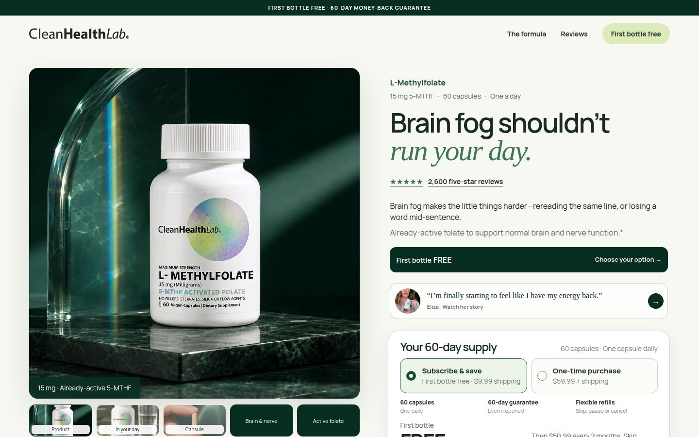
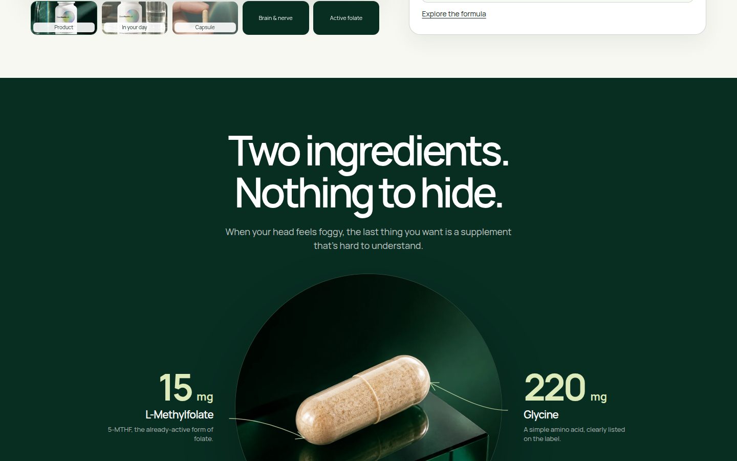
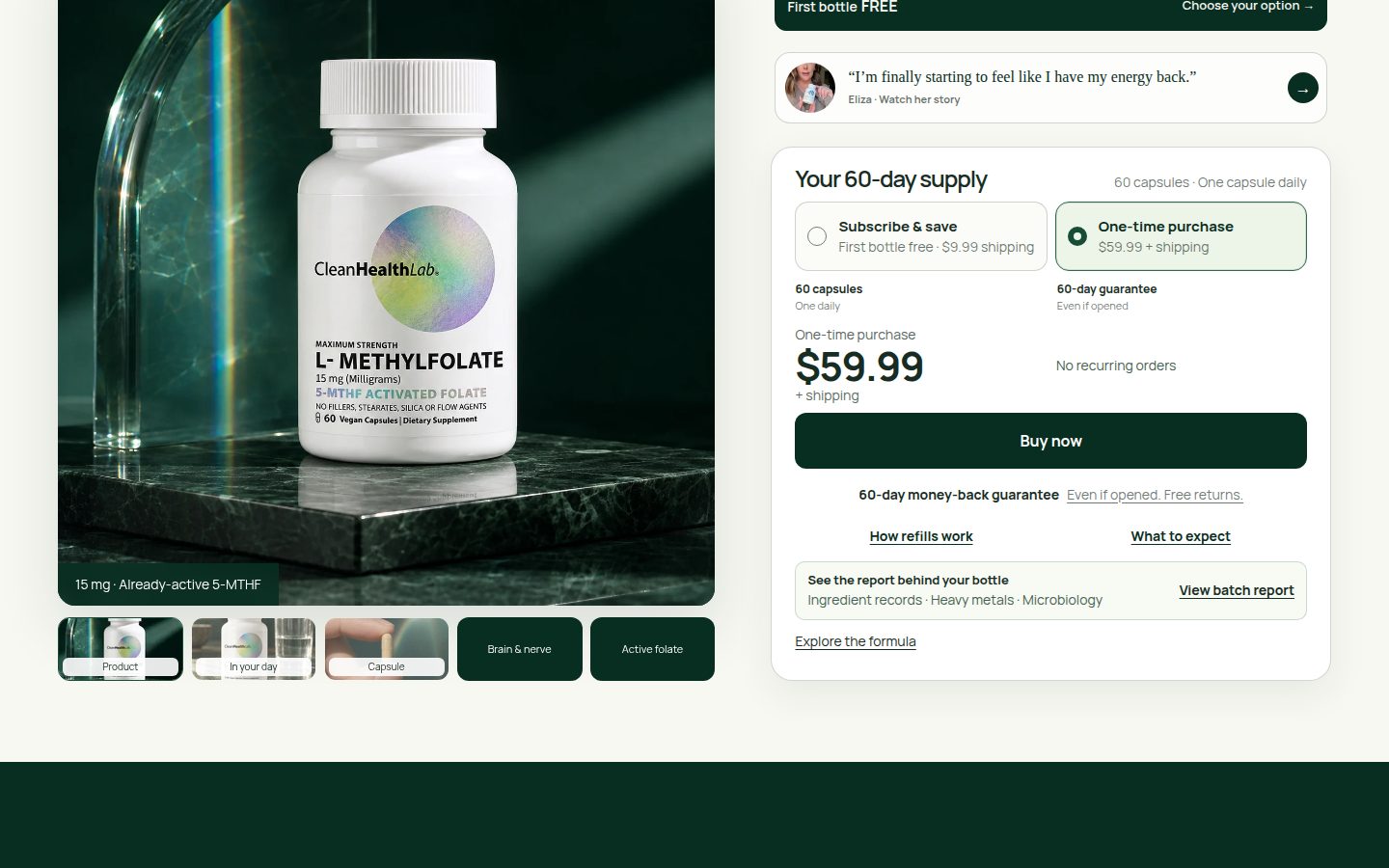
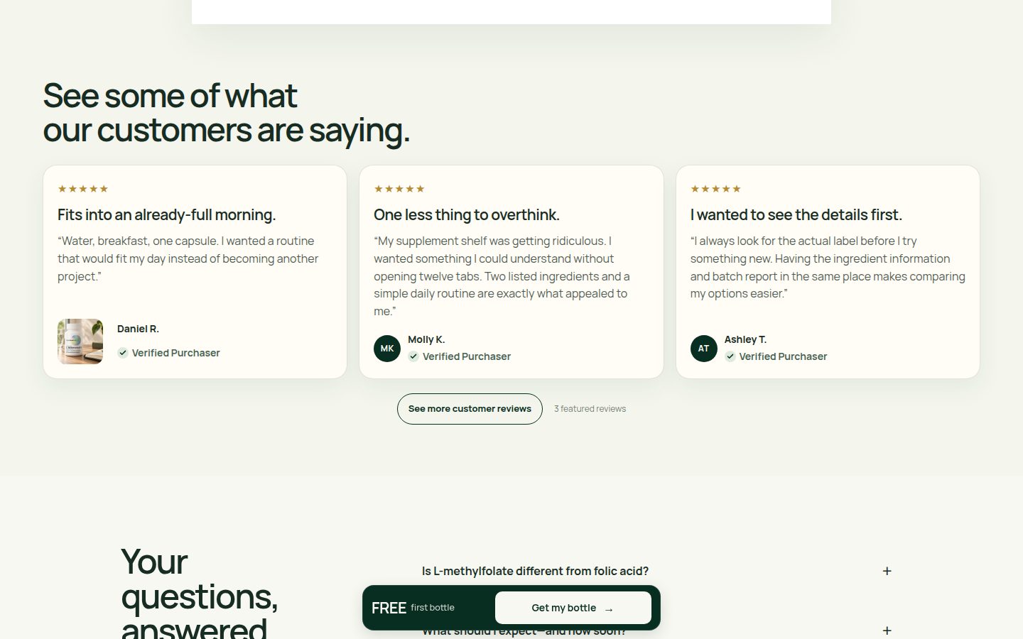
Strengths: controlled forest-green/cream palette, expressive sans/italic-serif pairing, excellent product lighting, and generous alignment create a polished composition (asset-015.jpg, asset-017.jpg, asset-020.jpg). The capsule diagram and asymmetric image corners add deliberate detail. Flaws: the square closing purchase panel feels less integrated than the rounded opening selector (asset-016.jpg, asset-024.jpg); small, pale supporting text weakens the otherwise clear hierarchy. The floating CTA also crosses editorial content (asset-019.jpg, asset-022.jpg). Limitations: screenshots establish static composition, not animation quality or measured contrast.



Brand distinctiveness — 8.2
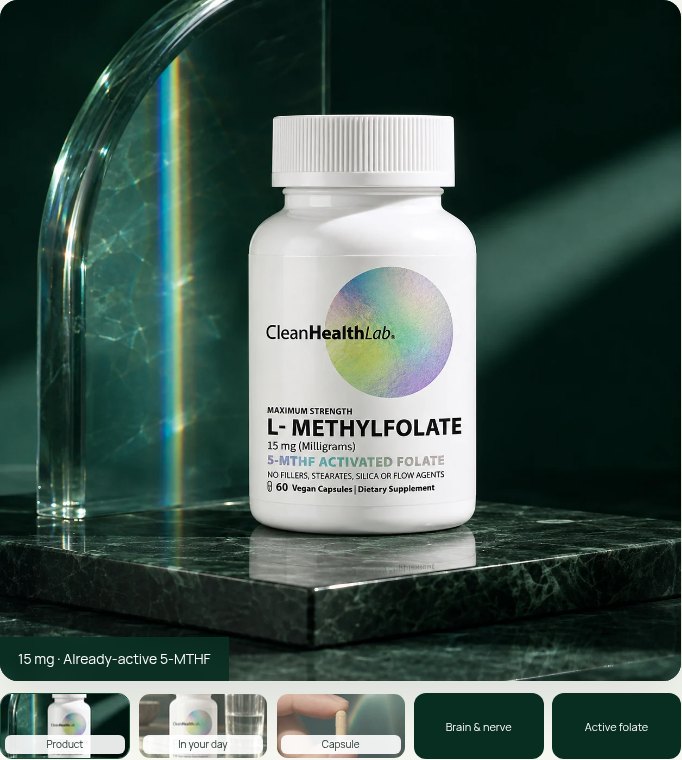
Strengths: the packaging’s iridescent circle connects naturally with refracted light, green stone, and glass throughout the product gallery (asset-036.jpg through asset-043.jpg). Repeated serif emphasis and ingredient transparency create a recognizable visual voice (asset-004.jpg, asset-020.jpg). Flaws: lower-page review cards and FAQ layouts rely on familiar commerce patterns, while the text-only gallery panels make less use of the distinctive optical motif (asset-022.jpg, asset-023.jpg, asset-044.jpg, asset-045.jpg). Limitations: no independent packaging reference establishes exact physical label or color fidelity.
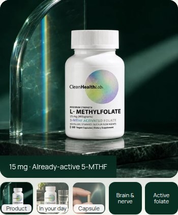
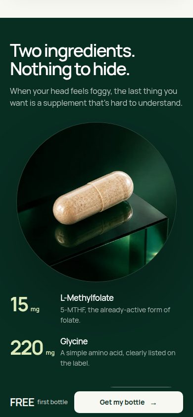
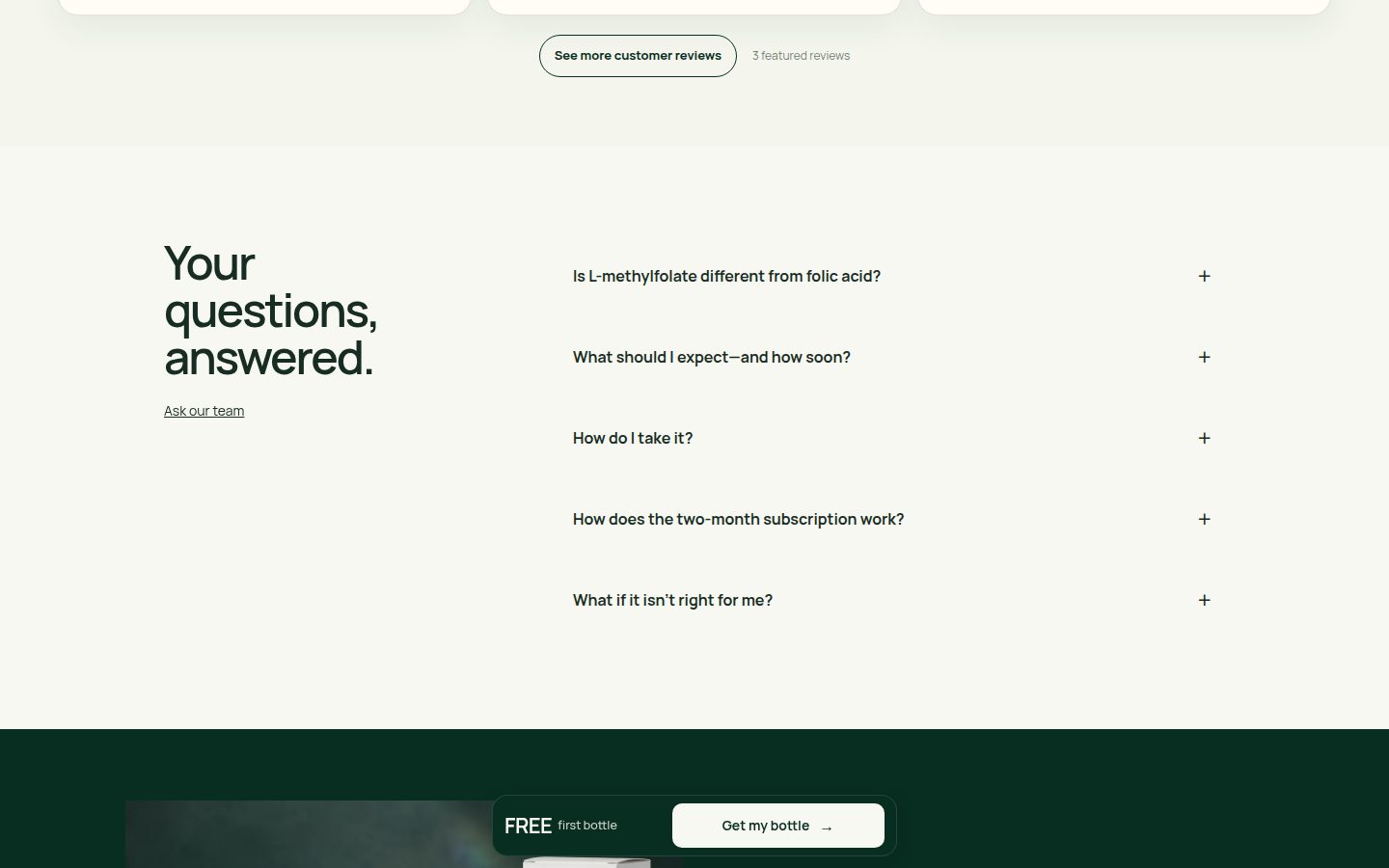
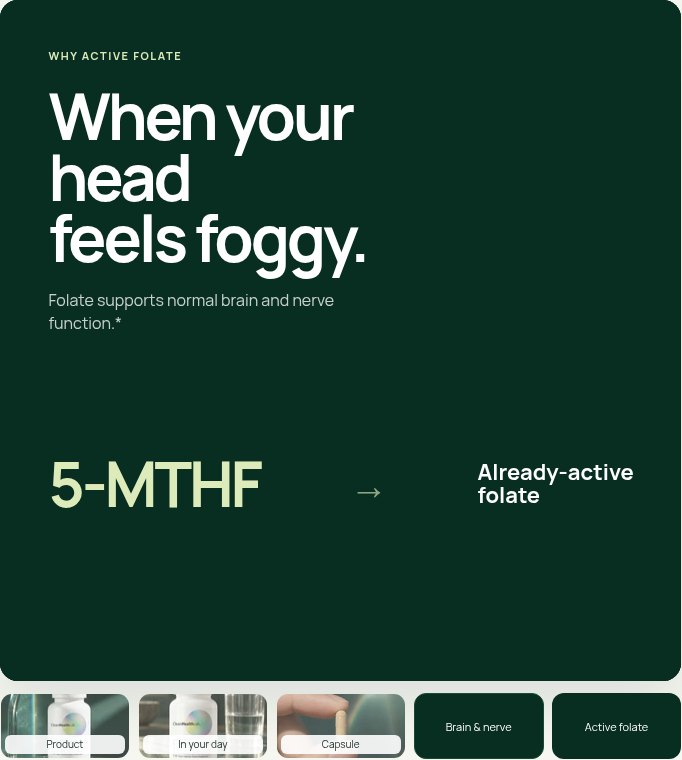
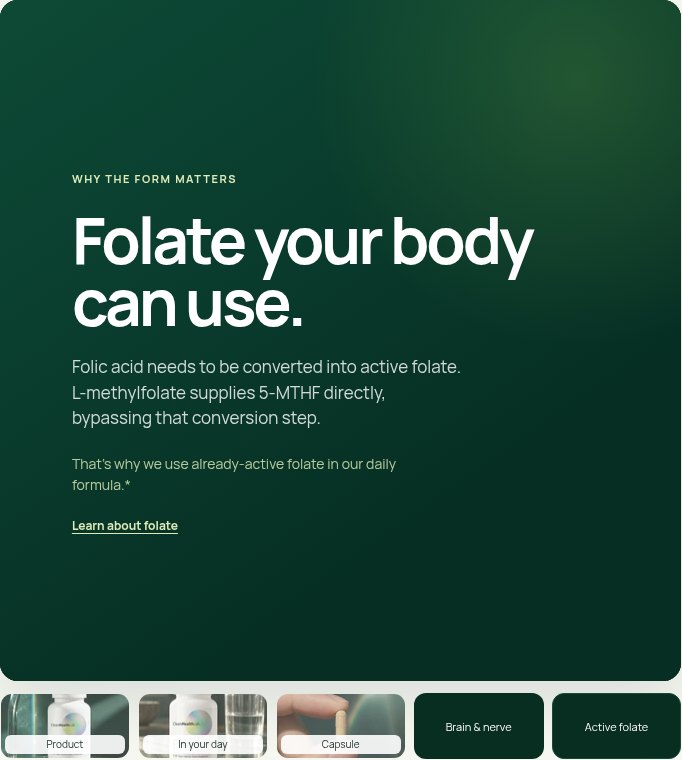
Journey — 8.1
Strengths: the page connects the problem, product choice, formula, label, daily routine, customer stories, questions, and final purchase opportunity. Formula, refill, expectations, and report links support focused exploration near the selector (asset-016.jpg, asset-029.jpg). Flaws: substantial video and written-review sections repeat reassurance and lengthen the route to FAQs (asset-019.jpg, asset-021.jpg, asset-022.jpg); persistent CTA placement interrupts reading in several captured positions. Limitations: captured alternate states demonstrate layouts, but anchor behavior, checkout continuity, and interaction timing remain unverified.
Trust/proof — 7.9
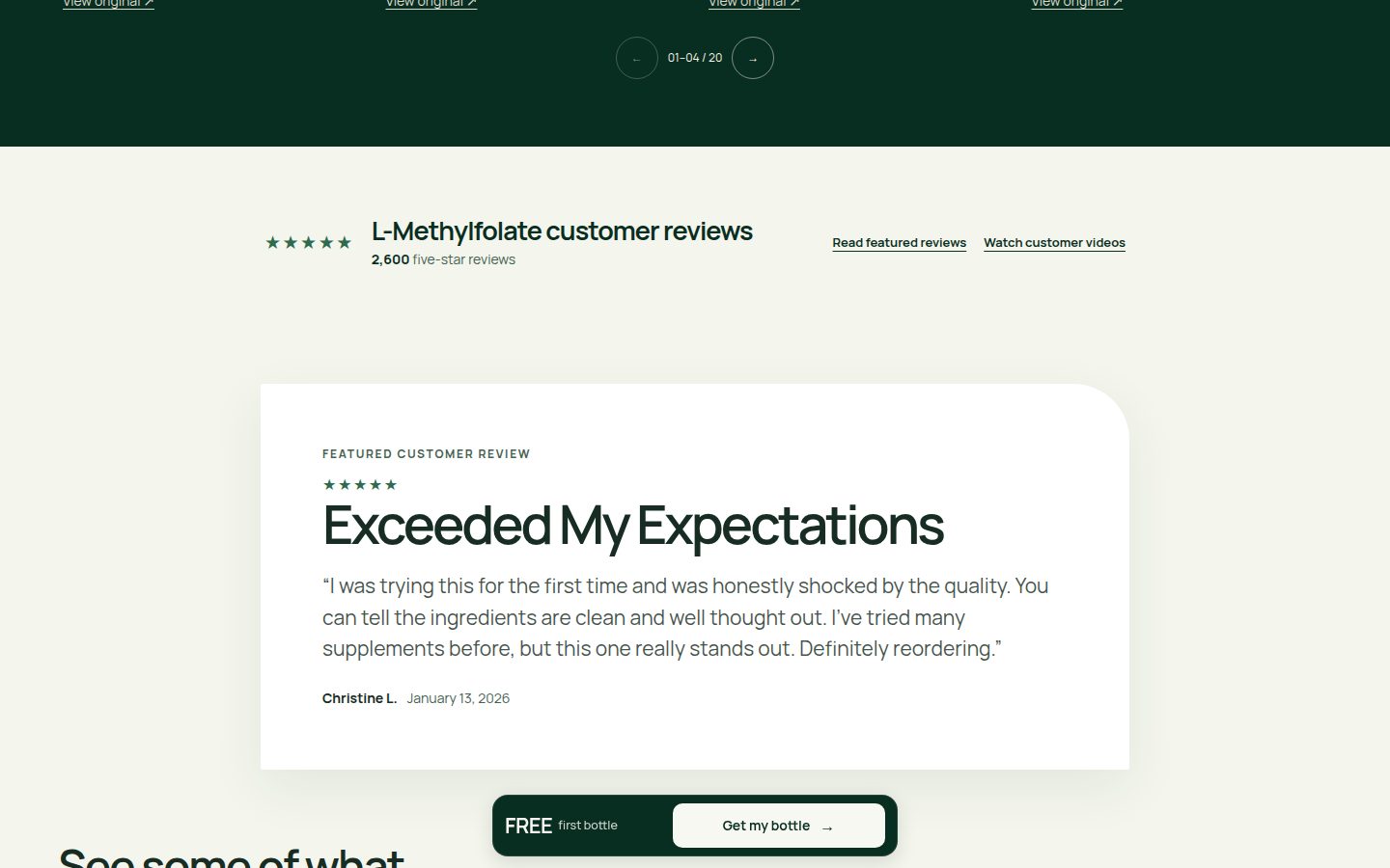
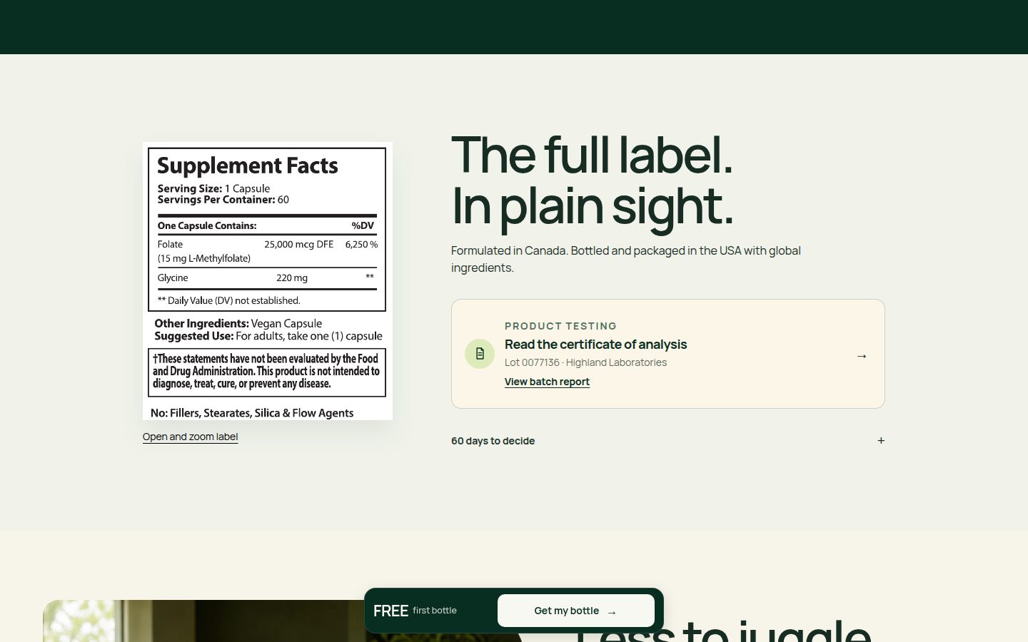
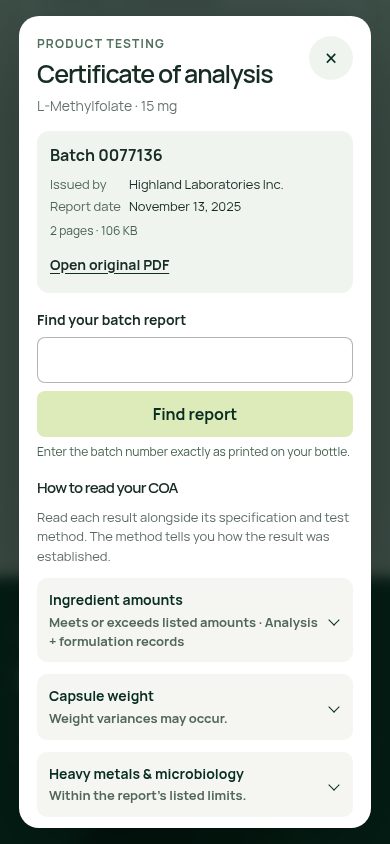
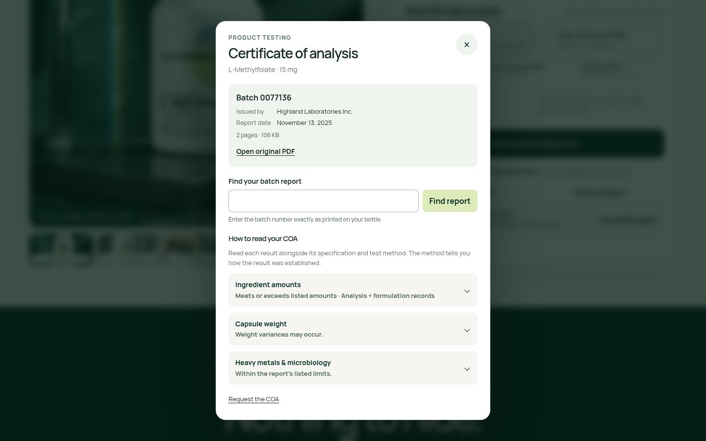
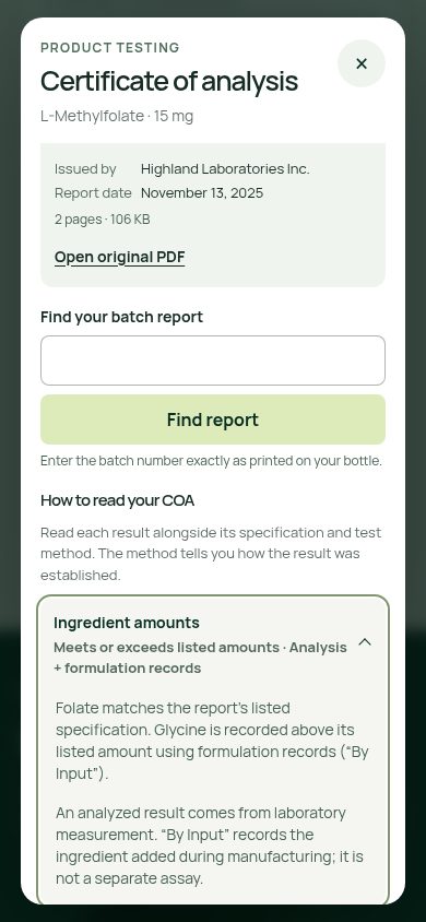
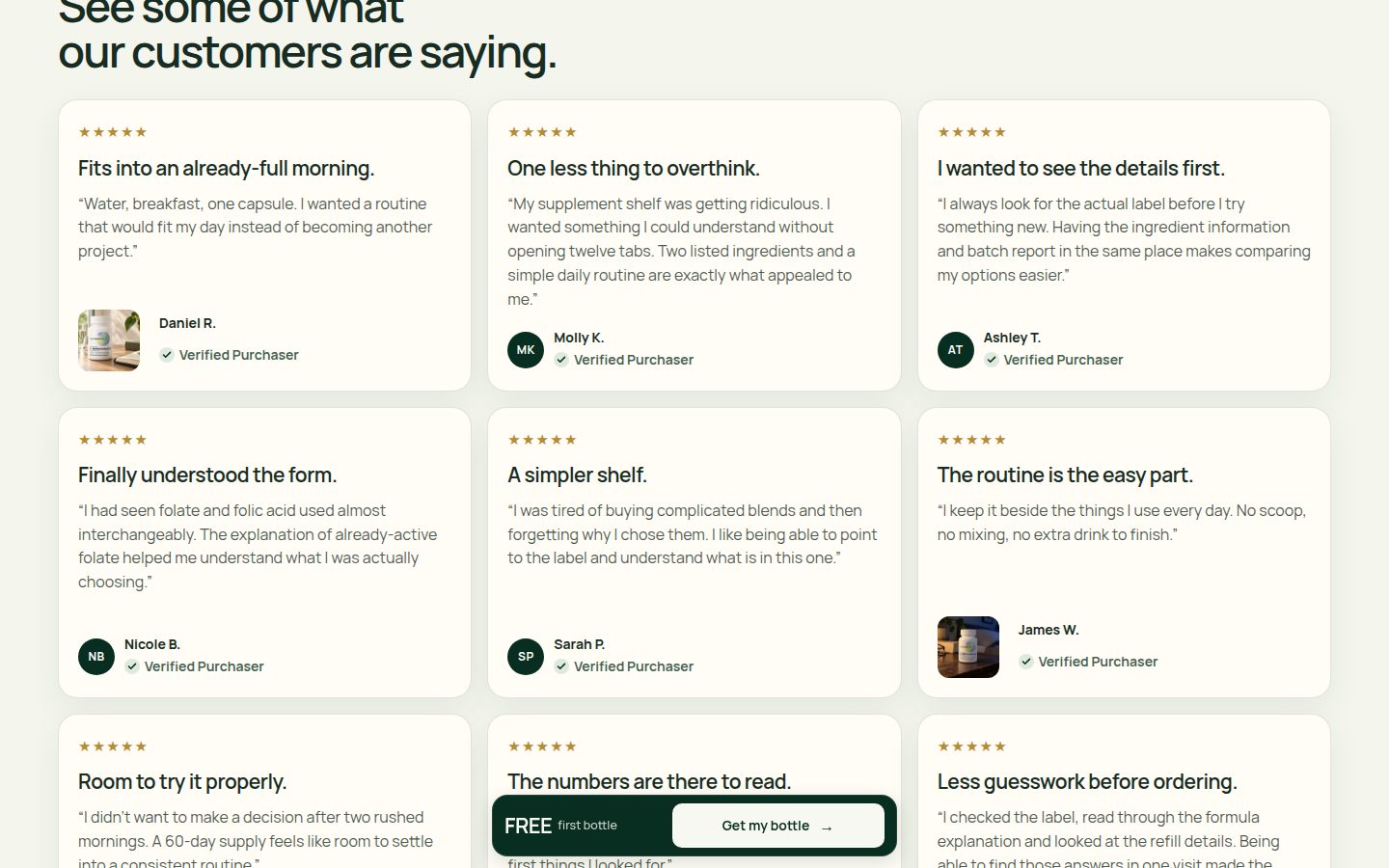
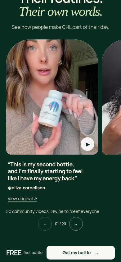
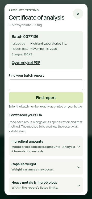
Strengths: a readable facts panel, manufacturing-origin disclosure, named laboratory, batch identifier, report date, original-PDF link, and batch lookup provide unusually concrete proof access (asset-018.jpg, asset-026.jpg, asset-034.jpg). The expanded explanation explicitly distinguishes laboratory measurement from formulation input records (asset-035.jpg). Customer videos include handles and original-source links (asset-007.jpg, asset-032.jpg). Flaws: the prominent 2,600 five-star-review claim is paired with selected positive testimonials without a visible aggregate source or rating distribution; expanded cards remain uniformly positive (asset-021.jpg, asset-031.jpg). Limitations: report contents, review authenticity, scientific substantiation, and destination links were not independently verified.


Offer clarity — 8.0
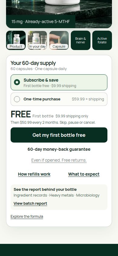
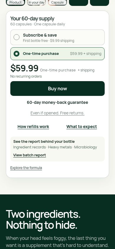
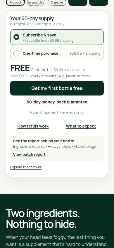
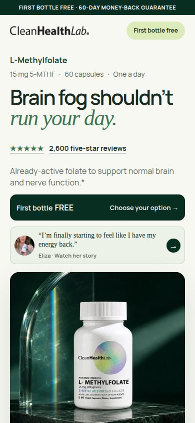
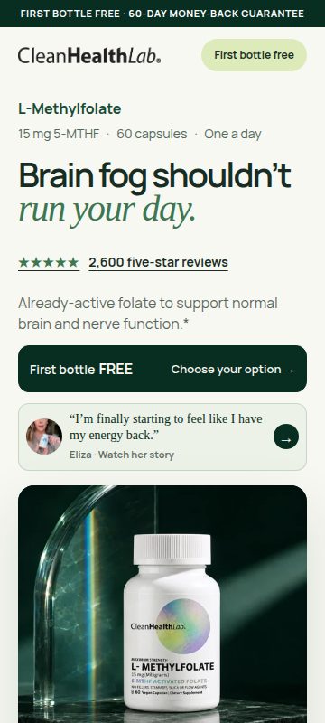
Strengths: selected purchase states clearly distinguish a $59.99 one-time purchase from a free first subscription bottle with $9.99 shipping and subsequent $50.99 charges every two months. Cancellation flexibility and the opened-bottle return promise sit near purchase controls (asset-002.jpg, asset-003.jpg, asset-016.jpg, asset-024.jpg). Flaws: hero and persistent 'FREE' messages omit those shipping and subscription qualifications, requiring another location to understand the offer (asset-001.jpg, asset-025.jpg, asset-028.jpg). Recurring terms receive substantially less typographic emphasis than FREE. Limitations: checkout totals, renewal shipping treatment, and synchronization between purchase selectors are not shown.
Mobile usability — 8.1
Strengths: the 360px hero retains readable headings and orderly spacing; 390px selectors stack cleanly, primary buttons are generous, and the report modal adapts its form into a single column (asset-025.jpg, asset-029.jpg, asset-033.jpg). Partial adjacent cards and explicit swipe instructions communicate horizontal browsing (asset-028.jpg). Flaws: the persistent bottom bar visually masks label text, routine copy, and review content in captured positions (asset-006.jpg, asset-009.jpg, asset-027.jpg). Gallery captions and secondary commercial copy are small at supplied dimensions (asset-029.jpg, asset-036.jpg). Limitations: touch behavior, modal scrolling, keyboard handling, safe-area behavior, and accessibility semantics are untested.

Exact blockers
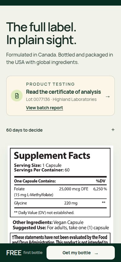
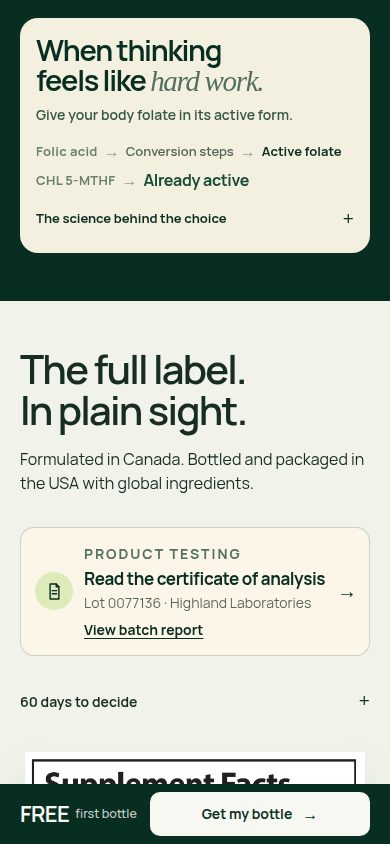
- The persistent purchase bar overlays meaningful content, including label text on mobile and testimonial/FAQ content on desktop (asset-006.jpg, asset-009.jpg, asset-019.jpg, asset-022.jpg). Highest-impact fix: give the bar a reserved viewport area and make section or anchor positioning respect that area so visible reading content remains unobstructed.
- The most prominent entry and persistent offer messages say the first bottle is free without adjacent shipping or subscription qualifications, although the selectors disclose both (asset-001.jpg, asset-025.jpg, asset-028.jpg versus asset-003.jpg). Highest-impact fix: add a compact, legible '$9.99 shipping · subscription required' qualifier wherever the free offer leads, preserving the full renewal terms beside purchase controls.
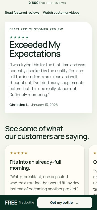
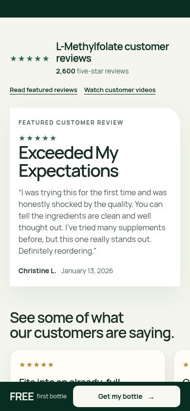
- The review presentation gives a precise five-star count substantially more prominence than its visible provenance; the expanded evidence remains a collection of positive cards (asset-021.jpg, asset-022.jpg, asset-031.jpg). Highest-impact fix: connect the headline count to a clearly identified review source and provide an accessible aggregate summary with rating distribution and review-verification context.
Evidence limitations
- Assessment is limited to supplied static screenshots and captured states; no live interaction or checkout testing was performed.
- Measured performance is unknown. No loading, responsiveness, conversion, or other commercial-outcome evidence was supplied.
- Contrast ratios, focus order, screen-reader semantics, touch-target bounds, and overlay accessibility were not measured.
- Sticky-bar overlap is visible at the captured scroll positions; permanent inaccessibility of the underlying content is not established.
- Original laboratory documents, scientific references, review sources, policy destinations, and batch-lookup results were not supplied for verification.
- No separately identified physical-product reference permits an independent packaging-fidelity assessment; gallery imagery was evaluated only in its visible page context.
Journey lens — scores, evidence and exact blockers
Visual craft — 8.7
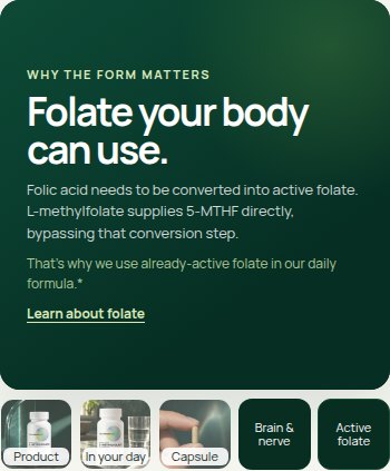
Strong hierarchy, controlled cream/green contrast, restrained serif accents and coordinated photography create a polished presentation (asset-015.jpg, asset-017.jpg, asset-020.jpg). Gallery states retain consistent framing and caption placement across sizes (asset-036.jpg–asset-045.jpg). The square closing purchase panel feels less integrated than the rounded opening selector, and the floating CTA interrupts otherwise generous compositions (asset-016.jpg, asset-022.jpg, asset-024.jpg). Motion and rendering stability are not evidenced.
Brand distinctiveness — 8.3
The holographic packaging mark, refracted light, green stone surfaces and repeated capsule imagery create a recognizable visual world (asset-001.jpg, asset-004.jpg, asset-041.jpg–asset-043.jpg). Plain-language ingredient transparency reinforces the identity (asset-005.jpg, asset-018.jpg). Cream backgrounds, rounded testimonial cards and broad wellness headlines are less distinctive than the product photography (asset-010.jpg, asset-022.jpg). Independent packaging-reference fidelity cannot be established from the supplied page/gallery views.
Journey — 8.1
The page supports a coherent progression from problem recognition to offer selection, formula, label, routine, customer evidence, FAQs and a closing purchase opportunity. Helpful shortcuts connect buyers to refills, expectations and batch reports near the selector (asset-003.jpg, asset-016.jpg), while gallery states answer practical product questions (asset-037.jpg–asset-040.jpg). However, videos, a large featured review and additional review cards extend the route to FAQs, and the persistent CTA overlaps reading content (asset-007.jpg–asset-012.jpg, asset-019.jpg–asset-023.jpg). Screenshots show alternate states, not verified navigation or checkout behavior.
Trust/proof — 8.0
Preserve the readable Supplement Facts, named laboratory, batch identifier, dated report, original-PDF link and explicit distinction between laboratory analysis and formulation records (asset-018.jpg, asset-026.jpg, asset-034.jpg, asset-035.jpg). Named video contributors, original-source links, purchaser badges and accessible support add useful reassurance (asset-014.jpg, asset-028.jpg, asset-031.jpg, asset-032.jpg). The prominent '2,600 five-star reviews' claim is followed by curated positive examples without a visible overall rating distribution or collection methodology (asset-010.jpg, asset-021.jpg, asset-031.jpg). Report contents and testimonial authenticity remain unverified.
Offer clarity — 7.8
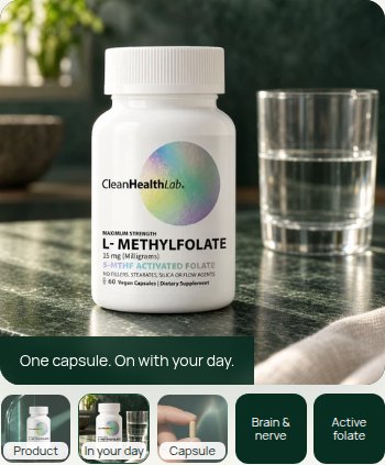
The purchase selectors clearly distinguish subscription from one-time purchase. The subscription state discloses $9.99 initial shipping, $50.99 every two months and cancellation flexibility; the alternative states $59.99 plus shipping and no recurring orders (asset-002.jpg, asset-003.jpg, asset-016.jpg, asset-029.jpg). Guarantees sit close to purchase buttons. However, hero and persistent 'FREE first bottle' prompts omit the shipping charge and subscription condition at those entry points (asset-001.jpg, asset-025.jpg, asset-028.jpg). One-time shipping and the final checkout total are not supplied.
Mobile usability — 8.1
The 360px hero retains readable hierarchy, and 390px selectors provide large stacked choices and a prominent purchase button (asset-025.jpg, asset-029.jpg). Carousel peeks, counters and arrows communicate additional content; the COA modal adapts its search controls vertically (asset-028.jpg, asset-033.jpg). The bottom purchase bar visibly covers portions of labels, routine copy and review content, reducing the reading viewport (asset-006.jpg, asset-009.jpg, asset-027.jpg). Secondary pricing and helper text are comparatively small and muted (asset-029.jpg, asset-035.jpg). Touch behavior, keyboard handling and modal focus management cannot be assessed from screenshots.
Exact blockers
- Offer entry points emphasize 'FREE' without the conditions shown later in the selector: $9.99 shipping and a subscription renewing at $50.99 every two months (asset-001.jpg, asset-003.jpg, asset-025.jpg, asset-028.jpg). This prevents consistently clear expectations throughout the journey. Highest-impact fix: add concise shipping and subscription qualifiers beside hero and sticky offer prompts.
- The persistent purchase bar overlays meaningful reading content, including the label, routine instructions, testimonial text and FAQ area (asset-006.jpg, asset-009.jpg, asset-019.jpg, asset-022.jpg, asset-027.jpg). This weakens an otherwise orderly information journey. Highest-impact fix: reserve a separate viewport region for the bar and suppress it when an inline purchase panel is visible.
- The review journey gives substantial space to selected positive testimonials while the headline count lacks visible rating distribution or collection context (asset-010.jpg, asset-021.jpg, asset-022.jpg, asset-031.jpg). This adds scrolling without equivalent help assessing the breadth of customer experience. Highest-impact fix: consolidate the review introduction into a compact aggregate summary with total count, rating distribution, sourcing details and access to all reviews.
Evidence limitations
- Assessment uses supplied static screenshots at their stated dimensions; no live interaction or checkout was tested.
- Measured performance, loading behavior and commercial outcomes are unknown.
- FAQ answers, refill explanations, guarantee terms and science content are not shown expanded.
- The original COA PDF, batch-search results, underlying review records and original testimonial videos were not supplied for verification.
- Screenshots cannot establish semantic accessibility, measured contrast, actual touch targets, focus management or responsive behavior between the supplied widths.
- Gallery captures show page presentation; no separately identified product-reference set establishes independent packaging fidelity.
Trust lens — scores, evidence and exact blockers
Visual craft — 8.6
Strengths: controlled forest-green and cream palette, expressive serif accents, strong product photography, and orderly desktop composition (asset-015.jpg, asset-017.jpg, asset-020.jpg). Flaws: the square final purchase panel departs from the rounded primary panel, and generous spacing around repeated review sections slows the visual rhythm (asset-016.jpg, asset-021.jpg, asset-024.jpg). Limitation: screenshots establish static finish, not animation quality or rendering stability.
Brand distinctiveness — 8.2
Strengths: the holographic packaging motif, refracted light, green stone, and consistent photographic treatment make the product presentation recognizable (asset-015.jpg, asset-024.jpg). Flaws: rounded testimonial cards and broad wellness phrasing are less distinctive than the product imagery; the packaging's iridescence has little expression elsewhere in the interface (asset-021.jpg, asset-022.jpg). Limitation: these attachments do not establish differentiation against actual competitors.
Journey — 8.0
Strengths: purchase options appear early, followed by ingredients, label evidence, routines, testimonials, questions, and a closing purchase opportunity; proof is also linked directly from the offer (asset-016.jpg, asset-017.jpg, asset-018.jpg, asset-020.jpg, asset-023.jpg, asset-024.jpg). Flaws: video testimonials, a review summary, a large featured review, and further review cards create a lengthy, repetitive proof sequence (asset-019.jpg, asset-021.jpg, asset-022.jpg, asset-031.jpg). Limitation: supplied alternate states show expanded content and carousel movement, but do not establish anchor accuracy or checkout continuity.
Trust/proof — 7.5
Strengths: the full label, manufacturing-origin wording, named laboratory, batch number, report date, original-PDF link, and batch lookup provide unusually concrete proof affordances (asset-018.jpg, asset-026.jpg, asset-034.jpg). The expanded explanation explicitly distinguishes laboratory measurement from glycine formulation records (asset-035.jpg). Customer videos include handles and original-source links (asset-007.jpg, asset-032.jpg). Flaws: the prominent '2,600 five-star reviews' claim lacks visible platform attribution or rating distribution, including in the expanded review view (asset-010.jpg, asset-021.jpg, asset-031.jpg). 'Two ingredients' also leaves the separately listed vegan capsule unexplained at the headline level (asset-004.jpg, asset-018.jpg). Limitation: report contents, review authenticity, and linked scientific substantiation are not independently established by screenshots.
Offer clarity — 7.6
Strengths: the subscription panel states $9.99 initial shipping, $50.99 every two months, and cancellation flexibility; the alternate purchase state clearly states $59.99 plus shipping and no recurring orders (asset-002.jpg, asset-003.jpg, asset-016.jpg, asset-029.jpg). Return reassurance sits beside purchase actions. Flaws: hero, header, and persistent 'FREE first bottle' messages omit the subscription condition and shipping charge, which appear only in the detailed offer (asset-001.jpg, asset-014.jpg, asset-025.jpg). Limitation: checkout totals, subsequent shipping charges, and operational cancellation terms are not shown.
Mobile usability — 8.1
Strengths: layouts remain coherent at 360px and 390px, with stacked offer choices, large primary buttons, readable headings, and a well-organized report modal (asset-025.jpg, asset-029.jpg, asset-033.jpg). Flaws: persistent purchase bars cover portions of the current reading viewport, while commercial qualifications and gallery labels are comparatively small (asset-006.jpg, asset-009.jpg, asset-027.jpg, asset-029.jpg). Limitation: screenshots cannot establish touch accuracy, keyboard behavior, modal focus management, or whether every obscured element can be scrolled clear.
Exact blockers
- Prominent free-bottle messaging is less qualified than the actual offer: the hero and persistent bar omit shipping and subscription conditions (asset-001.jpg, asset-014.jpg, asset-025.jpg), while the purchase panel reveals them (asset-003.jpg). Highest-impact fix: place '$9.99 shipping · subscription required' beside these free-bottle claims and retain the clearly stated renewal price at selection.
- The review presentation supplies a large five-star count but insufficient visible context for assessing it: neither the summary nor expanded cards show platform attribution, the total rating distribution, or the verification method (asset-021.jpg, asset-031.jpg). Highest-impact fix: connect the count to an attributable review source and show total reviews, rating distribution, and a concise explanation of 'Verified Purchaser.' Preserve the original-source links on customer videos.
- The formula headline is broader than the displayed label: 'Two ingredients. Nothing to hide.' names folate and glycine, while Supplement Facts separately lists 'Other Ingredients: Vegan Capsule' (asset-004.jpg, asset-018.jpg). Highest-impact fix: qualify the statement as two ingredients inside a vegan capsule and identify the capsule material alongside the formula. Preserve the full label and the explicit assay-versus-formulation explanation in asset-035.jpg.
Evidence limitations
- Assessment is limited to the supplied screenshots and visible states; linked destinations and live interactions were not tested.
- Measured performance is unknown: no loading, responsiveness, or layout-shift measurements were supplied.
- The original laboratory PDF, batch-lookup results, scientific references, and review-source records were not supplied; their validity or absence cannot be determined.
- Checkout, cancellation, return execution, video playback, accessibility semantics, and comprehensive keyboard behavior remain unverified.
- No conversion lift, commercial outcome, authorship, release history, or approval status is inferred.
Evidence limits
The review is based on static screenshots. It does not measure loading speed, conversion, checkout behavior, link destinations, review authenticity, laboratory findings, benefit substantiation, accessibility, touch behavior, or interaction reliability. The visible floating bar overlaps content at captured positions; that does not prove the underlying content is permanently unreachable by scrolling.
Before the judge run, all 10 gallery states—five slides at 390 pixels and five at 1440 pixels—were captured after settling with a maximum measured offset delta of 0 pixels. Visible community-video posters were loaded before capture. Public/source identity checks passed, all 40 programmed captures completed with zero errors, and the 45-image opaque packet passed selector and coverage preflight. No page bytes changed during capture or review.