Blind visual review
Three fresh, isolated GPT-6 Astra judges at high reasoning reviewed the same 45 opaque screenshots through craft, journey and trust lenses. Each saw all five gallery slides at readable main-image size at 390 and 1440 pixels. They received the locked rubric, neutral attachment index and output schema only—no conversation, prior results, user feedback, build notes, known concerns, score target, page history, separate report pages or product-reference attachments.
| Overall (weighted) | 8.22 |
|---|---|
| Visual craft | 8.60 |
| Brand distinctiveness | 8.17 |
| Journey | 8.00 |
| Trust/proof | 8.00 |
| Offer clarity | 8.33 |
| Mobile usability | 8.03 |
Independent findings
Against the corrected R21.23 blind review, the weighted score is effectively flat at 8.22 versus 8.21. Mobile usability rises 0.26 to 8.03 and trust/proof rises 0.03 to 8.00; journey remains 8.00. Visual craft changes by -0.03, brand distinctiveness by -0.06, and offer clarity is unchanged. Across the fresh R21.26 verdicts, the recurring concerns are the persistent purchase bar overlapping visible reading content and omitting the shipping and renewal context shown in the purchase panel. The journey lens additionally finds that the full mobile purchase selector arrives after the introduction, testimonial, and gallery. Craft flags the closing panel’s visual inconsistency and the review-count presentation; trust also flags the review-count presentation. These are independent screenshot-based visual judgments, not performance or conversion measurements.
Exact judge results
Craft lens — scores, evidence and exact blockers
Visual craft — 8.5
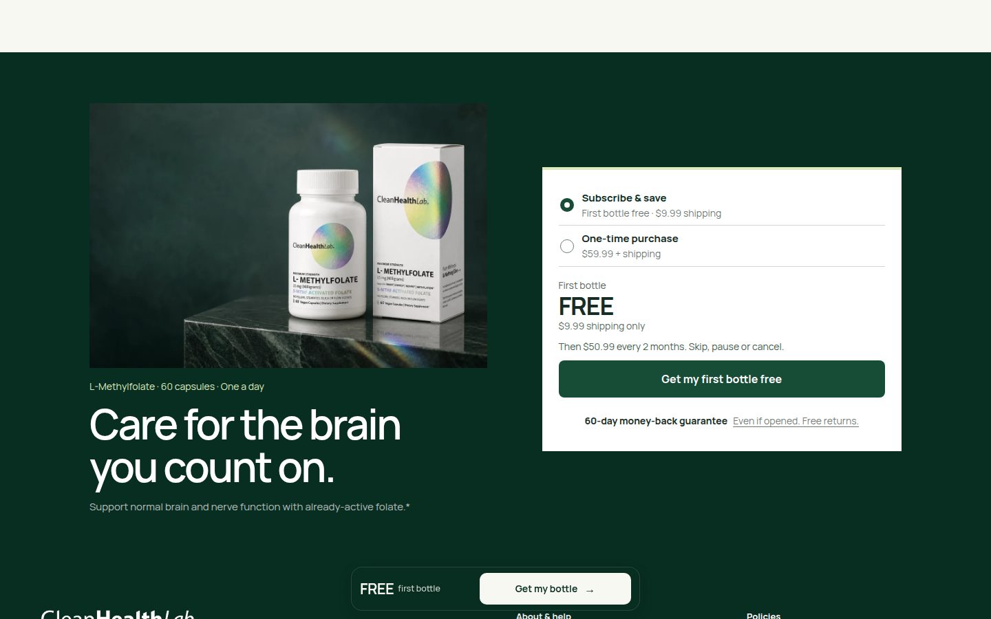
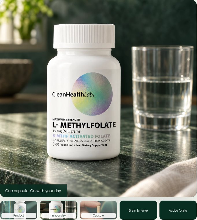
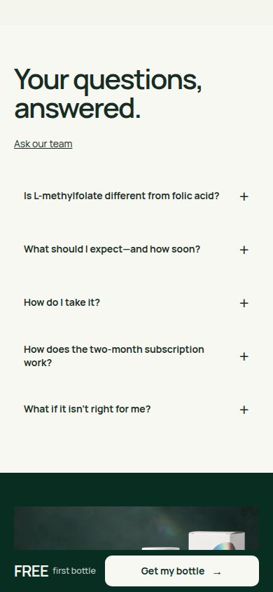
Strengths: controlled forest-green/cream contrast, expressive sans-serif and italic-serif pairing, and coordinated product photography create a polished hierarchy (asset-015.jpg, asset-017.jpg, asset-020.jpg). Ingredient callouts adapt thoughtfully from desktop to mobile (asset-004.jpg, asset-017.jpg). Flaws: the square, flat closing purchase panel feels disconnected from the rounded primary offer card (asset-016.jpg, asset-024.jpg); the floating CTA overlaps headings and review content in captured desktop states (asset-018.jpg, asset-031.jpg). Limitation: motion and transition quality are not observable.
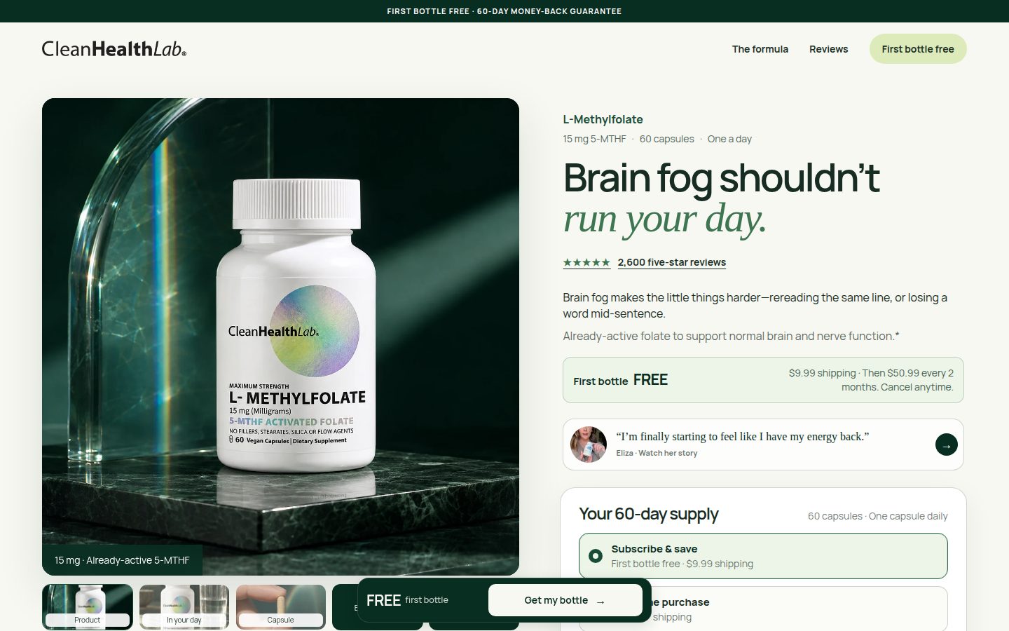
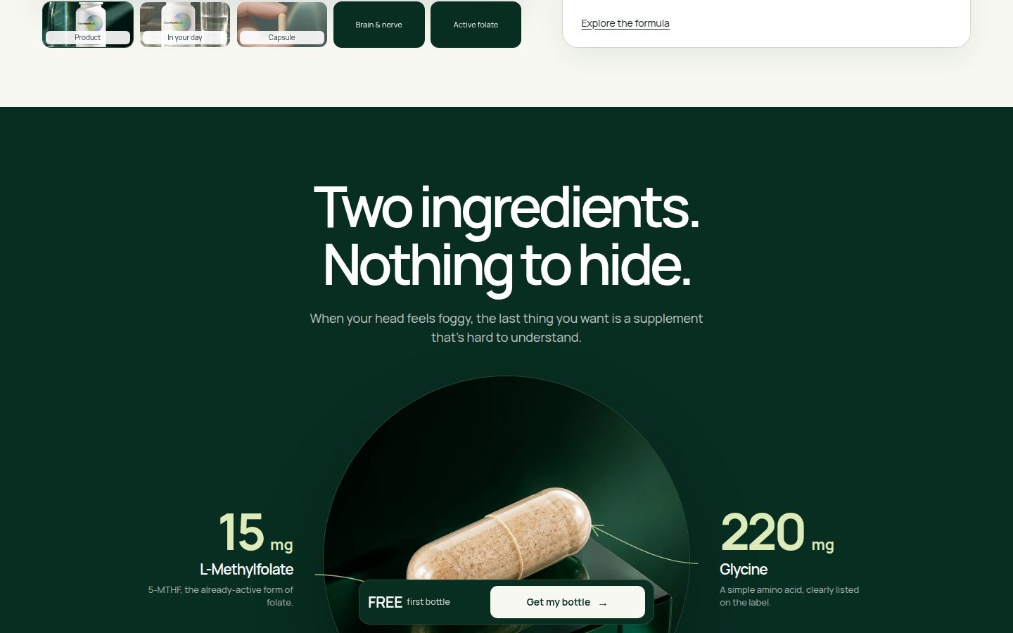

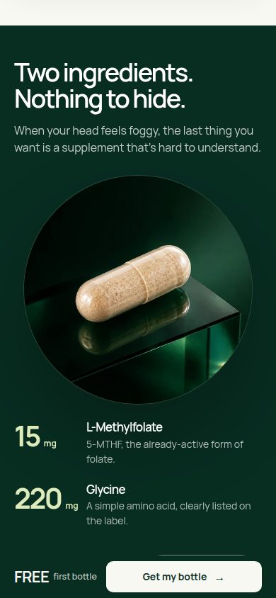
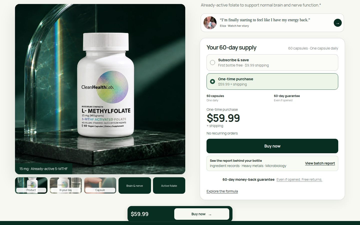
Brand distinctiveness — 8.1
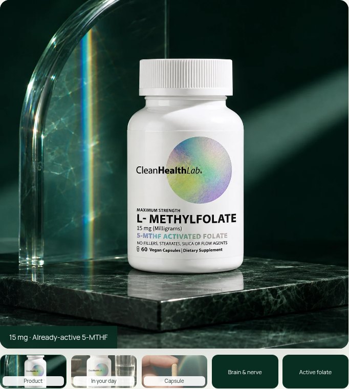
Strengths: emerald stone, refracted light, holographic packaging, and recurring editorial typography form a recognizable visual vocabulary (asset-015.jpg, asset-019.jpg, asset-041.jpg, asset-042.jpg). Flaws: that distinctive photographic vocabulary gives way to familiar pale cards and star-review layouts farther down the page (asset-021.jpg, asset-022.jpg); the closing offer loses some of the established component character (asset-024.jpg). Limitation: no competitive comparison evidence establishes category uniqueness.

Journey — 8.0
Strengths: the sequence moves coherently from problem and offer to ingredients, label/testing, customer stories, daily use, questions, and a closing purchase opportunity (asset-015.jpg through asset-024.jpg). Formula links and persistent purchase access support different reading paths. Flaws: video testimonials, a large featured review, and additional review cards lengthen the proof sequence; generous desktop spacing further slows scanning (asset-019.jpg, asset-021.jpg, asset-022.jpg). The floating CTA competes with content during that journey. Limitation: screenshots establish states, not navigation reliability or checkout completion.
Trust/proof — 8.0
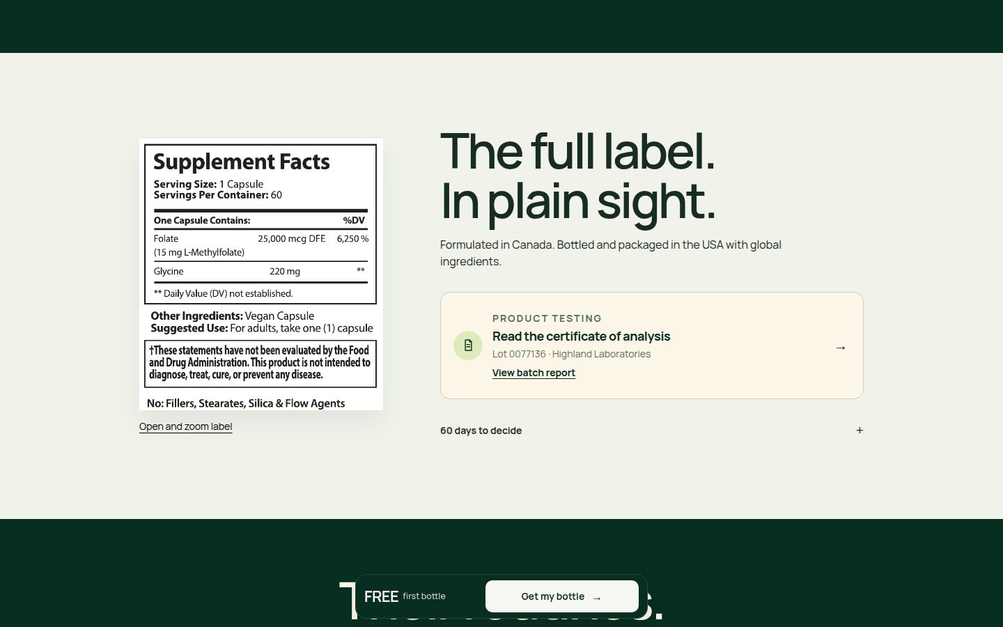
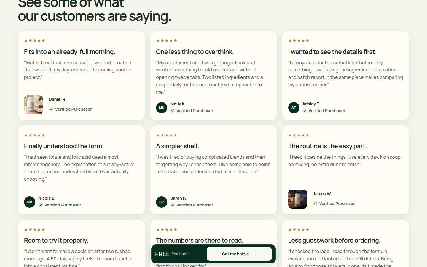
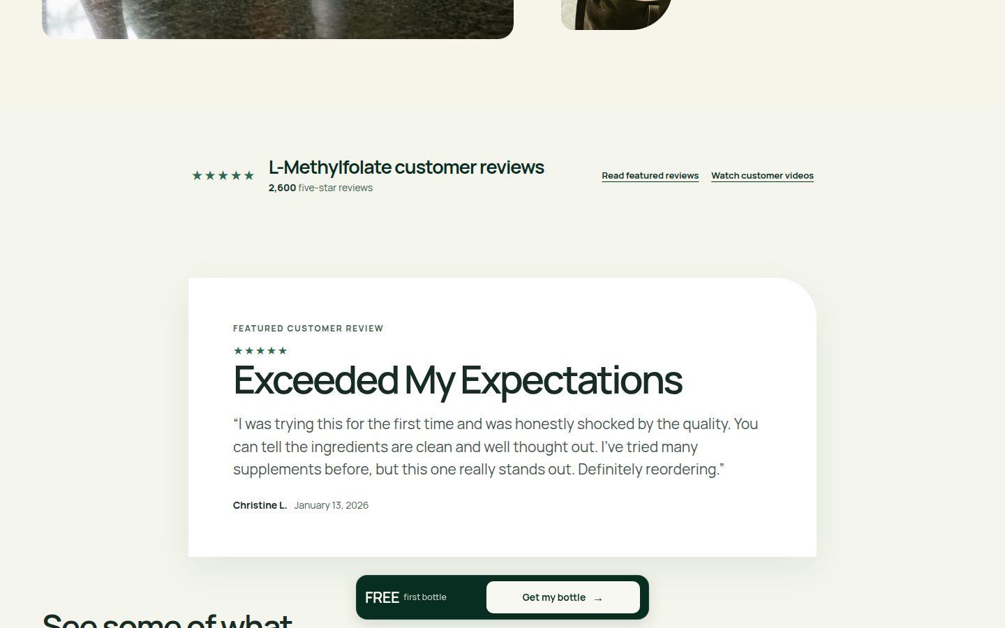
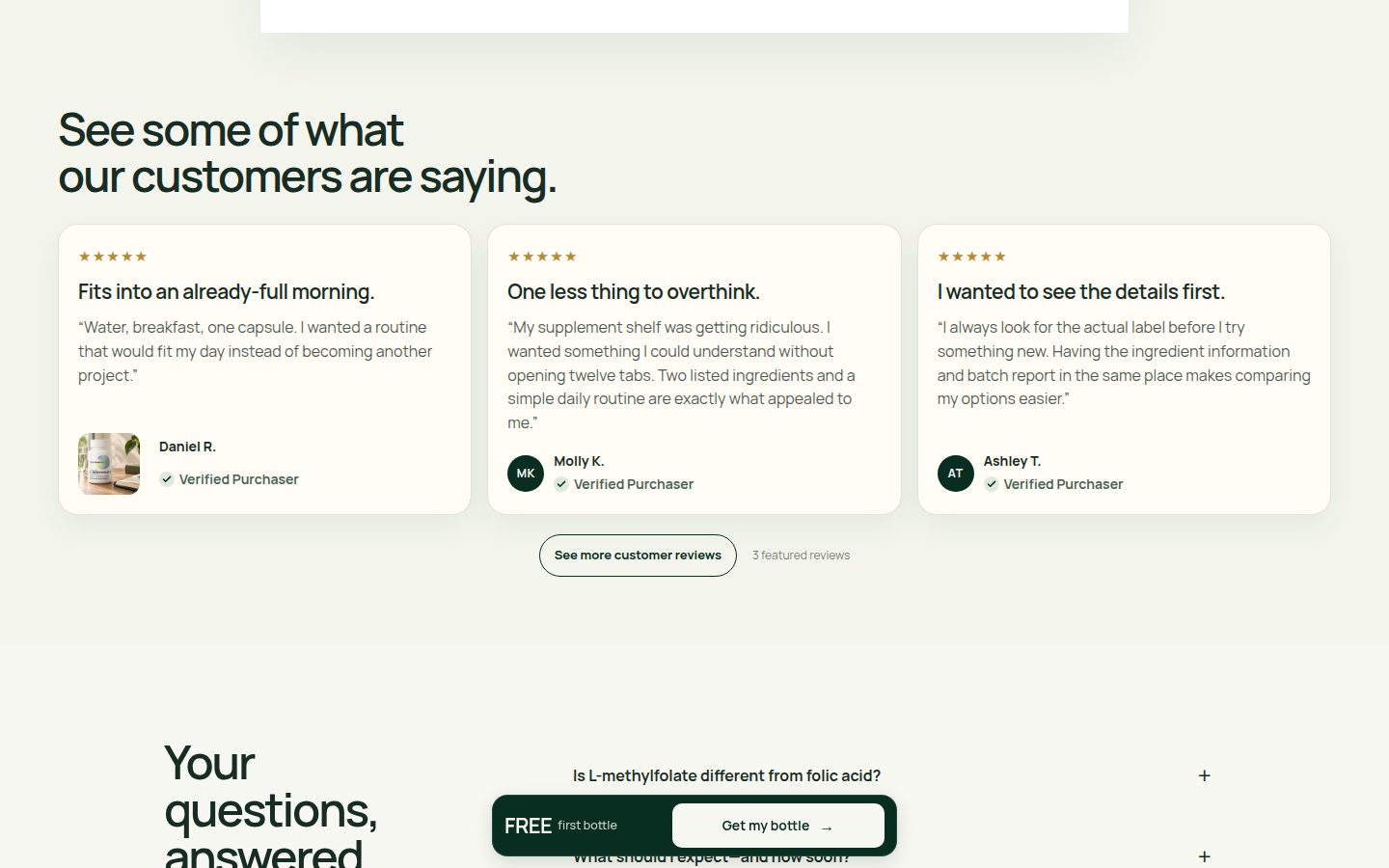
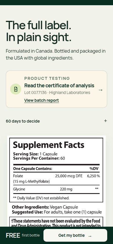
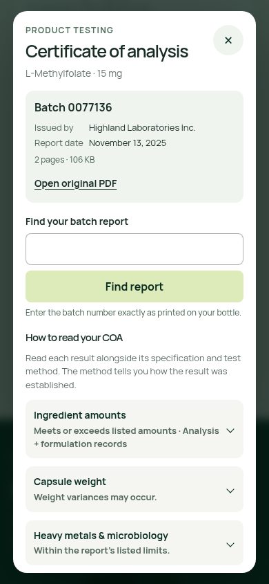
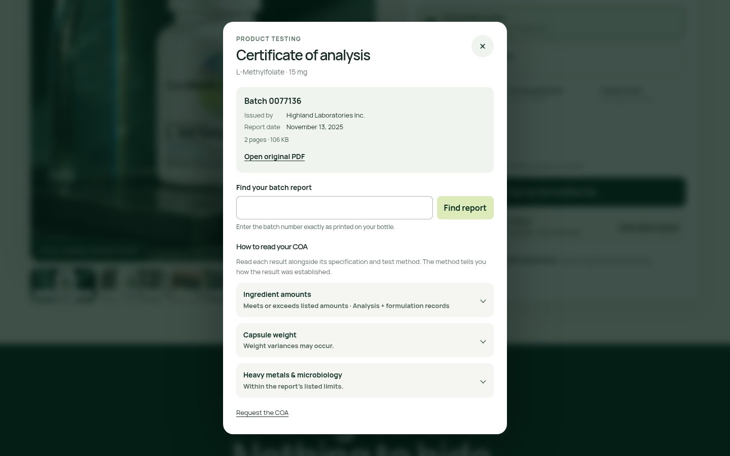
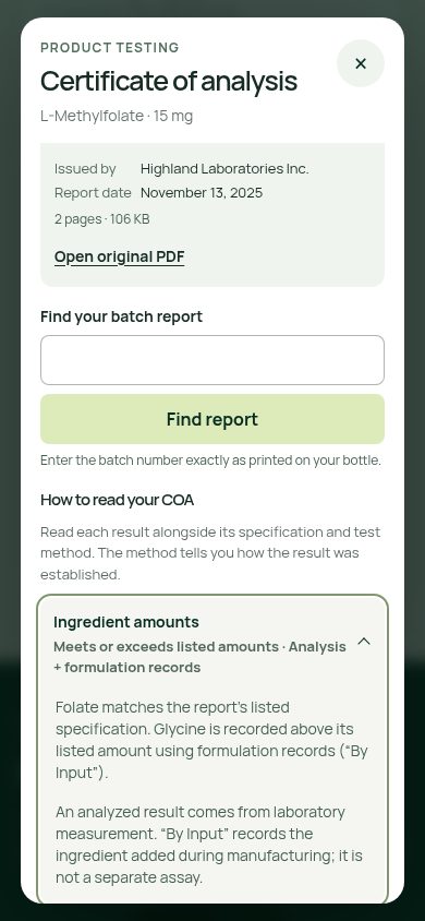
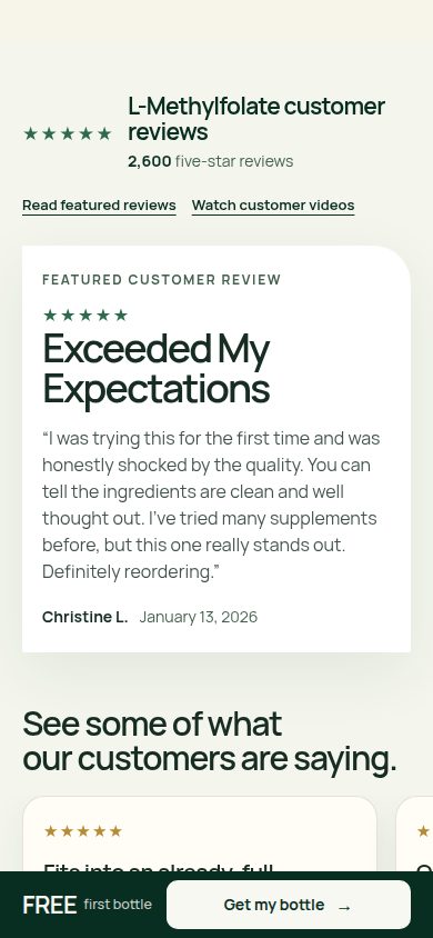
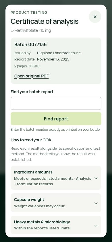
Strengths: the actual label, manufacturing-origin wording, named laboratory, batch number, report date, original-PDF link, and batch search make proof unusually concrete (asset-006.jpg, asset-018.jpg, asset-026.jpg, asset-034.jpg). Expanded copy explicitly distinguishes laboratory analysis from formulation records (asset-035.jpg). Testimonials include handles, original-source links, and purchaser badges (asset-007.jpg, asset-022.jpg). Flaw: the prominent '2,600 five-star reviews' claim has no visible source attribution or rating distribution alongside it, while displayed reviews remain uniformly positive (asset-010.jpg, asset-021.jpg, asset-031.jpg). Limitation: report contents, review authenticity, and verification methods cannot be confirmed from these captures.

Offer clarity — 8.4
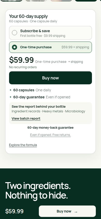
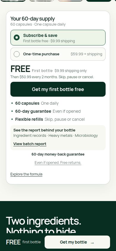
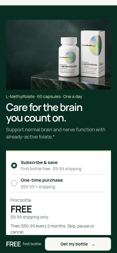
Strengths: both purchase modes clearly show selection, price, supply duration, and appropriate CTA wording; subscription captures disclose $9.99 initial shipping and $50.99 every two months, while one-time captures say no recurring orders (asset-002.jpg, asset-003.jpg, asset-016.jpg). Cancellation flexibility and opened-bottle returns are repeated near purchase controls. Flaw: the persistent subscription bar reduces the offer to 'FREE first bottle' without shipping or renewal context (asset-025.jpg, asset-029.jpg); one-time shipping is identified but unquantified (asset-002.jpg). Limitation: checkout totals and subsequent billing presentation are not supplied.
Mobile usability — 8.0
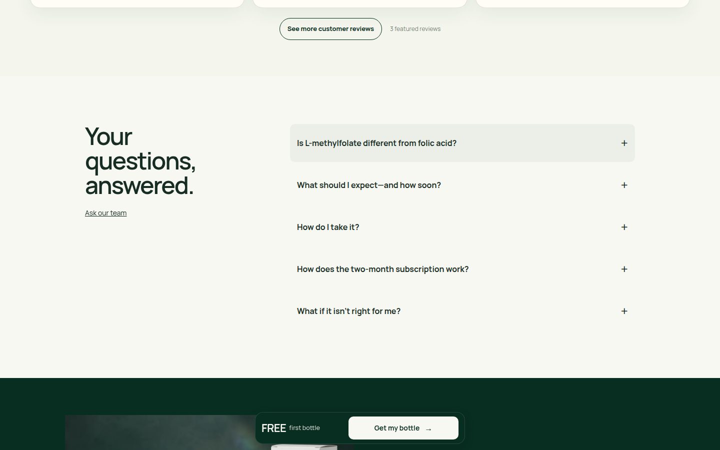
Strengths: readable headline wrapping at 360px, large purchase buttons, stacked offer controls, spacious FAQ rows, and a clearly labeled batch-report form show careful adaptation (asset-025.jpg, asset-029.jpg, asset-012.jpg, asset-026.jpg). Carousel previews and navigation communicate additional content (asset-028.jpg). Flaws: the fixed bottom bar occupies reading space and covers portions of label and review content at captured positions (asset-006.jpg, asset-027.jpg); secondary pricing and proof text is comparatively small and faint (asset-029.jpg, asset-035.jpg). Limitation: touch behavior, modal scrolling, keyboard access, and measured contrast are unverified.


Exact blockers
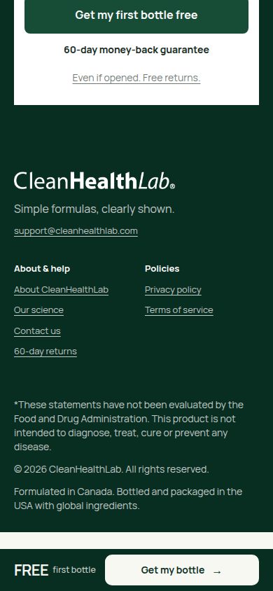
- The persistent purchase bar visibly competes with page content, covering a section heading and review text on desktop and label/review content on mobile (asset-018.jpg, asset-031.jpg, asset-006.jpg, asset-027.jpg). Its subscription state also omits shipping and renewal context. Highest-impact fix: revise sticky visibility and placement to avoid overlapping active content or visible purchase controls, and include a compact subscription-cost disclosure.
- The closing purchase panel breaks the established visual system: its square white container and plain divided rows contrast with the rounded, softly bordered primary offer card (asset-003.jpg, asset-013.jpg, asset-016.jpg, asset-024.jpg). Highest-impact fix: reuse the primary offer component's container, selection styling, spacing, and typography for the closing offer.
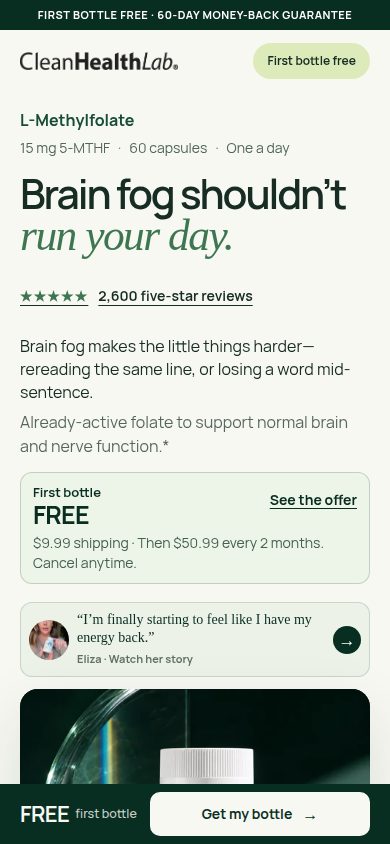
- The headline review count is more specific than the visible supporting review presentation: '2,600 five-star reviews' appears without an adjacent source or rating breakdown, while expanded cards show only five-star selections (asset-010.jpg, asset-021.jpg, asset-031.jpg). Highest-impact fix: connect the aggregate to a clearly attributed review collection with total count, rating distribution, and accessible sorting or filtering.
Evidence limitations
- Assessment is limited to the supplied screenshots and displayed states; no live interaction or checkout was tested.
- Measured performance is unknown because no performance evidence was supplied.
- Linked reports, original testimonials, return policies, and most expanded FAQ answers were not supplied; their contents and accuracy are unverified.
- Static captures do not establish whether overlapped content becomes fully accessible through scrolling or whether modal focus and keyboard behavior work correctly.
- Packaging/gallery comparison images were used for visual consistency and displayed gallery-state assessment, not scored as separate page designs.
- No conversion outcomes, review authenticity, clinical efficacy, authorship, or release history are inferred.
Journey lens — scores, evidence and exact blockers
Visual craft — 8.6
Strengths: controlled green/cream colors, expressive sans/italic typography, consistent image treatment and strong desktop balance (asset-015.jpg, asset-017.jpg, asset-019.jpg, asset-020.jpg). Flaws: spacious review sections slow the visual rhythm, and the square white closing offer feels less integrated than the rounded primary purchase card (asset-021.jpg, asset-024.jpg versus asset-016.jpg). Limits: screenshots establish static appearance, not animation quality or rendering stability.
Brand distinctiveness — 8.2
Strengths: iridescent packaging, dark stone photography and repeated curved silhouettes create recognizable continuity across hero, formula and lifestyle sections (asset-015.jpg, asset-004.jpg, asset-020.jpg). Flaws: the generic featured-review treatment and repeated simplicity language contribute less distinctive brand character (asset-021.jpg, asset-022.jpg, asset-031.jpg). Limits: category-wide uniqueness and packaging fidelity beyond the supplied views cannot be established.
Journey — 8.0
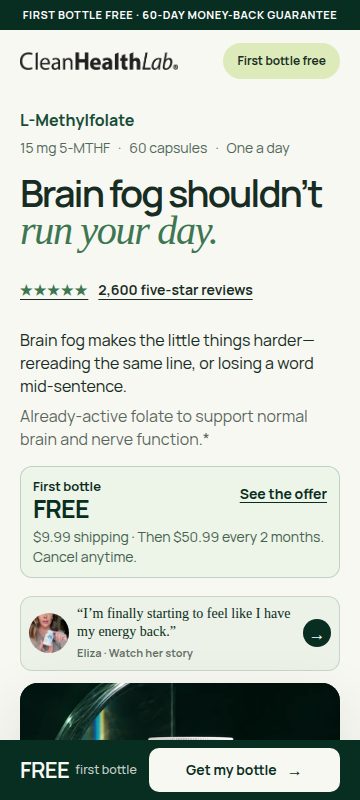
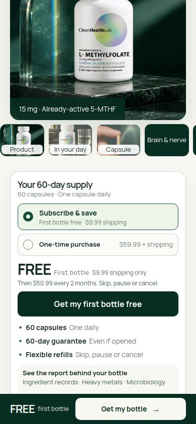
Strengths: the sequence connects the problem to the offer, ingredients, label evidence, customer stories, routine, FAQs and a final purchase opportunity; formula/review links provide shortcuts (asset-015.jpg through asset-024.jpg). Flaws: on mobile, introductory copy, offer teaser, testimonial and product gallery precede the full purchase selector; multiple testimonial sections lengthen the route to FAQs (asset-001.jpg, asset-029.jpg, asset-007.jpg through asset-012.jpg). Limits: captured alternate states demonstrate available presentations, not successful navigation or checkout completion.
Trust/proof — 8.2
Strengths: a readable label, named laboratory and batch, original-PDF link, attributed videos, purchaser badges, contact information and explicit return reassurance make evidence discoverable (asset-018.jpg, asset-028.jpg, asset-031.jpg, asset-034.jpg, asset-014.jpg). The expanded COA explanation distinguishes laboratory measurement from formulation records particularly well (asset-035.jpg). Flaws: the prominent 2,600 five-star claim is contextualized by selected positive reviews rather than a visible rating distribution or total review count (asset-010.jpg, asset-022.jpg, asset-031.jpg). Limits: review authenticity, report contents, scientific substantiation and fulfillment of guarantees are unverified.
Offer clarity — 8.4
Strengths: purchase cards clearly distinguish subscription from one-time purchase, disclose $9.99 initial shipping and $50.99 every two months, and state cancellation flexibility; the one-time state shows $59.99 and no recurring orders (asset-002.jpg, asset-003.jpg, asset-016.jpg, asset-024.jpg). Flaws: the persistent subscription CTA emphasizes FREE without repeating shipping or recurring commitment when the explanatory card is offscreen (asset-008.jpg, asset-012.jpg, asset-020.jpg). Limits: checkout totals, taxes and subsequent shipping charges are not established by the supplied states.
Mobile usability — 8.0
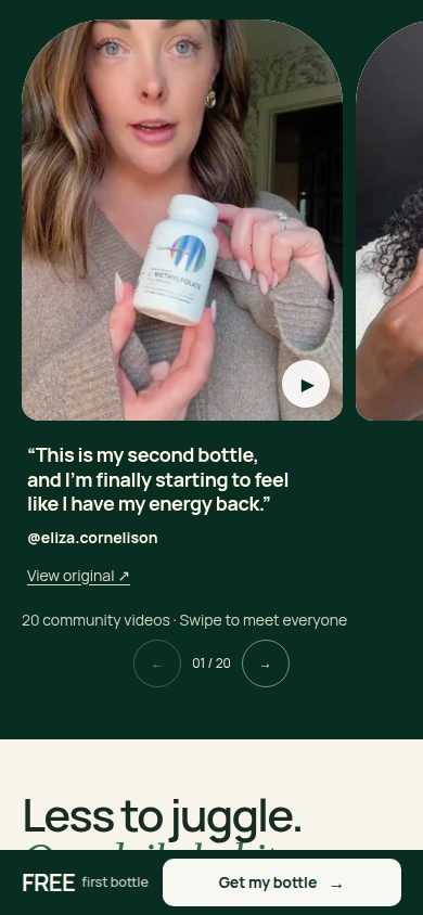
Strengths: readable headings, broad purchase controls, stacked content, visible carousel continuation and a well-organized COA modal adapt effectively to narrow screens (asset-003.jpg, asset-025.jpg, asset-028.jpg, asset-026.jpg). Flaws: the fixed purchase bar covers portions of headings, label content and routine copy in captured scroll positions; small secondary text also requires more effort than the main hierarchy (asset-003.jpg, asset-006.jpg, asset-009.jpg, asset-029.jpg). Limits: covered content is not proven unreachable; keyboard behavior, touch response, screen-reader support and modal scrolling are untested.

Exact blockers
- The mobile journey delays the full purchase decision until after the introduction, testimonial and large gallery (asset-001.jpg, asset-025.jpg, asset-029.jpg). Highest-impact fix: place a compact subscription/one-time selector with complete pricing directly after the introductory offer, keeping the gallery available immediately afterward.
- The persistent FREE CTA loses the shipping and subscription context supplied by the purchase cards (asset-003.jpg versus asset-008.jpg, asset-012.jpg, asset-020.jpg). Highest-impact fix: include concise initial-cost and renewal terms in the persistent offer, maintaining the selected purchase mode across all purchase surfaces.
- The persistent purchase bar visibly competes with page content and duplicates the purchase action even when a full purchase card is onscreen (asset-003.jpg, asset-006.jpg, asset-009.jpg, asset-029.jpg). Highest-impact fix: collapse it while a primary purchase button is visible and provide sufficient scroll clearance for section targets and final content.
Evidence limitations
- Assessment uses all supplied static images in sequence, including supplementary offer, gallery, review and COA states; product imagery is not scored as a separate page.
- Measured performance is unknown; no loading, responsiveness or layout-shift measurements were supplied.
- Screenshots do not verify CTA destinations, checkout completion, offer synchronization, batch lookup results, video playback or cancellation workflows.
- Original laboratory documents, review provenance and expanded science/FAQ answers were not supplied for verification.
- Accessibility behavior and viewport sizes beyond those supplied remain untested. No conversion lift or commercial outcome is inferred.
Trust lens — scores, evidence and exact blockers
Visual craft — 8.7
Strengths: disciplined green/cream colors, expressive sans/italic typography, polished product photography and generous alignment create a cohesive presentation (evidence/asset-015.jpg, evidence/asset-017.jpg, evidence/asset-020.jpg). Flaws: the square closing purchase panel departs from the rounded primary panel, and the review section has disproportionately large vertical gaps (evidence/asset-024.jpg, evidence/asset-016.jpg, evidence/asset-021.jpg). Limitation: screenshots establish static composition, not animation quality.
Brand distinctiveness — 8.2
Strengths: holographic packaging, dark stone, refracted light and recurring editorial typography form a recognizable visual vocabulary (evidence/asset-015.jpg, evidence/asset-019.jpg, evidence/asset-024.jpg). Flaws: repeated simplicity/routine messaging and standard star-review cards are less distinctive than the product imagery (evidence/asset-020.jpg, evidence/asset-022.jpg, evidence/asset-031.jpg). Limitation: no competitor comparison is supplied, so market uniqueness is unverified.
Journey — 8.0
Strengths: the page progresses from problem and offer through ingredients, label/testing, customer experience, routine guidance, FAQs and a closing purchase opportunity; proof links sit directly in the purchase panel (evidence/asset-001.jpg through evidence/asset-014.jpg, evidence/asset-016.jpg). Flaws: video testimonials, routine guidance, a featured review and another review collection prolong the route to FAQs; desktop review spacing adds further distance (evidence/asset-019.jpg through evidence/asset-023.jpg). Limitation: supplied states do not establish navigation behavior or checkout completion.
Trust/proof — 7.8
Strengths: the readable label, manufacturing-origin disclosure, named laboratory, batch number, report date and original-PDF link provide specific accountability (evidence/asset-018.jpg, evidence/asset-034.jpg). The expanded explanation explicitly distinguishes laboratory analysis from glycine formulation records, an unusually useful qualification (evidence/asset-035.jpg). Customer handles, original-source links and clear opened-bottle return language reinforce trust (evidence/asset-028.jpg, evidence/asset-016.jpg). Flaws: the prominent 2,600 five-star-review claim leads into curated positive reviews without a visible overall rating distribution or review-source explanation (evidence/asset-021.jpg, evidence/asset-022.jpg, evidence/asset-031.jpg). Limitation: report authenticity, review verification and clinical substantiation cannot be established from these screenshots.
Offer clarity — 8.2
Strengths: purchase panels clearly distinguish the free first subscription bottle with $9.99 shipping and $50.99 two-month refills from the $59.99 one-time option; the alternate state explicitly says no recurring orders (evidence/asset-002.jpg, evidence/asset-003.jpg, evidence/asset-016.jpg). Quantity, cadence, cancellation flexibility and guarantee are repeated near purchase controls. Flaws: the persistent FREE/Get my bottle bar omits shipping and subscription terms when those disclosures are outside the viewport; one-time shipping is also unspecified (evidence/asset-008.jpg, evidence/asset-012.jpg, evidence/asset-002.jpg). Limitation: checkout totals and the sticky button's destination are not supplied.
Mobile usability — 8.1
Strengths: readable single-column layouts, broad offer selectors, large purchase buttons, carousel previews and a well-organized testing modal translate effectively to narrow screens (evidence/asset-025.jpg, evidence/asset-029.jpg, evidence/asset-028.jpg, evidence/asset-033.jpg). Flaws: the first mobile viewport barely introduces the product image, while the persistent purchase bar visibly covers lower-page content in several states (evidence/asset-001.jpg, evidence/asset-025.jpg, evidence/asset-006.jpg, evidence/asset-027.jpg). Limitation: touch behavior, keyboard access, modal focus management and readability under zoom are untested.
Exact blockers
- The review presentation does not visibly contextualize the prominent 2,600 five-star-review claim: the supplied review sections show curated five-star entries without an overall distribution or identified collection source (evidence/asset-021.jpg, evidence/asset-022.jpg, evidence/asset-031.jpg). Highest-impact fix: add the overall rating, total review count, rating distribution and review-source/verification explanation beside the claim, with access to the complete review set.
- The persistent FREE offer loses its material qualifications away from purchase panels: shipping and recurring billing are absent from the bar while it remains actionable throughout the page (evidence/asset-008.jpg, evidence/asset-012.jpg, evidence/asset-020.jpg). Highest-impact fix: include a compact '$9.99 shipping; then $50.99 every 2 months' disclosure in the subscription bar and carry the selected offer consistently into the next step.
- The persistent purchase bar visibly overlays evidence readers are inspecting, including the label and review content, and also covers desktop testimonial text (evidence/asset-006.jpg, evidence/asset-027.jpg, evidence/asset-019.jpg). Highest-impact fix: reserve space for the purchase control or collapse it during proof exploration so supporting content remains unobstructed.
Evidence limitations
- All supplied attachments were inspected as static evidence. Alternate offer, gallery, carousel, review and modal states show rendered outcomes, not independently verified interactions.
- Measured performance is unknown; no loading, responsiveness or other performance measurements were supplied.
- The original certificate PDF, batch-search results and full testing details are not shown. The review assesses their presentation, not laboratory authenticity or product quality.
- Most FAQ answers and the science disclosure remain collapsed. Their contents, including any suitability or dosage explanation, are unknown and were not treated as absent.
- Customer identities, verified-purchaser methodology, testimonial relationships and the 2,600-review count were not independently verified.
- Checkout, final shipping charges, subscription management and return-policy execution are outside the supplied evidence.
- Packaging and gallery close-ups support consistency comparisons; they were not scored as separate page designs. No conversion or commercial outcomes are inferred.
Evidence limits
The review is based on static screenshots. It does not measure loading speed, conversion, checkout behavior, link destinations, review authenticity, laboratory findings, benefit substantiation, or assistive-technology behavior. The visible floating bar overlaps content in supplied screenshots; that does not prove the underlying content is unreachable by scrolling.
Before the judge run, all 10 gallery states—five slides at 390 pixels and five at 1440 pixels—were captured after settling and measured at their exact target offsets. Visible community-video posters were also allowed to load after scrolling before capture. No page bytes changed during capture or review.