Headline fit
Same words, same two fonts. What changes: the pain statement is bold and sits on deliberate lines; the payoff line is italic, regular weight, a step smaller and lighter, with air above it; line height is looser; the widest line fills about 92% of the phone width at every width, so the line count no longer jumps between phones and the type is not crowding the edges.
Open the real page on your phone: antidepressant · brain fog · ADHD · 3 AM. Nothing is on the store.
Antidepressant


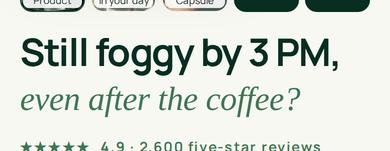
Brain fog

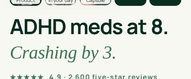
ADHD

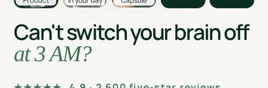
Anxiety / 3 AM

The numbers
| Font px | Lines | Widest line | Offer button bottom (px) | |
|---|---|---|---|---|
| Antidepressant 360 | 31.7 | 3 | 92% | 664 to 695 |
| Antidepressant 390 | 34.7 | 3 | 92% | 665 to 706 |
| Antidepressant 430 | 38.7 | 3 | 92% | 692 to 748 |
| Brain fog 360 | 34.9 | 2 | 93% | 654 to 667 |
| Brain fog 390 | 38.1 | 2 | 92% | 655 to 675 |
| Brain fog 430 | 42.5 | 2 | 92% | 682 to 713 |
| ADHD 360 | 39.2 | 2 | 92% | 654 to 677 |
| ADHD 390 | 42.8 | 2 | 93% | 655 to 686 |
| ADHD 430 | 44 | 2 | 85% | 682 to 717 |
| Anxiety / 3 AM 360 | 37.3 | 2 | 91% | 687 to 671 |
| Anxiety / 3 AM 390 | 40.8 | 2 | 92% | 655 to 678 |
| Anxiety / 3 AM 430 | 44 | 2 | 89% | 682 to 714 |
"Widest line" is how much of the content width the longest line fills. The last column is where the first-screen offer button ends, before and after; a phone with a visible height of about 660 px loses the button below the fold when it passes that. Fonts load before the fit runs, and it re-fits on rotate and resize. The earlier, larger fit (99% of the width, tight lines, both parts the same size) is retired. The night headline now breaks "Can't switch your / brain off at 3 AM?" (same words). Desktop keeps its current sizes.