Evidence and scorecards
1. Loop Earplugs valid
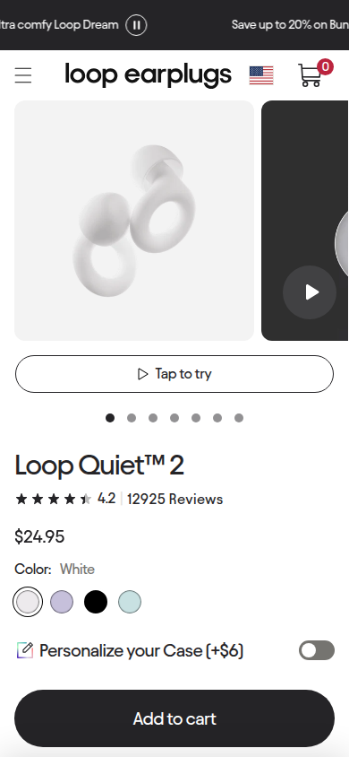
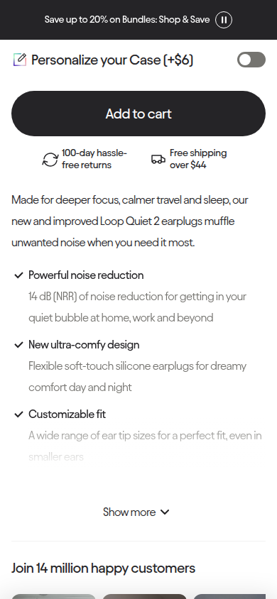
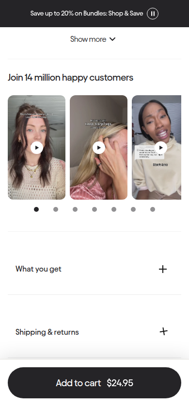
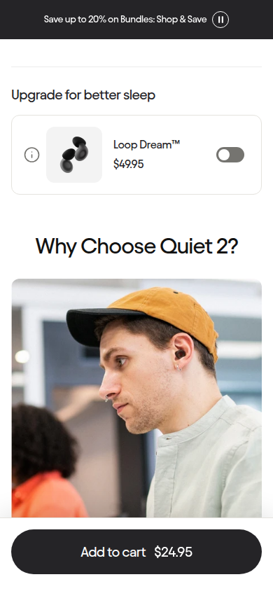
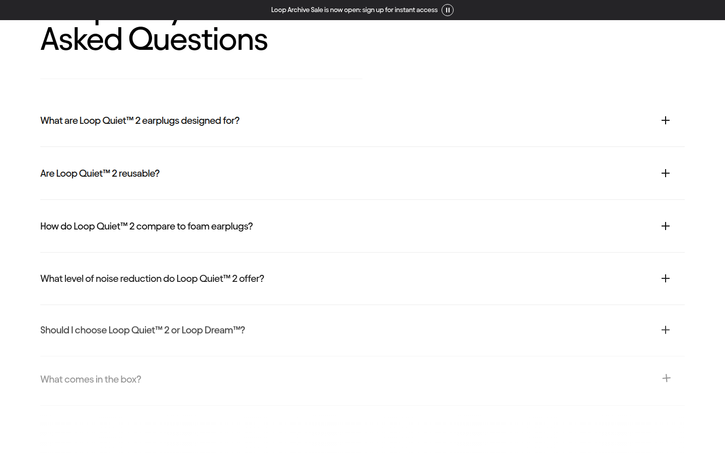
Quiet 2 core earplug PDP Sampled official PDP
Judge A · craft-led: 8.37/10
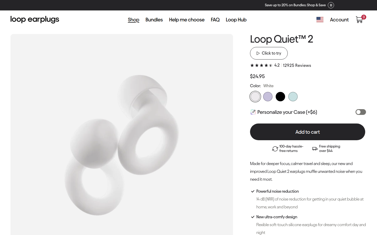
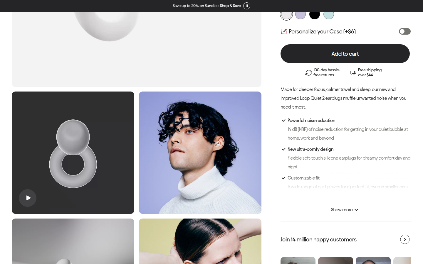
| Craft | 8.4 | Controlled image grid, generous white space, and clear purchase controls feel deliberately art-directed; the type and component system remains composed through long-form content. evidence evidence |
|---|
| Identity | 8.6 | The soft sculptural product photography, black-and-white system, rounded media corners, and concise wordmark form a consistent, recognizable world. evidence evidence |
|---|
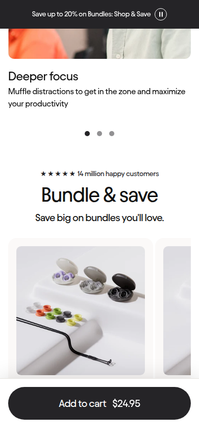
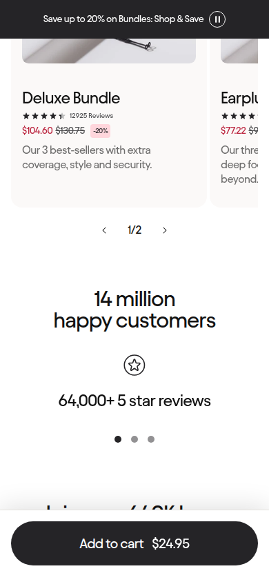
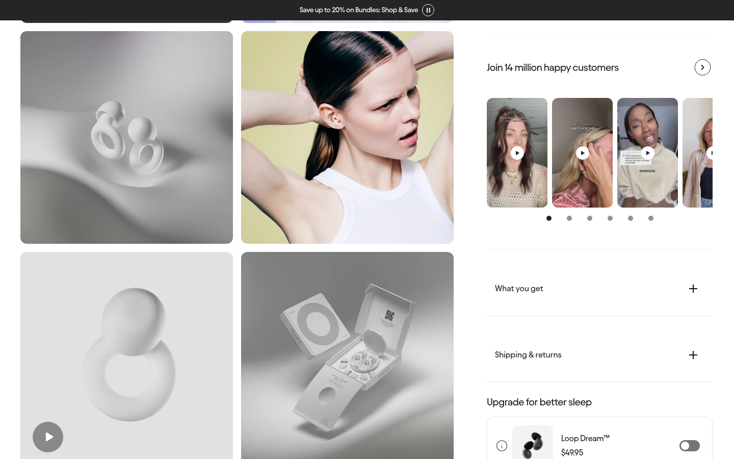
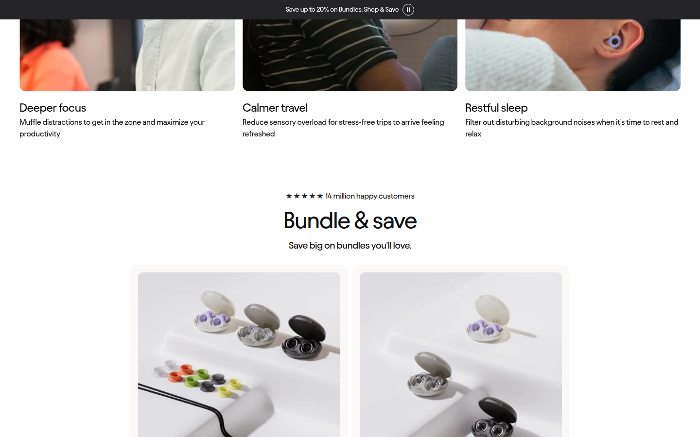
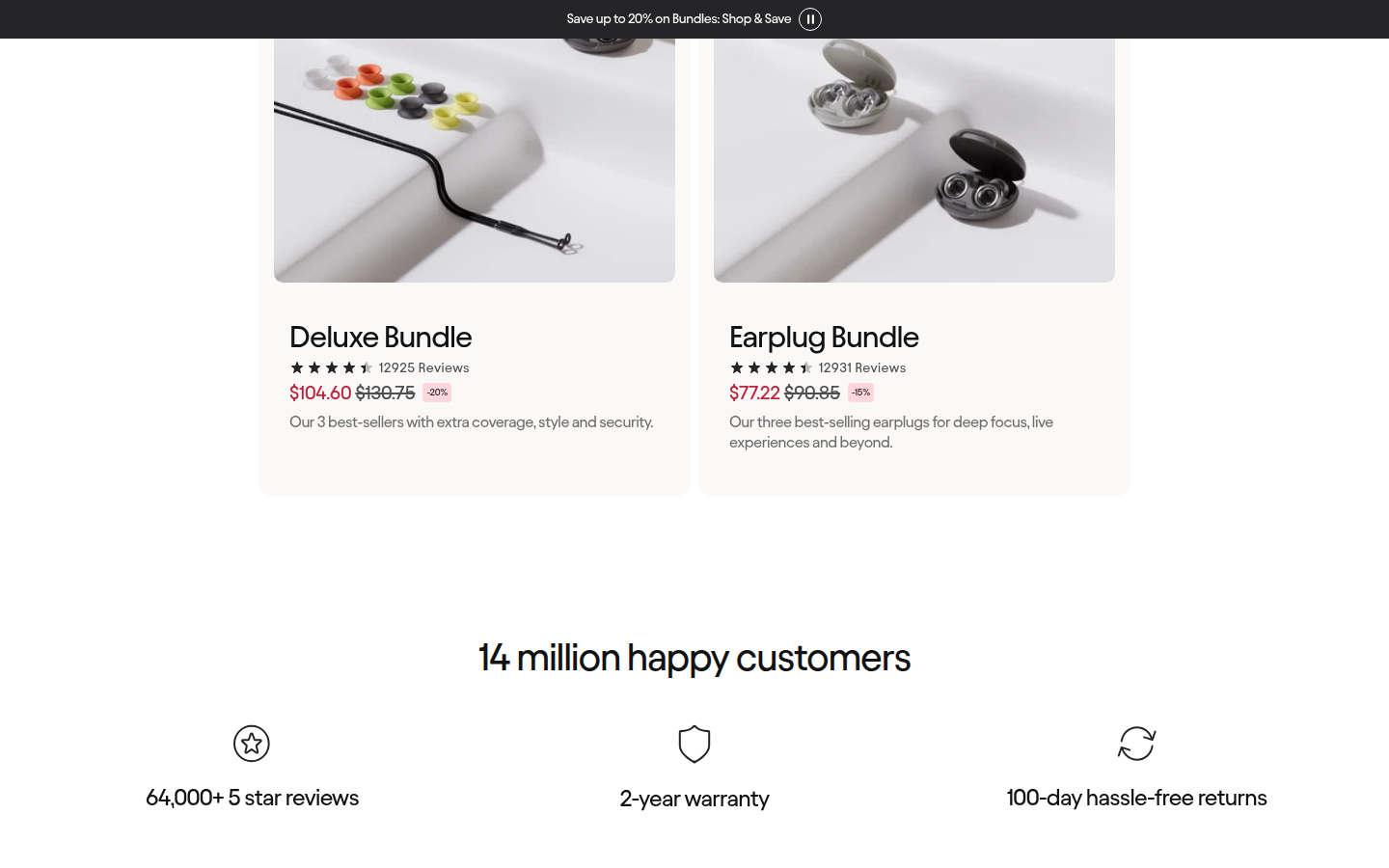
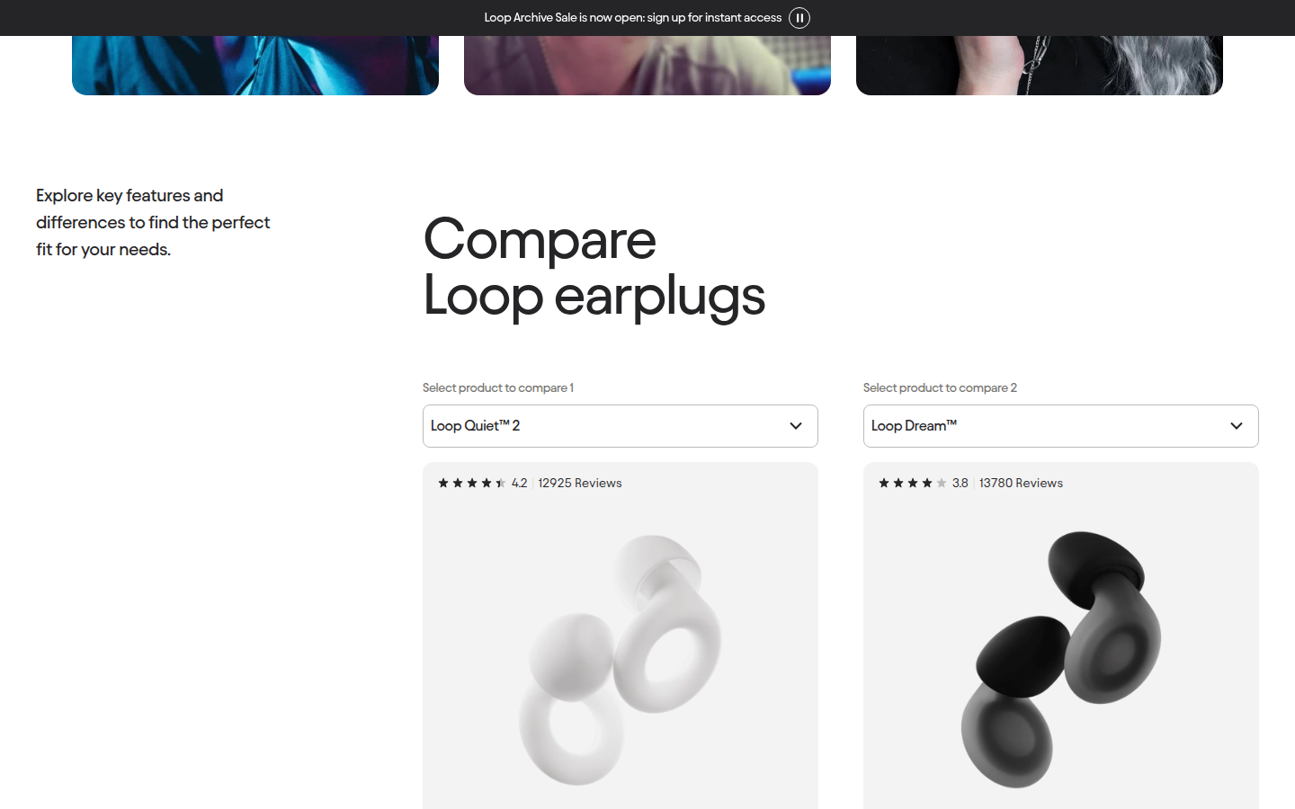
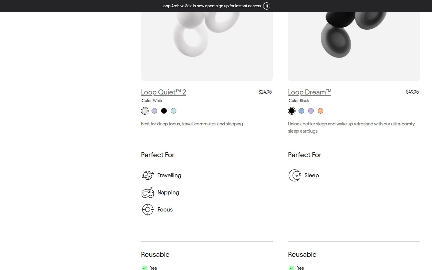
| Journey | 8.4 | The page progresses from decision controls to use cases, bundles, proof, comparison, reviews, and FAQ with enough visual change to sustain a long scroll. evidence evidence evidence |
|---|
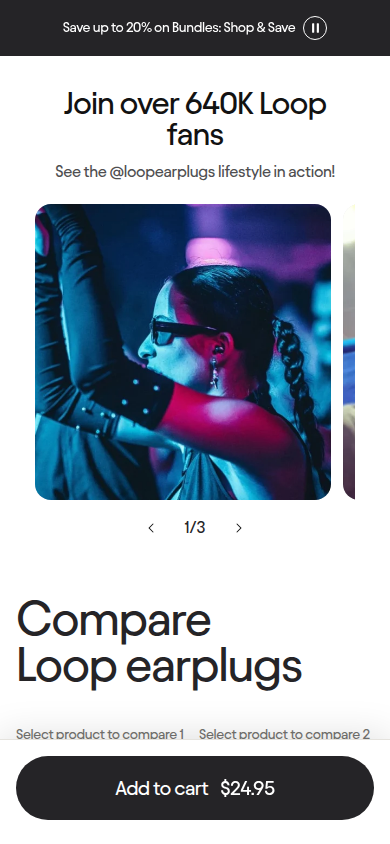
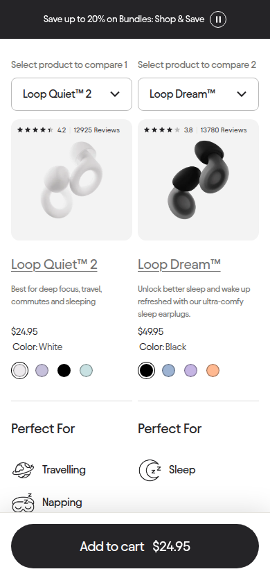
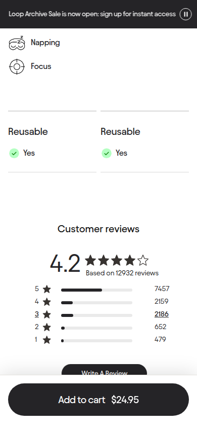
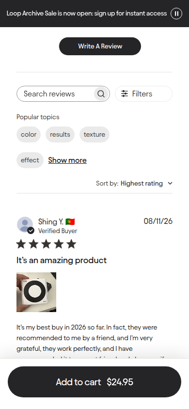
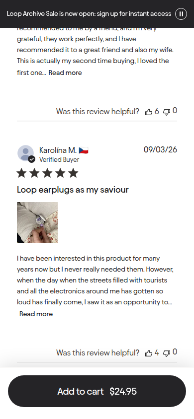
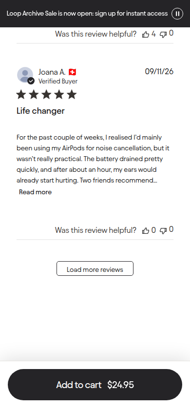
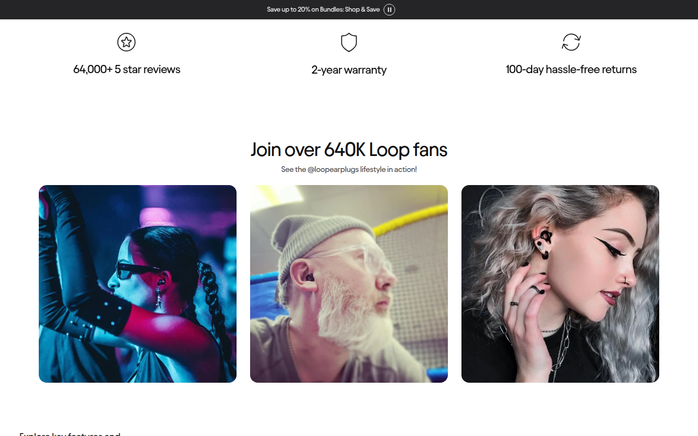
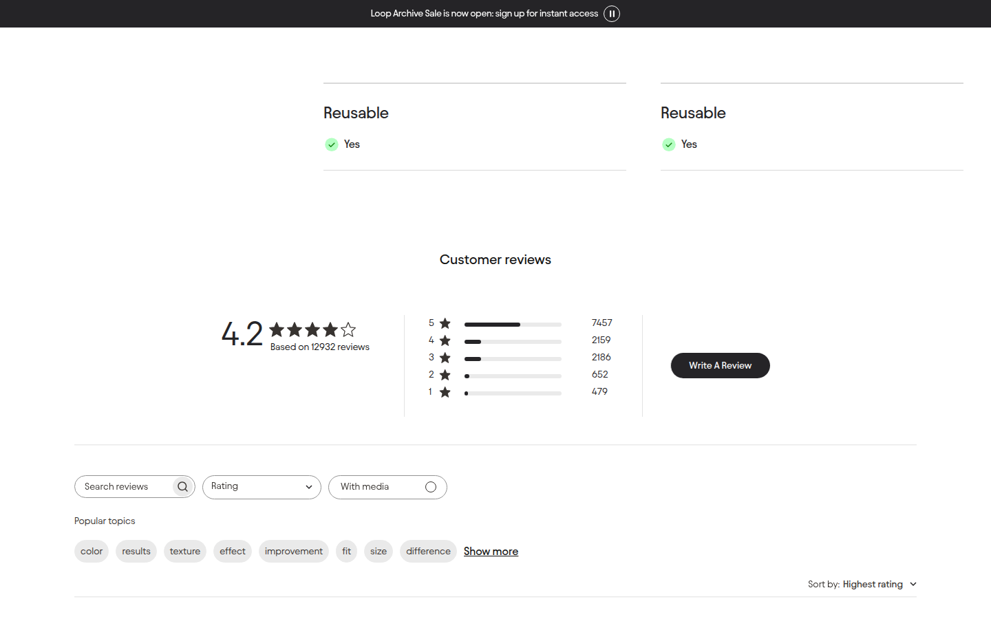
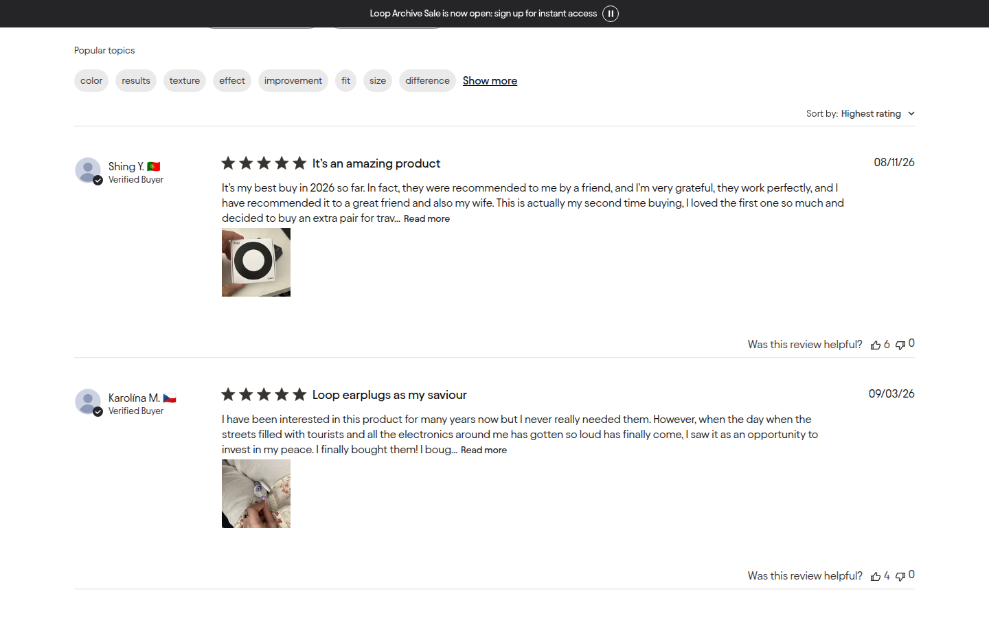
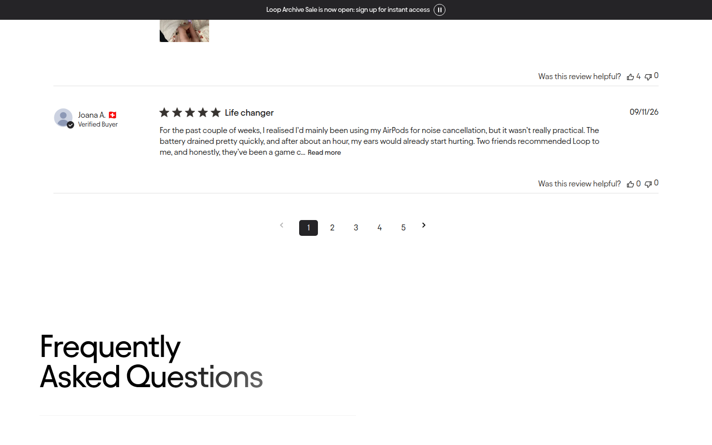
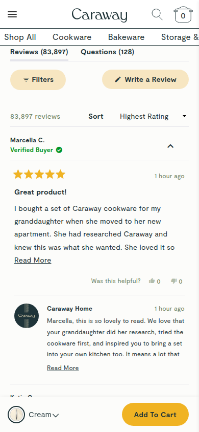
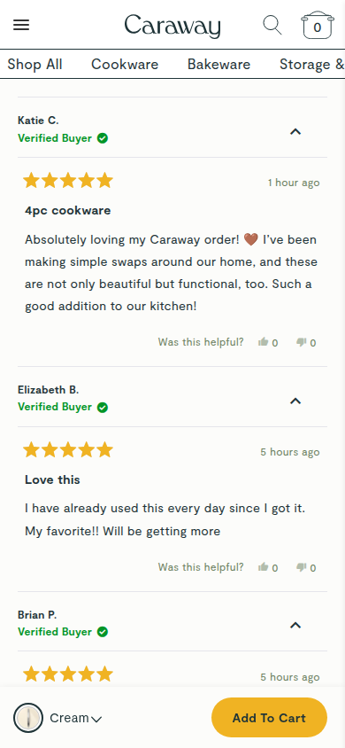
| Trust | 8.4 | Return and warranty terms, review count and breakdown, verified-buyer labels, review photos, and specific product comparison are visible and integrated cleanly. evidence evidence |
|---|
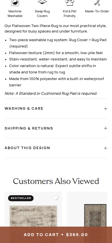
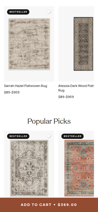
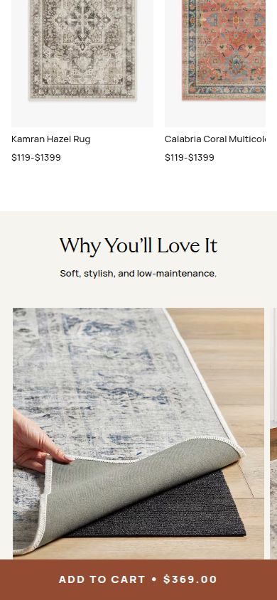
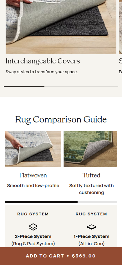
| Offer | 8.0 | Price, color selection, personalization, returns, shipping threshold, and bundle savings are easy to scan; the promotional ticker remains visually persistent and slightly competes with the product story. evidence evidence |
|---|
| Mobile | 8.1 | The sticky cart and compact selection flow are strong, with readable sections and useful comparison; carousel crops and the repeated fixed ticker reduce calmness in the dense middle scroll. evidence evidence evidence |
|---|
Strengths
- A coherent visual system carries from hero product art through the footer.
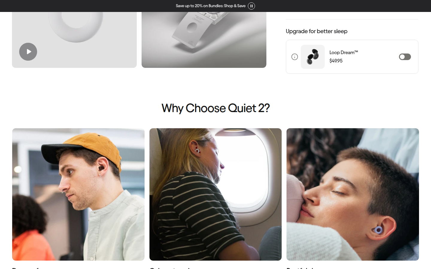
- Use-case photography makes the benefits legible without interrupting the purchase path.
- Proof is unusually substantive: reviews, warranty, returns, UGC, and product comparison all receive space.
Priorities
- Reduce ticker prominence or frequency once shoppers leave the purchase decision area.
- Give mobile carousels a clearer edge treatment so partially visible cards read as intentional navigation.
- Condense the very long FAQ-to-footer tail with stronger thematic grouping.
Limitations
- Judgment is limited to supplied static journey captures; interactions, expanded accordions, video playback, and checkout were not assessed.
Judge B · journey-led: 8.71/10
| Craft | 8.7 | The very pale product on the near-white opening background loses some immediate shape and contrast. evidence evidence evidence |
|---|
| Identity | 8.6 | It has a clear, coherent brand character, although the opening product image is visually subdued. evidence evidence evidence |
|---|
| Journey | 8.6 | Comparison arrives after a substantial run of social, lifestyle and bundle content, so a detail-oriented shopper has to travel farther to resolve fit. evidence evidence evidence evidence |
|---|
| Trust | 8.8 | The rendered evidence makes reassurance easy to find; this score assesses presentation only. evidence evidence evidence |
|---|
| Offer | 9.0 | The buying decision is unusually explicit and low-friction in the captured views. evidence evidence evidence |
|---|
| Mobile | 8.7 | The sticky purchase bar is effective but reduces the reading window over a long content sequence. evidence evidence evidence |
|---|
Strengths
- Exceptionally clear product configuration and purchase controls.
- A consistent, recognizable visual system across a very long PDP.
- Strong visible reassurance through reviews, customer content and post-purchase policies.
Priorities
- Give the pale hero product more contrast or a clearer contextual cue at first glance.
- Surface product comparison or fit guidance earlier for visitors deciding among Loop types.
- Reduce the amount of lower-page content obscured by the mobile sticky purchase bar.
Limitations
- All 16 mobile and 15 desktop supplied frames were visually inspected. Assessment is limited to those rendered captures.
2. AG1 blocked
AG1 pouch product detail Sampled official PDP
Unscored: Vercel Security Checkpoint; no valid visual evidence.
3. Ridge blocked
Ridge Wallet Gunmetal core product Sampled official PDP
Unscored: Cloudflare block; no valid visual evidence.
4. HexClad blocked
12pc set described by brand as best-selling Sampled official PDP
Unscored: Cloudflare security verification; no valid visual evidence.
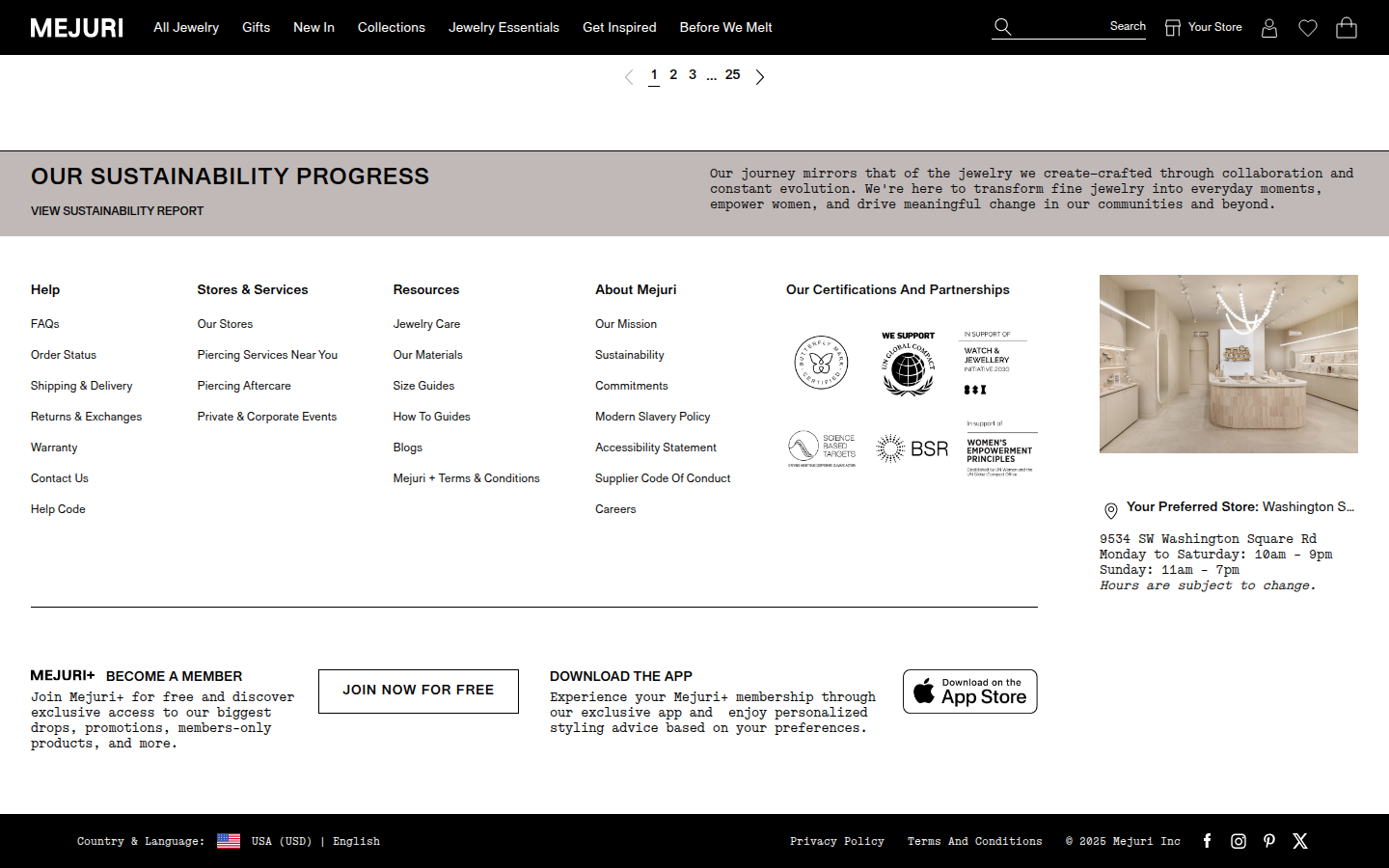
5. Mejuri valid
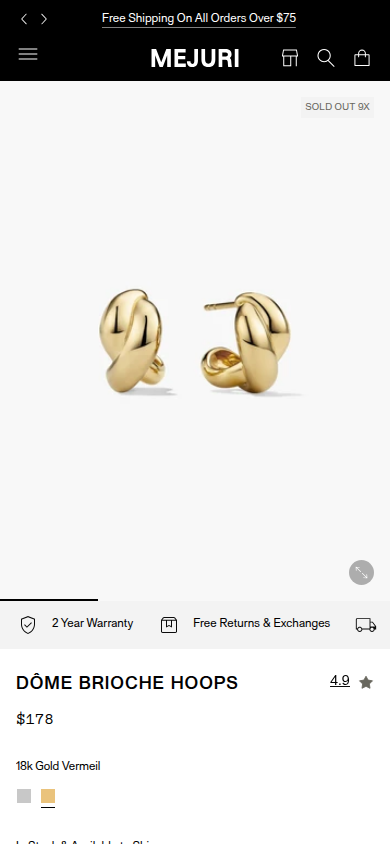
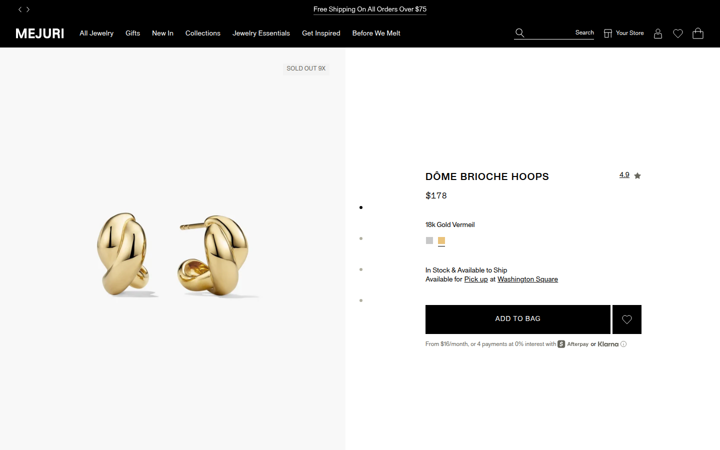
Dome Brioche Hoops signature collection Sampled official PDP
Judge A · craft-led: 7.48/10
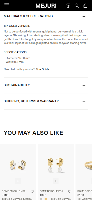
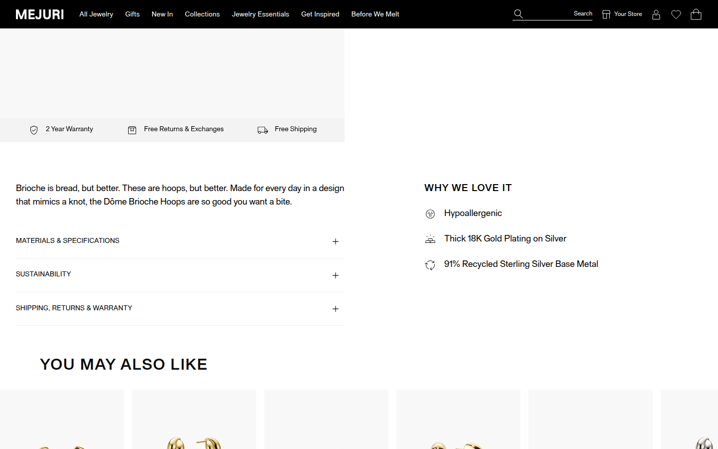
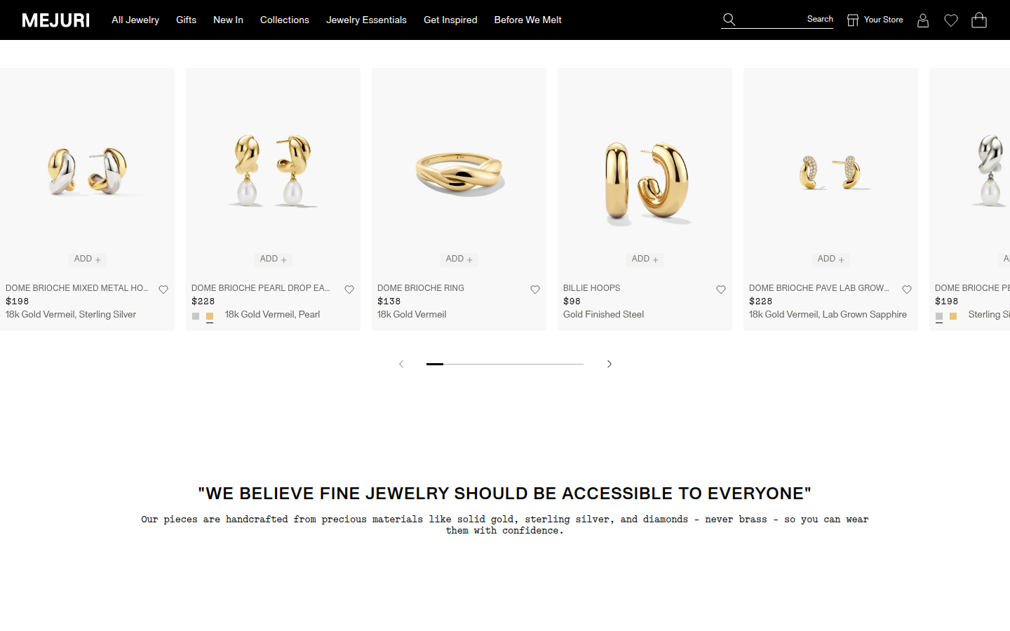
| Craft | 7.2 | Jewelry imagery and the spare black/white system are polished, but broad blank planes and intentionally ellipsized product-card names make portions feel mechanically laid out rather than carefully composed. evidence evidence evidence |
|---|
| Identity | 8.2 | The strict monochrome navigation, all-caps grotesk, monospaced explanatory voice, and quiet product photography make an identifiable fine-jewelry world. evidence evidence evidence |
|---|
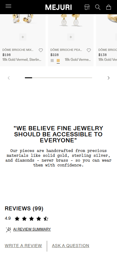
| Journey | 6.6 | The essential product facts arrive clearly, then the progression moves quickly into recommendations, mission text, and reviews with limited visual or narrative build. evidence evidence evidence evidence |
|---|
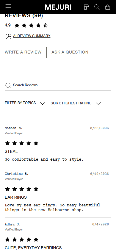
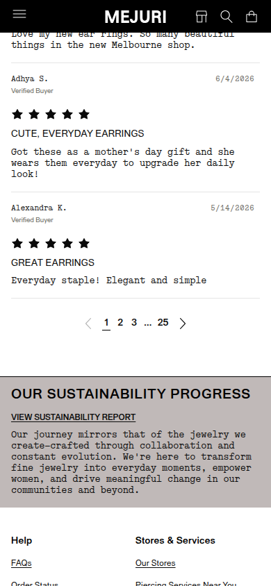
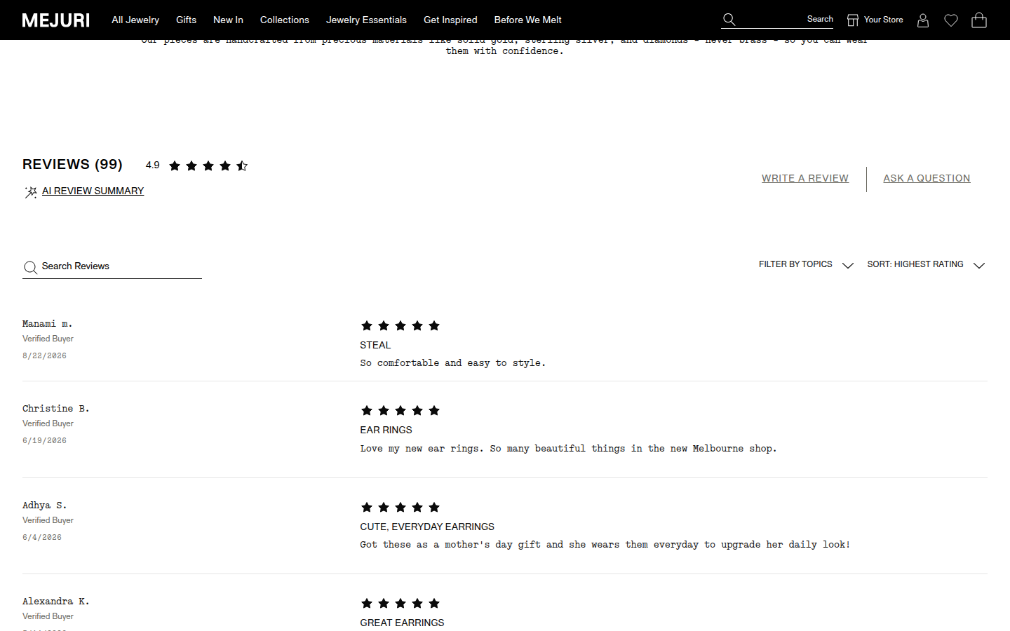
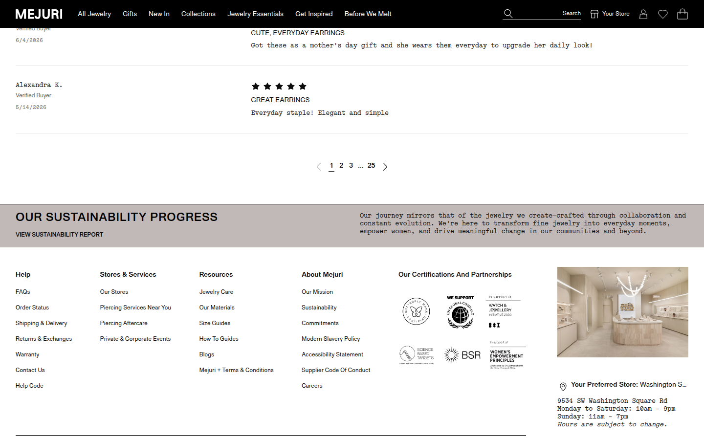
| Trust | 7.5 | Warranty, returns, materials detail, verified-buyer reviews, filters, and care/sustainability links create substantive reassurance, though the review surface is visually utilitarian. evidence evidence evidence evidence |
|---|
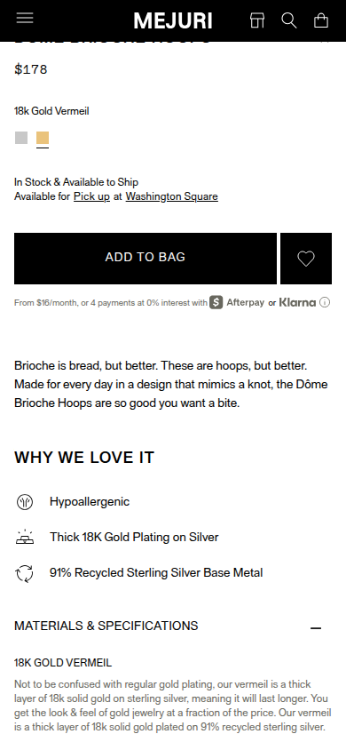
| Offer | 8.4 | Price, material choice, stock, pickup, finance option, and bag action are easy to locate and understand. evidence evidence evidence |
|---|
| Mobile | 7.5 | Mobile maintains a strong primary action and readable specifications. Deliberate recommendation-name ellipses and a long text-heavy lower journey reduce refinement. evidence evidence evidence evidence |
|---|
Strengths
- Crisp product photography and consistently controlled monochrome visual language.
- Clear purchase state and reassurance near the buy decision.
- Transparent materials and review presentation.
Priorities
- Give the post-buy story a more deliberate visual and narrative sequence before recommendations and reviews.
- Use shorter recommendation names or supporting labels where deliberate ellipses make products harder to identify.
- Reduce utilitarian density in the review and footer regions with more considered grouping and hierarchy.
Limitations
- Score covers supplied rendered stills only; no interaction, checkout, claim, product-fidelity, or performance certification.
- Some secondary recommendation images were incomplete in the capture manifest; scoring does not penalize their unavailable imagery.
Judge B · journey-led: 8.00/10
| Craft | 7.9 | The jewelry photography, grid, sharply controlled black-and-white shell, and type hierarchy are clean and expensive-feeling. The lower page relies on long, lightly structured white fields, so its finish is less composed than its opening. evidence evidence evidence |
|---|
| Identity | 8.4 | The spare palette, editorial product isolation, direct voice, and monospaced supporting copy establish a consistent recognizable retail identity from hero through footer. evidence evidence evidence |
|---|
| Journey | 7.6 | The product, options, benefits, specifications, recommendations, mission, and reviews form a readable sequence. The recommendation rail arrives before the product evidence has accumulated much depth, and the mission-to-reviews transition leaves substantial empty space. evidence evidence evidence evidence |
|---|
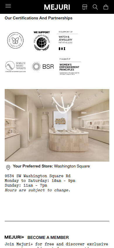
| Trust | 8.2 | Warranty, returns, material specifications, sustainability access, review count, visible Verified Buyer labels, review search/filtering, and certifications are all present in the sampled flow. Most proof appears as text and badges rather than integrated product-level evidence. evidence evidence evidence evidence |
|---|
| Offer | 8.2 | Price, selected material, availability, pickup, financing, warranty/returns, and a dominant Add to Bag control are clear at the point of decision. The material choice is visually modest and its selection state is communicated mostly by a small underline. evidence evidence |
|---|
| Mobile | 7.7 | The mobile layout preserves hierarchy, readable specifications, a usable review section, and a coherent footer. The persistent header takes vertical space and the dense lower information/recommendation sequence requires sustained scrolling without a parallel purchase prompt. evidence evidence evidence evidence |
|---|
Strengths
- A highly coherent, restrained jewelry identity.
- The first-screen product and purchase decision are unusually clean.
- Review and material reassurance remain visible and readable on mobile.
Priorities
- Use the large lower-page fields to strengthen product-specific proof before cross-sells.
- Bring a compact purchase re-entry point into the long mobile middle journey.
- Make material selection state more immediately legible.
Limitations
- Reviewed every supplied readable mobile390 and desktop1440 frame only.
- Several offscreen recommendation image requests were incomplete in the manifest; the visible frames remained readable and were not treated as a page defect.
- No interaction, checkout, accessibility, provenance, or commercial-performance claim is made.
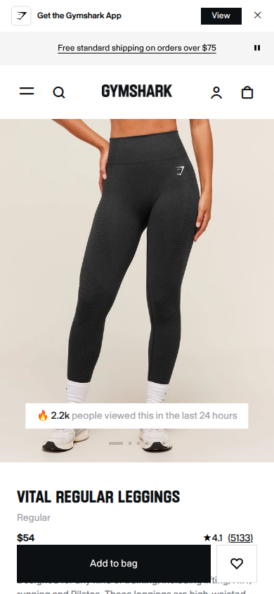
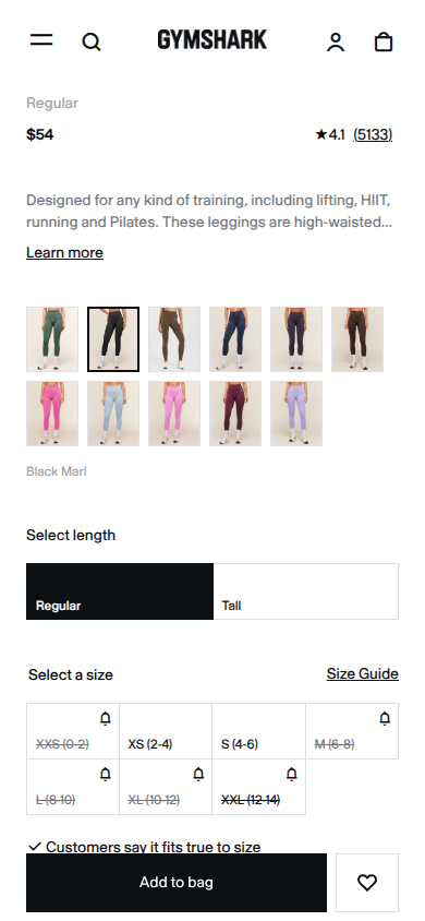
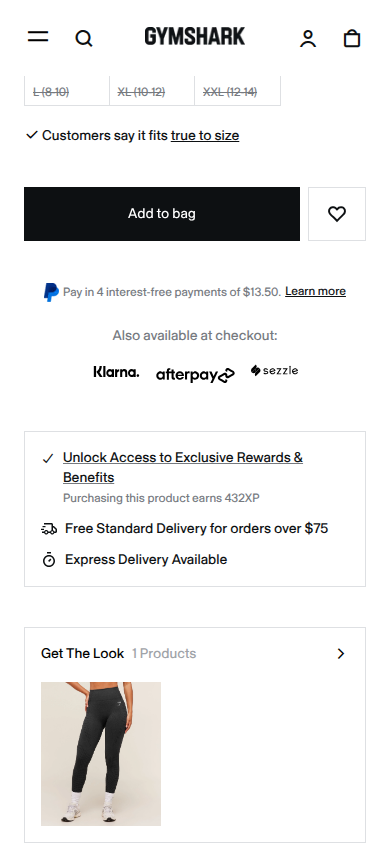
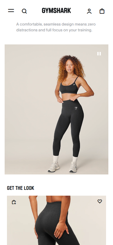
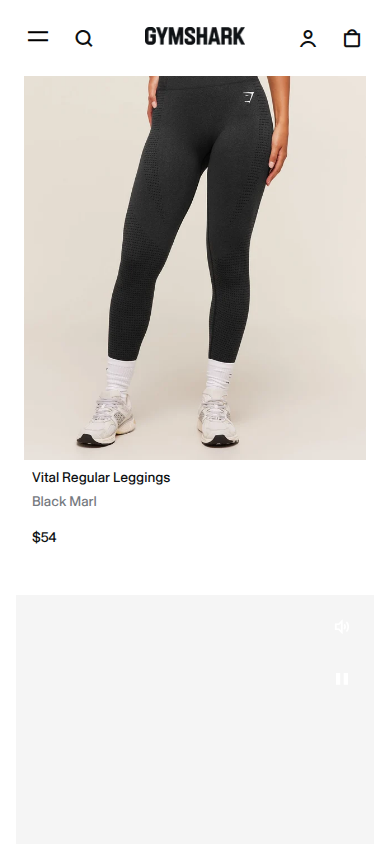
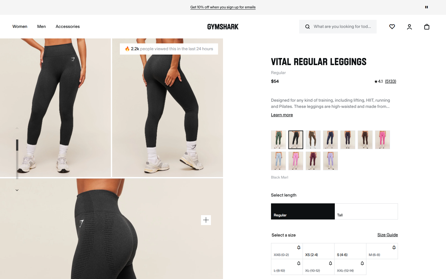
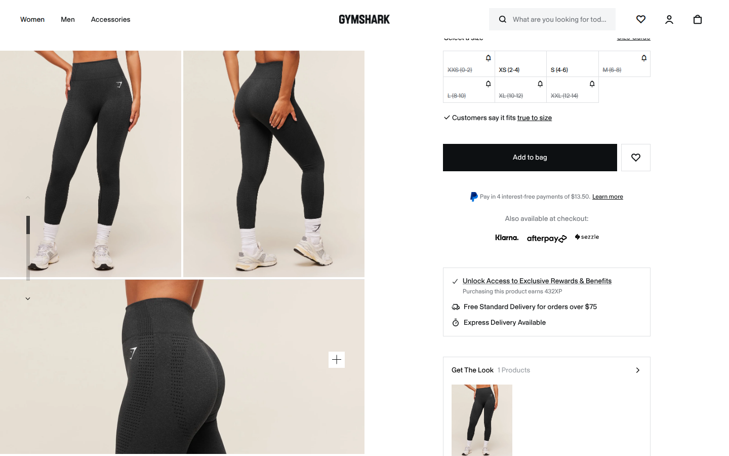
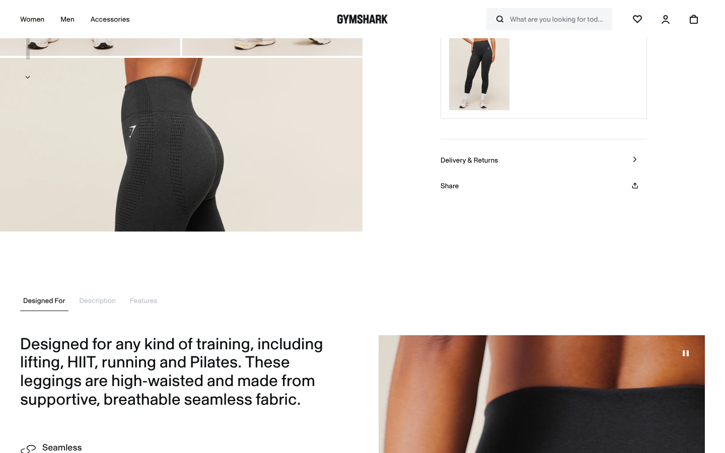
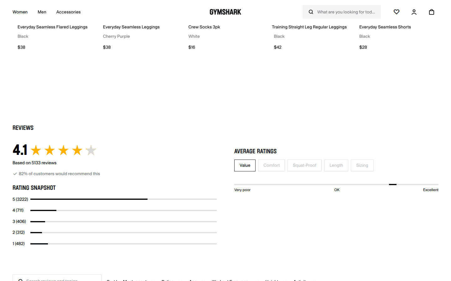
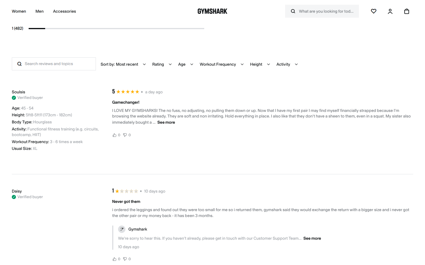
6. Gymshark unavailable
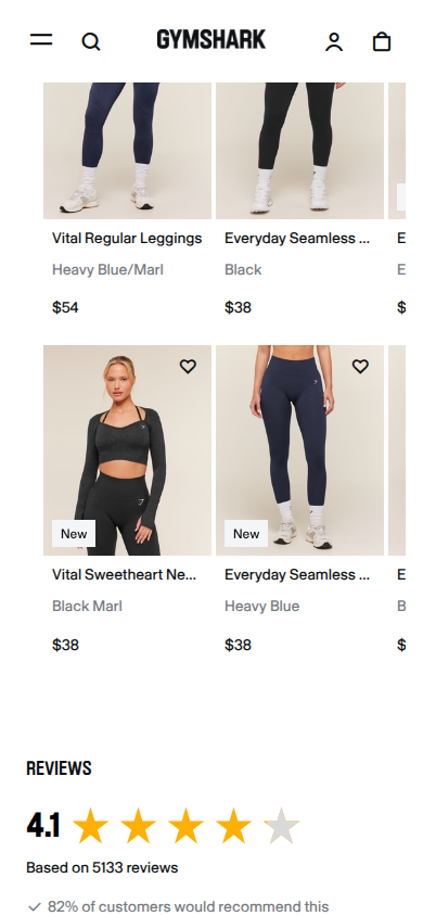
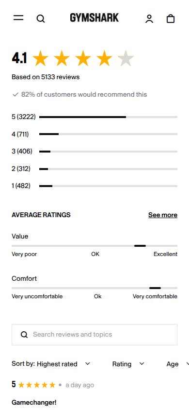
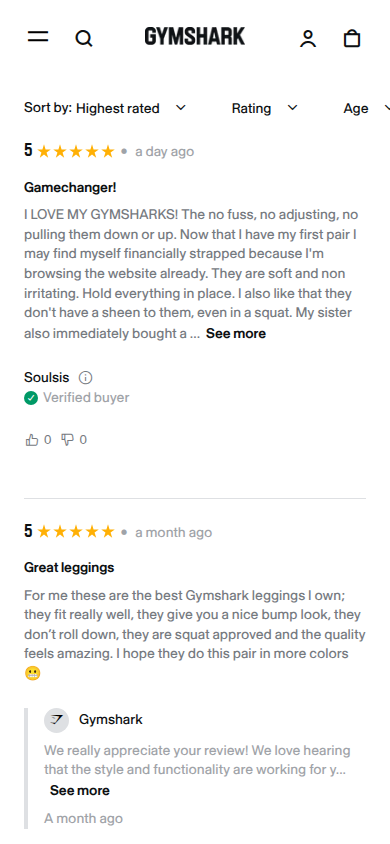
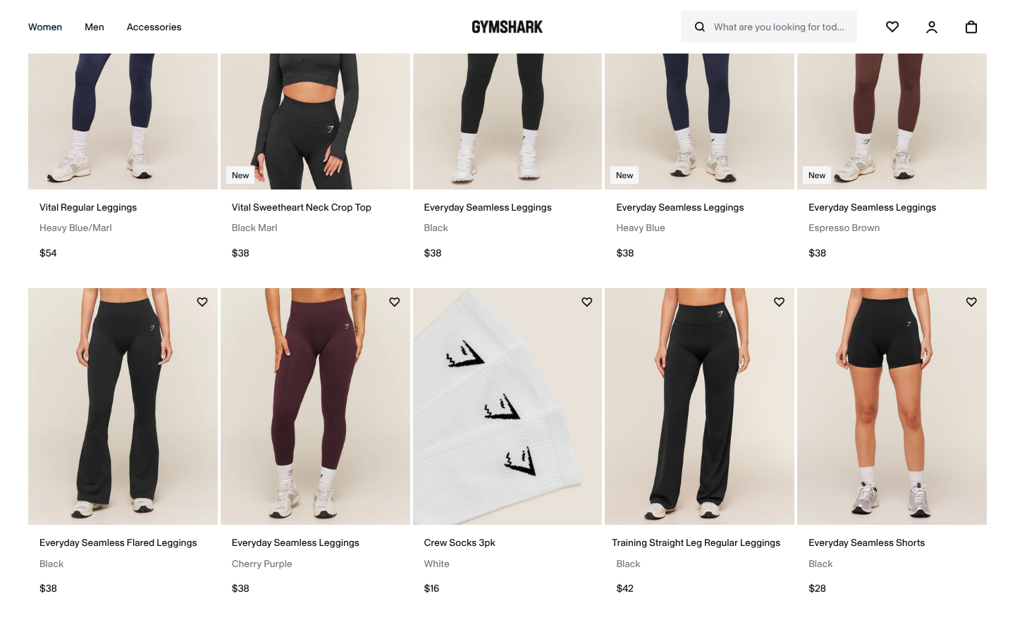
Vital Regular Leggings core apparel line Sampled official PDP
Unscored: Vital Collection video region is a large blank light-gray panel at both widths. No visible play control and ordinary load attempt could not recover media.
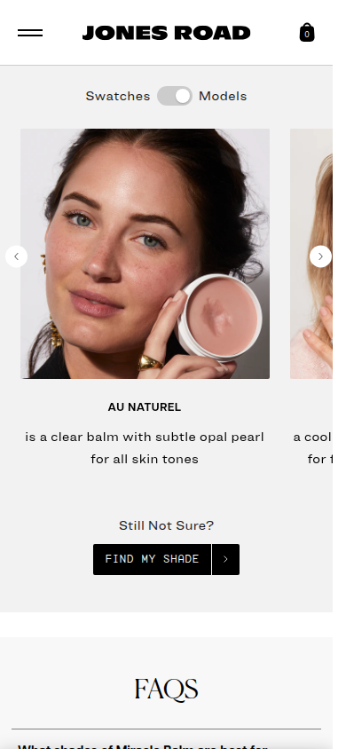
7. Jones Road Beauty unavailable
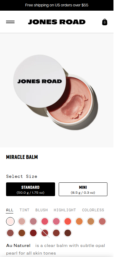
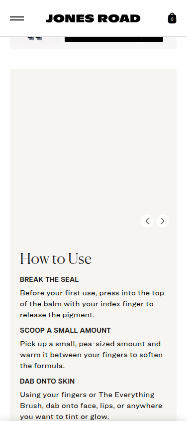
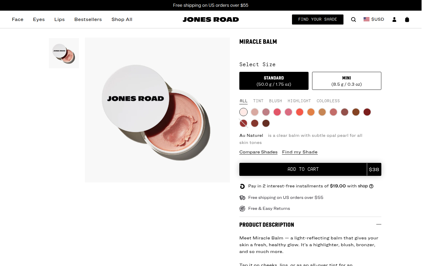
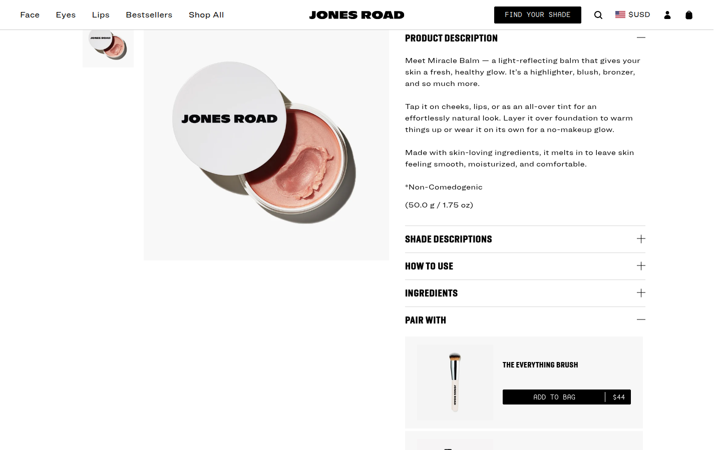
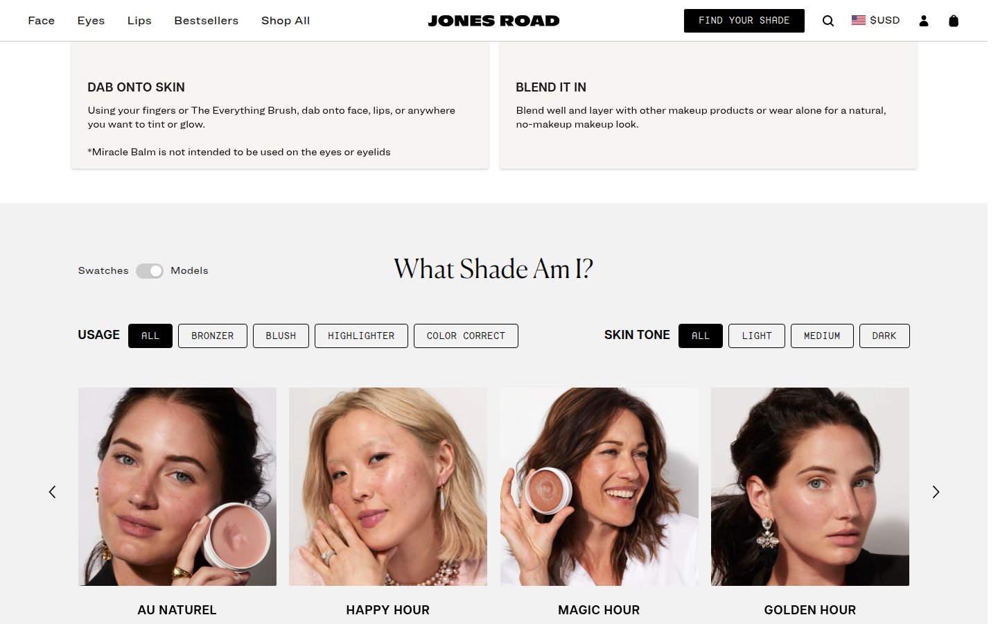
Miracle Balm core beauty product Sampled official PDP
Unscored: How to Use tutorial media remains an empty large panel; videos had readyState 0/currentSrc empty and no visible play control. Ordinary interaction cannot recover evidence.
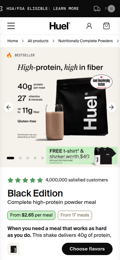
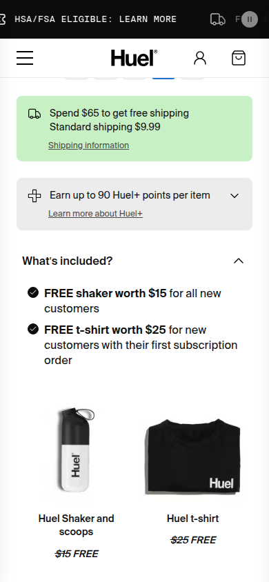
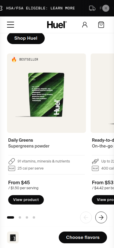
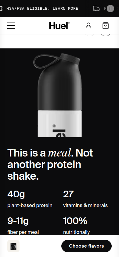
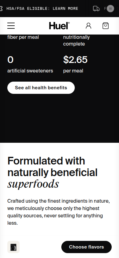
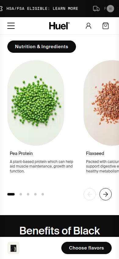
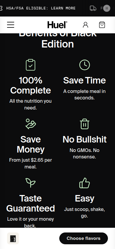
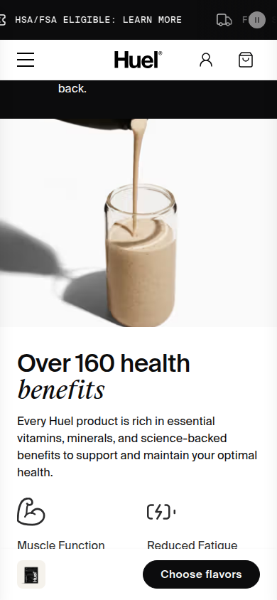
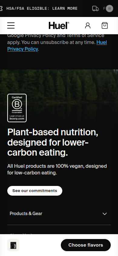
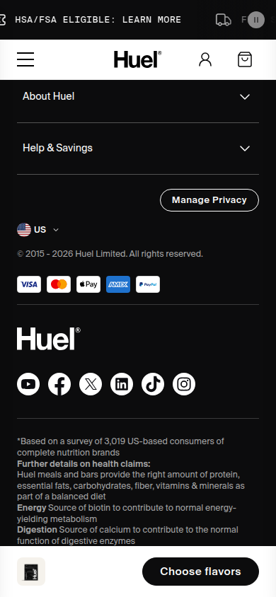
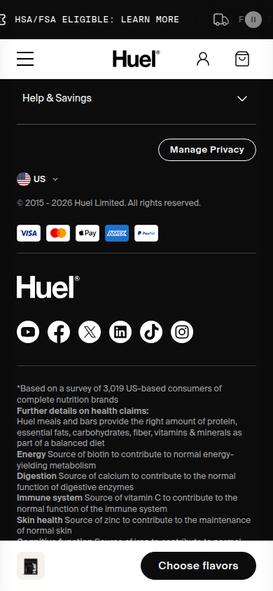
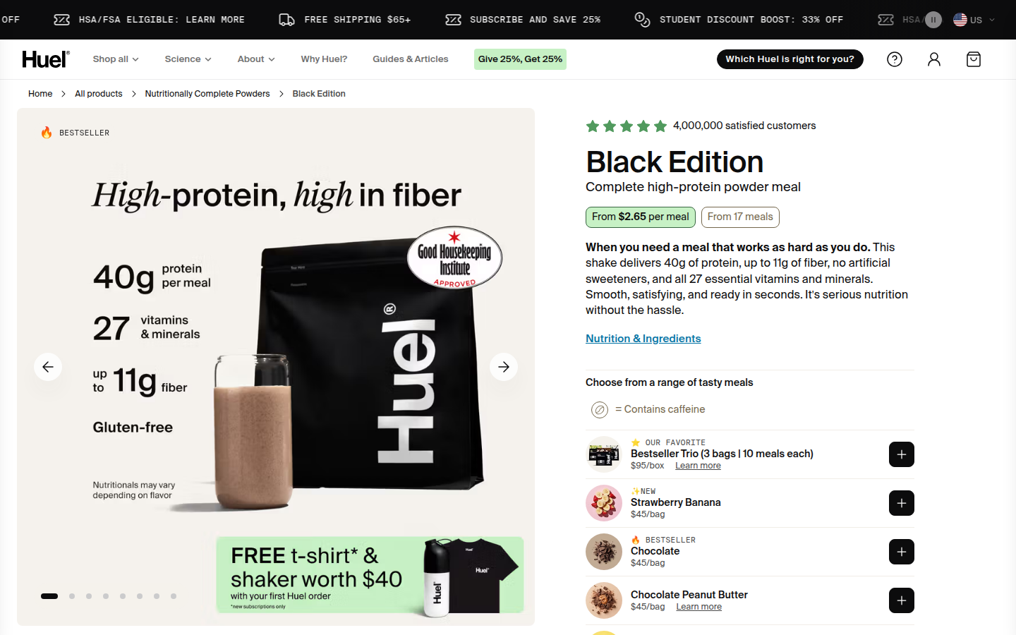
8. Huel valid
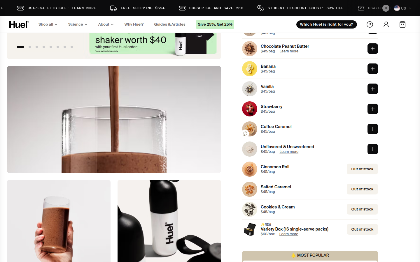
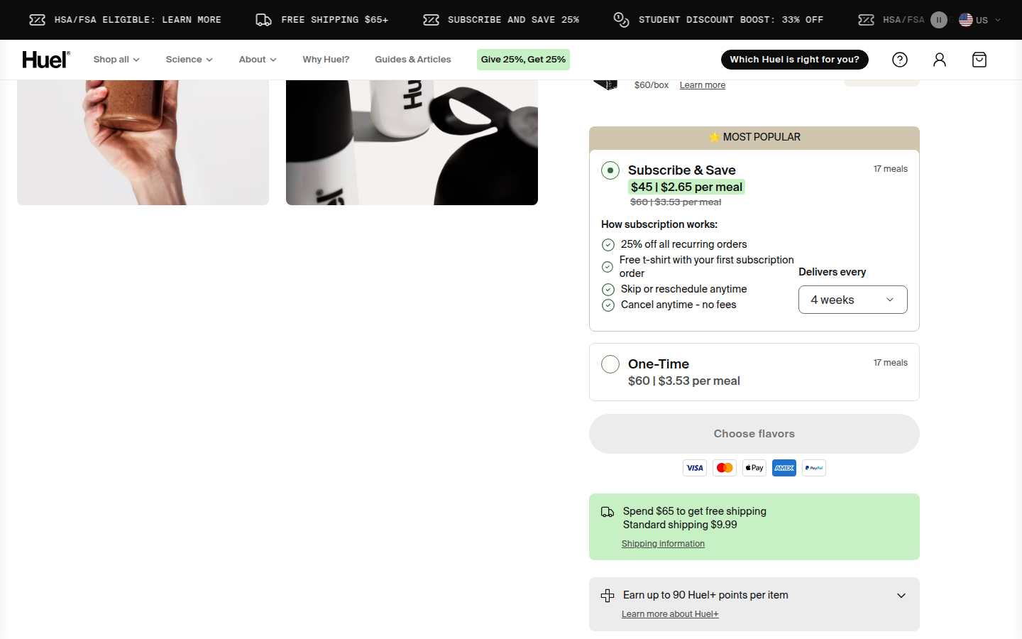
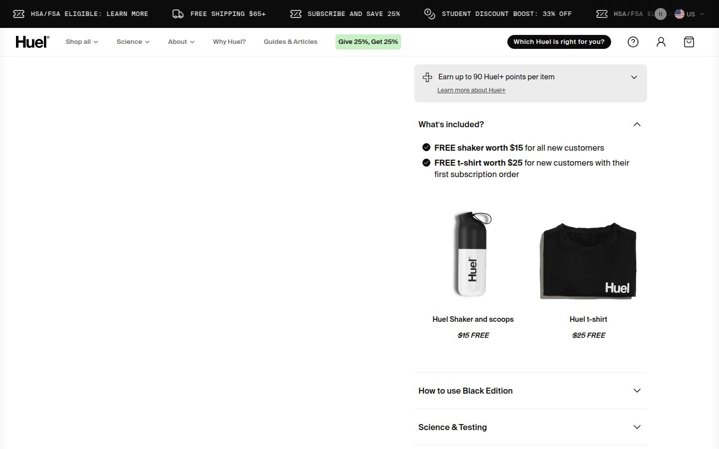
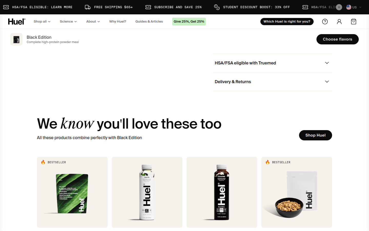
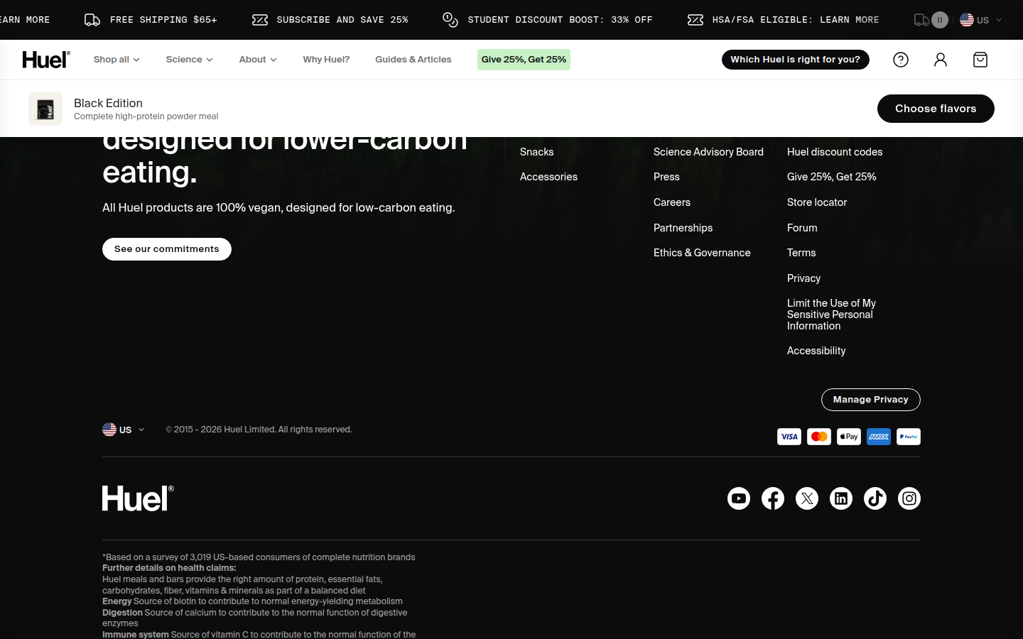
Black Edition labeled bestseller Sampled official PDP
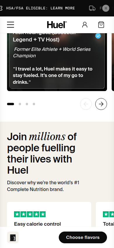
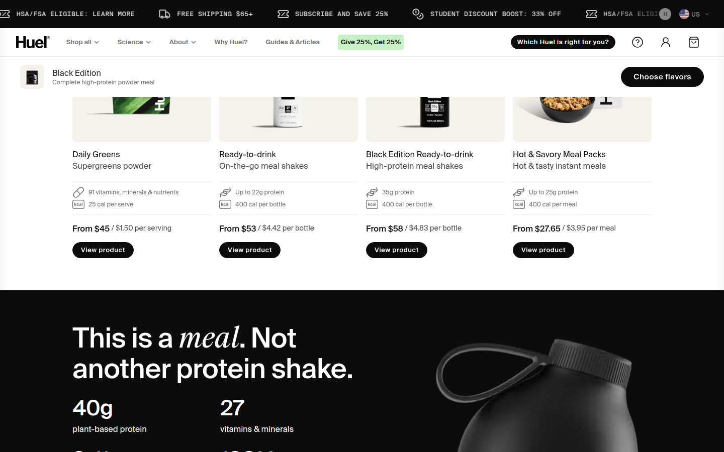
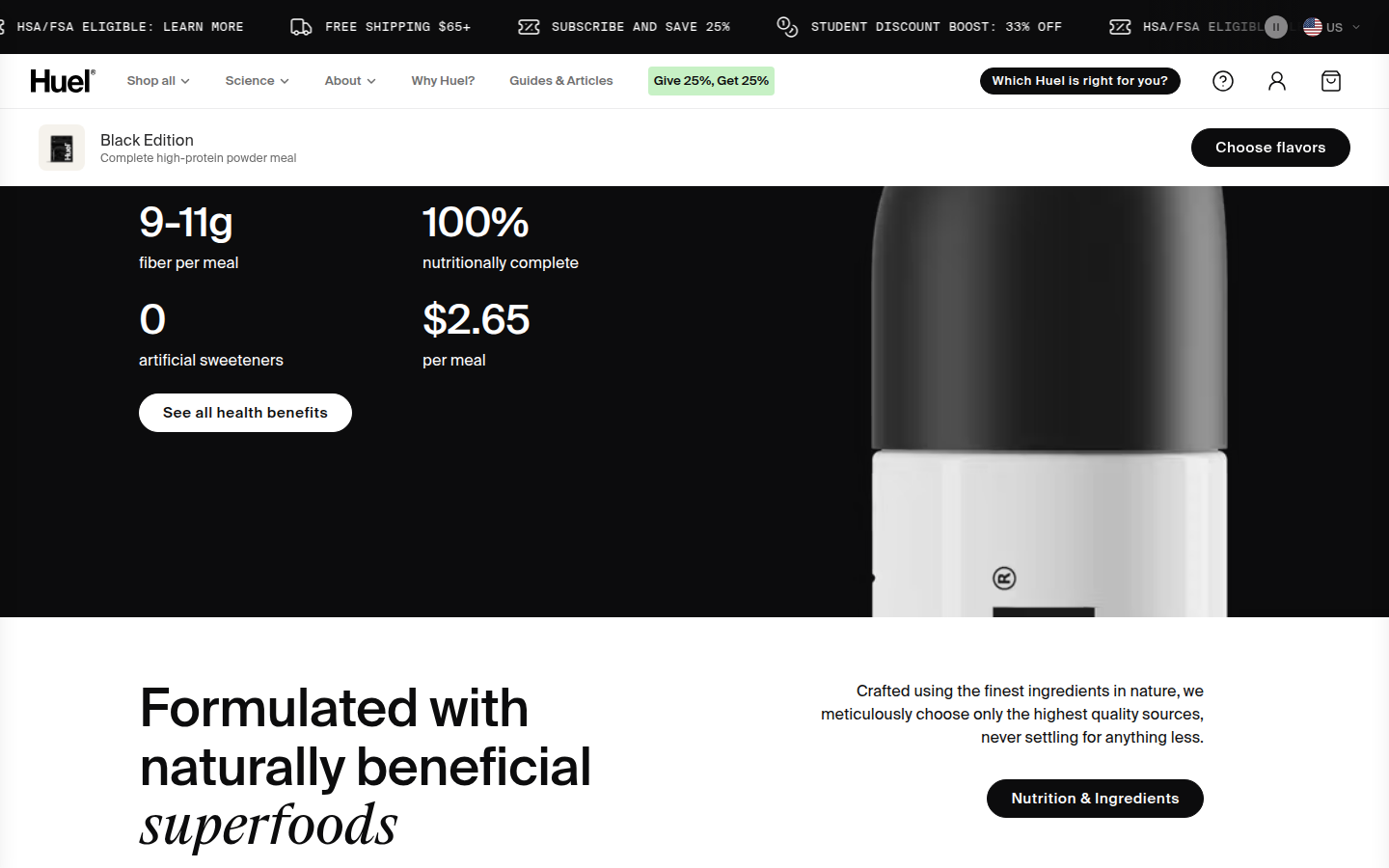
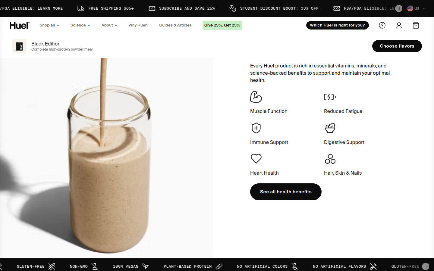
Judge A · craft-led: 8.51/10
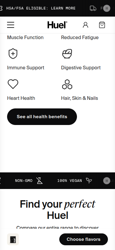
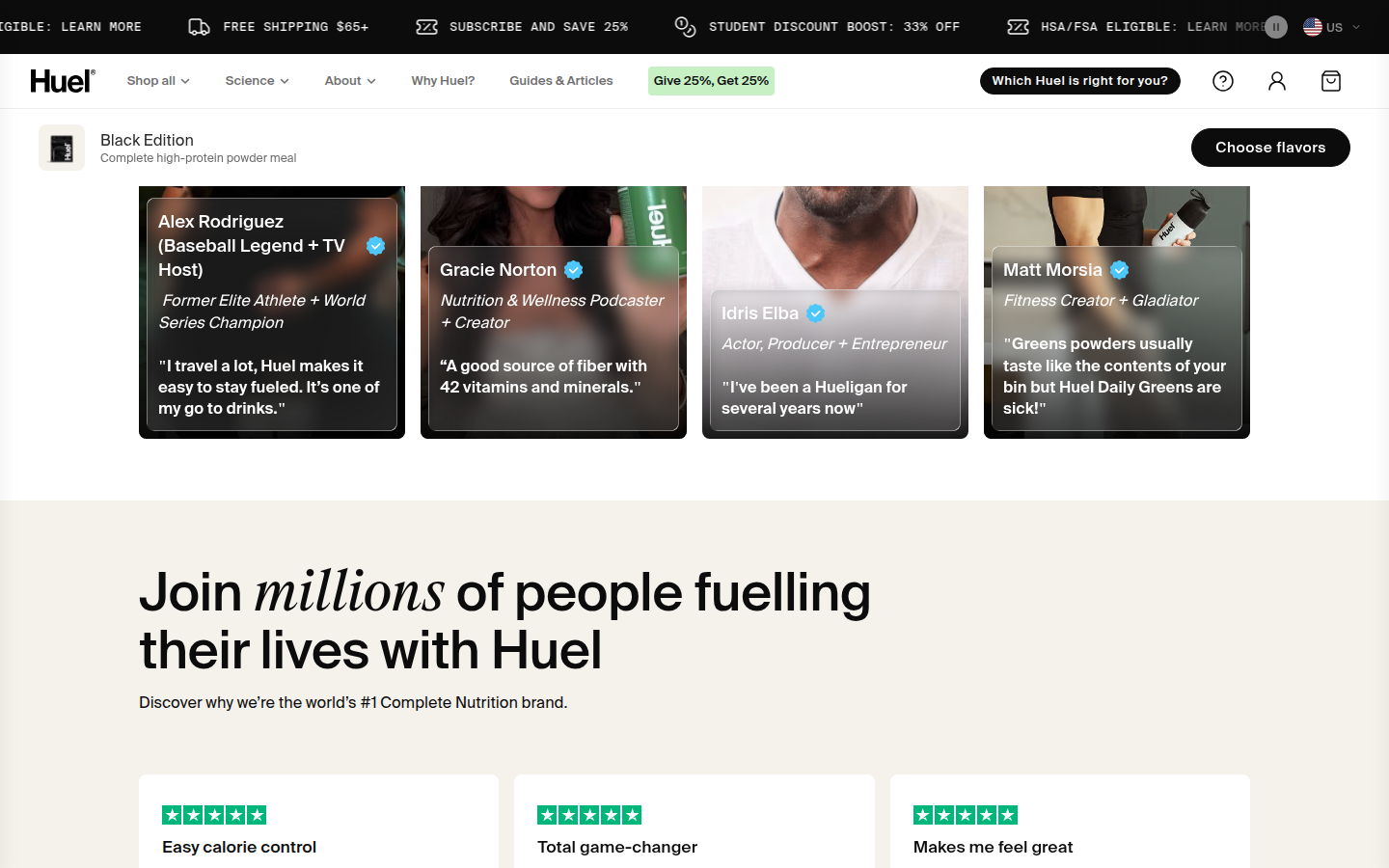
| Craft | 8.5 | A disciplined black, cream, and pale-green palette, oversized product photography, and the sans/italic-serif pairing make the page feel designed as one system. evidence evidence evidence |
|---|
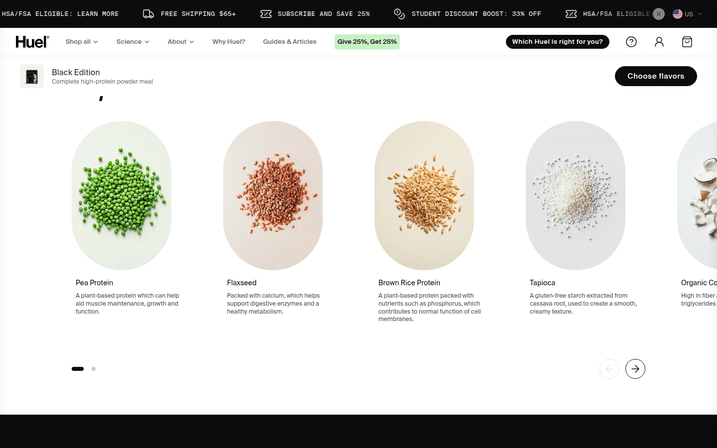
| Identity | 8.7 | The visual language stays unmistakably Huel through the manifesto, ingredient, editorial, and footer moments without needing repeated logos to carry it. evidence evidence evidence |
|---|
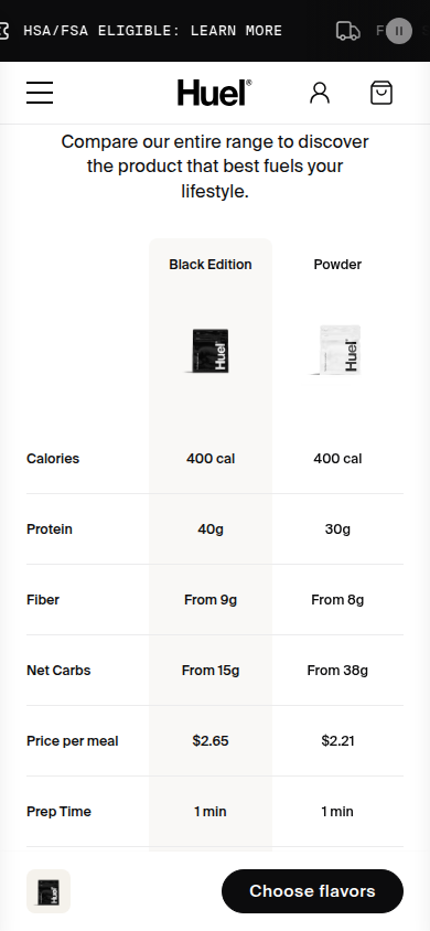
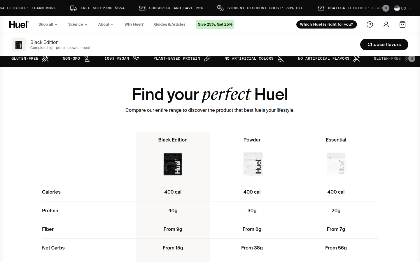
| Journey | 8.3 | The buying path, product rationale, ingredient story, comparisons, and proof form a clear progression. Several carousel and comparison modules make the later journey feel longer than it needs to be. evidence evidence evidence |
|---|
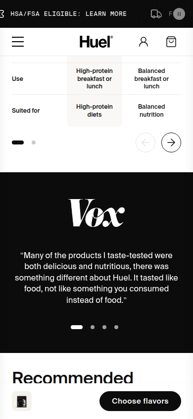
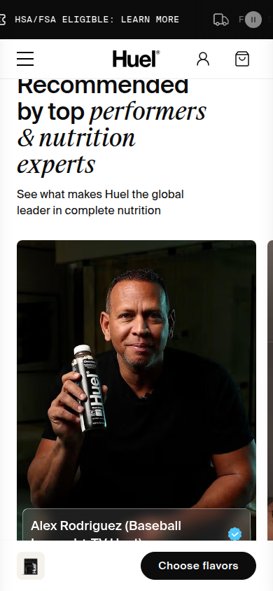
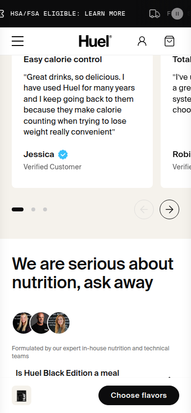
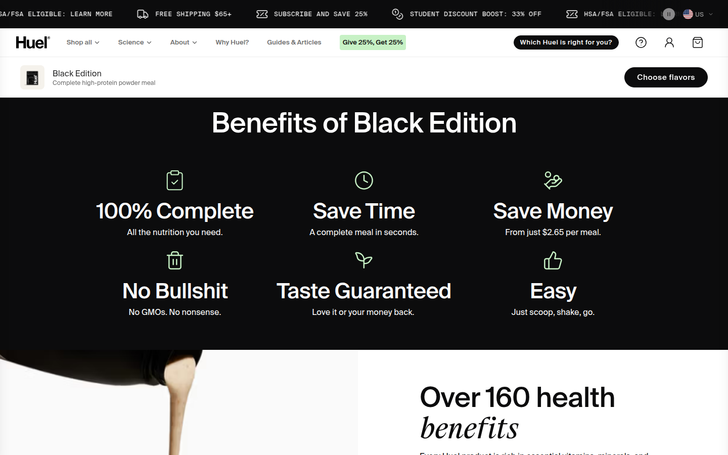
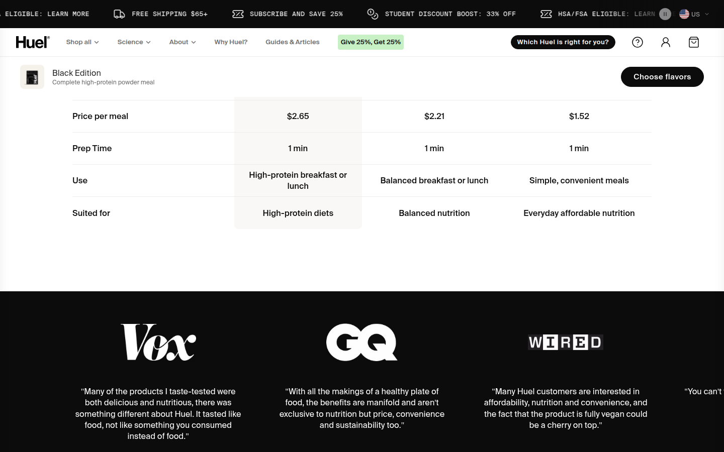
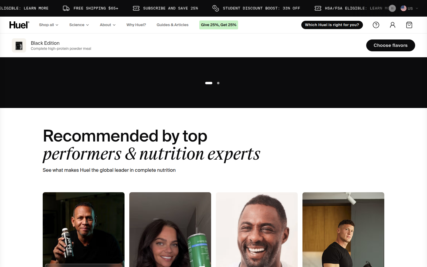
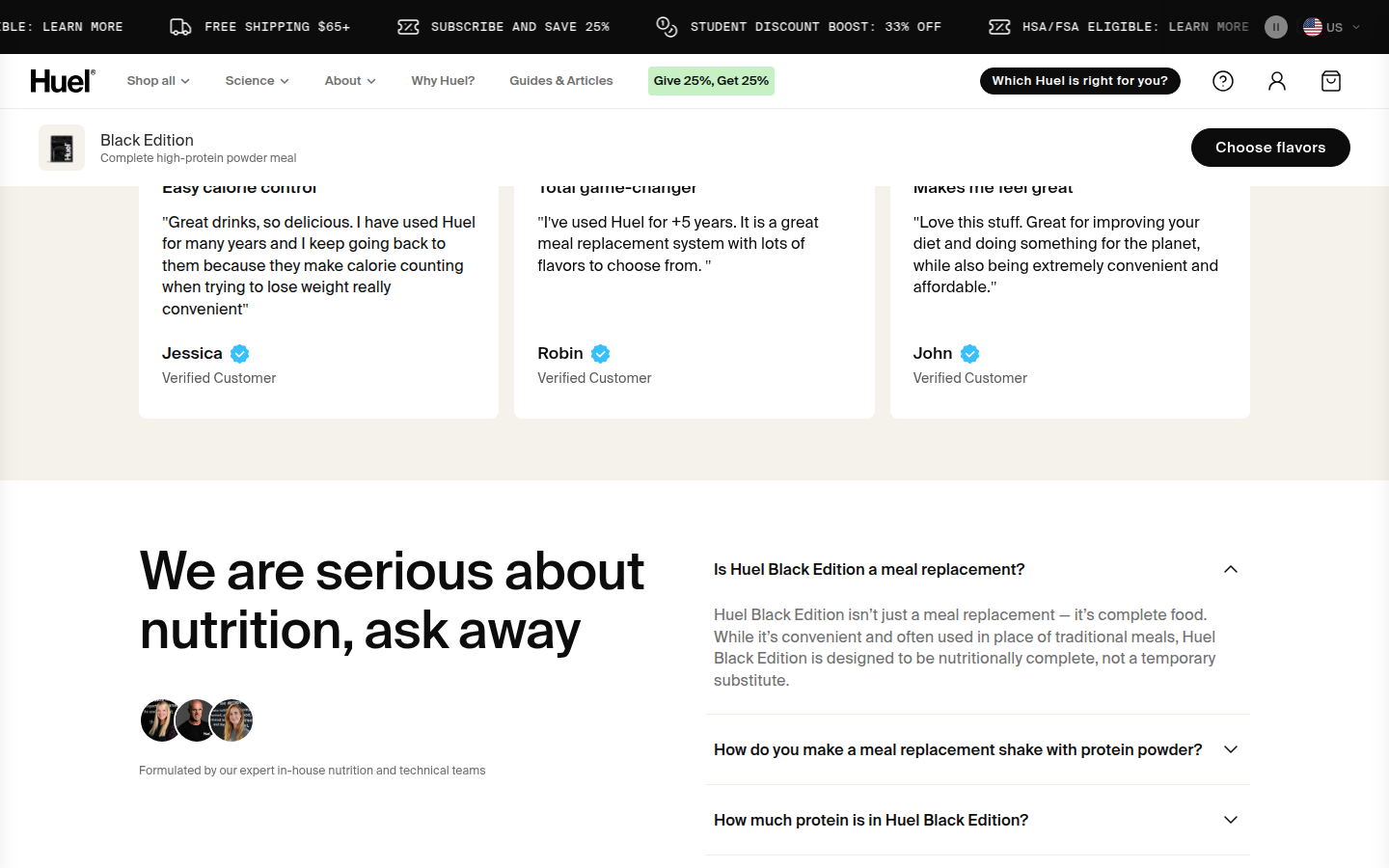
| Trust | 8.7 | Editorial marks, visible customer proof, named expert and talent modules, and detailed product information make support feel deliberately presented rather than tacked on. evidence evidence evidence |
|---|
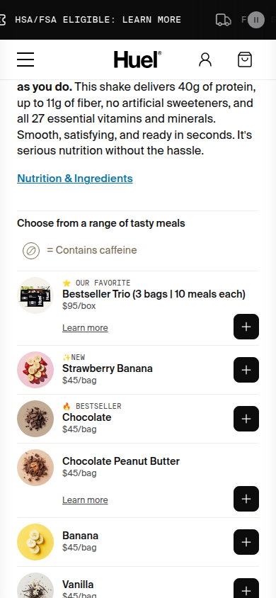
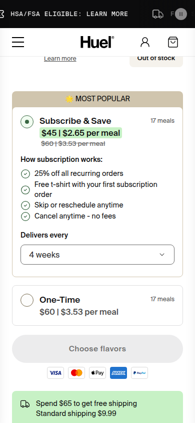
| Offer | 8.8 | Flavor selection, subscription savings, delivery cadence, cancellation language, and the primary purchase action are unusually explicit and easy to compare. evidence evidence evidence |
|---|
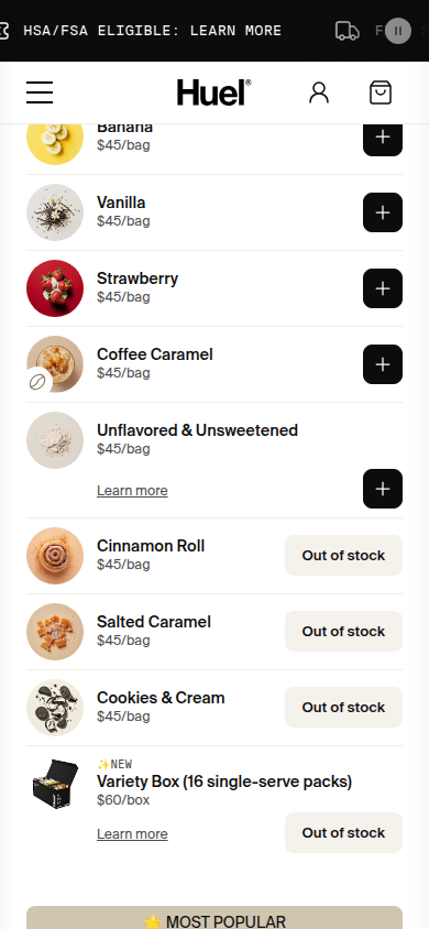
| Mobile | 8 | The hierarchy and type scale remain strong on a narrow view. The extended flavor list and always-present purchase bar add sustained interface density as the page scrolls. evidence evidence evidence |
|---|
Strengths
- Cohesive, recognizable art direction across commerce and editorial sections.
- Exceptionally legible subscription and flavor-selection logic.
- Trust material appears in several visual forms, not as a single crowded proof block.
Priorities
- Condense or group the long flavor list so selection reaches its decision point sooner.
- Reduce the competing visual weight of repeated promo and sticky-purchase messaging on mobile.
- Tighten the later carousel and comparison sequence to preserve momentum after the core purchase case is made.
Limitations
- Static full-page captures were reviewed at 390px and 1440px; interaction states and factual substantiation were not assessed.
Judge B · journey-led: 8.86/10
| Craft | 8.9 | The black, cream and white system is tightly composed across product photography, comparison, editorial type and lower-page modules. Type scale and cards retain a high-quality finish through a very long page. evidence evidence evidence evidence |
|---|
| Identity | 9.0 | A confident black-and-cream nutritional world, italic editorial emphasis and disciplined product photography make the page immediately and consistently Huel rather than a generic supplement template. evidence evidence evidence evidence |
|---|
| Journey | 8.8 | The purchase choices arrive early, then explanation, comparison, endorsement, reviews and FAQ create a readable decision sequence. The extensive flavor selector and numerous later modules make the route feel longer than necessary. evidence evidence evidence evidence evidence |
|---|
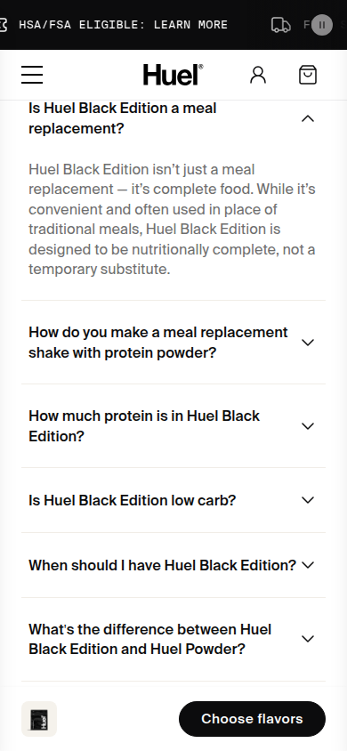
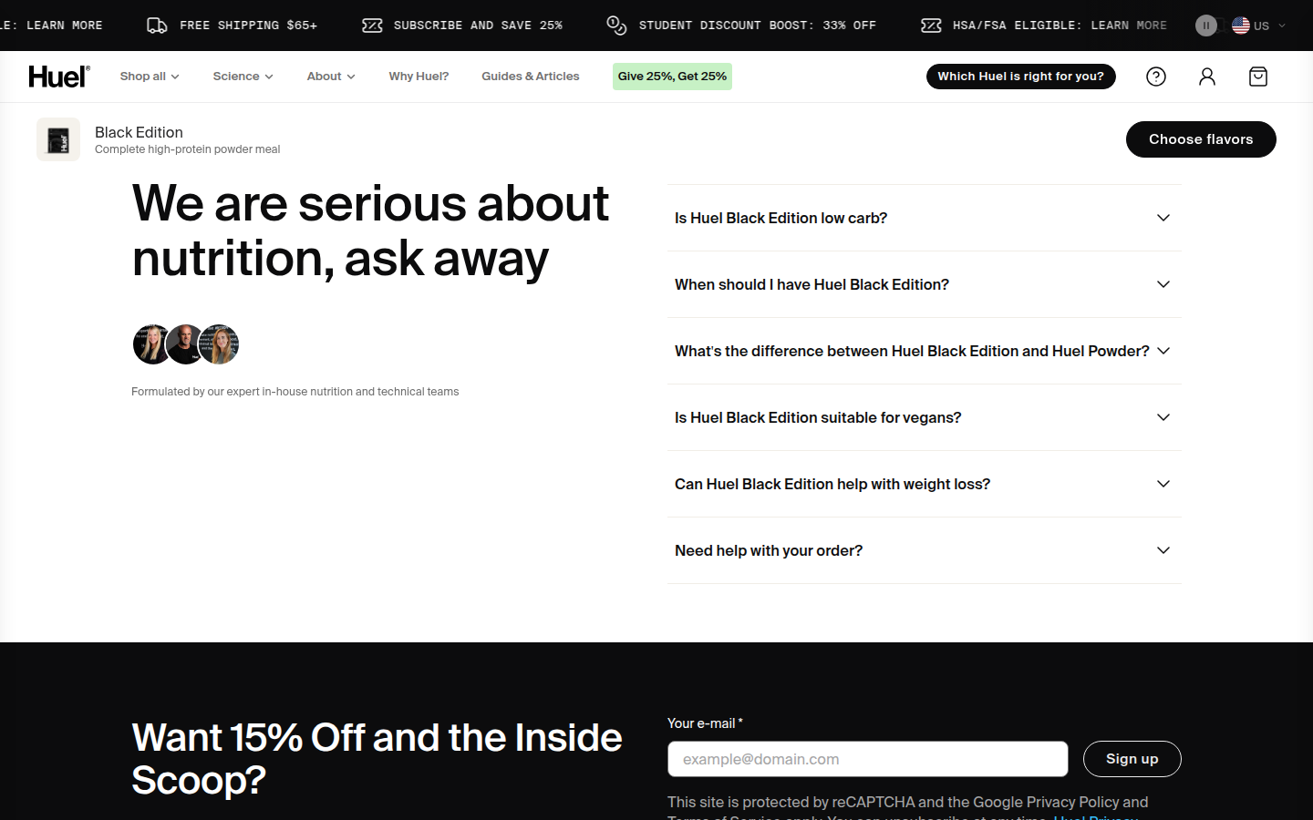
| Trust | 8.8 | Visible nutrition detail, comparison, recognizable editorial endorsement, named expert/performer cards, verified customer reviews and a substantial FAQ give the page several legible reassurance modes. evidence evidence evidence evidence evidence |
|---|
| Offer | 9.0 | The product choice, price per meal, quantity, subscription versus one-time purchase, shipping threshold and persistent choose-flavors CTA are clear at the decision point. evidence evidence evidence evidence |
|---|
| Mobile | 8.5 | The mobile hierarchy, product cards, comparison and testimonials remain unusually legible. The persistent choose-flavors bar is useful, though it continuously takes visual space and the long flavor-selection sequence asks for sustained scrolling. evidence evidence evidence evidence evidence |
|---|
Strengths
- A distinctive, coherent visual identity carries from the hero through the footer.
- Purchase terms and flavor/subscription choices are unusually visible for a complex selection flow.
- The lower journey combines comparison, endorsement, customer proof and FAQ without losing legibility.
Priorities
- Condense or better summarize the lengthy flavor-selection route before the purchase decision.
- Reduce the mobile vertical footprint of the persistent purchase bar where it competes with content.
Limitations
- Reviewed every supplied readable desktop1440 and mobile390 frame only.
- No interaction, checkout, accessibility, provenance, health-claim, or commercial-performance claim is made.
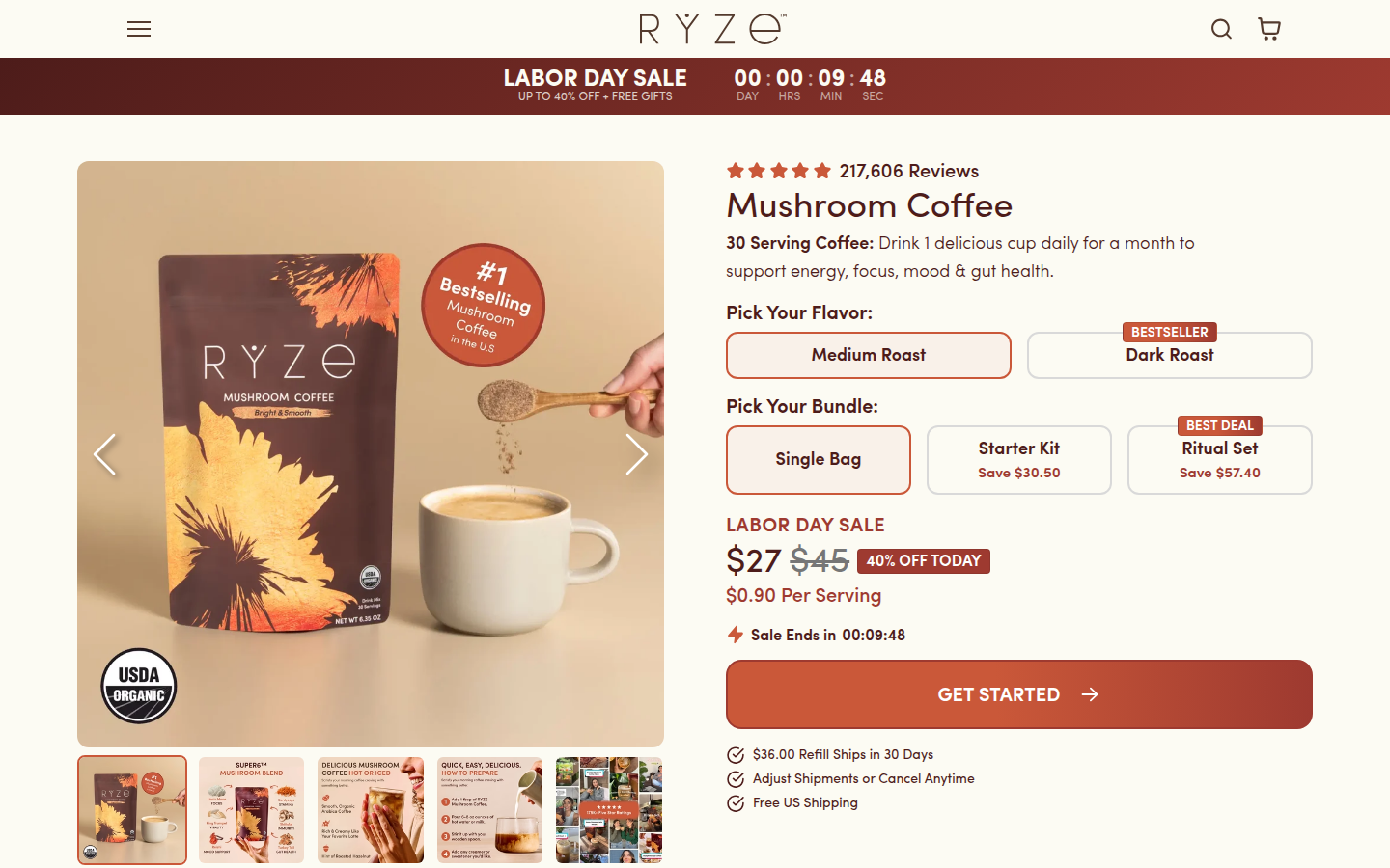
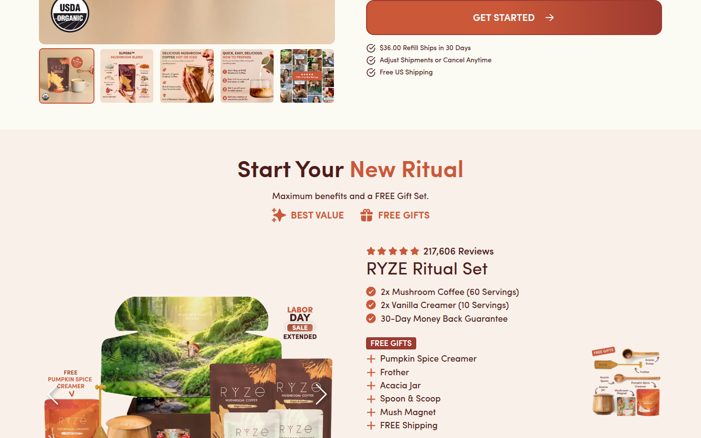
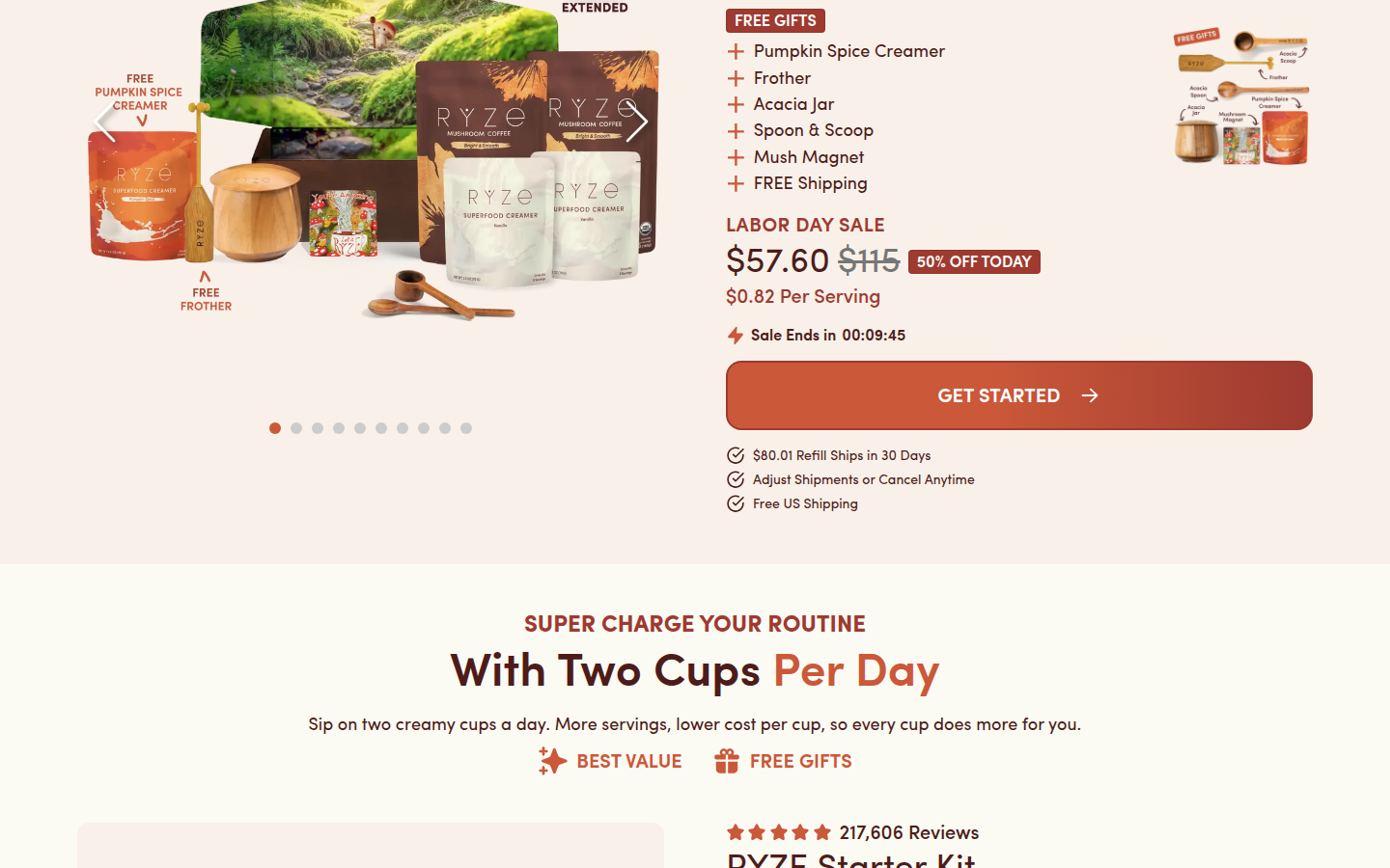
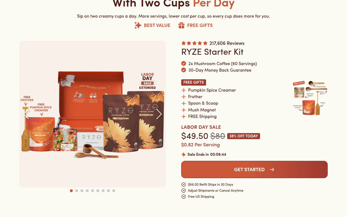
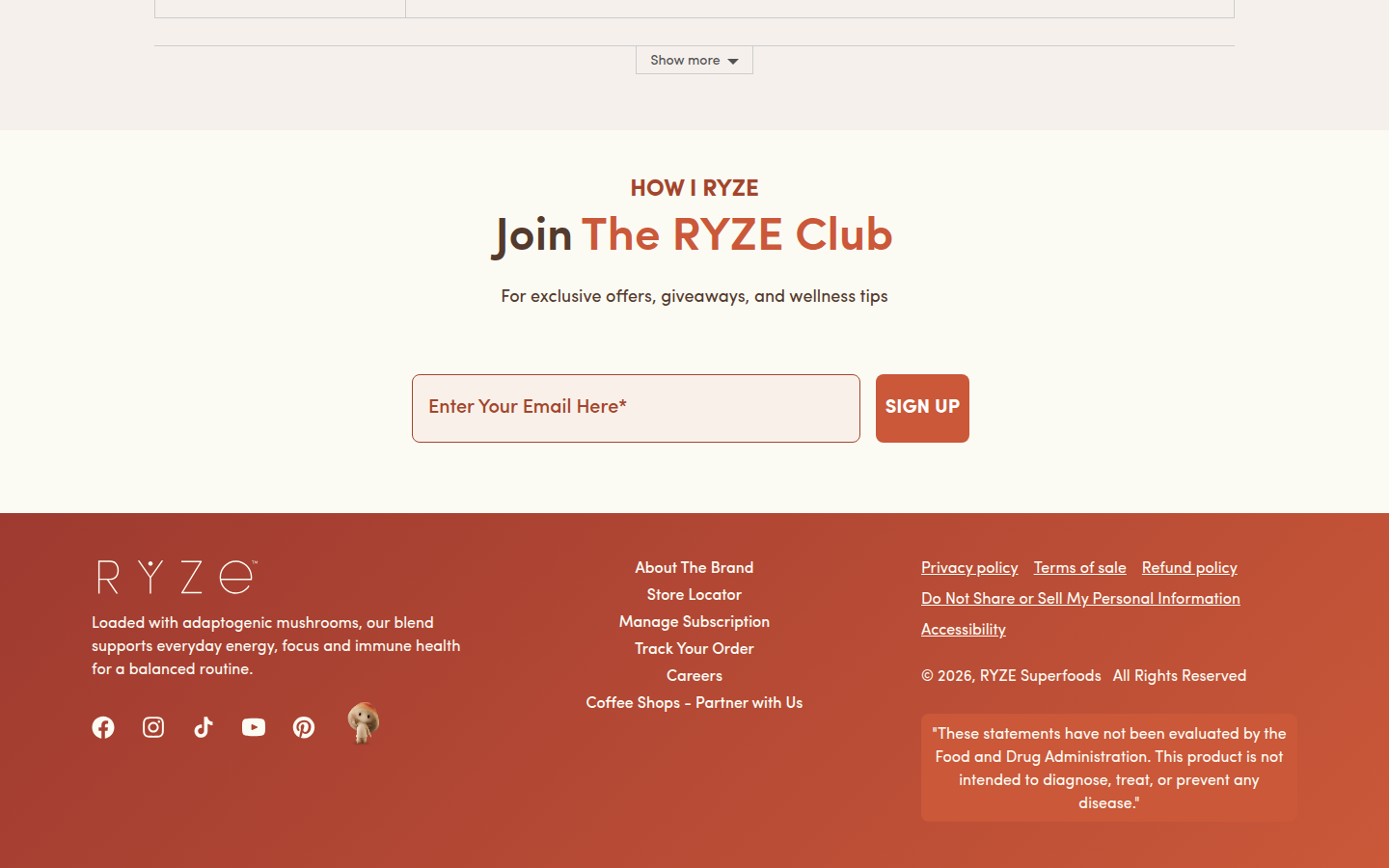
9. RYZE Superfoods valid
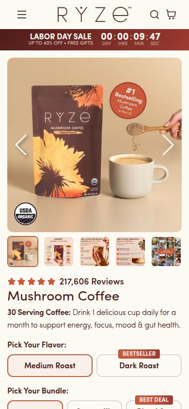
Core Mushroom Coffee PDP Sampled official PDP
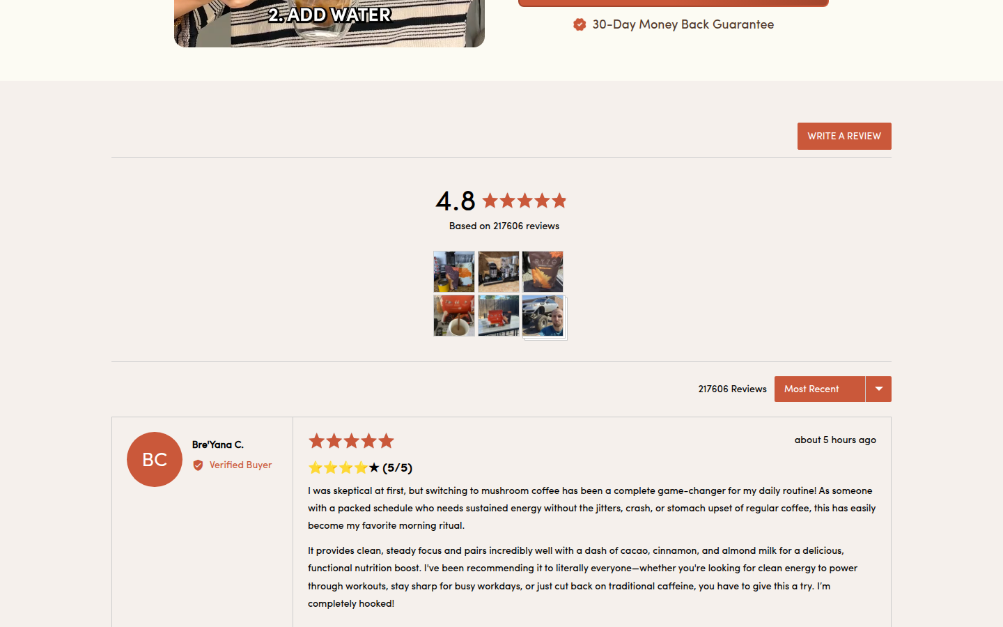
Judge A · craft-led: 8.25/10
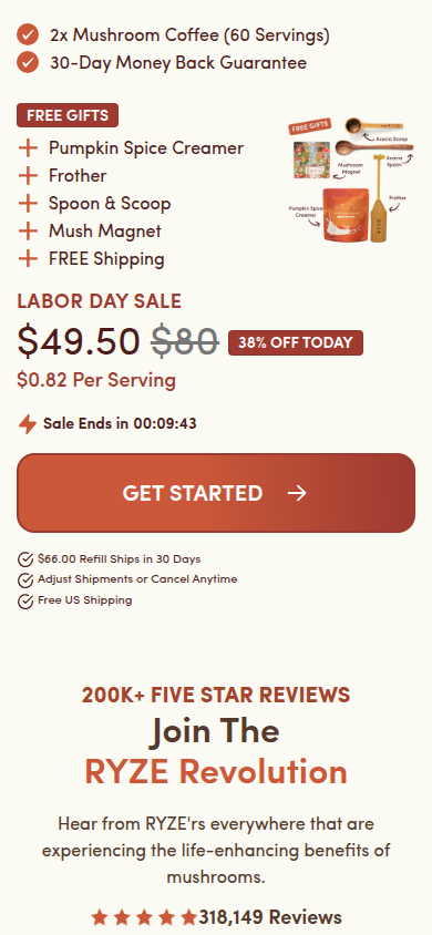
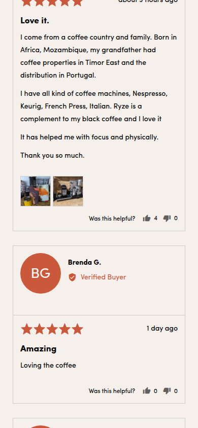
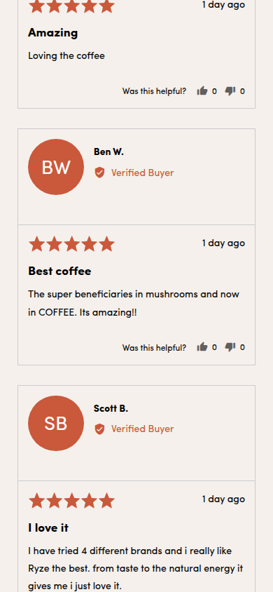
| Craft | 8.0 | Warm cream, peach, and rust tones, distinctive package photography, and softly rounded components form a polished system; the sale-heavy first screens and repeated offer modules make the composition feel busier than it needs to. evidence evidence evidence |
|---|
| Identity | 8.3 | The mushroom-coffee pack, earthy palette, hand-rendered accents, and domestic ritual imagery carry a specific, consistent RYZE world through product, proof, and education. evidence evidence evidence |
|---|
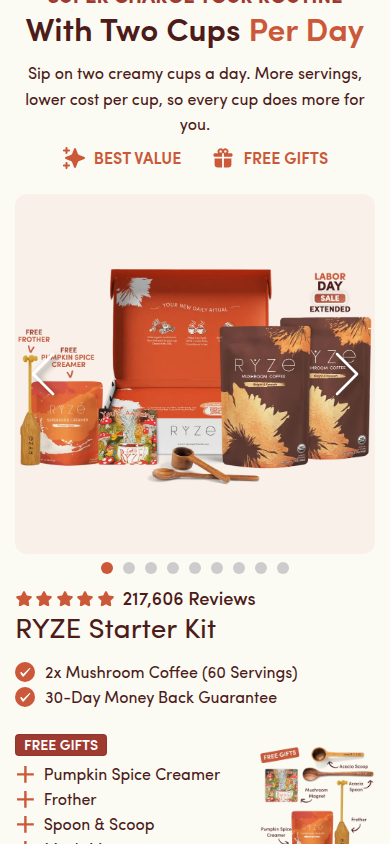
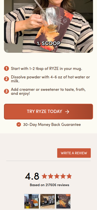
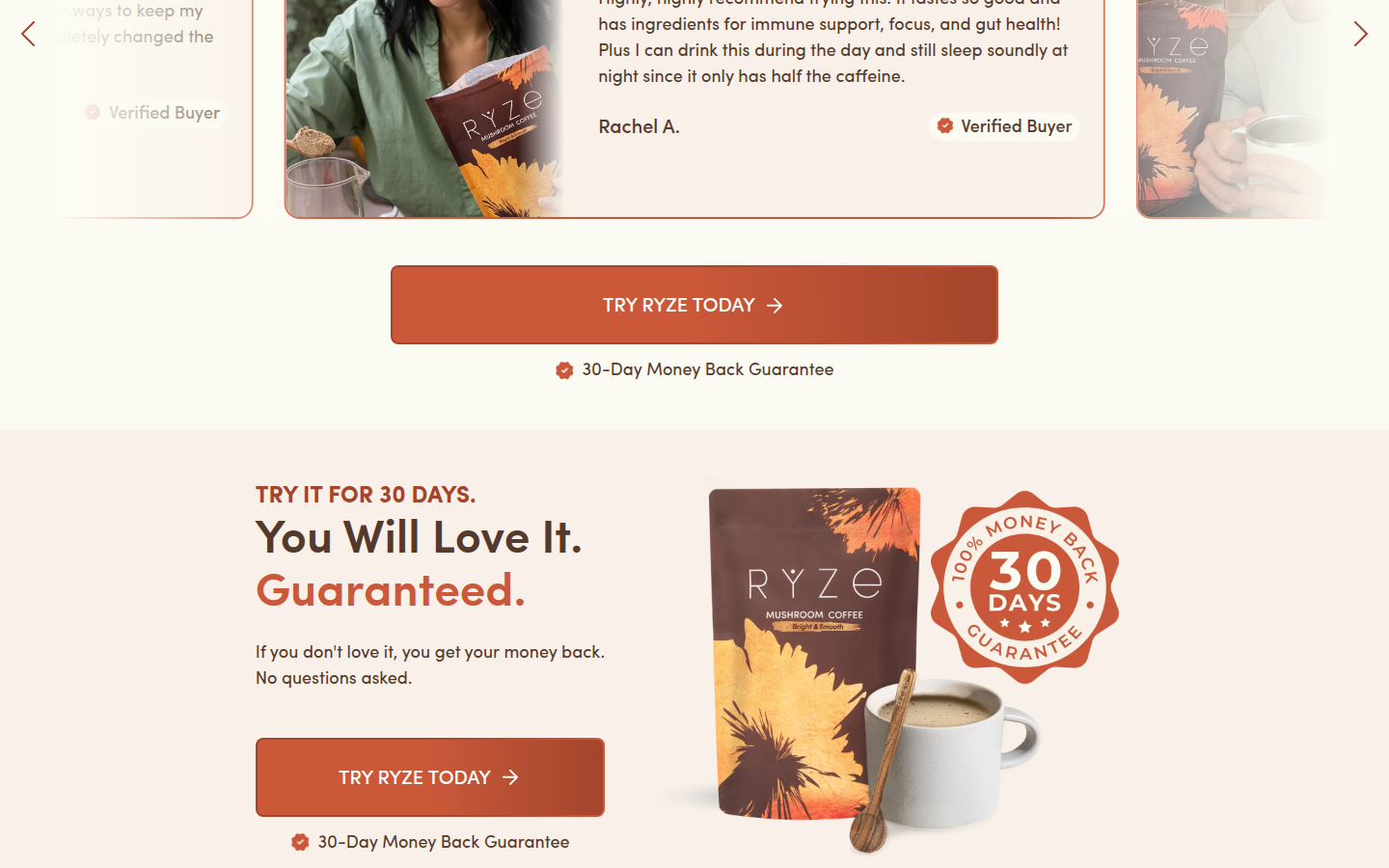
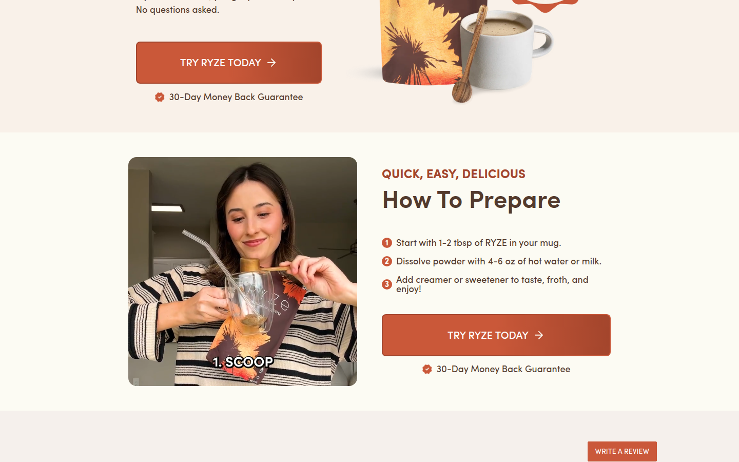
| Journey | 8.1 | The journey moves from choice and price to ritual, benefits, guarantee, preparation, and detailed buyer proof with clear visual transitions; multiple bundle and urgency blocks slow the middle decision path. evidence evidence evidence |
|---|
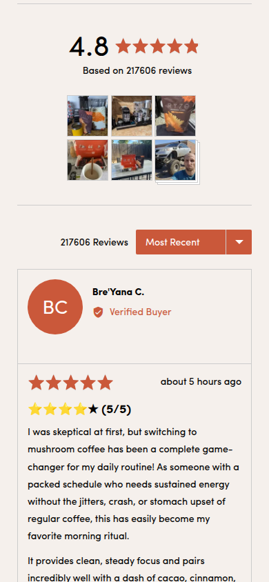
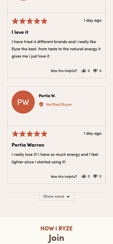
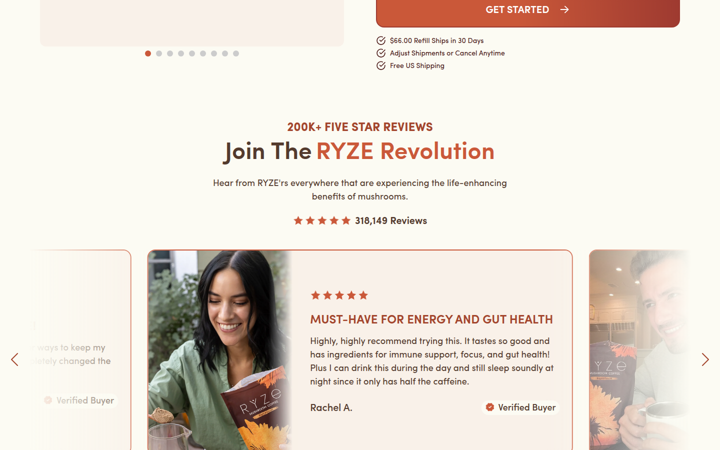
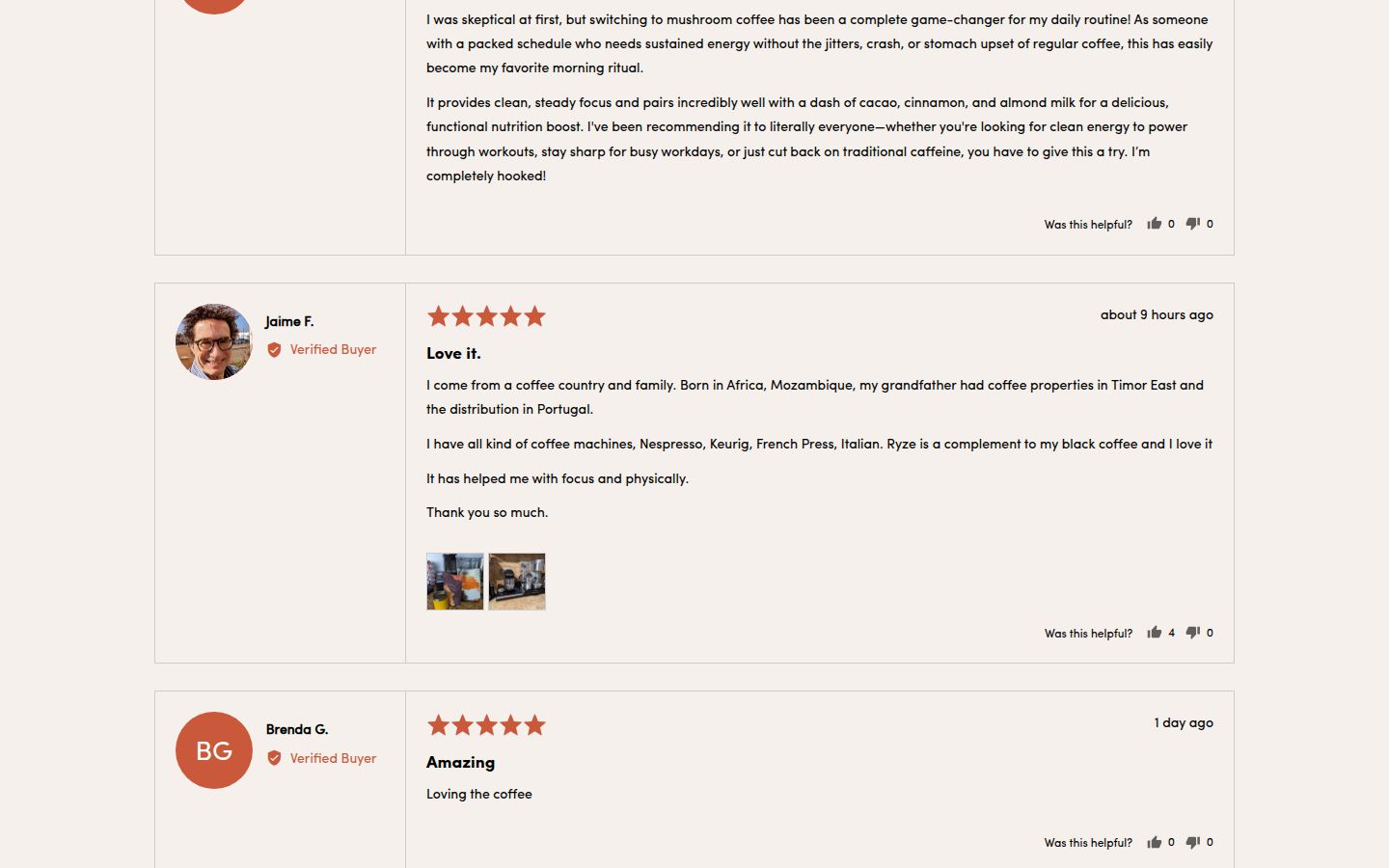
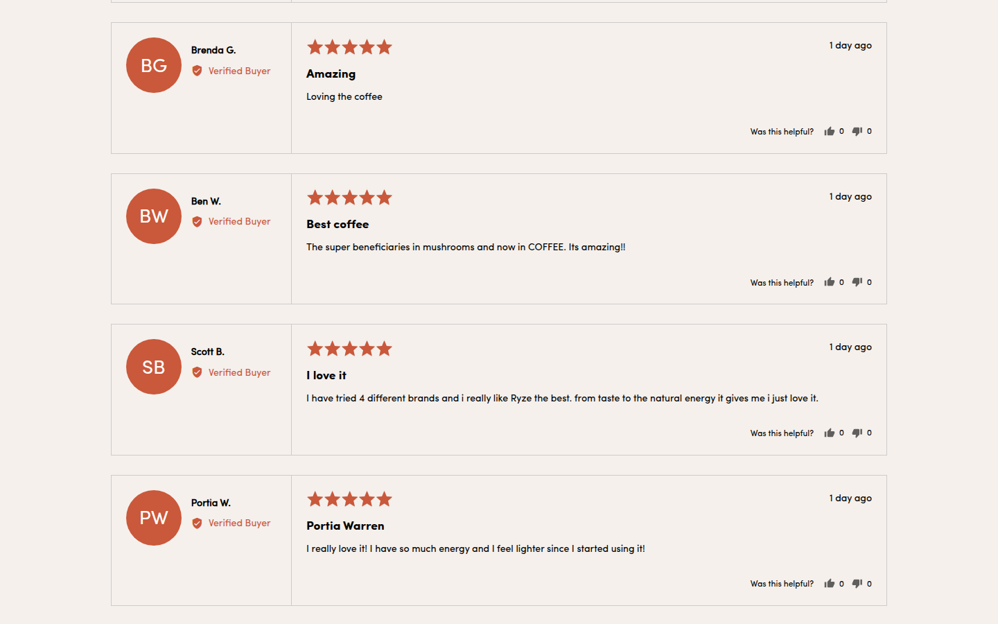
| Trust | 8.6 | Visible buyer count, verified reviews with media, a clear guarantee, preparation guidance, and repeated practical reassurance are presented with enough space to feel substantive. evidence evidence evidence |
|---|
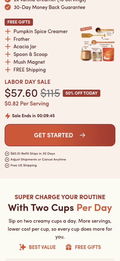
| Offer | 8.9 | Variant, bundle, subscription, savings, price, timing, and purchase action are highly legible at the decision point; the dense urgency stack competes somewhat with the product story. evidence evidence |
|---|
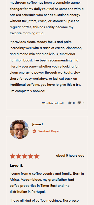
| Mobile | 7.9 | Controls, offer tiers, and imagery remain readable at 390px, but sustained banners and a long sequence of open review cards make the later mobile journey feel repetitive. evidence evidence evidence |
|---|
Strengths
- A specific, polished package-and-ritual visual language stays coherent across the full scroll.
- Purchase choices and savings are exceptionally clear at the point of decision.
- Guarantee, preparation guidance, and detailed buyer evidence make the proof presentation feel substantial.
Priorities
- Consolidate the tiered bundle modules so shoppers can compare the decision once without repeated offer framing.
- Ease sale countdown and discount messaging after the initial purchase area so the product story can breathe.
- Give the long mobile review run a concise summary or progressive reveal before showing many full cards.
Limitations
- Judgment is limited to supplied static journey captures; interactions, subscription selection behavior, expanded content, video playback, and checkout were not assessed.
Judge B · journey-led: 8.43/10
| Craft | 8.2 | The pack photography, warm earth-tone palette, rounded cards and type system are carefully consistent across the purchase and proof content. Dense promotional labels and repeated offer modules make some sections feel less edited than the visual system itself. evidence evidence evidence |
|---|
| Identity | 8.6 | The moss green, cocoa, cream and orange palette, illustrated marks, product pack and friendly rounded geometry create a recognizable system that holds from hero to footer. evidence evidence evidence |
|---|
| Journey | 8.1 | Choice, price, subscription, bundled alternatives, social proof, guarantee, preparation and reviews form a complete decision path. Several successive bundle pitches arrive before deeper product education, so the early journey can feel commercially repetitive. evidence evidence evidence evidence |
|---|
| Trust | 8.7 | Prominent rating volume, individual reviewer voices, customer images, a guarantee and clear shipping/subscription language supply varied reassurance throughout the rendered page. evidence evidence evidence evidence |
|---|
| Offer | 9.0 | Price, savings, flavor, quantity, subscription terms, gifts, bundle value and direct purchase controls are unusually explicit at the decision points. evidence evidence evidence evidence |
|---|
| Mobile | 8.3 | The narrow layout retains selection clarity, legible review content and strong action controls. The density of repeated sale, bundle and gift messages makes the first several mobile screens feel busier than necessary. evidence evidence evidence evidence |
|---|
Strengths
- A complete, highly legible purchase and offer system.
- A cohesive color, pack and illustration identity throughout the long PDP.
- Multiple rendered forms of reassurance: rating volume, reviews, customer media, guarantee and policy language.
Priorities
- Reduce the early run of bundle and gift pitches so the primary product choice gets more breathing room.
- Consolidate repeated sale and value labels to make the early mobile path quieter.
- Introduce deeper product-specific explanation before the successive offer modules.
Limitations
- Reviewed every supplied readable mobile390 and desktop1440 frame only.
- No interaction, checkout, accessibility, provenance, health-claim, or commercial-performance claim is made.
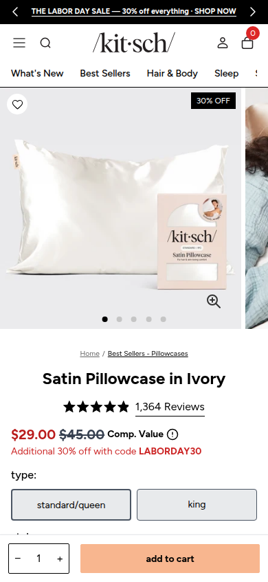
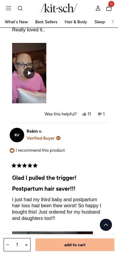
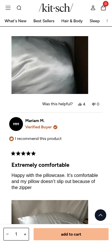
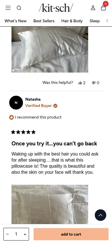
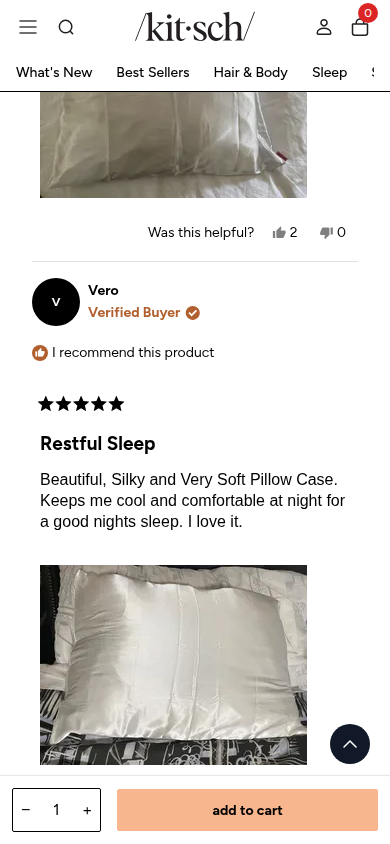
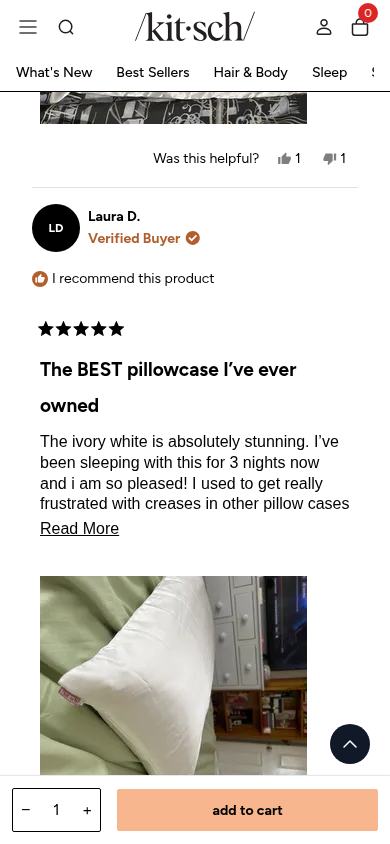
10. Kitsch valid
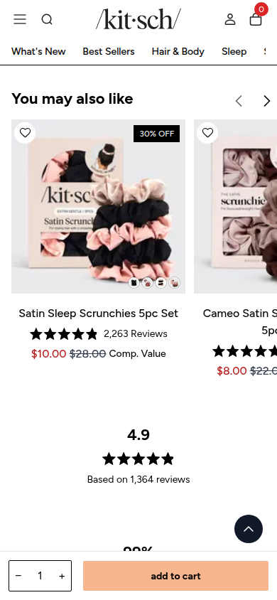
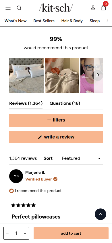
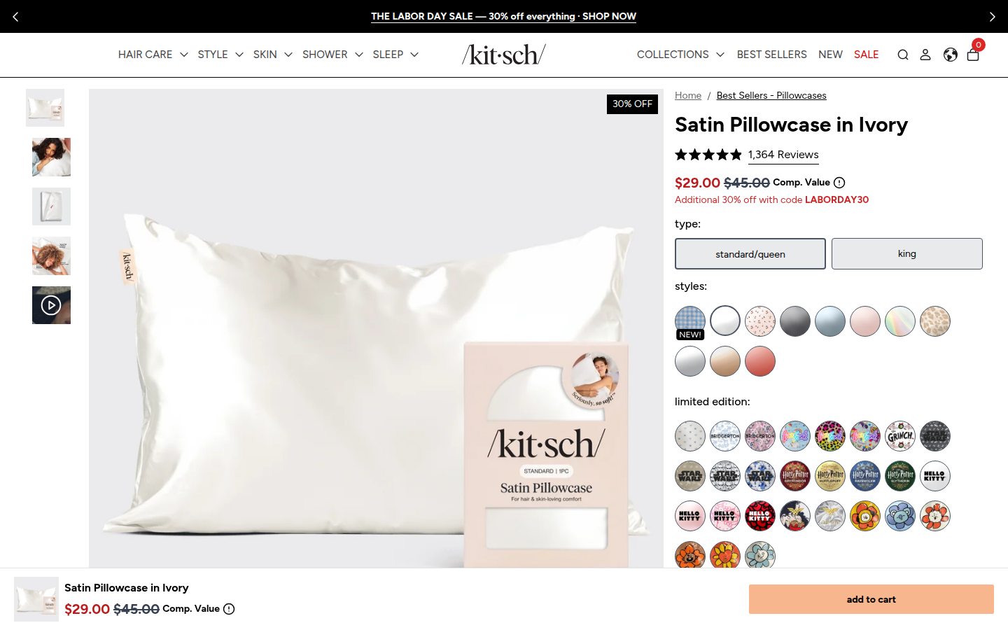
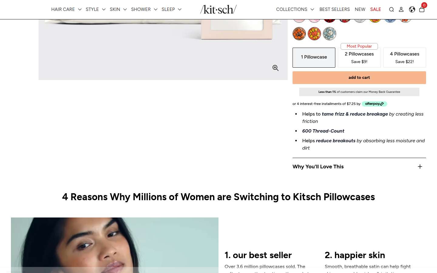
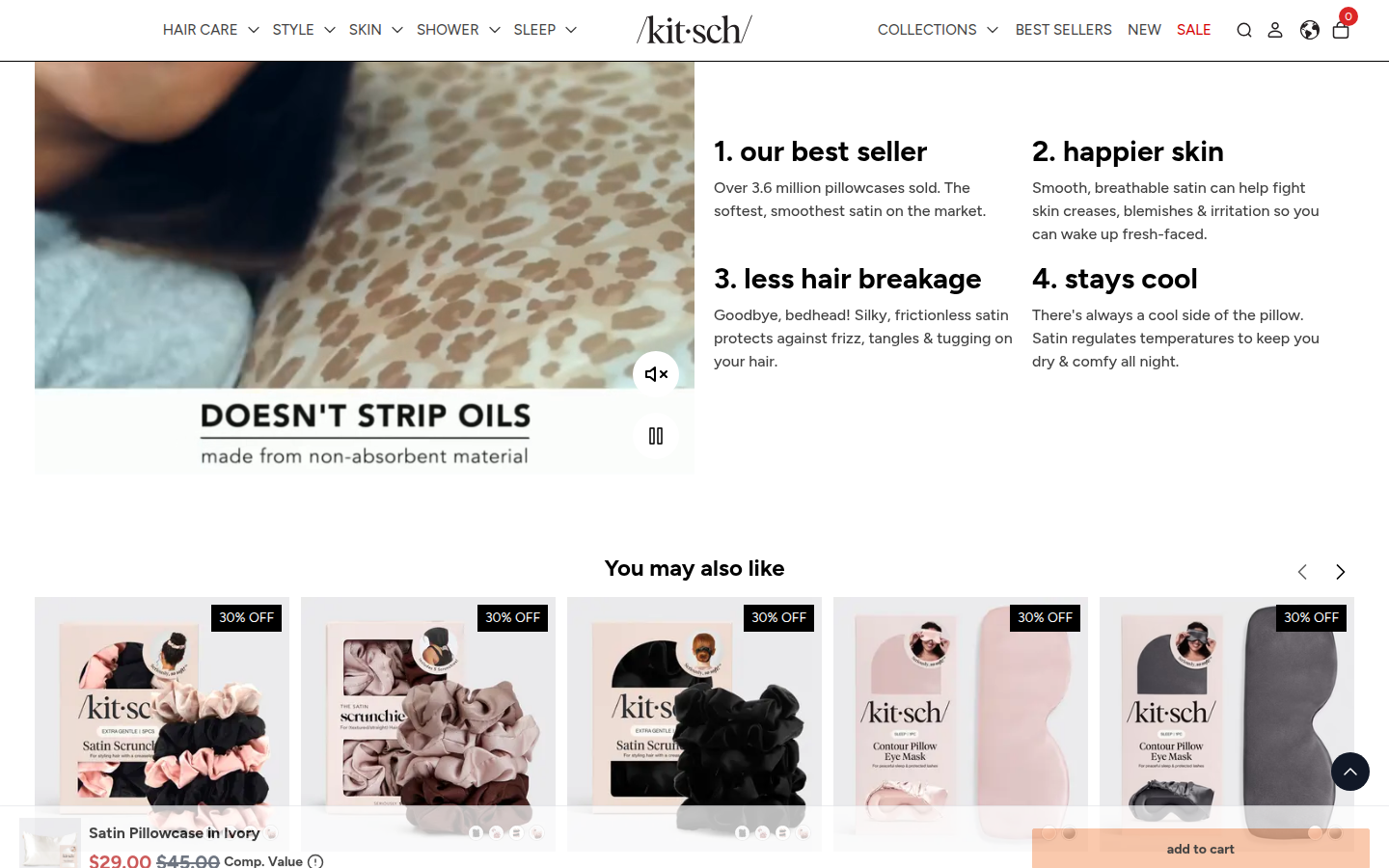
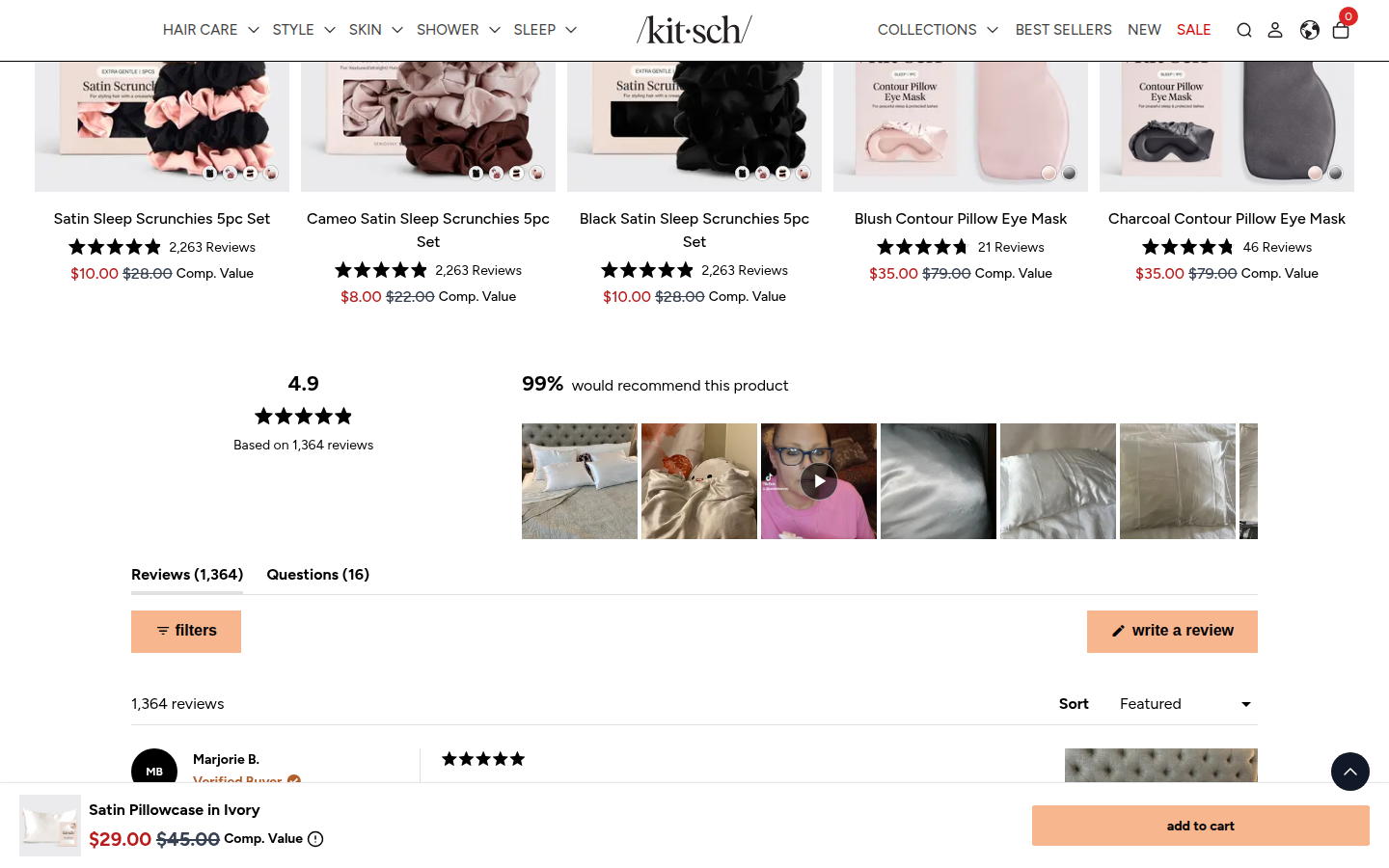
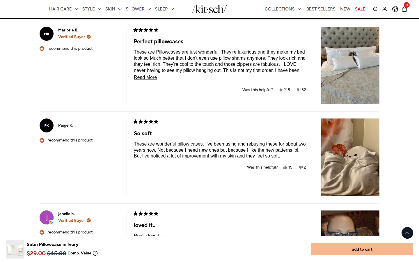
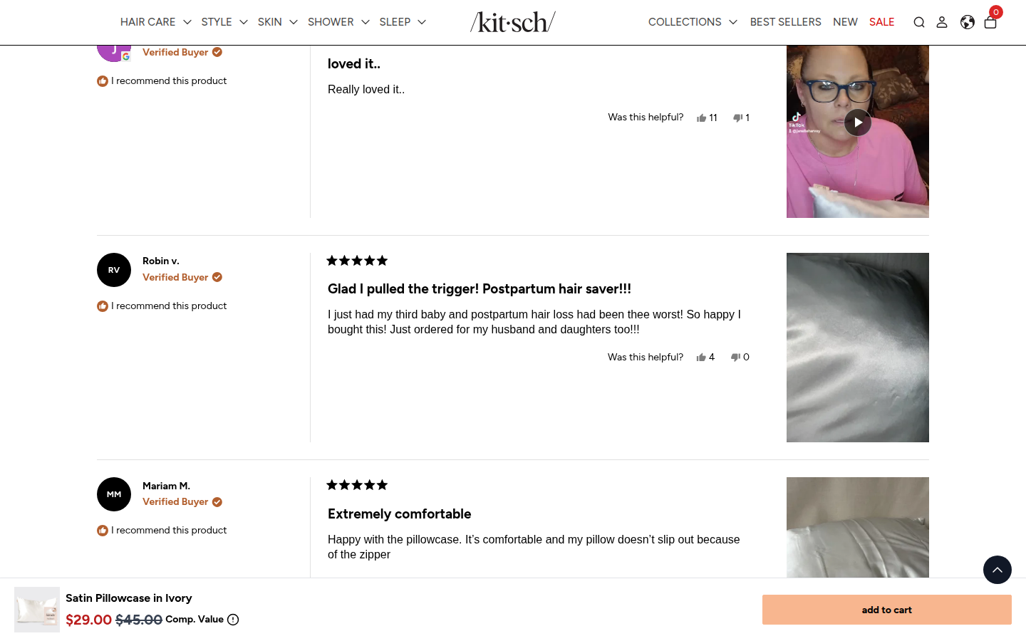
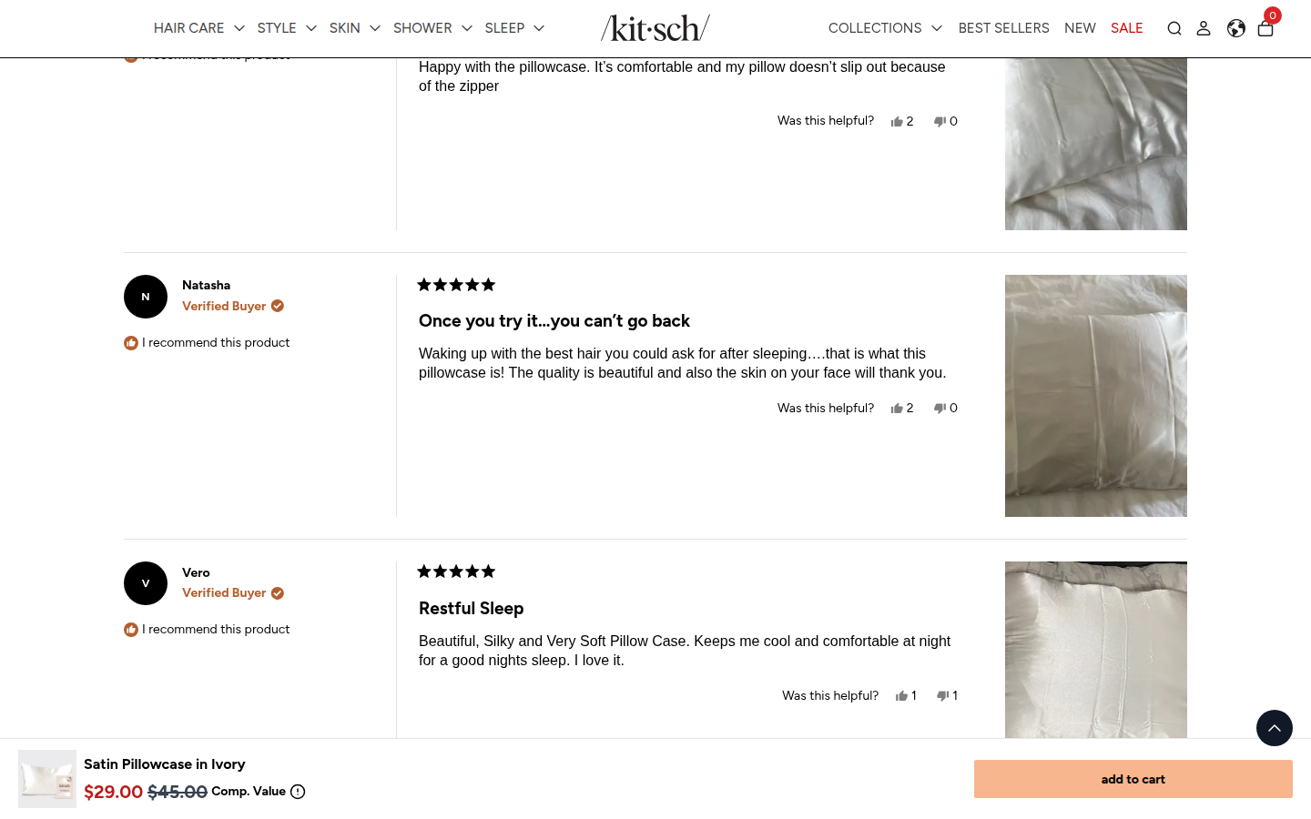
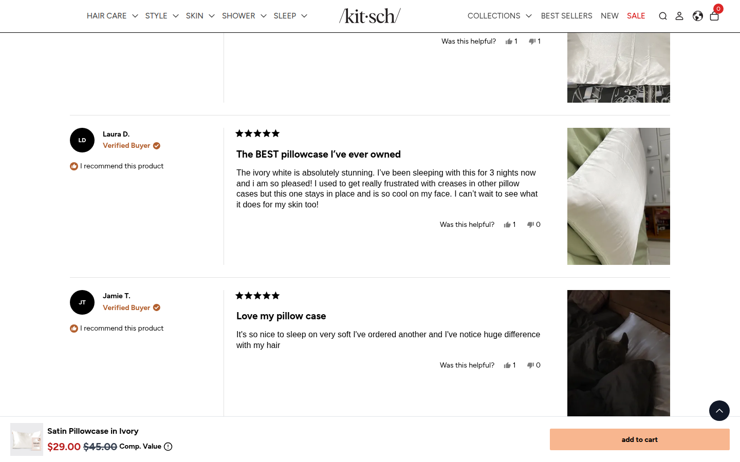
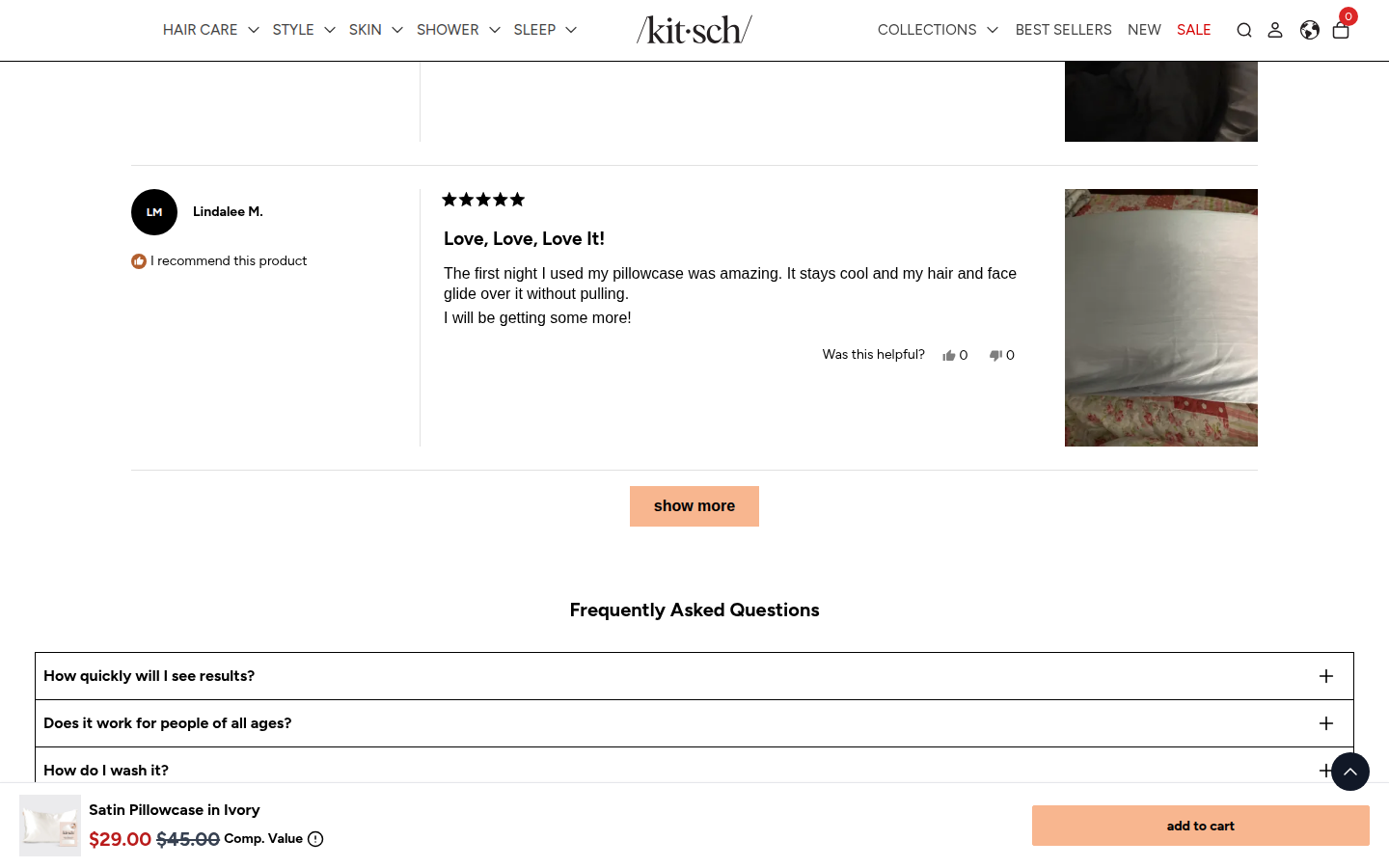
Official Pillowcase Best Sellers collection features this Satin Pillowcase PDP, a core Kitsch product with prominent review proof. Sampled official PDP
Judge A · craft-led: 7.99/10
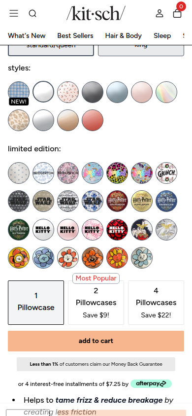
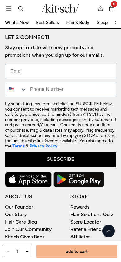
| Craft | 7.8 | The product photography, black-and-peach visual system, and clear sans typography are consistently finished. Repeated promotion treatments and the oversized style matrix make the purchase surface visually busy. evidence evidence evidence |
|---|
| Identity | 8.4 | The playful package photography, confident wordmark, peach accents, and warm beauty imagery carry a distinct approachable Kitsch world from hero to footer. evidence evidence evidence |
|---|
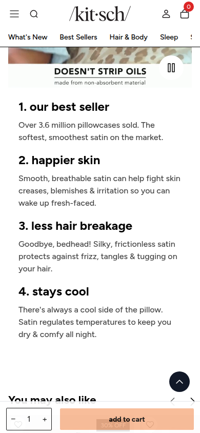
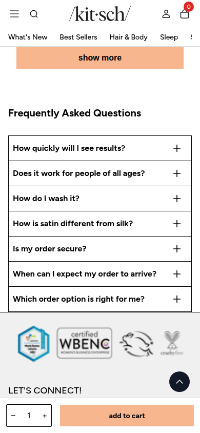
| Journey | 7.7 | The journey progresses from selection to benefit story, recommendations, reviews, FAQ, and footer. The crowded selector and long, lightly differentiated review run make it more effortful than the initial hierarchy suggests. evidence evidence evidence |
|---|
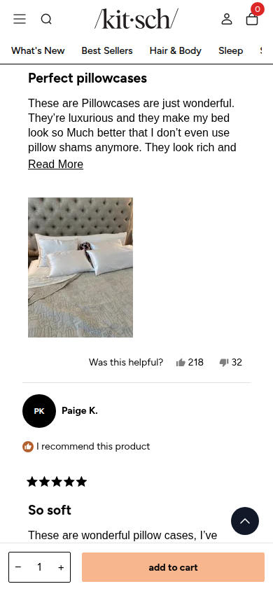
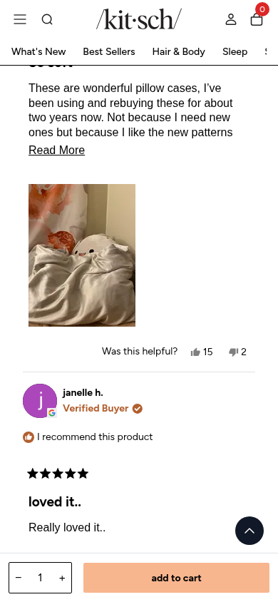
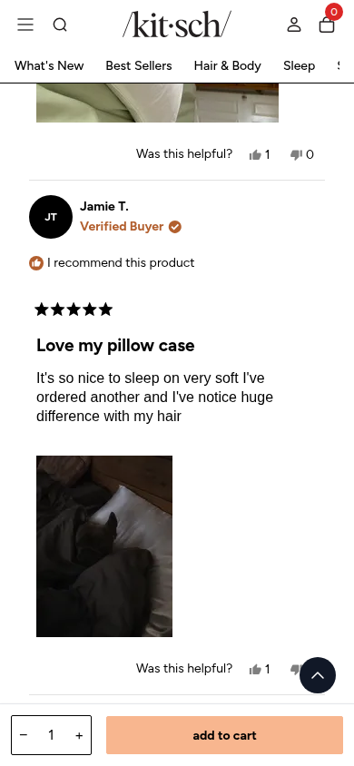
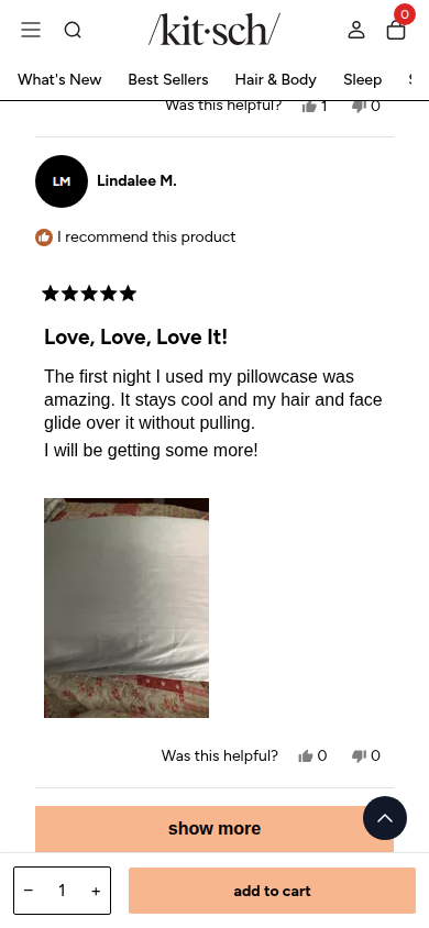
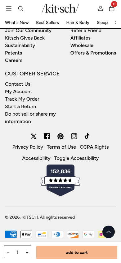
| Trust | 8.2 | Visible review count, buyer labels, reviewer imagery and video, review controls, FAQs, and organization marks offer substantial confidence cues. This assessment concerns their presentation, not verification of underlying claims. evidence evidence evidence |
|---|
| Offer | 8.4 | Price, comparison value, promotion, size, style, bundle choice, payment option, and add-to-cart remain prominent at the decision point. evidence evidence evidence |
|---|
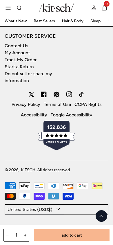
| Mobile | 7.5 | The core imagery, choices, review evidence, FAQ, and footer retain legibility at 390px. Persistent promotional and purchase chrome plus the dense swatch-and-bundle controls reduce the calm reading room during a long scroll. evidence evidence evidence |
|---|
Strengths
- A vivid product system connects tactile imagery, package design, price, and selection at the top of the page.
- The peach, black, and white palette with the Kitsch wordmark makes the experience immediately recognizable and approachable.
- A large, well-presented review area uses visible buyer labels and customer photo or video content to add texture.
Priorities
- Cluster or progressively reveal the style and limited-edition choices so the decision surface reaches its purchase action with less scanning.
- Consolidate adjacent promotion and offer messages to establish a quieter cadence between the product choice and benefit story.
- Reduce persistent mobile chrome during deep review and FAQ reading to return more vertical space to the content.
Limitations
- Static full-page captures were reviewed at 390px and 1440px; interaction states and factual substantiation were not assessed.
Judge B · journey-led: 8.17/10
| Craft | 8.2 | The photographic hero, black-and-peach commerce system, clear type and product packaging create a polished, consistent PDP. The very long selector grid and repeated review entries make the lower page visually more utilitarian than the opening. evidence evidence evidence evidence evidence evidence |
|---|
| Identity | 8.3 | The distinctive wordmark, playful package graphics, peach action color, and approachable beauty imagery form a recognizable visual language that survives the dense commerce controls. evidence evidence evidence evidence evidence evidence |
|---|
| Journey | 7.8 | Selection, benefits, customer evidence, FAQs and footer service information form a full, understandable sequence. The unusually large set of style and licensing options makes the purchase corridor long before the buyer reaches the core product explanation. evidence evidence evidence evidence evidence evidence evidence evidence evidence evidence |
|---|
| Trust | 8.4 | Review volume, recommendation rate, individual verified-buyer review cards, customer images/video and prominently placed guarantee language provide varied reassurance in the rendered experience. evidence evidence evidence evidence evidence evidence evidence evidence |
|---|
| Offer | 8.8 | Price reduction, code, size, styles, bundle quantity, installment option, guarantee and persistent add-to-cart action are all explicit. The multiplicity of variant choices still makes the choice feel demanding. evidence evidence evidence evidence |
|---|
| Mobile | 7.6 | Text, primary controls, proof content and the sticky cart remain legible at 390px. The sticky bar removes meaningful viewport height, while the extensive circular style grid and long reviews extend the narrow journey substantially. evidence evidence evidence evidence evidence evidence evidence |
|---|
Strengths
- Strong product image, packaging and commerce hierarchy at the primary decision point.
- A clear, recognizable visual identity carried from hero to post-purchase service content.
- Extensive customer review media and verified-buyer presentation are easy to find.
Priorities
- Group the large style and licensing selection set behind a clearer first choice or compact picker.
- Reduce persistent mobile cart-bar height once selection is complete.
- Give the long review run more visual summarization before individual entries.
Limitations
- Every supplied readable desktop1440 and mobile390 frame was visually reviewed.
- No interaction, checkout, accessibility, provenance, health-claim, or commercial-performance claim is made.
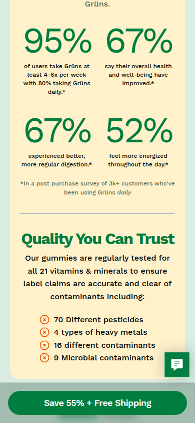
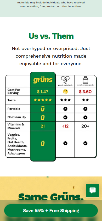
11. Grüns unavailable
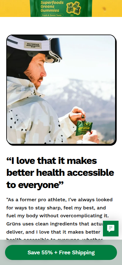
Core adult superfood gummies Sampled official PDP
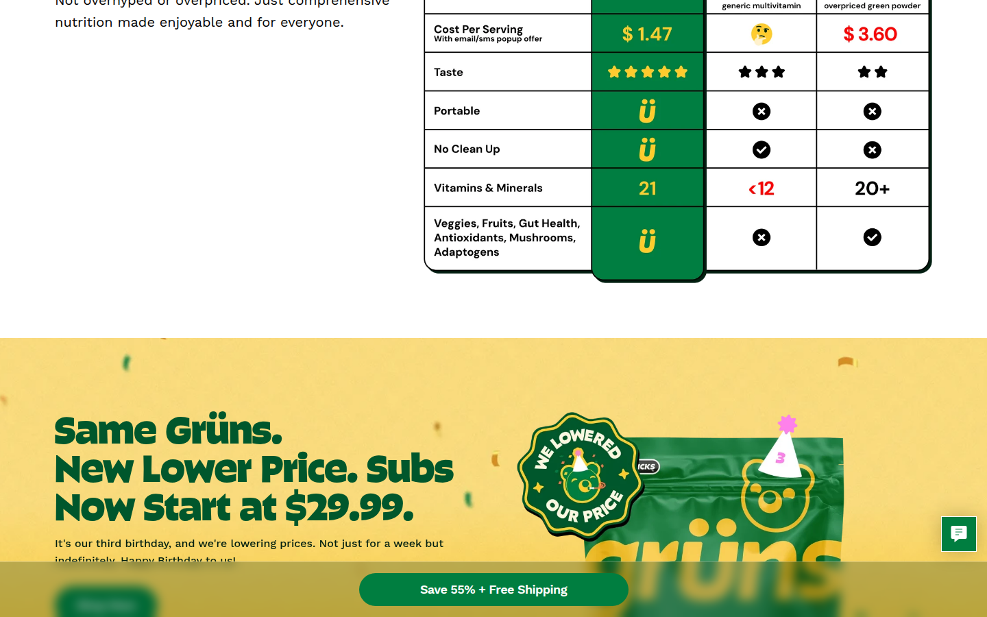
Unscored: An ordinary retry completed, but the testimonial-video media remains replaced by black restricted-content cards: mobile segment-011-y7051 and desktop segments-007-y4788 through -008-y5472. Exclude these important-media frames from scoring; no usable complete visual-evidence set is available.
12. Ruggable valid
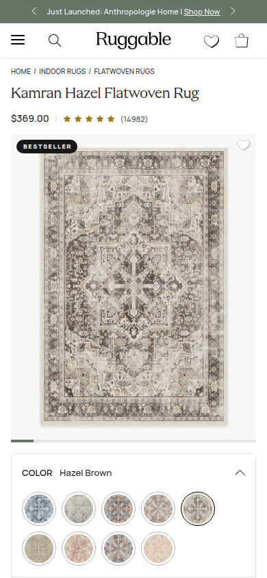
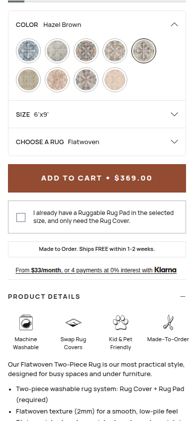
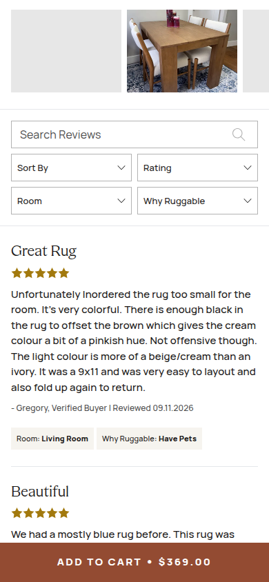
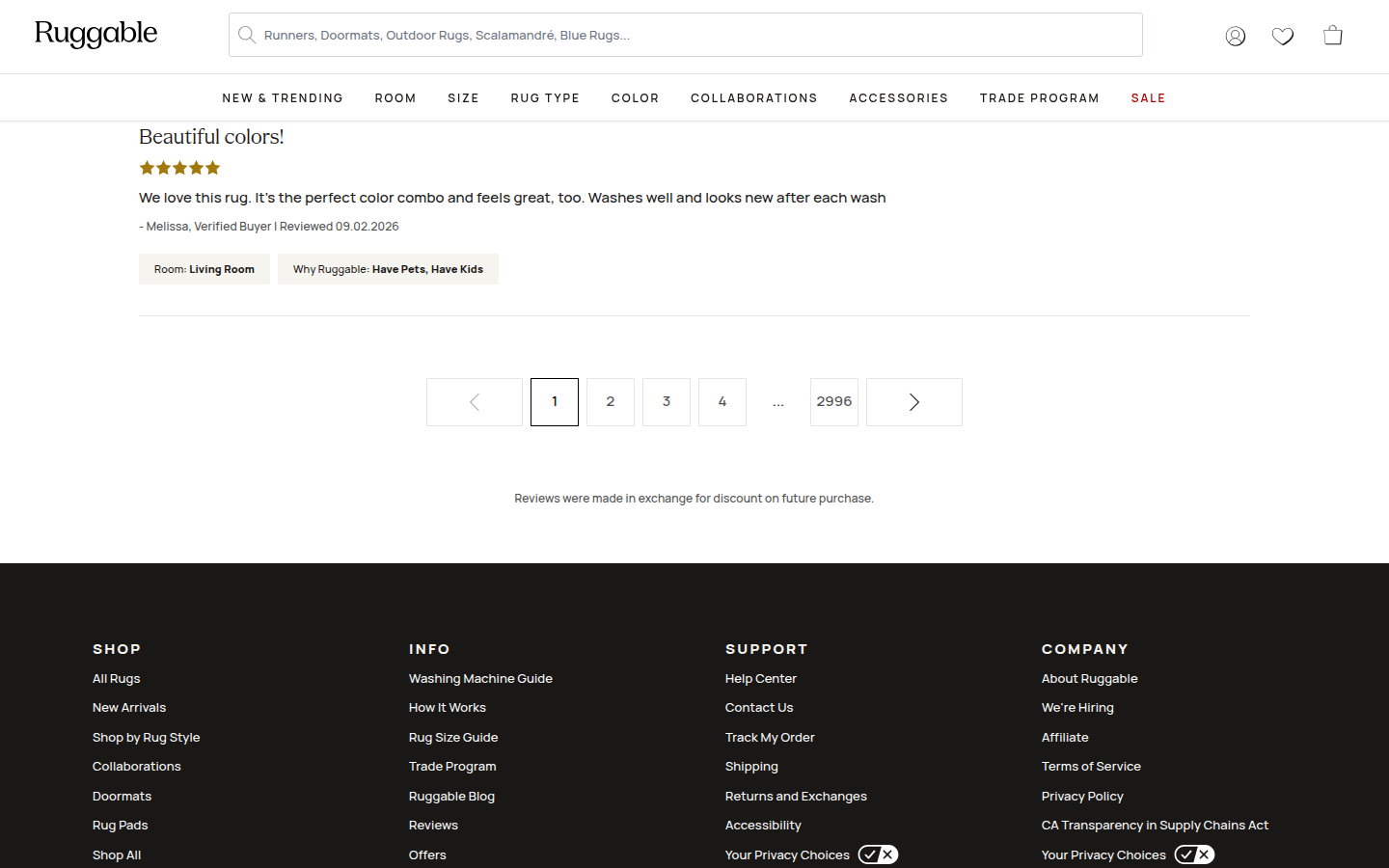
Official product page identifies this as a bestseller and it represents Ruggable's core two-piece washable Cover + Pad system. Sampled official PDP
Judge A · craft-led: 8.15/10
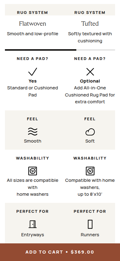
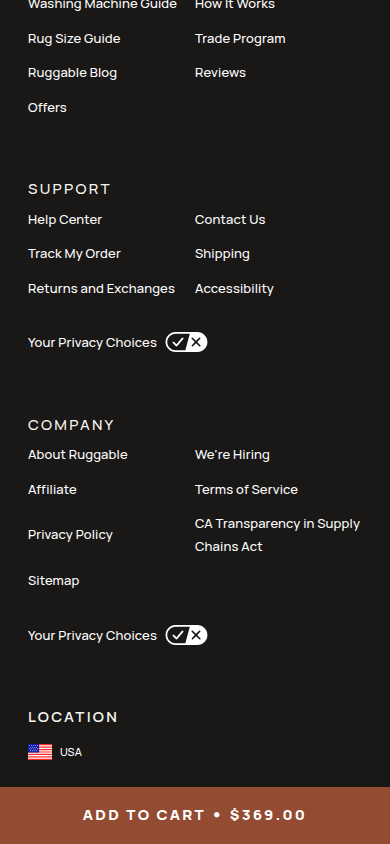
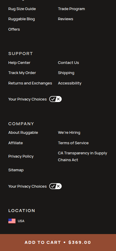
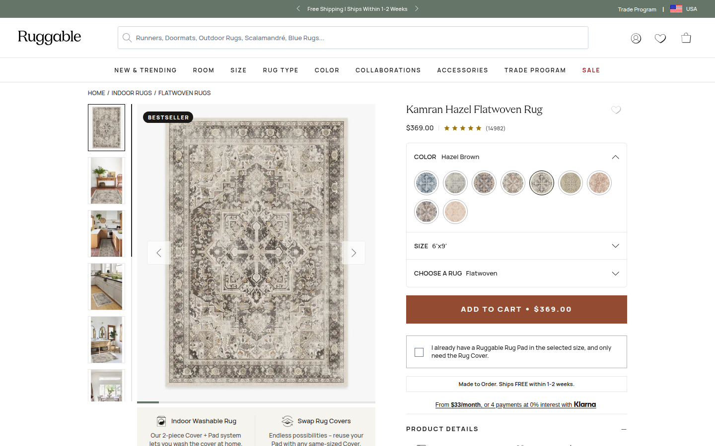
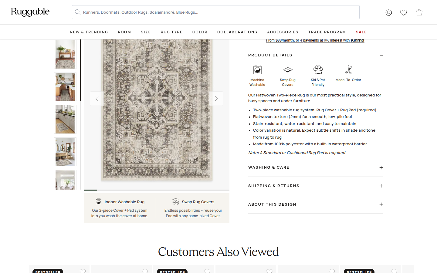
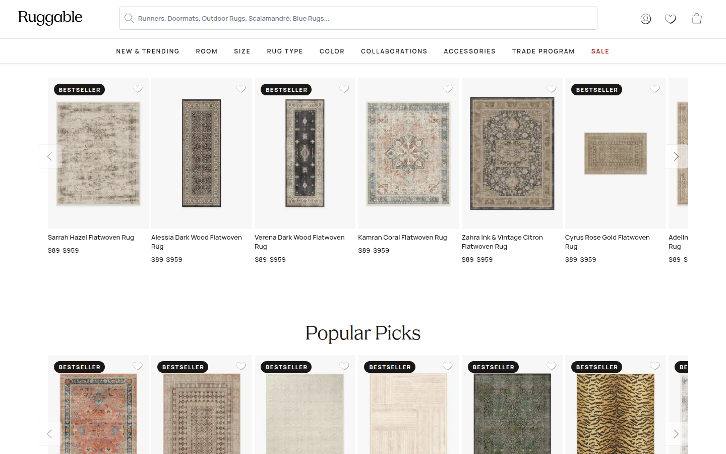
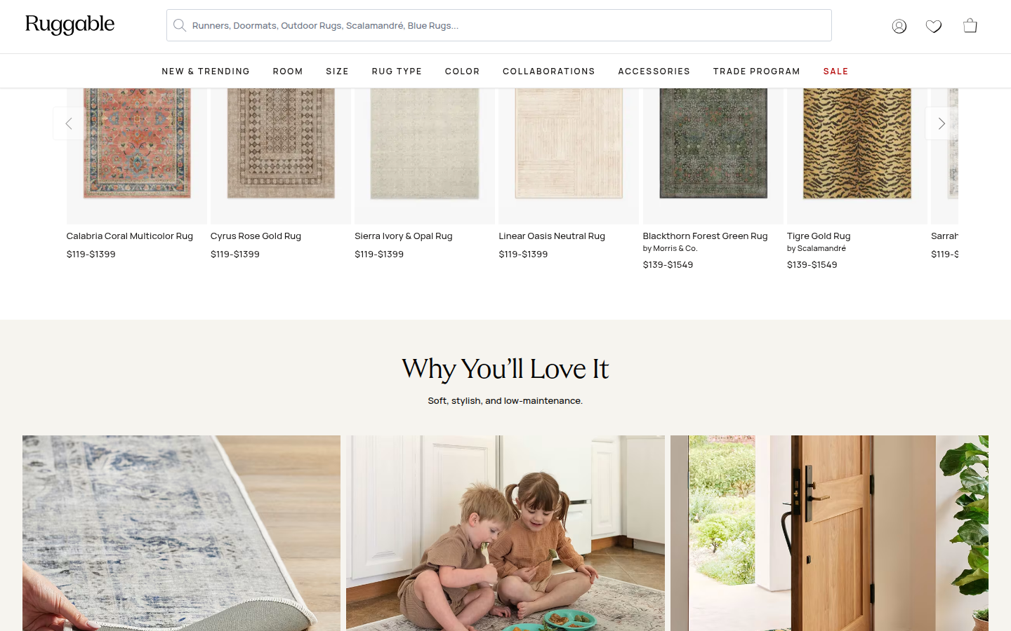
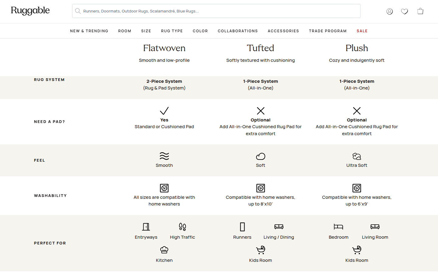
| Craft | 7.9 | A pared-back black, cream, and muted-rug palette, generous white space, and elegant serif hierarchy make the interface clear; catalog shelves and a large comparison grid shift the lower page toward routine retail presentation. evidence evidence evidence |
|---|
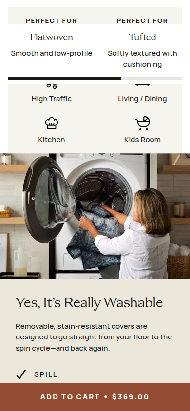
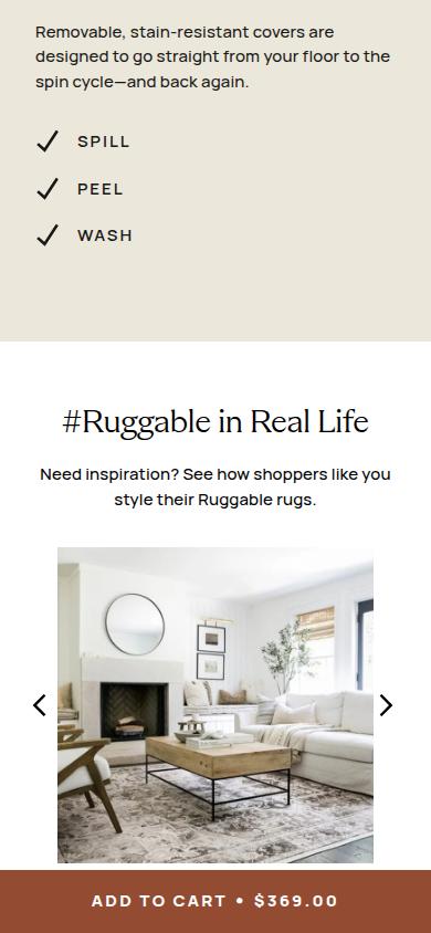
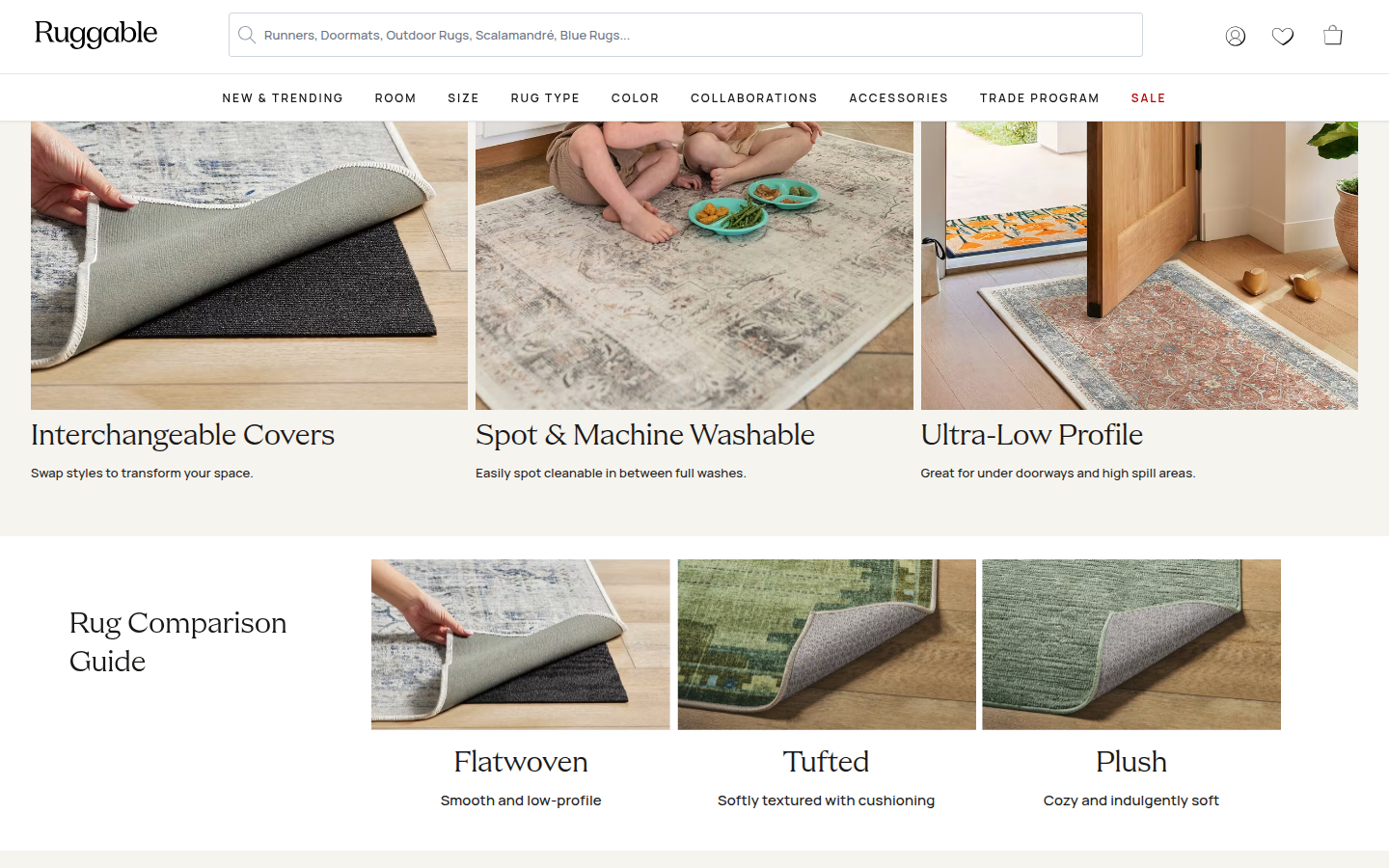
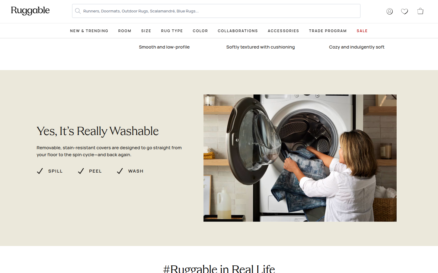
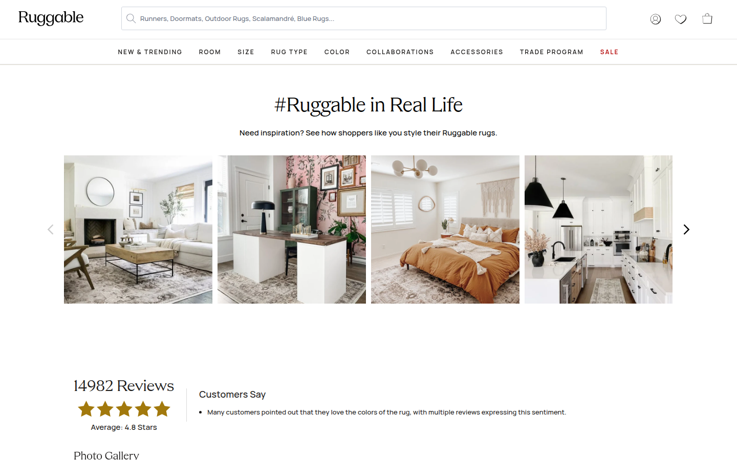
| Identity | 8.1 | The visual language consistently frames rugs as flexible home objects through interior photography, warm neutrals, careful product presentation, and practical care imagery. evidence evidence evidence |
|---|
| Journey | 8.2 | The progression from exact configuration to material explanation, lifestyle evidence, product comparison, washability, real-life gallery, and reviews is easy to follow; two consecutive recommendation shelves arrive before the main product story develops. evidence evidence evidence |
|---|
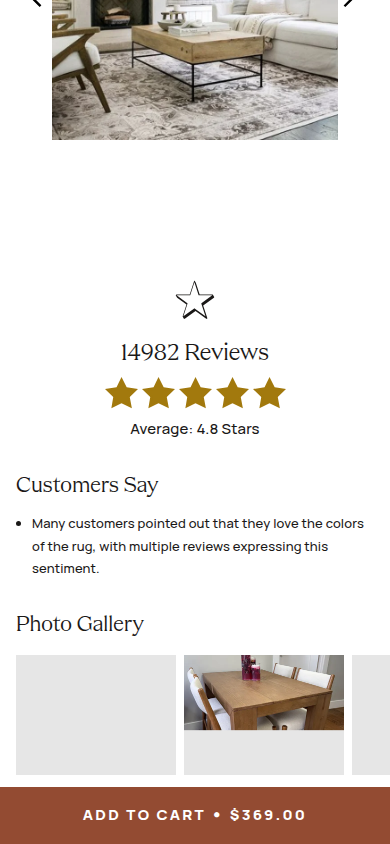
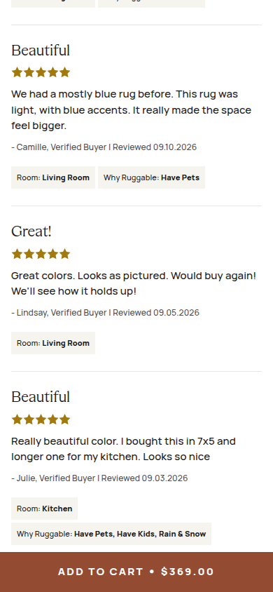
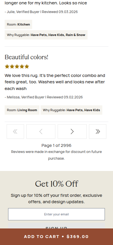
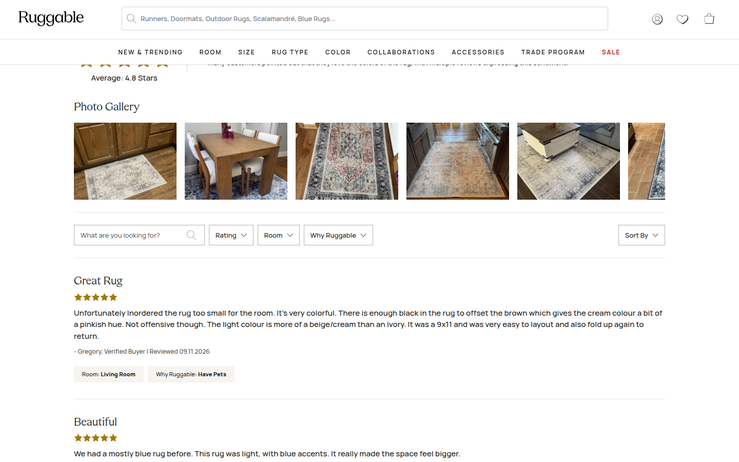
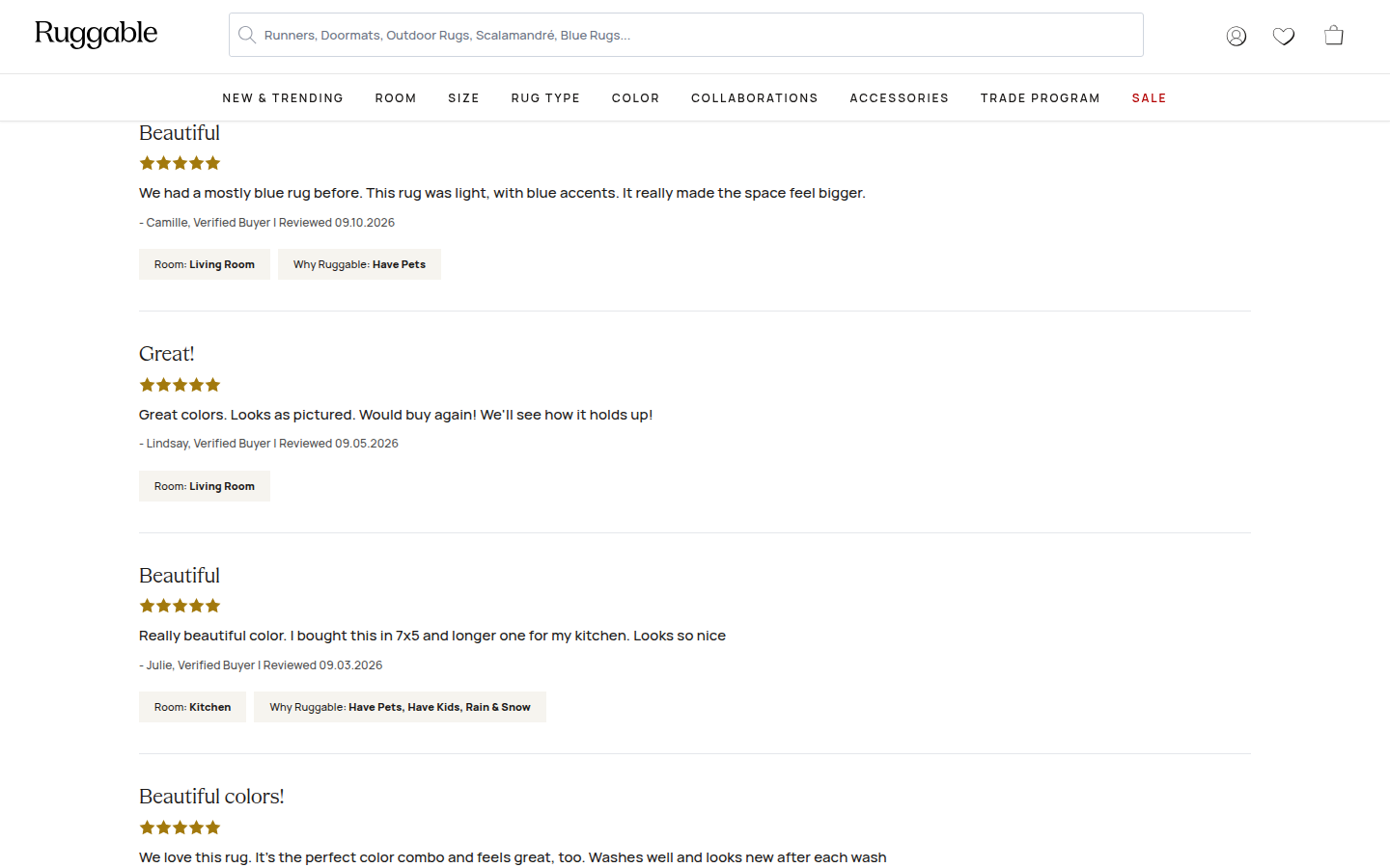
| Trust | 8.5 | Specific material and care details, contextual photos, a large review total, buyer photo gallery, filters, and named detailed reviews form a convincing proof presentation. evidence evidence evidence |
|---|
| Offer | 8.3 | Color, size, rug construction, price, payment option, timing, and a prominent action are grouped well at the decision point; the required-pad note has enough visibility to clarify the purchase. evidence evidence |
|---|
| Mobile | 8.1 | The selection panels, sticky purchase action, comparison content, and reviews remain readable at 390px; the persistent cart bar and extended recommendation shelves reduce the space available for the central story. evidence evidence evidence |
|---|
Strengths
- A calm, coherent home-interior visual language connects the product to real rooms and daily use.
- Configuration and required purchase context are unusually clear early in the journey.
- The washability explanation and detailed review evidence make the claim-to-proof sequence feel credible.
Priorities
- Move or shorten the two recommendation shelves so they do not interrupt the product education before the core benefit story.
- Give the long comparative specification grid a more concise mobile summary before the full detail.
- Introduce a stronger visual transition between catalog browsing and the later editorial proof sections.
Limitations
- Judgment is limited to supplied static journey captures; interactions, size and rug selections, expandable details, gallery behavior, and checkout were not assessed.
Judge B · journey-led: 8.33/10
| Craft | 8.3 | The restrained black, cream, and warm-brown system is cleanly typeset and the interiors are composed well; repeated product-card grids feel more conventional than the leading product surface. evidence evidence evidence evidence |
|---|
| Identity | 8.3 | The patterned rug photography, serif display type, and considered rooms create a coherent premium-home identity, though the merchandising modules are familiar category patterns. evidence evidence evidence evidence |
|---|
| Journey | 8.4 | Color, size, format, price, and practical ownership questions are all visibly answered, then supported by a useful flatwoven-versus-plush comparison. Recommendations arrive before some of the deeper “why this format” education, and the cover-only option is a consequential condition presented fairly late. evidence evidence evidence evidence evidence evidence |
|---|
| Trust | 8.7 | High-volume rating proof, photo reviews, named verified buyers, review filters, and a clear disclosure that some reviews were exchanged for a discount make the proof system unusually legible. evidence evidence evidence evidence evidence |
|---|
| Offer | 8.1 | Price, financing, shipping promise, delivery estimate, and the purchase action are easy to locate. The option complexity and cover-only checkbox add a small amount of buying friction. evidence evidence evidence evidence |
|---|
| Mobile | 8.0 | The mobile hierarchy and choices remain readable and the fixed add-to-cart action remains clear. Its persistent tall bar materially reduces the visible lower-page canvas, while several galleries still demand sideways exploration. evidence evidence evidence evidence |
|---|
Strengths
- A polished product decision surface with real material, format, and care education.
- Review proof is deep and transparent rather than just a star-count badge.
- The room photography and typography give the long page a consistent premium-home feel.
Priorities
- Move the cover-only/pad decision closer to the primary format and size choices, with plainer consequence framing.
- Reduce the height or persistence of the mobile purchase bar after the primary buying zone.
- Sequence the strongest product-format rationale before recommendation grids so first-time shoppers reach the “why” sooner.
Limitations
- Reviewed every supplied readable desktop1440 and mobile390 frame only. One mobile photo-gallery tile is blank in the supplied capture and was not treated as a product-design deduction.
- No interaction, checkout, accessibility, provenance, health-claim, or commercial-performance claim is made.
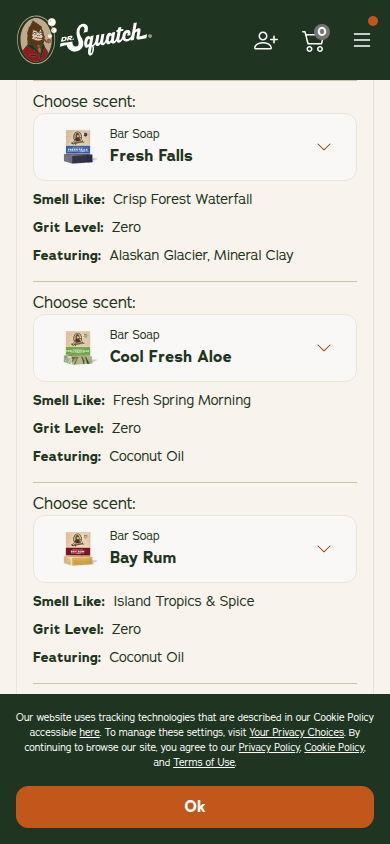
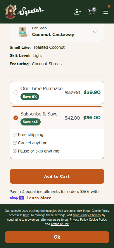
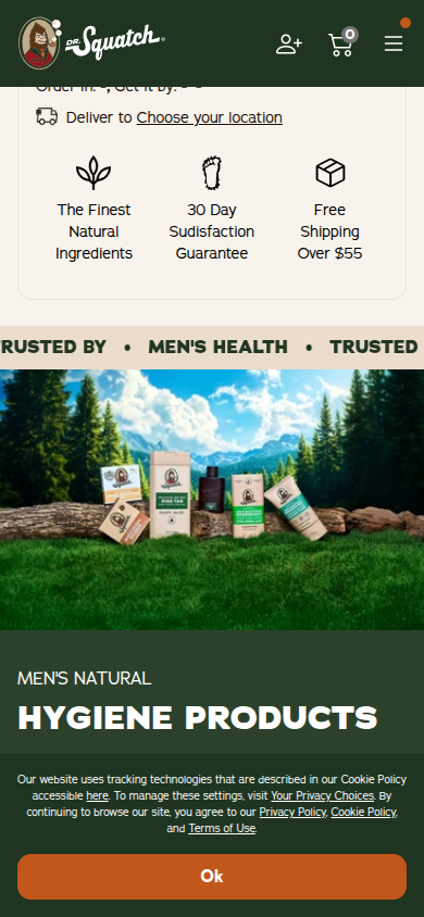
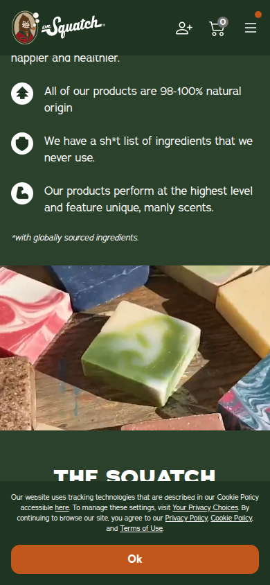
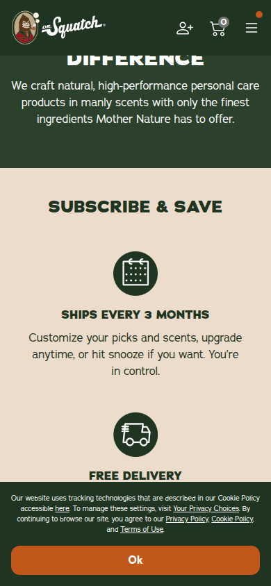
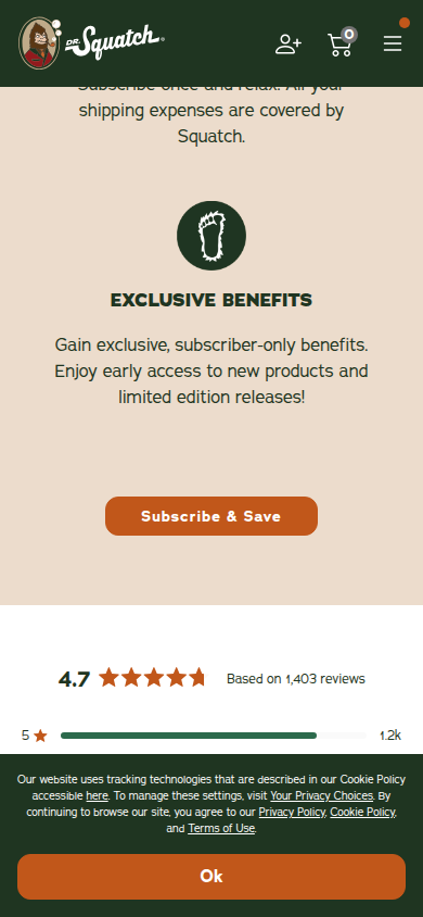
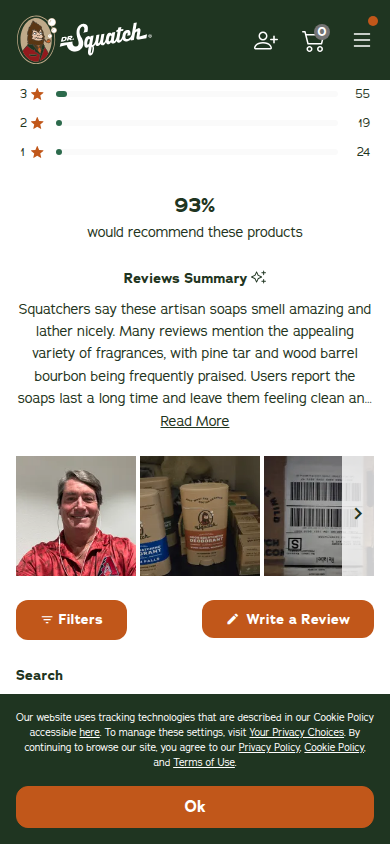
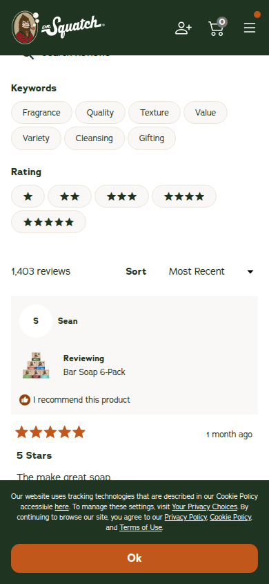
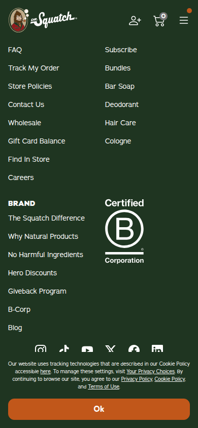
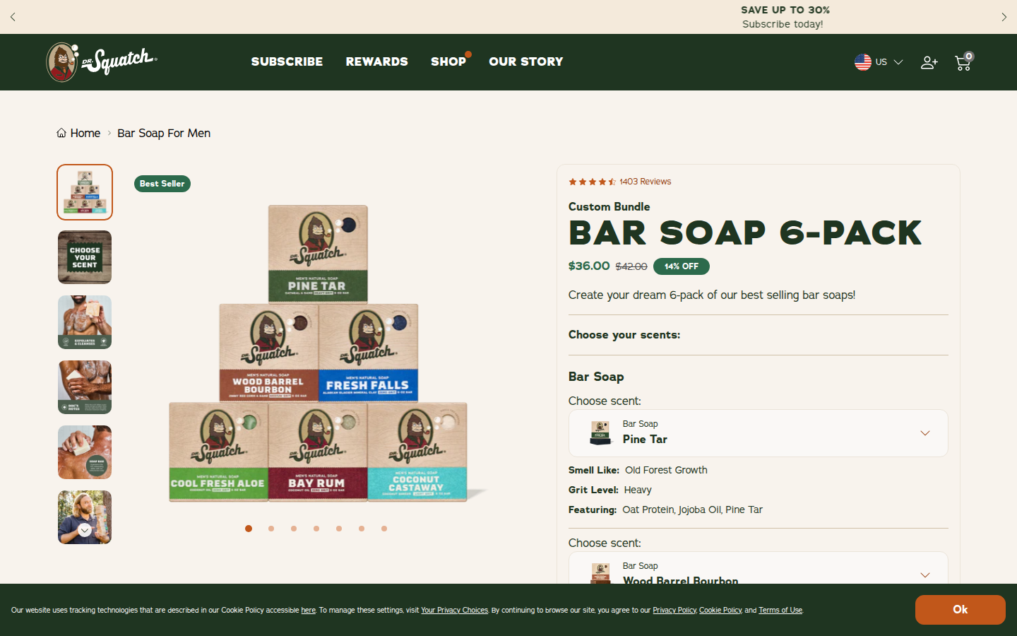
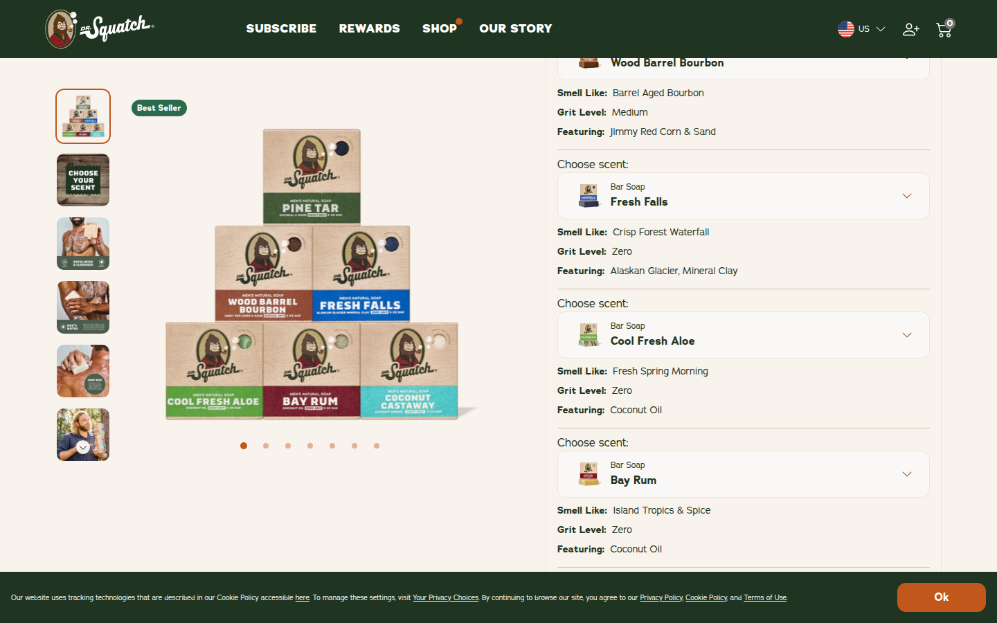
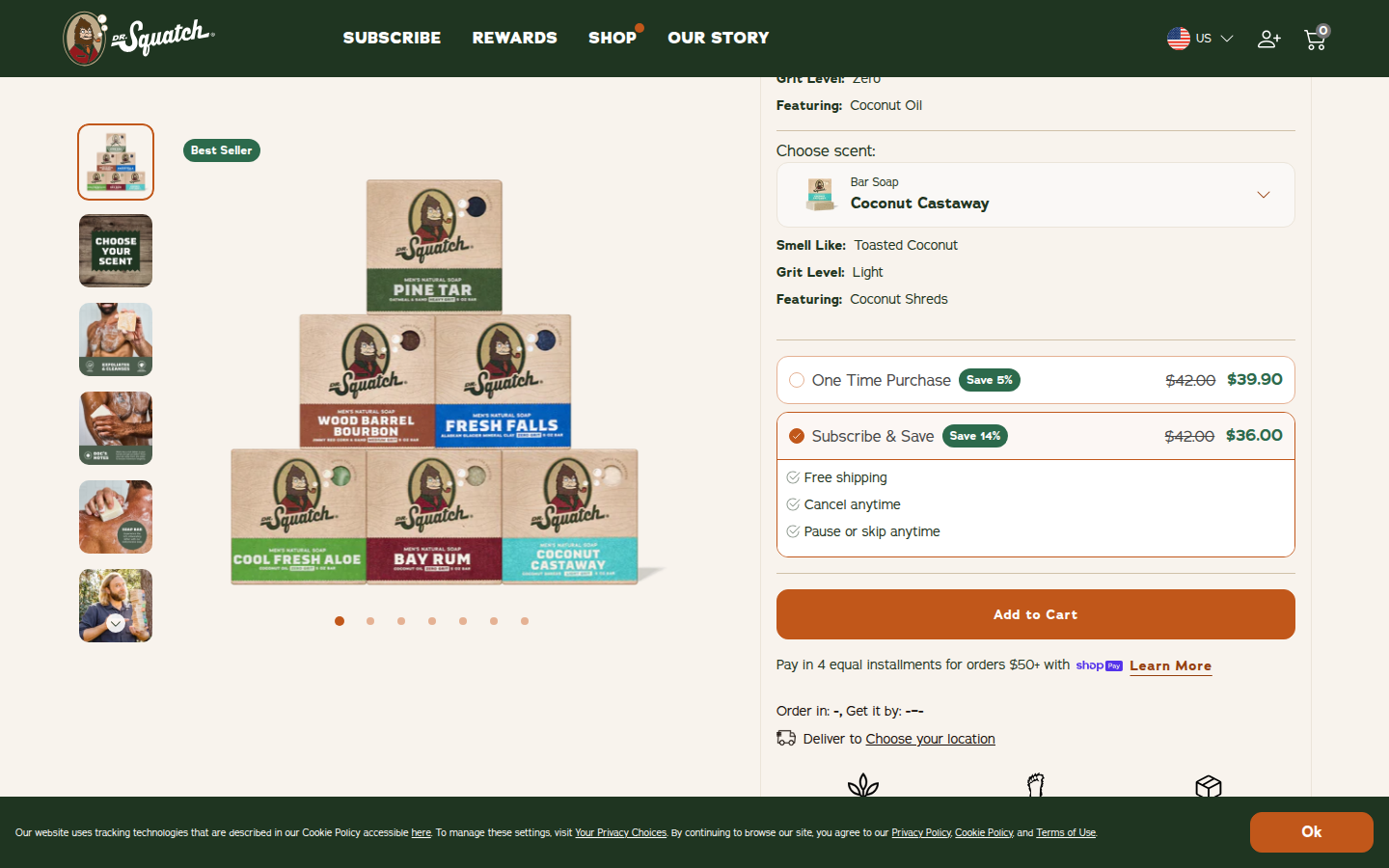
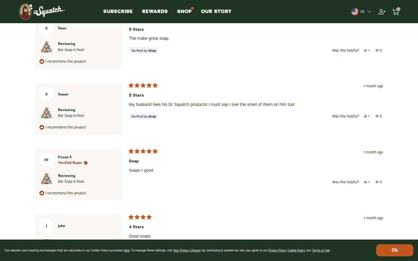
13. Dr Squatch unavailable
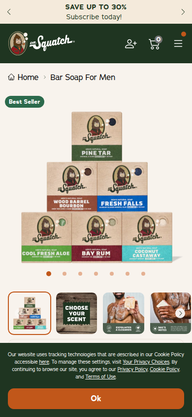
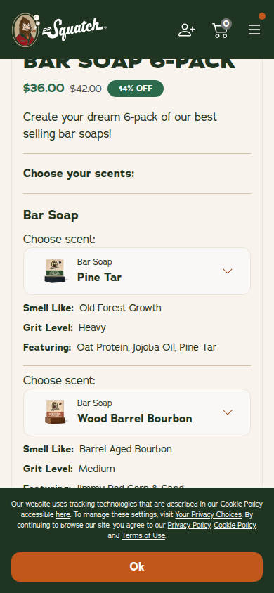
Official product page and bundle collection label the custom Bar Soap 6-Pack a bestseller; it shows the brand's core product and bundle mechanics. Sampled official PDP
Unscored: Latest ordinary retry still has the cookie-consent panel with visible OK control across sampled opening, middle, and footer at both widths. The journey cannot be treated as clean evidence.
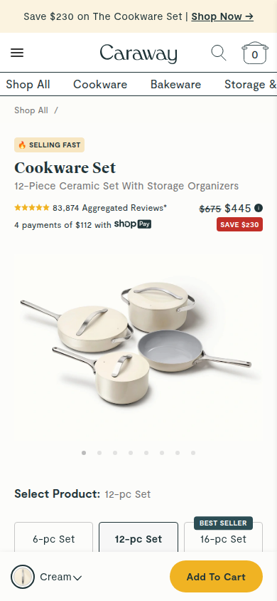
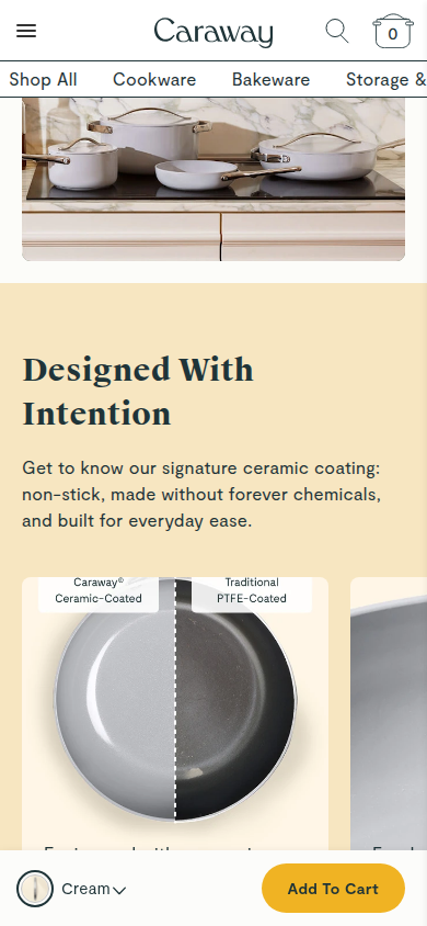
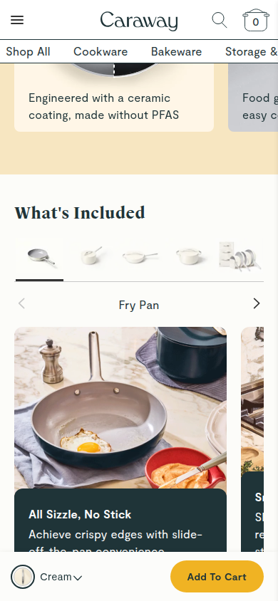
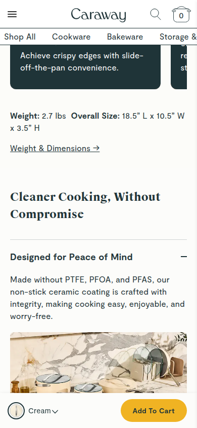
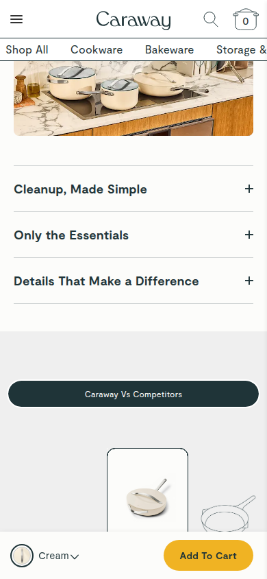
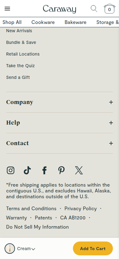
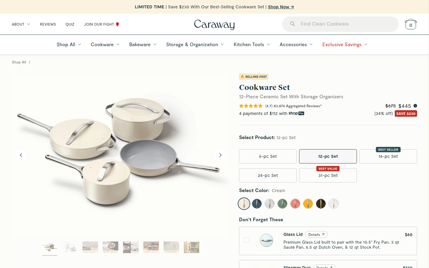
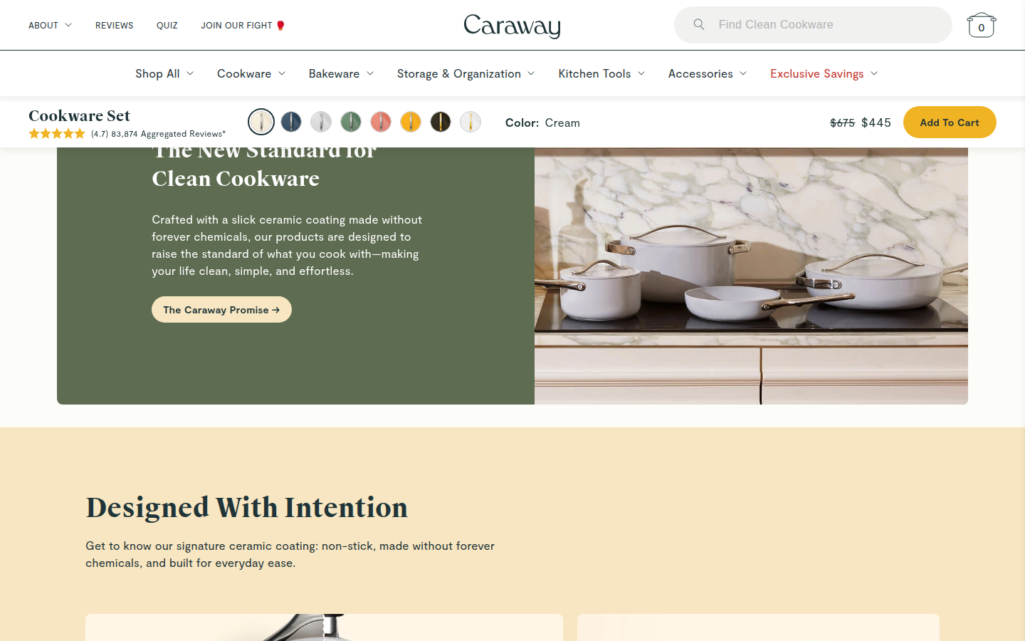
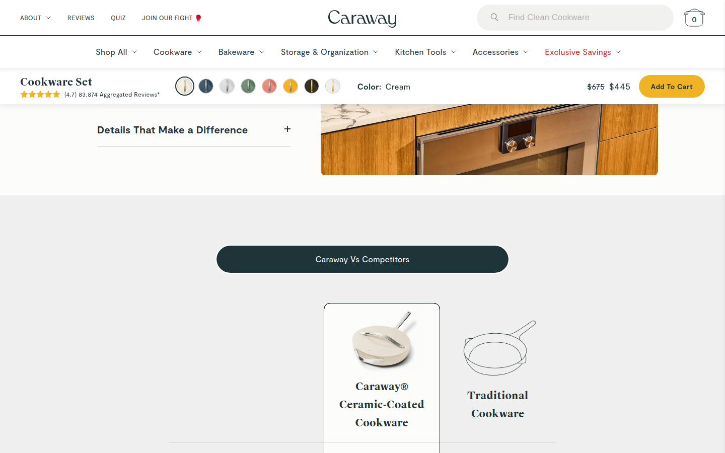
14. Caraway valid
Official Cookware Set PDP is the brand's central cookware offer and is promoted there as selling fast. Sampled official PDP
Judge A · craft-led: 8.39/10
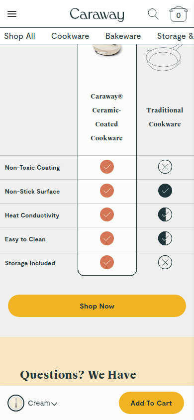
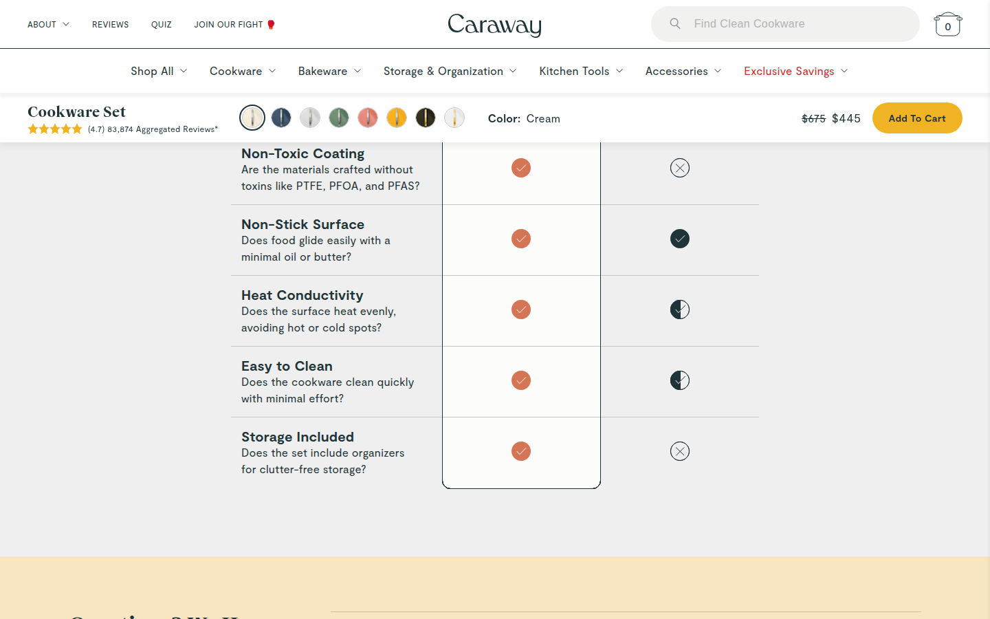
| Craft | 8.4 | The cream, navy, and warm-yellow system is carried with unusually disciplined spacing, product photography, editorial type, and restrained graphic detail; the dense run of later comparison, FAQ, recommendations, and reviews becomes visually more utilitarian. evidence evidence evidence |
|---|
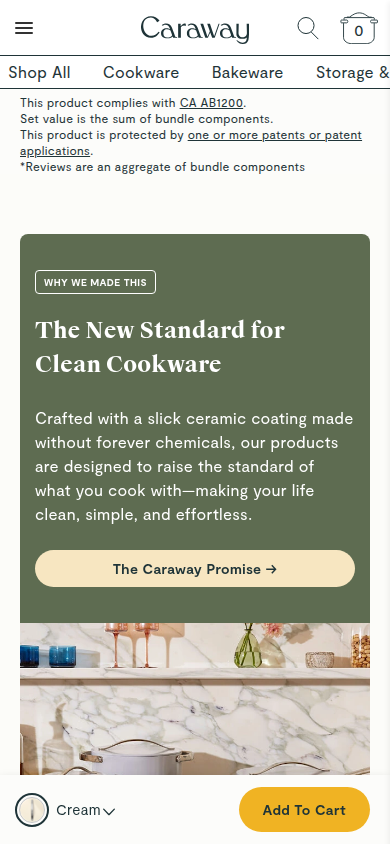
| Identity | 8.5 | Color-coded cookware, clean-kitchen imagery, serif headlines, and the calm home palette create a recognizable Caraway world that survives from selection through education and proof. evidence evidence evidence |
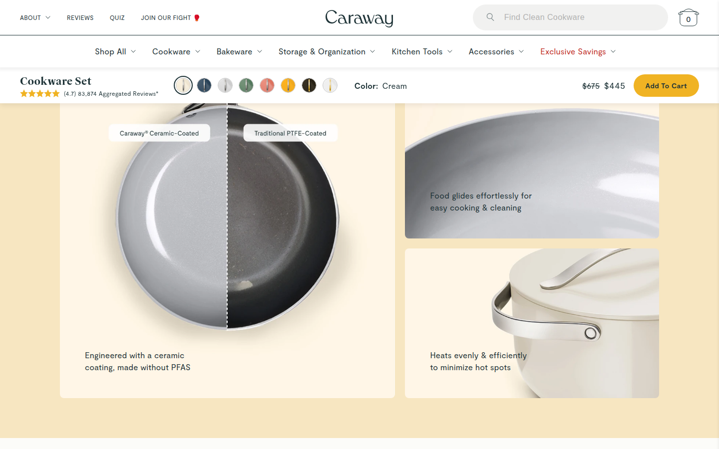
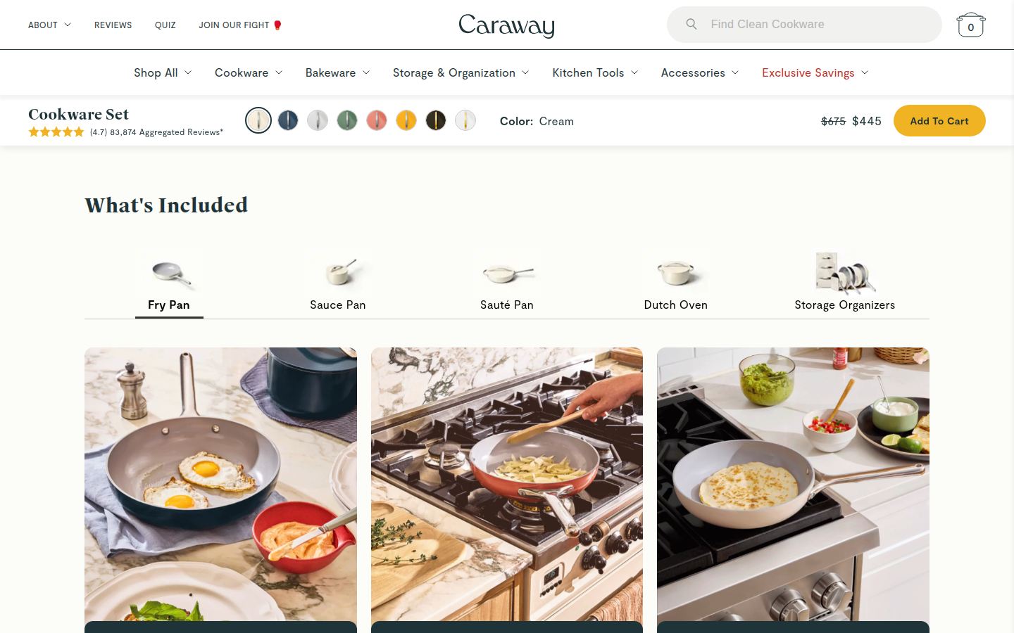
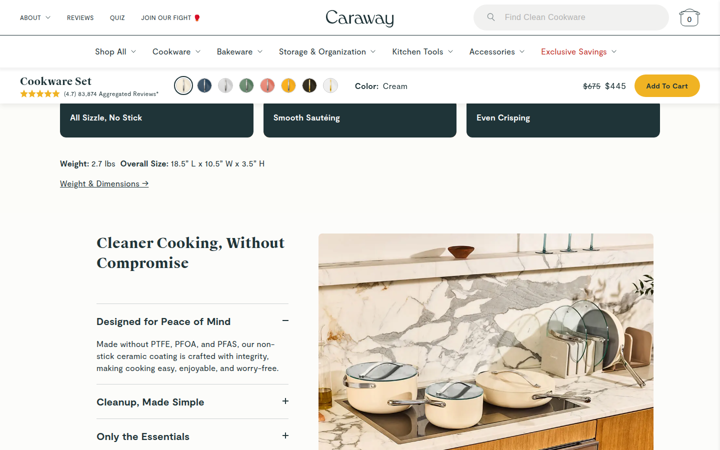
|---|
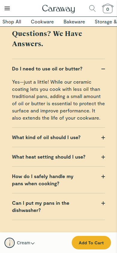
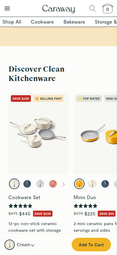
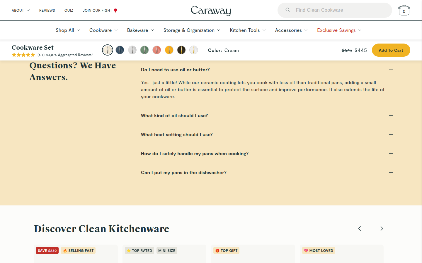
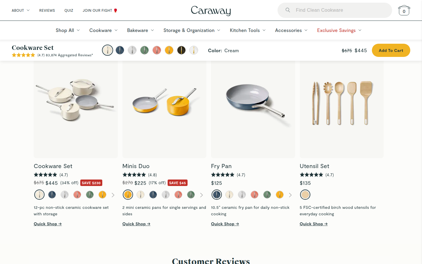
| Journey | 8.2 | The page moves coherently from product configuration to material comparison, included pieces, use cases, care guidance, FAQ, related products, and reviews; the informational middle is long and relies on several successive accordion or comparison formats. evidence evidence evidence |
|---|
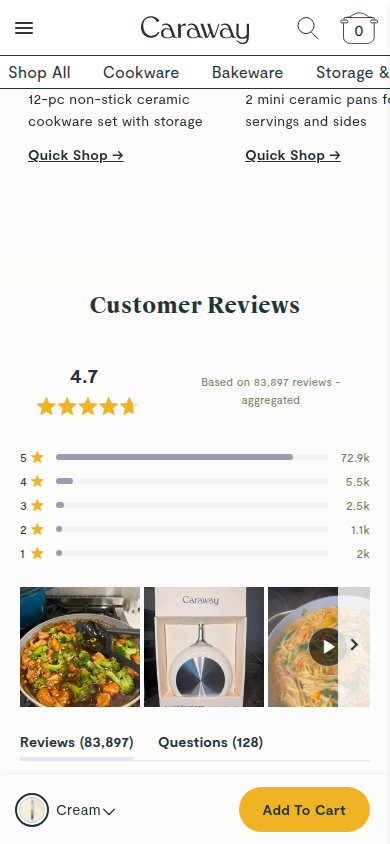
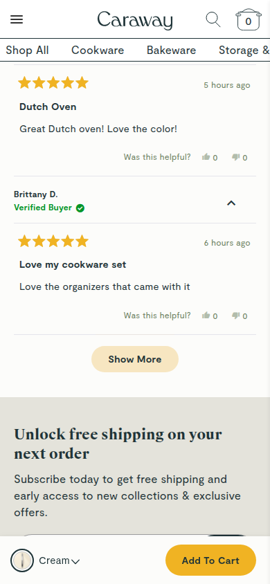
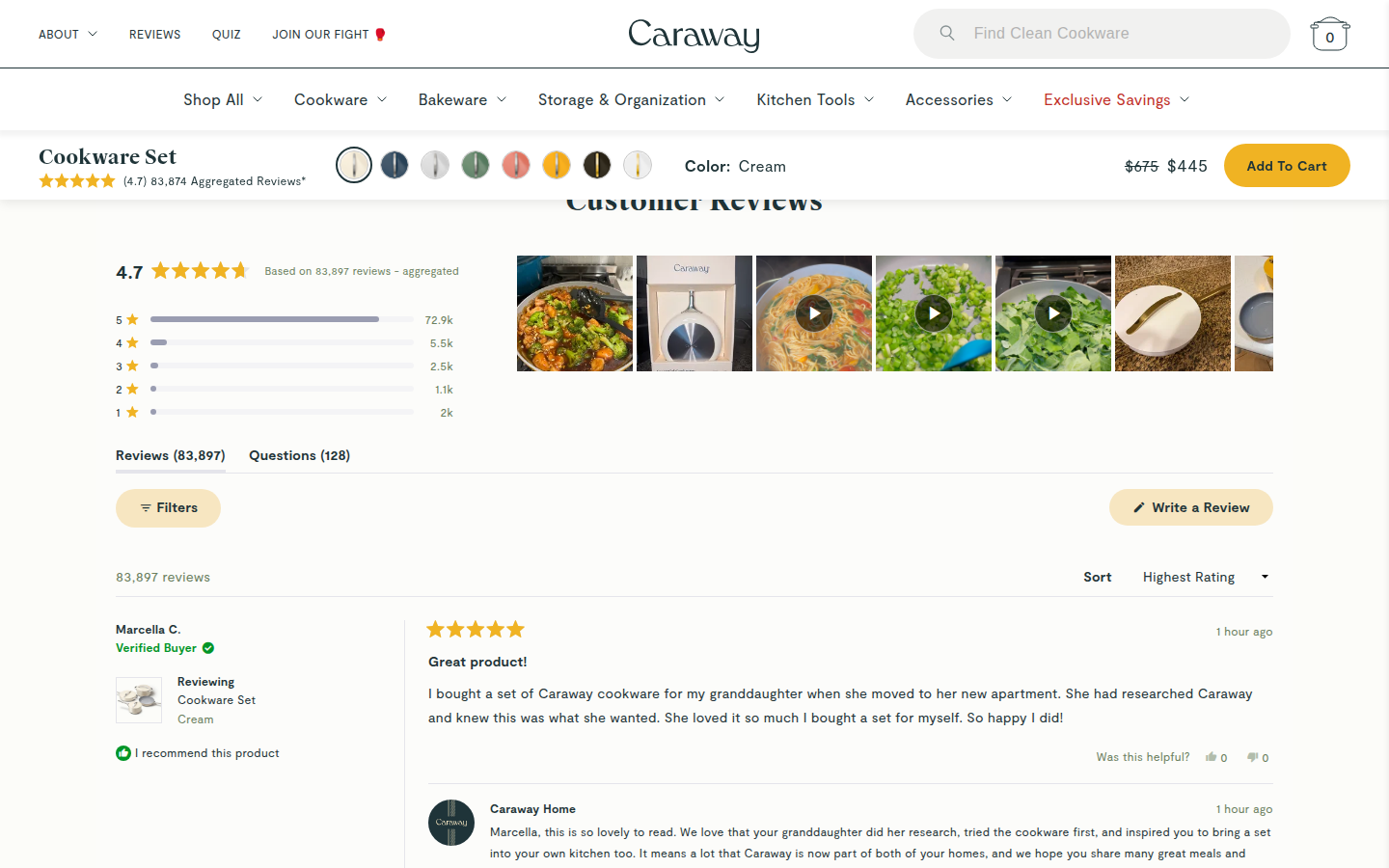
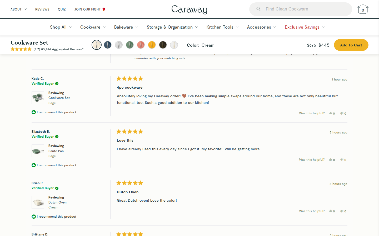
| Trust | 8.4 | The material comparison, product-specific details, large review aggregate, review media, verified-buyer labels, and brand replies make substantiation easy to scan without breaking the editorial treatment. evidence evidence evidence |
|---|
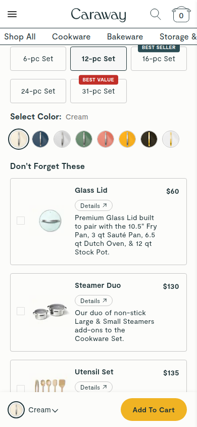
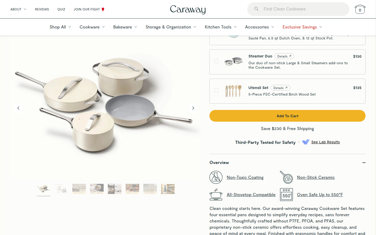
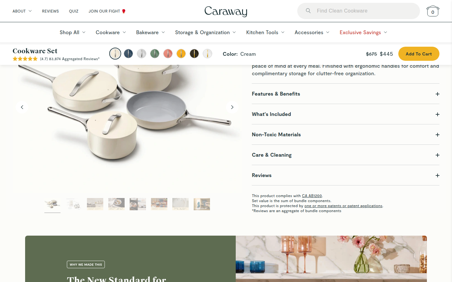
| Offer | 8.8 | Color, included items, discount, price, review signal, and add-to-cart action are all visible at the decision point, while the desktop purchase strip continues the decision context through the story. evidence evidence |
|---|
| Mobile | 8.1 | Photography, choice controls, proof, and the persistent purchase action remain legible at 390px; the tall fixed header and repeated long-form information modules make the overall scroll feel more occupied than the desktop journey. evidence evidence evidence |
|---|
Strengths
- A coherent editorial cookware identity is expressed through palette, product photography, and typography across the whole page.
- The purchase area makes a complex set, colors, value, and action easy to understand.
- Material comparison and buyer proof feel substantive and integrate cleanly into the product story.
Priorities
- Condense the middle information sequence so comparison, care, and FAQ do not require several similarly structured decision blocks in a row.
- Use a lighter mobile header state after initial selection to return more vertical room to the product story.
- Give the related-products-to-reviews transition a stronger editorial beat so the lower page feels less like a standard commerce stack.
Limitations
- Judgment is limited to supplied static journey captures; interactions, color selection, accordion behavior, video playback, and checkout were not assessed.
Judge B · journey-led: 8.60/10
| Craft | 8.6 | Precise product photography, restrained cream/ink/ochre palette, polished editorial photography and consistent type create a carefully finished surface across the long page. evidence evidence evidence |
|---|
| Identity | 8.5 | The clean-kitchen point of view is distinct and sustained through the cookware styling, deep green, warm cream and serif-led editorial moments. evidence evidence evidence |
|---|
| Journey | 8.5 | Configuration, add-ons, safety proof, product education, comparison, FAQ and readable reviews build a thorough decision path. The long repeated comparison and reassurance sequence creates some distance before the review proof. evidence evidence evidence evidence |
|---|
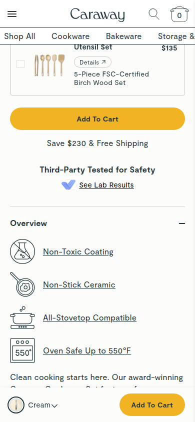
| Trust | 8.9 | Third-party safety testing, exceptionally prominent rating volume, review media, named verified buyers and detailed individual reviews are visible rather than merely asserted. evidence evidence evidence evidence |
|---|
| Offer | 8.8 | The price reduction, savings, set-size decision, color selection, add-ons and free-shipping message are explicit at the purchase moment and remain available via sticky purchase controls. evidence evidence evidence evidence |
|---|
| Mobile | 8.3 | Mobile preserves legible selection controls, useful product detail and reviews with a persistent action bar. The horizontal category navigation truncates and the fixed header plus fixed CTA reduce content space on many screens. evidence evidence evidence evidence |
|---|
Strengths
- A composed product system that stays recognizably Caraway from hero through the long-form education.
- Purchase choice and savings are unusually clear without sacrificing product imagery.
- Safety evidence and detailed, named verified-buyer reviews provide robust visible reassurance.
Priorities
- Reduce the amount of fixed mobile chrome so the product education has more room to breathe.
- Resolve or redesign the truncated horizontal mobile category navigation.
- Tighten the mid-page comparison and reassurance run before reviews.
Limitations
- Reviewed every supplied readable mobile390 and desktop1440 frame only.
- No interaction, checkout, accessibility, provenance, health-claim, or commercial-performance claim is made.
15. True Classic unavailable
The official Best Sellers navigation ranks the Classic Crew as its number-one product; the black Crew Neck PDP is its direct product page. Sampled official PDP
Unscored: Latest targeted close retry still retains the 20% promotion modal across sampled opening, middle, and footer at both widths. The journey cannot be treated as clean evidence.
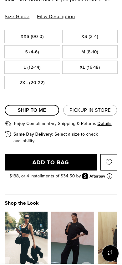
16. Alo Yoga valid
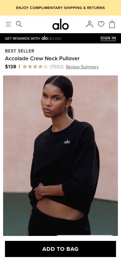
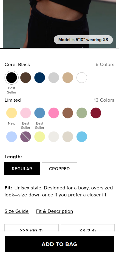
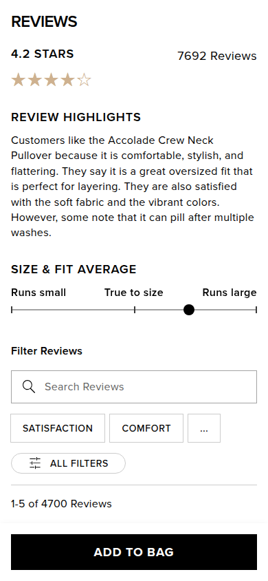
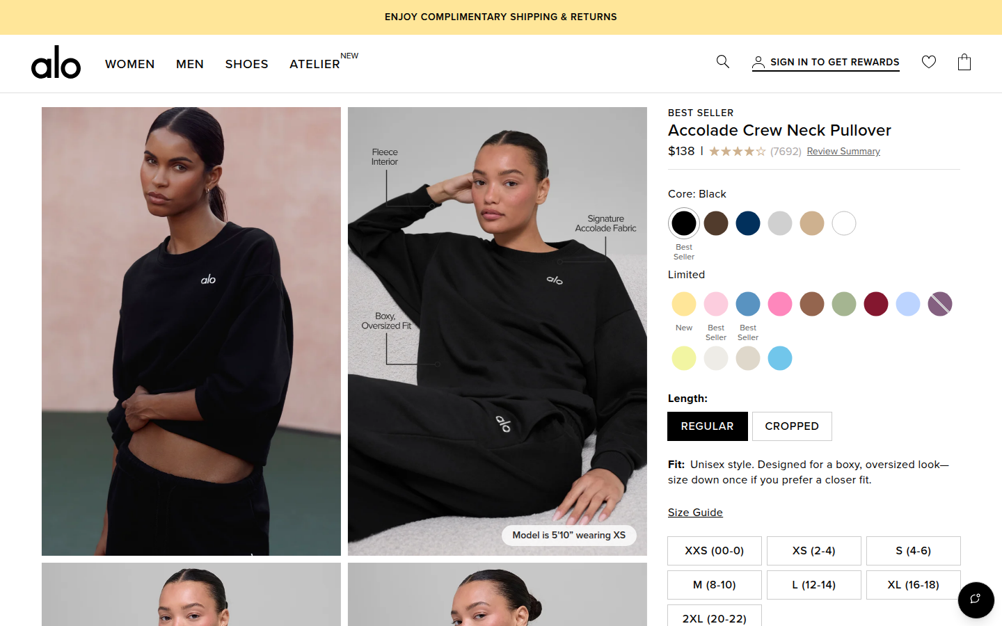
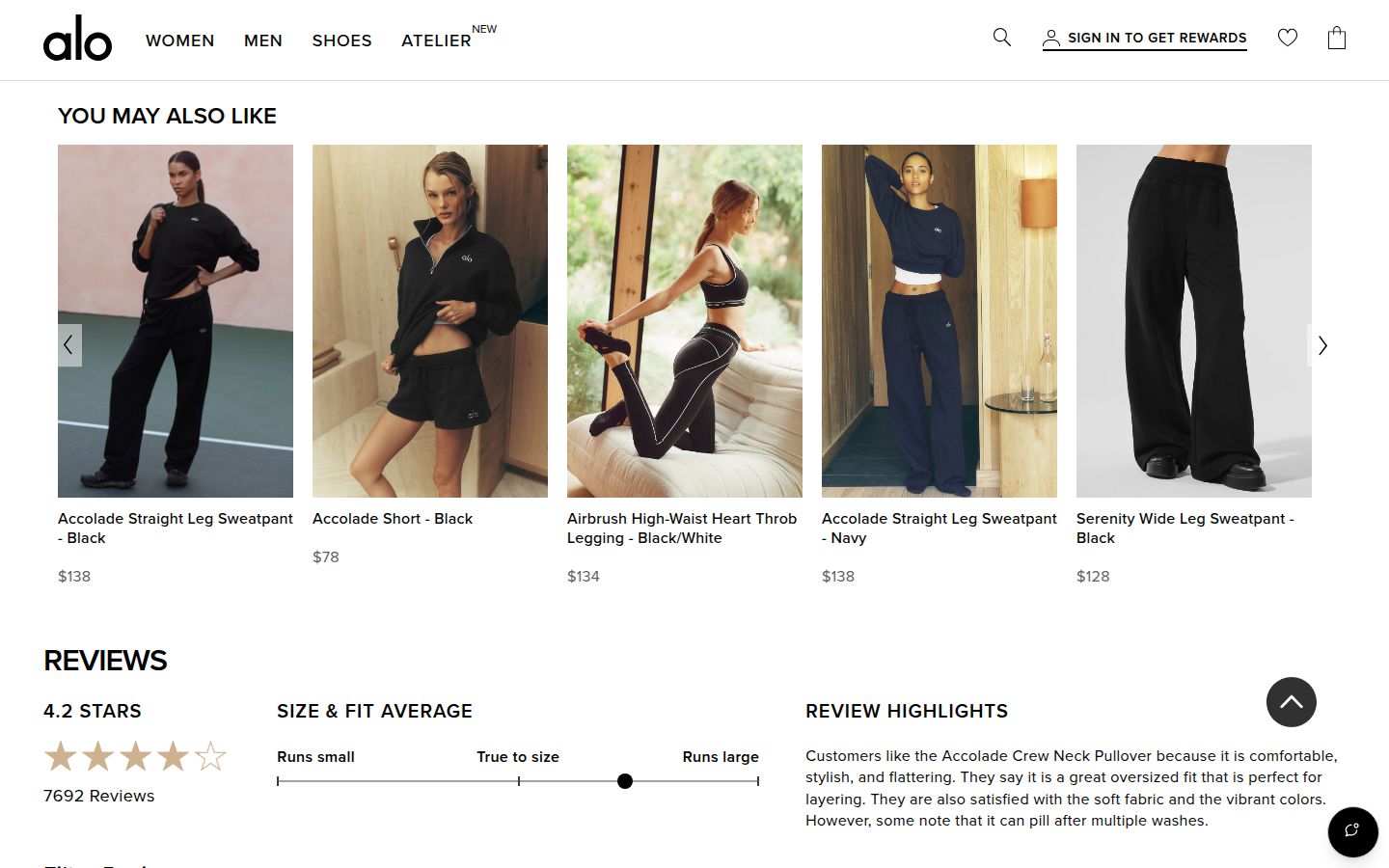
Official PDP marks the Accolade Crew Neck Pullover as a bestseller and it is a representative core Alo apparel item. Sampled official PDP
Judge A · craft-led: 8.27/10
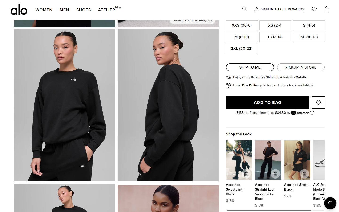
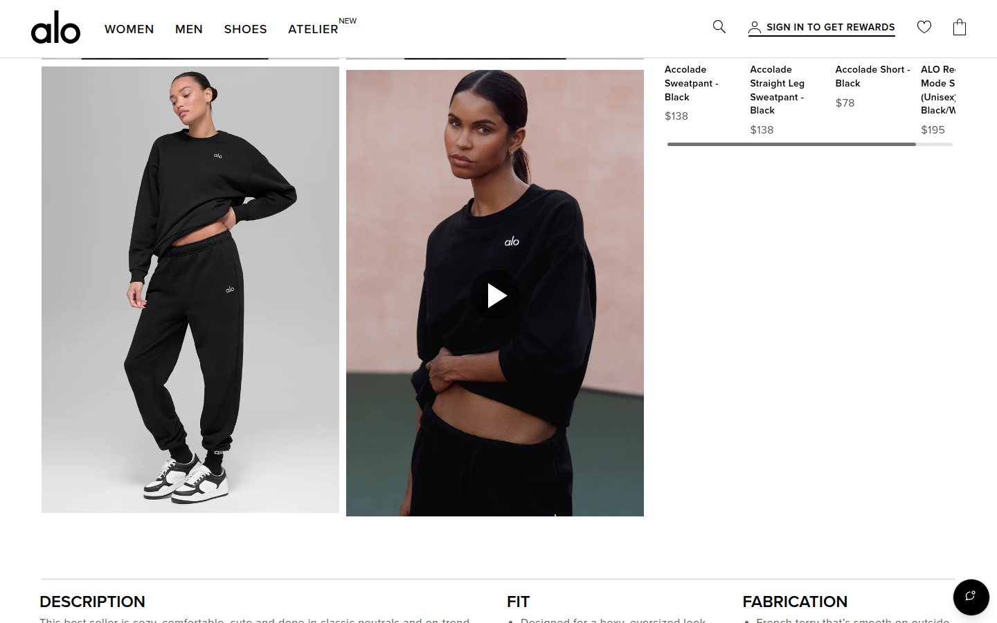
| Craft | 8.4 | Restrained black, cream, and warm neutral photography give the dense commerce page a refined, editorial surface; product modules and imagery are consistently well composed. evidence evidence evidence |
|---|
| Identity | 8.2 | The quiet luxury-athletic identity holds across product imagery, typography, outfit merchandising, and the high-contrast footer. evidence evidence evidence |
|---|
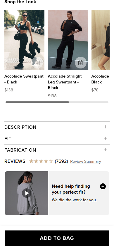
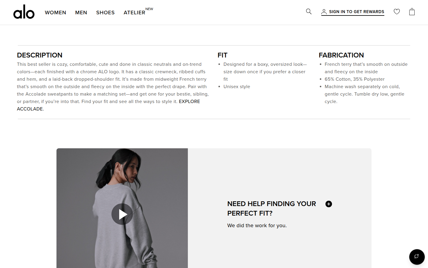
| Journey | 8.1 | The decision path moves cleanly from color, length, and sizing to fit details and styling. Multiple similar-item and styling rails stretch the post-purchase narrative. evidence evidence evidence |
|---|
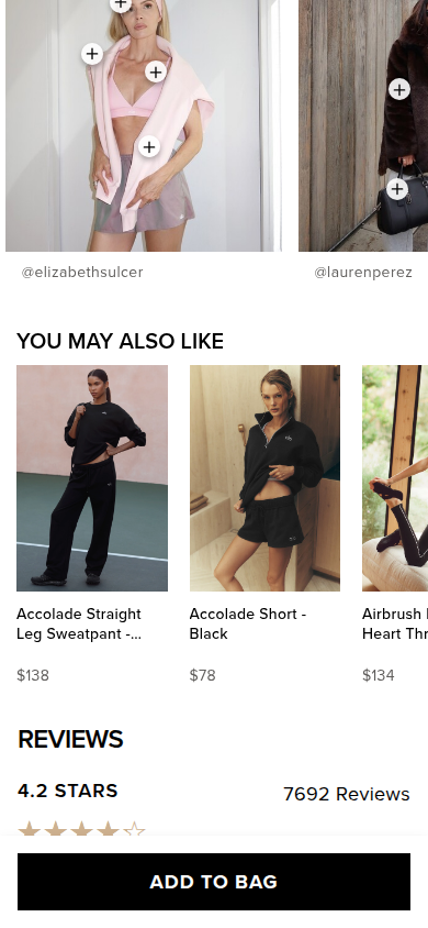
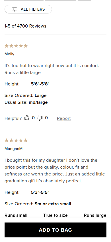
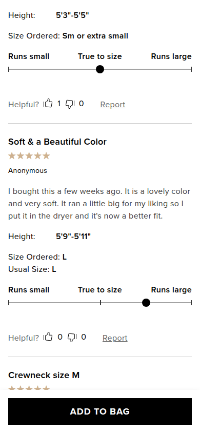
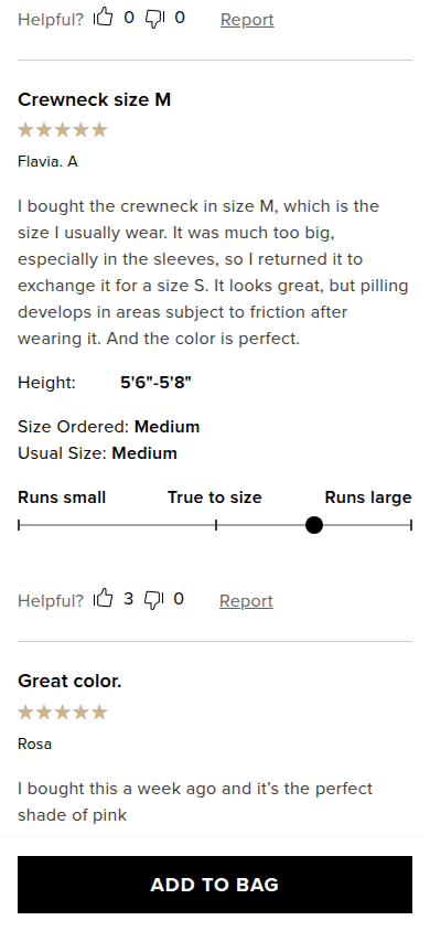
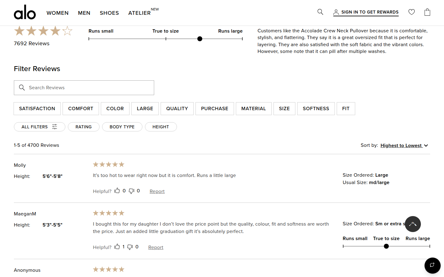
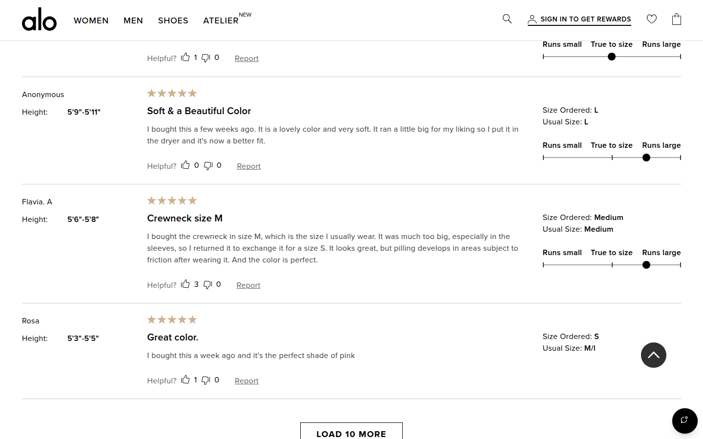
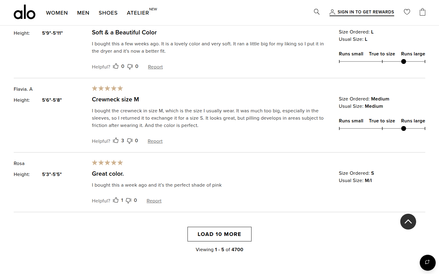
| Trust | 8.4 | Review count, highlights, fit distribution, searchable filters, and readable individual reviews make social proof substantial and easy to parse. evidence evidence evidence |
|---|
| Offer | 8.4 | Color families, length, size, delivery options, price, installment language, and bag action are visibly organized without hiding the core choice. evidence evidence evidence |
|---|
| Mobile | 8.1 | The mobile hierarchy remains legible and the sticky bag action is clear. It consumes ongoing viewport space through a long, already dense product and review journey. evidence evidence evidence |
|---|
Strengths
- Premium editorial product imagery stays coherent with the commerce interface.
- Variant, fit, and delivery choices are unusually scannable.
- Reviews are presented with useful visual structure and specific fit context.
Priorities
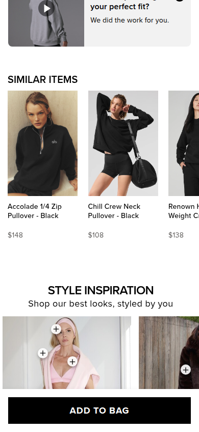
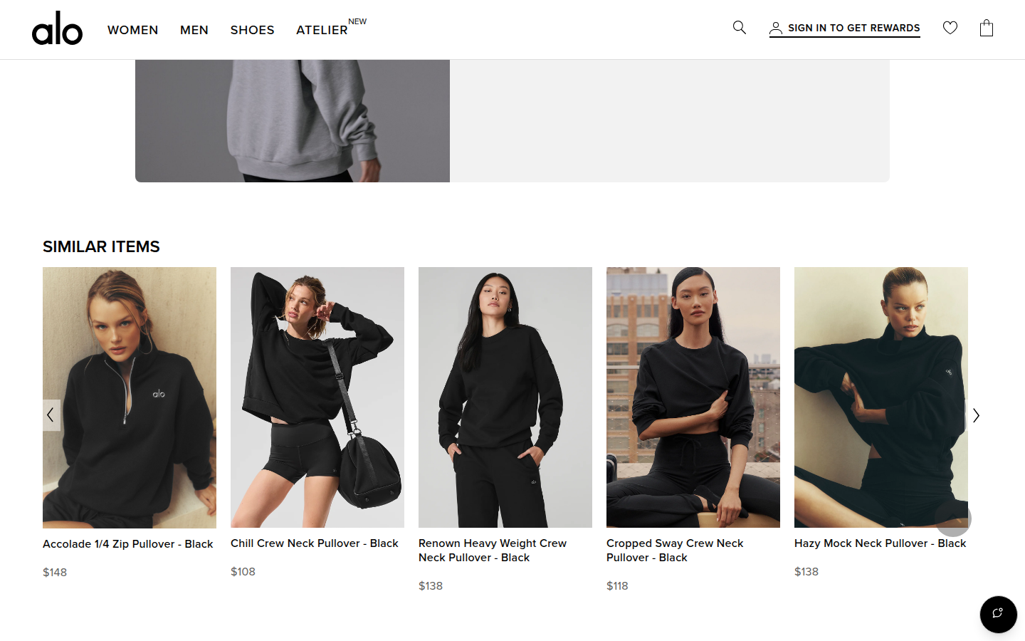
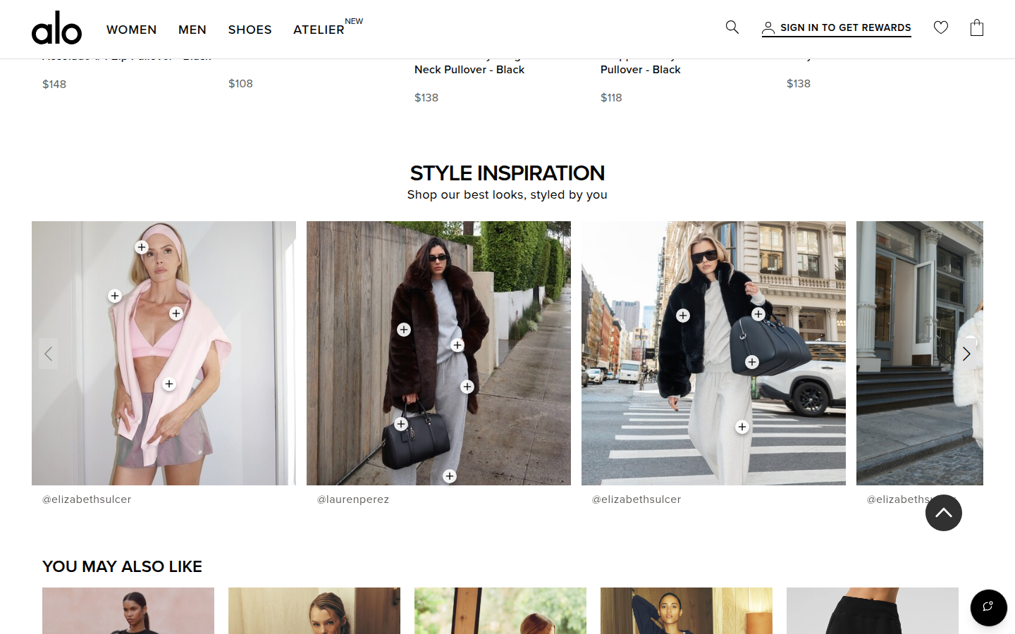
- Reduce repetition between Shop the Look, Similar Items, Style Inspiration, and You May Also Like.
- Give the product story a stronger visual break before the long merchandising sequence.
- Make the persistent mobile bag bar feel lighter once the customer is deep in reviews and recommendations.
Limitations
- Static full-page captures at 390px and 1440px were reviewed; interaction behavior and factual substantiation were not assessed.
Judge B · journey-led: 8.47/10
| Craft | 8.7 | Restrained black, white and pale-gold styling, controlled typography and consistently strong apparel imagery make the page feel polished. The very long run of merchandised carousels is less tightly edited than the primary presentation. evidence evidence evidence |
|---|
| Identity | 8.6 | The spare monochrome interface, athletic editorial photography and Alo marks create a distinctive premium activewear world that persists through outfit and inspiration modules. evidence evidence evidence |
|---|
| Journey | 8.3 | The first screens establish product, fit, colors, sizes, delivery and purchase cleanly, then move through specification, fit help, related looks and reviews. On both widths, several recommendation galleries arrive before the review proof, extending the decision path. evidence evidence evidence evidence |
|---|
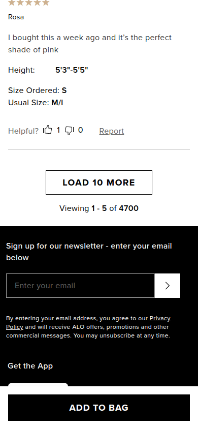
| Trust | 8.5 | A visible 4.2-star rating with 7,692 reviews, fit distribution, reviewer height and size fields, individual review text, returns and delivery cues provide concrete reassurance. evidence evidence evidence |
|---|
| Offer | 8.0 | Price, color, length, inclusive size grid, delivery method and payment installments are easy to locate. The $138 value proposition itself relies mostly on visual and material context rather than a concise product-specific reason to choose. evidence evidence evidence |
|---|
| Mobile | 8.4 | The mobile hierarchy preserves image impact, selection clarity, visible delivery information and an ever-present purchase action. The fixed action bar consumes meaningful vertical space throughout an already long merchandising sequence. evidence evidence evidence evidence |
|---|
Strengths
- Premium, coherent image-led activewear presentation.
- Exceptionally clear sizing, color, fit and delivery choices at purchase.
- Substantive rendered review and fit evidence.
Priorities
- Move the review summary and fit proof ahead of some of the repeated recommendation galleries.
- Give the $138 product choice a short, specific value explanation near the purchase controls.
- Reduce the cumulative footprint of the mobile fixed purchase bar during lower-page browsing.
Limitations
- Reviewed every supplied readable mobile390 and desktop1440 frame only.
- No interaction, checkout, accessibility, provenance, or commercial-performance claim is made.
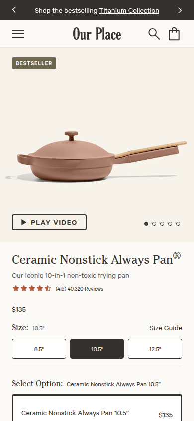
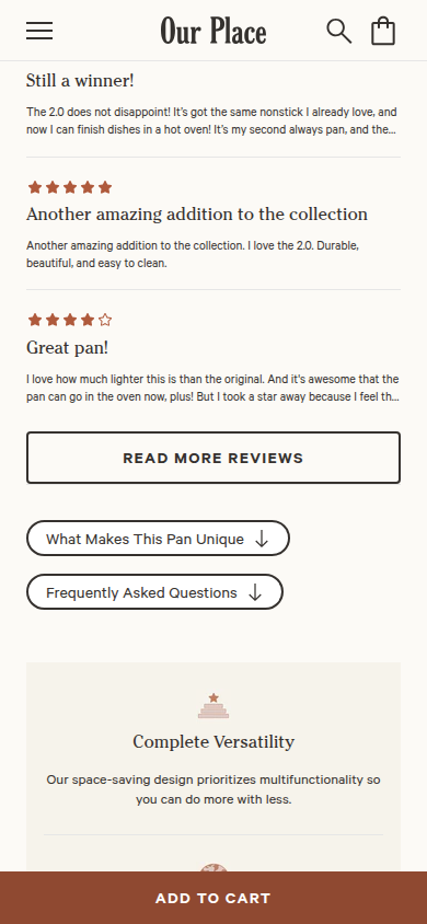
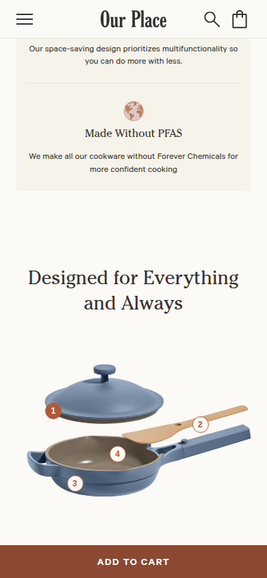
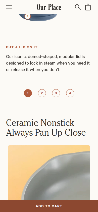
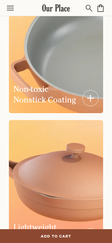
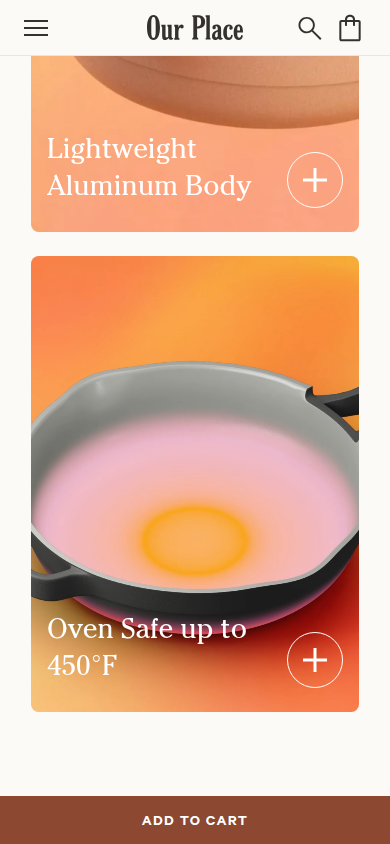
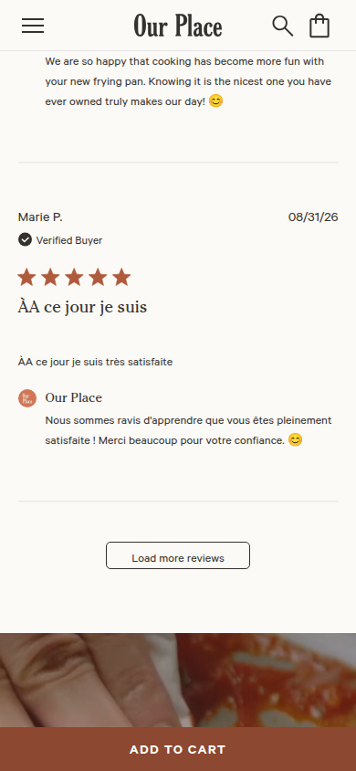
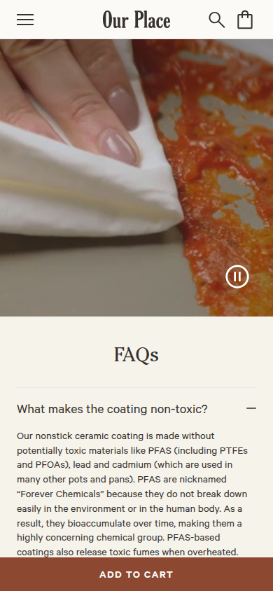
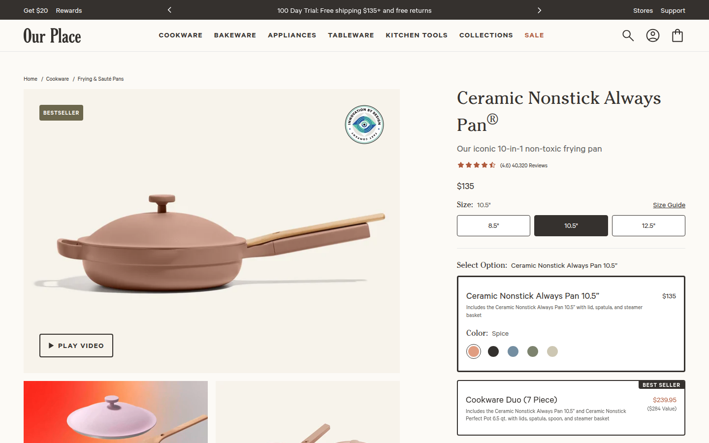
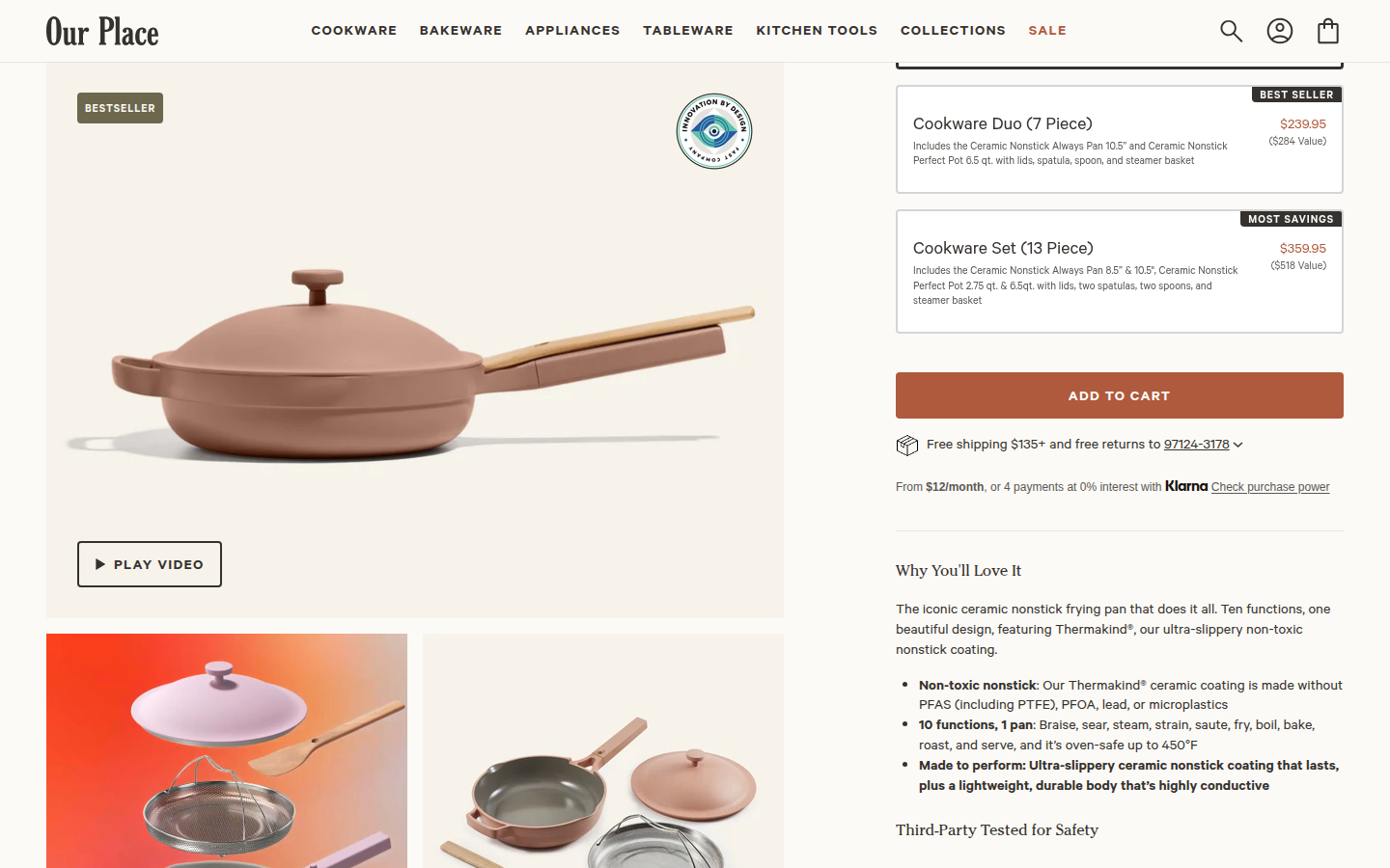
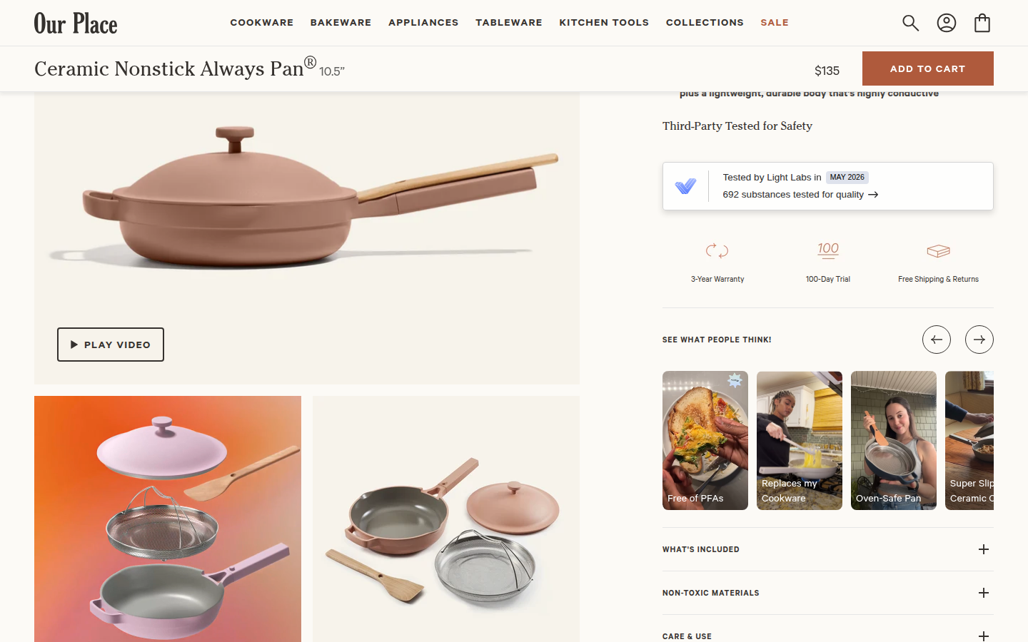
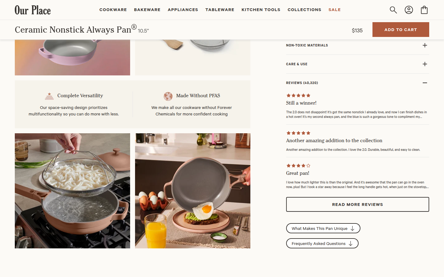
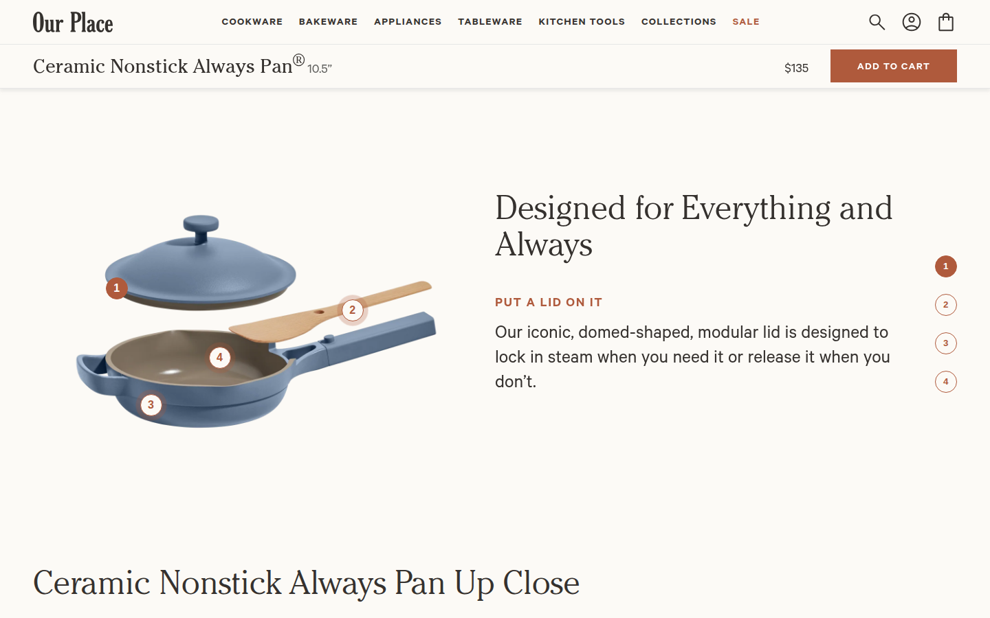
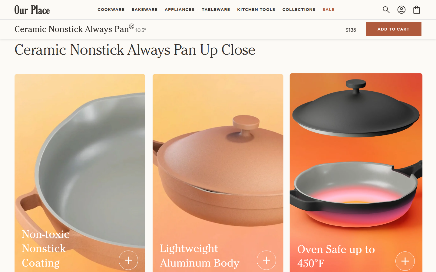
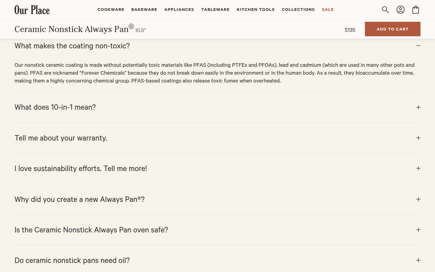
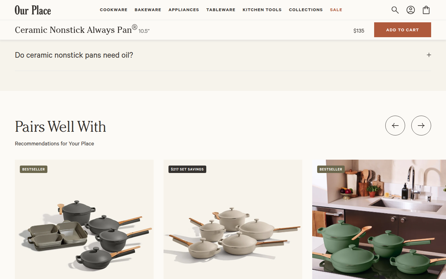
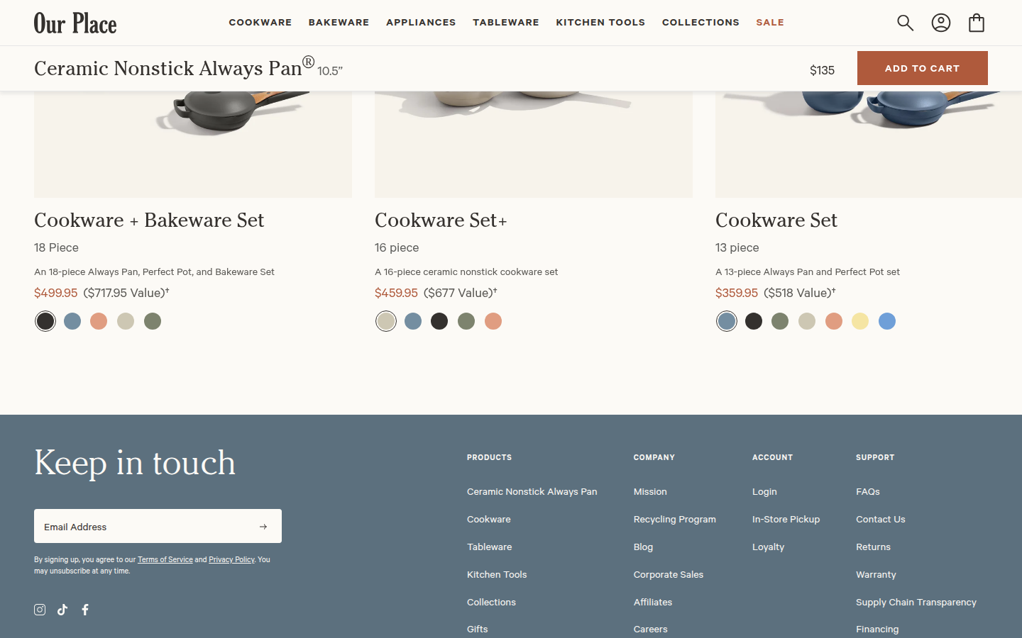
17. Our Place valid
The Always Pan is the brand's iconic multi-function cookware product and is marked in its official bestseller collection. Sampled official PDP
Judge A · craft-led: 8.62/10
| Craft | 8.6 | Warm off-white, rust, charcoal, and sage are carried through unusually polished product photography, diagrams, and card systems; the page remains composed despite a large amount of content. evidence evidence evidence |
|---|
| Identity | 8.8 | The expressive serif/sans system, friendly illustrative product language, and grounded palette make the experience immediately recognizable and consistently ownable. evidence evidence evidence |
|---|
| Journey | 8.4 | The flow makes product, configuration, bundle, use-case, reassurance, reviews, and support easy to find. The lower feature narrative stays thoughtful but becomes long and somewhat repetitive. evidence evidence evidence |
|---|
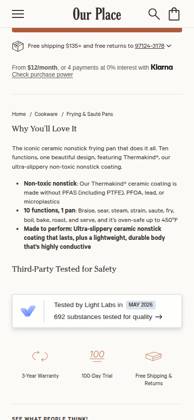
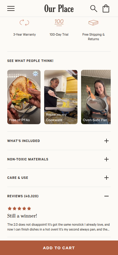
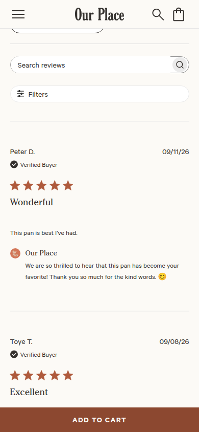
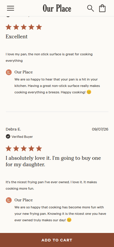
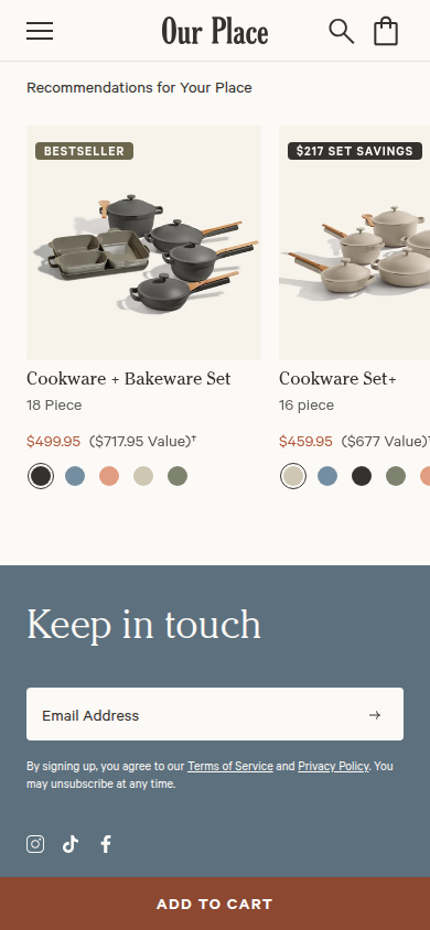
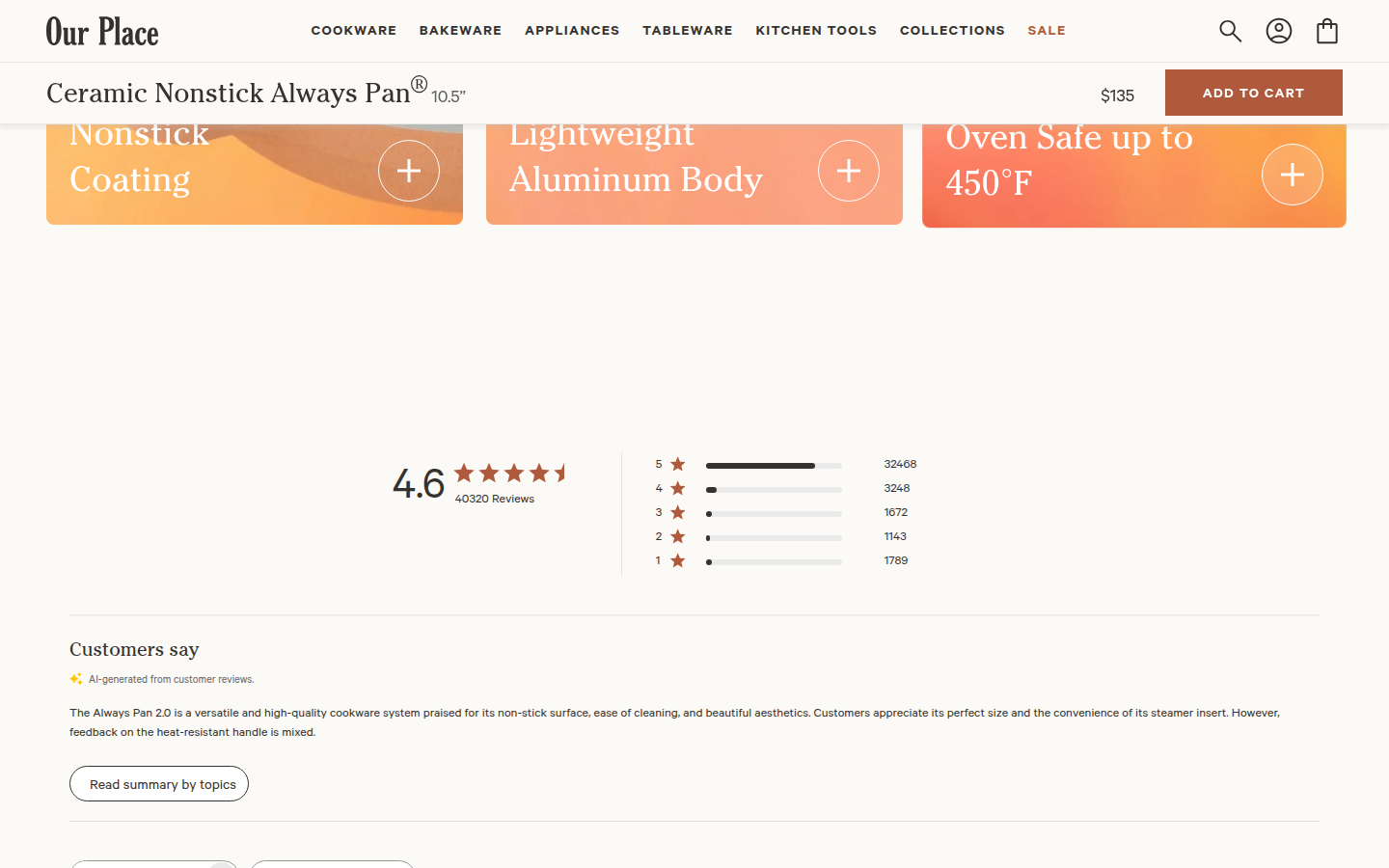
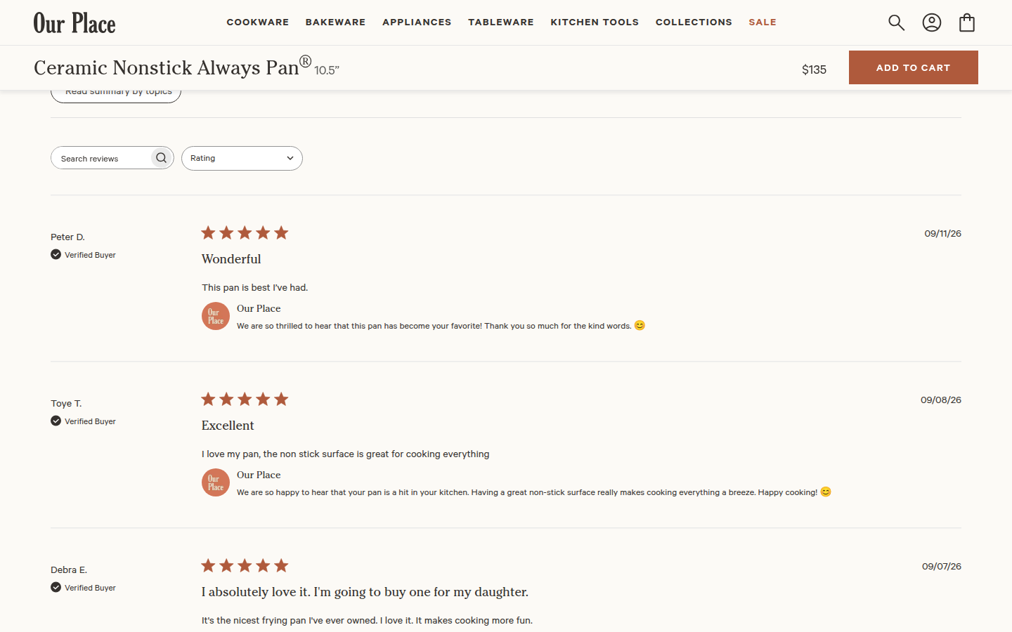
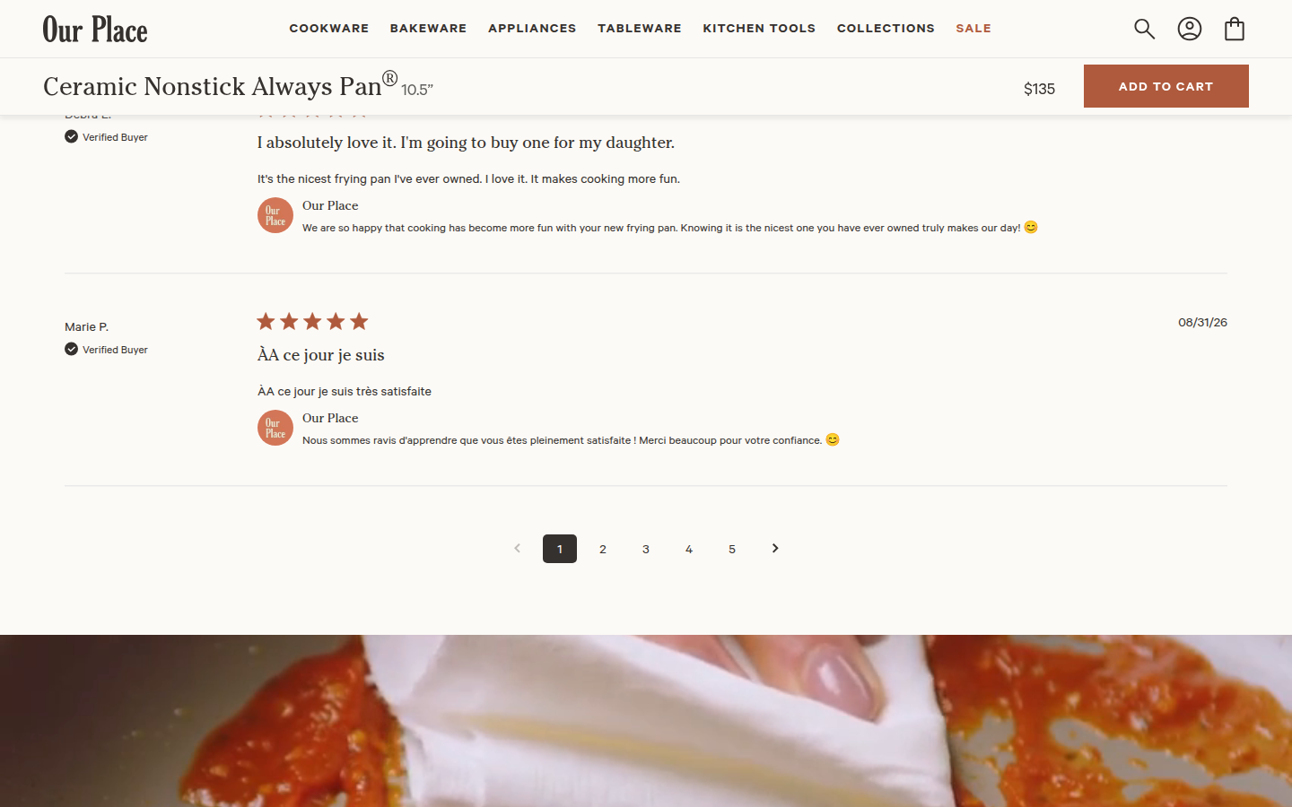
| Trust | 8.8 | Safety, trial, warranty, shipping, buyer reviews, reviewer labels, brand replies, and visual customer material form a substantial, legible reassurance system. evidence evidence evidence |
|---|
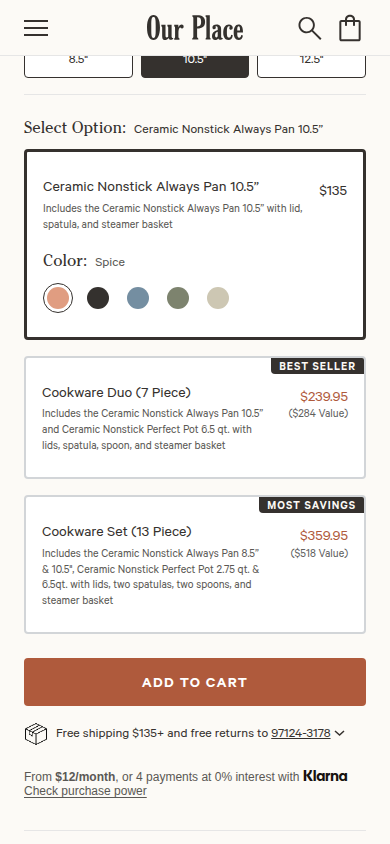
| Offer | 8.8 | Size, color, bundle options, price, payment, cart action, and delivery terms are grouped cleanly at the moment of choice without obscuring the core product. evidence evidence evidence |
|---|
| Mobile | 8.3 | Small-screen product choices, proof, imagery, and type remain readable across the full journey. The persistent purchase bar and the page length place a modest ongoing cost on lower-page reading room. evidence evidence evidence |
|---|
Strengths
- A warm, highly specific visual system connects photography, product education, and interface details.
- The purchase surface handles configuration, bundles, payments, and delivery with exceptional clarity.
- Reviews, buyer imagery, policy reassurance, and support material sustain confidence well beyond the buy box.
Priorities
- Reduce repetition in the extended feature demonstration so key decision moments return sooner.
- Let the lower-page mobile purchase bar and desktop sticky treatment recede more during reviews and FAQ reading.
- Strengthen hierarchy among the repeated feature cards, illustrations, and reassurance modules on mobile.
Limitations
- Static full-page captures at 390px and 1440px were reviewed; interaction behavior and factual substantiation were not assessed.
Judge B · journey-led: 8.78/10
| Craft | 8.8 | The cream, navy, and warm-brown system, editorial type, product renders, photography, and section transitions form a composed product story across both widths. evidence evidence evidence evidence evidence evidence |
|---|
| Identity | 8.7 | The tactile cooking imagery, friendly serif voice, and warm palette give the pan a recognizable domestic-editorial character that stays coherent through the page. evidence evidence evidence evidence evidence |
|---|
| Journey | 8.8 | Configuration, product explanation, use cases, proof, reviews, FAQs, and related products appear in a clear decision sequence, with useful visual variety along the way. evidence evidence evidence evidence evidence evidence evidence evidence evidence evidence evidence evidence evidence evidence |
|---|
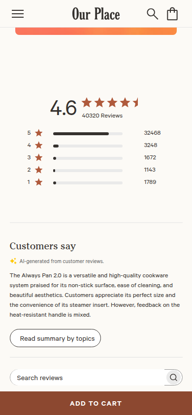
| Trust | 9.0 | Safety testing, trial and warranty details, review distribution, verified purchaser reviews, visible brand replies, and FAQs provide unusually complete visual reassurance. evidence evidence evidence evidence evidence evidence evidence evidence evidence |
|---|
| Offer | 8.7 | Price, dimensions, color, single-versus-set choices, shipping, financing, and an unambiguous add-to-cart action are all visible before the page asks for a decision. evidence evidence evidence evidence |
|---|
| Mobile | 8.6 | The mobile layout preserves hierarchy, readable controls, imagery, review proof, and a persistent purchase action; the fixed CTA and stacked configuration choices make the upper experience denser. evidence evidence evidence evidence evidence evidence evidence |
|---|
Strengths
- A cohesive product story carries the same warm, editorial identity from the initial selector through the closing recommendations.
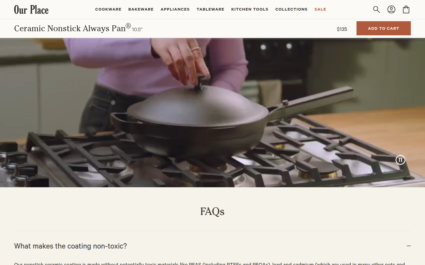
- Decision support is substantial and well distributed: product anatomy, use imagery, testing, policies, customer reviews, and FAQs each arrive when they are useful.
- Mobile retains the full commerce and proof system with strong hierarchy and legible controls.
Priorities
- Make the single-pan and multi-piece purchase choices easier to scan at a glance before the shopper reaches the cart action.
- Reduce the visual weight of the persistent mobile purchase bar so the product information above it gets more breathing room.
- Add a compact progress or summary cue after the dense early configuration area to make the long mobile story easier to re-enter.
Limitations
- All 14 desktop and 18 mobile supplied frames were viewed. This assessment is limited to rendered captures; it does not test interaction, loading, checkout, accessibility, or product claims.
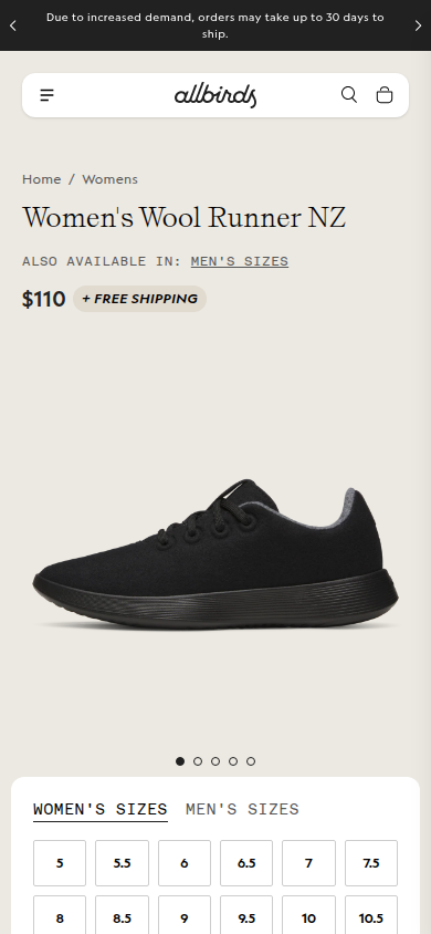
18. Allbirds unavailable
Current PDP for the Wool Runner NZ, the refreshed version of Allbirds' signature Wool Runner franchise. Sampled official PDP
Unscored: Current retry has usable mobile content but no desktop capture segments after the ordinary iframe dismissal closed the desktop context. Both-width evidence is unavailable.
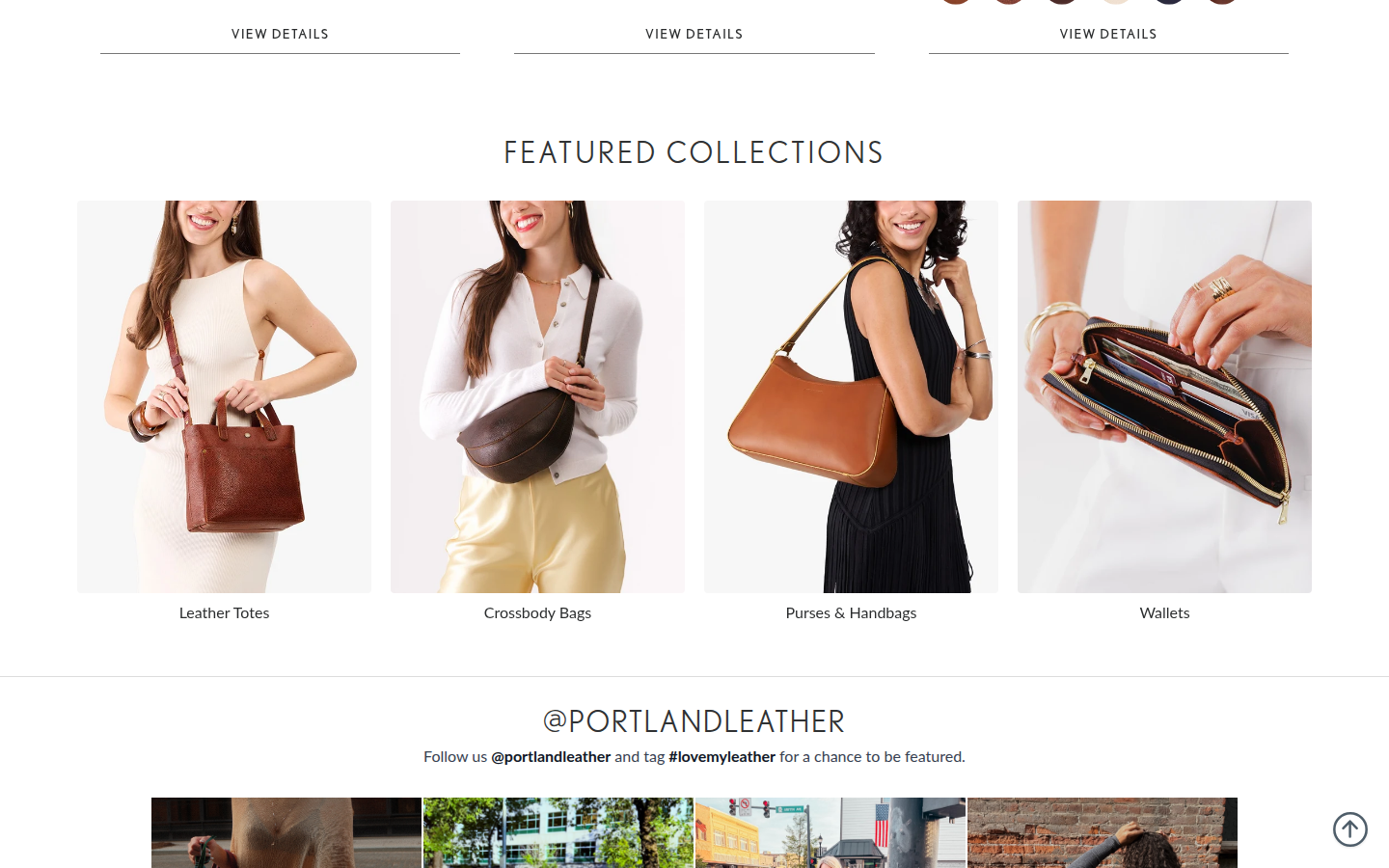
19. Portland Leather Goods valid
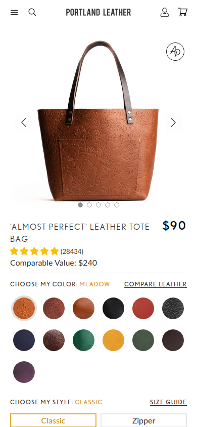
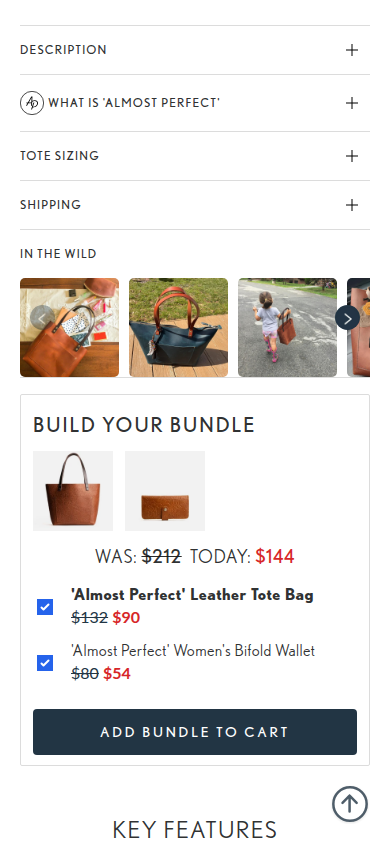
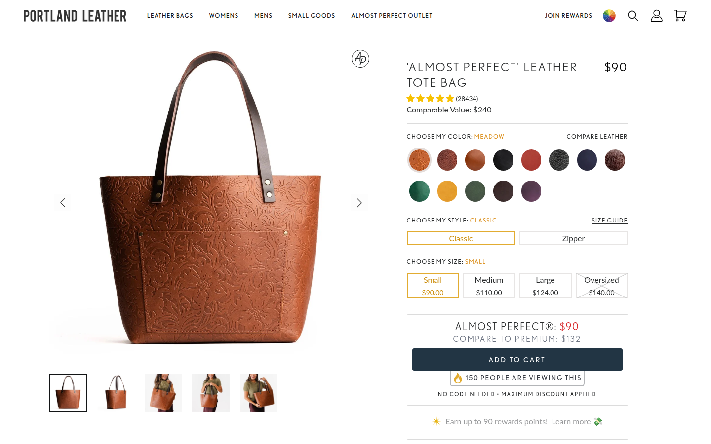
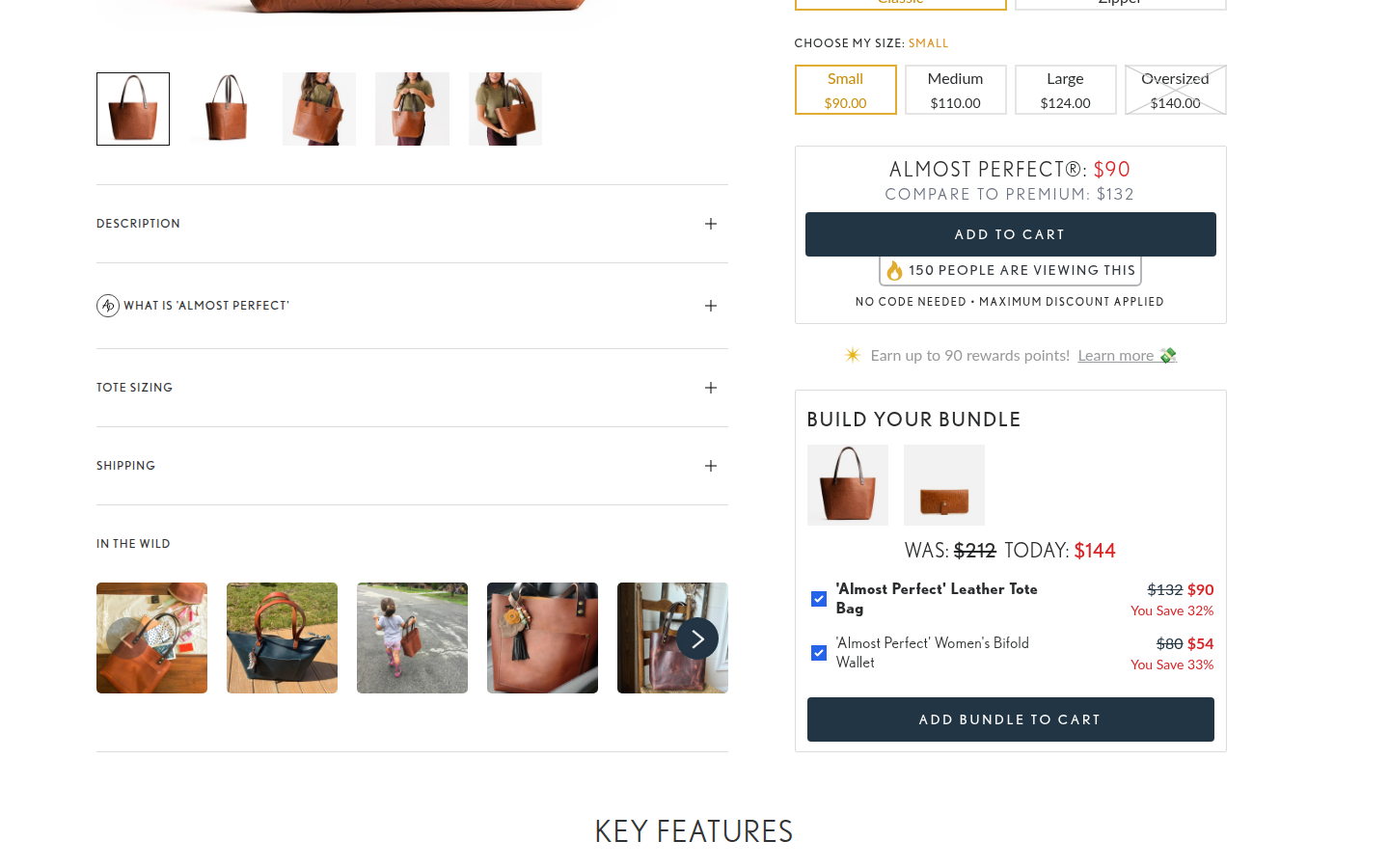
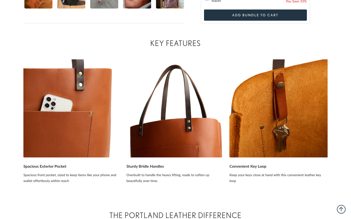
High-review official Tote PDP that represents Portland Leather's core leather-goods offer and its Almost Perfect value proposition. Sampled official PDP
Judge A · craft-led: 7.64/10
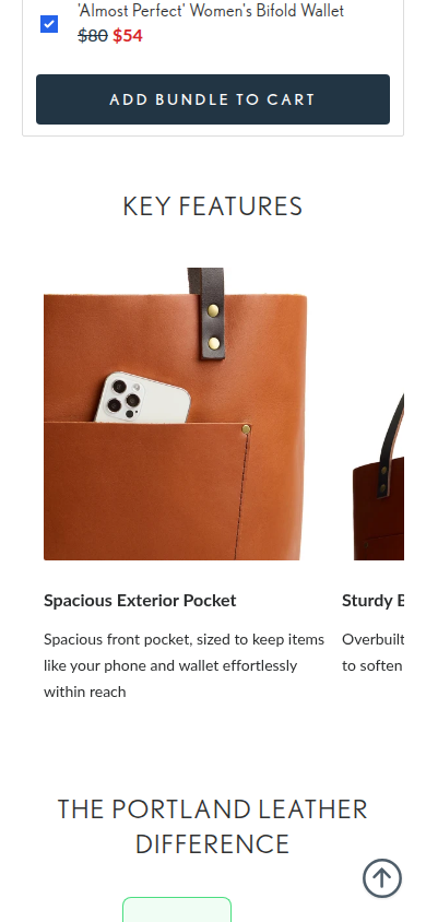
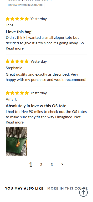
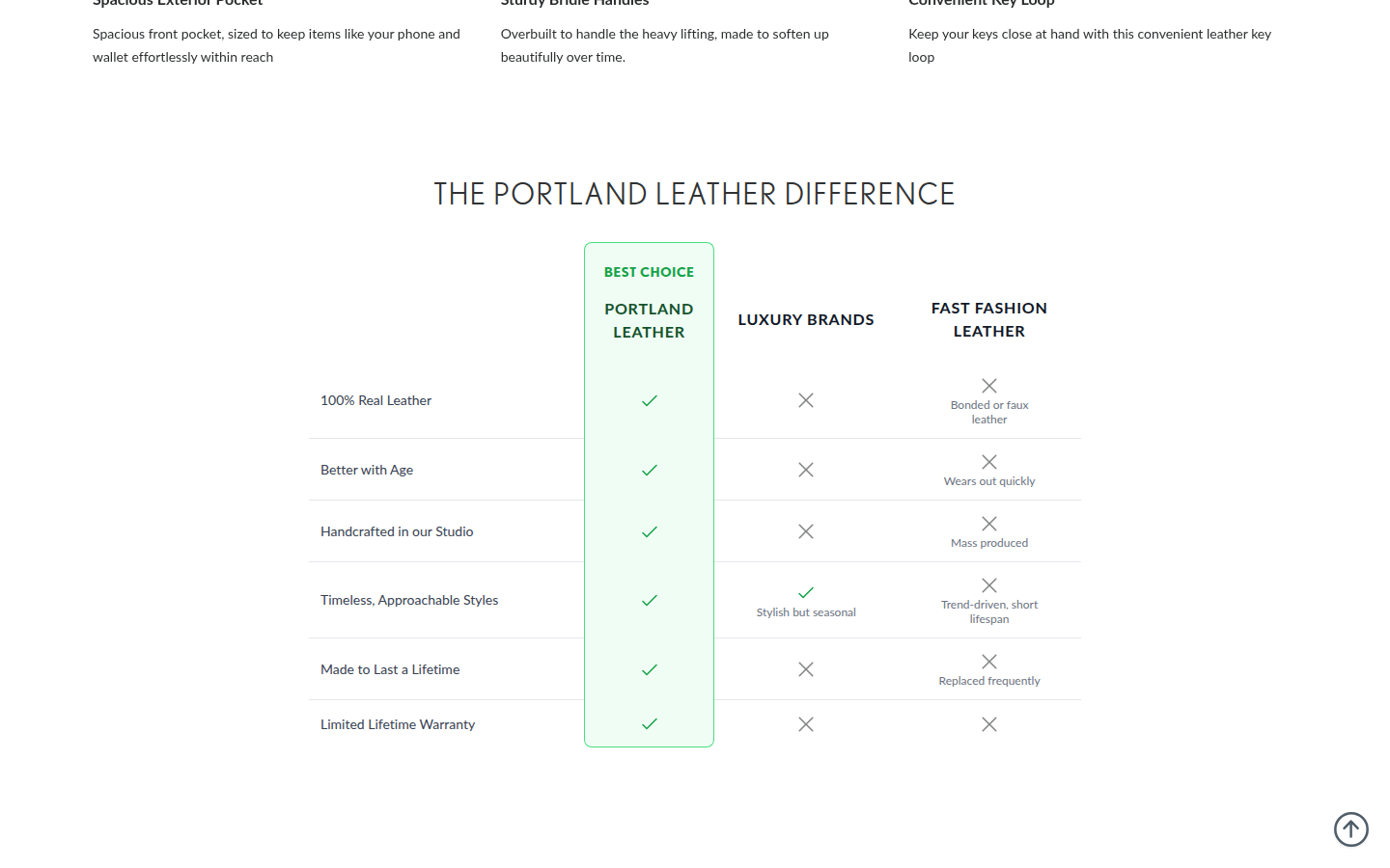
| Craft | 7.4 | Clean photography and ample white space put material detail first, while the widely tracked letterspacing and mixed type weights can feel more utilitarian than refined. evidence evidence evidence |
|---|
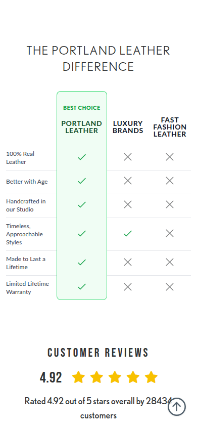
| Identity | 7.6 | The earthy product palette, maker-oriented comparison, and simple navy-and-gold utility styling form a coherent, recognizable outlet identity. evidence evidence evidence |
|---|
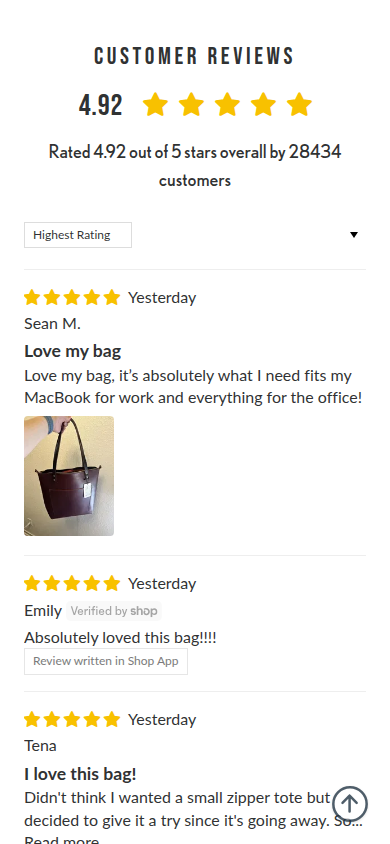
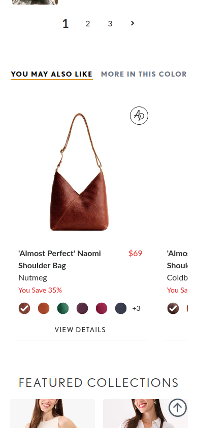
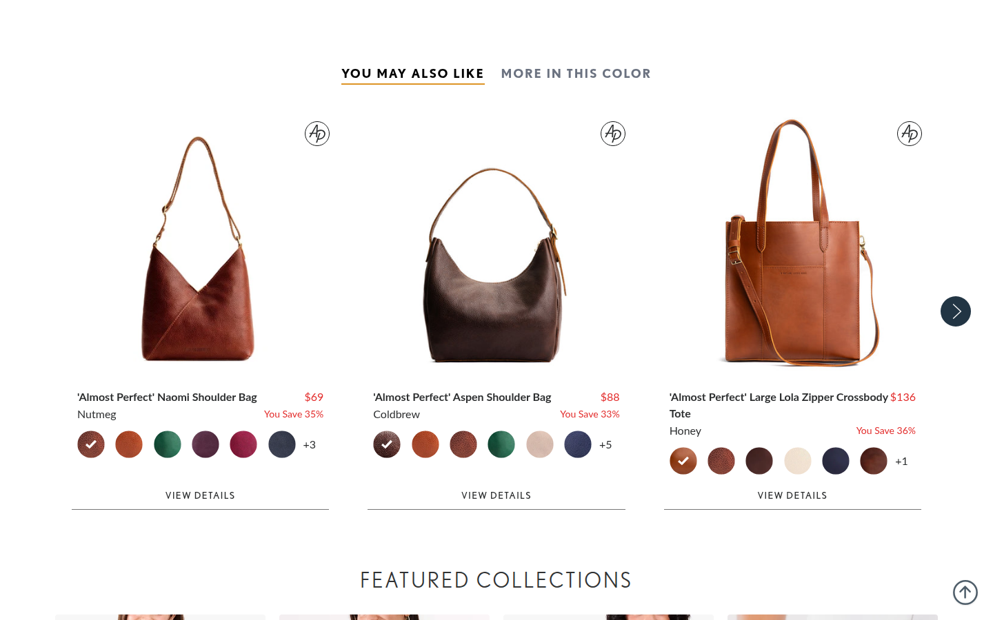
| Journey | 7.6 | Configuration, bundle, feature detail, comparison, customer reviews, and recommendations arrive in a sensible order, though the offer and adjacent merchandising take more attention than the product story. evidence evidence evidence |
|---|
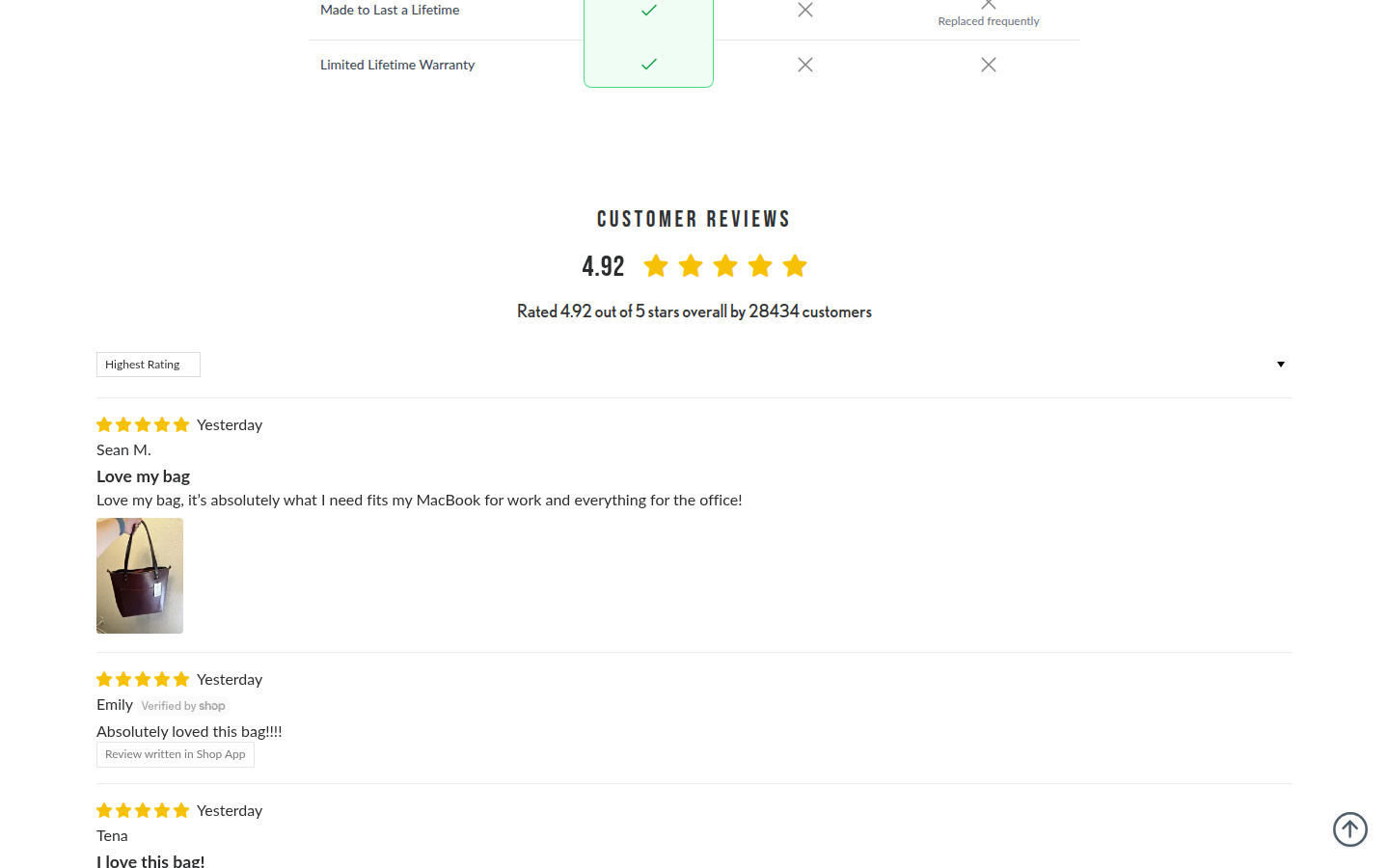
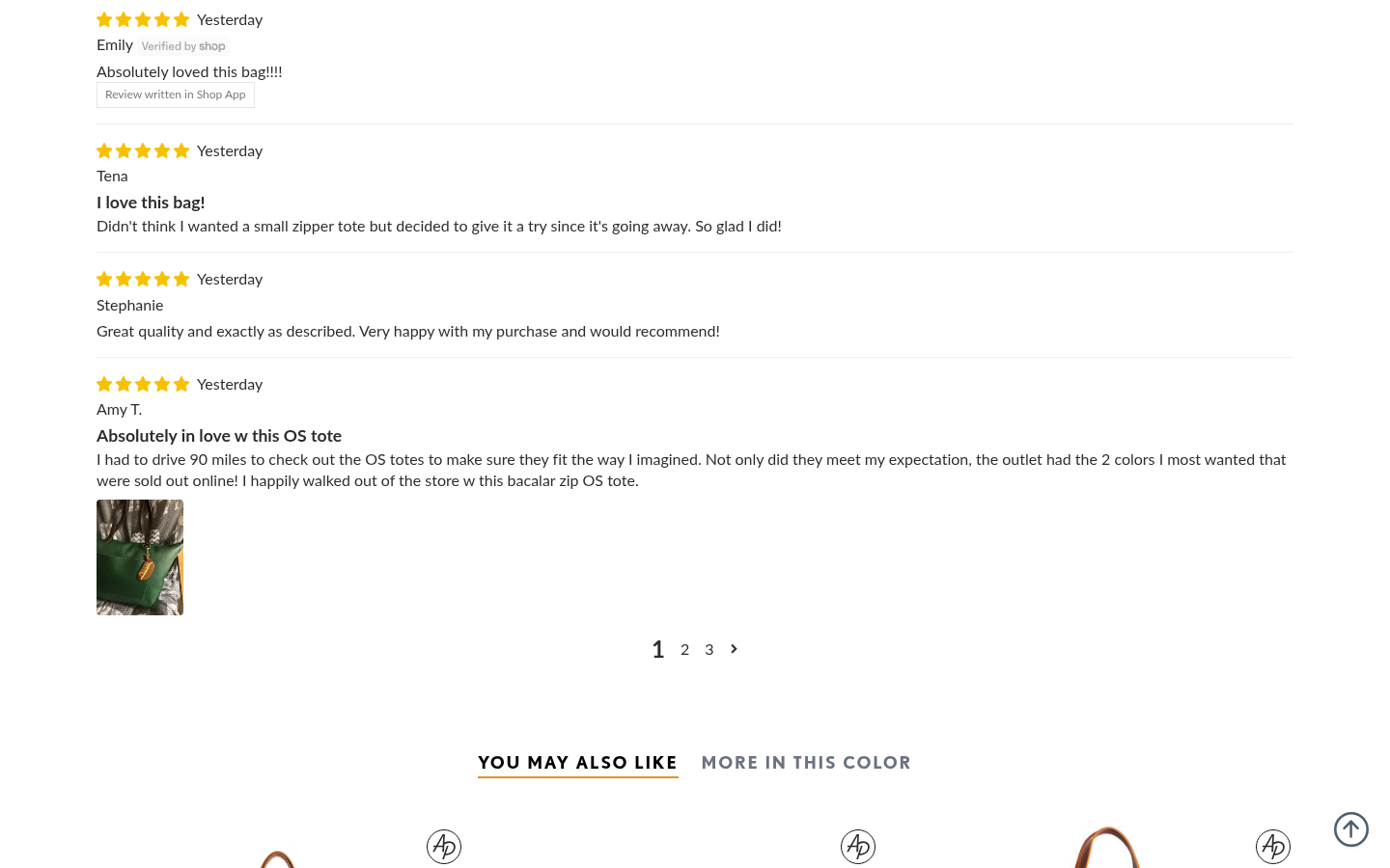
| Trust | 7.8 | Named customer reviews, review photos, a clear rating summary, and practical feature imagery make the proof tangible. The self-comparison table is useful but necessarily brand-authored. evidence evidence evidence |
|---|
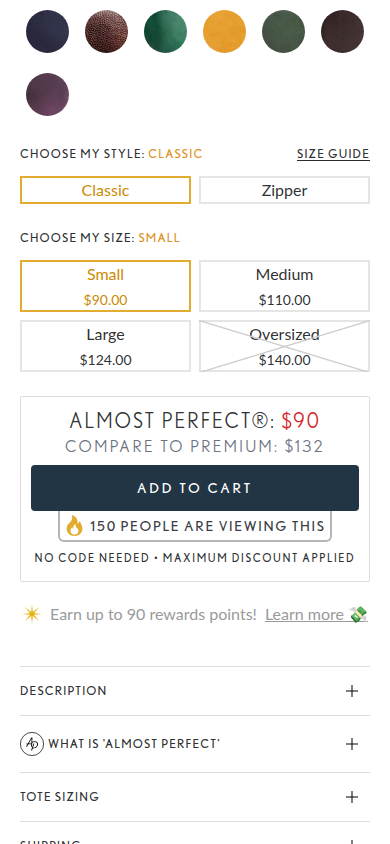
| Offer | 8.4 | Color, style, size, explicit selected-state pricing, comparable value, and the purchase action are all visible before the shopper has to hunt. evidence evidence evidence |
|---|
| Mobile | 7.4 | The extensive options remain touch-legible and the product imagery reads well. Small all-caps labels, many competing deal cues, and carousel edges make the narrow journey feel busier than the desktop view. evidence evidence evidence |
|---|
Strengths
- Clear configuration and price hierarchy at the purchase decision.
- Strong material-detail photography with genuinely useful close-ups.
- Customer proof includes names, written feedback, and visible owner images.
Priorities
- Reduce competing urgency, savings, rewards, and bundle cues around the primary add-to-cart decision.
- Relax the letterspacing and all-caps treatment on utility labels for a more premium reading rhythm.
- Give the key-feature story more editorial breathing room before moving into comparison and review modules.
Limitations
- Static full-page captures were reviewed at 390px and 1440px; interaction states and factual substantiation were not assessed.
Judge B · journey-led: 8.08/10
| Craft | 8.0 | High-quality product photography, carefully controlled color, and a restrained type system give the purchase area and detail story a polished, coherent finish. Some long comparison and review areas settle into repeated utility-card rhythm. evidence evidence evidence evidence evidence |
|---|
| Identity | 8.2 | The worn-leather photography, warm neutrals, direct naming, and product-detail imagery create a specific, consistent leather-goods character from hero through gallery. evidence evidence evidence evidence evidence |
|---|
| Journey | 8.1 | Options and purchase controls arrive alongside the product, followed by material detail, comparison, reviews, customer imagery and recommendations. The flow remains understandable, though the pricing, bundle, discount, and rewards messages stack tightly near the decision point. evidence evidence evidence evidence evidence evidence evidence evidence evidence evidence |
|---|
| Trust | 8.4 | Concrete product-comparison content, visible customer photography, extensive individual reviews and buyer imagery make reassurance feel integrated rather than isolated. evidence evidence evidence evidence evidence |
|---|
| Offer | 7.8 | Color, price, availability, add-to-cart and promotional value are visible at once. Comparable pricing, bundle value, live-viewer messaging, discount language and rewards compete for attention in the same small decision zone. evidence evidence evidence evidence |
|---|
| Mobile | 7.8 | Controls, reviews, and text remain readable at 390px. Feature and recommendation carousels are visually dense on the narrow canvas, and the early purchase screen has several simultaneous commercial messages. evidence evidence evidence evidence evidence evidence evidence |
|---|
Strengths
- Product photography and material details are consistently polished.
- A recognizable leather-goods identity holds across commerce, comparison, review, and gallery content.
- Review and customer-image proof is substantial and easy to encounter.
Priorities
- Simplify the cluster of price comparison, bundle, discount, and rewards messages beside the primary CTA.
- Give the long comparison and review sequence more rhythm through stronger editorial breaks.
- Reduce density in the mobile feature and recommendation carousels.
Limitations
- Every supplied readable desktop1440 and mobile390 frame was visually reviewed.
- No interaction, checkout, accessibility, provenance, or commercial-performance claim is made.
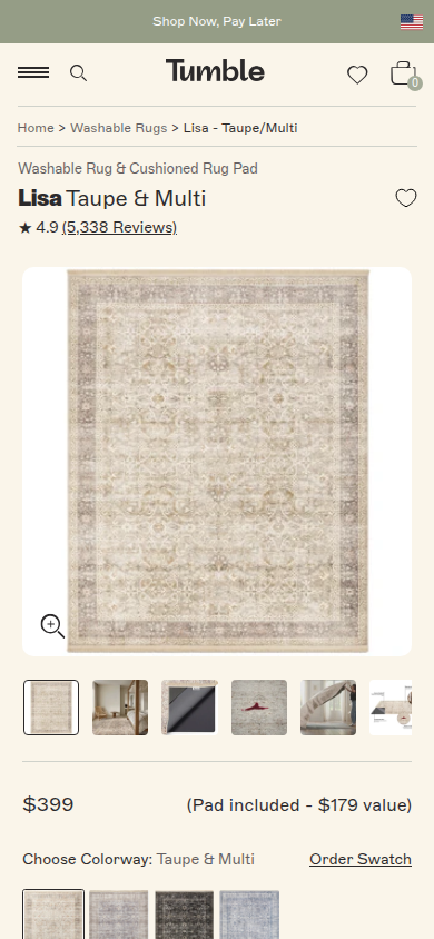
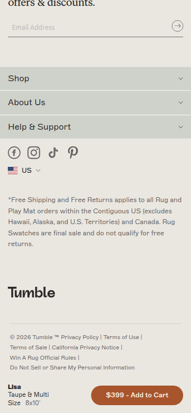
20. Tumble valid
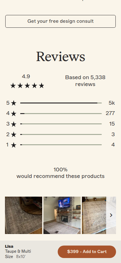
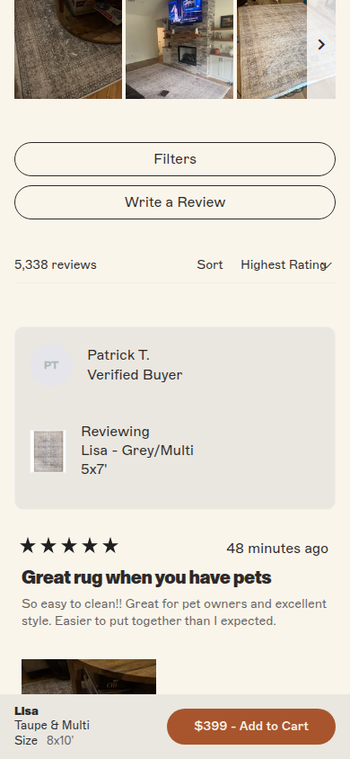
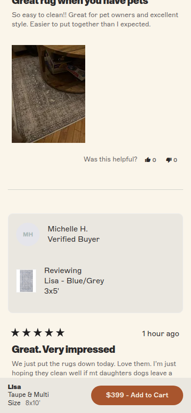
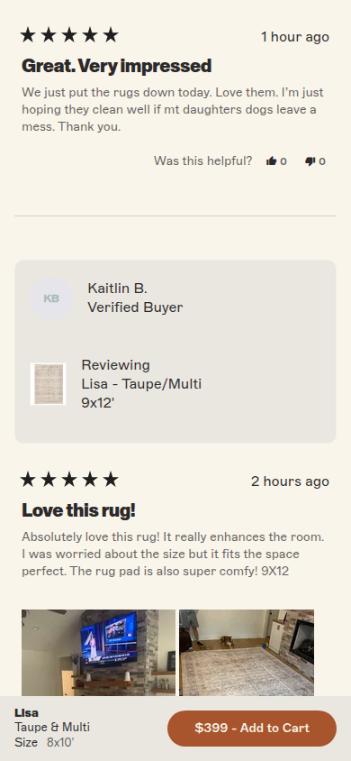
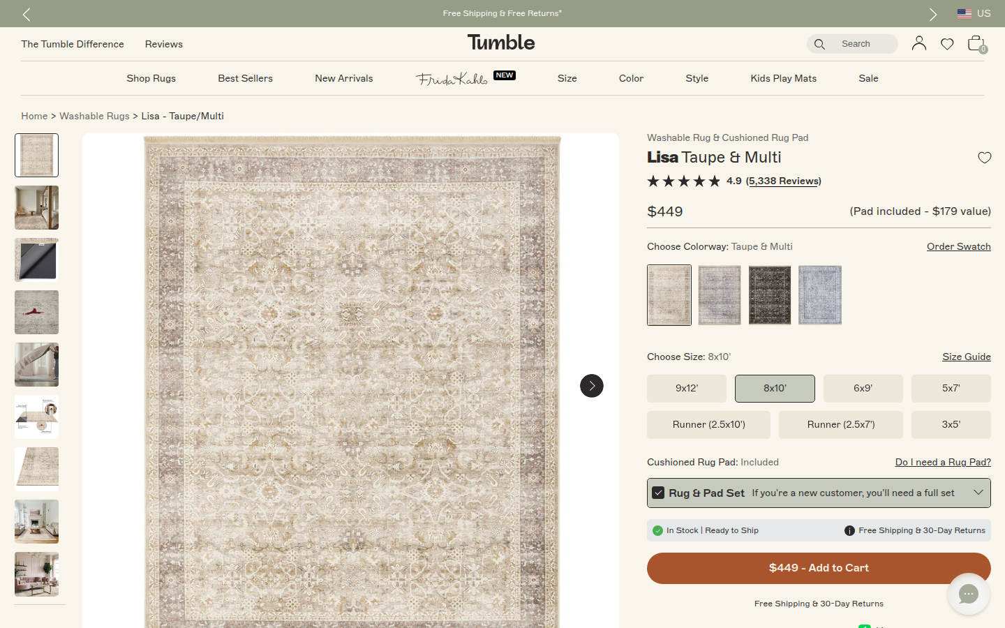
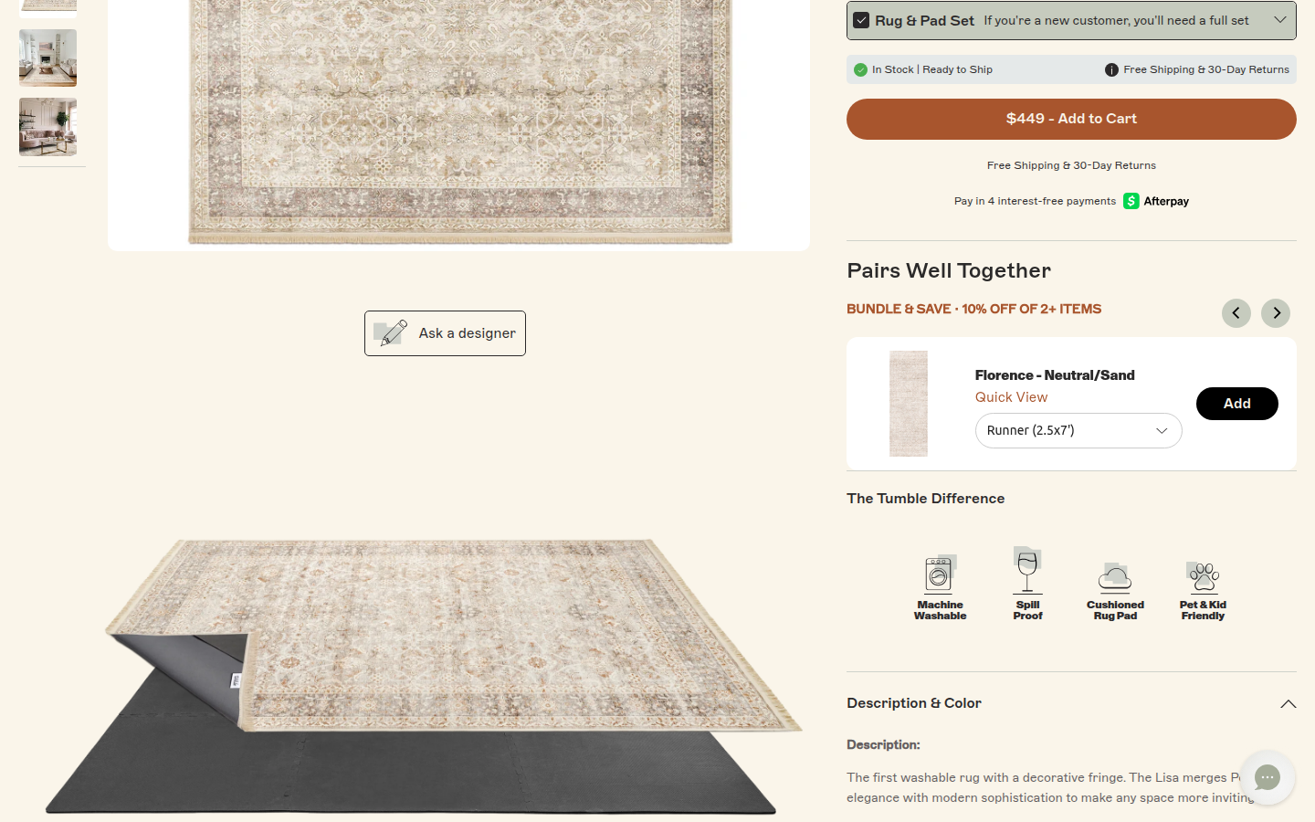
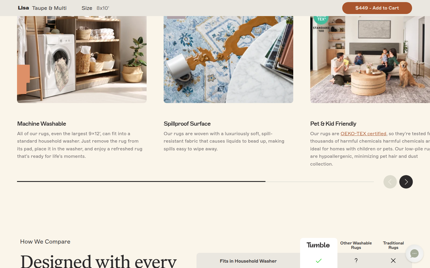
Official Best Sellers content includes the Lisa washable rug; this concrete product PDP also carries a substantial on-page review count. Sampled official PDP
Judge A · craft-led: 8.25/10
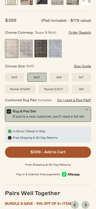
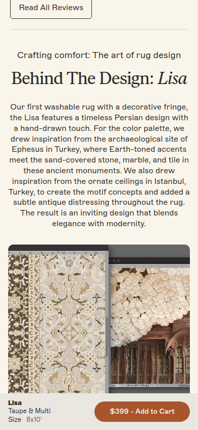
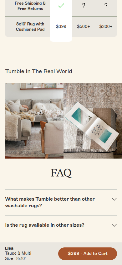
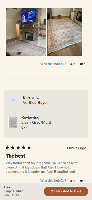
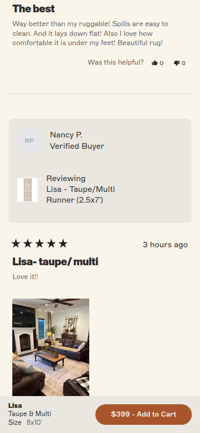
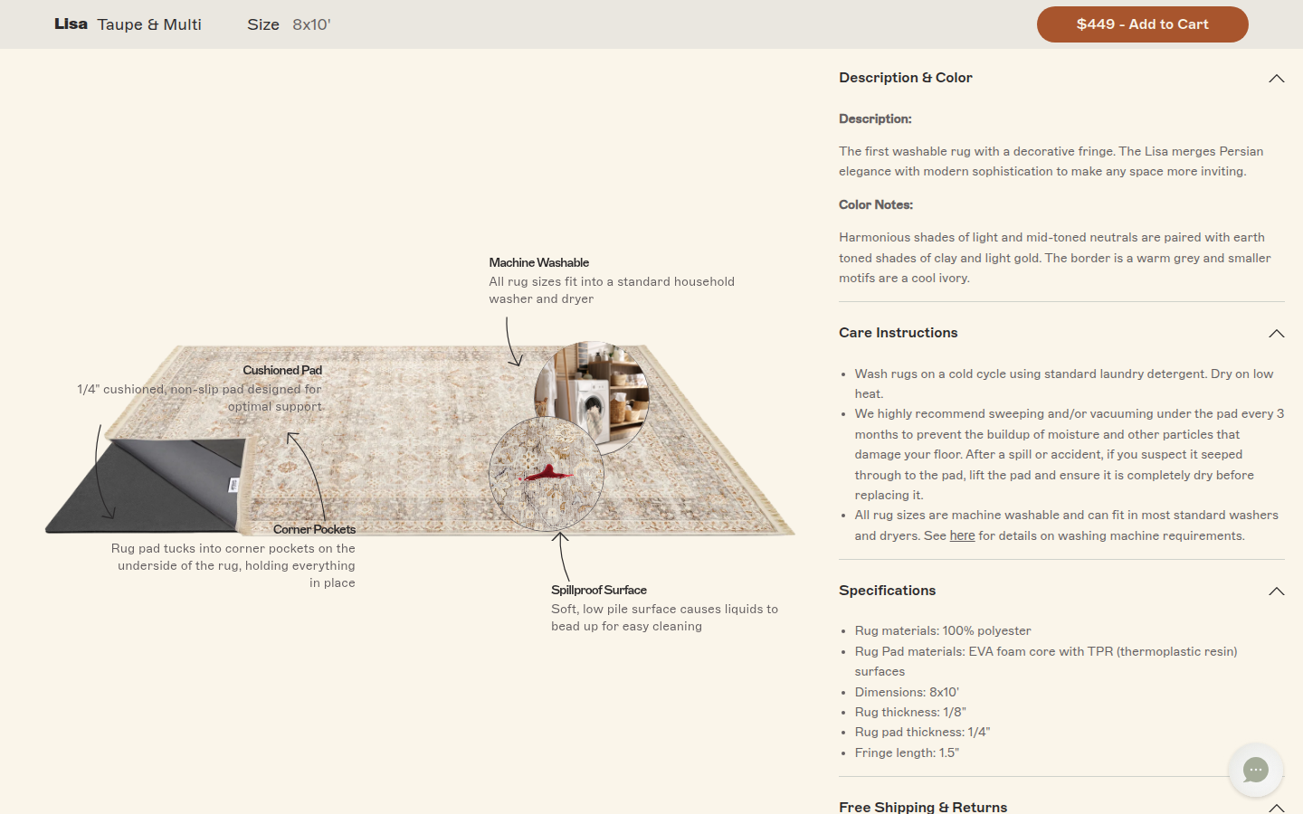
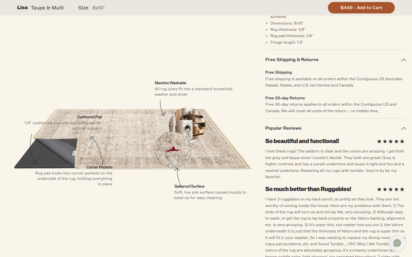
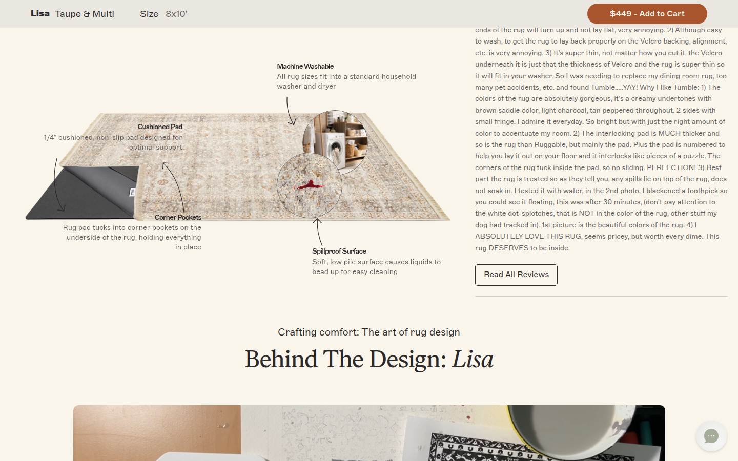
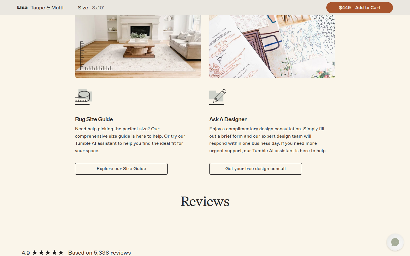
| Craft | 8.2 | The cream, sage, and rust system, editorial serif headings, restrained controls, and product photography form a polished whole. Some dense purchase and sticky-control surfaces soften the otherwise quiet presentation. evidence evidence evidence |
|---|
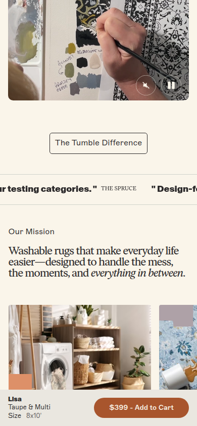
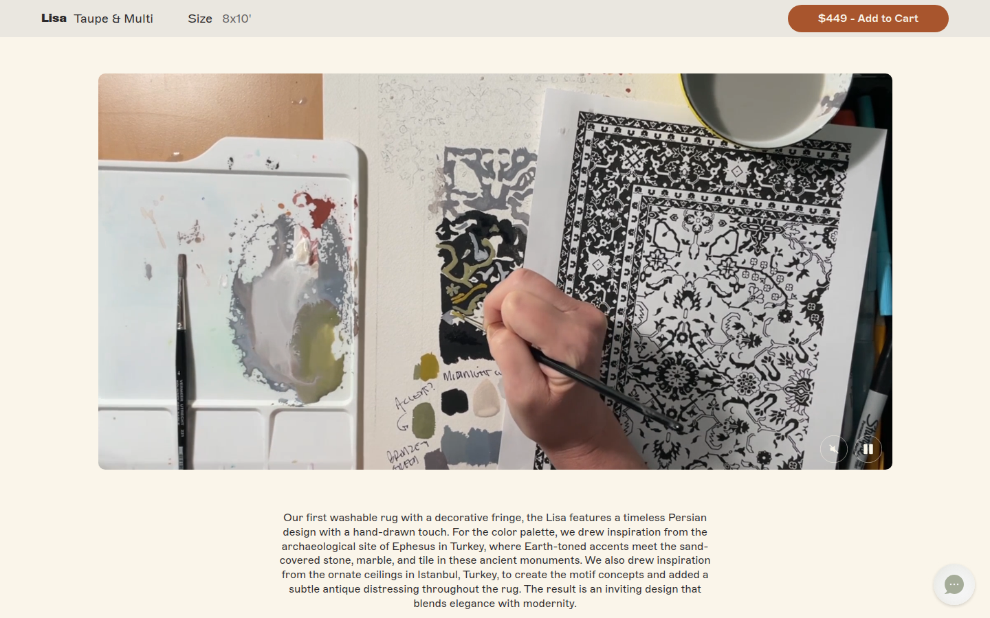
| Identity | 8.2 | The artist-led Lisa story carries the product pattern into a recognizably warm, design-conscious home world. It is coherent throughout, though the broader visual vocabulary remains familiar within premium home retail. evidence evidence evidence |
|---|
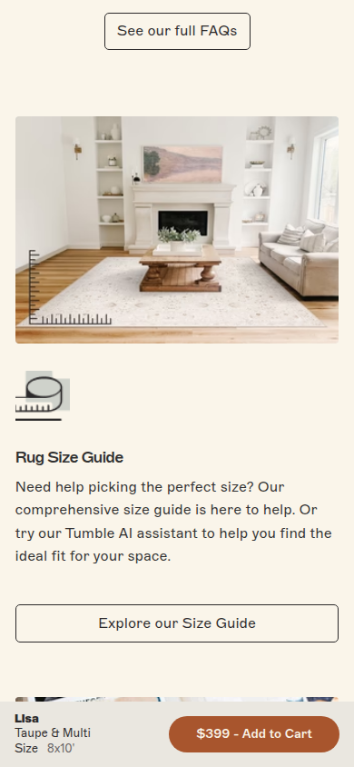
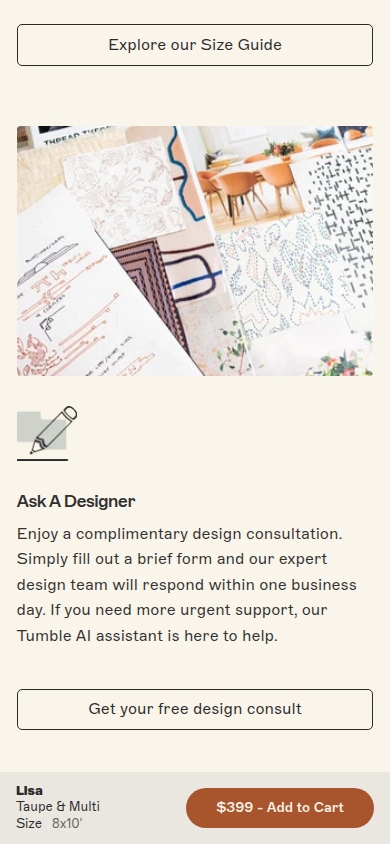
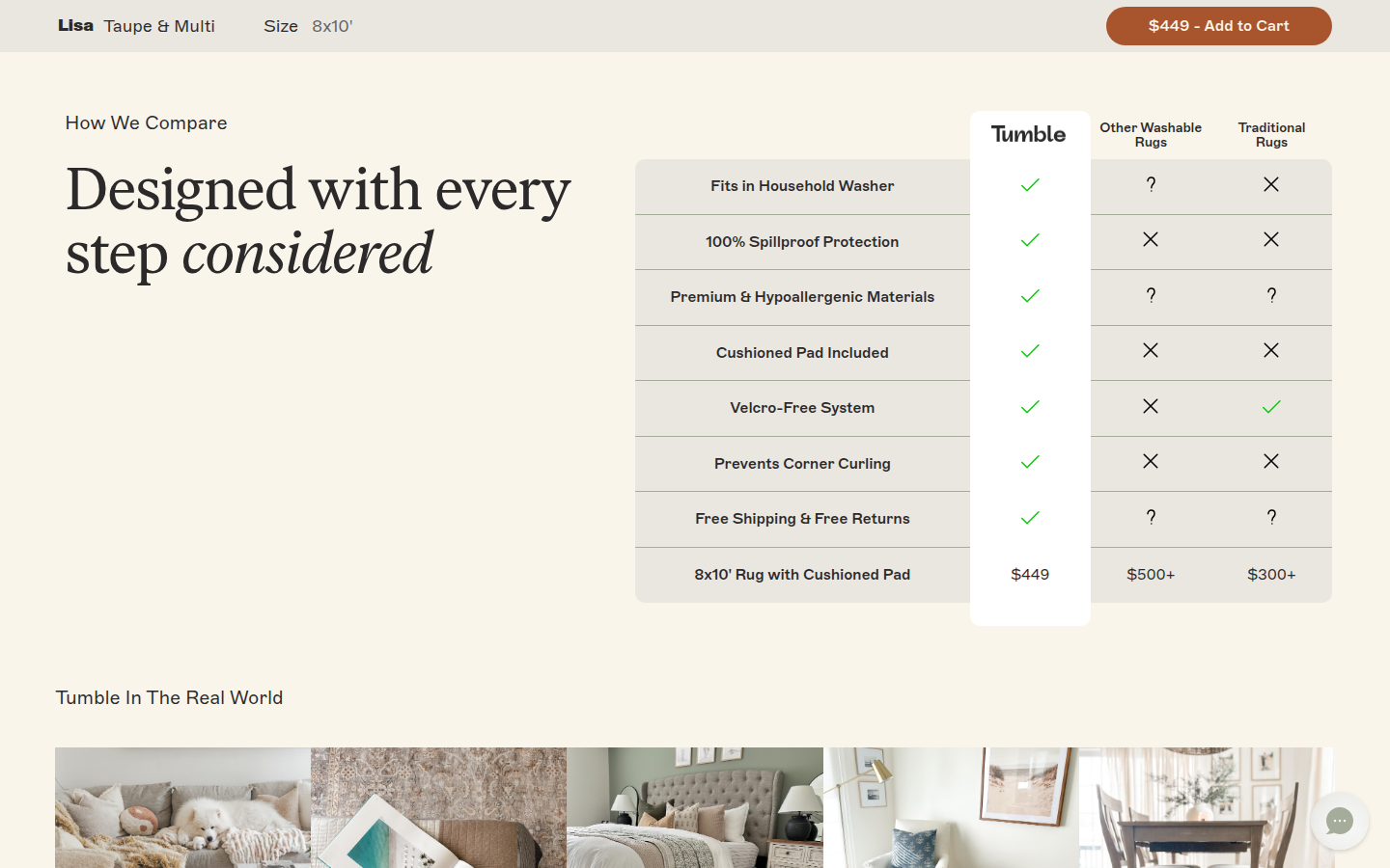
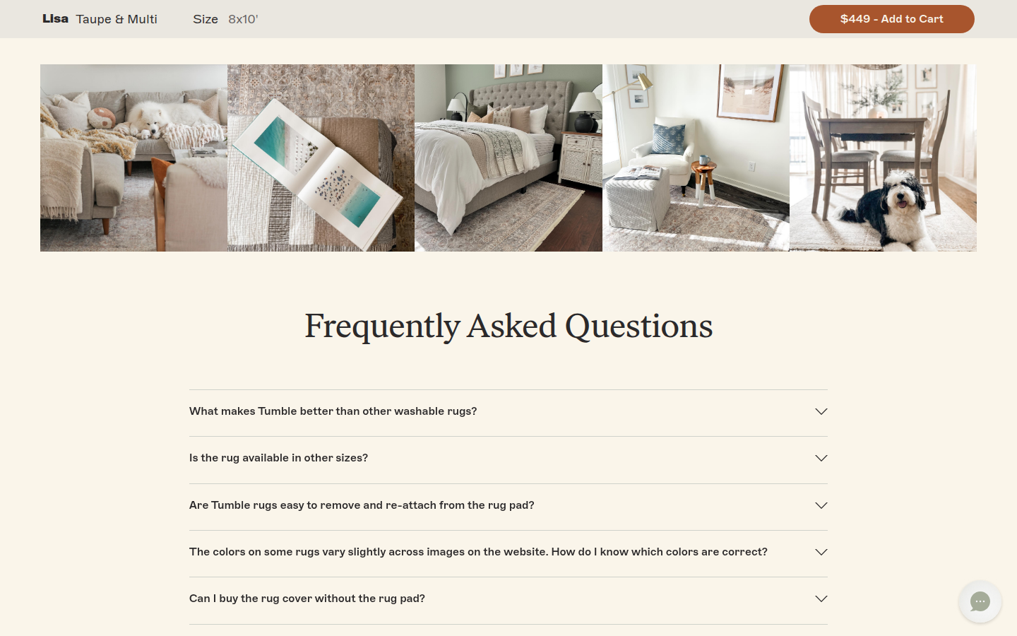
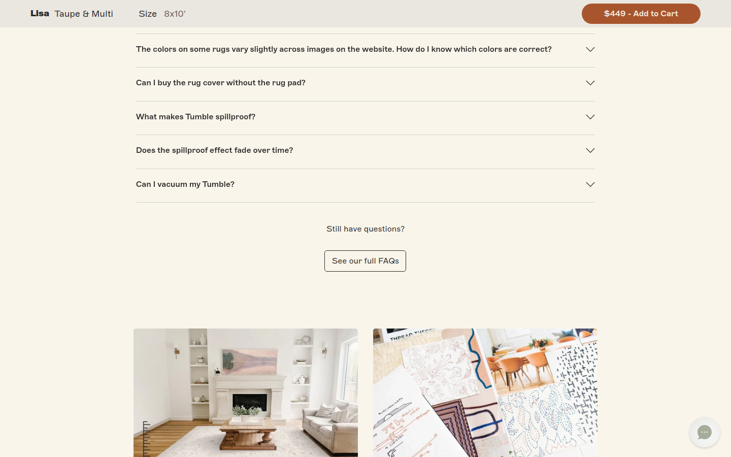
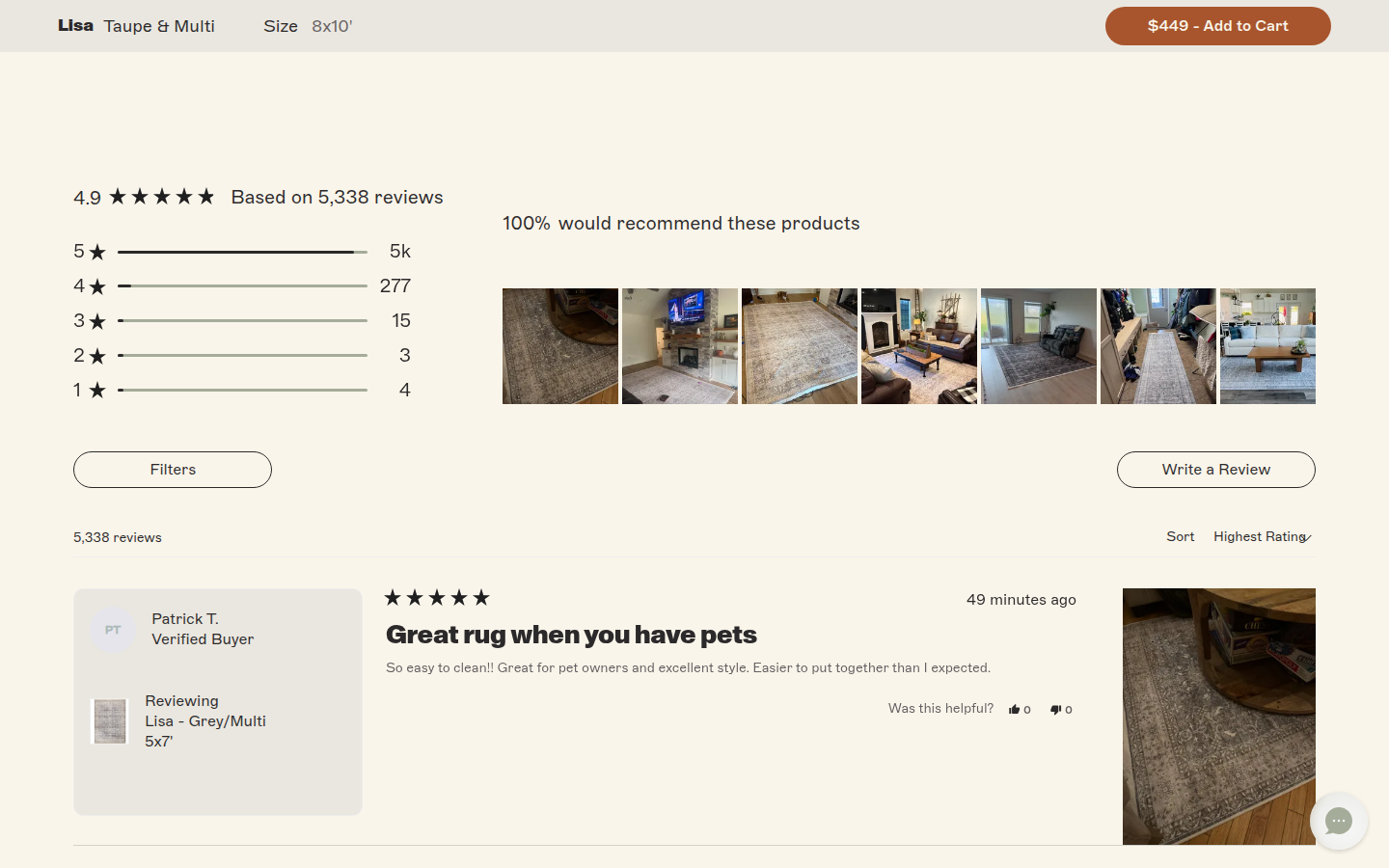
| Journey | 8.2 | The sequence moves from selection and practical construction proof into design origin, benefits, comparison, inspiration, FAQs, service help, and reviews. The lower half is rich but long, with several adjacent proof and support modules competing for attention. evidence evidence evidence |
|---|
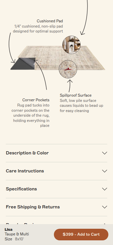
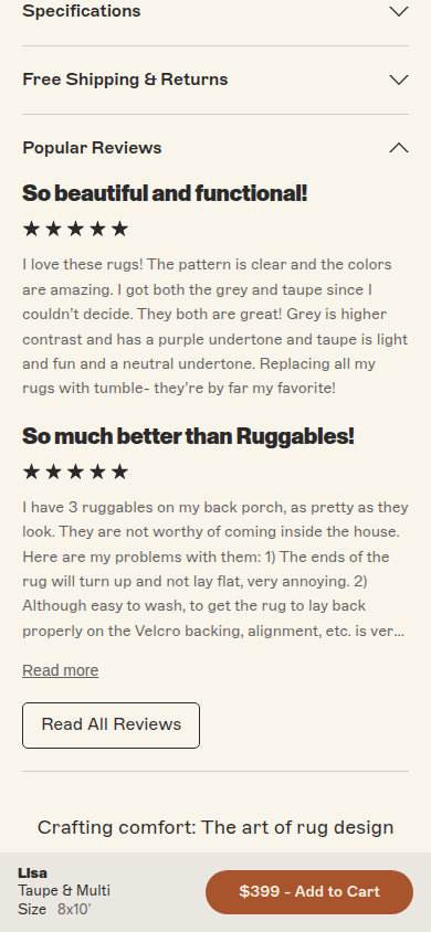
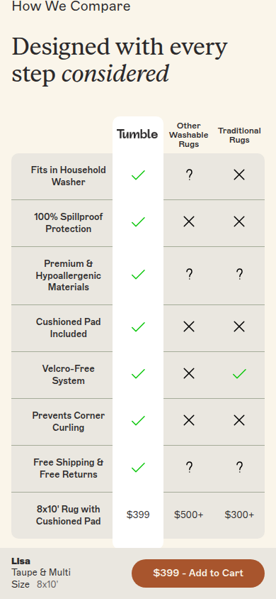
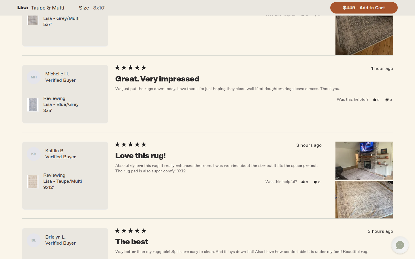
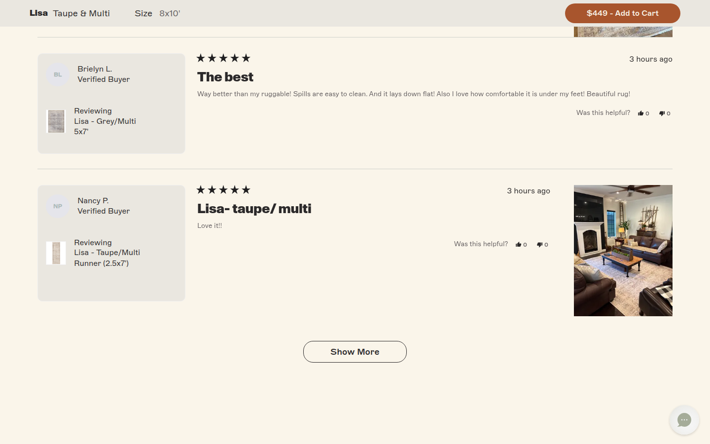
| Trust | 8.4 | Clear care specifications, shipping and returns, practical construction imagery, and substantial visible buyer review presentation with product context and photos give the page credible texture. The comparison table is useful orientation but remains brand-authored. evidence evidence evidence |
|---|
| Offer | 8.5 | Price, included-pad value, color and size selection, availability, returns, payment option, and a prominent purchase action are legible at the decision point. evidence evidence evidence |
|---|
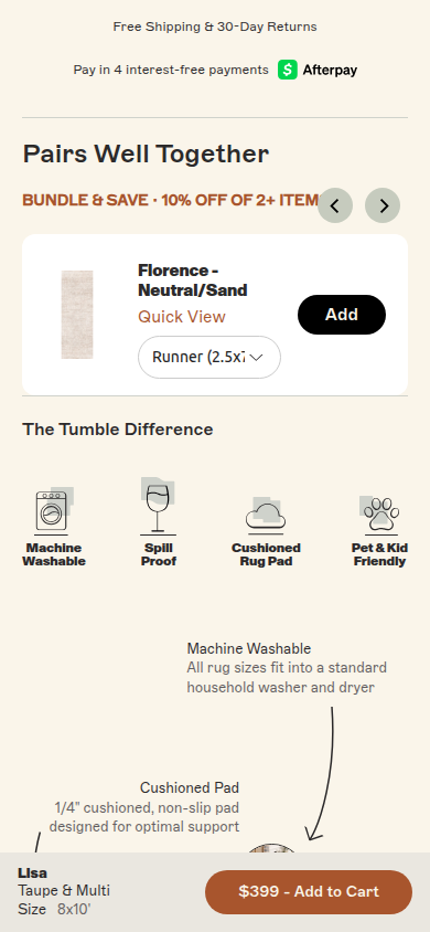
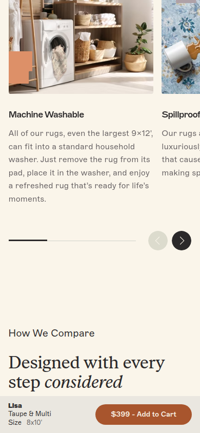
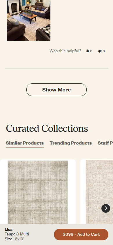
| Mobile | 8.1 | Product options, proof, review content, and help sections remain readable at 390px, and the sticky purchase bar keeps the selected item clear. The persistent bar adds visual weight during the long lower journey, while partial carousel edges add density. evidence evidence evidence |
|---|
Strengths
- A refined product-selection area makes a complex rug purchase understandable without abandoning visual calm.
- The design-origin story joins the product’s pattern, photography, and editorial typography into a cohesive experience.
- Practical proof and richly presented buyer evidence sustain confidence well beyond the initial CTA.
Priorities
- Reduce repetition in the lower proof and service sequence so the design story, comparison, FAQ, and review modules each have more breathing room.
- Lighten the persistent mobile purchase bar during deep-scroll content to preserve more reading space.
- Give the comparison table clearer contextual framing so its brand-authored perspective does not carry more weight than the independent customer evidence.
Limitations
- Static full-page captures were reviewed at 390px and 1440px; interaction states and factual substantiation were not assessed.
Judge B · journey-led: 8.96/10
| Craft | 9.1 | Refined editorial composition, restrained typography, warm photography and exact spacing create a highly resolved system across product, story, service and footer regions. evidence evidence evidence evidence evidence evidence evidence |
|---|
| Identity | 9.1 | The quiet palette, serif-led voice, tactile room imagery and careful service language form an ownable, continuous visual world rather than a generic retail skin. evidence evidence evidence evidence evidence evidence evidence |
|---|
| Journey | 9.1 | The page moves cleanly from product and configuration to material explanation, care, service policies, customer proof, brand story and FAQs. Each topic receives visual breathing room without losing the purchase thread. evidence evidence evidence evidence evidence evidence evidence evidence evidence evidence evidence evidence evidence |
|---|
| Trust | 9.0 | Shipping, returns, warranty-style service details, product specifications, review summaries, reviewer cards and consultative support cues are placed where questions naturally arise. evidence evidence evidence evidence evidence evidence evidence |
|---|
| Offer | 8.4 | Variant, size, pad option, stock state, delivery terms and cart action are presented calmly and clearly. The premium decision is clear, but less explicit value framing is offered than elsewhere on the page. evidence evidence evidence evidence evidence |
|---|
| Mobile | 8.5 | The narrow layout preserves the page’s typographic hierarchy, product controls, review detail and service content. The persistent bottom purchase bar uses material viewport height, and some intentionally partial horizontal content makes the long journey slightly denser. evidence evidence evidence evidence evidence evidence evidence evidence evidence |
|---|
Strengths
- An unusually cohesive editorial identity from hero to footer.
- Clear, spacious decision progression across product information, service details, proof and brand story.
- Trust signals are richly presented without breaking the visual calm.
Priorities
- Make premium value framing more explicit at the first purchase decision.
- Reduce the visual footprint of the persistent mobile purchase bar after the primary configuration is chosen.
- Offer a compact visual cue for the mobile horizontal content so its continuation is immediately apparent.
Limitations
- Every supplied readable desktop1440 and mobile390 frame was visually reviewed.
- The desktop and mobile hero displayed different prices in the supplied captures; without verified selected-state context, this is noted as capture uncertainty and not scored as a defect.
- No interaction, checkout, accessibility, provenance, or commercial-performance claim is made.